Miguel will be giving a 2-day workshop on brush lettering as part of the Proyecta series of events being held between December and February to promote design and innovation in the state of Oaxaca in Mexico.
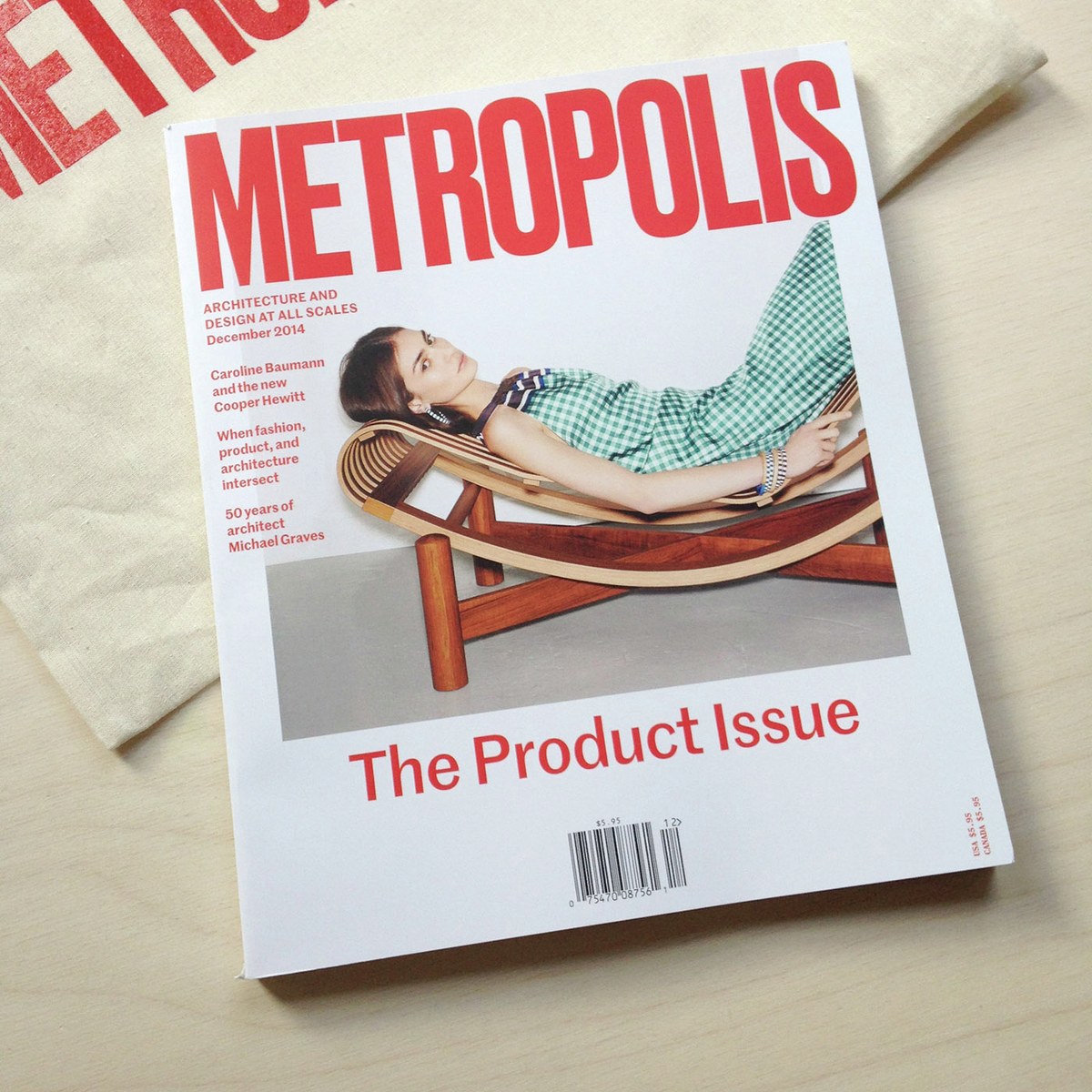
Venerable architecture, interiors, and product design magazine Metropolis has unveiled a clean, smart, and well-structured new look with their December 2014 issue, designed by Adam Lucas and Andrew LeClair, using Marr Sans and Publico Text and Text Mono throughout.
We've printed a set of three posters for Dala Prisma, and they've been wheatpasted around New York and London.
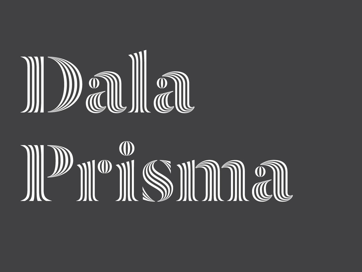
Dala Prisma is a development of the stencil typeface Dala Floda, replacing the solid forms with a series of stripes which vary in width, offering a wonderful optical effect. The family was conceived by Paul Barnes and drawn by Ben Kiel of Typefounding, using a purpose-built tool by the brilliant Frederik Berlaen, the creator of Robofont. Dala Prisma is available in three weights: Roman, with 3 strokes; Bold, with 4 strokes; and a striking Fat, with 5 strokes.
Chris Dixon and Christian Schwartz will be speaking together at a TDC Salon, focusing on Chris's redesign of Vanity Fair and the typeface family that Christian and Paul designed for him.
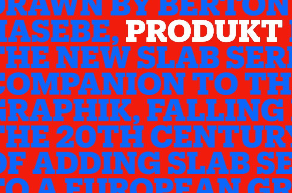
Drawn by Berton Hasebe, Produkt is the slab serif version of the sans Graphik family. This typeface follows the twentieth century tradition of adding slabs to a European Grotesk to create an attractive and functional companion serif typeface.
Paul Barnes and Christian Schwartz have drawn a custom version of Paul's Caslon Doric Black for the identity of the 2nd Istanbul Design Biennial, designed by Project Projects.
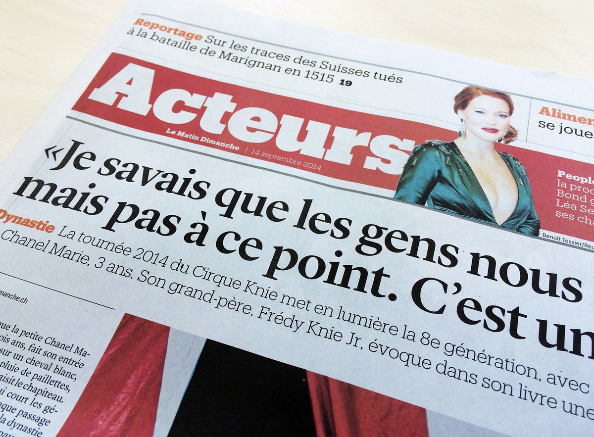
Ariel Cepeda has redesigned Le Dimanche Matin, the Sunday edition of the Lausanne-based French language Daily Le Dimanche, serving the Vaud region. Headline typography is in Kai Bernau's Lyon Display and Produkt, a slab serif companion to Graphik designed by Berton Hasebe with Christian Schwartz, slated for release in November 2014.
Paul will be one of the speakers at a symposium on Didot and Modern typefaces on 16–17 October 2014, organized by Sébastien Morlighem. The other speakers include James Mosley, François Rappo, and Loïc Sander.
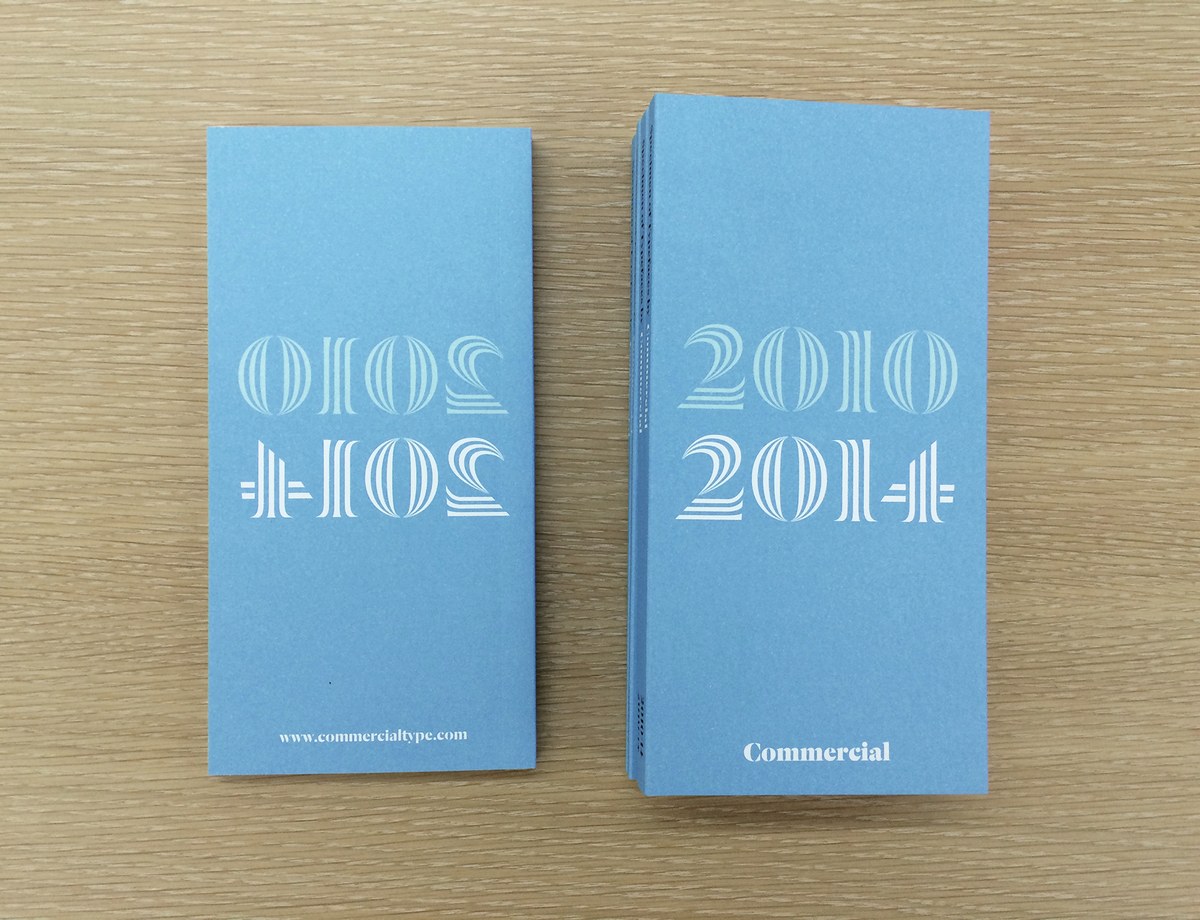
We had some of our 2010-2014 type specimen books left, but we overwhelmed by demand, and they went much more quickly than we expected. We plan to print a new specimen in 2015, so sign up for our mailing list in the site footer.

Commercial Type is delighted to announce the release of Darby Sans, a contemporary family of two related sans serifs: one is the functional Darby Sans; the other a more delicate and refined display version for large sizes, where the contrast is dramatically higher. Drawn by Paul Barnes together with Dan Milne, the roots of Darby lie in the British tradition of lettering and typefounding that began to flower in the middle of the eighteenth century.
Paul will be speaking at an event held by LongLunch in Edinburgh, Scotland, where he will discuss Marr Sans, among many other things.
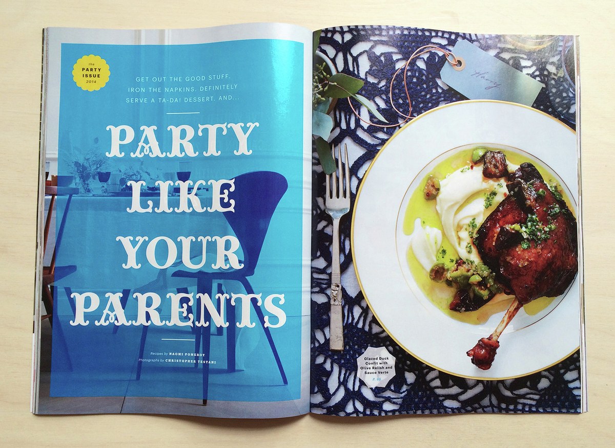
Miguel Reyes lettered a number of headlines and dropcaps for Bon Appétit’s October 2014 "Party Issue" special package.
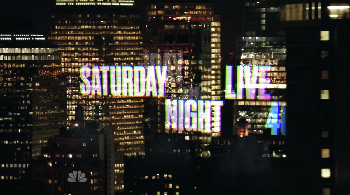
Pentagram designed new opening titles and bumpers for the 40th season of Saturday Night Live, which debuted on September 27. Berton Hasebe drew a custom version of Druk Condensed, slightly lighter and wider than the existing version.
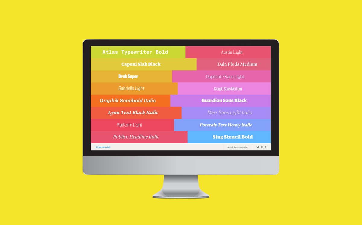
We are delighted to announce our new Webfonts Showcase, a set of sixteen microsites, each showing a different family from our library and highlighting a different aspect of its personality.
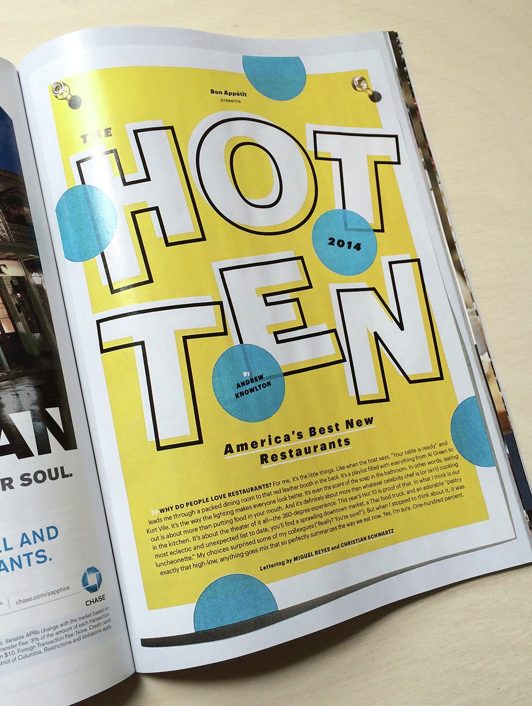
Commissioned by Alex Grossman and Kristin Eddington, Miguel Reyes and Christian Schwartz provided eleven pieces of lettering for the 2014 Hot Ten, Bon Appétit's annual list of the ten best new restuarants in the US.
Commercial Type designer Miguel Reyes will be conducting a 2-day lettering workshop and giving a talk entitled "Tipos Comerciales" at the 2014 Tipos Latinos conference in Bogotá.
Another part of Paul Barnes's onging Chiswick project, first seen in O, the Oprah Magazine in 2010, and later in Document Journal in 2013, has made its public debut in the latest edition of ’SUP MAGAZINE.
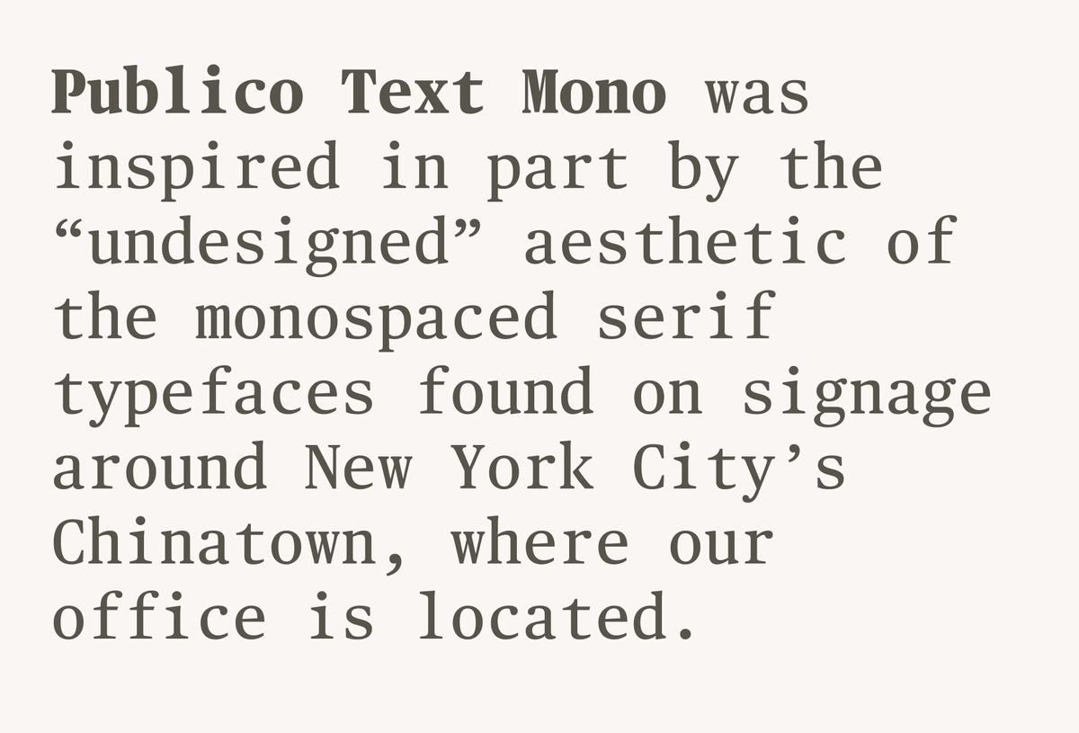
The forms of Commercial Type's latest release, Publico Text Mono, feel at once familiar and alien—recognizable as Publico, but with a distinctly strange texture. Greg Gadzowicz added the italics in 2014. In keeping with the un-designed aesthetic, the italics are optically corrected obliques.
Paul Barnes's Marian was designed for large sizes only, but the concept for the family was always about reduction to the underlying skeleton, rather than size, so Marian Text applies these principles to make a family that works for small sizes. Suddenly Marian is no longer just a beautiful series of display faces, but a useful text family.
Christian Schwartz will reprise his lecture from last year's Ampersand conference, expanded to show some new projects and to reflect the fact that the world of webfonts continues to evolve at a rapid pace.
In the third installment of Roland Früh's Easy Lessoning residency (together with Ryan Waller and Other Means) in Brooklyn, Christian Schwartz will speak on Commercial Type’s work with Vanity Fair and Louise Paradis will present her research and design around the TM Typografische Monatsblätter.
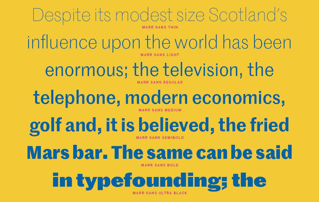
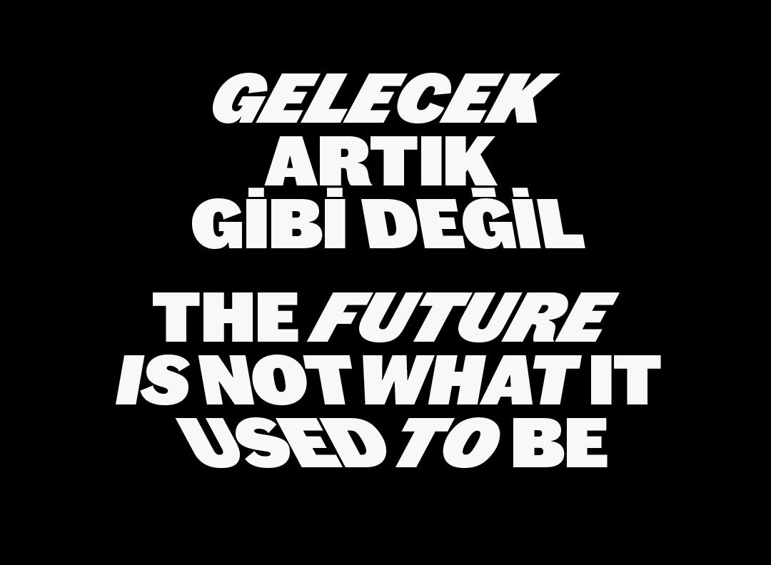
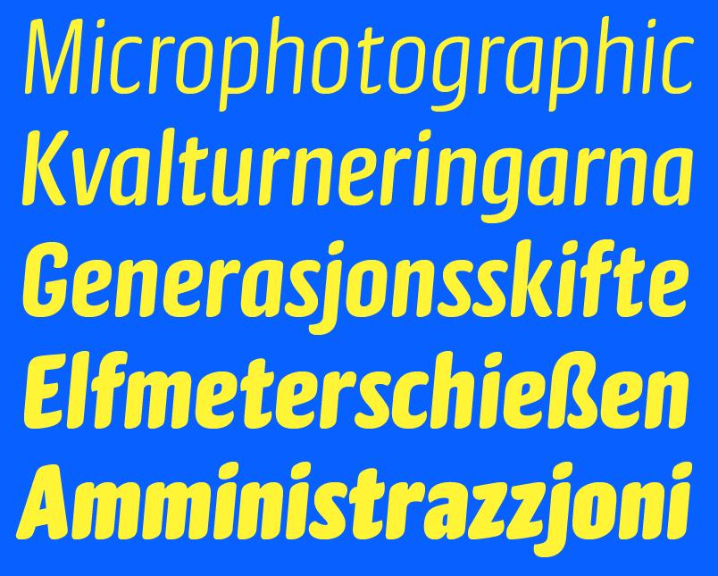
Marr Sans is a 2014 revival of a characterful grotesque that appeared in only one weight during the 1870s. Paul Barnes and Dave Foster have expanded this original into a seven-weight family. One of the innovations of the nineteenth century captured in Marr is the first example of sans serif oldstyle figures in a typeface, at the time a considerable novelty.
Christian Schwartz will give a guest lecture for the participants in a special summer residency program at the School of Visual Arts in New York called "Typography as Language: Design, History and Practice".
Designed by Berton Hasebe, Druk is a study in extremes, featuring the narrowest, widest, and heaviest typefaces in the Commercial Type library to date.
Christian will be speaking at the National Library of Sweden in Stockholm for A4's next Typographical Friday.
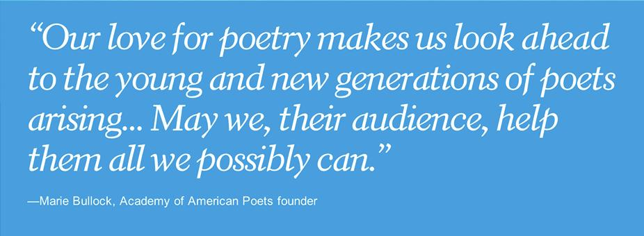
New York design studio Project Projects have redesigned poets.org, the online home of the Academy of American Poets. A major component of the redesign is a new digital revival of William Addison Dwiggins's Electra, first issued by Linotype in 1935, made with the kind permission of Monotype.
Christian Schwartz will be speaking at the Moscow offices of Yandex.
Chiswick Sans High has had its first public use in issue number 4 of Document Journal, a New York-centric fashion, art, and culture magazine. started by Paul Barnes in 2009 when he was drawing Chiswick.
Inspired by brush lettering, Gabriello was commissioned by Puma, and is now available for licensing. Paul Barnes originally designed Gabriello in a single Bold weight. Miguel Reyes added three lighter weights and one heavier weight, giving the family a casual flexibility for display uses far beyond apparel, in the vein of such classic display faces as Balloon and Dom Casual.
Paul has confirmed 6 events in Australia and New Zealand in April. Lectures are planned in Melbourne, Hobart, Canberra, Christchurch, and Auckland. A workshop is also planned.
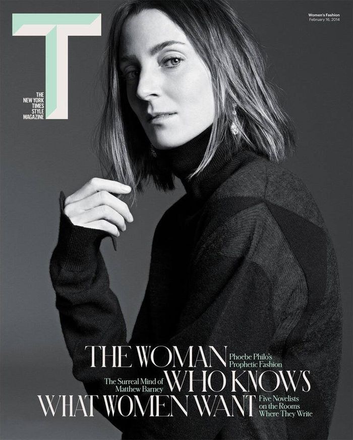
A small addition to Graphik debuted in today's issue of T, the New York Times Style Magazine: Graphik Titling, based on the as-yet unreleased Condensed, X Condensed, and XX Condensed widths of Graphik.
Christian will be speaking at « Lettres Modernes 2: voir, regarder, lire » at l'École supérieure d’arts & médias de Caen/Cherbourg in Caen, France.
Christian will be conducting a 2-day workshop entitled "Iteration in Type Design: Taking a Typeface from a Good Idea to a Great Tool" at Gestalten Space in Berlin. Participants will spend the two days working on their own typeface in progress, with the main focus on evaluating the typeface and learning how to take it to completion. Participants must bring a laptop with font editing software installed and at least one typeface in progress.

The latest issue of Wallpaper* uses Portrait Inline to great effect, along with the rest of the family and Darby Sans Text, for their 2014 Design Awards.
A Wide width in three weights has been added to Schnyder for this year's issues of T, the New York Times Style Magazine. Schnyder was originally designed by Berton Hasebe and Christian Schwartz for the 2013 top-to-bottom redesign by creative director Patrick Li and his team of Shawn Carney and Aurelie Pellissier.
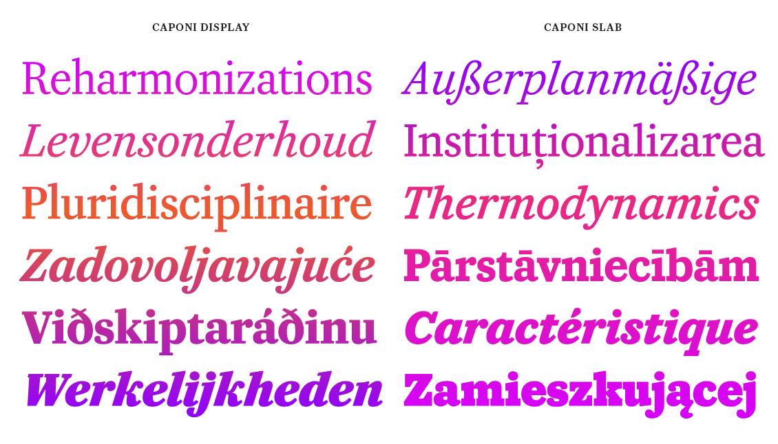
Most contemporary revivals of Giambattista Bodoni’s work have focused almost entirely on the elegant, high-contrast types that he cut in the early part of the nineteenth century. Caponi expands the notion of what Bodoni’s work was.
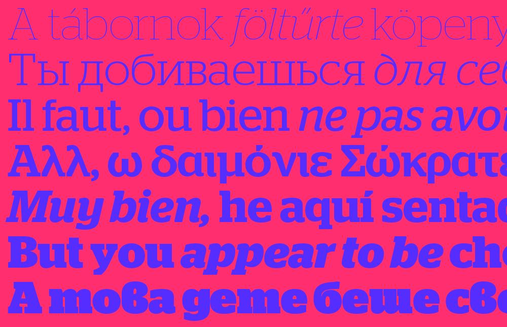
Stag and Stag Sans were designed by Christian Schwartz in 2005 for the US edition of Esquire, and have been two of our most popular families ever since their release in 2007. We had many requests for Cyrillic and Greek support for these families over the years, so we have added it to both families.
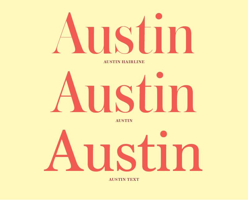
Austin was first designed in 2003 for the elegant display typography of Harpers & Queen, a British fashion magazine, and Paul Barnes had long wanted to augment the delicate display face with a more rugged version for smaller sizes. He finally found the time, and the result is a highly personable text face firmly in the British tradition, hewing much closer to the original types—cut by Richard Austin in the late 18th century for the publisher John Bell—that had originally inspired the Austin family.