Poets Electra for poets.org
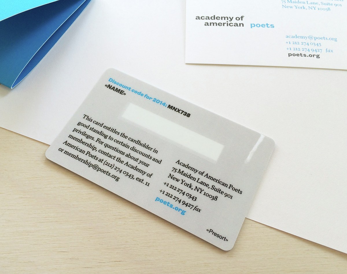
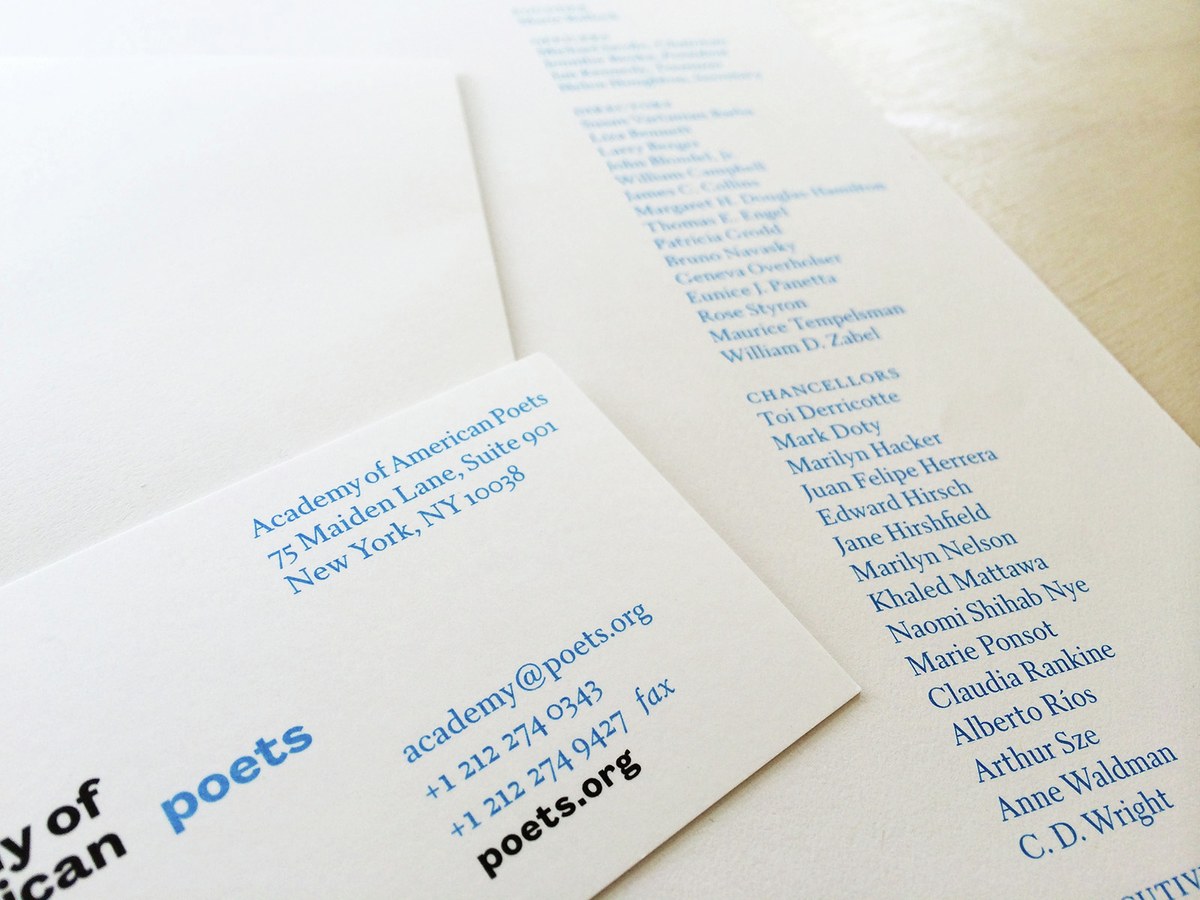
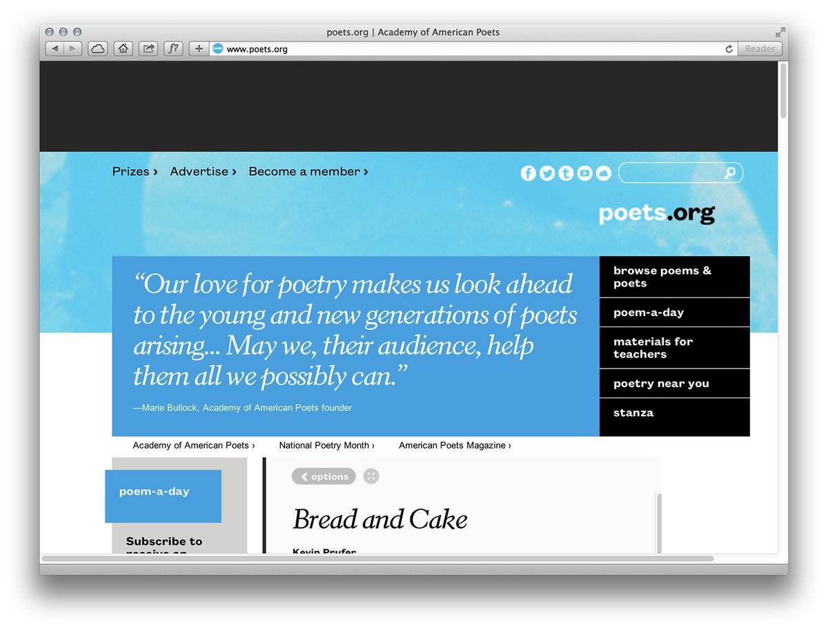
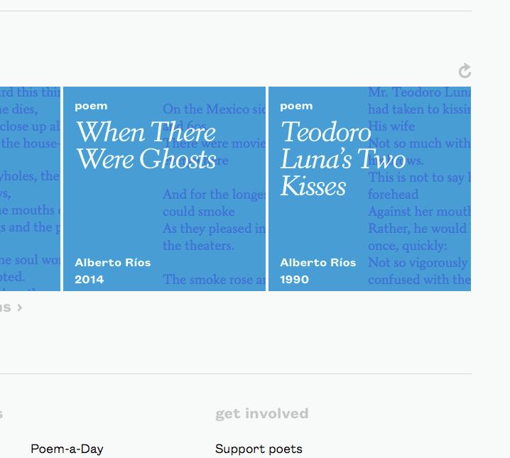
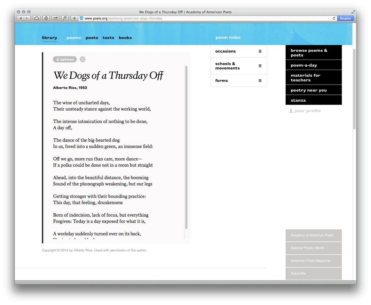
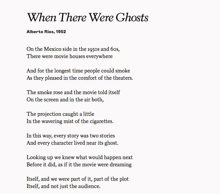
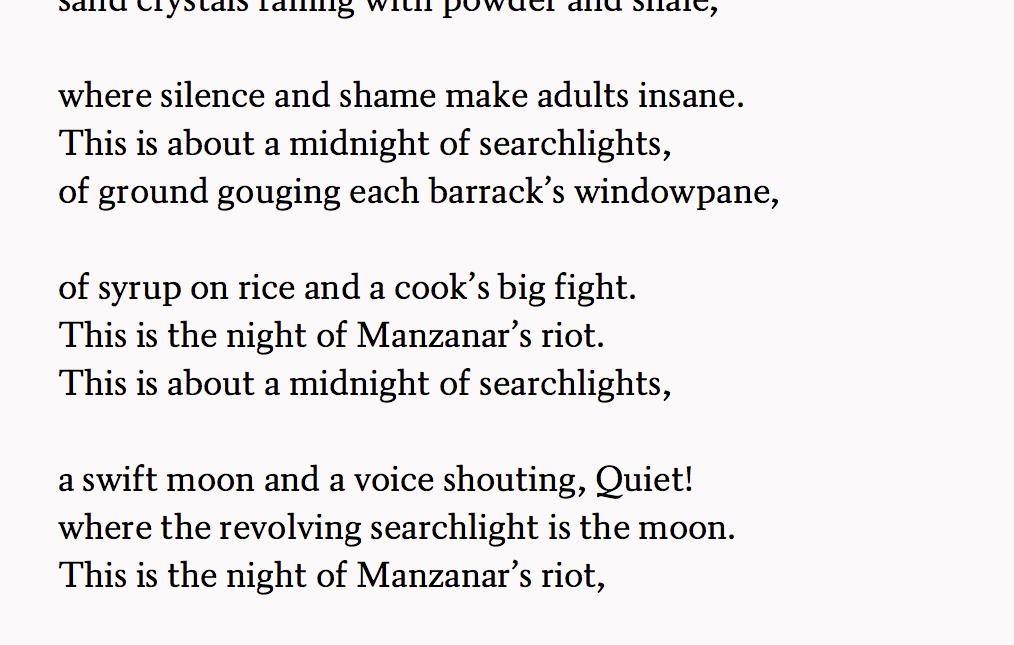
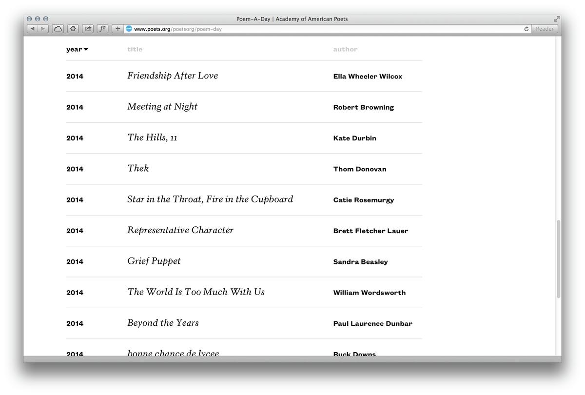
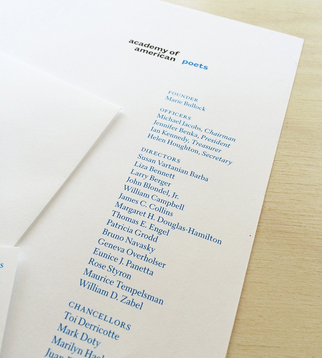
New York design studio Project Projects have redesigned poets.org, the online home of the Academy of American Poets. A major component of the redesign is a new digital revival of William Addison Dwiggins's Electra, first issued by Linotype in 1935, made with the kind permission of Monotype. Working from samples of the 8pt hot metal type, Christian Schwartz drew the screen version, and Miguel Reyes drew a more robust version for print use. The accompanying sans serif is Kris Sowersby's Founders Text. A major part of the new design is the ability to embed poems anywhere across the internet, a feature that relies on Poets Electra to relate the embedded poems back to the Academy of American Poets.
At the request of Project Projects and the Academy of American Poets, Christian Schwartz wrote a short piece on his experience working on the project, which is republished below.
Type designer's notes: Finding Electra
Christian Schwartz
I was raised on a steady diet of W.A. Dwiggins' text faces. Growing up, most of the books at my local public library dated back to the 1940s to 60s, when Caledonia and Electra were two of the most predominant typefaces used by American publishers. To simply call these typefaces "quirky" would not do justice to the gleeful, unique character and wonderfully active textures of Dwiggins' best works, long beloved by graphic designers since their initial release in the 1930s and 40s.
When Project Projects contacted me to collaborate on a contemporary revival of Electra for the Academy of American Poets, I jumped at the chance to dissect and research this typeface that I've long loved, and was grateful that Monotype, now the owner and steward of Linotype's legacy, graciously granted permission for us to proceed. That this revival was intended to be used primarily on the Web posed a unique challenge, as drawing type for the screen inevitably requires a measure of compromise. It was of utmost importance for us to maintain Electra's distinctive formal qualities.
A typeface for Poets on the web
Though carrying a comparatively brief history, web typography has been limited by a unique set of severe restrictions. Until just a few of years ago, web designers were limited to roughly a dozen standardized typefaces, due to technical constraints that only allowed webpages to display text using fonts installed on the user's own computer — a stark contrast to the thousands of typefaces available to print designers. The number of web fonts increased significantly in 1996, when Microsoft introduced their so-called “core typefaces,” freely available across devices to improve the reading experience with visual consistency. This was a pivotal moment signaling the web's transition to mainstream use by the general public, similar in the way the mouse, for example, had made computers more user-friendly for the previous generation.
At the centerpiece of this collection was a pair of typefaces by celebrated British type designer Matthew Carter: Georgia, a serif, and Verdana, a sans serif, designed specifically for reading on screen, rather than being direct adaptations of existing print typefaces. Due to technological constraints of the time, each had to be designed twice: once as coarse bitmaps, drawn pixel-by-pixel for each size; then a second time, using smooth outlines that allow for scaling at any size. Though both typefaces were designed for the screen, each borrowed from previous eras. Georgia is influenced by the earliest typefaces made specifically for newspaper text, designed in Edinburgh in the early 1800s.
Type designers often look to the past for solutions to today’s problems, because the difficulties of making type readable on a computer screen or an old newspaper – blurriness, low fidelity in details – aren’t so different. Georgia was originally drawn to accommodate the limitations of the screen, but its massive popularity has meant that screen rendering evolved in turn to accommodate the typeface. To approximate a contemporary version of Electra, we compared Georgia to the 19th century newspaper typefaces that influenced it, then used what we learned to adapt Poets Electra from samples of the 8pt "hot metal" Linotype typeface.
The unforgiving environment of the screen meant that many of Electra's subtlest eccentricities had to be sacrificed for the sake of legibility. Compared to Linotype's existing digital version, which was digitized from the 24pt original, Poets Electra has a quieter and more sober tone. Weight variations were evened out; counterforms are even squarer; long stems don't have the same tapering; and many terminals aren't as intrinsically strange. Ironically, nearly all of these differences had already existed between different size versions of the original. When compared to the original 8pt hot metal type — in a twist of irony — Poets Electra gives a far more faithful rendition for the overall feel of the text than previous digitizations. To maintain a consistent voice across screen-based and print media, we then had to translate Poets Electra back for use in print. It felt a little too light on paper, so Commercial Type designer Miguel Reyes drew a slightly heavier weight of both Roman and Italic for use in print.
A history of Electra
In 1940, producing a typeface was by necessity a team effort: W.A. Dwiggins' first letterform drawings were just the beginning of a long process that entailed redrawing the letters for production, engraving masters, and fitting the spacing within the fixed system of widths available on the Linotype machine. The limitations of the Linotype machine shaped Electra in fundamental ways: Letters such as 'f' and 'j' couldn't extend past the sidebearings and overhang other letters. Common kerning pairs of letters such as 'AV' and 'To' had to be cast as ligatures — which meant, in practice, they were rarely used, making un-kerned text the norm. Finally, the most important limitation of all required that roman and italic letters all had to fit on exactly the same widths.
This “duplexing” of letters onto the same widths allowed roman and italic type to easily be mixed on the same line, which was and is important for everyday typography. Many typefaces available on the Linotype machine had been adapted from "cold metal," or typesetting by hand, which didn't share the same limitations, particularly on character widths. Many italics, which had typically been much narrower than their roman counterparts, became sadly distorted simulacra of their original designs when adapted for machine setting. Dwiggins' typefaces were different, though: he knew about these limitations in advance, and configured a set of tricks to make his italics look perfectly natural on the duplexed widths, although the formal integrity of some letters, notably 'f' and 'j', were still compromised to an extent by the impossibility of overhanging.
Restoring the past
To restore Electra for the modern-day, we considered each of what I see as the three main approaches a type designer can take when creating a contemporary revival. A type designer may, for one, attempt an historical reenactment, by digging up sketches, trial proofs, design notes, and any available means to get into the mindset of the person who designed the original typeface. One might say this is a form of method acting, albeit one based on a fair amount of guesswork: the designer dissects the decisions that shaped the typeface, and makes informed predictions of how the typeface may have looked if it had been made with today's range of tools, freed from the technological limitations of the time.
Conversely, a type designer may choose to simply regard an older typeface as an artifact of its time. Rather than attempting to reconstruct a decision-making process, the typeface is taken at face value — compromises and all. This frees the contemporary designer from investing time spent second-guessing granular details of how, for example, the limitations of a typesetting machine might have influenced some of the nuances, and allows him or her to instead depict the typeface as it appears on the page.
Finally, a type designer might use a historical typeface as a jumping-off point for creating a new interpretive work, focusing on one or more existing traits to make a contemporary typeface that fully reflects the time it was designed in, though sometimes with only the most tenuous connection to history.
I have tried all three of these methods on various projects, and felt that treating Electra as an artifact — without trying to second-guess how Dwiggins would have tackled issues of designing type for the screen — to be the most appropriate approach for Poets Electra.
