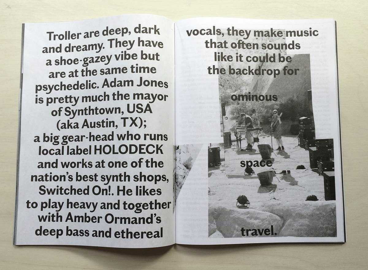
Chiswick Sans Low in ’SUP
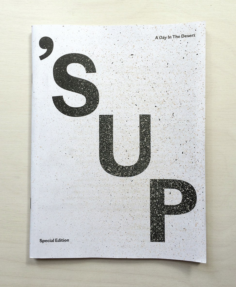
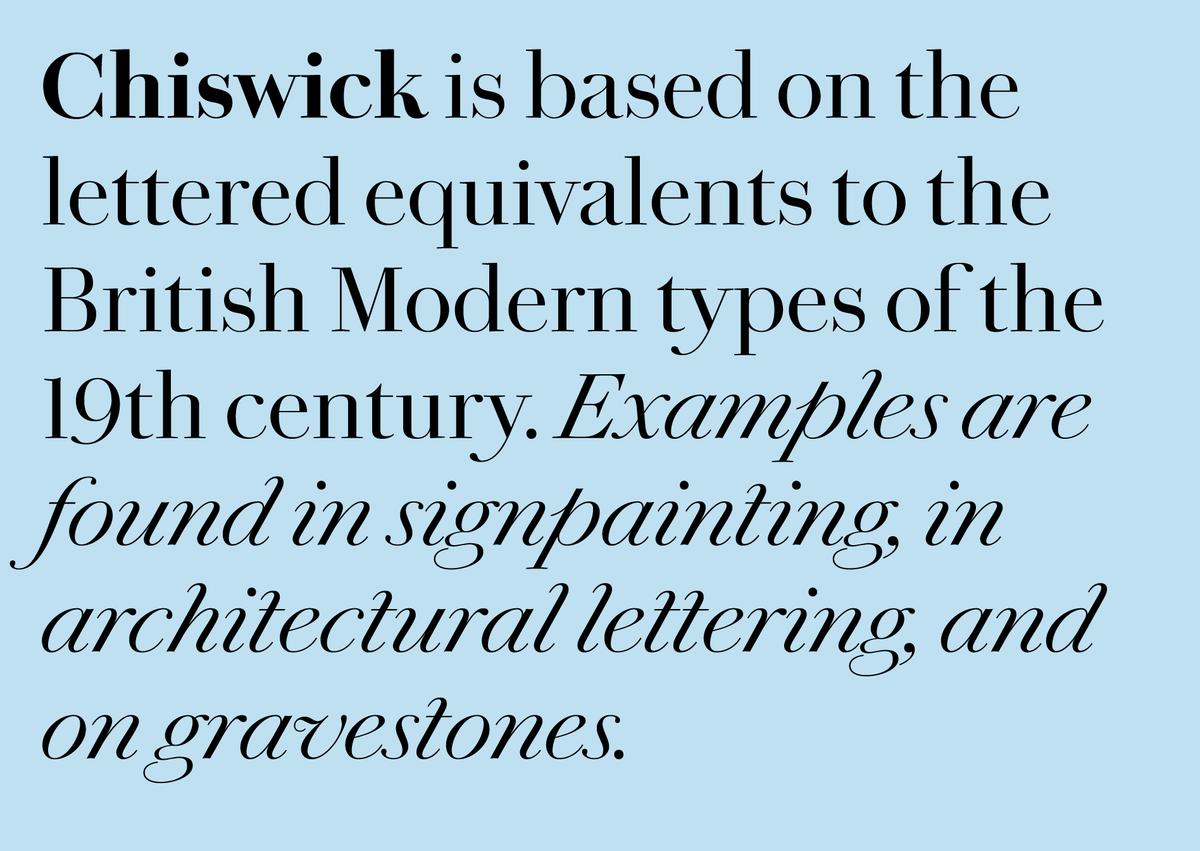
Another part of Paul Barnes's onging Chiswick project, first seen in O, the Oprah Magazine in 2010, and later in Document Journal in 2013, has made its public debut in the latest edition of ’SUP MAGAZINE. Chiswick (previously known as Wyatt) is a typographic revival of British vernacular letterforms of the 18th and 19th centuries, drawing on examples such as those found in lettering manuals, in architectural lettering, and expecially on gravestones. Chiswick is far more casual than the typefaces of the time, with an elegant and expressive italic.
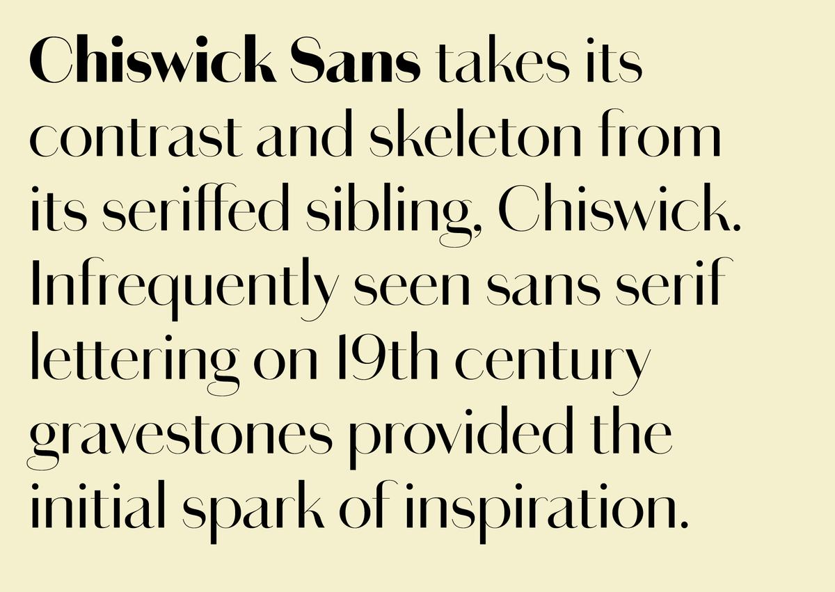
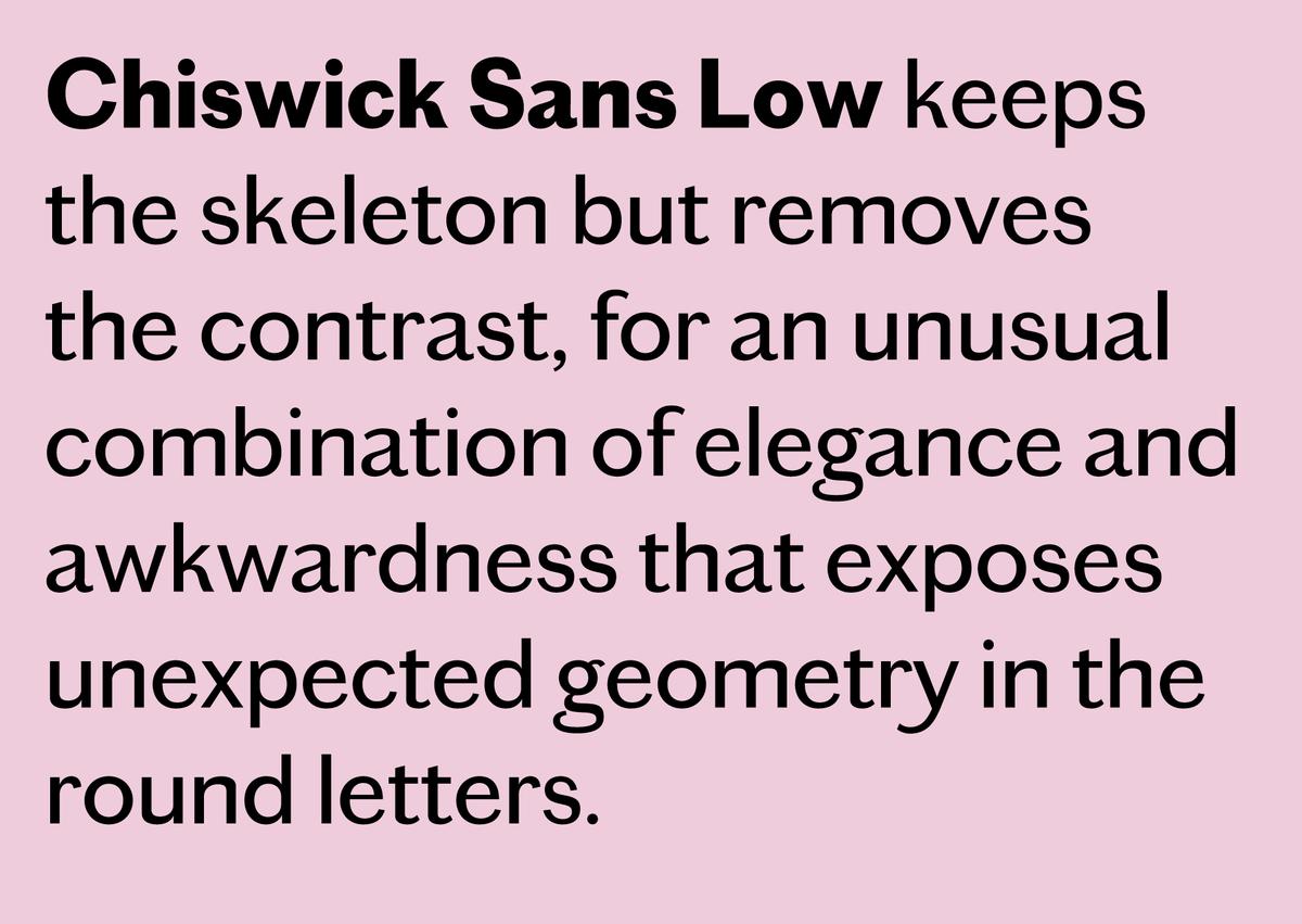
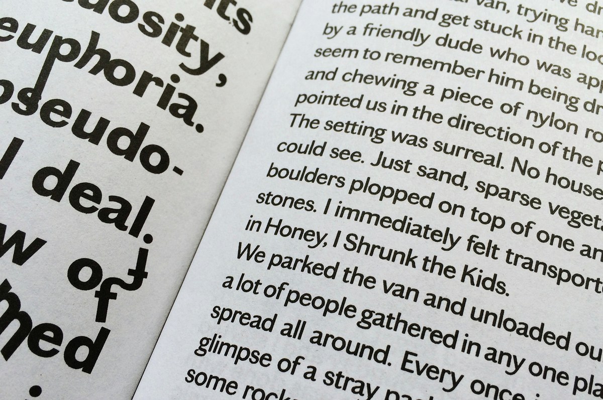
Paul's exhaustive research turned up a handful of examples of sans serif lettering on gravestones, which inspired Chiswick Sans High, a high contrast, serifless companion to Chiswick. Other lettering of the period inspired him to attempt a low contrast version as well. Strangely, when the contrast is removed, a pure geometry in the shapes of the round bowls is exposed: O and o are circular.
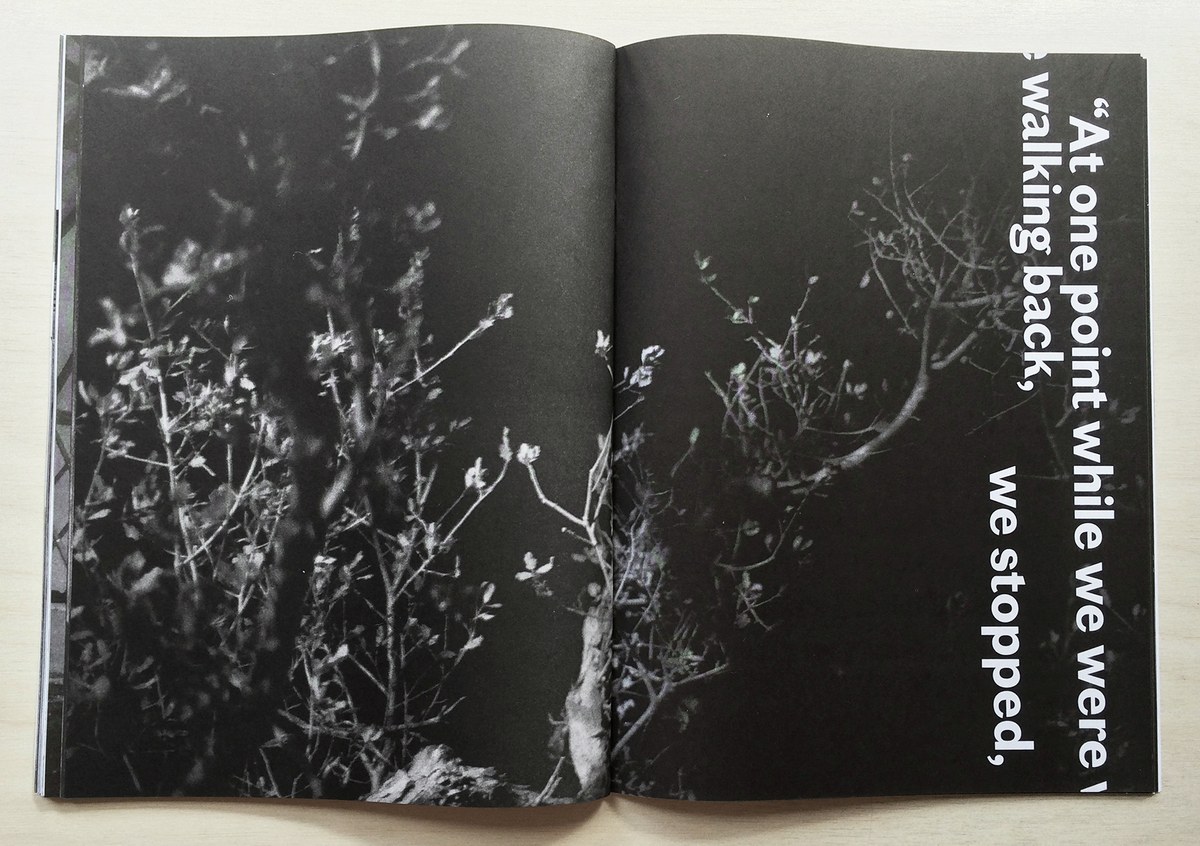
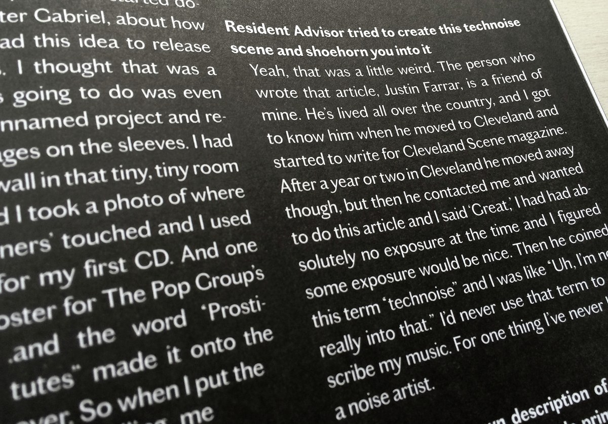
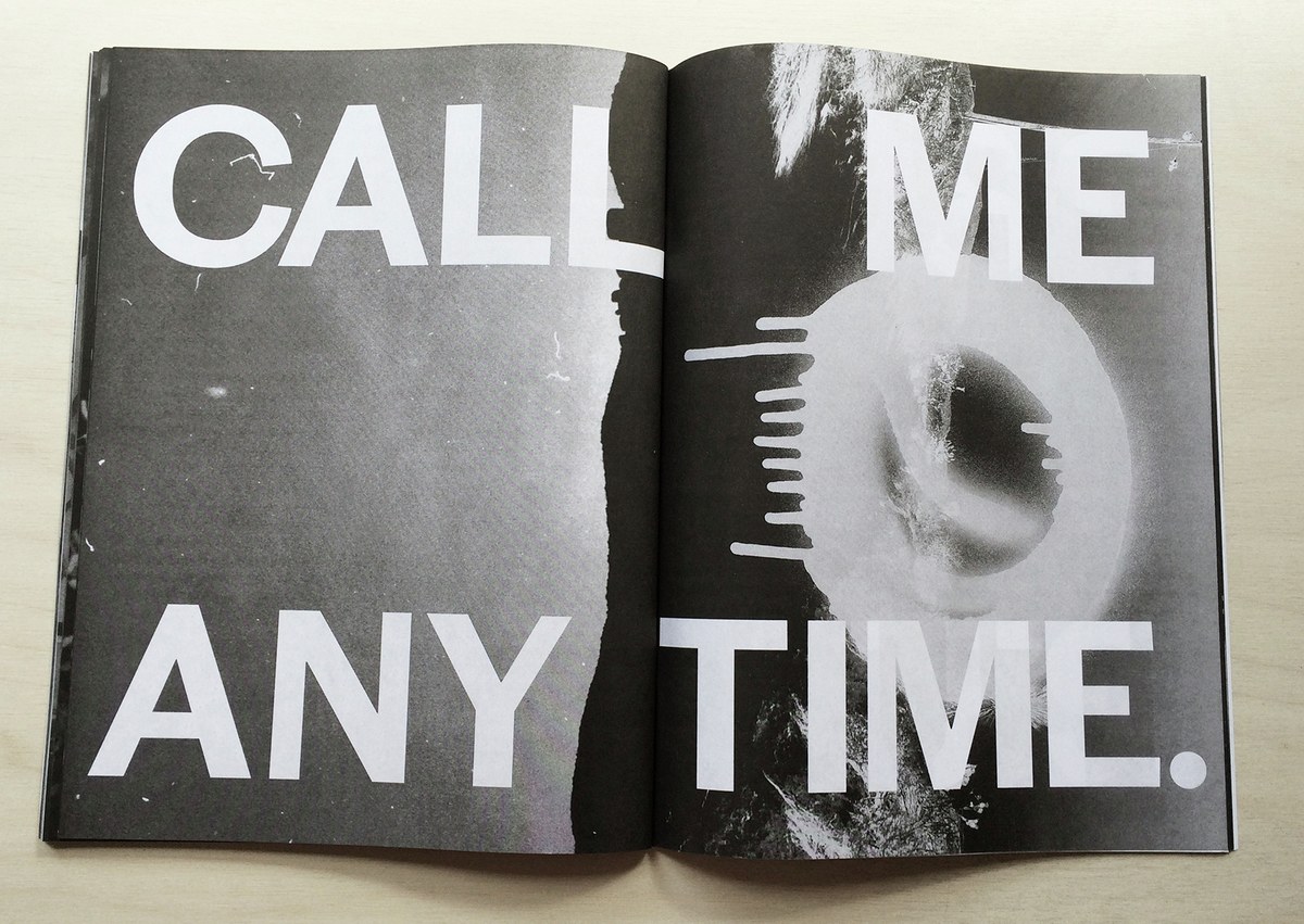
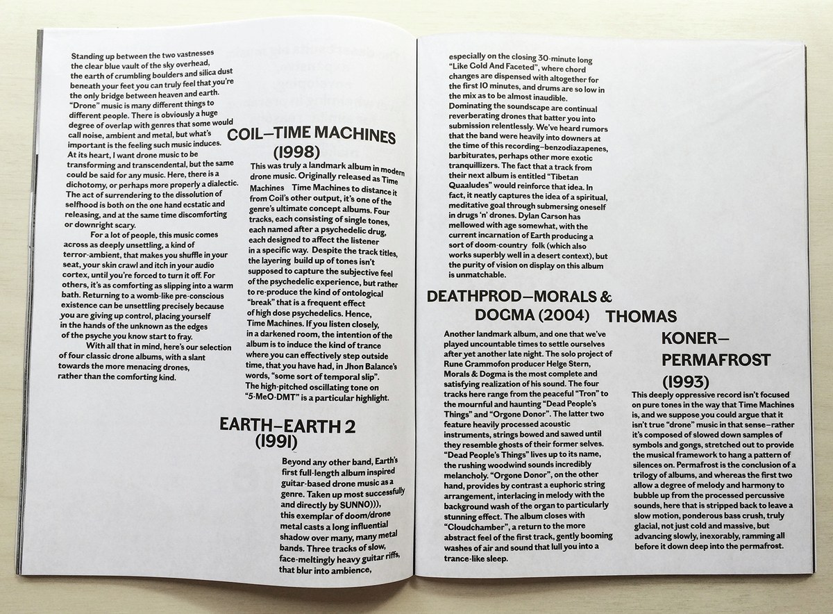
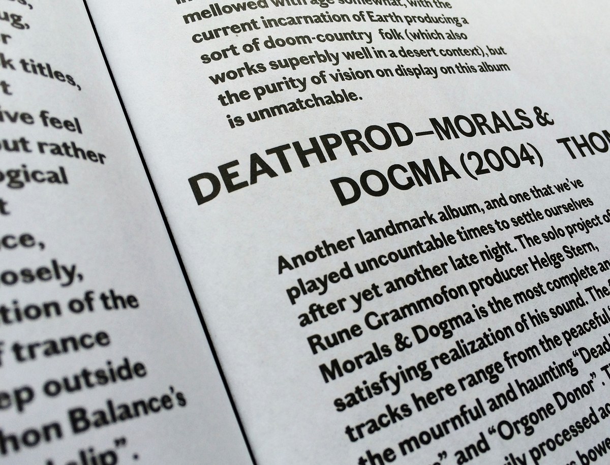
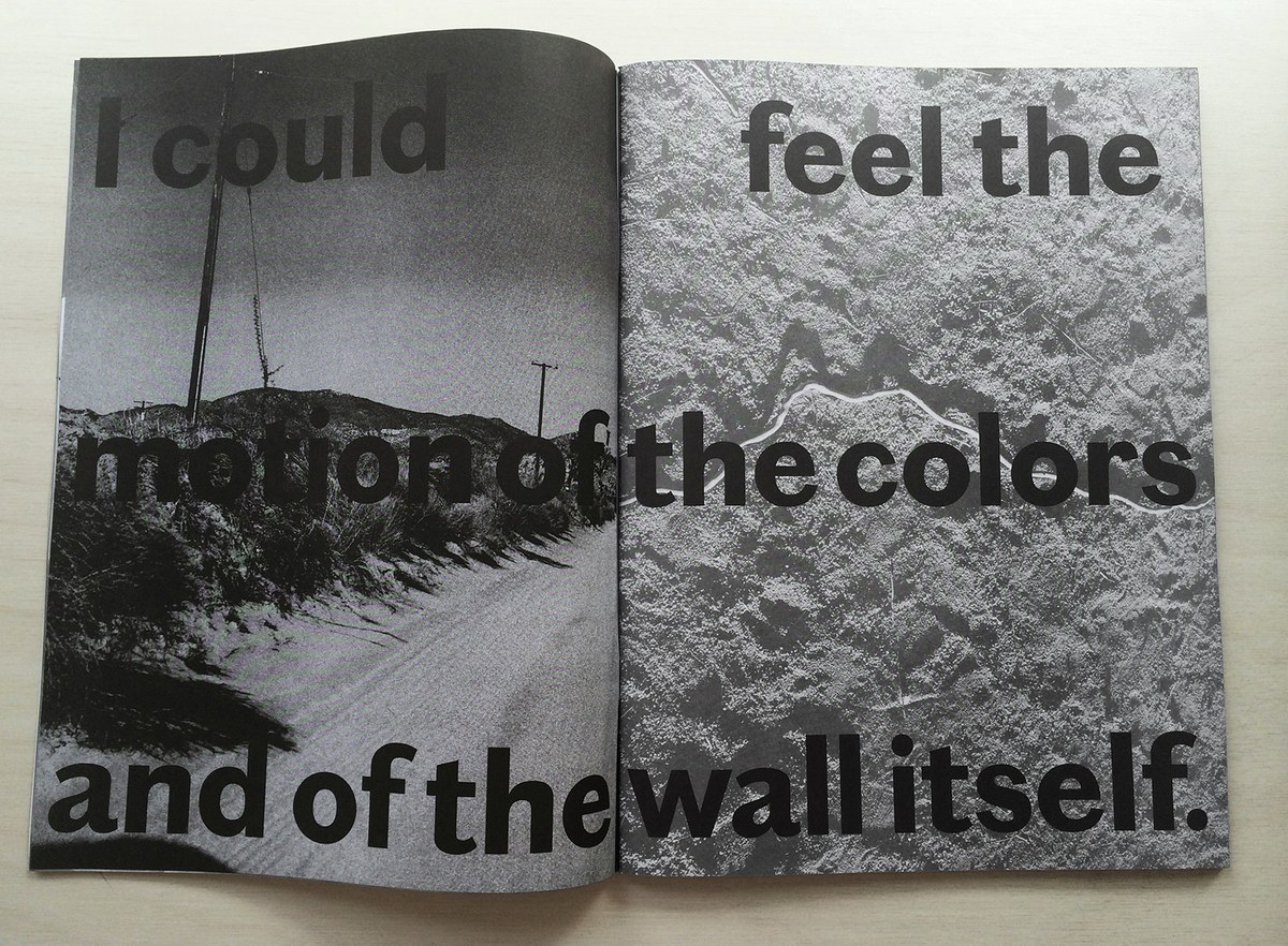
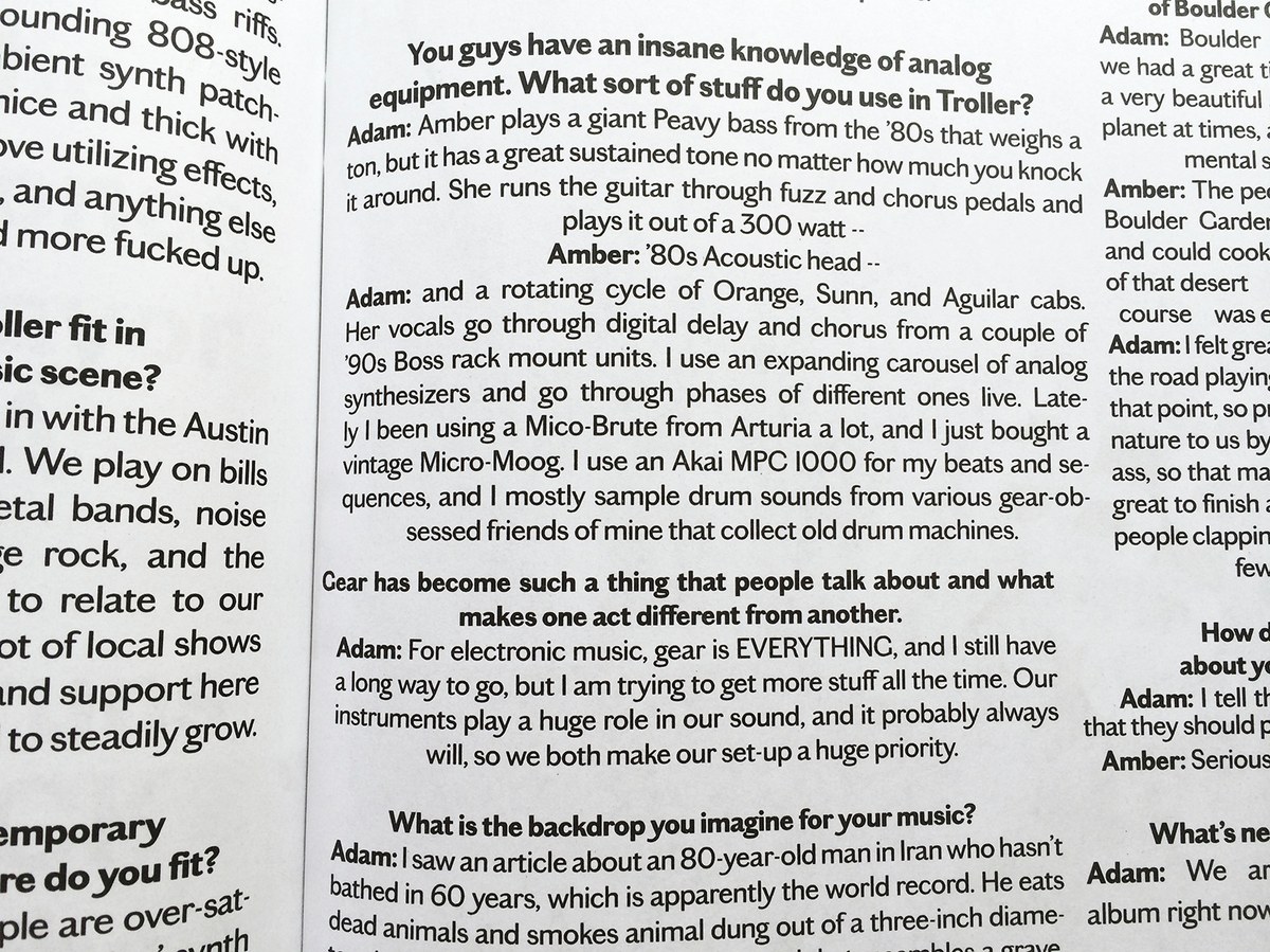
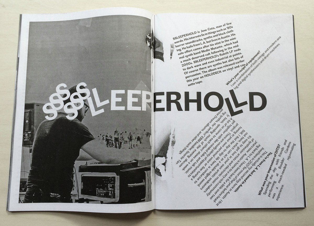
The tension between elegance and crudeness in Chiswick Sans Low made it a good fit for a special desert mini-edition of ’SUP, centered around a small music festival the team put on in Topanga Canyon last winter. The issue was designed by Richard Turley and Tracy Ma, with photo editor Emily Keegin. All type in the issue is in three weights of Chiswick Sans, sometimes with psychedelic modifications by the designers, and it seemed to hold up well on the uncoated paper.
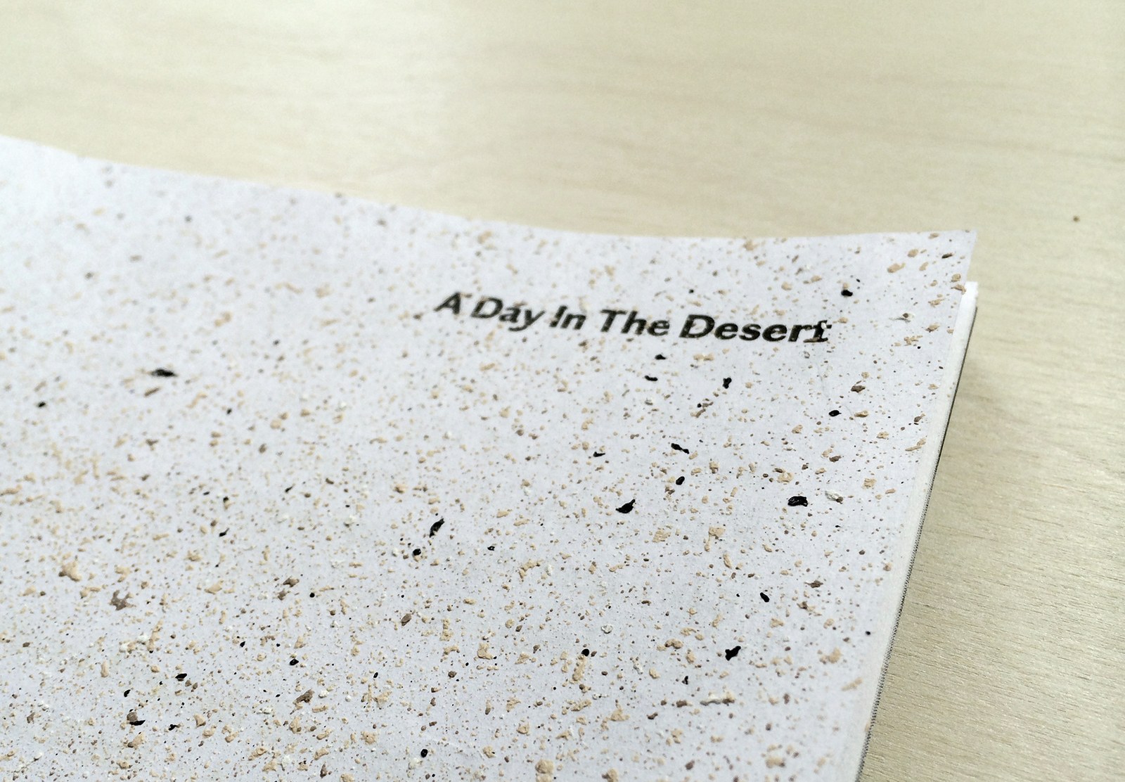
The cover has been spray painted by hand, so each copy is slightly different.
