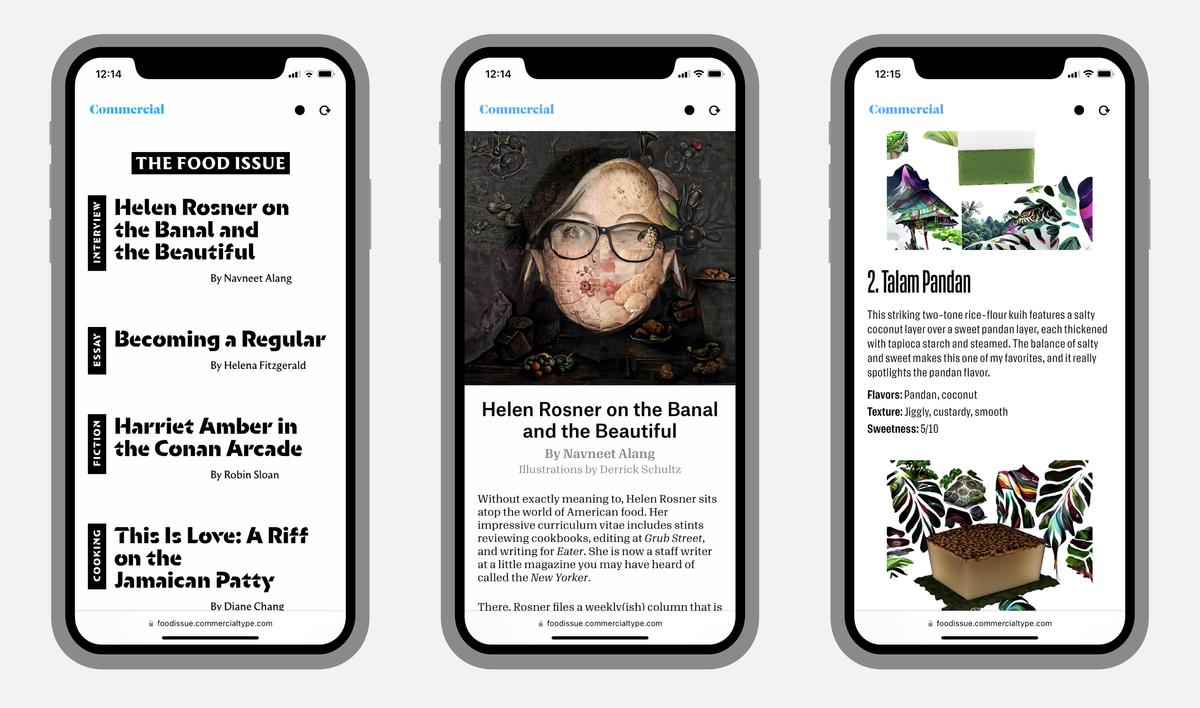
We are happy to announce The Food Issue, a one-off publication designed to show the extensive range of our text typefaces. See it at foodissue.commercialtype.com
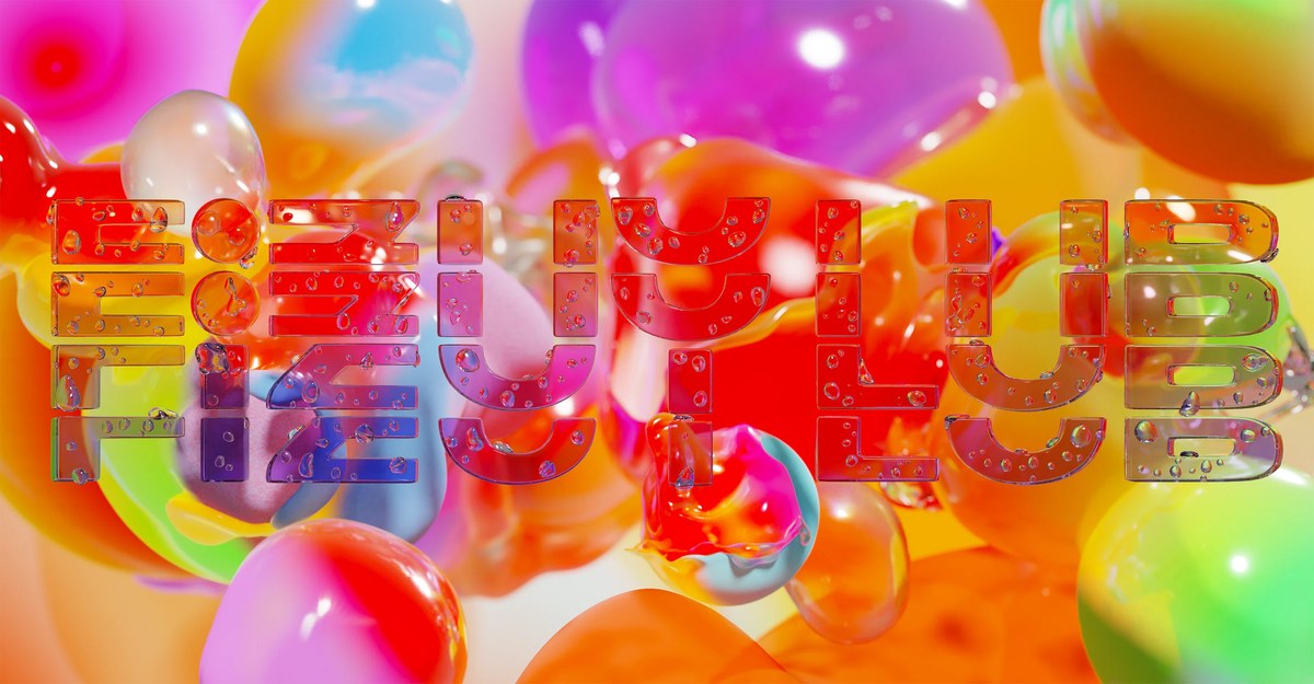
As part of his takeover of It’s Nice That in August 2022, Richard Turley’s studio Food invited us to take part in a speculative branding project for a fizzy drink, using AI at each step to help with the process. We enjoyed taking part in this clear-eyed (and somewhat tongue in cheek) exploration of how AI can actually be useful to the design process.
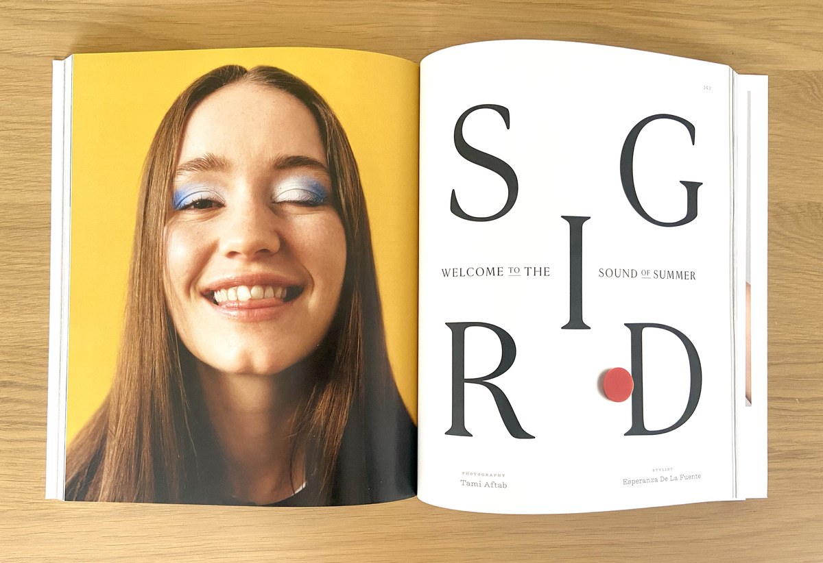
Christian Schwartz drew an all-cap serif titling typeface for a redesign of Lula by Lisa Rahman with Mark Leeds, which appeared in the F/W 2022 issue.
Designed by Paul Barnes for the cycling-clothing brand Rapha, Frame comes in four weights with separate versions for text and headlines. It is also available as a variable font, with axes for weight and optical size. The family has a large x-height, reduced extenders, simple serifs with minimal tapering, and an overall crispness most evident in the ball terminals.

To celebrate and promote the release of Frame our friends at Rapha travelled to two of the most iconic Spring Classics cycling races, the Tour of Flanders (Ronde van Vlaanderen) and Paris-Roubaix. With a series of bold and eyecatching placards held aloft by the roadside they update the long and rich tradition of guerilla advertising.
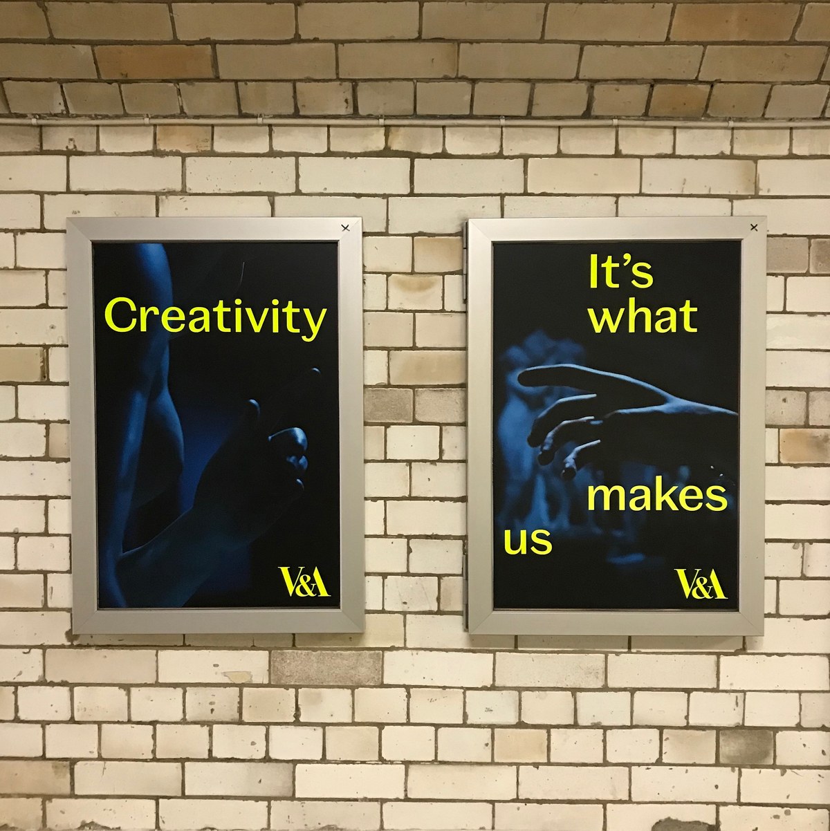
Paul Barnes and Tim Ripper have designed Spiller for the Victoria and Albert Museum. It offers a multiple range of styles and expressions based on a basic skeletal structure. This allows a unity of voice on screen, print and signage across the large number of venues within the V&A, whilst allowing an individuality when required.
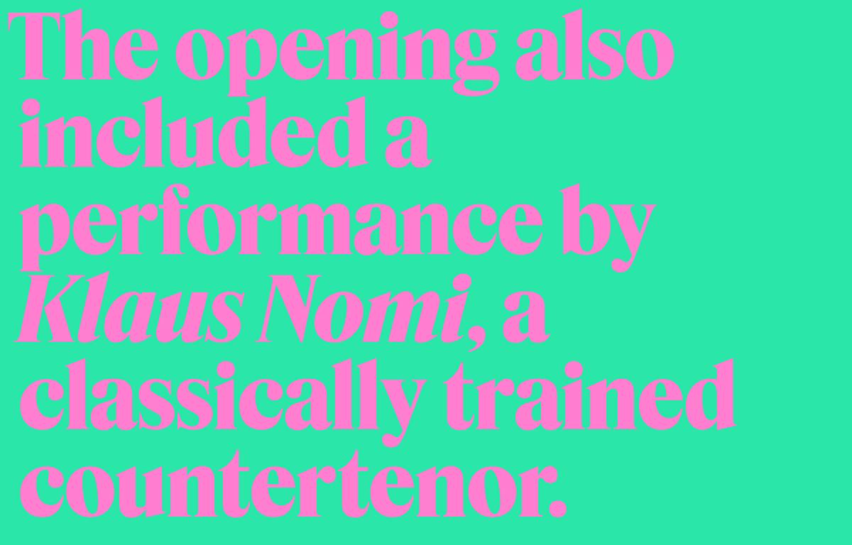
Dark, dense, lovely Feature debuted in February 2018 in T: The New York Times Style Magazine. Originally designed by Christian Schwartz and Berton Hasebe in three optical sizes and two widths, the efficient serif family has been expanded for this release by Hrvoje Živčić, who completed the character sets, added an Ultra weight to the Display version, and drew italics for the whole collection.

Greg Gazdowciz was the lead designer on Roboto Serif, a serif companion for Roboto designed for comfortable reading on screen. This family is designed to embrace the functional side of variable fonts, with weight, width, optical size, and grade axes.
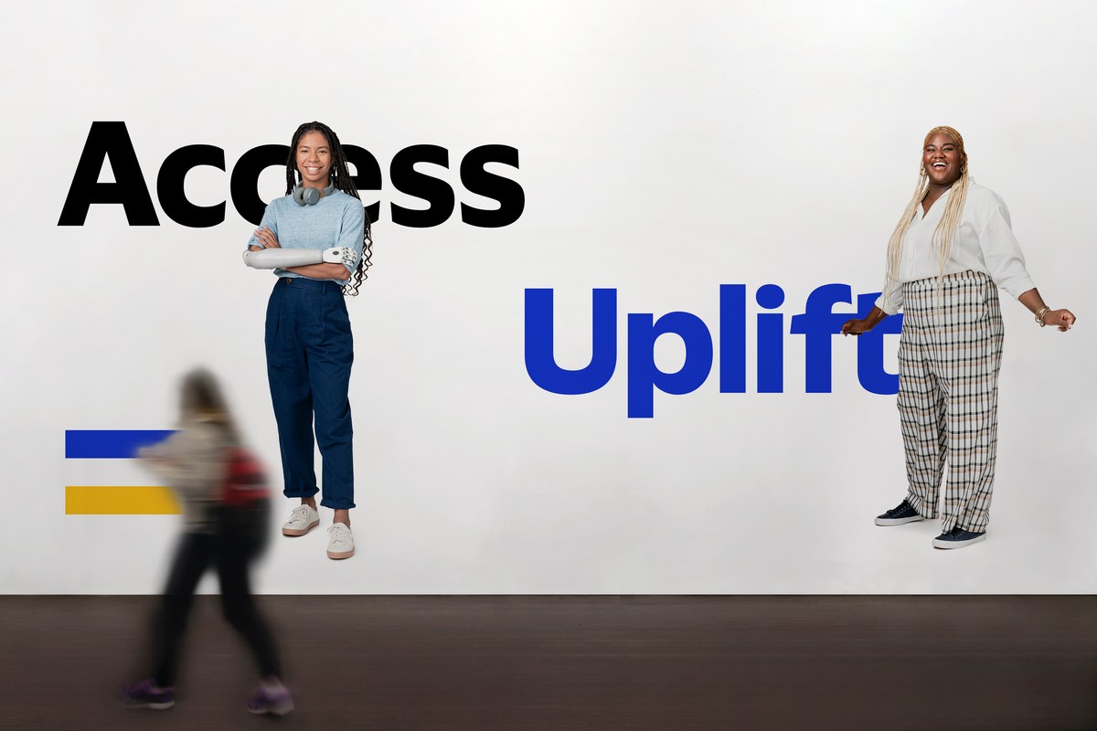
Working with branding consultants Mucho, Commercial Type partner Paul Barnes and designer Thomas Bouillet have created a modern humanist-style sans serif, Visa Dialect, designed to replace Visa’s previous corporate typefaces across all media.

Kara Gordon was elected to The Advisory Board of the Type Directors Club for a two-year term.