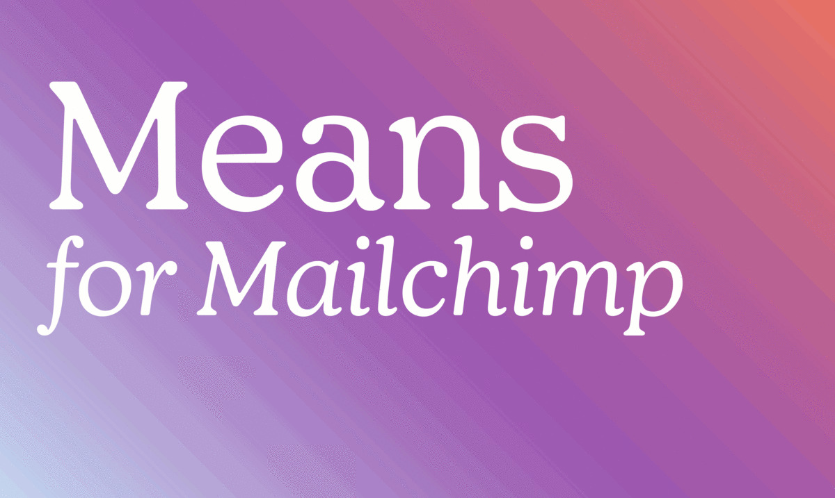
Means is a versatile serif family drawn for Mailchimp, used as the primary typeface in the latest iteration of their identity. Referencing the work of Oswald Cooper, designer Greg Gazdowicz toned down many of the retro elements while retaining the friendliness that is elemental to the Mailchimp brand. Used across display and text, from mobile to billboards, Means presents Mailchimp, grown up.

Berton Hasebe originally drew Review for T: The New York Times Style Magazine, where it debuted in February 2018. Now expanded and available for licensing, Hasebe’s blunt family evokes the plucky, DIY era of phototype and Letraset, minus any nostalgia or grunge. Set tight, Review creates a striking text image while remaining readable.

First released in 2009, Graphik is now more accessible and cosmopolitan, with freshly drawn families for the Armenian, Georgian, Hebrew, and Thai scripts. The new designs translate the spirit, rather than the letter, of Christian Schwartz’s original “vanilla” sans serif.

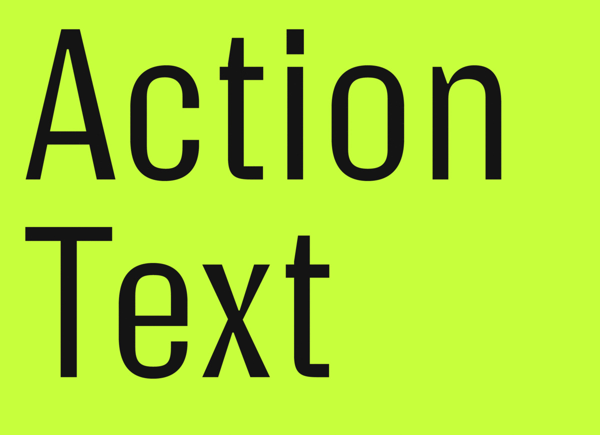
Type made for screens needn’t lack personality. Action Text continues the reflections Dutch superstar Erik van Blokland embarked on with Action Condensed. Geared toward interfaces and continuous text onscreen, Action Text comes in a variable version with weight and grade axes, as well as a “flat” version in four weights accompanied by matching italics, with a Bright and Dark grade for each weight.

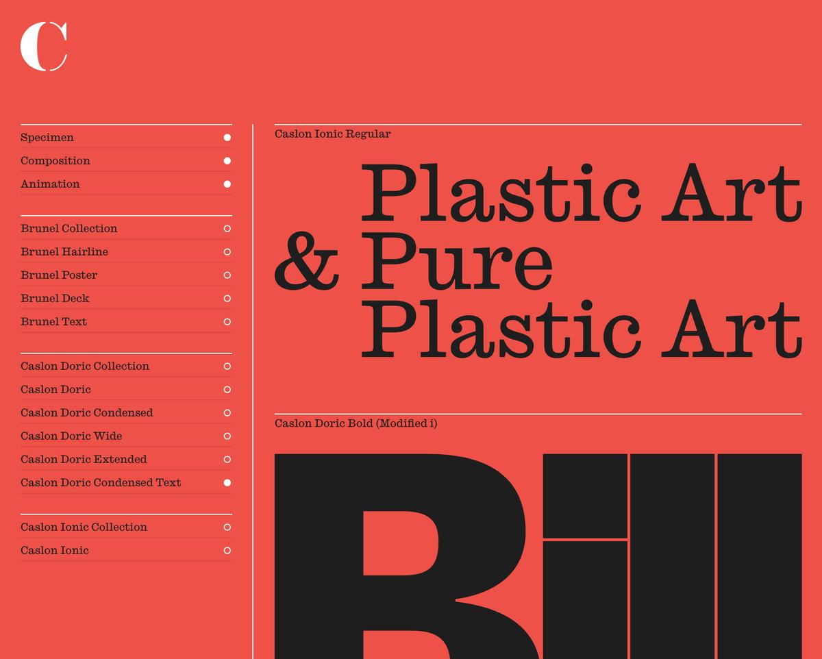
Earlier this year, we enlisted Jonny Sikov and Britt Cobb at Pentagram in New York to show a different side of some of the most versatile families in the Commercial Classics collection. Far from being quaint museum pieces, these typefaces look completely at home in crisp, Modernist-influenced settings, balancing the precision of the layouts with their warmth and character.
Unfortunately due to ongoing situation we have cancelled all dates. We will reschedule the tour for Fall 2020.