About
Commercial Type has created commissioned typefaces for all kinds of projects, large and small. Our clients include design agencies, cultural institutions, publications, and brands around the world. To learn more about the process of working with us, drop us an email.
Select Clients
Editorial
Cultural
Sport
Corporate
Education
Identity
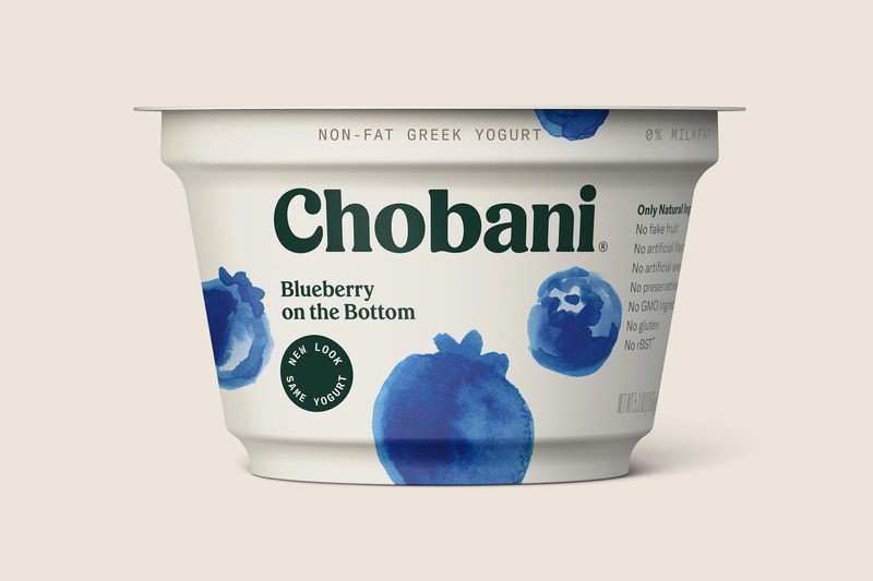
Founded in 2005 and first appearing on shelves in 2007, Greek yogurt maker Chobani rebranded and introduced all-new packaging at the end of 2017. Two key elements of the new identity are the new logotype, drawn by independent type designer Berton Hasebe; and Chobani Serif, a new typeface drawn by Hasebe in collaboration with Christian Schwartz.
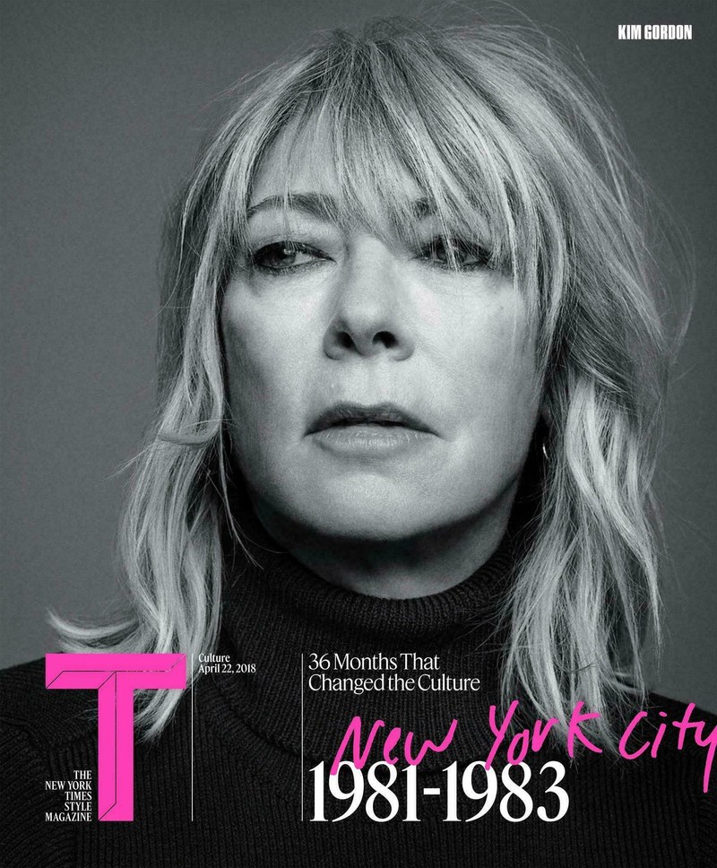
Over the course of eleven years, through several changes of editor and design director, Berton Hasebe and Christian Schwartz have created custom typefaces that have helped define the moment in fashion for T.
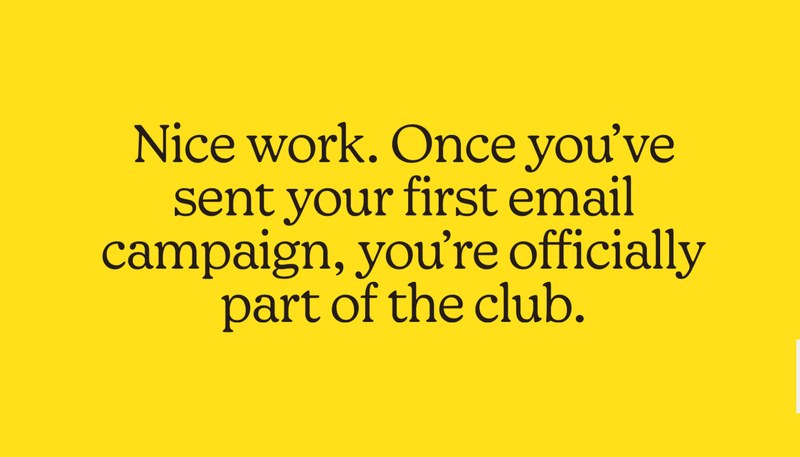
Greg Gazdowicz drew a workhorse serif family for the latest evolution of the Mailchimp identity, carried out by their in-house team in 2020.
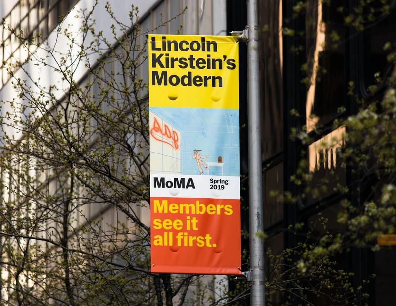
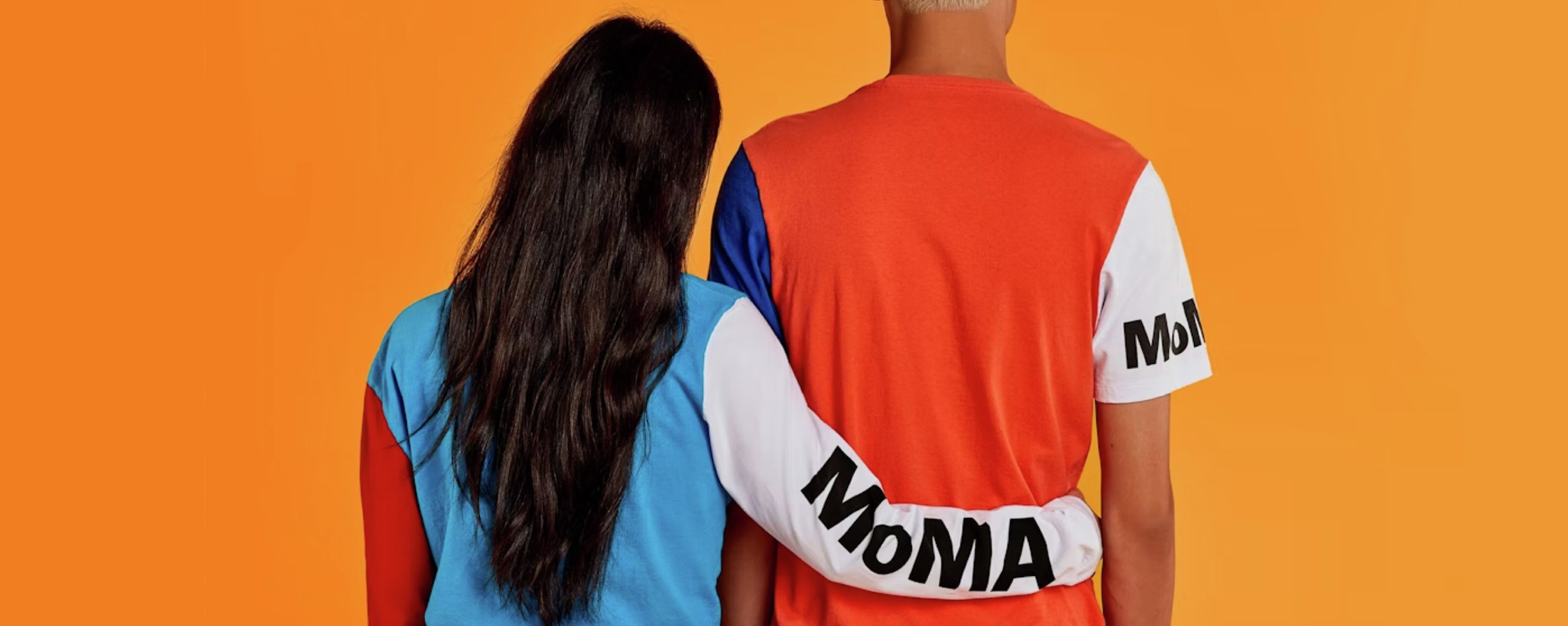
In 2018, MoMA reopened after a major expansion of the museum, which spurred a refresh of communications and signage. As part of this process, Christian Schwartz drew MoMA Sans to replace the mix of sans serifs they had been using with one cohesive family to cover their full range of typographic needs.
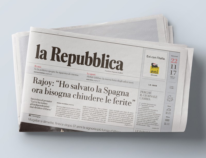
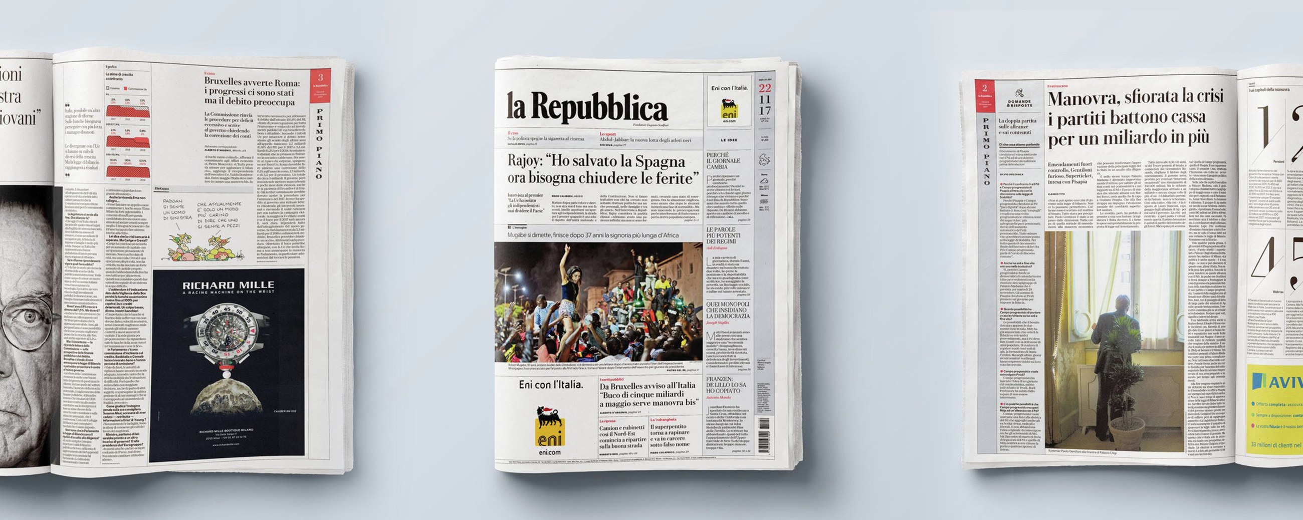
In 2017, Commercial Type created a new typographic palette for the redesign of La Repubblica, a popular national daily newspaper in Rome, Italy.
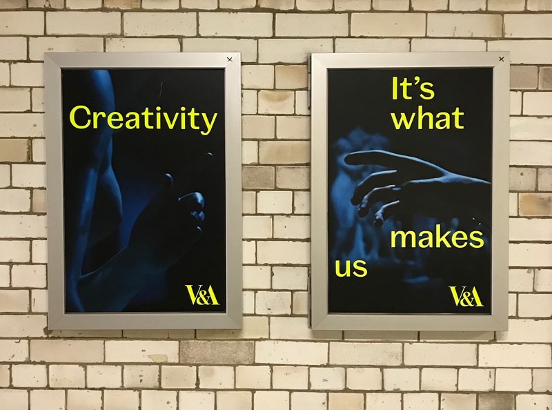
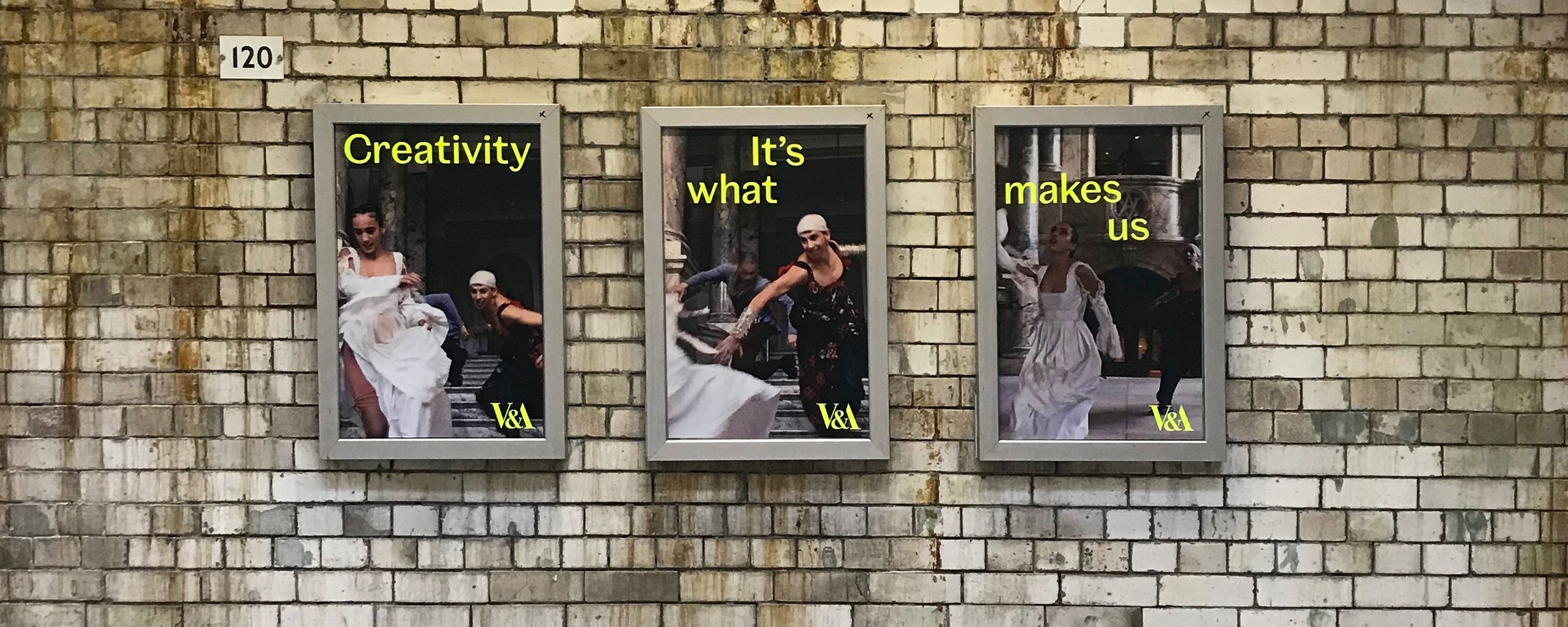
Spiller is a contemporary typeface family designed for the Victoria and Albert Museum by Paul Barnes and Tim Ripper. It offers a wide range of styles and expressions based on a basic skeletal structure. This begets a unified voice in print and on screen and signage across the large number of venues within the V&A, while allowing an individuality when required.
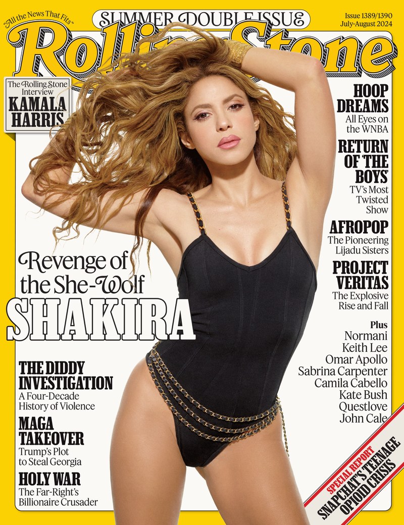
The Summer 2024 issue of Rolling Stone kicked off a new era for the magazine, with a redesign by Richard Turley and Mark Leeds, a new headline typeface drawn by Tim Ripper, and some swash caps for Feature Flat Deck drawn by Julien Priez.
Working with consultant Anna Thurfjell, Greg Gazdowicz and Christian Schwartz developed a new nameplate and logo system for Aftonbladet, the most widely read newspaper in Sweden.
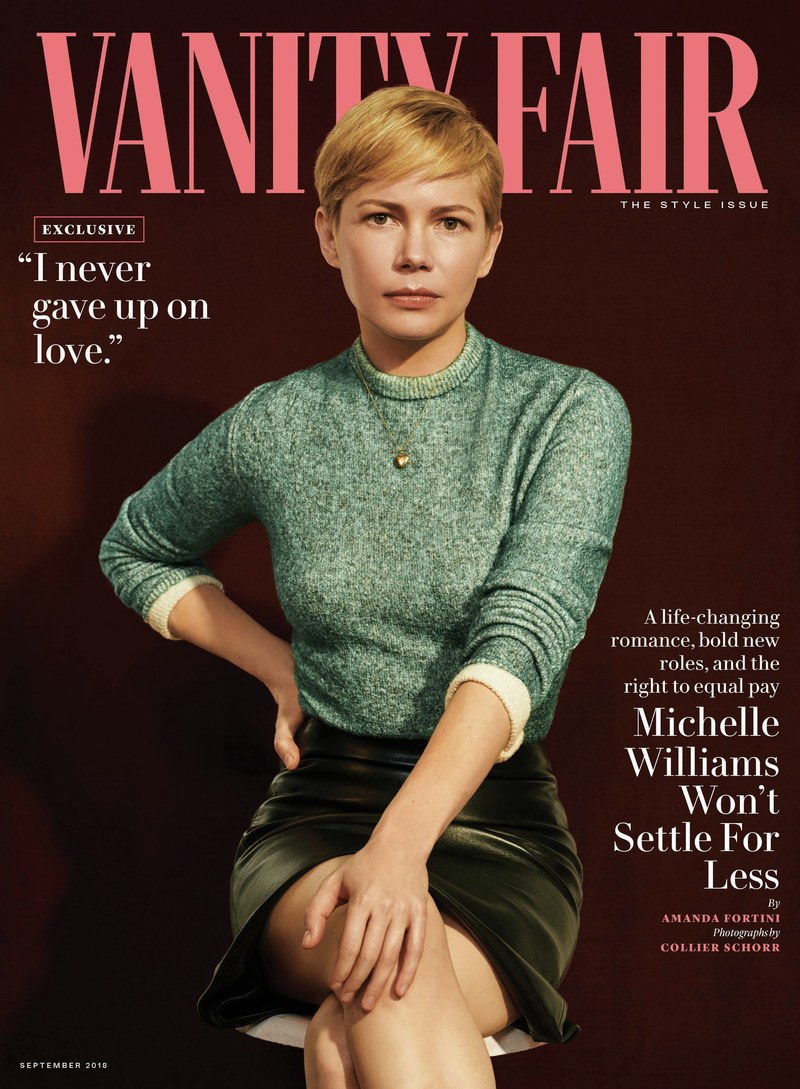
VF Didot, designed by Paul Barnes and Christian Schwartz, debuted on the cover of the August 2013 issue of Vanity Fair and has been used ever since.

Tim Ripper drew a serif text and display family called REI Stuart for the REI Co-op identity in 2019.
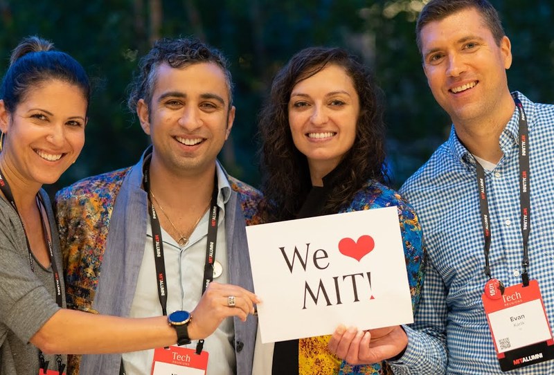
Serendipity sometimes plays a crucial role in bringing together designer and client to provide the impetus for completing unfinished sketches. Such was the case with Corridor, a custom typeface drawn by Tim Ripper for a new rebrand of the MIT Alumni Association.
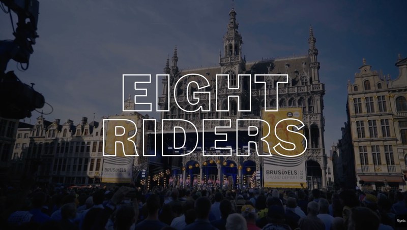
In 2017, Rapha’s Art Director, Jack Saunders, approached Commercial Type with a view to updating and expanding its typographical palette. Paul Barnes and Dan Milne created a serif family and tailored Caslon Doric to fit their needs.
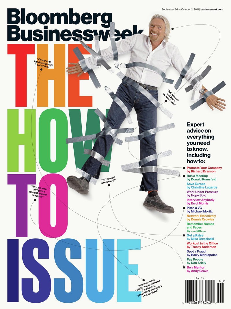
Between 2010 and 2013, we created typefaces and lettering for Richard Turley and his team at Bloomberg Businessweek.

In 2019, Commercial Type partners Paul Barnes and Christian Schwartz designed a series of typefaces for Nature, one of the world’s leading scientific journals.
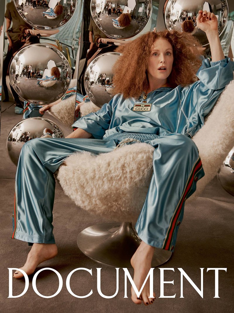
Christian Schwartz drew a new logotype for Document Journal in 2020.
