Caponi by Paul Barnes and Christian Schwartz
Most contemporary revivals of Giambattista Bodoni’s work have focused almost entirely on the elegant, high-contrast types that he cut in the early part of the nineteenth century. Caponi expands the notion of what Bodoni’s work was. Though it draws a bit on his later work, particularly in the uppercase, Paul Barnes and Christian Schwartz decided to take as their primary reference the typefaces Bodoni cut during the early years of his career, when he had been greatly influenced by the Rococco style of the French printer and punchcutter Pierre Simon Fournier.
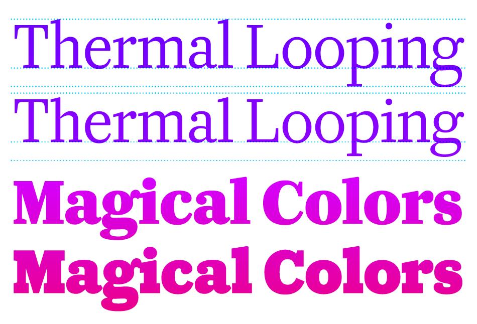
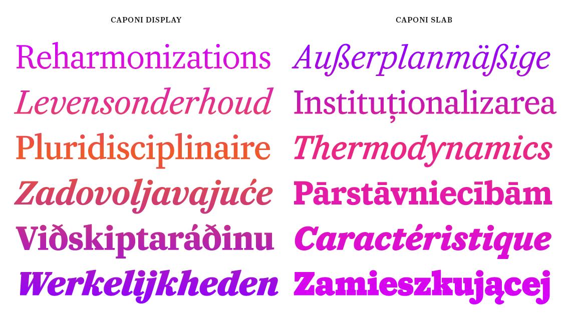
The three families of Caponi each play a different role while complementing each other. Though lower contrast than other contemporary Bodoni revivals, Caponi Display follows Bodoni’s approach to weight and contrast, with long, elegant ascenders and descenders. As a traditional Modern with relatively high contrast, it is ideal for headline typography. Caponi Slab, on the other hand, is low contrast throughout, culminating in a punchy Black weight, useful for large and expressive display typography, while also being robust enough for subheads, pull quotes, and other small display uses. Caponi Display and Caponi Slab are similar in their lightest weights, but as the two families get heavier, they depart quickly into two very different approaches to weight and contrast. Caponi Text is a more faithful interpretation of Bodoni’s early work, capturing the unexpected warmth of his romans and the quirks of the italics, with mismatched terminal shapes and subtly varying serifs.
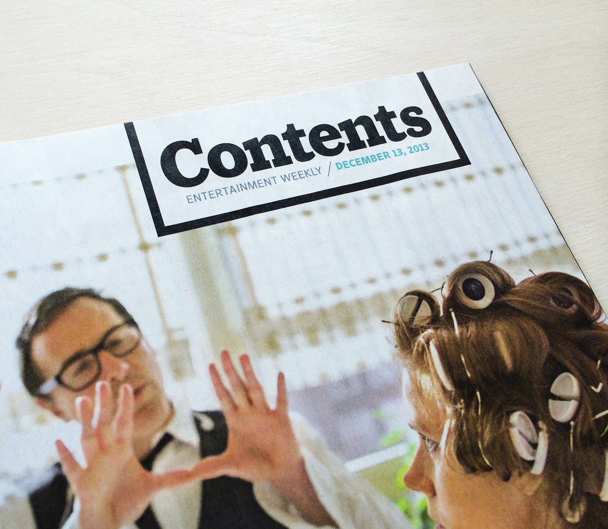
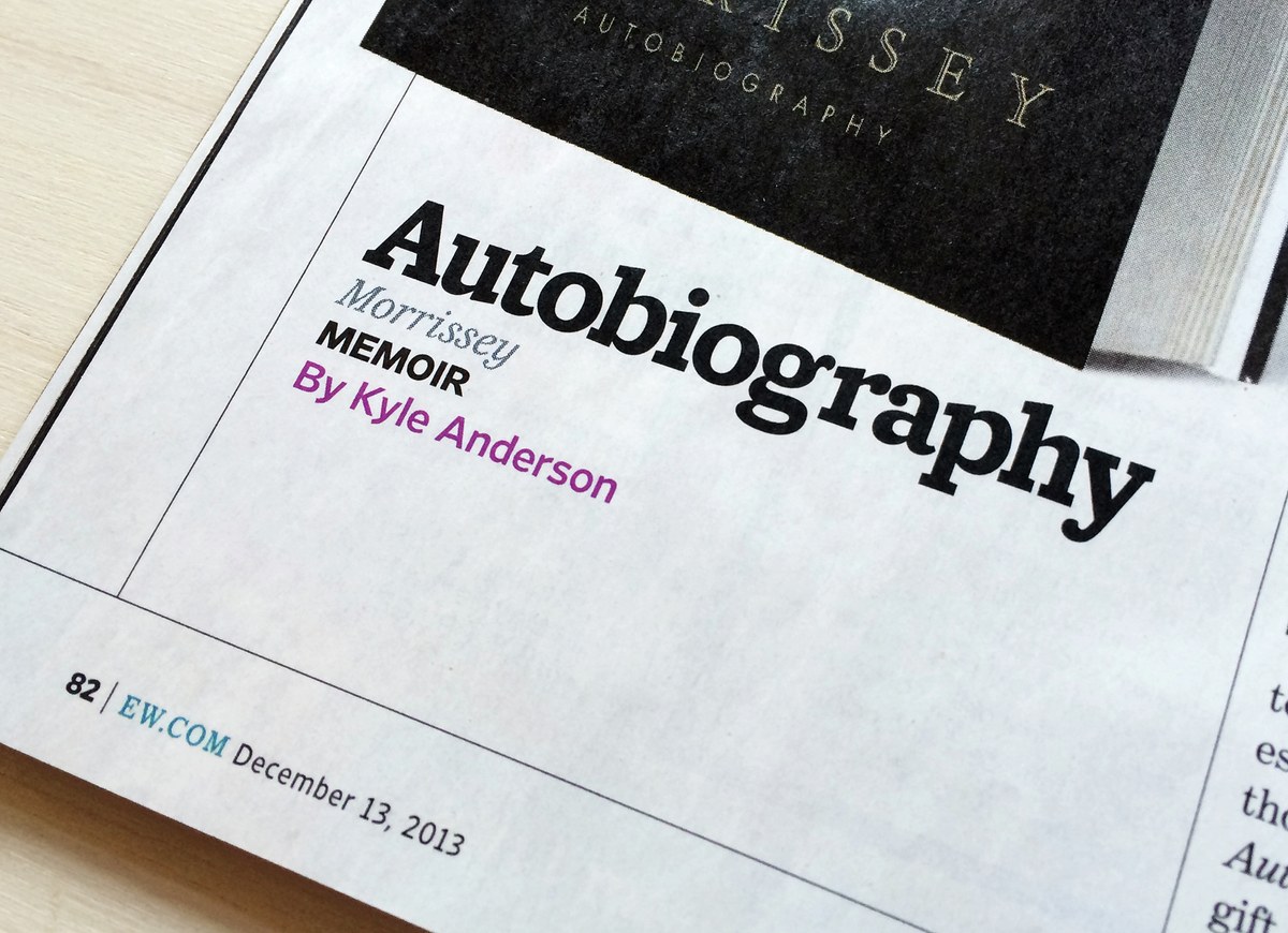
The late Amid Capeci, for whom the family is named, commissioned Caponi Slab for headline typography in 2010 for his twentieth anniversary revamp of Entertainment Weekly. A wide range of topics could potentially end up on the cover of the magazine from week to week, from high-minded Oscar movies, to controversial pop stars, to gleefully trashy reality television, so the family needed to cover many tones in one cohesive range of weights. The solution was a spectrum from elegance to exuberance: the lightest weights clearly show their origin in Bodoni’s work, but the family transforms into a boisterous slab serif as it gains weight. Caponi Slab’s short ascenders and descenders allow it to work with tight leading, and its low contrast helps it to hold its own on the page no matter the size.
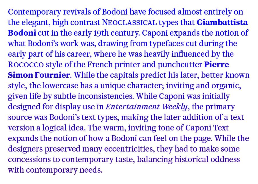
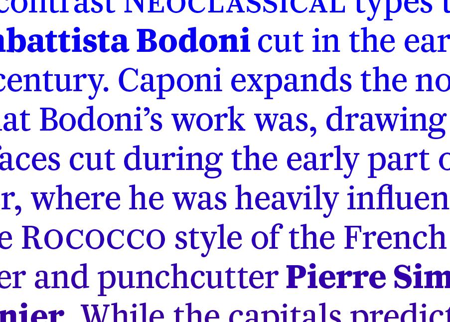
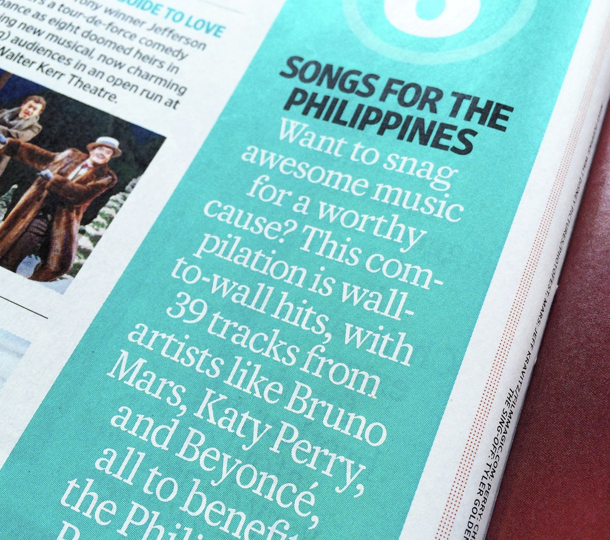
Since the primary source for the project was Bodoni’s text types, the later addition of a text version was a logical idea. Caponi Text, drawn by Barnes and Schwartz with help from Commercial Type designer Miguel Reyes, is unusual among contemporary interpretations of Bodoni not just in focusing on Bodoni’s earliest work, but also in fully embracing the inconsistencies and unevenness of the source material. The warm, inviting tone of Caponi Text expands the notion of how a Bodoni can feel on the page. While preserving many eccentricities, it also make concessions to contemporary taste, so a more traditional lowercase s, with serifs rather than ball terminals, is available as an alternate.
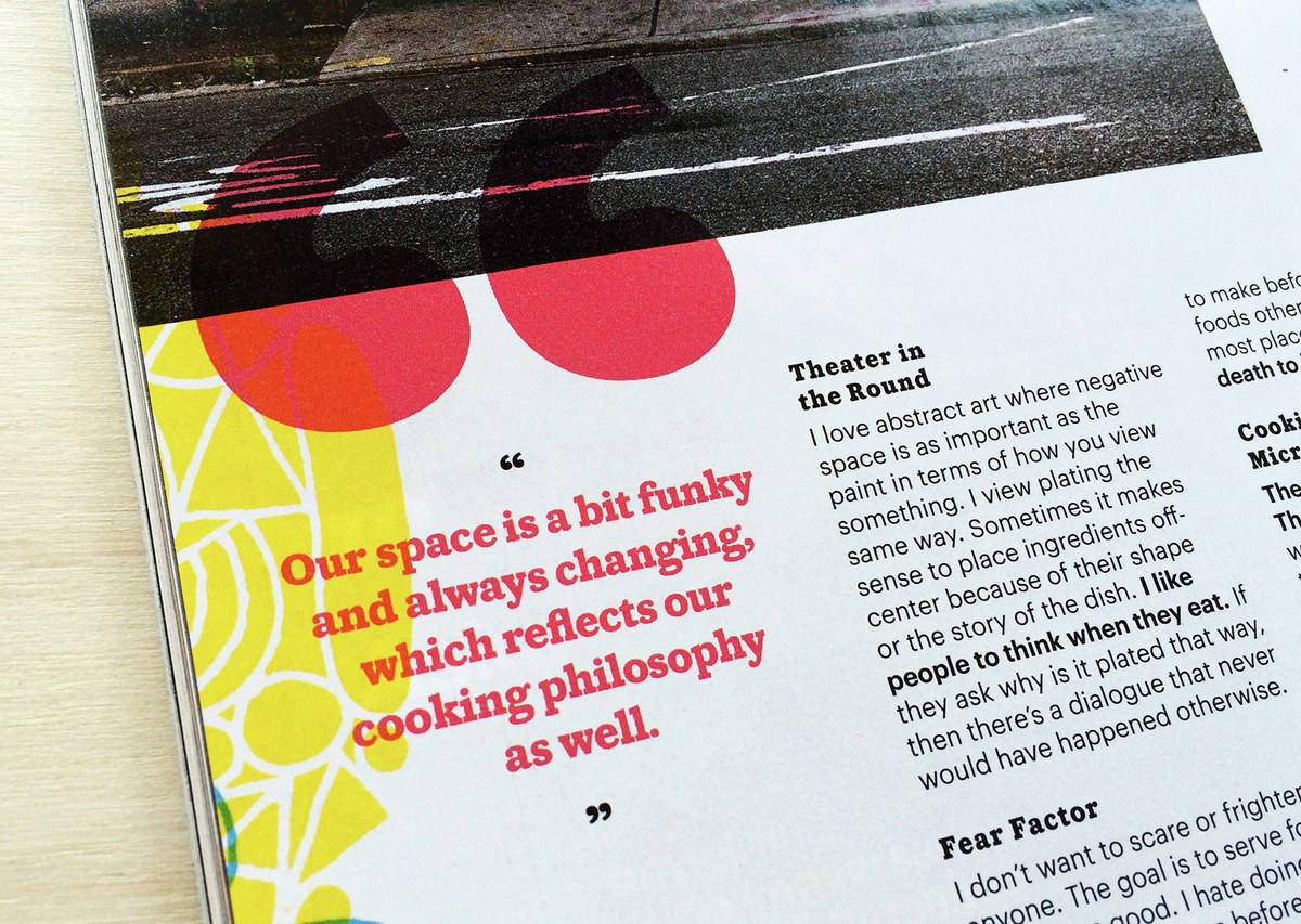
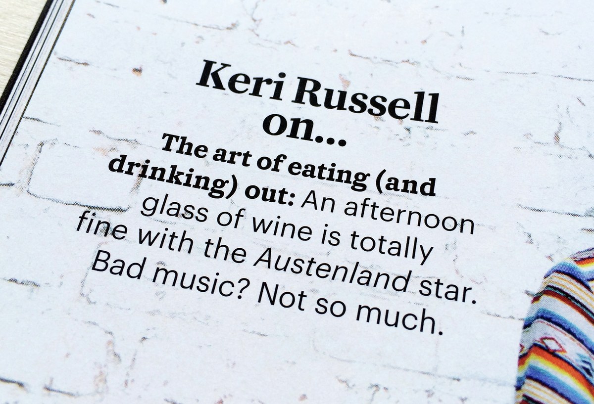
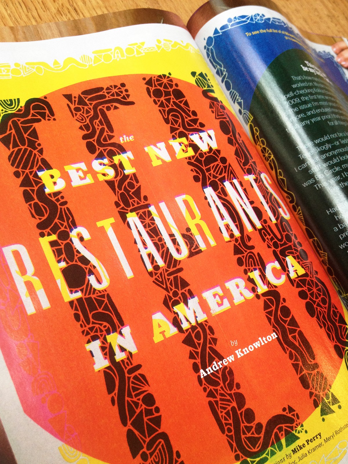
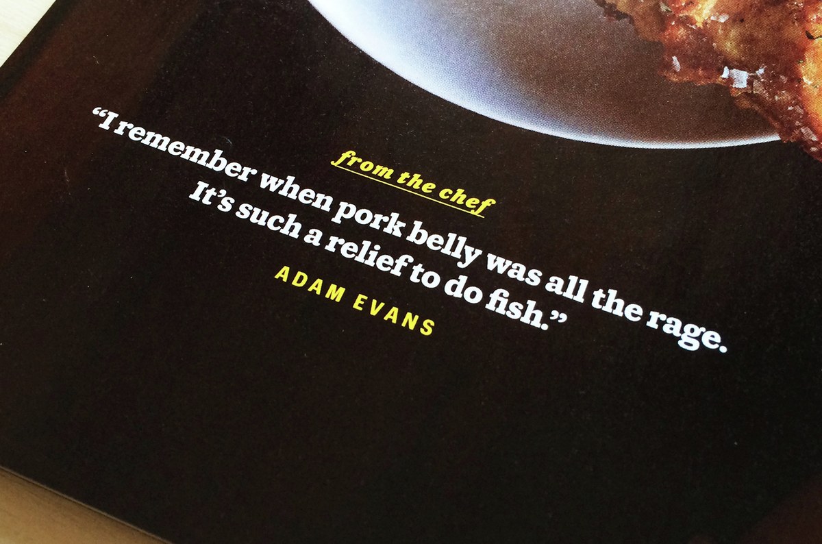
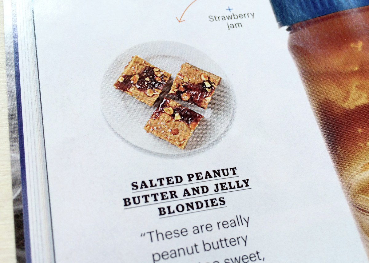
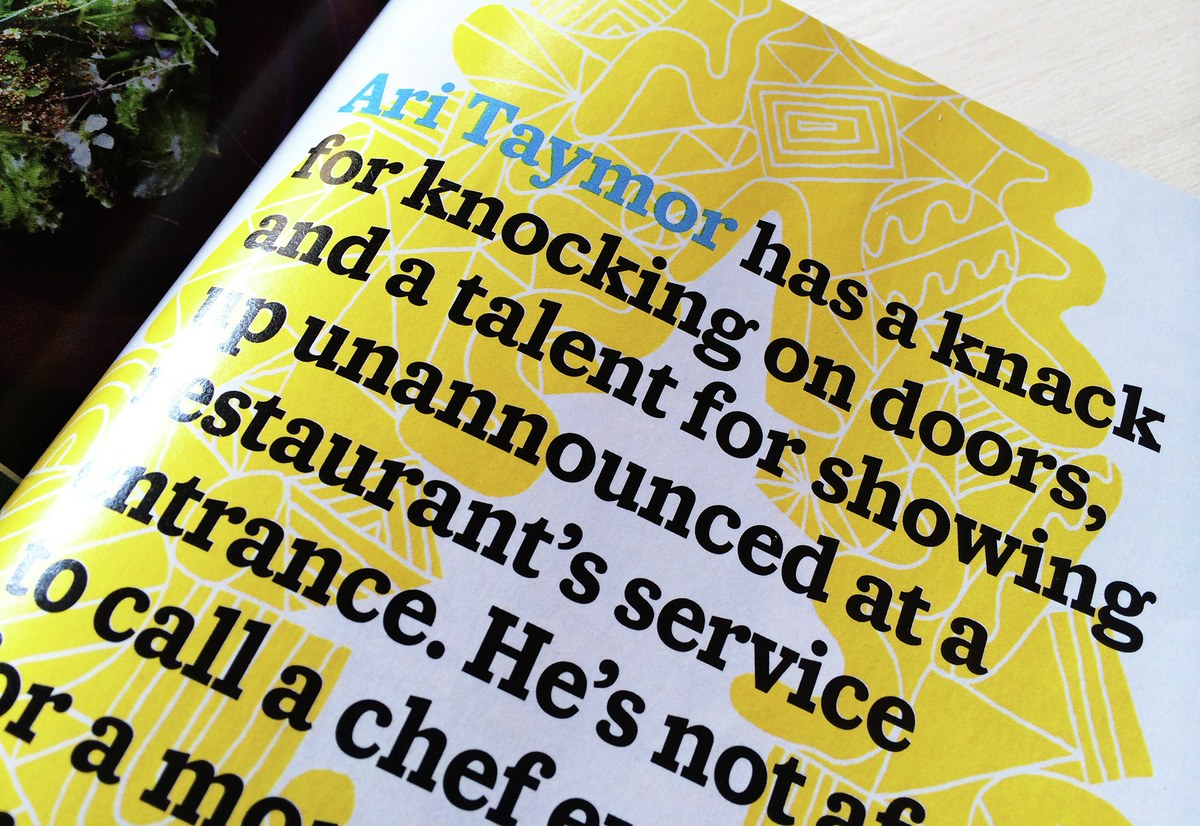
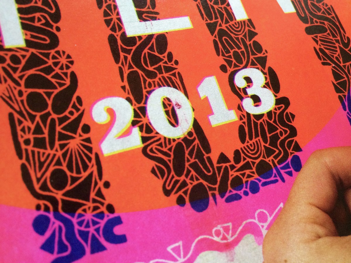
In addition to the ongoing use of Caponi Slab in Entertainment Weekly, the Display and Slab can be seen together in Bon Appétit, where the two different kinds of contrast complement one another in the dense, complex, and high-energy Starters section in the front of the book, and the family helps to anchor special packages like 2013's "50 Best Restaurants in the USA".
