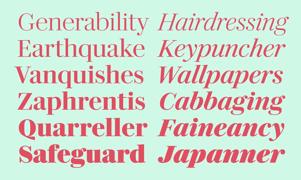
Darby Serif, is an elegant new contemporary serif typeface, designed by Paul Barnes, with Dan Milne. The companion to Darby Sans, the text version first appeared in 2017 in Francesco Franchi’s redesign of La Repubblica newspaper in Italy.
Miguel will give a lettering workshop at this year’s Tipografía México conference in Monterrey. Speakers include Jassiel Rivera, Gonzalo García, Ricardo González, and David Jonathan Ross. Workshops will also be given by Sindy Ethel and Armando Pineda.
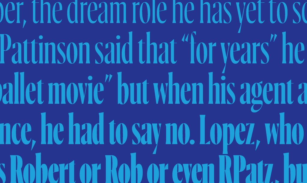
Ayer is an elegant condensed display typeface designed by Miguel Reyes between 2016 and 2019 for W, a large format fashion magazine. Display typefaces for fashion magazines need flexibility in order to extend their lifespan beyond a couple of seasons. The four different italics in the Poster size is one way Ayer fills this need.
Paul will be part of a panel discussion hosted by the Providence Public Library and will give a lecture in Boston hosted by the local AIGA chapter.

Commercial Type partners Paul Barnes and Christian Schwartz have designed a series of new typefaces for Nature, one of the world’s leading scientific journals. Working closely with creative director Kelly Krause and external design consultant Mark Porter, Barnes and Schwartz have created Harding, a multi weight text and display family
Greg will give a talk entitiled “Ahistoric Reading” at this year’s BITS conference in Chiang Mai. This talk will be in depth look at his process of designing Roboto Serif for Google, a typeface that ignores historical precedents for how native screen typefaces should look by ignoring atmosphere and focusing purely on making a comfortable reading experience on screen.

Tim Ripper has drawn a new serif text and display family called REI Stuart for the latest evolution of the REI Co-op identity. The family is based loosely on the Plantin model, with a soft finish reminiscent of the routed lettering on National Parks Service signs.
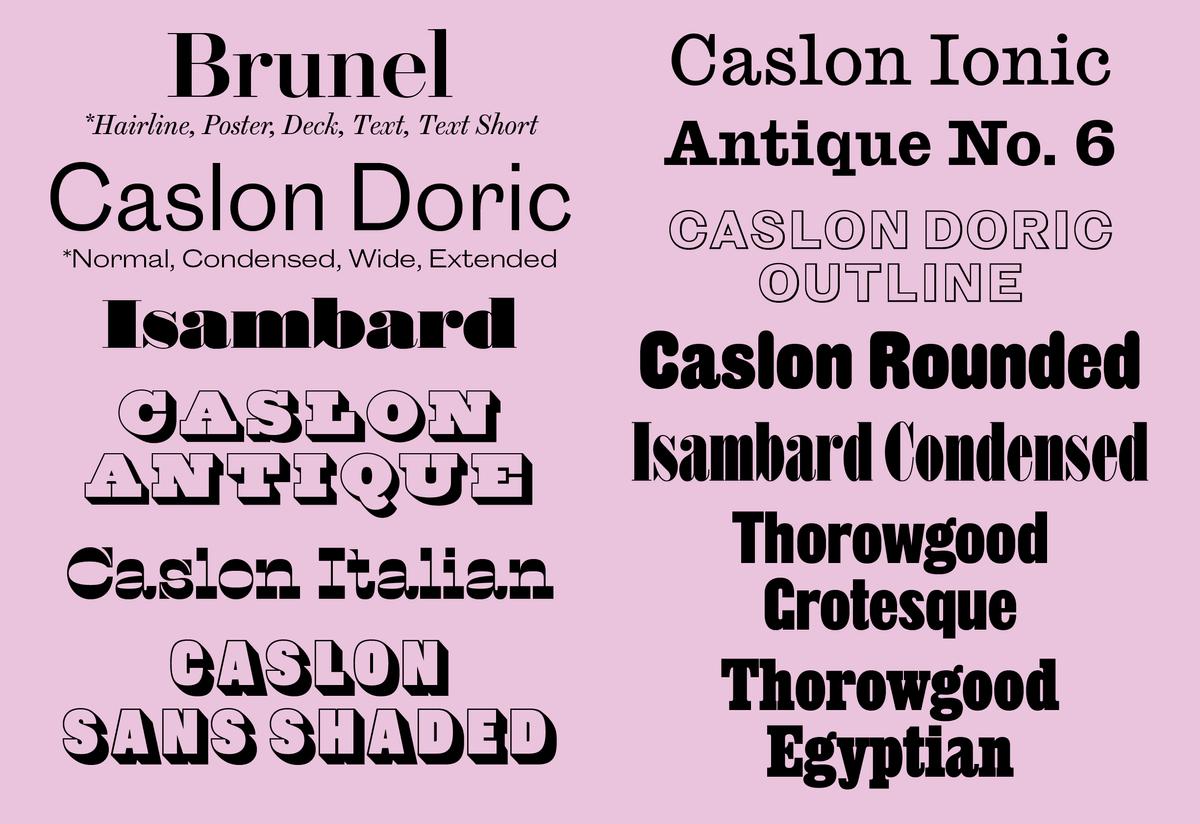
Commercial Classics has released seven additional families, including a revival of Caslon Ionic No. 2 first seen in last year's relaunch of Interview magazine, and Thorowgood Grotesque, based on the first sans serif with a lowercase cut in the British Isles.
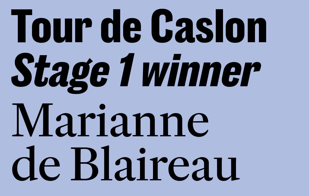
Since its foundation 15 years ago, Rapha has been producing some of the finest cycling clothing in the world, both for amateurs and for the pro teams. Working closely with Rapha’s internal design team, Commercial Type partner (and long time cycling enthusiast) Paul Barnes and long time collaborator Dan Milne have created a new range of typefaces for the company, Rapha Sans and Rapha Serif.
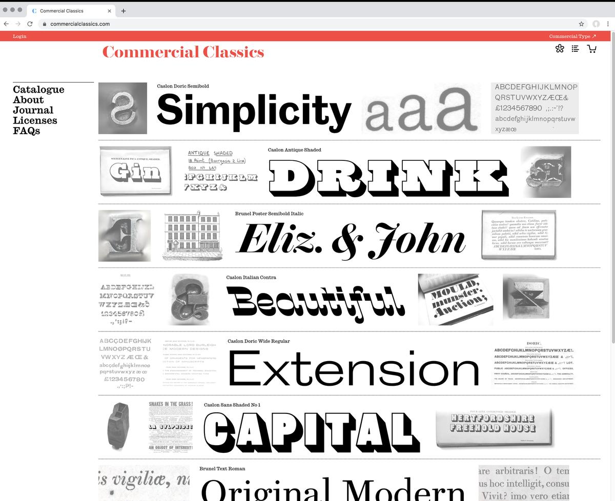
We are proud to introduce a new venture, Commercial Classics. Many years in the making, this alternate library is dedicated to bringing historical typefaces back to life and making them available for contemprary design. Our initial set of six families includes extensive workhorse serif and sans serif families, along with four exuberant display families.
Please join Commercial Type to celebrate the launch of Commercial Classics with type specimens, drinks, posters, a silent auction to benefit the St Bride Foundation, and a preview of an upcoming collaboration between Commercial Type and clothing label Dahsar. The party is co-hosted by Commercial Studio and Dahsar.
“Historical Type in Contemporary Design”, a panel discussion with Paul Barnes, Tobias Frere-Jones, Shira Inbar, and Elizabeth Carey Smith. Moderated by Angela Riechers.
Hosted by the Parsons School of Design.
Lecture by Paul Barnes followed by Q&A with Greg Gazdowicz, Tim Ripper & Christian Schwartz. This talk is part of the Lubalin Lecture Series hosted by Type@Cooper at The Cooper Union.
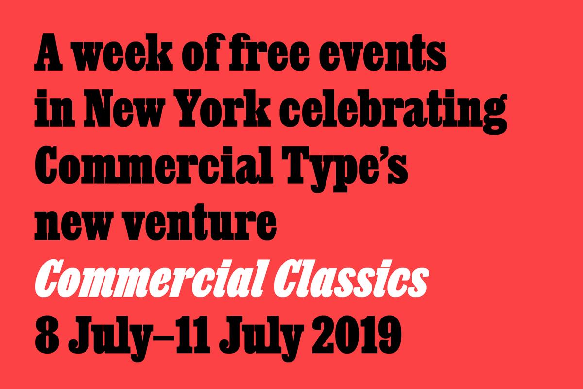
We are planning a week of events in New York during the week of 8–11 July around the launch of Commercial Classics, including a lecture, a panel discussion, and a party.
Type designer Miguel Reyes of Commercial Type will discuss the ideas and process behind Ayer, a new condensed display family originally drawn for W, a large-format glossy fashion magazine.