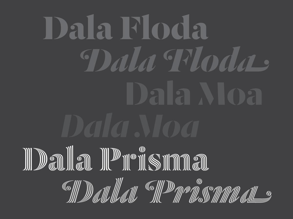
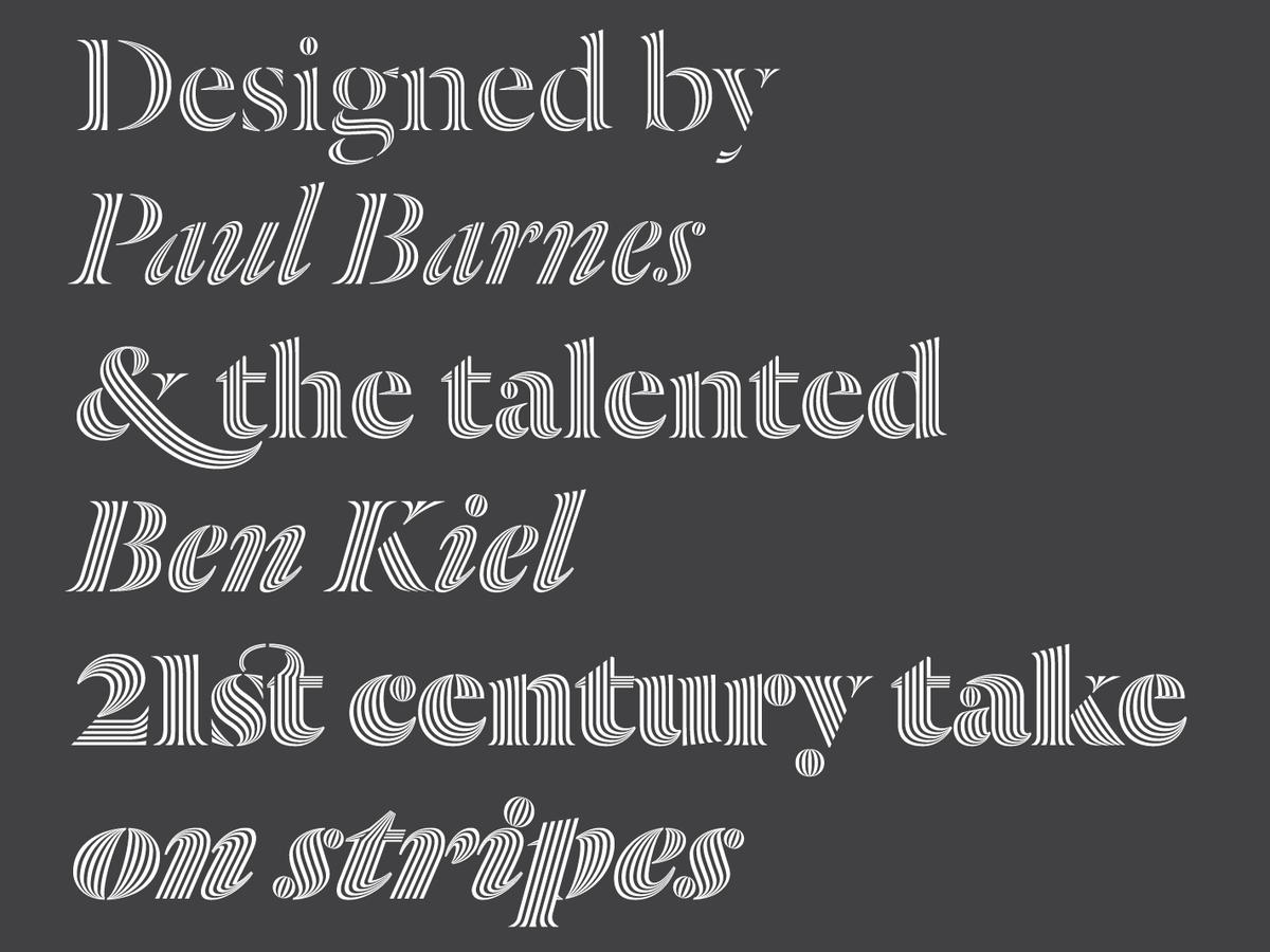
Dala Prisma by Paul Barnes and Ben Kiel
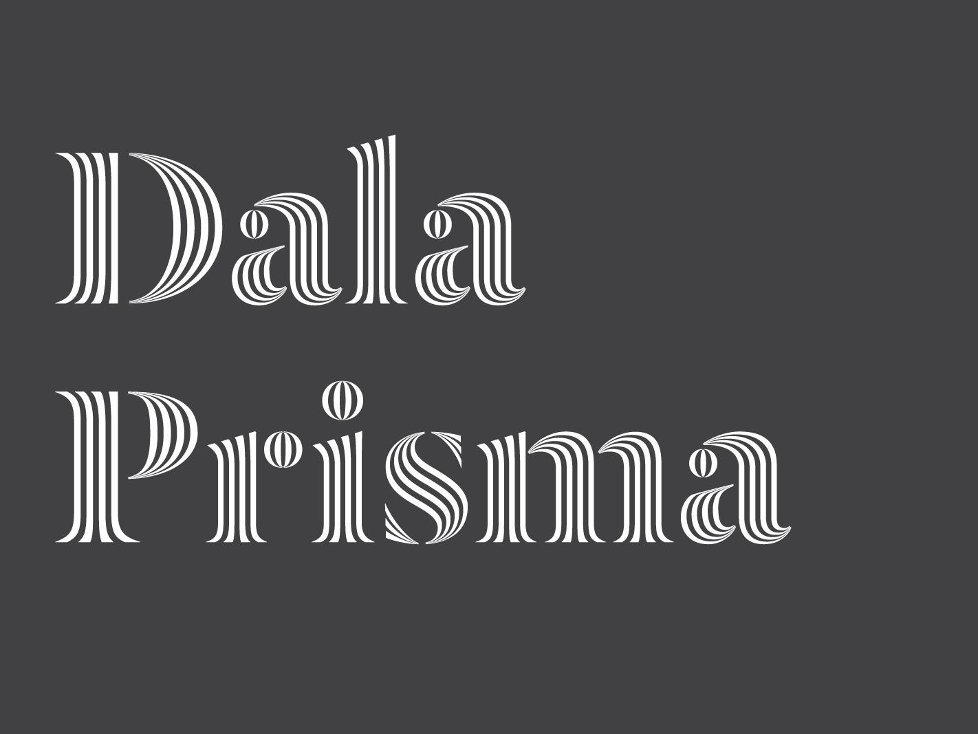
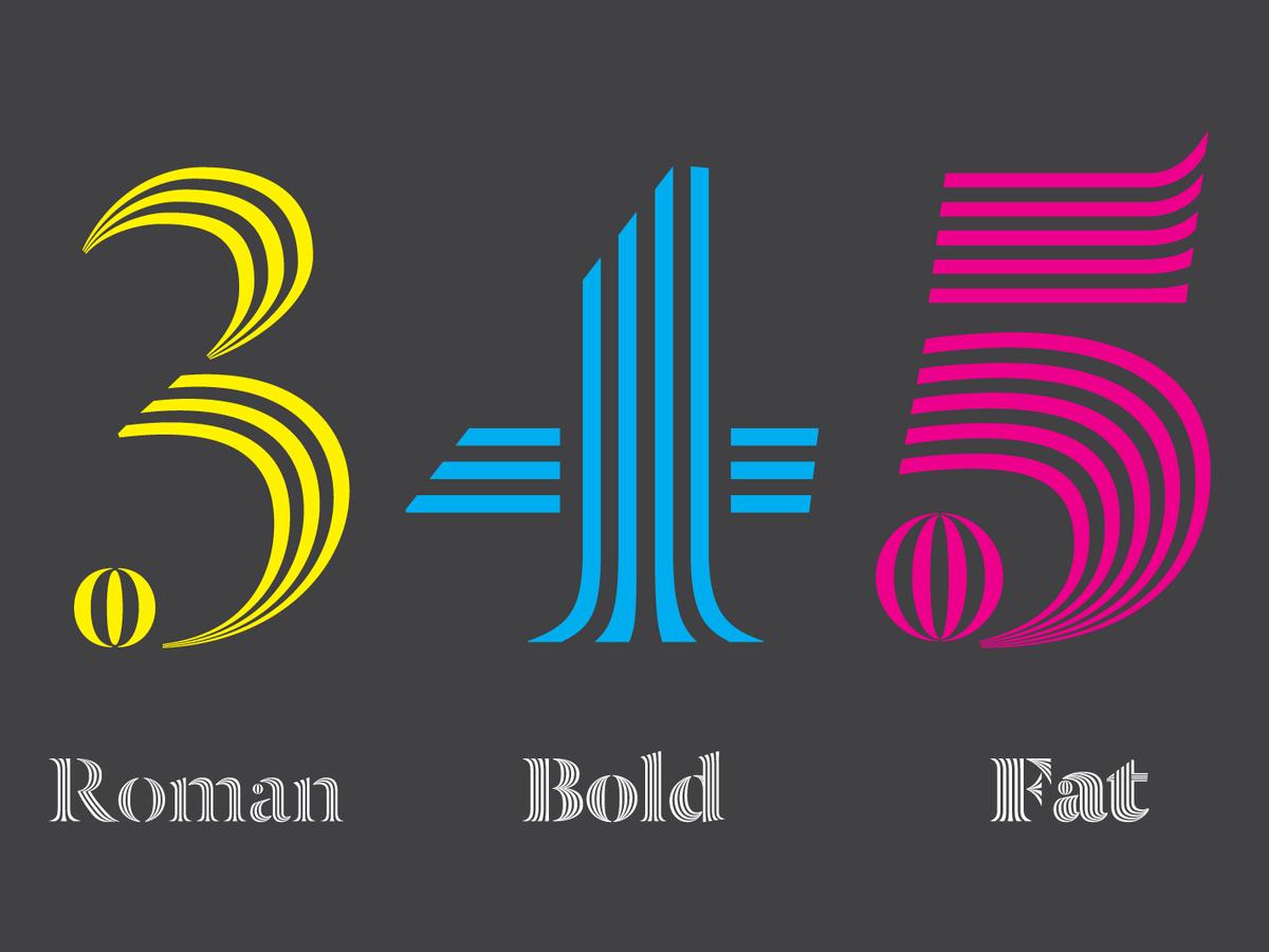
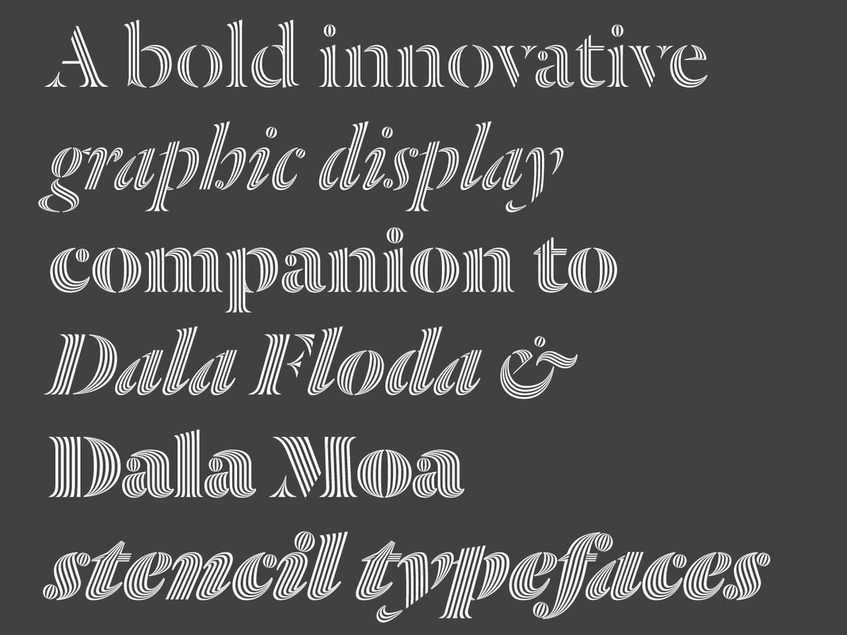
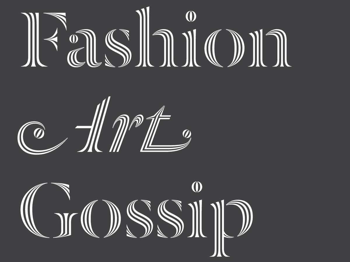
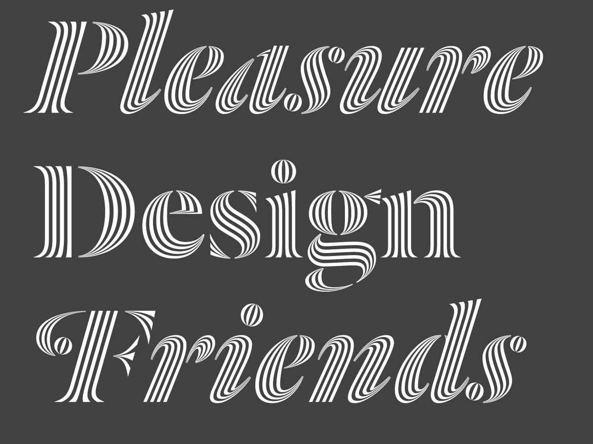
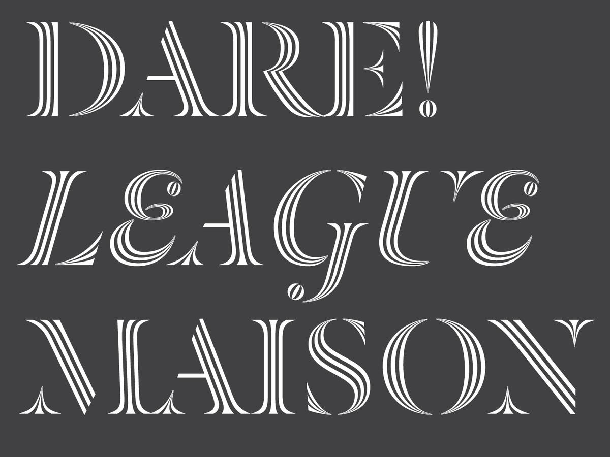
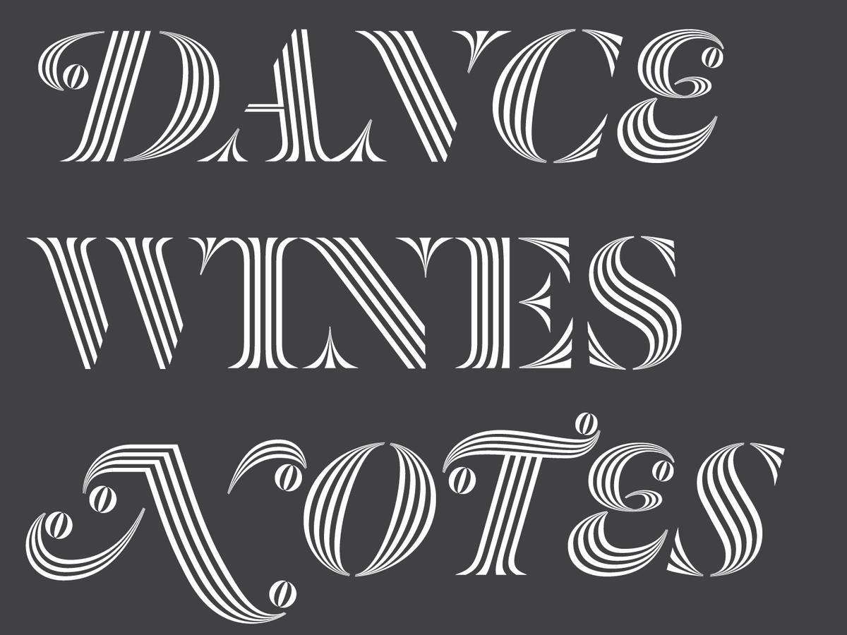
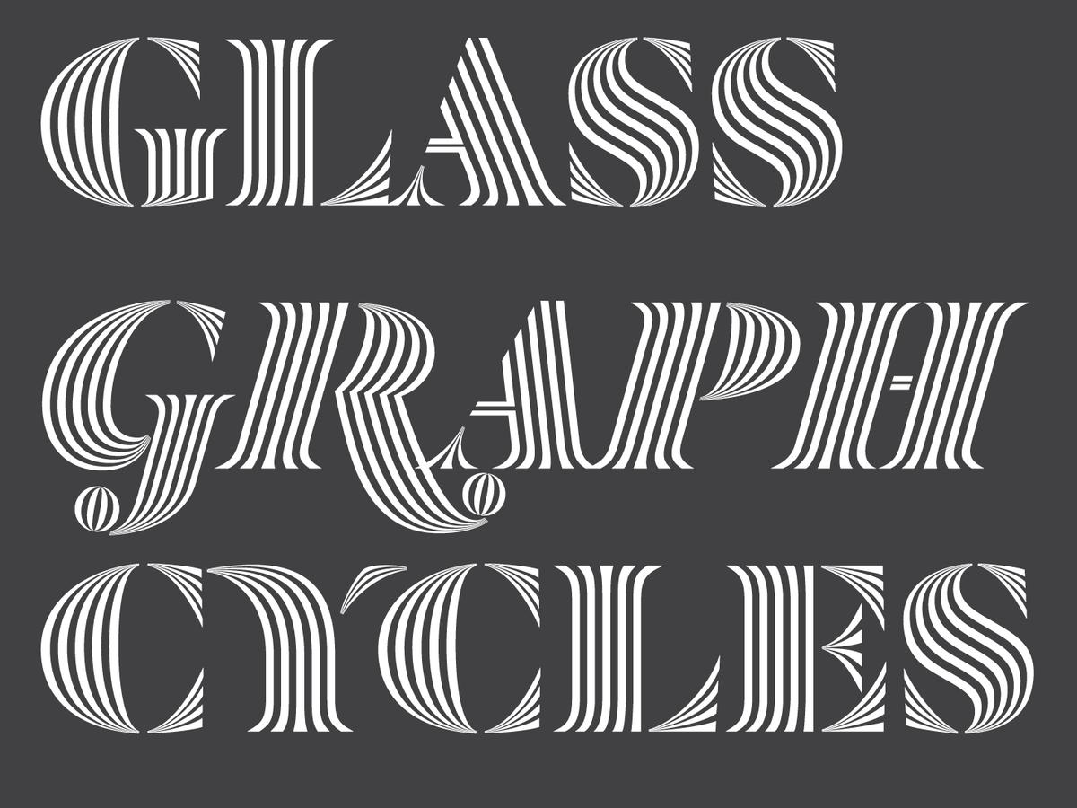
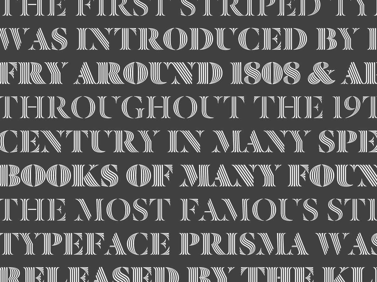
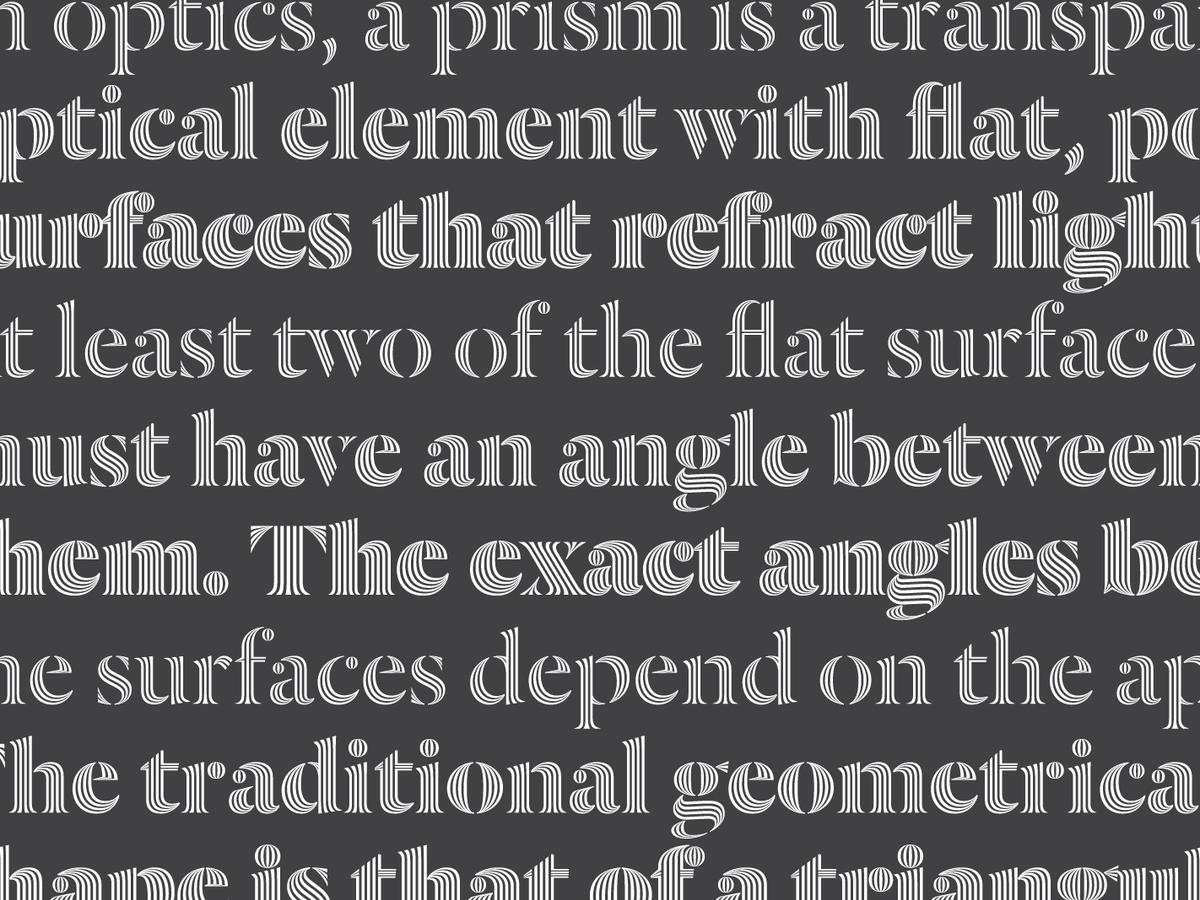
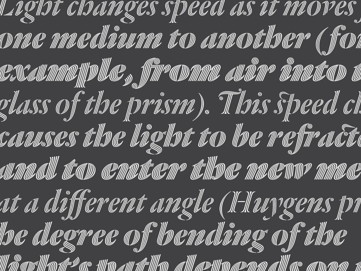
Dala Prisma is a development of the stencil typeface Dala Floda, replacing the solid forms with a series of stripes which vary in width, offering a wonderful optical effect. The family was conceived by Paul Barnes and drawn by Ben Kiel of Typefounding, using a purpose-built tool by the brilliant Frederik Berlaen, the creator of Robofont. Dala Prisma is available in three weights: Roman, with 3 strokes; Bold, with 4 strokes; and a striking Fat, with 5 strokes.
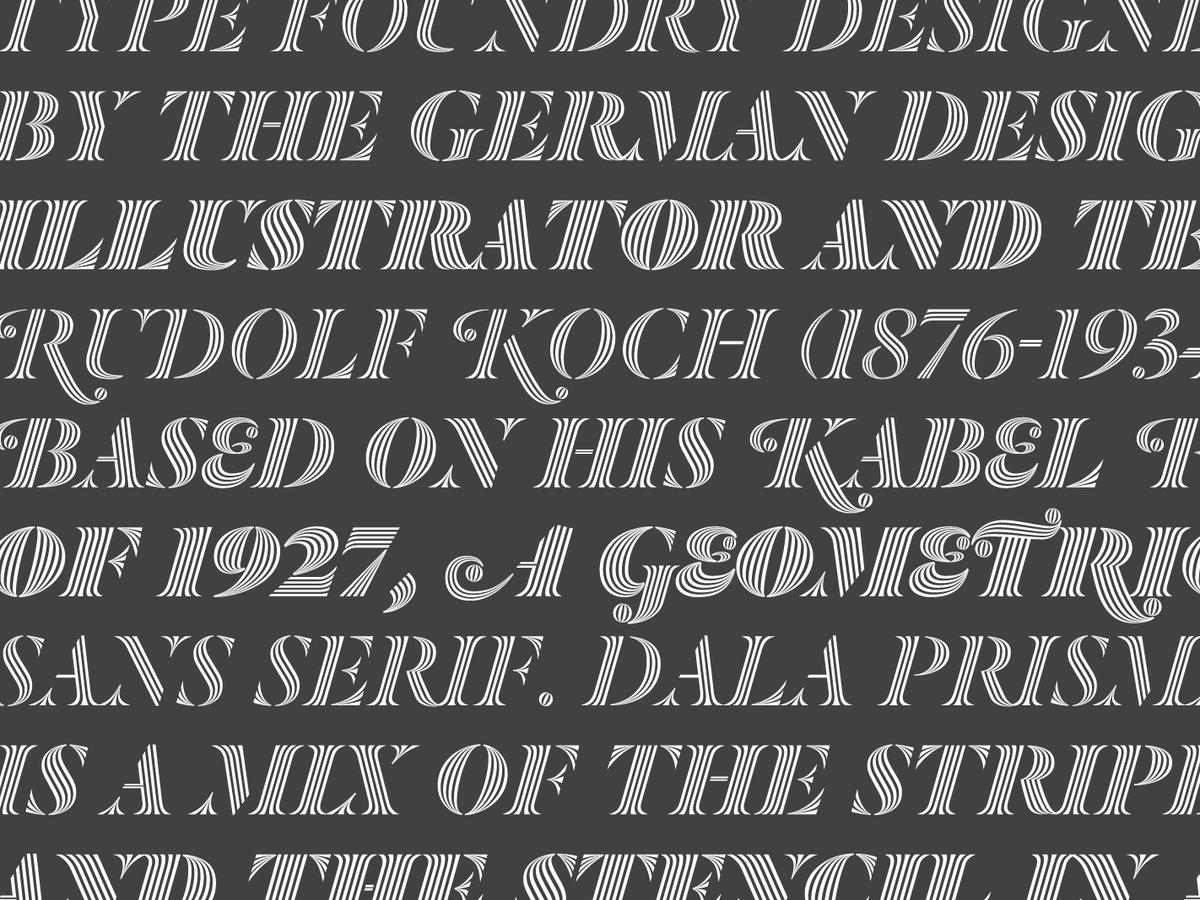
Stripes have always fascinated humans; we are drawn to and repelled by these forms found in the natural and manmade worlds. In the visual arts we find them everywhere. Typefaces with inscribed lines appeared in the Eighteenth century, but the first striped letter was probably made by Edmund Fry during the early years of the Nineteenth century. During the twentieth century the Klingspor foundry released a version of Rudolf Koch’s Kabel, named Prisma in the early 1930s, seemingly inspired by the striped neon letters found at night across Germany. In Dala Prisma, this optical effect is applied to the Renaissance style stencil, Dala Floda. The variation between thick and thin is exaggerated with multiple lines, which increase in number as the typefaces becomes bolder. With both roman and italic variants, Dala Prisma is a uniquely powerful display typeface.
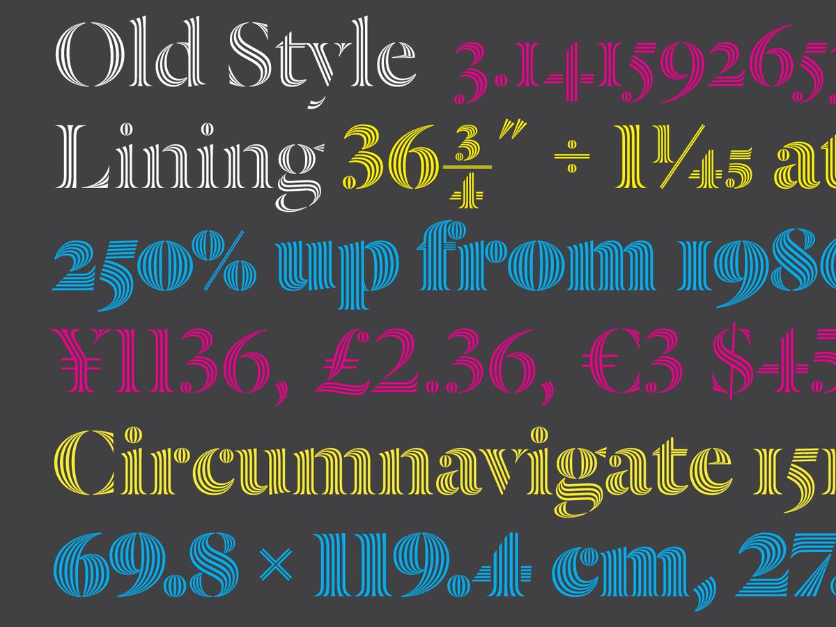
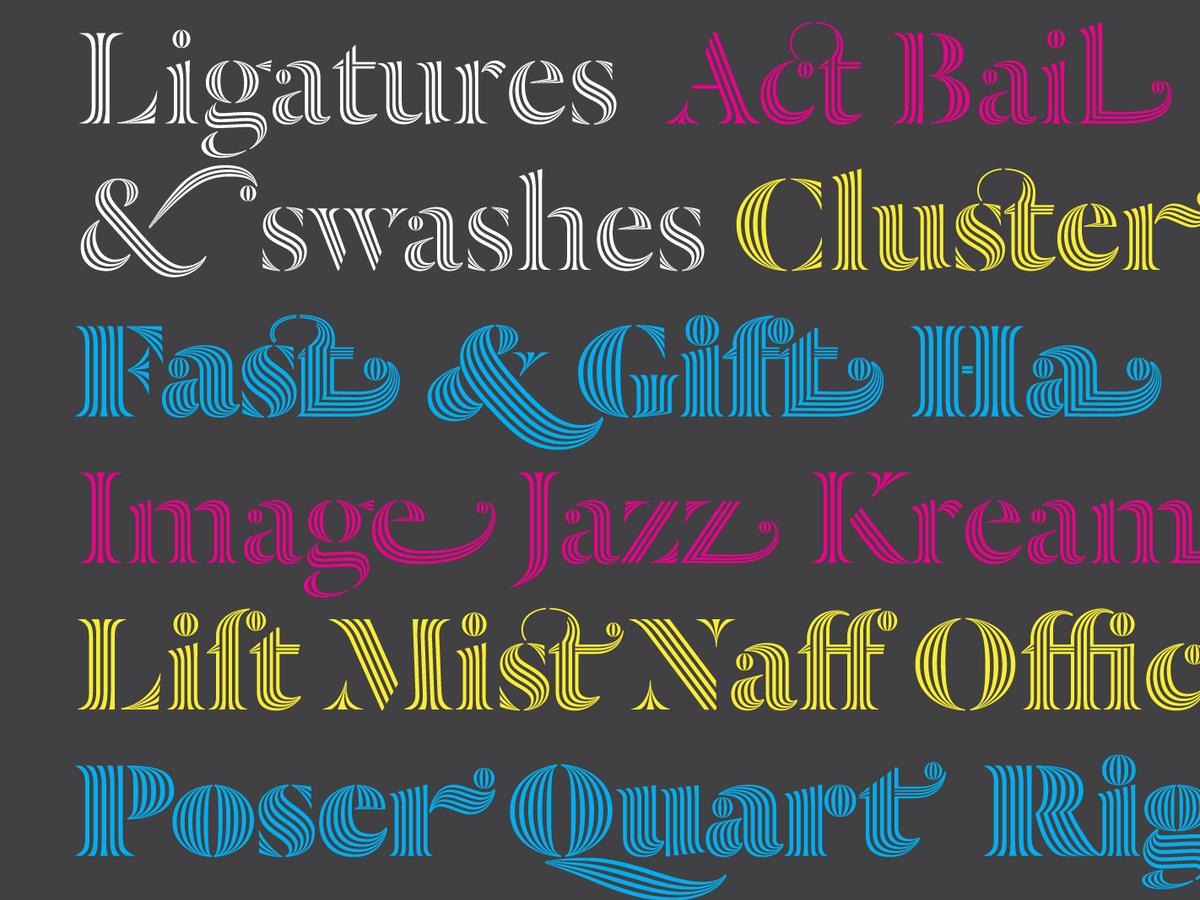
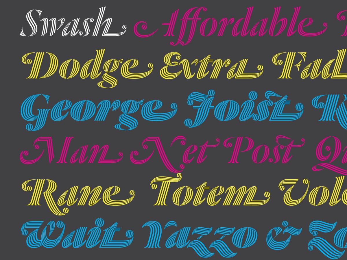
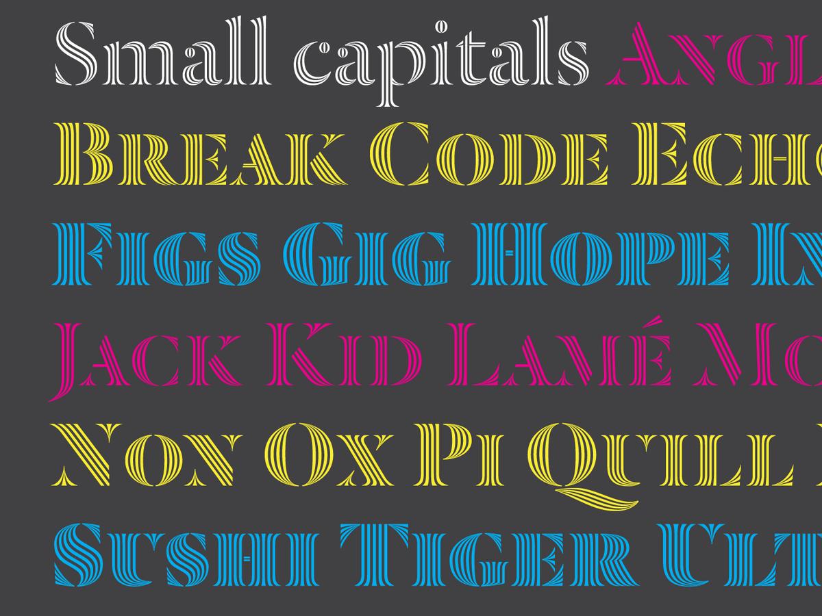
Like Dala Floda, Dala Prisma has a full set of typographic features, including small capitals for the romans, an extensive set of ligatures, and expressive swash alternates for many italic capitals. The extreme thinning of lines means this family only works at large display sizes.
