Darby Sans by Paul Barnes & Dan Milne
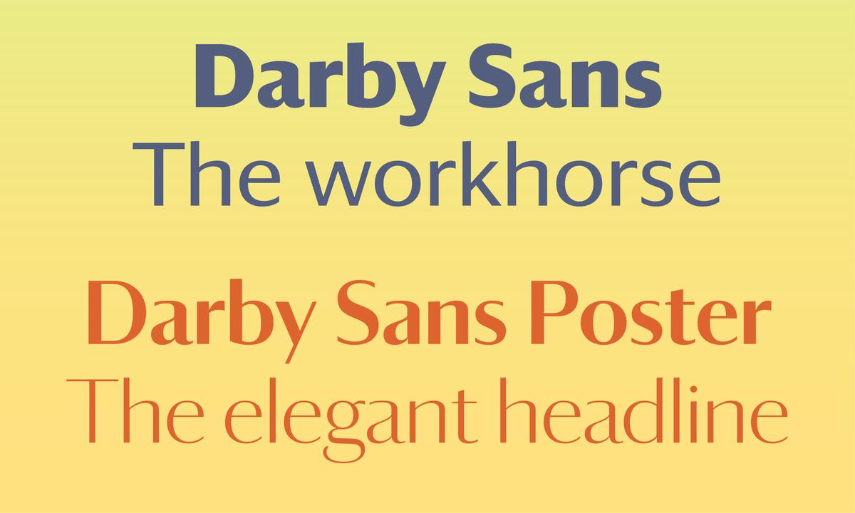
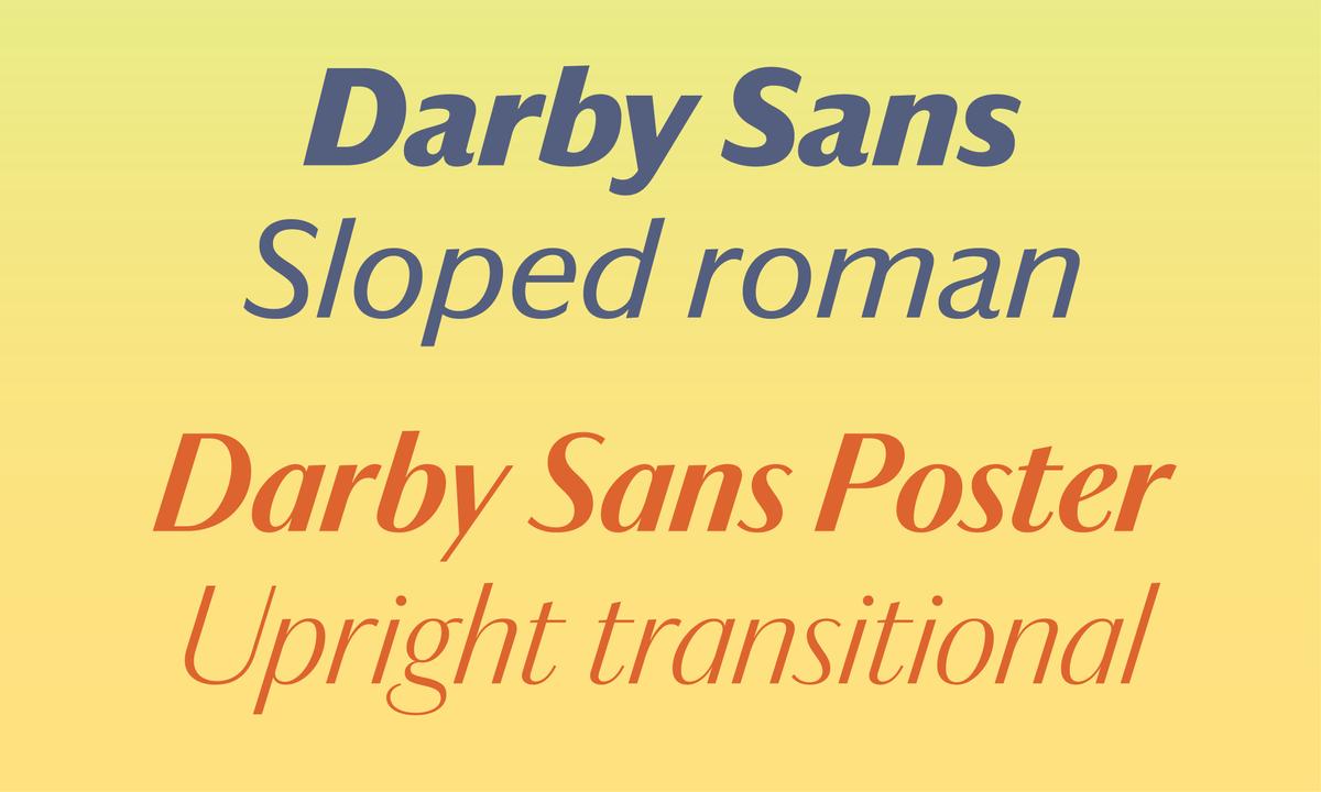
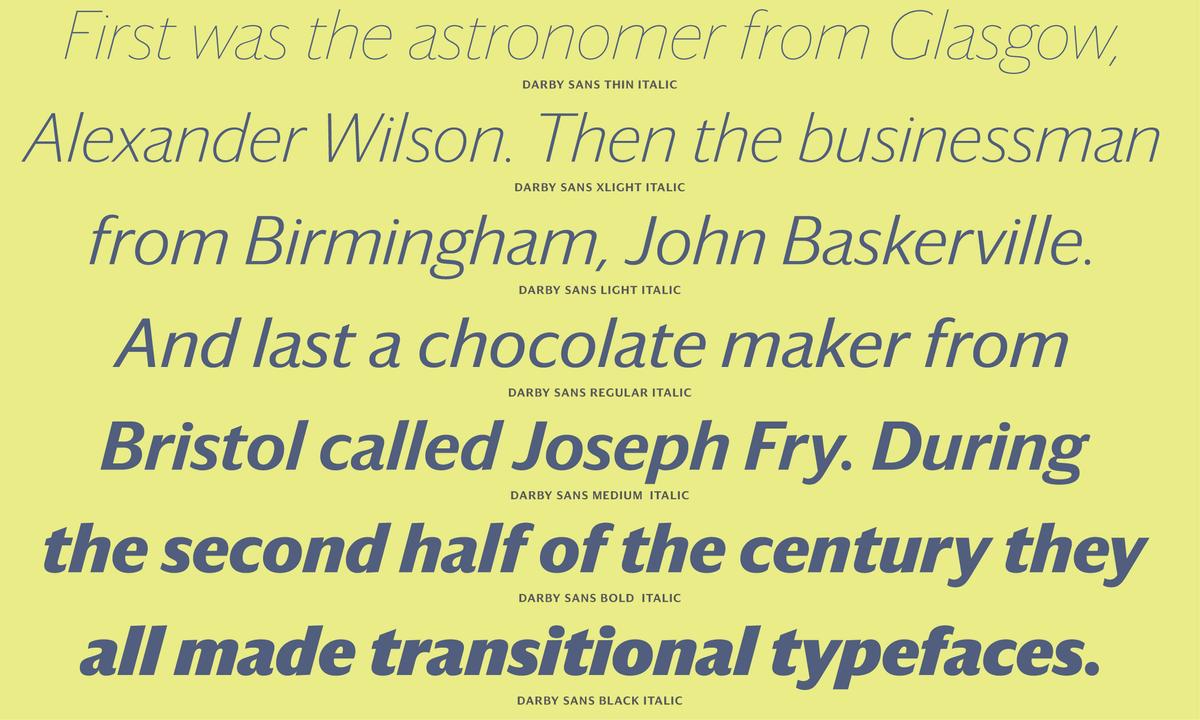
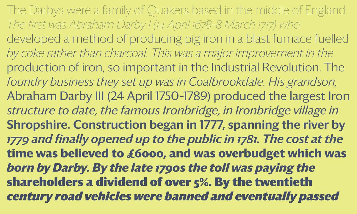
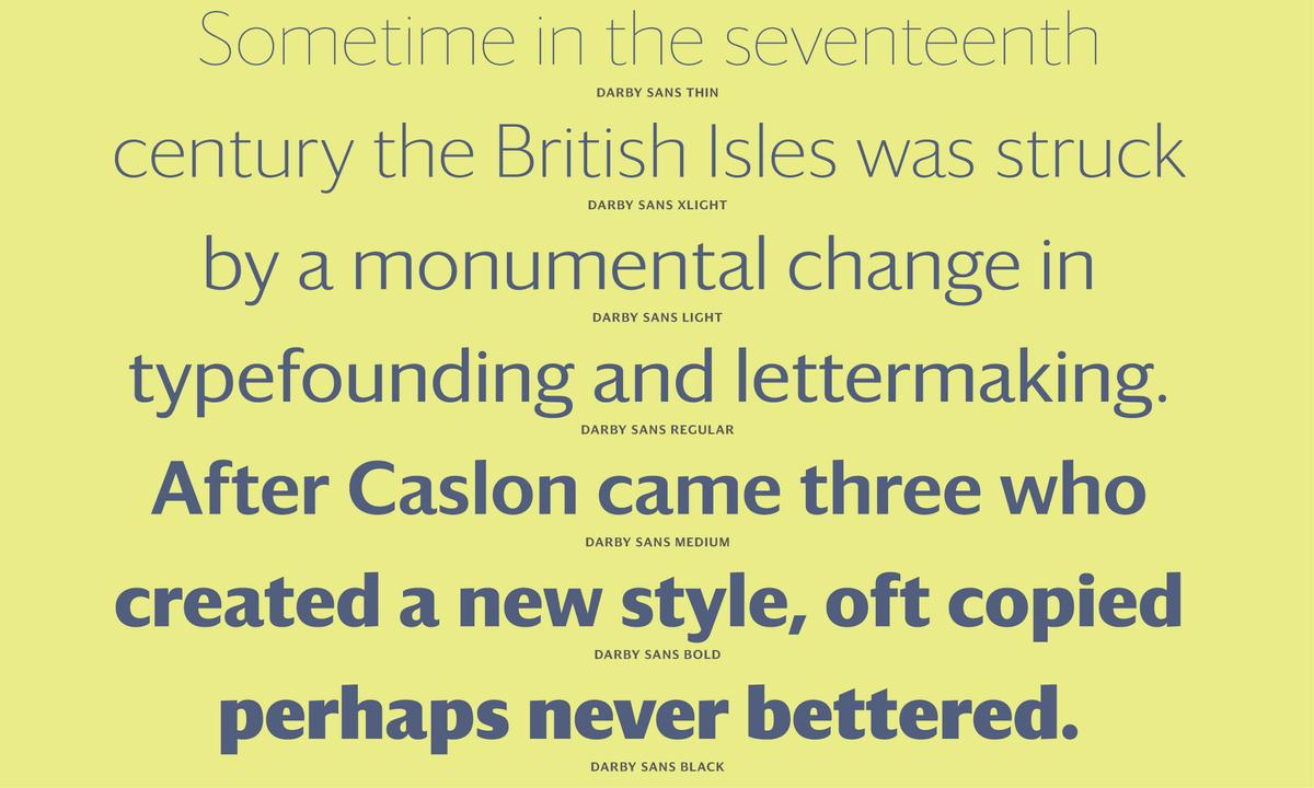
Commercial Type is delighted to announce the release of Darby Sans, a contemporary family of two related sans serifs: one is the functional Darby Sans; the other a more delicate and refined display version for large sizes, where the contrast is dramatically higher. In style they can be described as humanist designs. Originally designed for Wallpaper* magazine, they are suited for many uses spanning editorial design, graphic design, corporate design and through to advertising. Drawn by Paul Barnes together with Dan Milne, the roots of Darby lie in the British tradition of lettering and typefounding that began to flower in the middle of the eighteenth century. Behind the contemporary bodies, one can see the structural qualities of the three major type founders of this period; John Baskerville of Birmingham, Joseph Fry of Bristol and Alexander Wilson of Glasgow. The high body of the bowl of the a, the open g, and the bow in the £ are all typical of the style. Both families have contrast between thick and thin strokes, a trait that has been unfashionable in sans serifs for many years, but has more recently seemed ripe for new exploration. Darby Sans, with its lower but still visible contrast, takes on the functional job of any contemporary sans serif, while Darby Sans Poster is a display typeface where the contrast is dramatically increased for greater elegance.
Darby Sans is a contemporary humanist sans serif that is at its heart a workhorse. The family works effortlessly in all situations, from small text sizes to large, bold display use. We feel that it may be our best screen typeface to date, maintaining both readability and personality from 10px up to the largest display sizes. Rather than following the typical British sans serif model of Gill and Johnston, Darby Sans looks back instead to the eighteenth century. At its heart in the roman it follows the transitional forms found in the typefaces of Baskerville, Fry & Wilson, but also in the vernacular lettering style found in everyday life. These are the letters of the Age of Enlightenment; the name itself comes from the Darby family, famed pioneers of the industrial revolution. Stripping these forms of serifs and contrast renders an open and intelligent sans serif typeface suited for both print and for screen use.
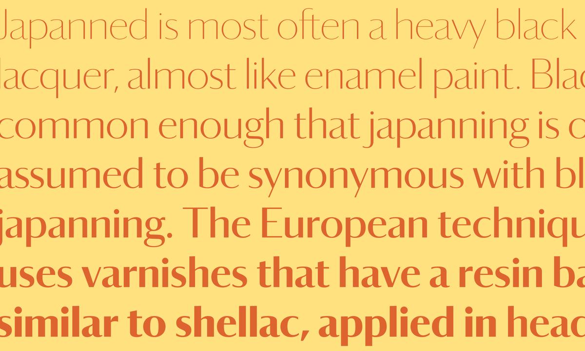
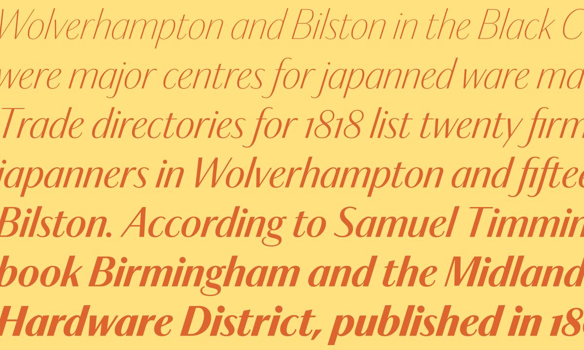
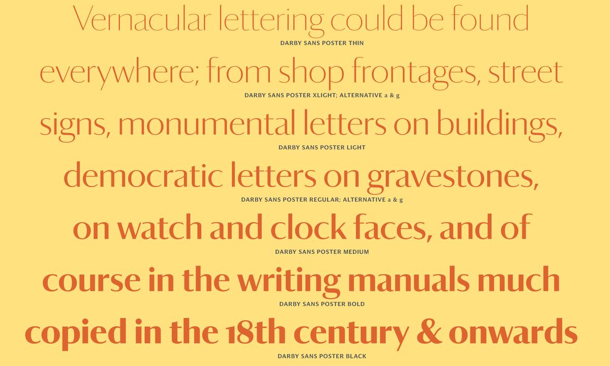
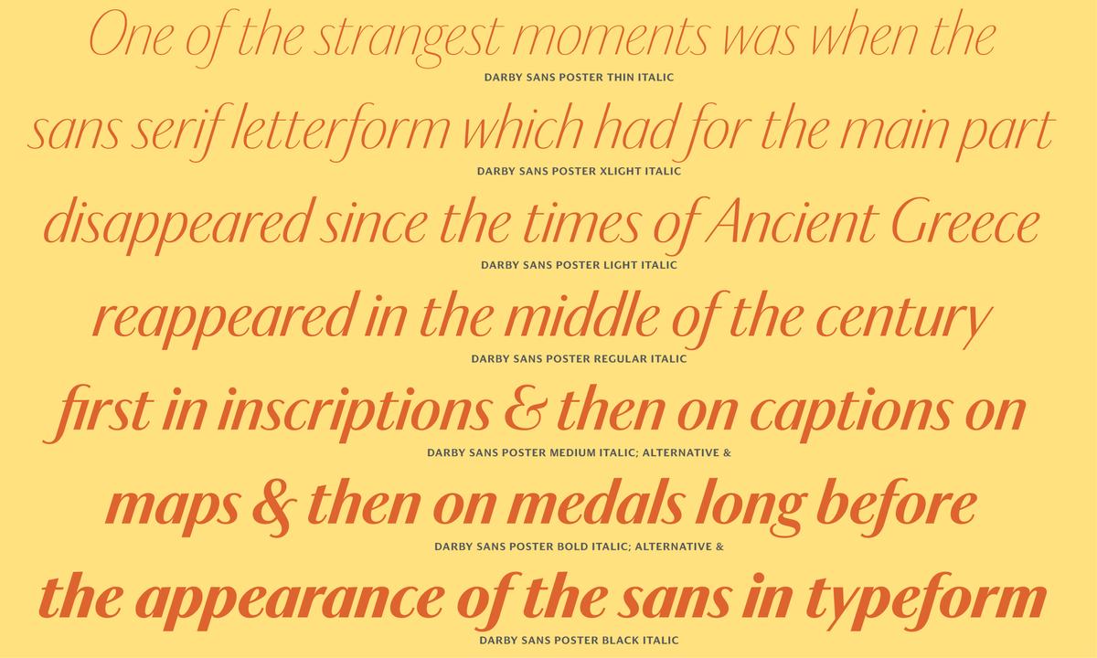
High-contrast sans serifs offer a form of beauty and refinement we more typically associate with serif letters of luxury and elegance. Darby Sans Poster mixes the traditional skeleton of the transitional letter with a stripped down sans form to create a modern display face. Sans letters with high contrast reappeared in Britain in the late eighteenth and early nineteenth centuries, and Darby Sans Poster draws on these sources: lettering found on memorials, lettering on coins, and later in the typefaces of the Figgins foundry. While Darby Sans chooses a simple slanted italic, Darby Sans Poster’s italics are patterned on the condensed and upright style of Joseph Fry. More limited in use than its lower contrast sibling, Darby Sans Poster works best at large sizes where its beauty can truly sparkle.
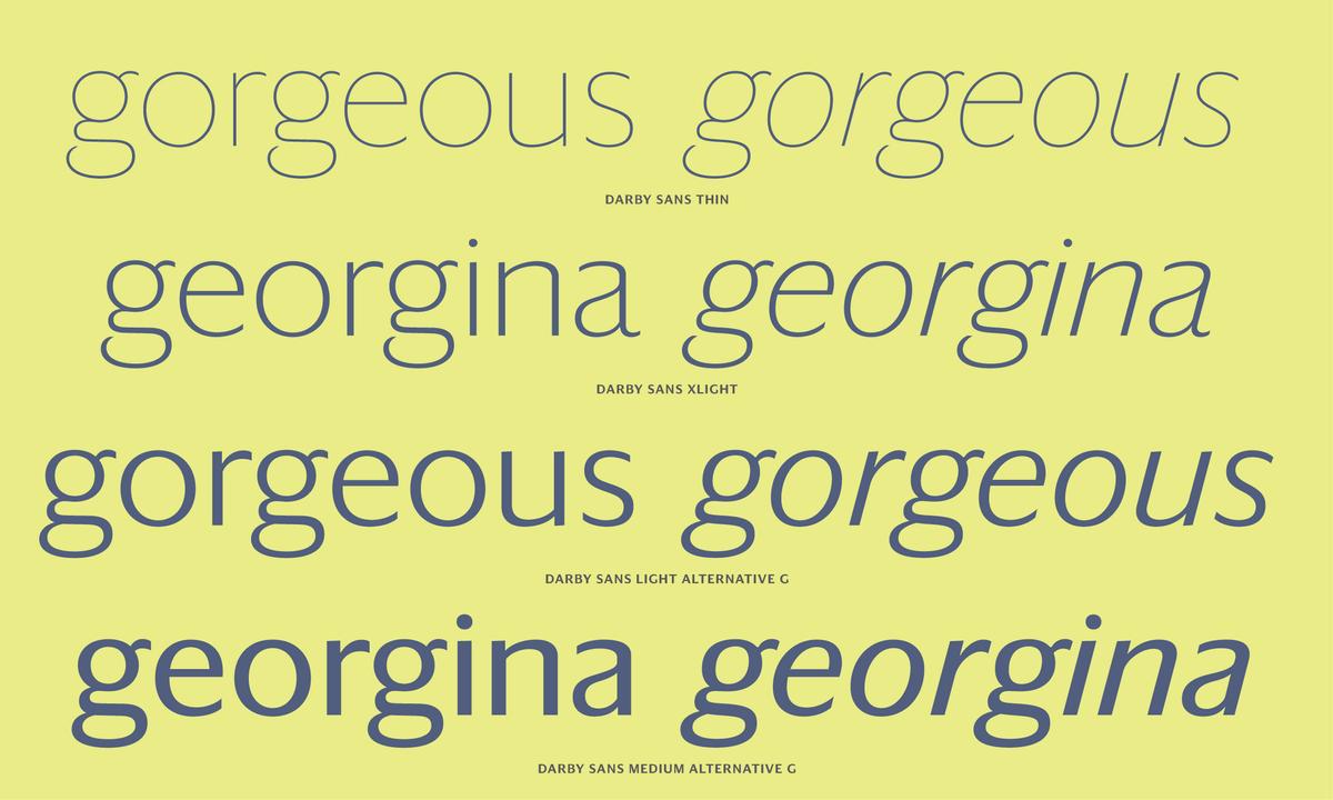
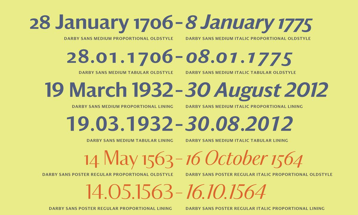
A handful of alternates subtly modernize the forms, removing the tail from the lowercase a for tighter spacing, and closing the gap on the lowercase g. Additionally, multiple figure styles give flexibility and functionality.
Darby Sans and Darby Sans Poster each come in seven weights with italics. The collection is available for use on the desktop, for self-hosted web use, and for embedding in mobile apps.
