Greg will be at the prestigious Cranbrook Academy of Art, giving a lecture on his work and teaching a two-day introductory workshop on type design, focusing on sketching and quickly generating ideas.
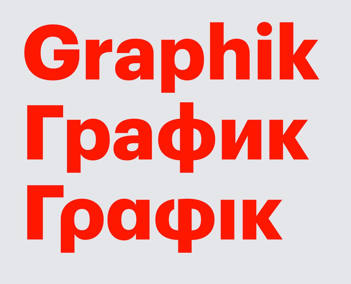
Graphik now supports Greek and a number of languages that use the Cyrilic alphabet, including Russian, Ukrainian, Belorussian, Bulgarian, and Serbian. The Cyrillic was drawn by Ilya Ruderman, and the Greek was drawn by Panos Haratzopoulos.
Christian Schwartz will be speaking at this year's Bankgok International Typographic Symposium (BITS), the biggest international type conference in Asia. He will also be conducting a special workshop the day before. Please visit the conference site for more details.
Christian will be speaking at the inaugural LetterLove, a brand new quarterly series of talks aimed to build awareness of typography and type design education in Singapore and the region, organized by our friends Mark & Sarah de Winne of Relay Room.
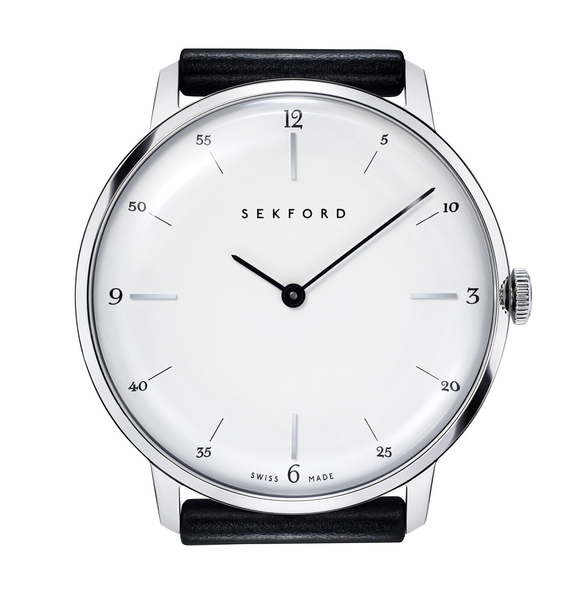
Commercial Type has provided the numbers and other lettering for a new watch that celebrates English heritage.
As part of the new postgraduate program called “Type Innovation” at CENTRO, Diseño, cine y televisión in Mexico City, Miguel Reyes will be teaching the introductory course on Letter Design. In advance of the first class, Miguel will give a public lecture on his work with Commercial Type.
Christian Schwartz will be taking a brief side trip during the North American tour to speak at Serebro Nabora, a type conference in Moscow.
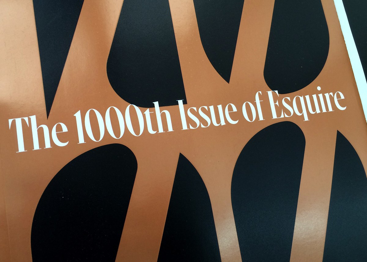
Christian Schwartz drew a new display serif face called Gingrich for the 1000th issue of Esquire. The typeface is named for the founding editor of the magazine.
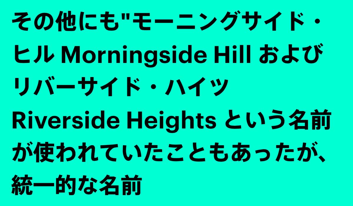
We have licensed a number of our typefaces to serve as the Latin portion of Japanese typefaces available through the unique FitFont service by Type Project.
Paul and Christian will be giving a series of 20 lectures across North America in September and October, starting in Vancouver and ending in Washington DC. More info inside.
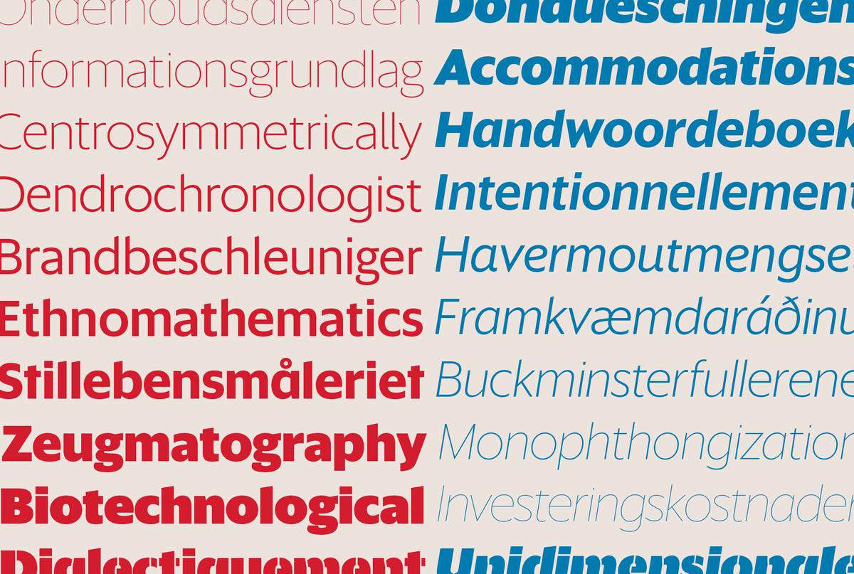
Commercial Type is pleased to announce the release of Sanomat Sans, a geometric sans with a wide range of weights in both display and text variants, originally drawn for the 2013 redesign of Finnish newspaper Helsingin Sanomat, including its digital and broadcast divisions.
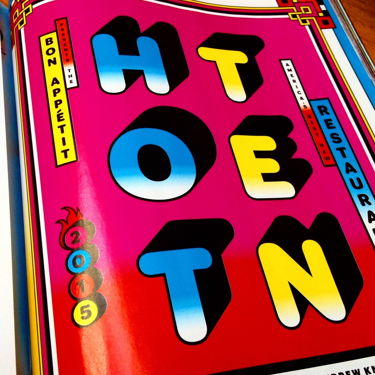
Christian Schwartz drew Graphik Round Black for Bon Appétit's 2015 Hot Ten, their annual roundup of the ten best new restaurants in the US.
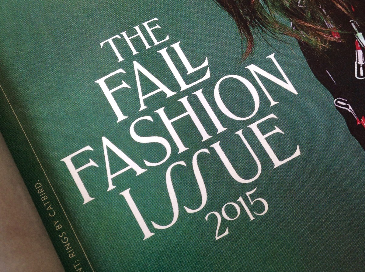
Greg Gazdowicz drew an all-caps titling typeface for New York magazine’s 2015 fall fashion issue.
Typography Summer School is a meeting place for graduates of graphic design, wanting to bridge the gap between student and professional and learn more about typography. The school brings together leading practitioners and participants to study, exchange ideas, and investigate the discipline.
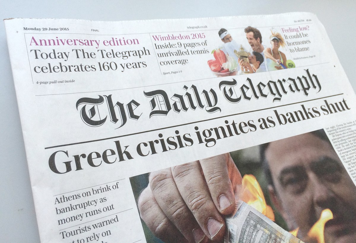
The Daily Telegraph has undergone a design transformation to mark its 160th anniversary. Under the guidance of design director, Jon Hill, one of the last remaining quality daily broadsheets in the UK has a completely new typographic dress from Commercial Type. Working closely with Hill was Commercial Type partner, Paul Barnes, who has developed two new type families as well as designing the new title piece.
Typographics is a 10-day design festival devoted to contemporary typography, with talks, workshops, and tours focusing on where typography is today and where its future may lie. It will be held at Cooper Union in New York City as a combined effort of Type@Cooper and the Herb Lubalin Study Center, with a big helping hand from Roger Black. Christian Schwartz will be speaking on newspaper type on Saturday morning, alongside such luminaries as Alex Trochut, Barbara Glauber, Juan Carlos Pagan, and Erik van Blokland. Commercial Type is proud to be a sponsor of what is sure to be a great event.
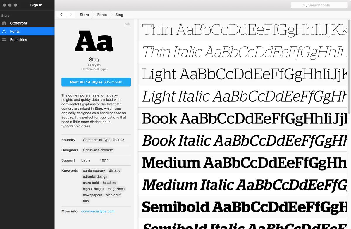
Fontstand, a new service for testing fonts and renting font licenses, has launched today with over 20 independent type foundries participating, including Commercial Type.
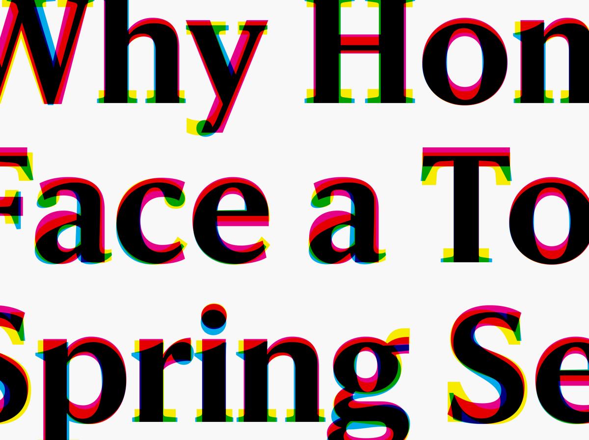
The McClatchy Company publishes 29 daily newspapers across the US. Working with Garcia Media, they have spent the last year developing a unified design language that will bring together the print papers, mobile apps, and web editions with a more consistent overall look. We designed a set of typefaces that will help to bridge the gap between design consistency and individual character.
Paul will be speaking in Dublin. The event has been organized by the National Print Museum in conjunction with Typography Ireland. Tickets are limited, please contact info@nationalprintmuseum.ie to reserve a place.
Paul will be speaking at the School of Design at Northumbria University, together with the brilliant book cover designer David Pearson.
Christian Schwartz will be speaking on designing type for newspapers at a special session on type and typography at the Society for News Design conference in Washington, DC.

Berton Hasebe has added two new families to the Druk collection: Druk Text and Druk Text Wide. These families are designed to be useful for the small elements of display typography that give structure and texture to a page without requiring dramatic changes in scale. Each is comprised of 4 weights with italics.
Paul Barnes will be one of the judges for this year's TDC Typeface Design Competition, and will also speak alongside Garson Yu at the Judges' Night.