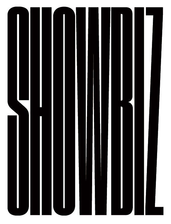
2011 was a densely packed and chaotic year, so the type needed to help reflect this in Bloomberg Businessweek's Year in Review issue. Berton Hasebe added some very dramatically condensed versions to his already very condensed sans family Druk, while Christian Schwartz pulled some Neue Haas Grotesk numerals in the opposite direction. Berton also provided some impossibly condensed pieces of lettering, for places where even Druk XXXX Condensed wasn't quite narrow enough. The illustration on the 4-part cover is by James Dawe.
Christian Schwartz will be speaking at the Association of Registered Graphic Designers' 12th annual DesignThinkers Conference in Toronto, along with an impressive list of designers from all areas of graphic design.
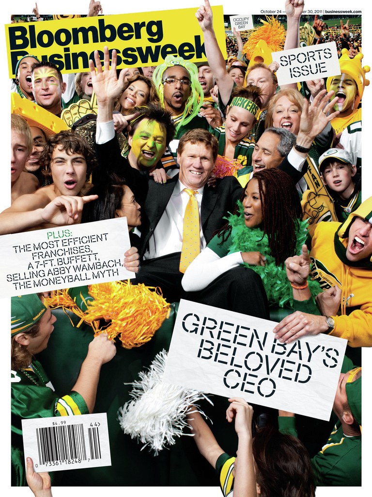
Bloomberg Businessweek Creative Director Richard Turley wanted something a little bit more flexible than just a piece of lettering to tie a special section on sports together, so Christian Schwartz created a stencil version of the Regular weight of their Neue Haas Grotesk, loosely inspired by the work of Lawrence Weiner (who, ironically, despises Helvetica).
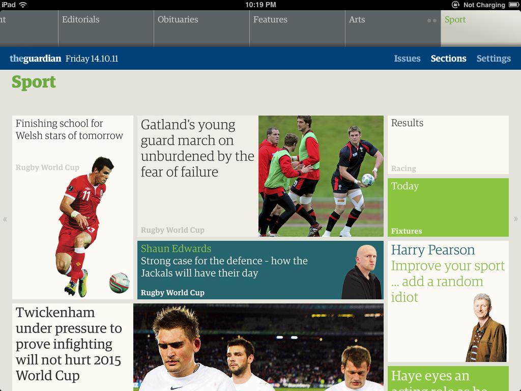
The Guardian has launched a new iPad edition, using the typefaces we developed for their print edition. Mark Porter, former Guardian creative director, headed up the design of the app, adapting and reimagining the design principles from his 2005 redesign of the newspaper.
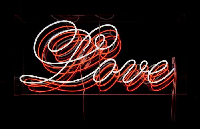
"Thieves Like Us" is a collaboration between Commercial Type and designer and artist Dino Sanchez. This temporary showroom will exhibit Marian, a new typeface by Paul Barnes that reduces classic models of serif type design to their basic skeletal forms, exploring the possibilities offered by these single stroke forms in a variety of media.
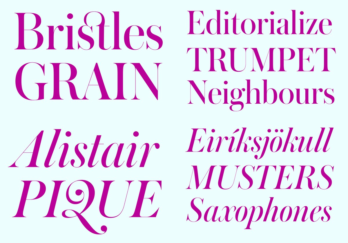
When we first designed Austin in the middle of the last decade, we always imagined that it was as extreme as it could possibly be. Well of course it wasn't, as our new release Austin Hairline amply demonstrates.
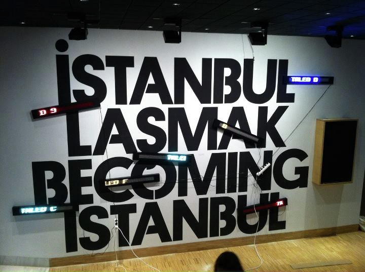
Berton Hasebe drew a custom stencil version of Platform for an exhibition at SALT Istanbul called "Becoming Istanbul" designed by Project Projects.
Christian Schwartz will be speaking on "Obsessions in Type Design" at the 2011 Rencontres internationales de Lure, a weeklong conference on typography taking place in Lurs, Alpes de Haute Provence, France.
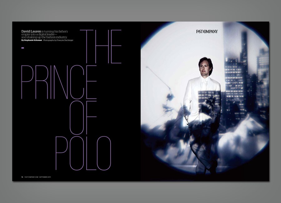
The September 2011 issue of Fast Company is the latest step in a redesign by creative director Florian Bachleda, with Alice Alves and Ted Keller, introducing three new typeface families from Commercial Type: Kaiser, Zizou Sans, and Zizou Slab.
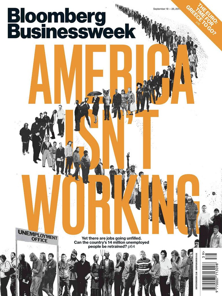
Berton Hasebe has designed Druk, a condensed sans serif in 4 weights, for Richard Turley and his team at Bloomberg Businessweek.
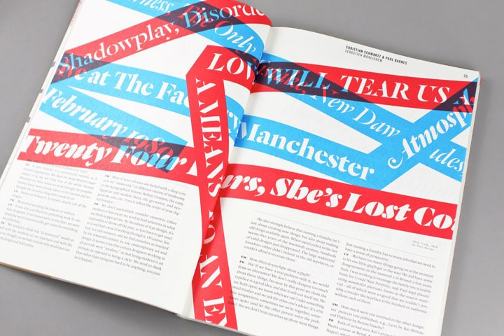
Christian and Paul were interviewed by Sébastien Morlighem for the inaugural issue of Codex a new journal on typography from John Boardley, the man behind I Love Typography and designed by our friends at Working Format.
Paul Barnes and Christian Schwartz will be touring Australia in June, giving 7 talks and a workshop over 12 days. Their lecture will touch on a number of the projects they have collaborated on, and discuss how they came together to form Commercial Type.
Paul Barnes will be lecturing about his work at The Design Society in Singapore.
Esquire and Bon Appétit have both redesigned, and both are using newly drawn condensed widths of Graphik.
Christian Schwartz will be speaking on collaborations in type design as part of the wei sraum lecture series at aut in Innsbruck, Austria. The lecture is open to the public and admission is free.
Christian Schwartz and esteemed calligrapher and type designer Kris Holmes will each be teaching a weeklong workshop for students at the University of the Arts in Philadelphia, Pennsylvania during the last week in March. The two will also be lecturing as part of the local AIGA's "Exposed" lecture series. The lectures will be open to the public and will be held at University of the Arts, Levitt Auditorium, Gersham Y, Broad and Pine Streets.
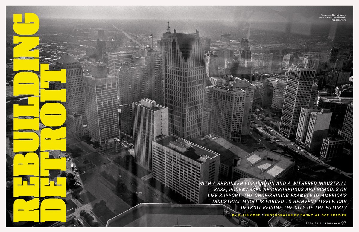
Berton Hasebe designed a new slab serif headline typeface in three weights for a complete revamp of the iconic Ebony by new creative director Darhil Crooks, which debuted with the April 2011 issue. Commercial Type also assisted with redrawing the nameplate, marking its first change since the magazine was founded in 1945.
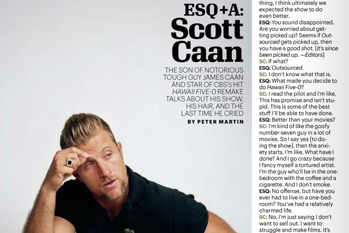
After 5 years with Stag, the US edition of Esquire was ready for a change. In additon to adding two new sections and replacing Stag Sans with Graphik, they also commissioned a new serif display face called Granger, designed by Kai Bernau and Susana Carvalho.