Marian Text by Paul Barnes
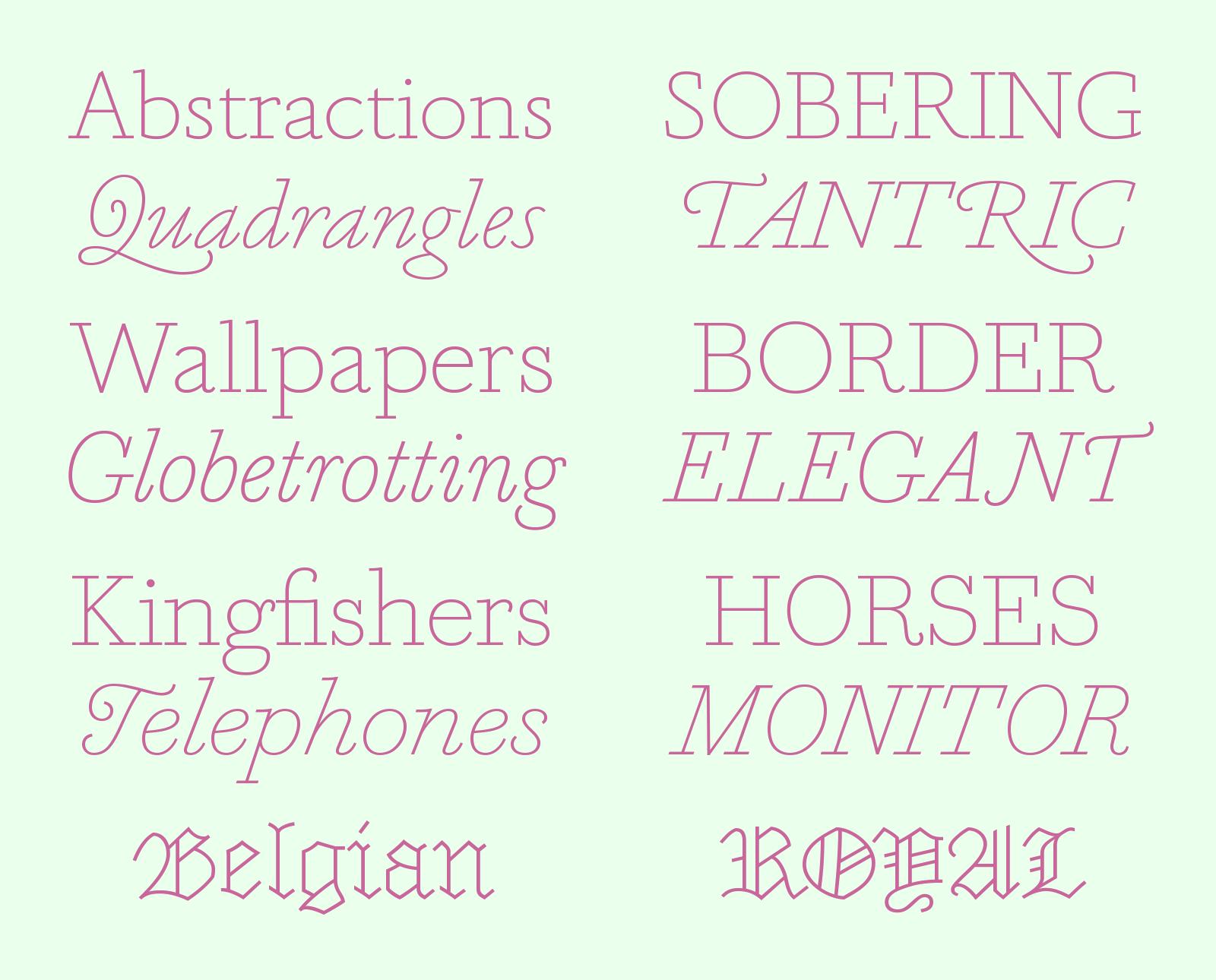
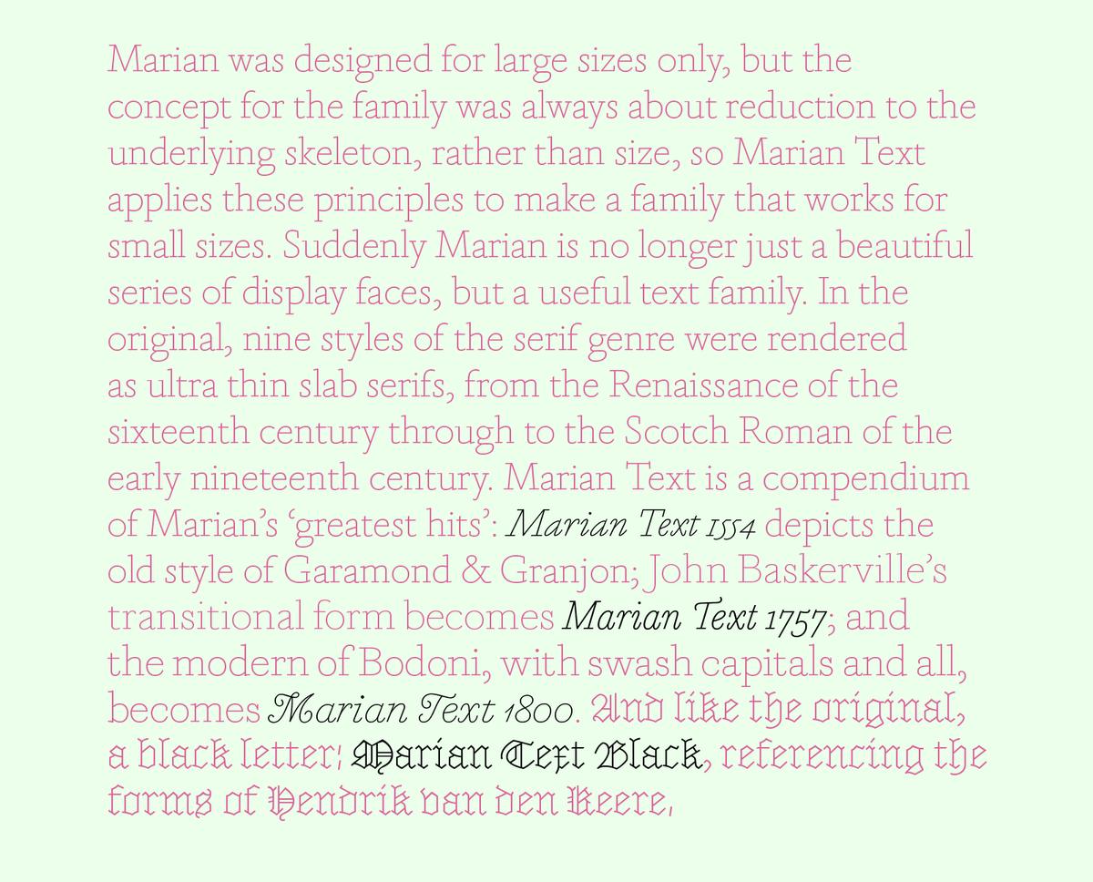
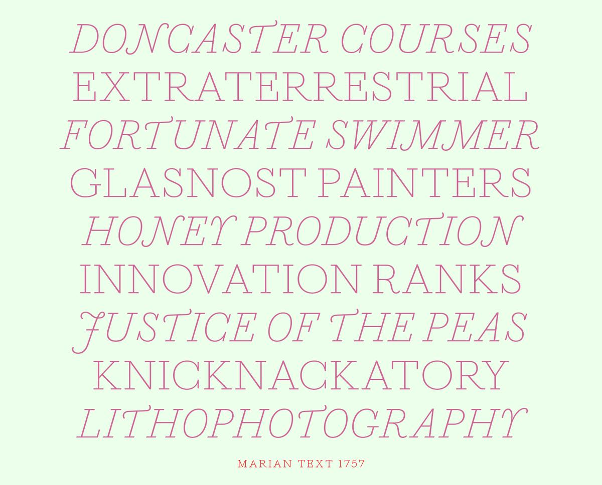
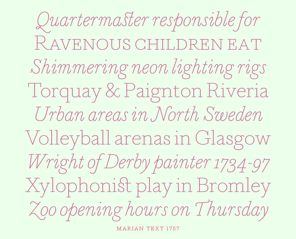
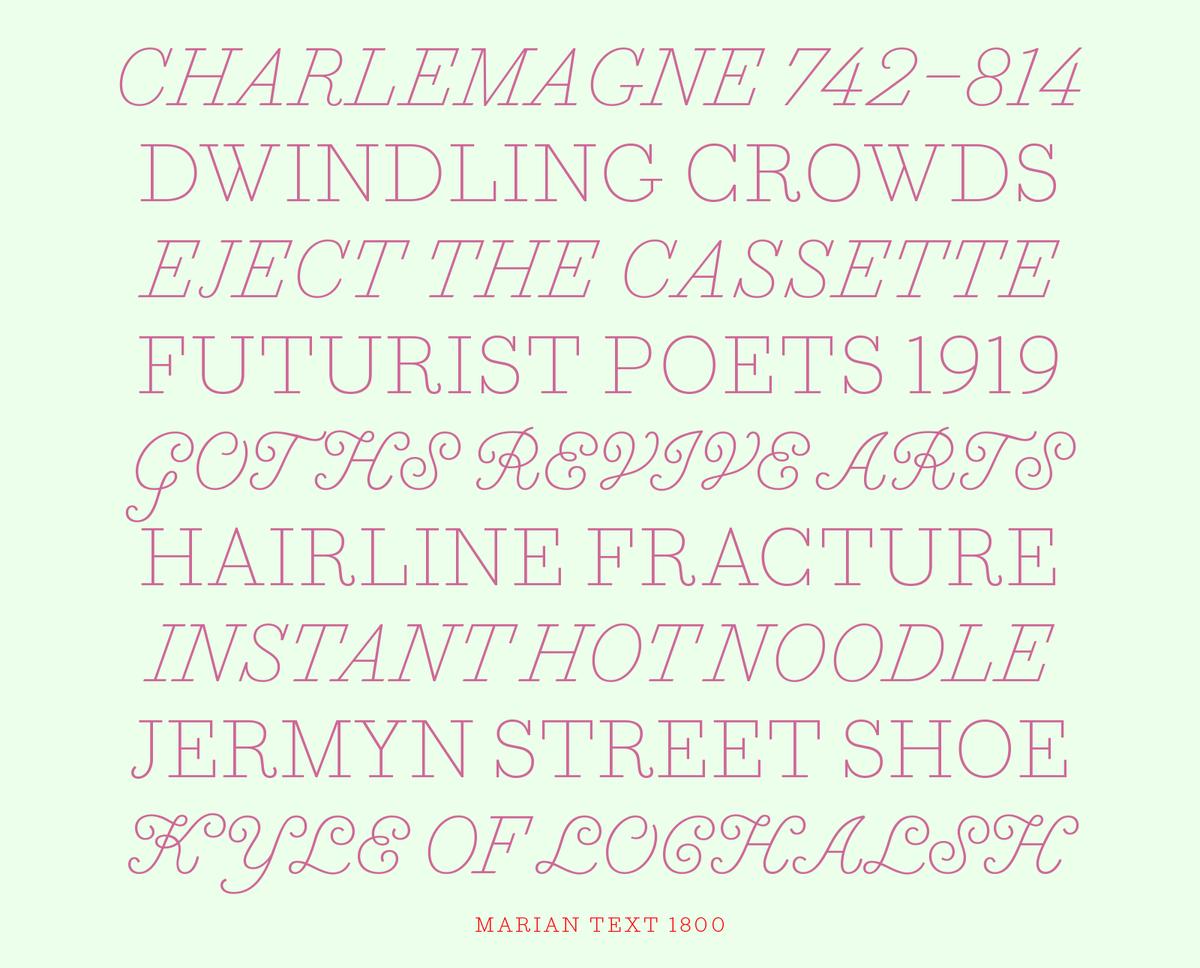
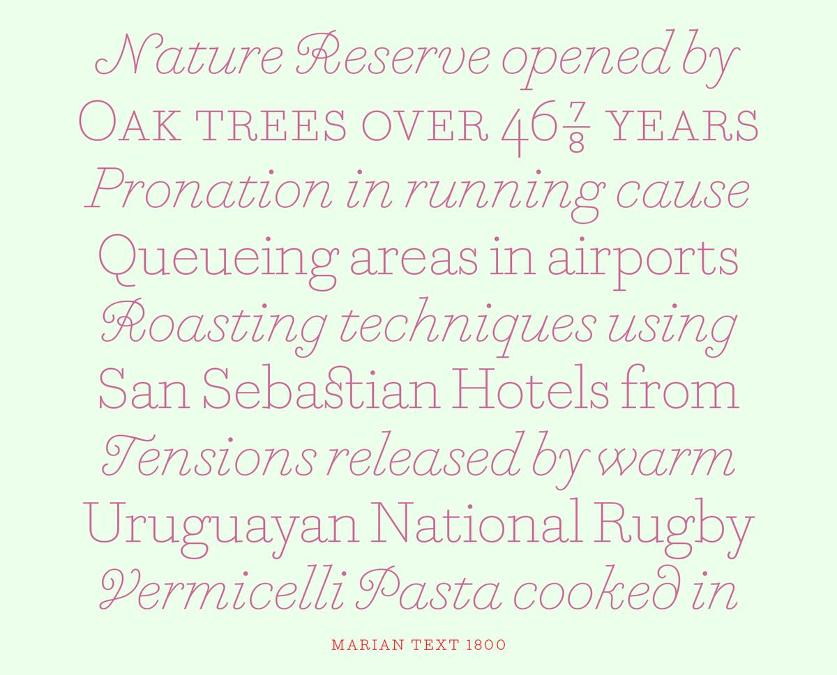
Paul Barnes's Marian was designed for large sizes only, but the concept for the family was always about reduction to the underlying skeleton, rather than size, so Marian Text applies these principles to make a family that works for small sizes. Suddenly Marian is no longer just a beautiful series of display faces, but a useful text family.
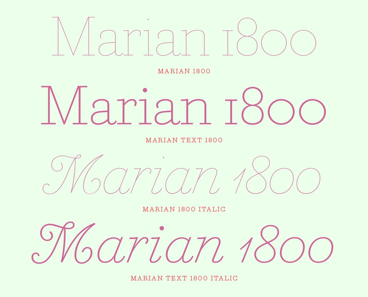
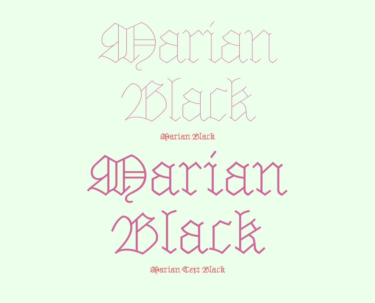
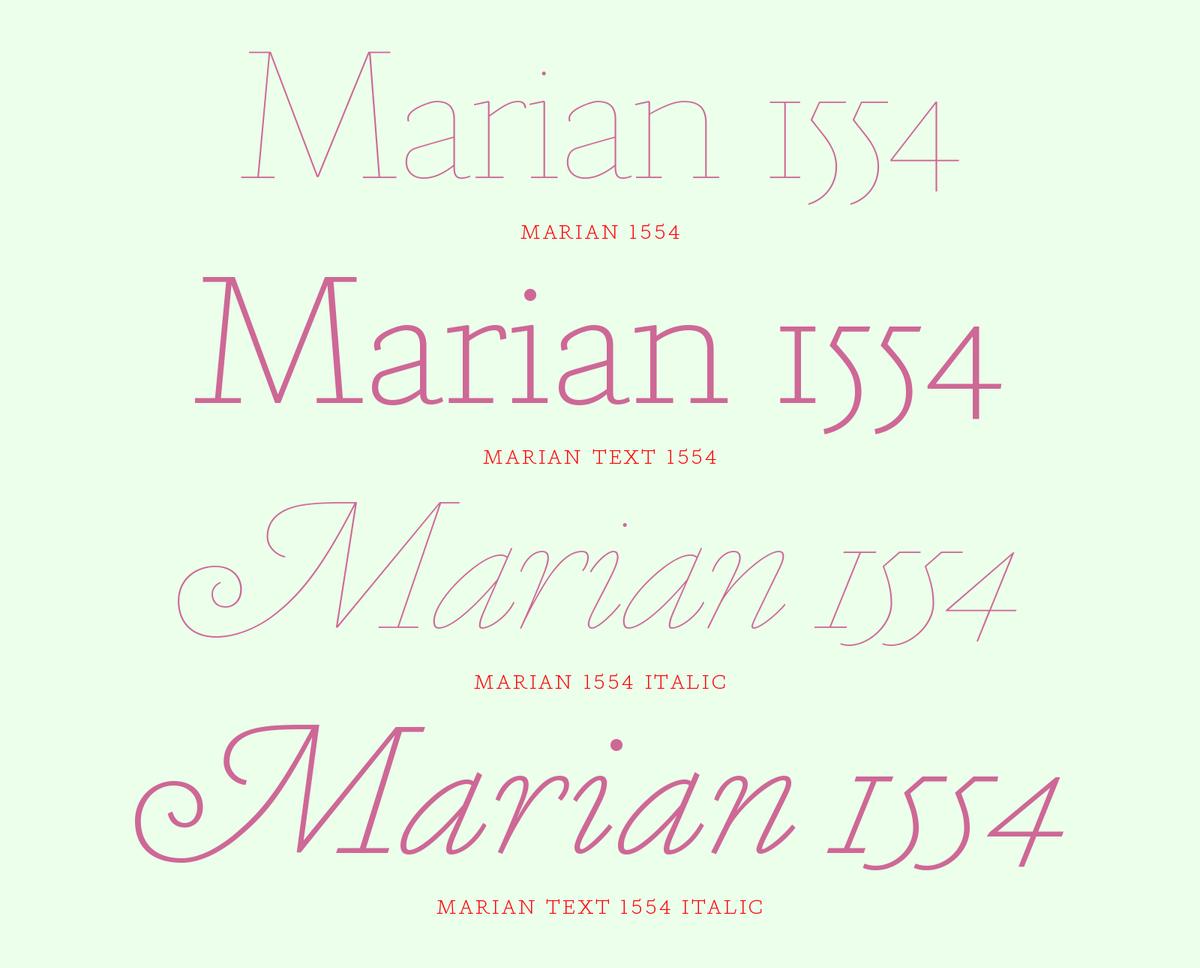
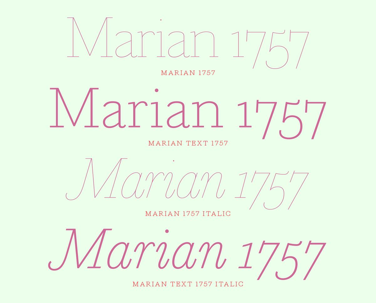
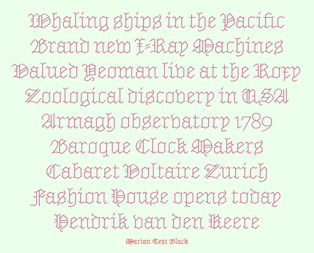
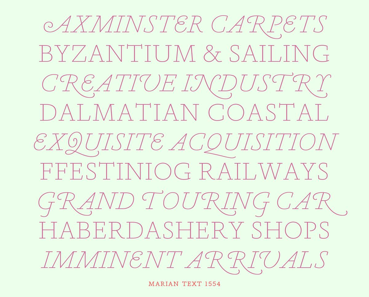
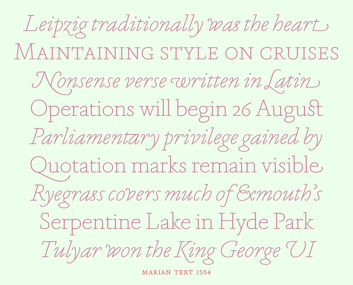
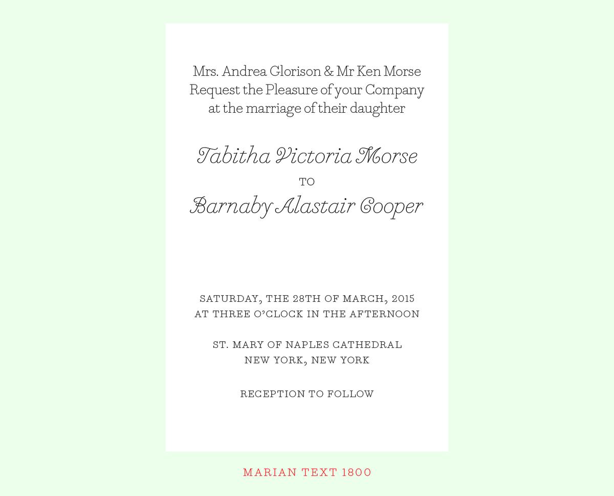
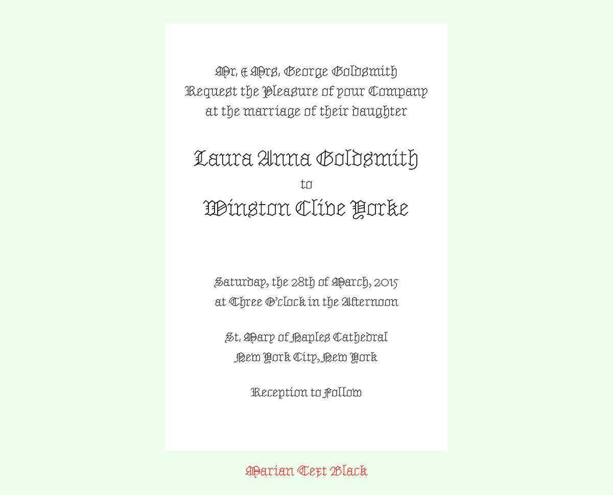
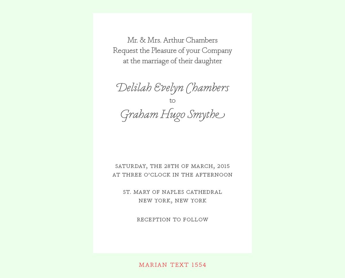
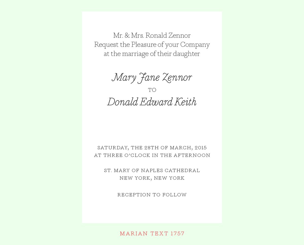
In the original, nine styles of the serif genre were rendered as ultra thin slab serifs, from the Renaissance of the sixteenth century through to the Scotch Roman of the early nineteenth century. Marian Text is a compendium of Marian’s ‘greatest hits’: Marian Text 1554 depicts the old style of Garamond & Granjon; John Baskerville’s transitional form becomes Marian Text 1757; and the modern of Bodoni, with swash capitals and all, becomes Marian Text 1800. And like the original, a black letter: Marian Text Black, referencing the forms of Hendrik van den Keere. Marian Text has subtle contrast only where strokes come together, to maintain the illusion of being monoline. Marian Text 1554 and 1800 were drawn by Sandra Carrera, during an internship at Commercial Type in 2013. Marian Text 1757 and Black were drawn by Commercial Type staff designer Miguel Reyes.
Because its strokes are so thin, Marian Text is best used at point sizes of 9pt and up. A 100 : 26 ratio of point size gives an exact mathematical match between the stroke weight of Marian and Marian Text, meaning that text set in 100pt Marian will precisely match 26pt Marian Text in stroke weight. However, this is a mathematical match, not necessarily a visual match. In order for the two faces to be optically equivalent, Marian Text should be set a bit smaller. We recommend a 100 : 20 ratio for equivalent weights.
All 7 styles of Marian Text are available for desktop, web, and mobile app licensing. Additionally, the original ultra-thin hairline versions of Marian 1554, 1757, 1800, and Black have been redrawn and manually hinted for use as webfonts.
