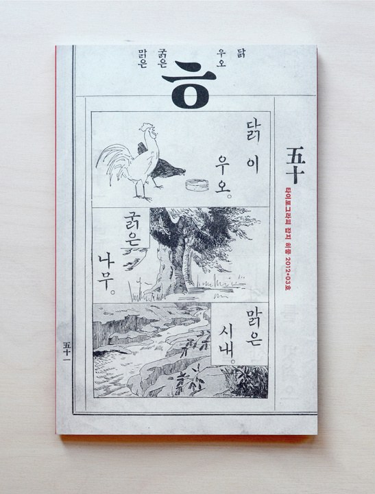
Commercial Type was featured in the latest issue of hiut, a small-format magazine on typography and type design published in Seoul, South Korea. The issue also featured an in-depth review of Atlas Grotesk and Atlas Typewriter, notable because it’s the first non-Hangeul typeface they have reviewed.
The Beatrice Warde memorial lecture, "You Can't Repeat the Past", makes its first outing in mainland Europe at the KABK in the Hague, the Netherlands. Paul Barnes will be showing how his work relates to the past, and will be showing rarely seen images of the Caslon foundry, sans serifs from 1806, mono line letters from the 18th century and much, much more.
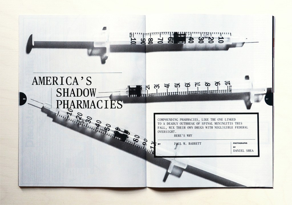
Christian Schwartz created a monospaced version of Publico Text for Bloomberg Businessweek. Originally drawn (but not used) for the election special issue, it found its way into the November 19-25 2012 issue, in an article about the shady world of compounding pharmacies.
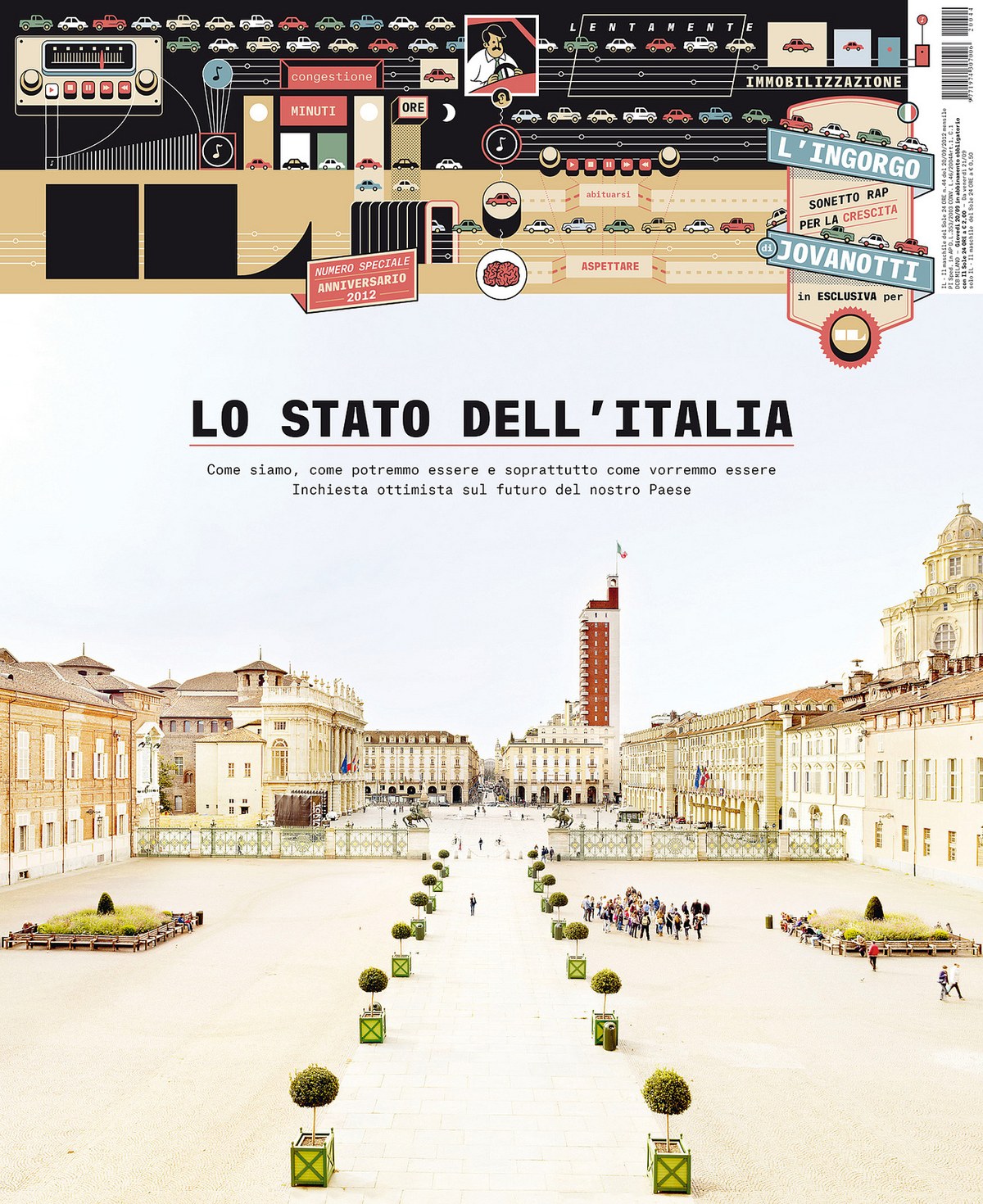
Creative director Francesco Franchi recently added Atlas Typewriter to the type palette of IL, a monthly magazine published by Il Sole 24 Ore, a business newspaper in Milan, Italy. Atlas Typewriter is used for covers and display typography in addition to being used for hard data in complex information graphics.
Christian Schwartz will be teaching a workshop entitiled "Diseño de tipografía: de la calle al estudio" ("Type design: from the street to the studio") in Mexico City, hosted by Grupo Horma. He will also deliver a lecture at a one-day conference on typography, alongside speakers including David Kimura and Marina Garone.
Paul will be speaking at TYPO London 2012, which has the theme "Social". Although this is just two days after his lecture at St Bride, he promises to deliver a completely different talk.
Paul Barnes will be giving the annual Beatrice Warde Lecture at the St Bride Foundation in London. Entitled "You can't repeat the past", Paul's lecture will address how important the past has been in his work, how it has influenced many of his designs and what we can learn from it in making contemporary typefaces.
Christian Schwartz will be lecturing on type design at Dasein Academy of Art in Kuala Lumpur on the afternoon of October 17, hosted by TypoKaki.
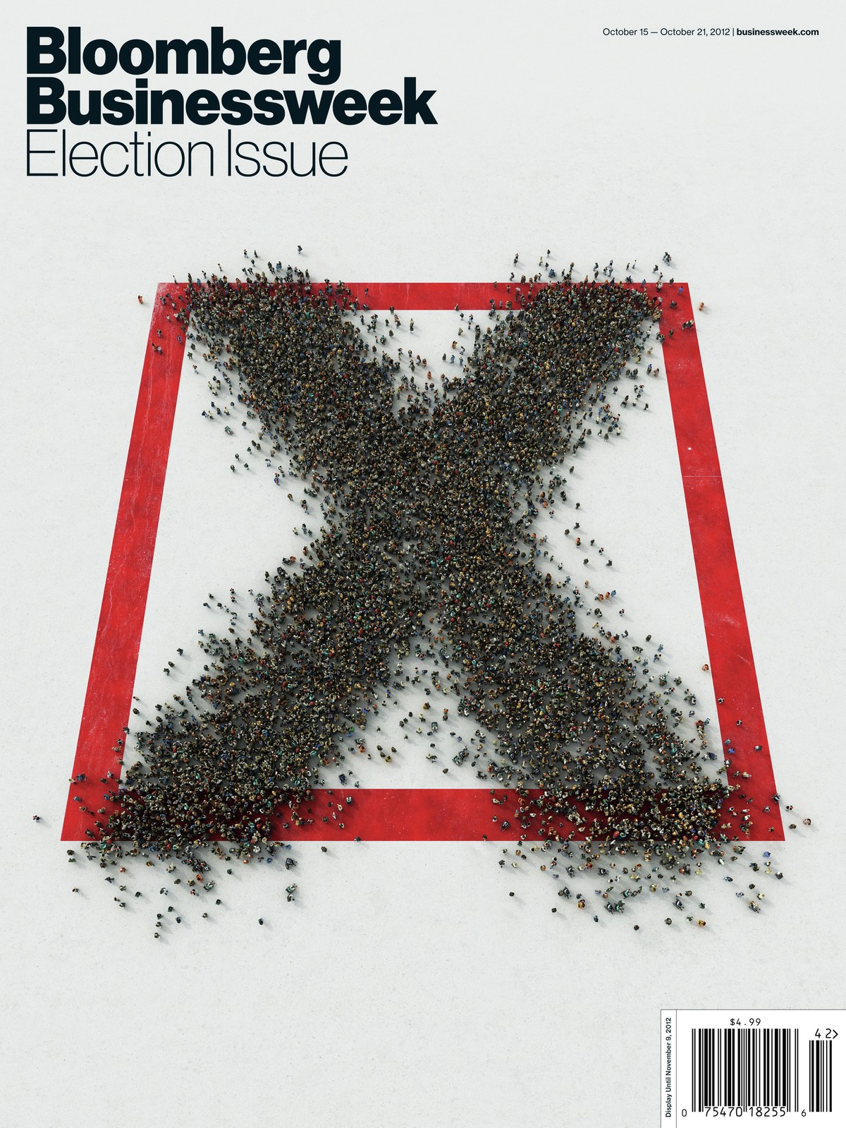
Bloomberg Businessweek put out a special issue on the US presidential election this week, once again completely upending their standard format to tell a story in depth. For this graphics-intensive issue, we created a monospaced version of Neue Haas Grotesk (not planned for future release), for use in typesetting the issue's data. A set of alternates gives the face the ability to feel more like computer output or like typewritten information, as needed. Cover by Justin Metz.
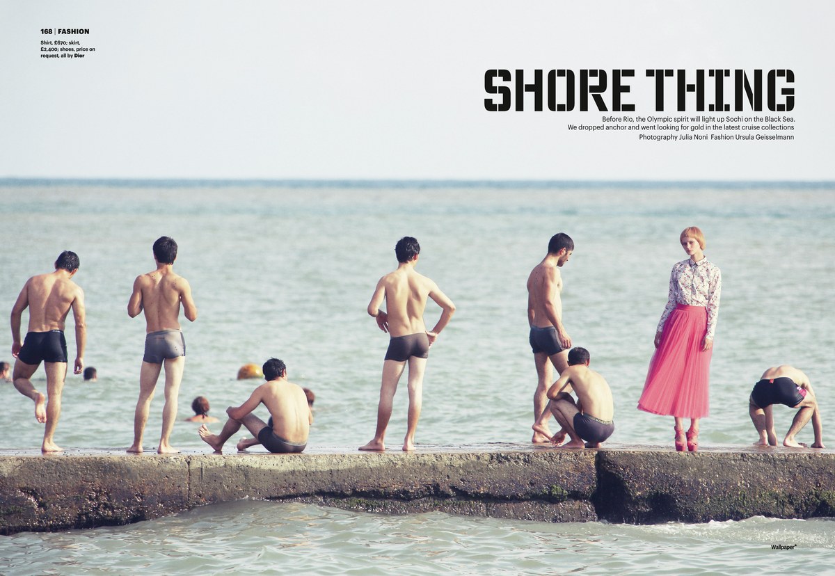
Wallpaper*'s November 2012 issue is the final of their for BRIC specials, each of which featured a custom typeface used throughout the issue. Christian Schwartz and Vincent Chan designed Обои (Oboi, Russian for "wallpaper") in one weight with support for both Latin and Cyrillic. Schwartz says, "It was difficult to come up with a typeface that looked distinctly Russian without falling into various clichés, or looking completely unremarkable once it's not in Russian anymore. I haven't been to Moscow, but when I went to St Petersburg a few years ago I noticed a particular style of all-cap stencils all over the place on everything from buildings, signs, and vehicles to the space travel equipment on display at the Cosmonauts Museum. Although the letterforms were based on a simple rectangular structure, the stencil breaks were inconsistent in a very inventive way, sometimes with the same letter being broken in completely different ways on adjacent lines. We adopted this approach and drew multiple versions of each letterform with the aim of playing the simple, regular structures against the inconsistent breaks for an interesting overall texture."
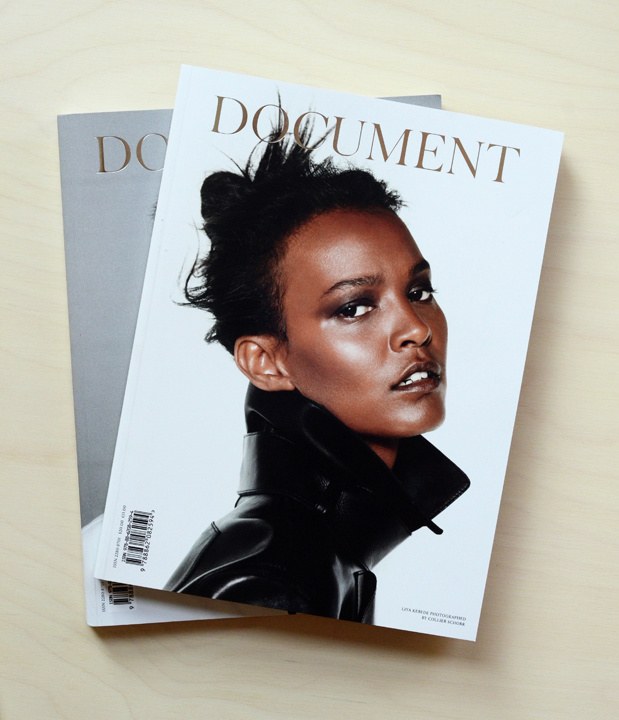
Commercial Type is proud to have been involved with the launch of Document Journal, a new fashion, art, and culture magazine with a New York-centric point of view from Editorial Director and Publisher Nick Vogelson and Creative and Fashion Director James Valeri. Christian Schwartz and Berton Hasebe consulted on the magazine's typography, with Berton's forthcoming release Portrait anchoring the type palette.
Paul Barnes will be speaking at Kyoorius Designyatra 2012 in Goa, India. The theme of this year's conference is "The Divide".
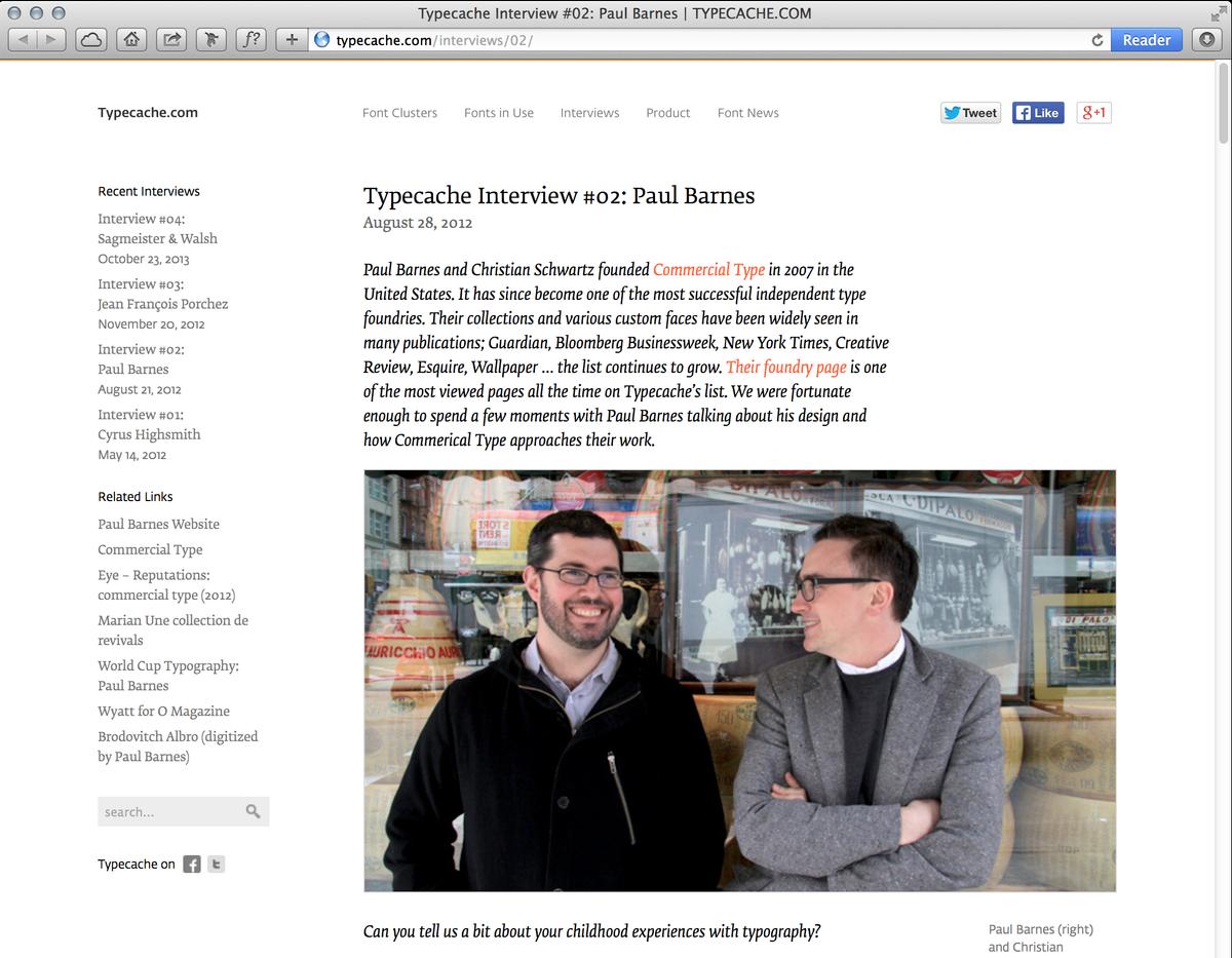
Paul Barnes has been interviewed by the nice people at Typecache, a new online compendium of type news and information.
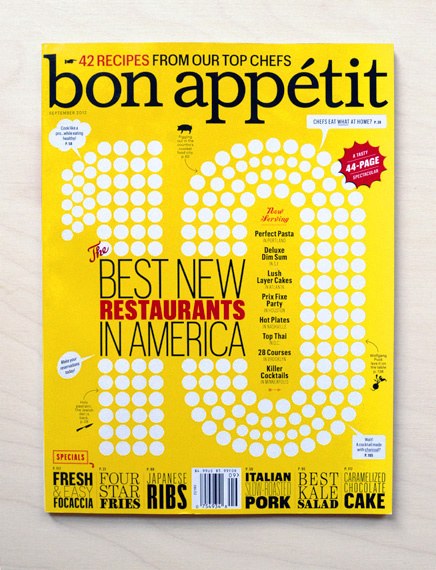
Bon Appétit magazine commissioned several pieces of lettering for the "Hot 10" list of America's best new restaurants in their September 2012 issue. This issue was a chance to combine two of our favorite design motifs: dots and dramatic swashes. Berton Hasebe worked with creative director Alex Grossman on the cover, and Christian Schwartz worked with art director Elizabeth Spiridakis on numbers from 1-10 in the interior, playfully interweaving the dots with the photography to create a distinctive, handmade look that tied the whole package together.
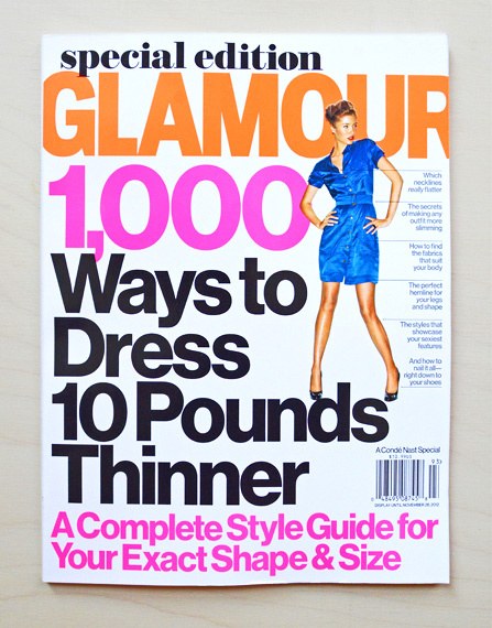
The US edition of Glamour recently redesigned, using Brunel and Neue Haas Grotesk. Art director Sarah Viñas headed up the redesign, with creative director Geraldine Hessler, commissioning two very thin, especially high-contrast weights of Brunel.
Eye magazine and the St Bride foundation are hosting an informal evening of graphic designers talking about their favorite objects from the vast collections at St Bride. The panel is made up of Sara De Bondt, Violetta Boxill, Simon Esterson, Alan Powers, Mark Thomson, and our own Paul Barnes.
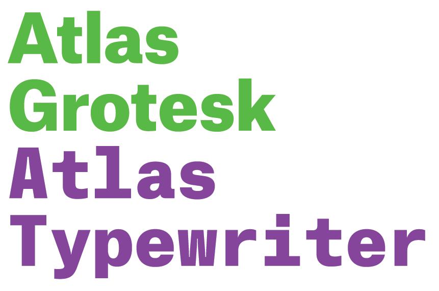
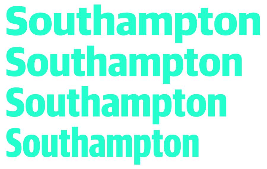
We're delighted to announce the release of a new pair of typefaces by Atelier Carvalho Bernau: Atlas Grotesk, an all-new sans serif family in six weights; and Atlas Typewriter, a companion monospaced family also in six weights.
Christian Schwartz will be delivering two lectures on type design for publications at MagNet 2012, an annual conference in Toronto held by Magazines Canada.
On Tuesday 29 May at 7pm, Paul Barnes will be signing copies of newly published Marian, une collection de revivals at the office of Ypsilon Éditeur.
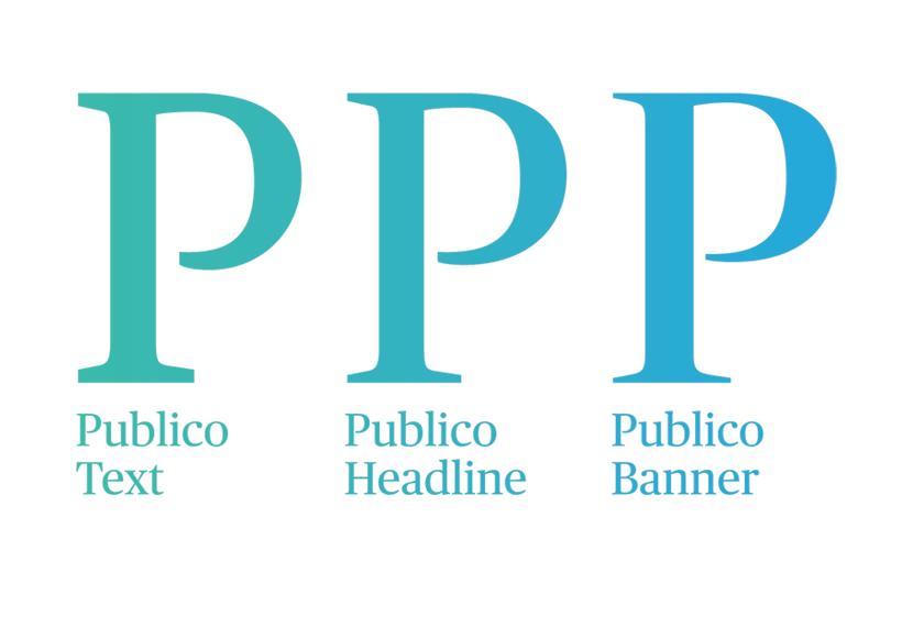
Publico Banner was initially designed to meet the needs of magazine designers who found that Publico Headline was not quite sharp enough for enormous display type. Publico Banner offered designers Paul Barnes and Christian Schwartz, assisted by type designer Ross Milne, an opportunity to indulge their love of high-contrast, large x-height, very tightly spaced late 1970s display type.
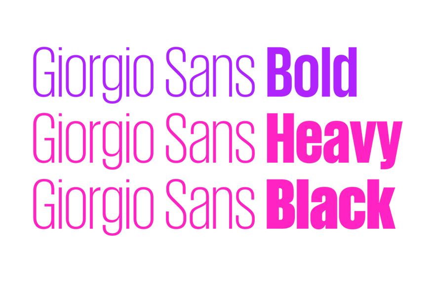
In the process of adding a heavier weight of Giorgio Sans for Mark Porter and Simon Esterson's refresh of Portuguese daily newspaper Público, we realized that we could go even heavier, eventually ending up with Heavy and Black weights.
Guardian Sans Headline has undergone a major expansion with the addition of three narrower widths: Narrow, Condensed, and X Condensed. Each is available in 9 weights with italics.
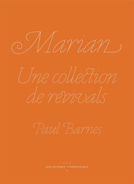
Marian is the subject of a new book from Ypsilon.éditeur in France. Written by Paul Barnes and translated into French by Sébastien Morlighem, this book is the first title in the publisher's new series, 1|1, in the "Bibliothèque typographique" collection. The book is 56 pages long, features Paul's essay in both English and French, is printed in 2 colors, and is profusely illustrated.
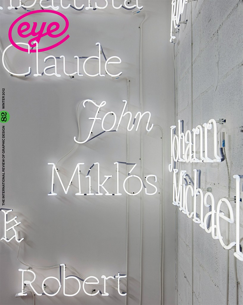
Editor in chief John Walters and creative director Simon Esterson sat down with Paul Barnes and Christian Schwartz in London in November for a wide-ranging interview to be published in Eye magazine issue 82, winter 2012.
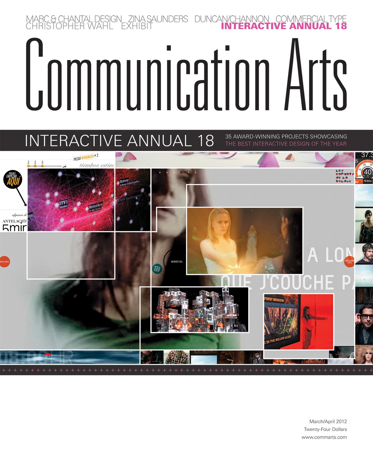
Angelynn Grant's interview with Commercial Type founders Paul Barnes and Christian Schwartz is featured in the March/April 2012 issue of Communication Arts magazine.
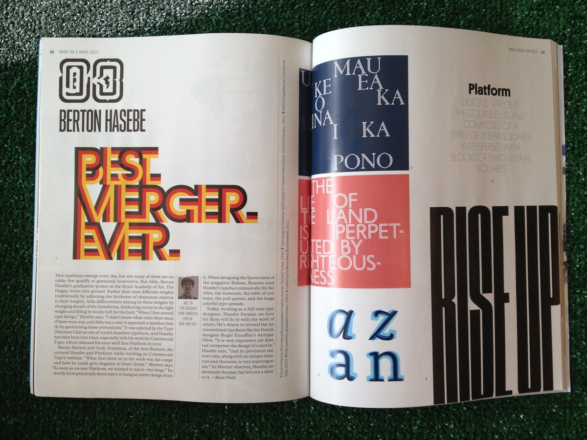
Berton Hasebe was chosen as one of Print's New Visual Artists this year, also known as the "20 Under 30".
Mark Porter and Simon Esterson have refreshed their 2007 redesign of Público with some additions to the type palette.
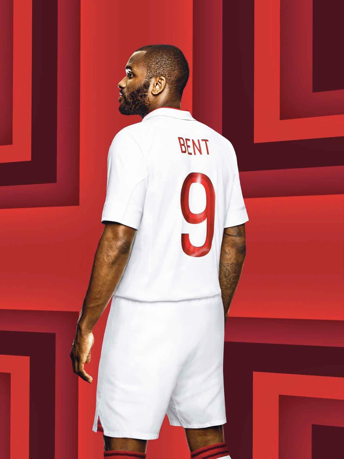
Commercial Type partner Paul Barnes has designed the distinctive 2-tone numbers and letters that appear on the new Umbro England football kit. They will be launched on 29 February 2012 when England take on the Netherlands at Wembley Stadium. They were designed with Umbro’s design team led by Robert Warner.
The Spring 2012 "Obsessed Issue" of glossy style magazine BULLETT uses an all-new type palette made up of upcoming and existing typefaces from Commercial Type, selected in collaboration with Nick Vogelson.
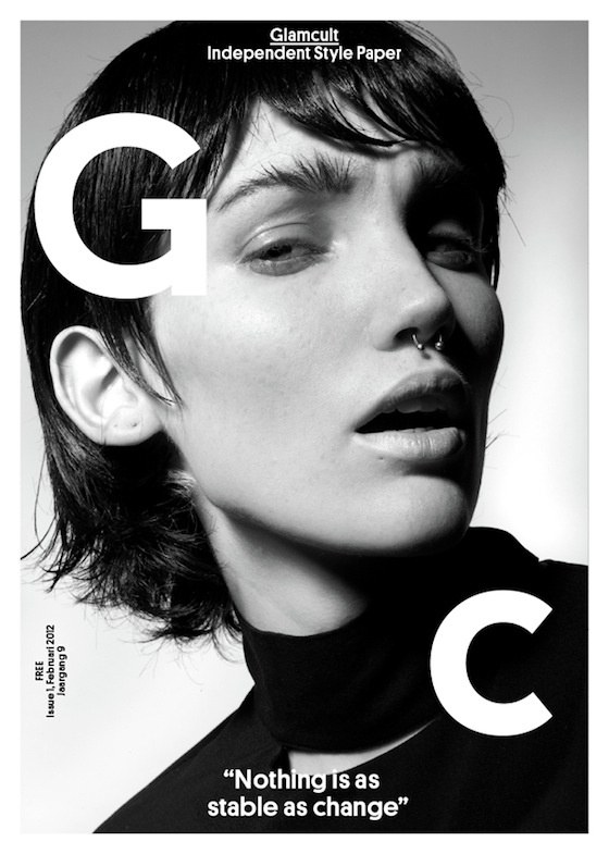
Platform is the main typeface for both headlines and text in the recent redesign of Glamcult, a large-format independent style paper based in the Netherlands. The February 2012 issue, where the redesign debuted, featured a short interview with Berton Hasebe.
We are offering a full-time position with benefits for someone to handle mastering and testing of fonts in both current and legacy formats, and to handle technical support. Ideal candidates will have an interest in and experience with webfont production and implementation.
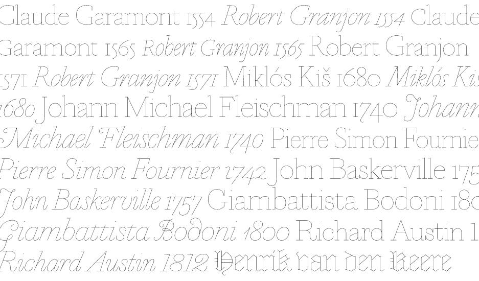
Commercial Type is pleased to announce the release of Marian, a new typeface family in 19 styles designed by Paul Barnes. Marian is a series of faithful revivals of some of the greats from the typographic canon: Austin, Baskerville, Bodoni, Fournier, Fleischman, Garamont, Granjon, Kis and van den Keere. The twist is that they have all been rendered as a hairline of near uniform weight, revealing the basic structure at the heart of the letterforms. Together they represent a concept: to recreate the past both for and in the present.