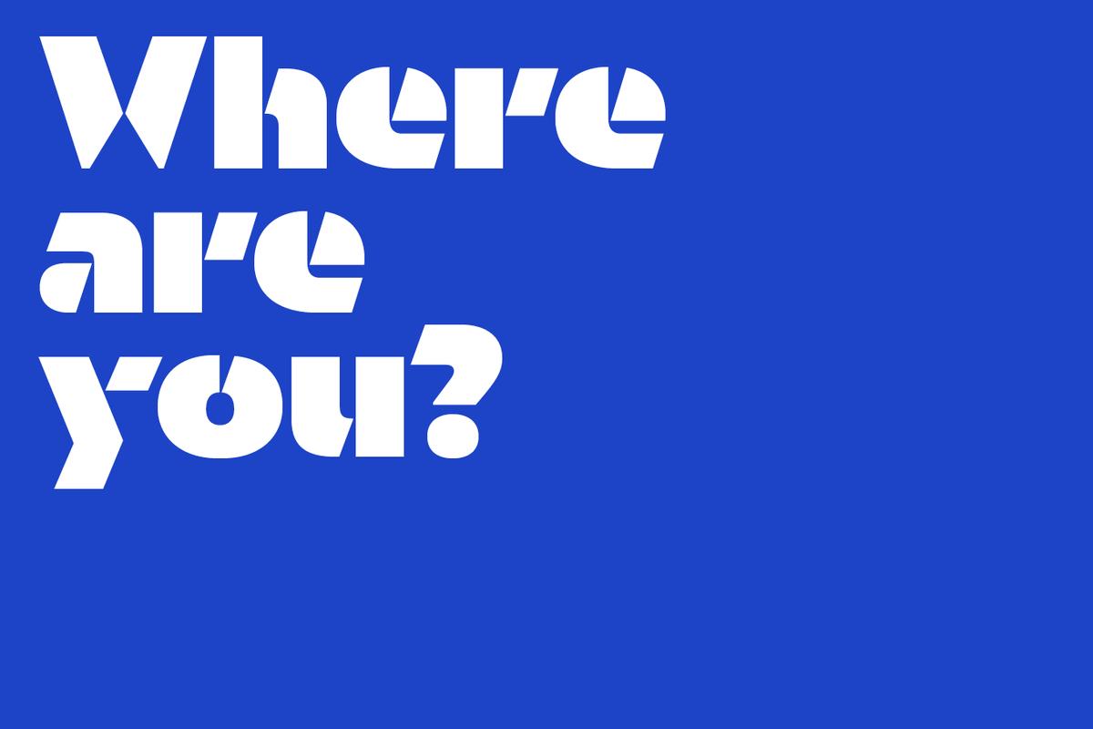
Orientation, a new stencil typeface designed by Sandrine Nugue, makes a striking impression from the first glimpse. Typefaces designed for print are often used for signage, but it is rare for a typeface to go in the other direction, from signage to print and screen. With Orientation, this is exactly how it began.
Paul will be speaking at “Typographic Voices: Empowerment”, the third installment of VOX POP London, a series of panels organized by the Hoffmitz Milken Center for Typography at ArtCenter College of Design, together with Mike Abbink, Dr. Nadine Chahine, and Ty Drake. The panelists will examine how typography influences the impact of news across all media.
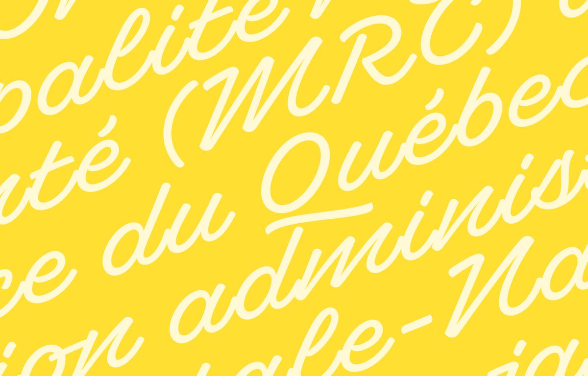
Ross Milne's script typeface Superette was inspired by non-connecting script lettering he observed on a small island in southern Quebec. With its striking angle and purposefully non-joining letterforms, Superette is a gleeful celebration of what is often considered “bad taste” and an exploration of letterforms typically seen outside the context of graphic design.
Miguel Reyes will be speaking and giving a workshop on casual brush lettering at the 8th edition of BITS, which will take place on the beach in Hua Hin instead of Bangkok this year.
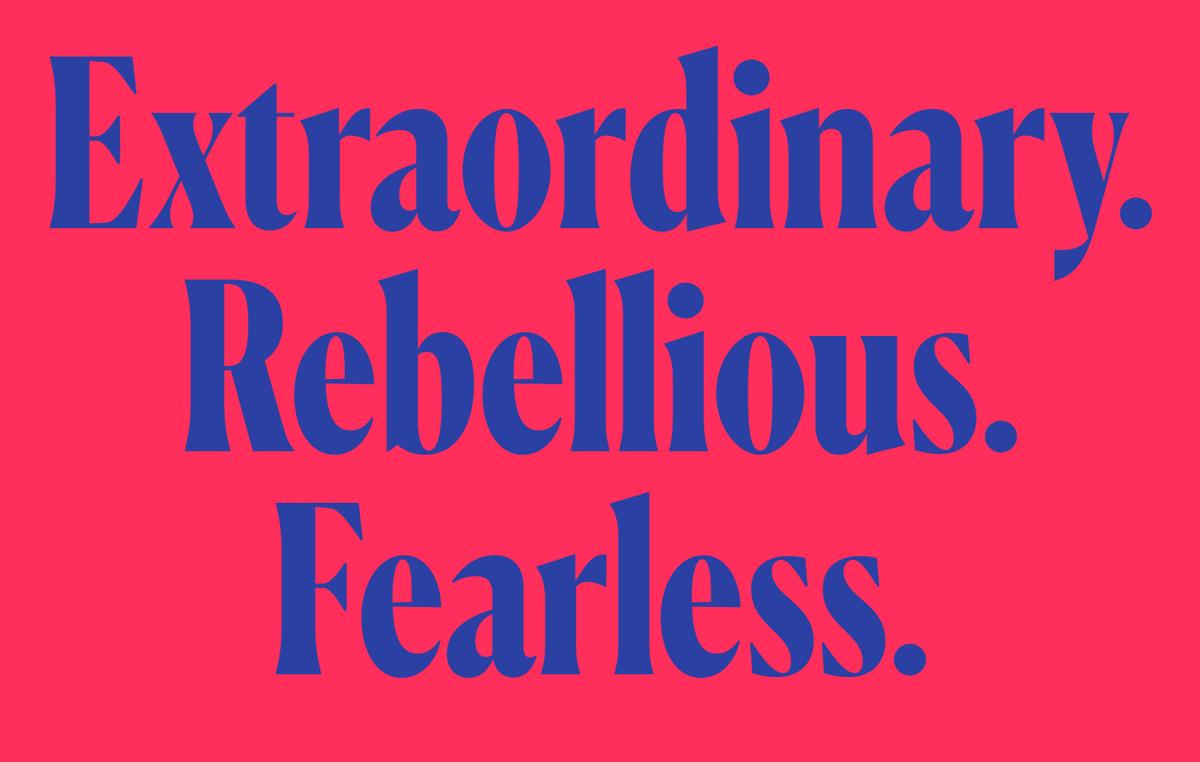
Miguel Reyes has further expanded his popular Canela collection with a condensed display family.
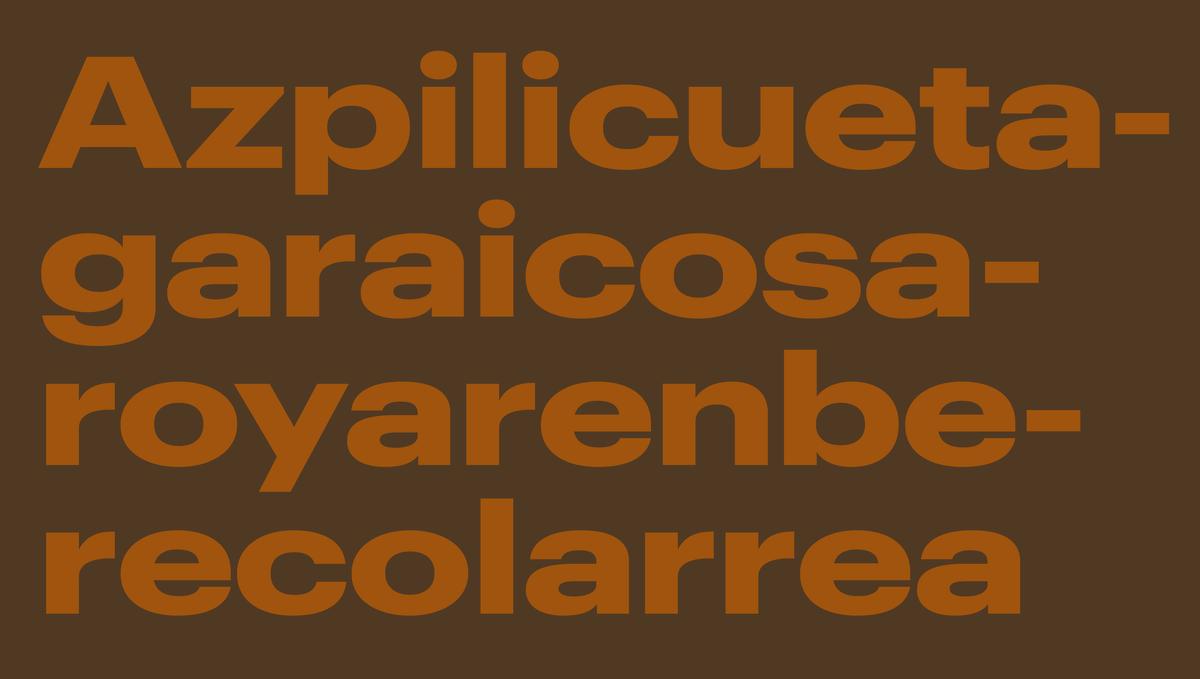
Graphik is an exceptionally complete system of sans serifs designed to be a blank slate, perfectly suited for any style of expression. With the release of Graphik Wide, the rational grid of eight widths from XXXX Condensed to Wide, and nine weights with italics, is now complete.
Together with T creative director Patrick Li, Berton Hasebe and Christian Schwartz will chat about the typefaces created for the two most recent incarnations of the magazine. They will share the development of three specific typeface families and discuss typography's intrinsic role in enabling unique editorial voices.
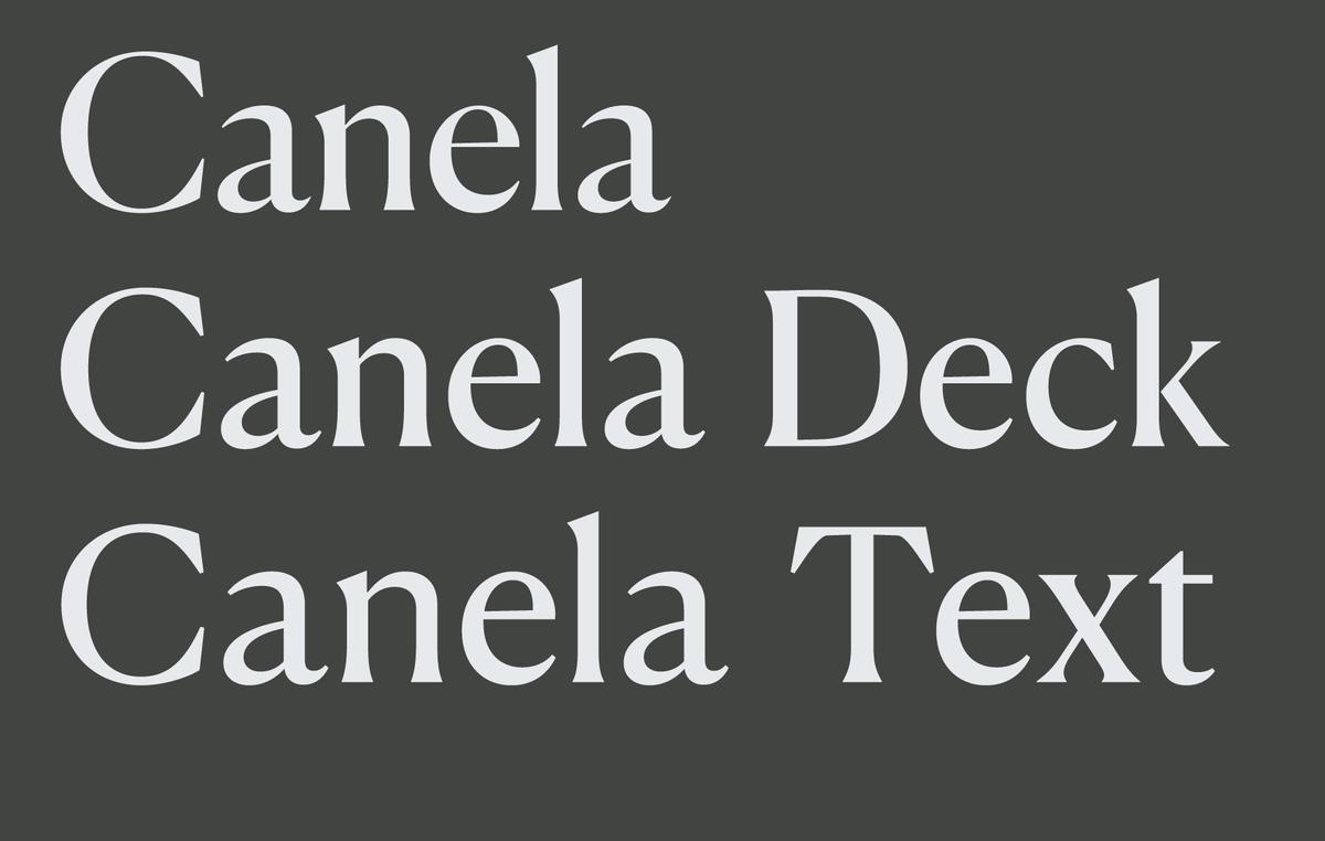
To expand Canela’s range of usable sizes, Miguel Reyes has drawn two additional optical sizes: Canela Deck and Canela Text. Both families are designed to keep the elegance and beauty of the original display face while giving it the robustness it needs to work at smaller sizes.
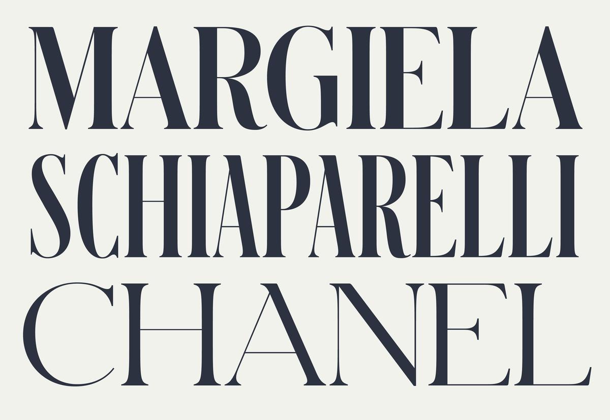
Schnyder was designed by Berton Hasebe and Christian Schwartz for the 2013 top-to-bottom redesign of T, the New York Times Style Magazine by creative director Patrick Li and his team. With three weights, four widths, and four optical sizes, Schnyder is a complete system for making beautiful, offbeat, and distinctive headline treatments.
On April 21, 2018, Fontstand is organising a packed day of presentations and discussions in the Croatian capital of Zagreb. Paul Barnes will be speaking alongside Ilya Ruderman, Quentin Schmerber, Laura Meseguer, Catherine Dixon, and many other world-class type designers and typographers from around the world, discussing the creation and use of type in the 21st century. (The tickets are sold out)
Christian Schwartz will be speaking on a panel about custom type design together with Mike Abbink of IBM, Boyoung Lee of Sephora, Matteo Bologna of Mucca Design, and Leland Maschmeyer of Chobani at Type Drives Culture, a one-day conference organized by the New York Type Directors Club.
Christian Schwartz has assisted in organizing an afternoon of talks on type in news design at SND/NYC, featuring Tobias Frere-Jones, Francesco Franchi and Angelo Rinaldi of La Repubblica, Yara Khoury, and Peter Rentz & Derrick Schultz of the New York Times. This series of short talks and conversations will explore the macro and micro issues of typography in news.
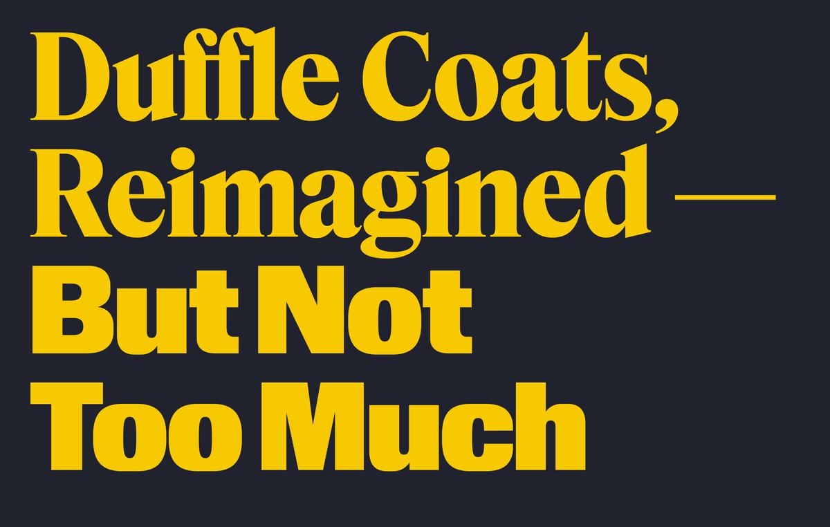
Hanya Yanagihara is now editor in chief of T, the New York Times Style Magazine, leading creative director Patrick Li and his staff to reimagine the look of the magazine from front to back, once again enlisting Berton Hasebe and Christian Schwartz to create custom typefaces for the redesign: Kippenberger, an all-purpose sans; and Fact, a compact and utilitarian serif.
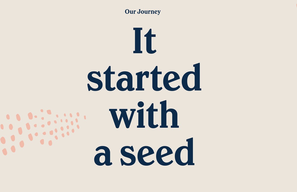
Founded in 2005 and first appearing on shelves in 2007, Greek yogurt maker Chobani rebranded and introduced all new packaging at the end of 2017. The rebrand was carried out by the company's internal design team; two key elements of the new identity are the new logotype, drawn by Berton Hasebe, and a new typeface drawn by Berton in collaboration with Christian Schwartz.