Gabriello by Paul Barnes and Miguel Reyes
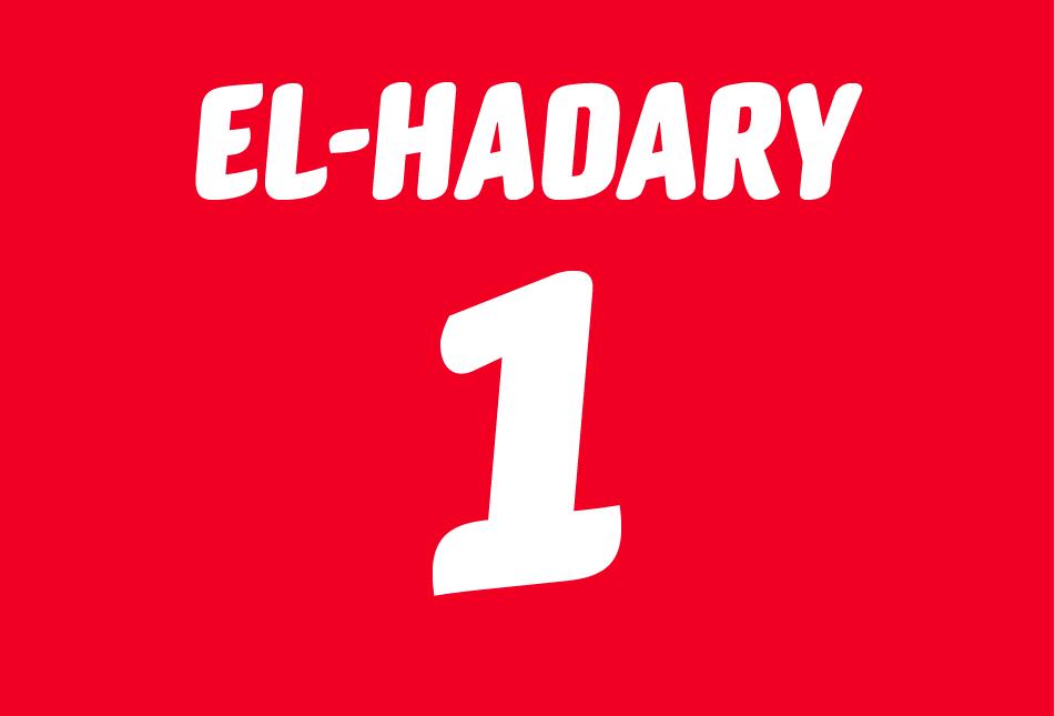
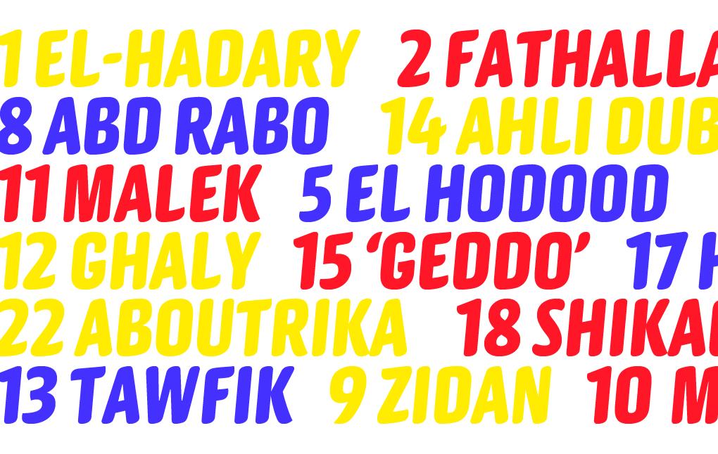
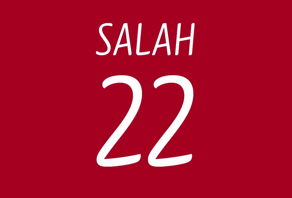
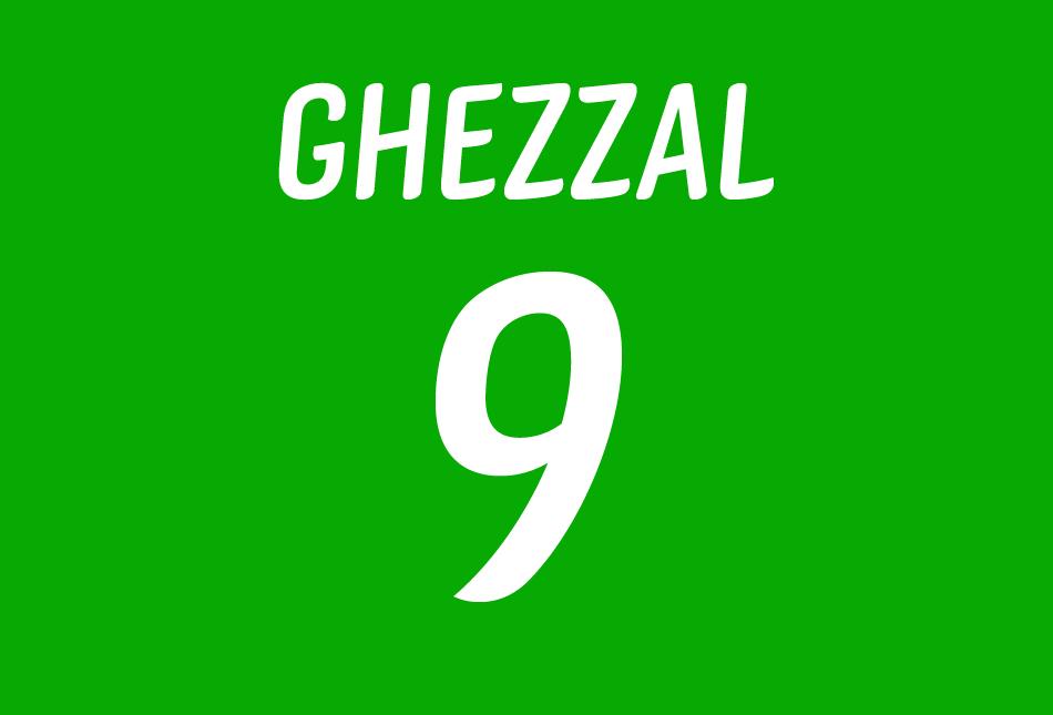
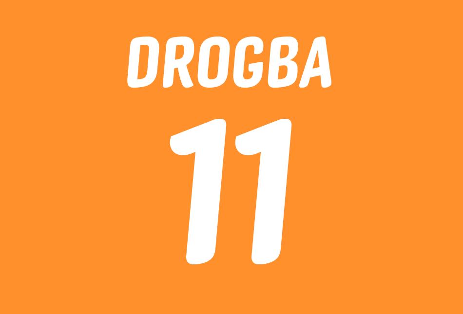
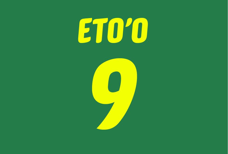
Inspired by brush lettering, Gabriello was commissioned by Puma. First used by their sponsored teams at the 2010 Africa Cup of Nations, including winners Egypt, and was later used at that year’s World Cup, held in South Africa. It was used on the kits worn by Algeria, Cameroon, Côte d’Ivoire, and Ghana, who reached the quarterfinal. Gabriello has also been used by Puma for various other sports, including athletics.
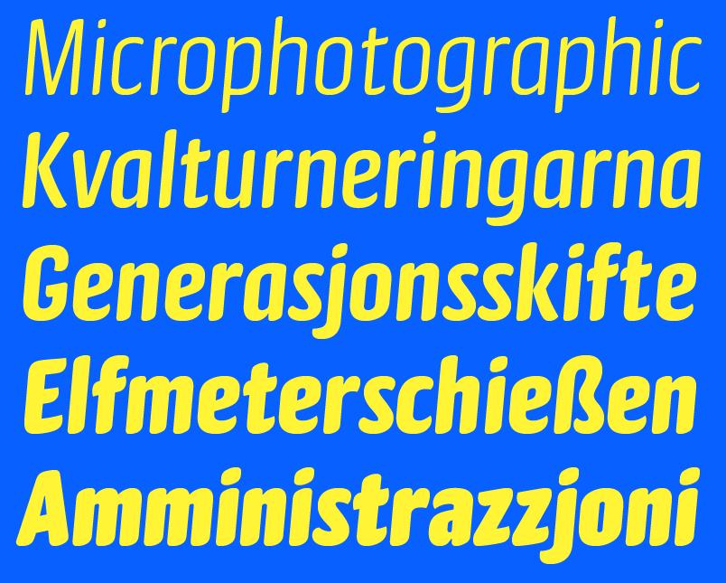
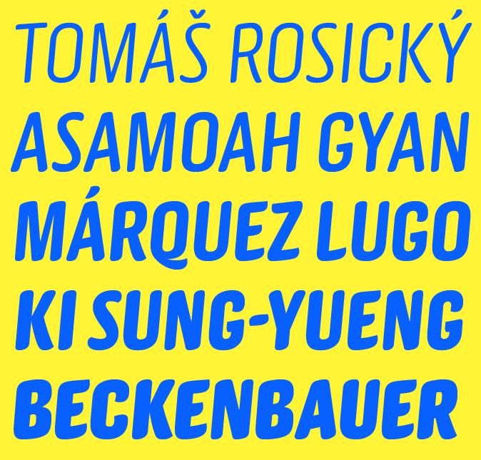
Paul Barnes originally designed Gabriello in a single Bold weight, balancing the need for a distinct aesthetic with the strict regulations on size and stroke thickness put forth by FIFA and UEFA, while also accommodating how the shirts are produced: numbers and names are ironed on, often right before game time, and the letters can’t overlap without melting and ruining the shirt. Far more organic than the typical straight-sided octic athletic letters, Gabriello is slanted on two axes, both horizontally and vertically, giving the energy of a script without causing and production issues with the shirts. Miguel Reyes added three lighter weights and one heavier weight, giving the family a casual flexibility for display uses far beyond apparel, in the vein of such classic display faces as Balloon and Dom Casual.
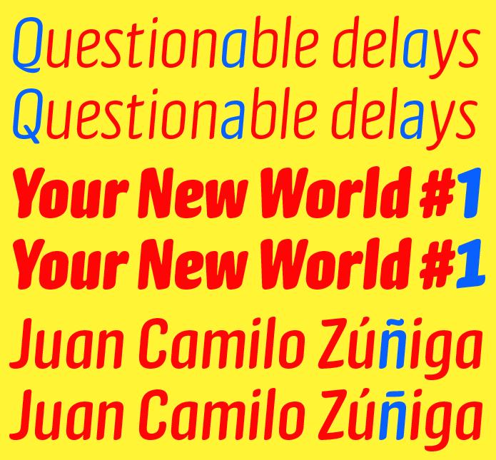
A handful of alternates give additional flexibility to the family: while the casual single-story a is authentic to the brush-lettered roots of the family, the double-story form gives a more readable option for smaller sizes; The 1 with a foot serif works better as a standalone form; and the flat alternate tilde form also evokes the brush lettering of Spanish-speaking countries and Estonia.
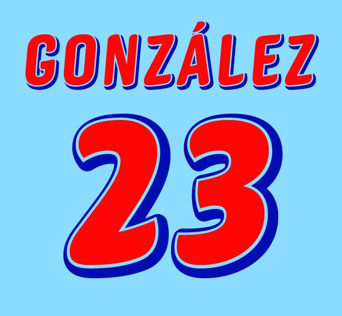
Gabriello adapts particularly well to multi-layered shadow and outline treatments. By copying the text, giving it a slight offset, and adding a round-cornered stroke, visually complex shaded treatments can be made very quickly, through just a few simple steps.
