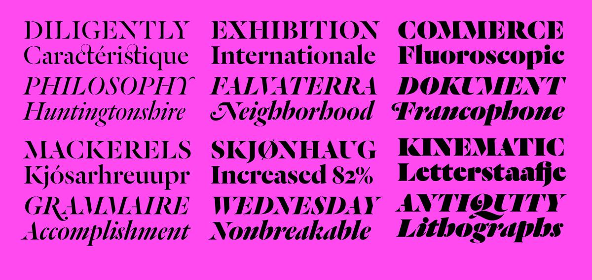
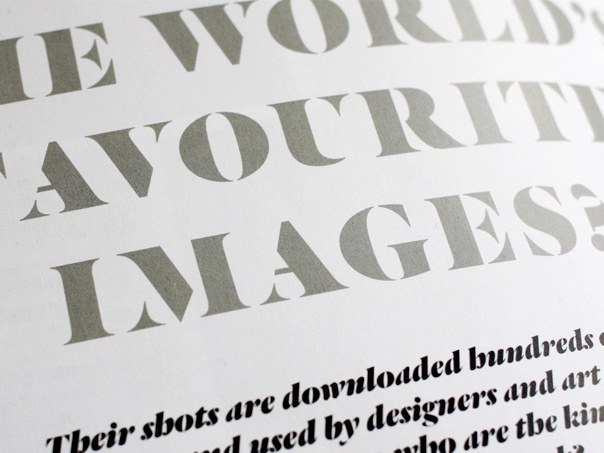
Today we announce our final release of 2010, Dala Floda, designed by Paul Barnes. Originally inspired by worn gravestone lettering and lettering on shipping crates, this typeface has its roots in the typefaces of the Renaissance but adds the twist of being a stencil letterform.
Christian Schwartz will be delivering the lecture "How Can You Change a Modern Classic?: The Story Behind the Guardian's Typefaces" to the students at the Type@Cooper program at Cooper Union.
Christian Schwartz will be speaking and giving a workshop at BITS MMX (Bangkok International Typographic Symposium 2010), the first ever typographic conference in Bangkok, Thailand.
Paul Barnes will be speaking at the EDO's October event, a Type Night also featuring UK Esquire creative director David McKendrick and Kuchar Swara of Swara & co.
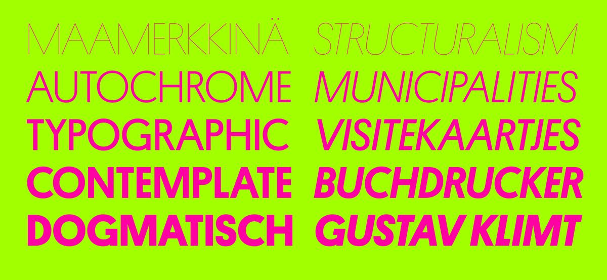
Today we are delighted to announce the release of Platform, the first published typeface by our staff type designer Berton Hasebe. This family is an exploration of how the geometric sans serif – one of the most well-trod genres of 20th century type design – might be approached in a contemporary context. Rather than aiming for perfection, Platform instead plays with the inherent crudeness in letters that have been reduced to their simplest essence.
Caponi was designed by Paul Barnes and Christian Schwartz for a subtle tweak of Entertainment Weekly on the occasion of the magazine's 20th anniversary. Commissioned by (and named for) design director Amid Capeci, Caponi is based very loosely on some of Giambattista Bodoni's earliest types.
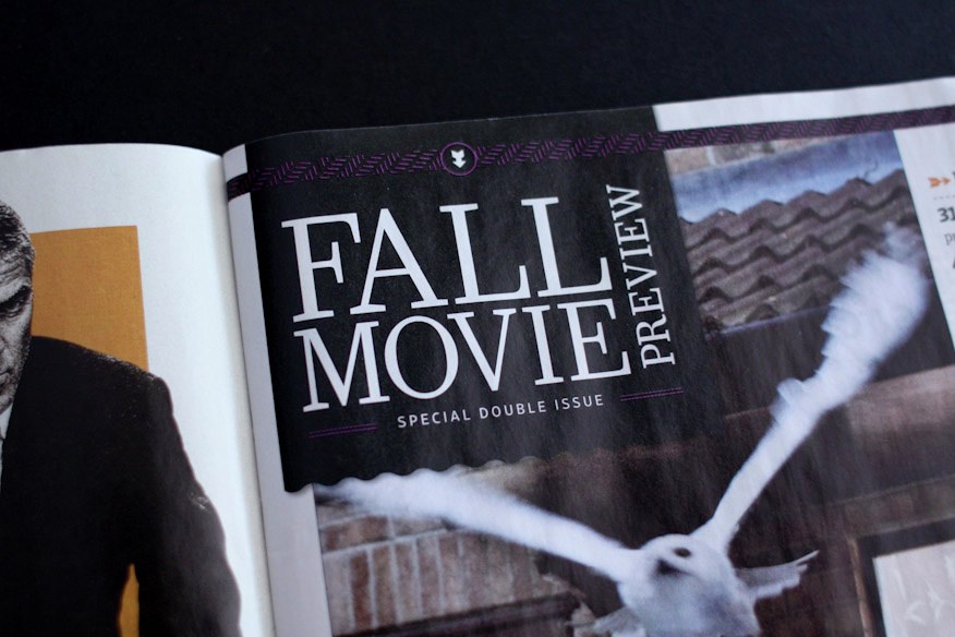
Pialat is the latest display face designed by Commercial Type for T: The New York Times Style Magazine. Senior Art Director Chris Martinez was very taken with lettering in the titles for À nos amours, a 1983 film by French director Maurice Pialat, and asked us to use these forms as the starting point for a new typeface. Berton Hasebe drew the face in two variations: one with conventional hairlines; and an Open version, where the thin parts of the letters all appear to have worn away.
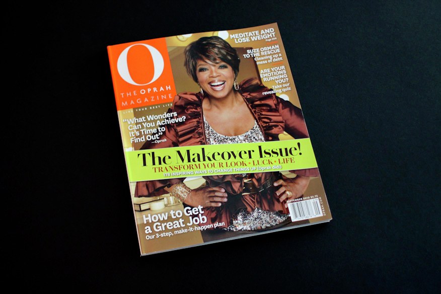
The September 2010 issue of O, The Oprah Magazine debuted with an all new look thanks to publication design specialists Robert Priest and Grace Lee of Priest + Grace, with whom we first worked on Condé Nast Portfolio. Commercial Type partner Paul Barnes created Wyatt, a serif headine typeface in five weights, specially for the redesign.
Commercial Type are pleased to announce the release of Lyon Display, a new serif display typeface in 5 weights, designed by Kai Bernau as a headline companion for his Lyon Text family.
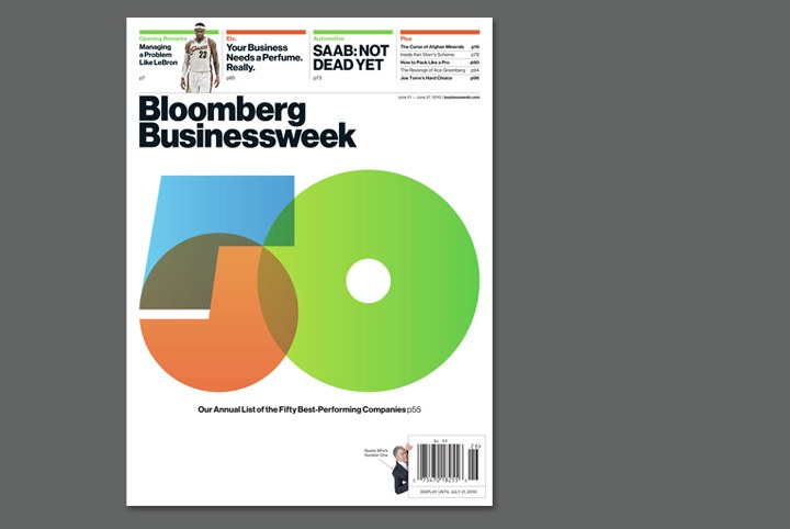
BusinessWeek relaunched as Bloomberg Businessweek with their latest issue. New creative director Richard Turley asked us to revisit our painstakingly faithful digital revival of Max Miedinger's original Neue Haas Grotesk, which was commissioned but ultimately not used by the Guardian in 2004.
The Empire State Building lobby restoration was honored at the 20th Annual Lucy G. Moses Preservation Awards, held by The New York Landmarks Conservancy on 21 April 2010. Two Twelve Associates commissioned a set of two typefaces from Commercial Type for signage in the lobby and office floors and on the exterior, and we are proud to have been part of the restoration effort.
Paul Barnes and Lyon’s designer Kai Bernau (with partner in Atelier Carvalho Bernau, Susana Carvalho) will be speaking at the International Typographic Conference in Amiens, which is taking place between 19-21 April. Both will be appearing on the morning of Monday the 19th.
Popular UK design magazine Creative Review unveiled a new look with April's issue, which is just now hitting newsstands. The cover features a new logotype drawn by Commercial Type partner Paul Barnes based on his upcoming release Dala Floda, which is also used for display typography throughout the magazine, along with Kai Bernau's Lyon Display and Lyon Text.
Christian Schwartz will be teaching a 2-day workshop in Jeffrey Keedy's "Digital Type Design" class at California Institute of the Arts, and will also give an evening presentation on a few recent projects.
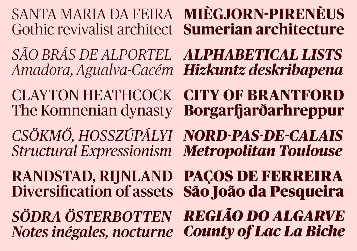
Commercial Type has released Publico, a serif typeface for publications with variations for use at Headline and Text sizes. Designed by Paul Barnes and Christian Schwartz, assisted by Kai Bernau and Ross Milne, this family now includes small caps and olstyle figures, expanding its usefulness beyond news.
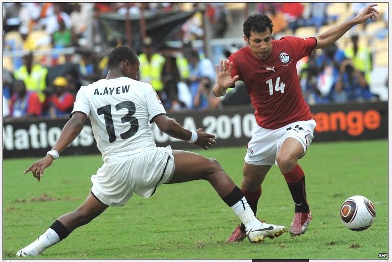
Paul Barnes created lettering and numbers for all teams outfitted by Puma in the 2010 Africa Cup of Nations. Egypt have retained the cup, beating Ghana 1-0, and both teams were wearing kits designed by Puma.
A short article on Commercial Type was featured in the February 2010 issue of UK design magazine Creative Review.
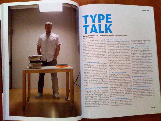
An interview with Christian Schwartz appears in the January 2010 issue of Wallpaper* magazine's Thailand edition. Interviews with Schwartz will also appear in upcoming issues of Thai design magazines art4D and Computer Arts.
Commercial Type's first release of 2010 is an expansion of the Austin family. Light and Ultra weights, drawn by Berton Hasebe for Alex Grossman's new design of WSJ magazine, extend the original into dramatic new territory, and are available now. At the same time, a magazine in Russia commissioned Cyrillic support for the original family, giving us an opportunity to work with Ilya Ruderman in Moscow. These are also available now, and include localized alternates for Bulgarian and Serbian.