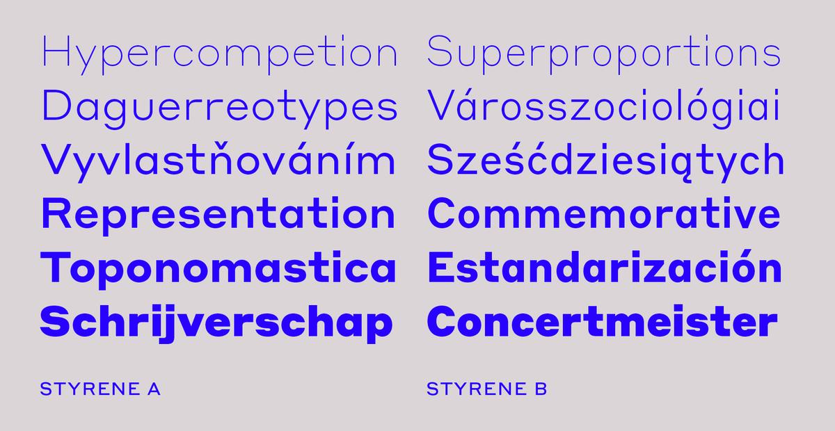
Styrene, a new sans serif by Berton Hasebe, is his latest exploration of proportion and simplicity in type design. The family's two widths offer different textures: version A is dogmatically geometric, with a strong personality, while version B is narrow though not truly condensed.
Christian will be speaking at an evening of lectures and a roundtable discussion in Seoul, together with type designers Noël Leu from Grilli Type and Yongje Lee from Hiut Type School.
Miguel will be in tour in South America in November, giving workshops and lectures in Colombia, Peru, and Argentina. He will also speak at the Biennial de Tipos Latinos in Santiago de Chile.
Greg Gazdowicz, Miguel Reyes, and Christian Schwartz will be speaking as part of the series of design talks at Paperless Post. They will speak on collaboration and how they each found their way into type design.
Miguel will be giving a lecture entitiled “Tipografía para Revistas Contemporáneas” (Type design for contemporary publications) on the first day of Tipografía México, a 2-day conference at CENTRO in Mexico City.
Miguel will be teaching a workshop on supermarket-style and casual brush lettering at the Spanish Cultural Center in Mexico City.
Robinson is the first release by Commercial Type designer Greg Gazdowicz. Inspired by calligraphic sans serifs from the first half of the 20th century, Gazdowicz aimed to make a contemporary sans that used the hallmarks of broad-nib construction to add visual interest without being explicitly calligraphic. The result is a crisp, refreshing sans with a lively personality.
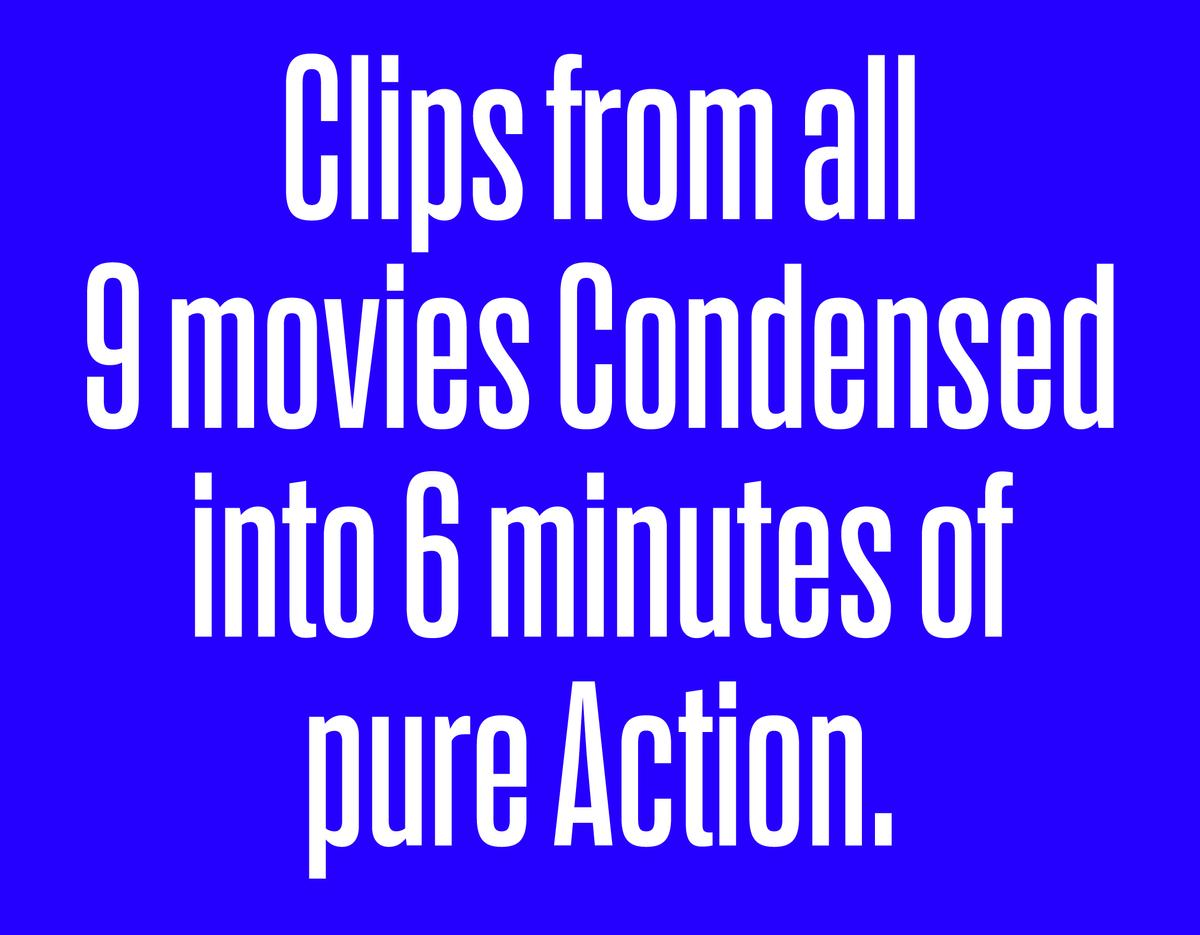
Earlier this year we released Erik van Blokland’s Action Condensed. 8 months later, we’re surprised to see that it is primarily being used in print so far. To help get inspiration flowing, we asked our friends at Project Projects to create an interface showing Action Condensed doing what it does best. See the result at action.commercialtype.com
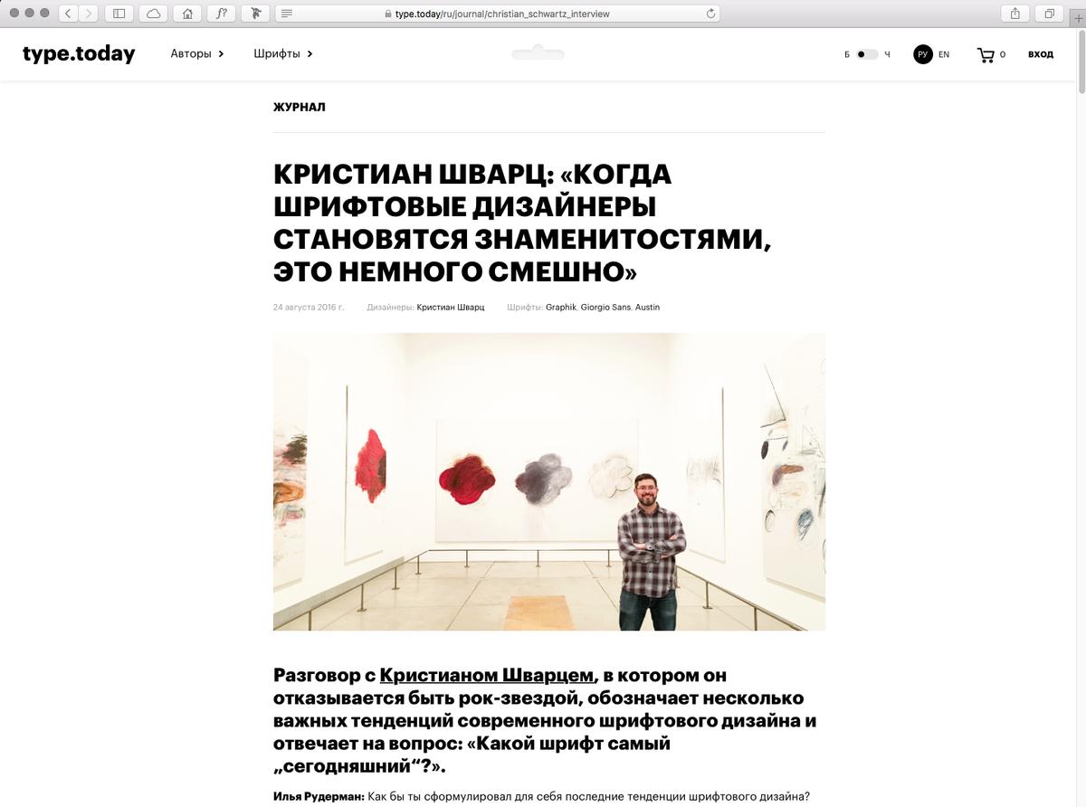
Ilya Ruderman of type.today did an extensive interview with Christian about contemporary ideas in type design, how to relate to type history, and so-called celebrity status. Link inside,
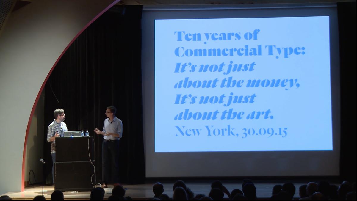
The New York date of our tour last fall was recorded and has been posted online. The talk was originally presented by AIGA/NY on 30 September 2015 at the Parsons auditorium. Many thanks to them for making the video available. Link inside.
Le Jeune, originally designed by Commercial Type partners Paul Barnes and Christian Schwartz for Vanity Fair in 2013, is a modern adapation of the French Modern idiom. Named for the Parisian typefounder and punchcutter Joseph Mole Le Jeune, Le Jeune blends the precision of French neo-classical types with a contemporary x-height and ball terminal shapes from the Anglo-American tradition.
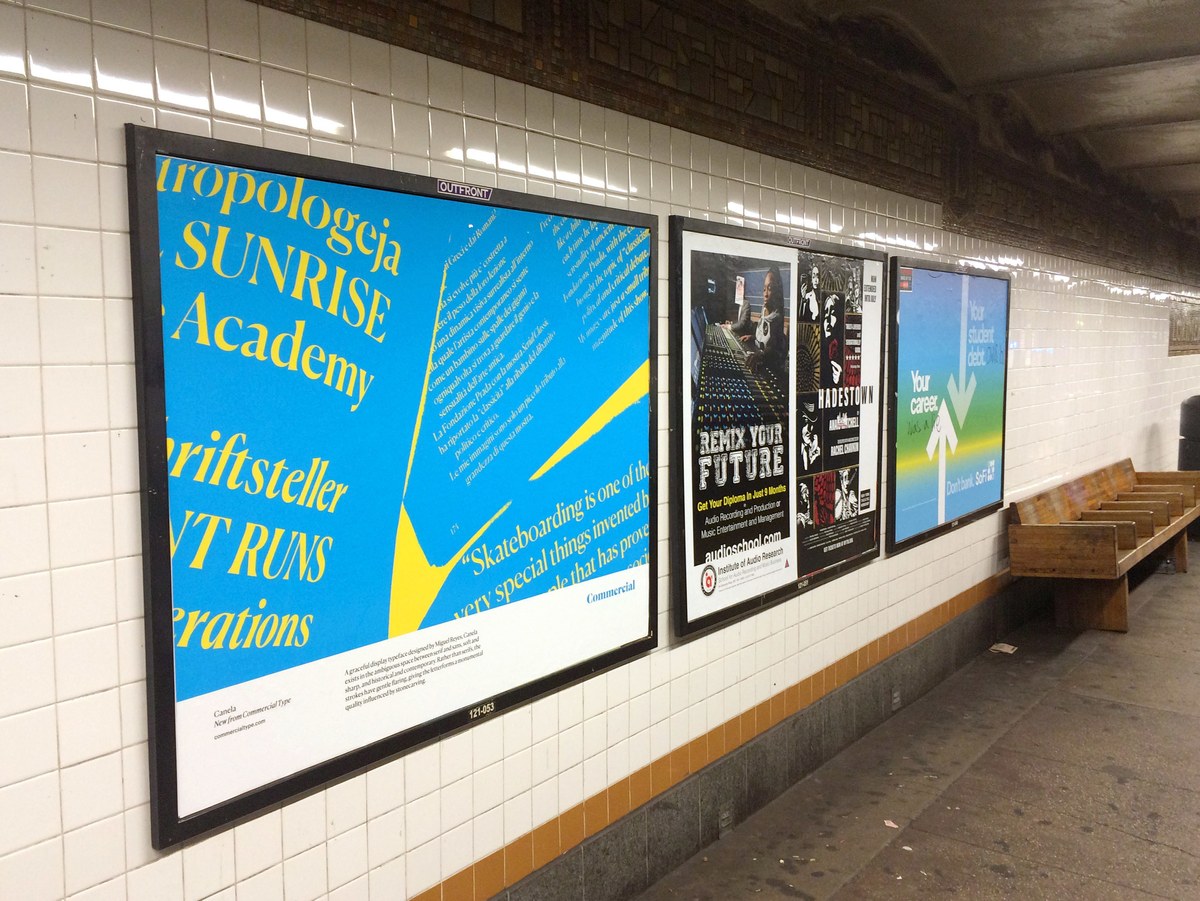
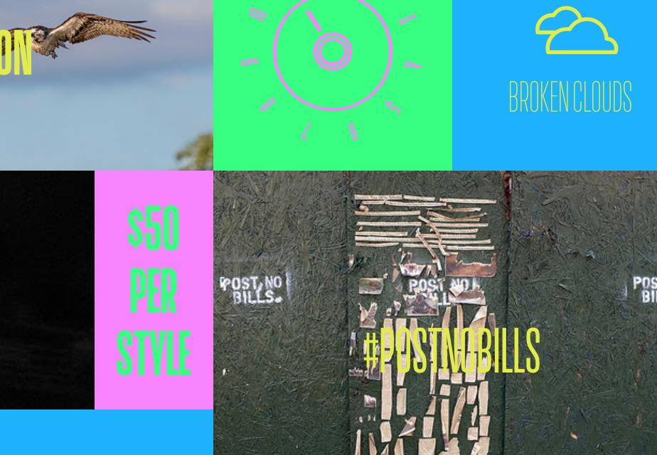
We're running ads in three subway stations on the L train in Brooklyn for the month of June: Lorimer Street, Graham Avenue, and Grand Street. The ads were designed by Project Projects and the colors are even brighter in person.
Austin News is a collection of four closely related typefaces for headlines and text in both print and screen use. Adapted from the successful Austin families, originally designed for magazines, Austin News has compact ascenders and descenders for tight leading: classic news proportions.
Creative director Darhil Crooks has commissioned a new display sans for The Atlantic. Drawn by Christian Schwartz, this typeface helps to give a new personality to the feature well.
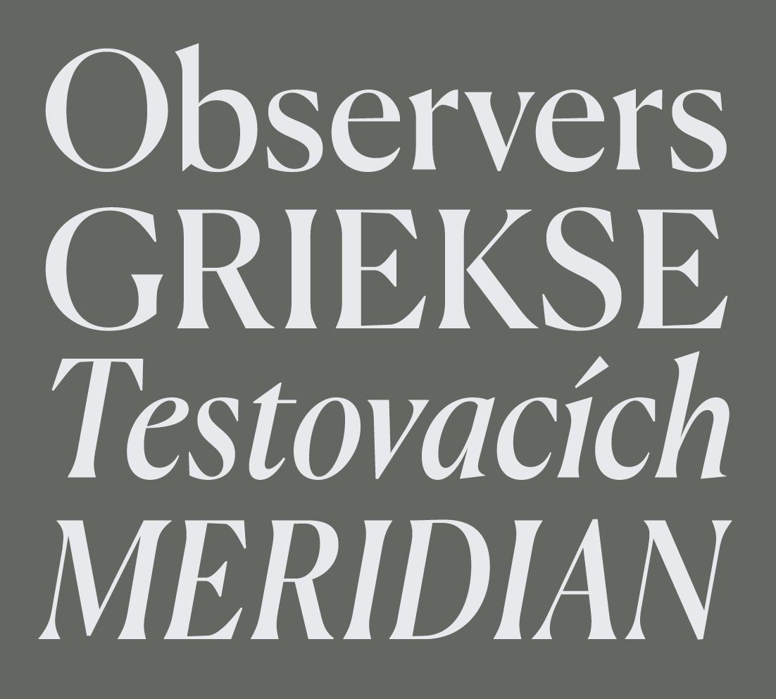
Canela, designed by Miguel Reyes, is a new typeface that defies easy categorization. Neither serif nor strictly sans, not overtly historical but drawing clear influence from Caslon Old Face, and somewhat soft in its finish while crisp in its contrast, Canela is obvious only in its grace and beauty.
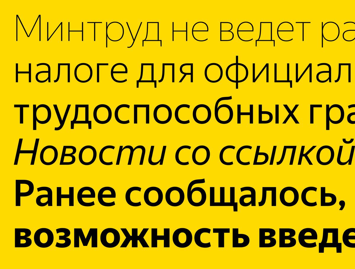
Yandex Sans, designed by Miguel Reyes and Moscow-based type designer Ilya Ruderman and art directed by Christian Schwartz, is a new corporate typeface for Yandex, the largest search engine in Russia.
Christian will be speaking at the California Institute of the Arts in Valencia, CA.
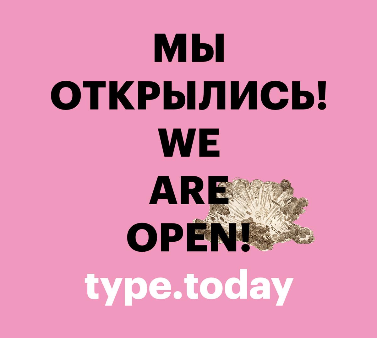
Our friends Ilya Ruderman and Yury Ostromentsky of CSTM Fonts have launched a new type distributor called type.today. Based in Moscow, this new company specializes in Cyrillic typefaces, and will distribute all of the typefaces from our library that Ilya has added Cyrillic support to.
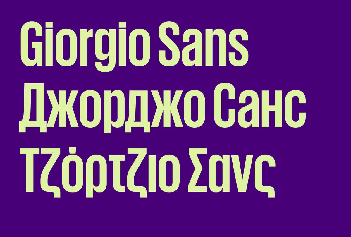
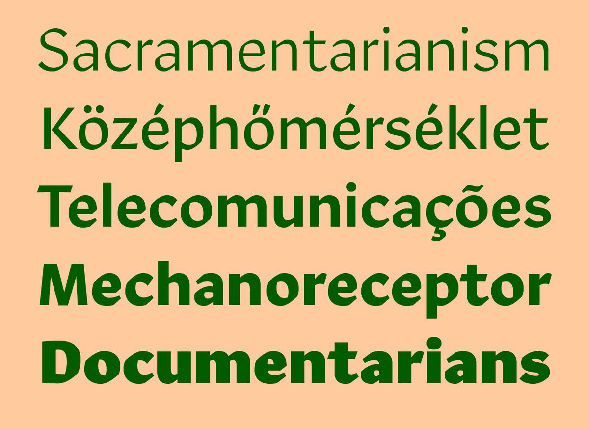
Giorgio Sans now supports Greek and a number of languages that use the Cyrilic alphabet, including Russian, Ukrainian, Belorussian, Bulgarian, Serbian, and Kazakh. The Cyrillic was drawn by Ilya Ruderman, and the Greek was drawn by Panos Haratzopoulos.
Christian will be giving a talk entitiled "Type as voice, type as culture" in Mexico City at Centro de diseño, cine y televisión. He will also spend the week with the students in the postgraduate type design program, following up on Miguel's time with them last fall.
Our neighborhood in New York is full of construction sites, so we made some stencils to see how Tanja would work in a more utilitarian setting.
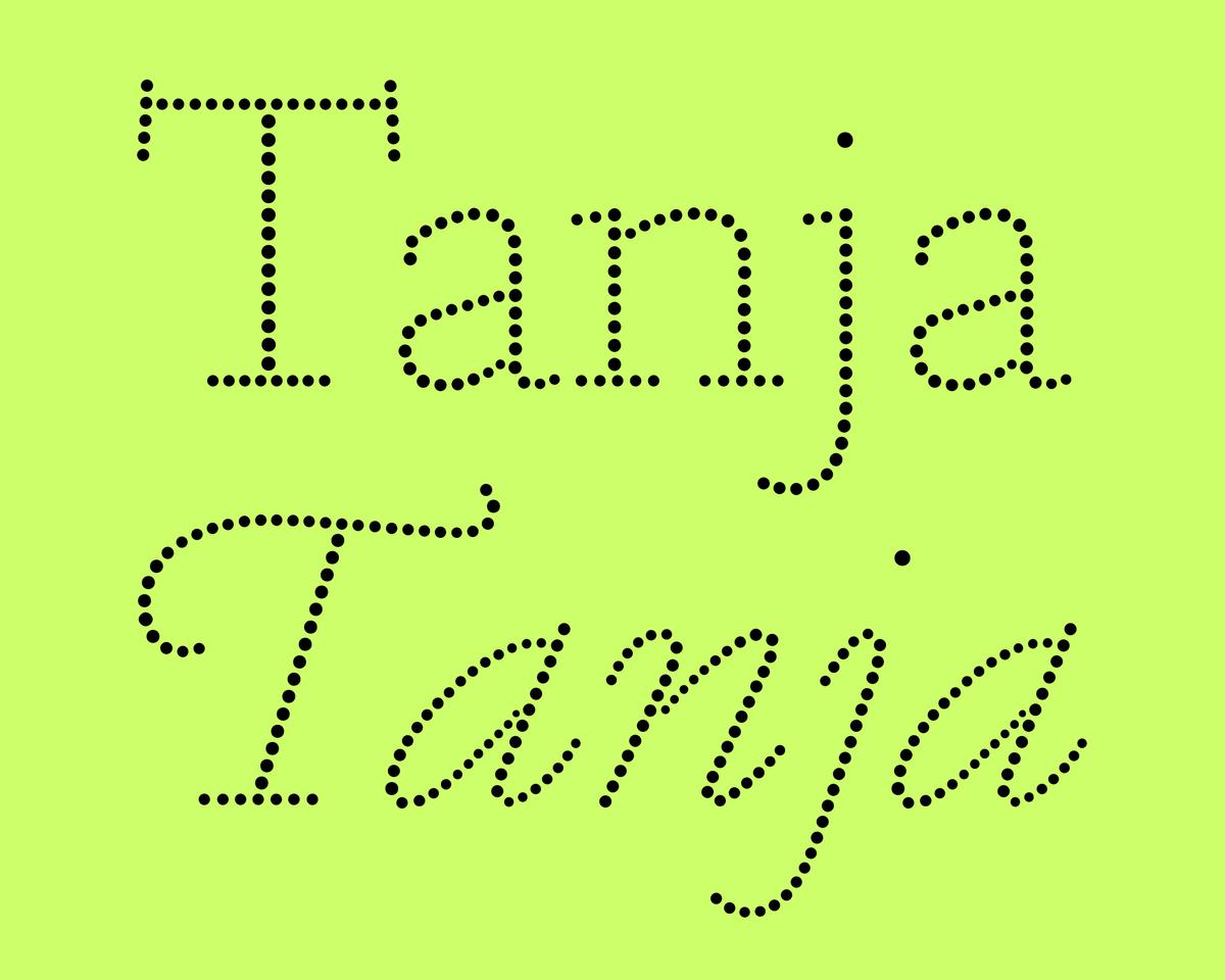
Typefaces made from circles are an intriguing proposition for graphic designers. Many are created for technical reasons, such as for dot matrix printers, or for large screens at sports events. Usually these are simple sans serif forms, but Tanja is something unique; a Renaissance dot typeface.
Christian will be speaking in Montréal on Friday 11 March, at an event hosted by Concordia University.
Paul will MC Eye’s next Type Tuesday, a quarterly series of informal events about typography, graphic design and visual culture. For this occasion, they will celebrate St Bride itself, and its amazing archive.
Algebra is a broad-shouldered slab serif typeface built on superelliptical forms, designed by Susana Carvalho and Kai Bernau. Its loose spacing gives a remarkably comfortable texture in text, and its crisp detailing gives a distinctive and serious feeling at display sizes. Algebra balances strength with elegance.
Paul will appear in conversation with author Coralie Bickford-Smith in celebration of Reading 2016 Year of Culture. The event will be MCed by Eric Kindel.
Commercial Type’s second release of 2016 is Marr Sans Condensed, an expansion of Marr Sans. Designed by young Croatian designer Hrvoje Živčić, it’s a welcome addition to the original developed by Paul Barnes and Dave Foster in 2014.
Action Condensed was designed for the screen by Dutch type design legend Erik van Blokland, who was looking for typefaces for interface design without an overtly neutral personality. Each of the family’s four weights has three grades on the same width, allowing text to change weight on rollover without disrupting the layout.