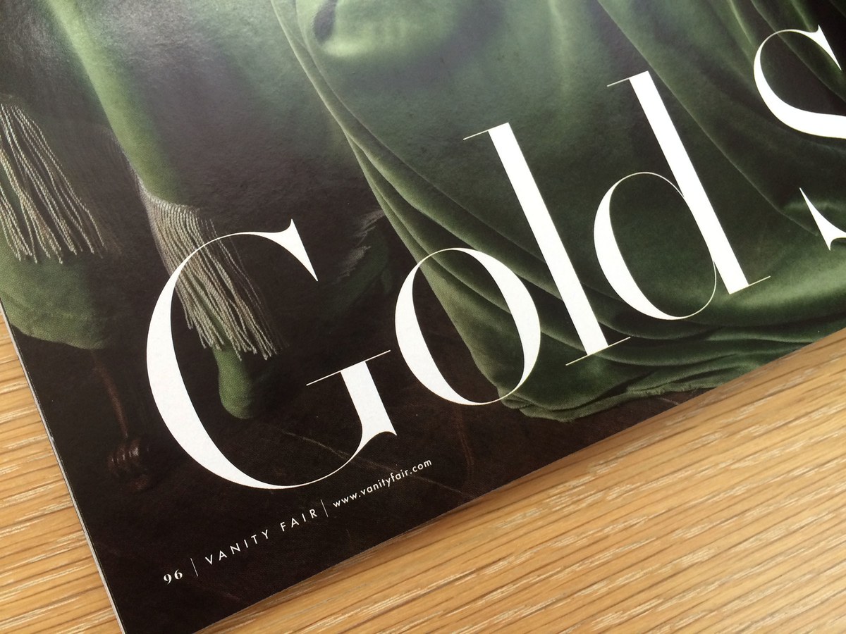
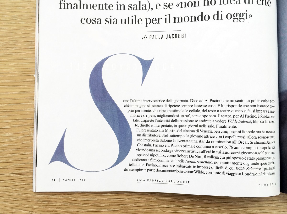
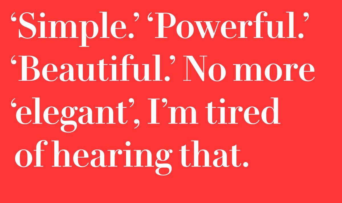
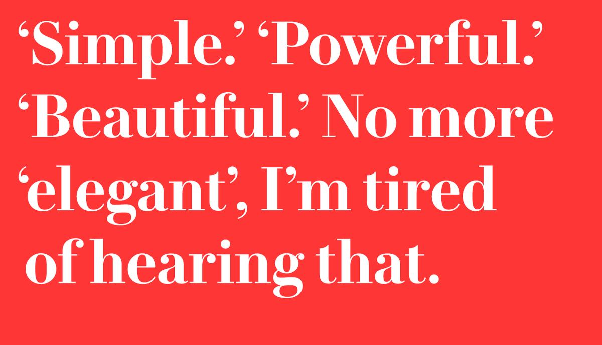
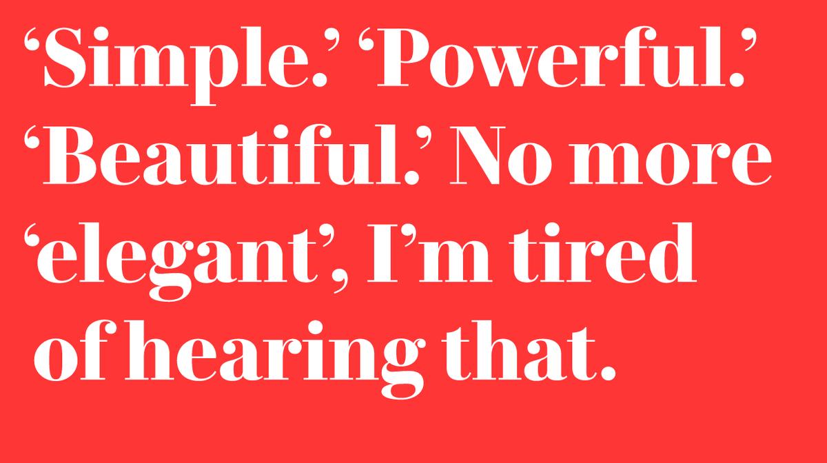
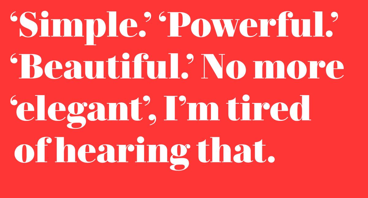
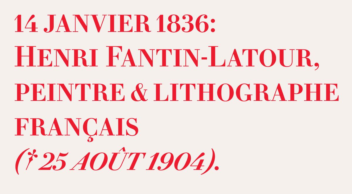
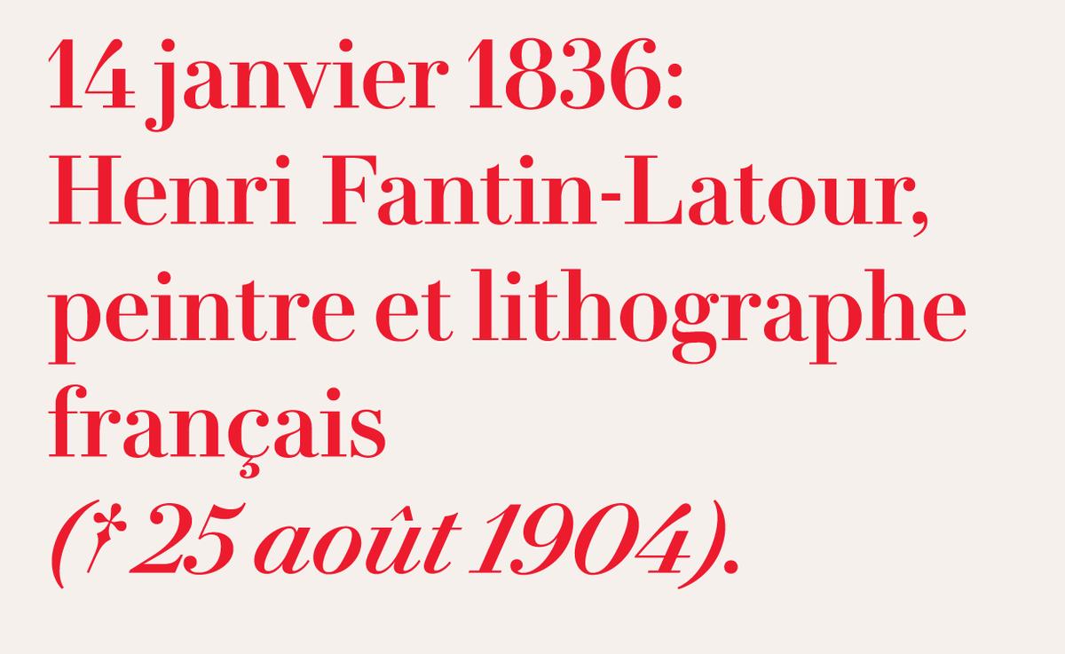
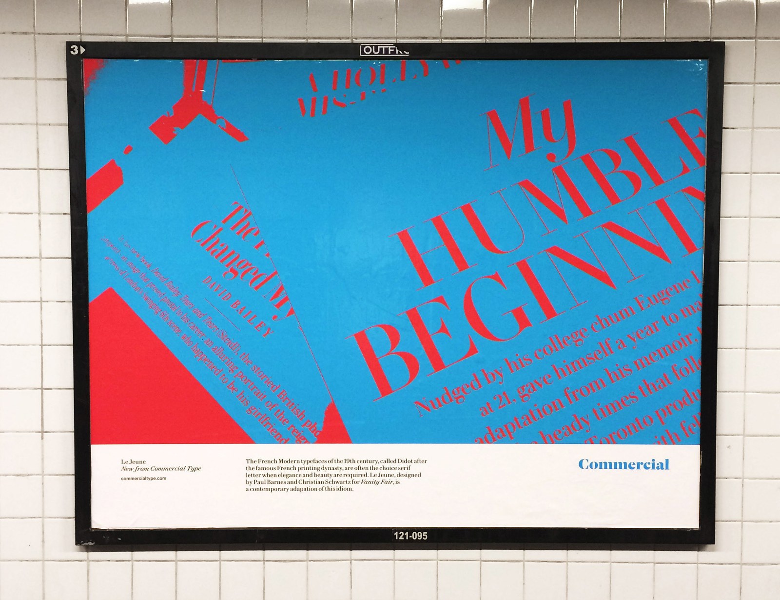
Le Jeune by Paul Barnes & Christian Schwartz
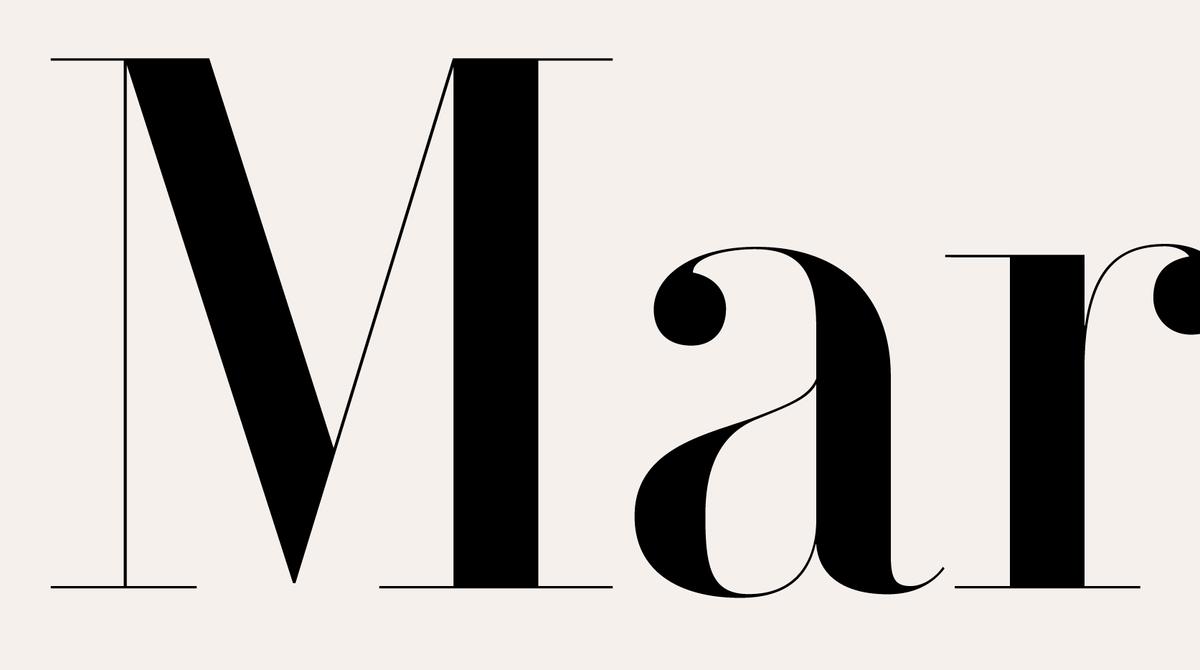
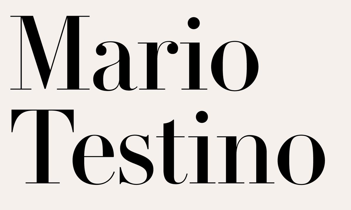

The French Modern of the nineteenth century, often named Didot after the famous French printing dynasty who popularized the style, is often the choice serif letter to communicate elegance and sophistication. Le Jeune, originally designed by Commercial Type partners Paul Barnes and Christian Schwartz for Vanity Fair in 2013, is a modern adapation of the idiom in four optical sizes. Named for the Parisian typefounder and punchcutter Joseph Molé Le Jeune, a contemporary of the Didot family, Le Jeune blends the precision of French neo-classical types with a more contemporary enlarged x-height and ball terminal shapes from the Anglo-American tradition. Where the French Moderns typically feature soft teardrop forms, Le Jeune features sharp, round ball terminals more typical of both the nineteenth century in Britain, and the later interpretations of these types for Photo-Lettering, Inc. and its contemporaries in the US in the middle of the twentieth century.

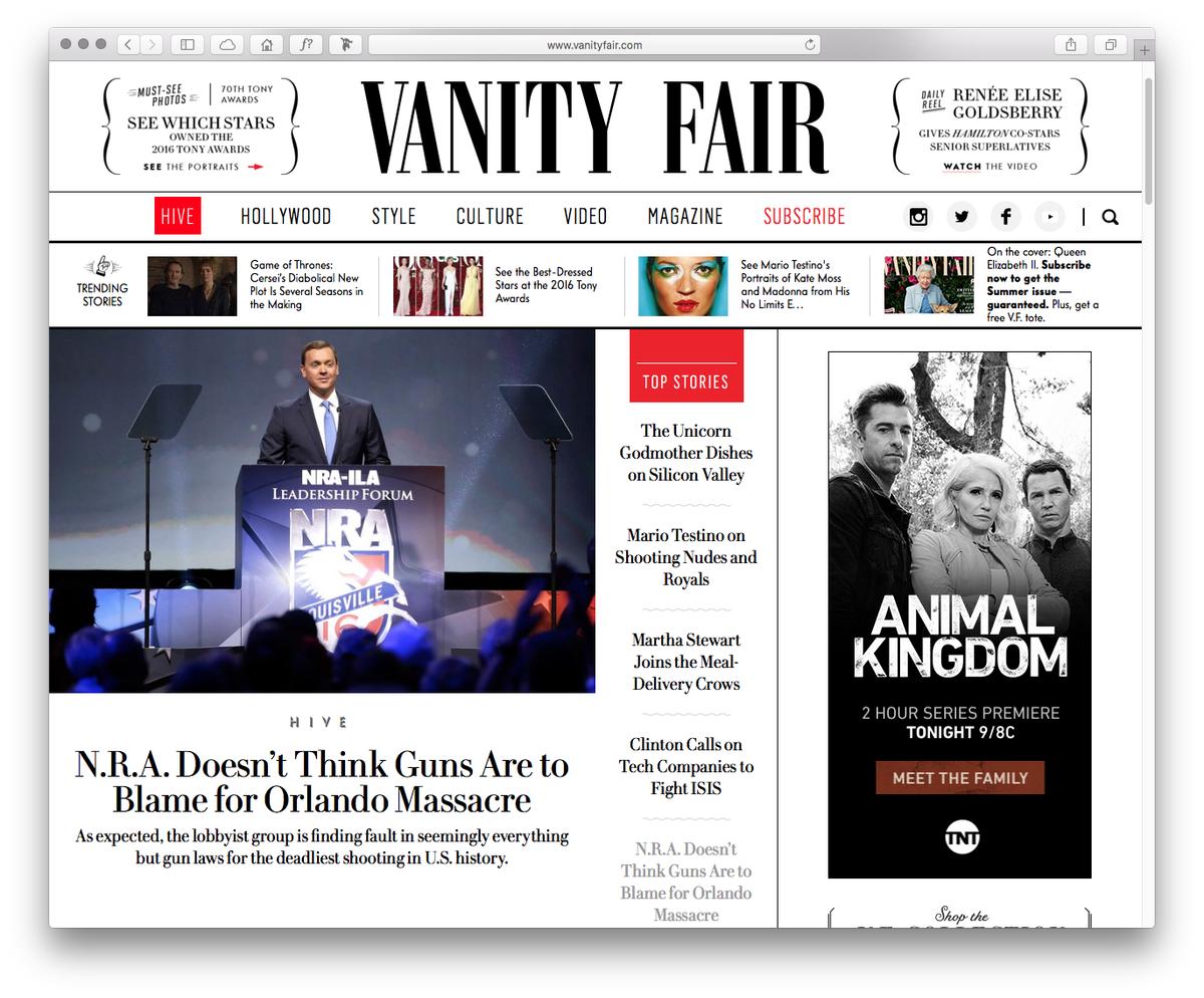
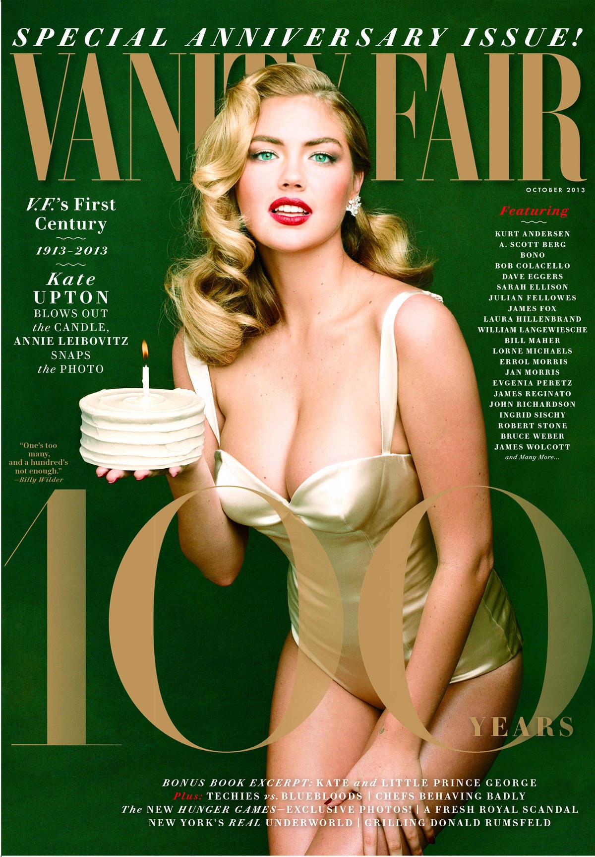
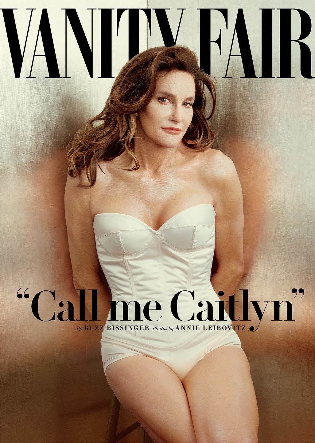
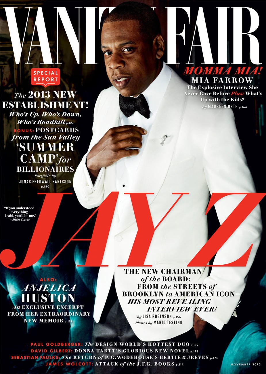
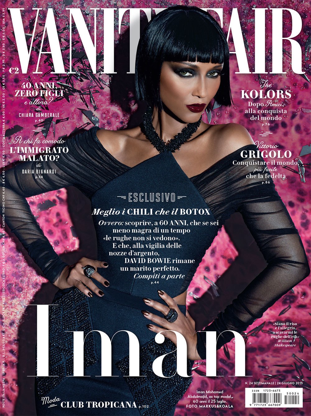
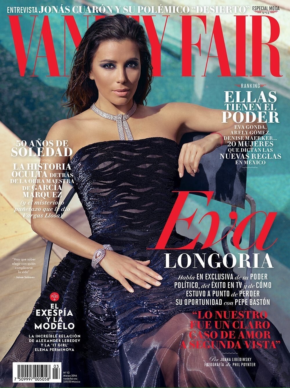
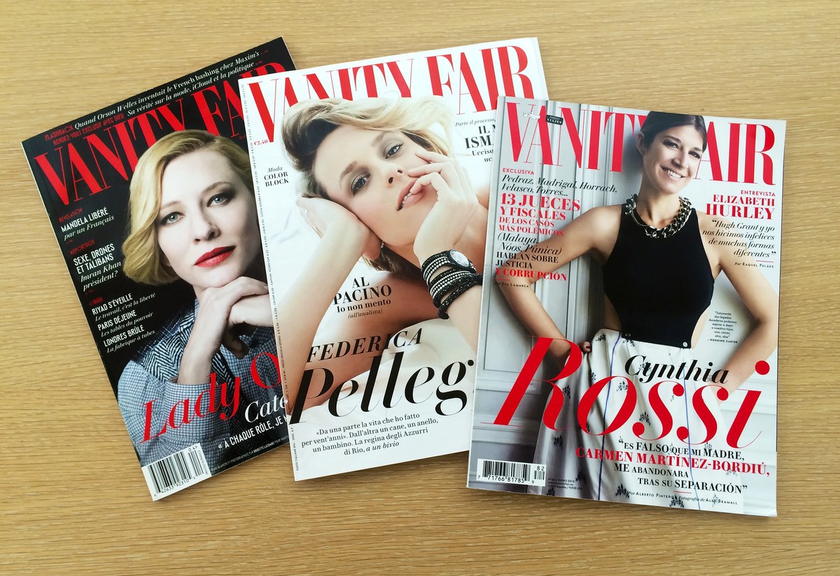
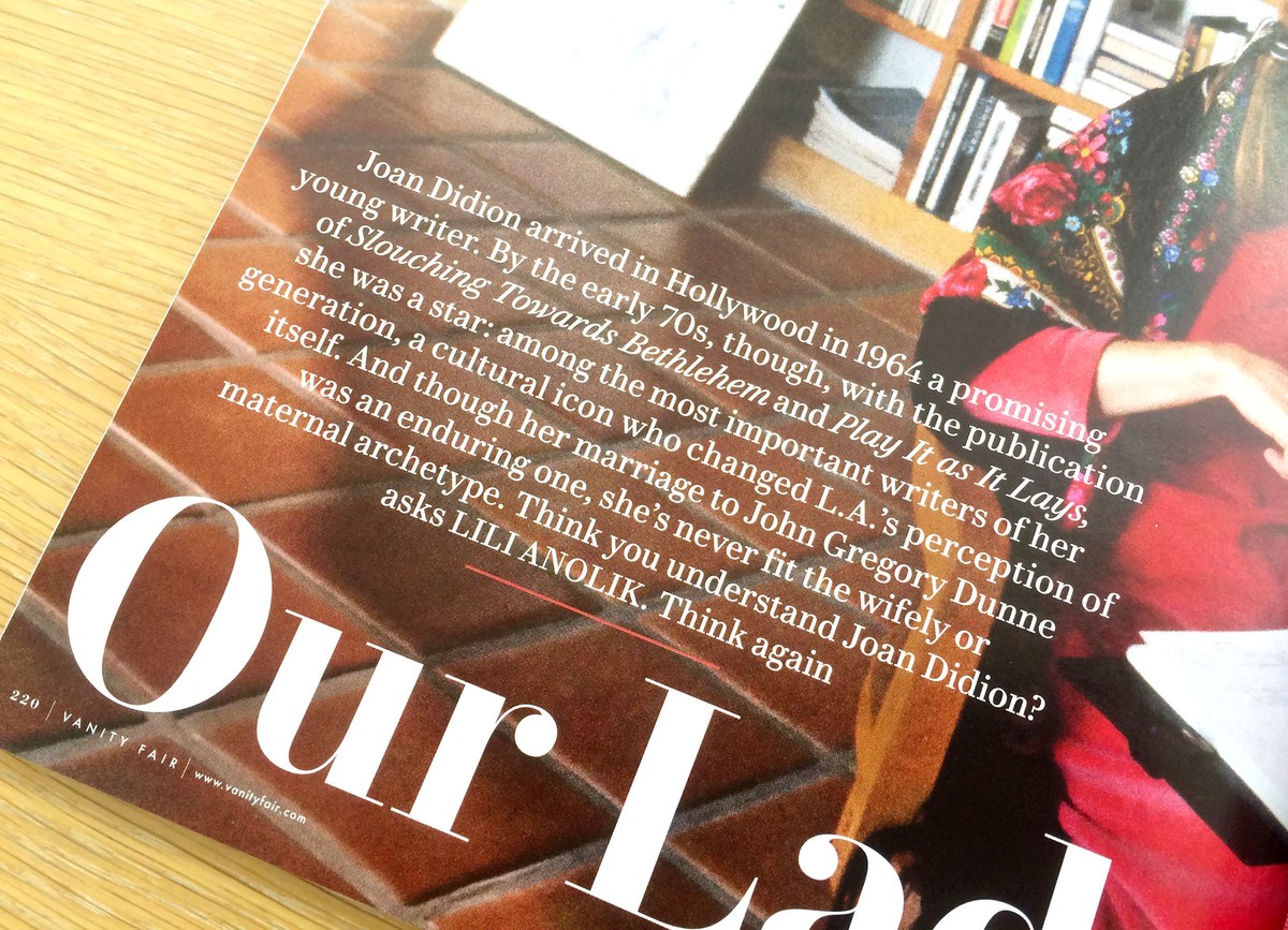
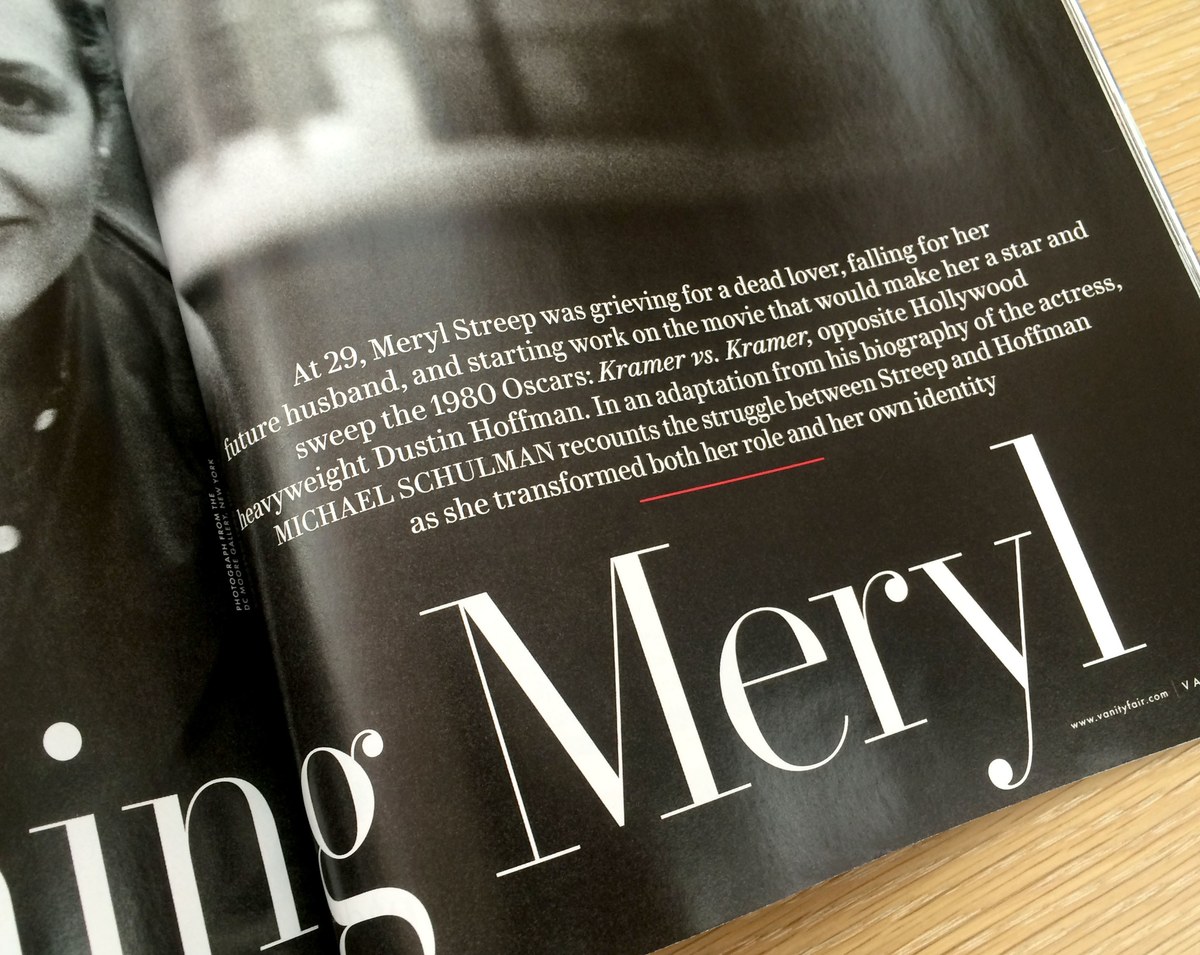
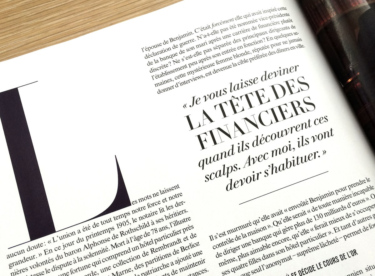
After arriving at Vanity Fair in late 2011, new design director Chris Dixon took his time in gradually refreshing the look of the magazine. Rather than undertaking a major redesign and launching it with all the splash that entailed, he retained the visual identity of the magazine while steadily improving the sections and navigation and refining the established aesthetic. Part of this evolution was commissioning a new display typeface to replace the various Didots the magazine had long been using: an earlier incarnation of Le Jeune, originally called VF Didot, debuted in the August and September 2013 issues, just in time for the magazine’s 100th anniversary.
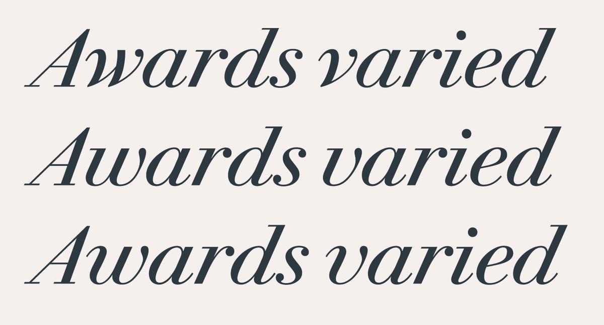
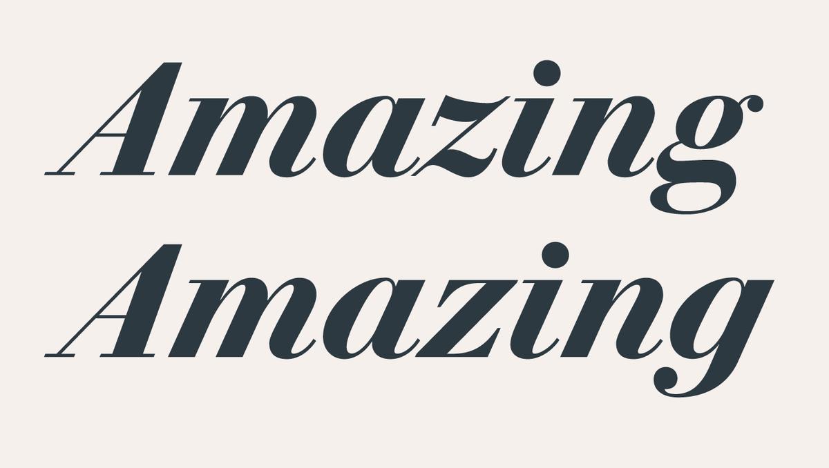
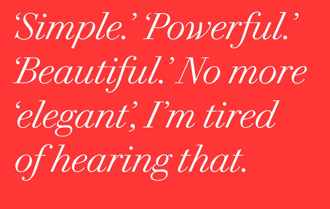

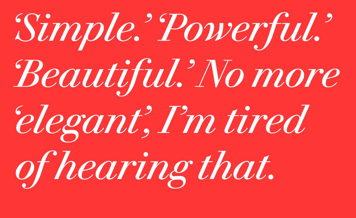


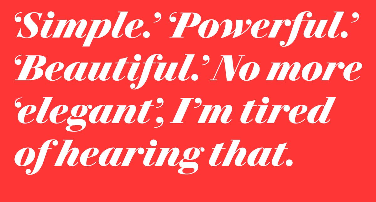
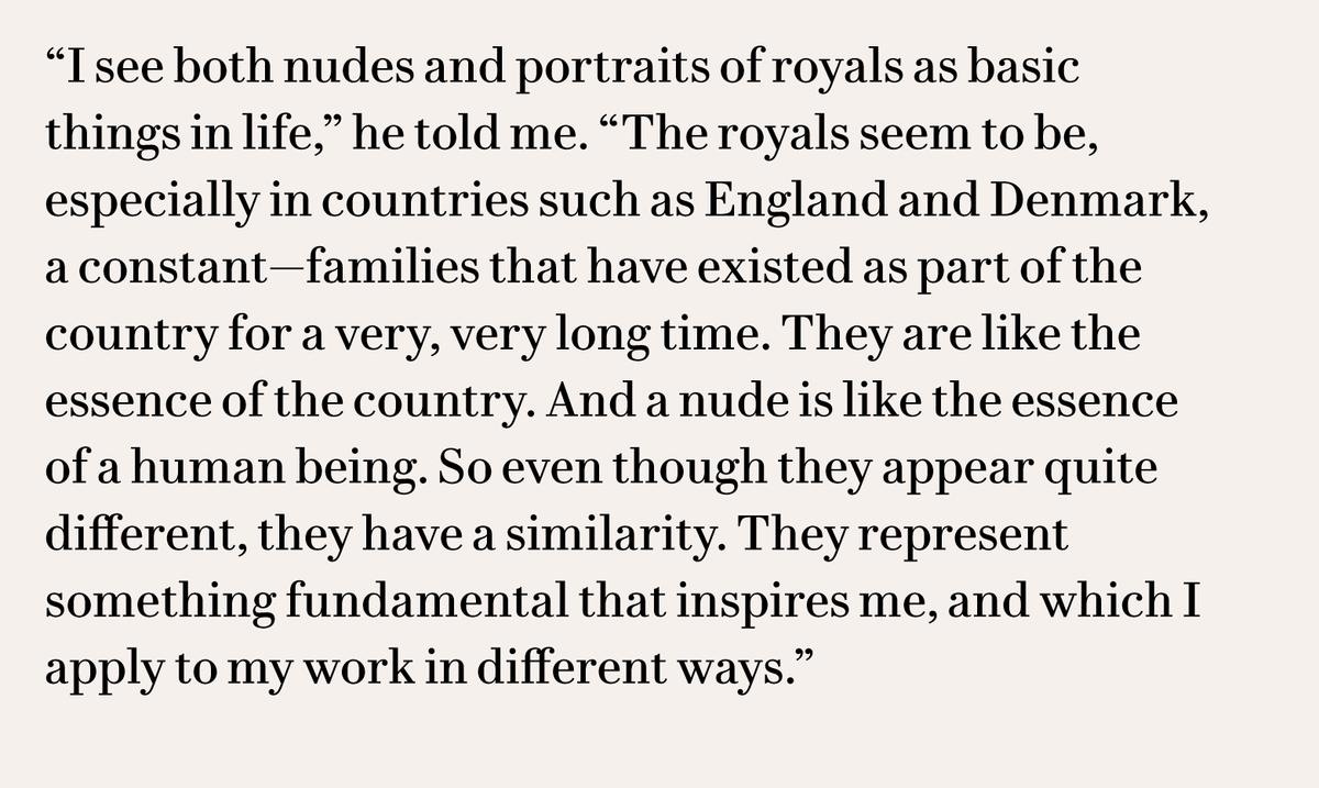
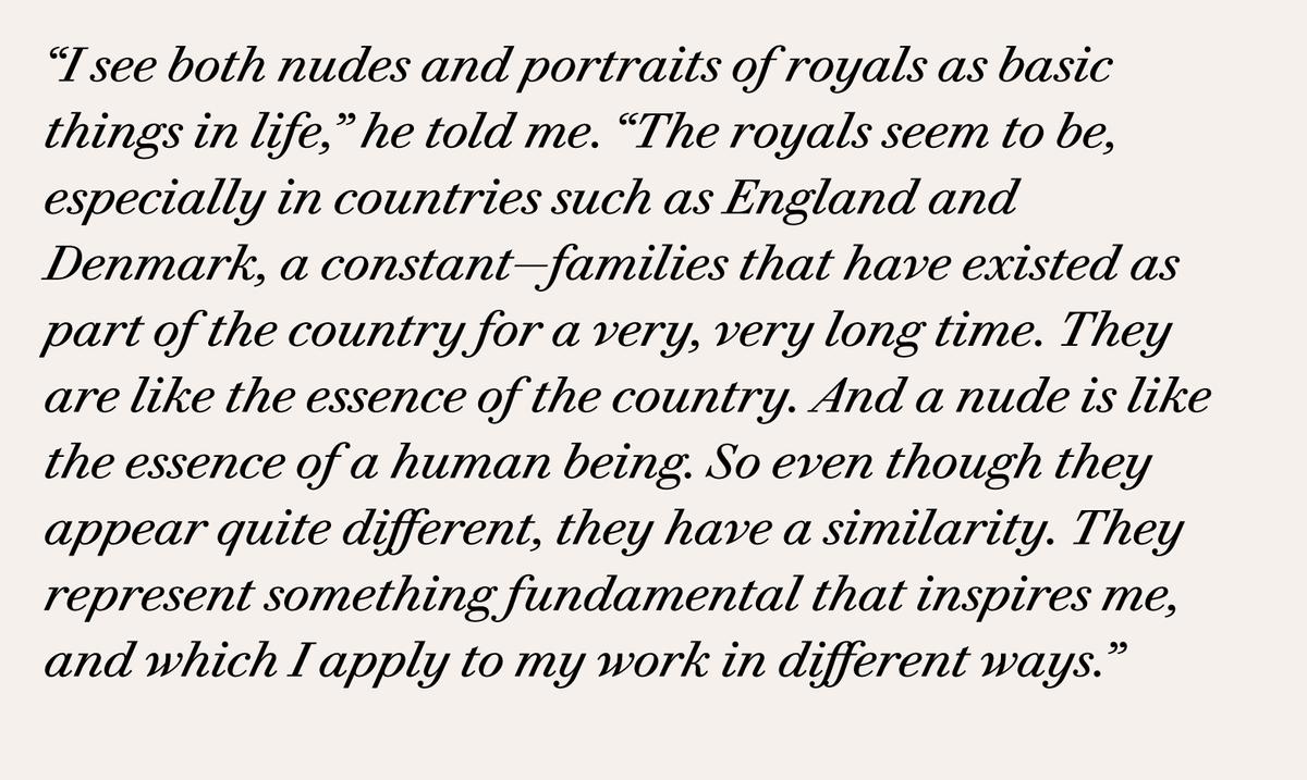
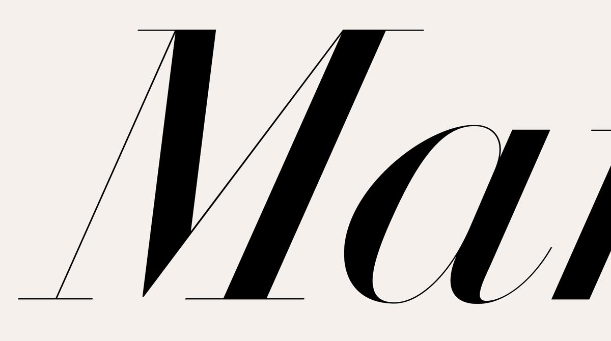
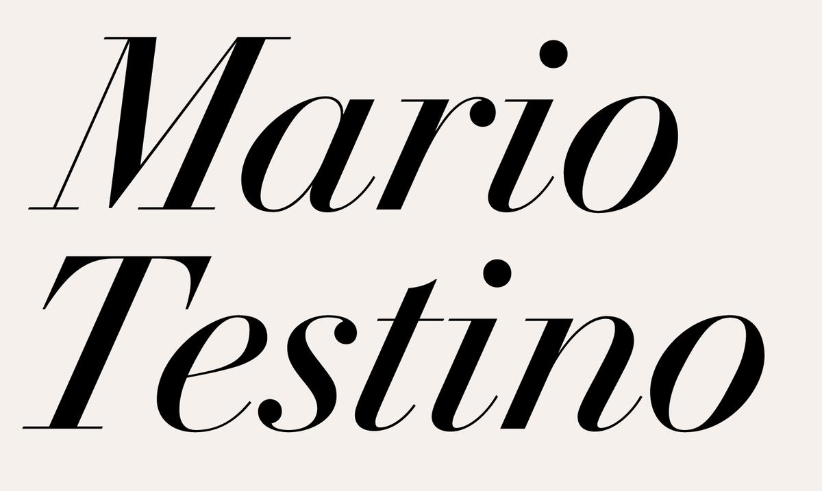
Schwartz and Barnes enlisted the help of designer and type historian Sébastien Morlighem to find a wide range of historical references across the French Modern era, eventually settling on the famed broadsheet specimen Molé Le Jeune produced in 1819 as their primary source. Molé’s foundry was bought out by E. Tarbé around 1834, who also acquired the Firmin Didot & fils foundry around 1837 and later renamed the operation the ‘Fonderie générale’. By the 1910s Molé’s punches had ended up in the hands of the Peignot & fils typefoundry, who kept his types available, though they were incorrectly labelled as “Didot”. Molé created one of the most distinct and beautiful variants of the French modern italic, and its idiosyncrasies have been preserved here: in addition to its uncommonly steep angle, it has distinct letterforms such as the sharp lowercase v and w. In both roman and italic, Le Jeune is characterized by crispness and beauty. Though its vertical proportions and ball terminals differ significantly from Le Jeune’s model, the spirit of the original comes through in the grace of the romans and the exuberant spirit of the italics.
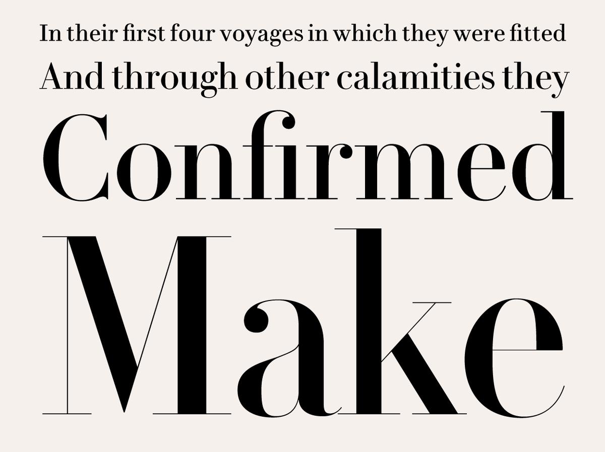
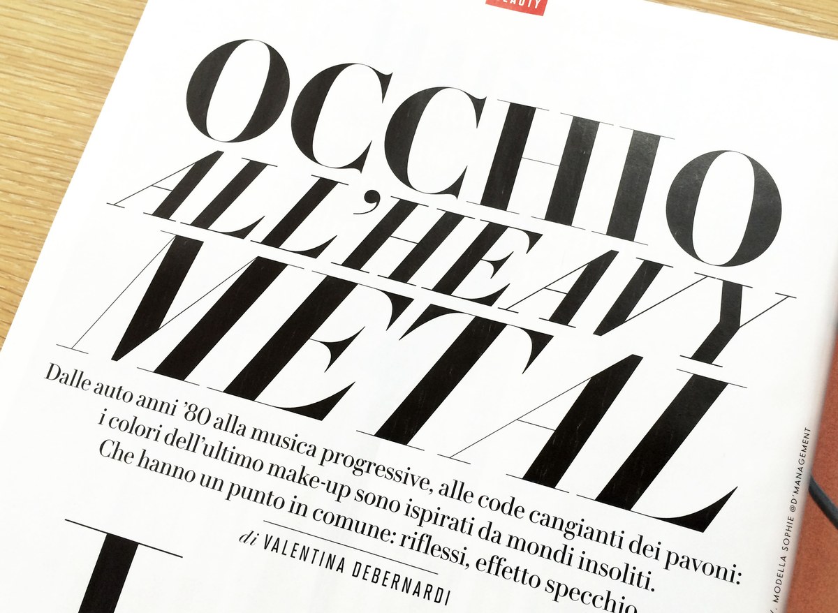
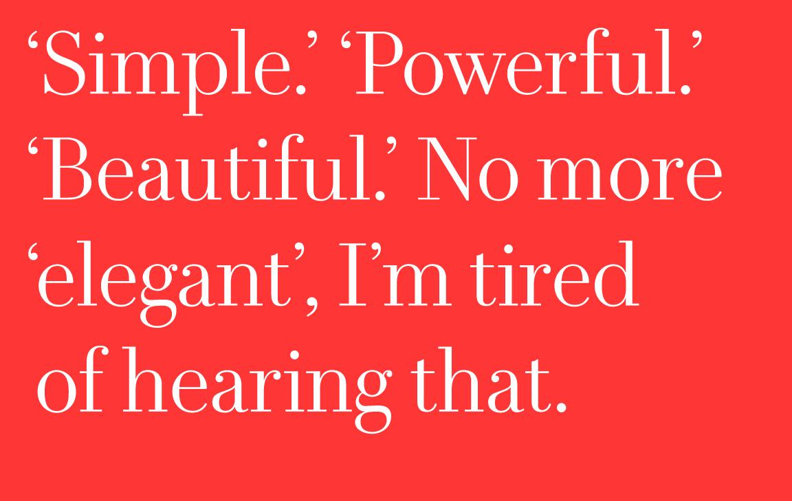
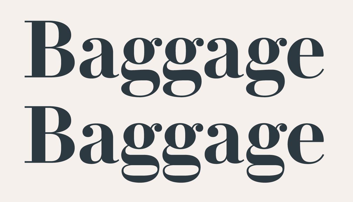
To fulfill the requirements of modern use, Le Jeune comes in four optical sizes for use from huge headlines of 200 point and above, where contrast between thick and thin is most extreme, down to 6 point captions, where robustness is needed. In the largest sizes the family comes in six weights from a Light to a full-figured Black, while the text size omits the Light and Medium for a total of four weights.

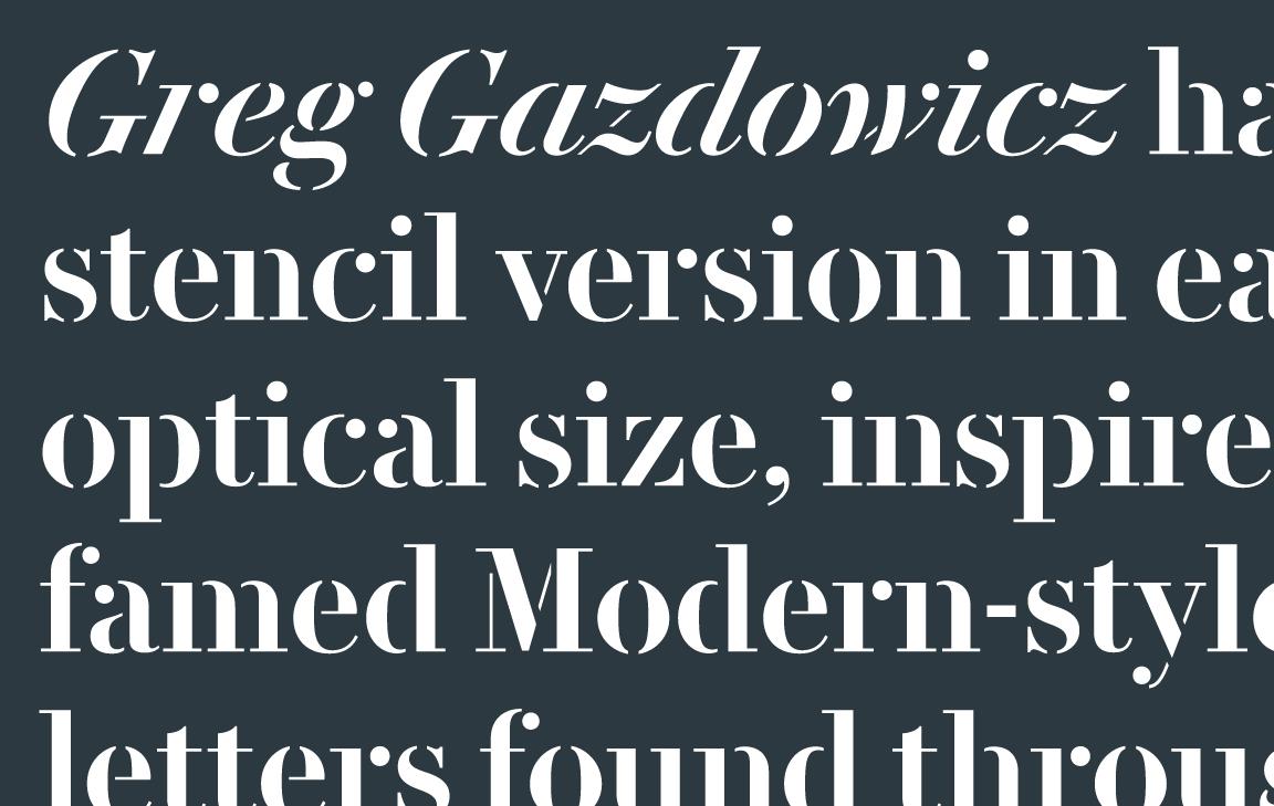
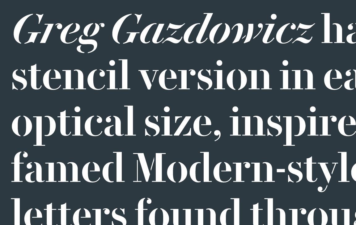
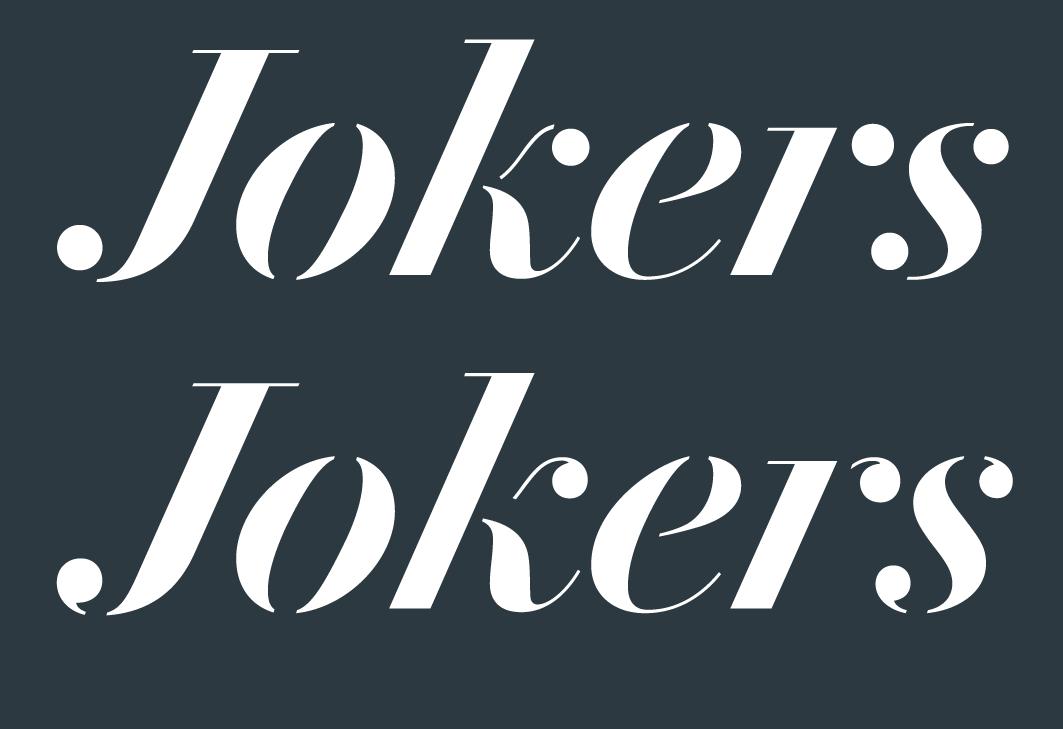
Greg Gazdowicz has added a stencil version in each optical size, inspired by the famed Modern-style stencil letters found throughout France. In their default form, the ball terminals have been abstracted to simple circles; more tradition-minded designers will find a full set of ‘cut’ alternates available as well. Though not intended for running text in its smallest optical size, the stencil offers new possibilities for applications such as folios or even interface elements.
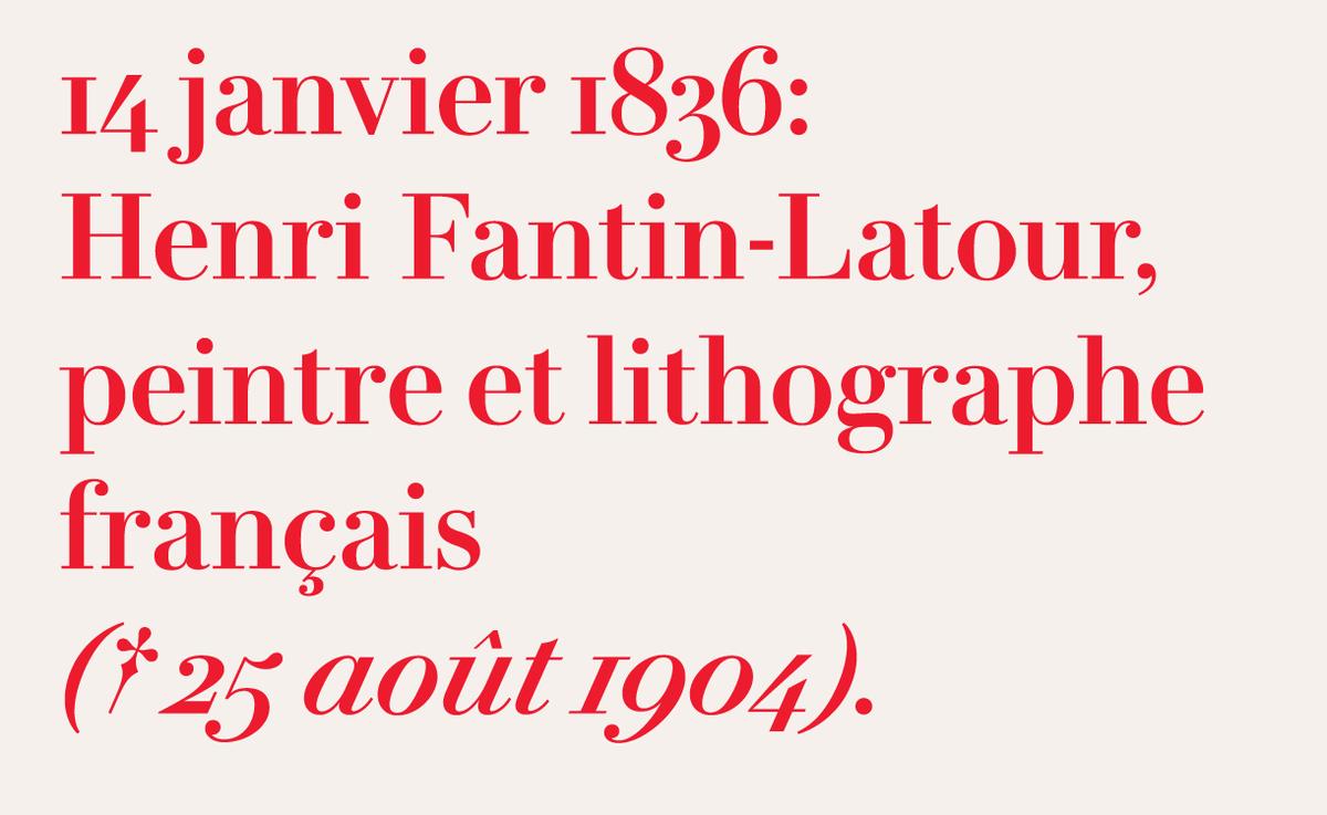
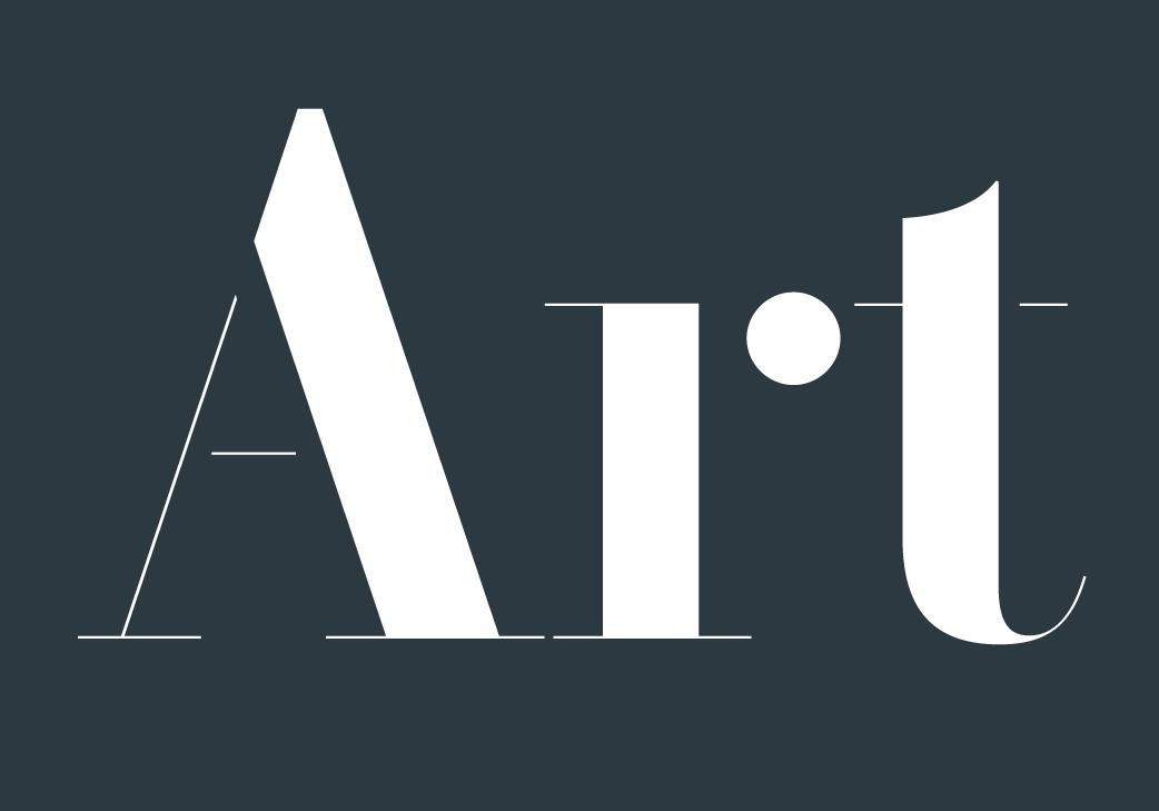
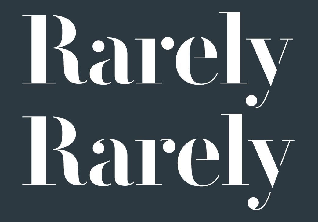
All weights of roman and italic feature small capitals, lining and non-lining figures, fractions, and superior and inferior numerals. The non-lining figures come in two versions, one drawn to meet modern expectations, and an alternative set that is more faithful to the forms used in nineteenth century France.
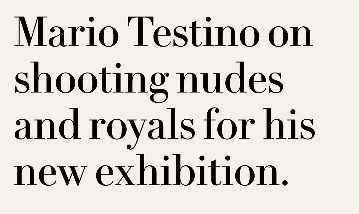
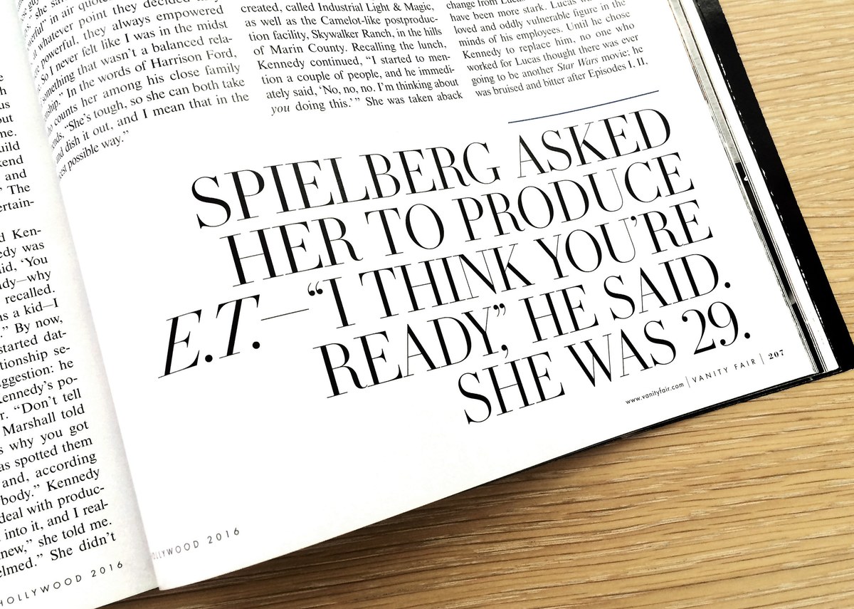
Designed originally for magazines and editorial design, Le Jeune is well suited to graphic, book and corporate design where modern elegance is a requirement.
Related fonts
