New release: Tanja
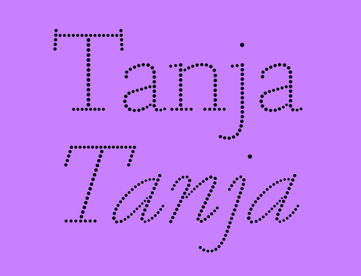
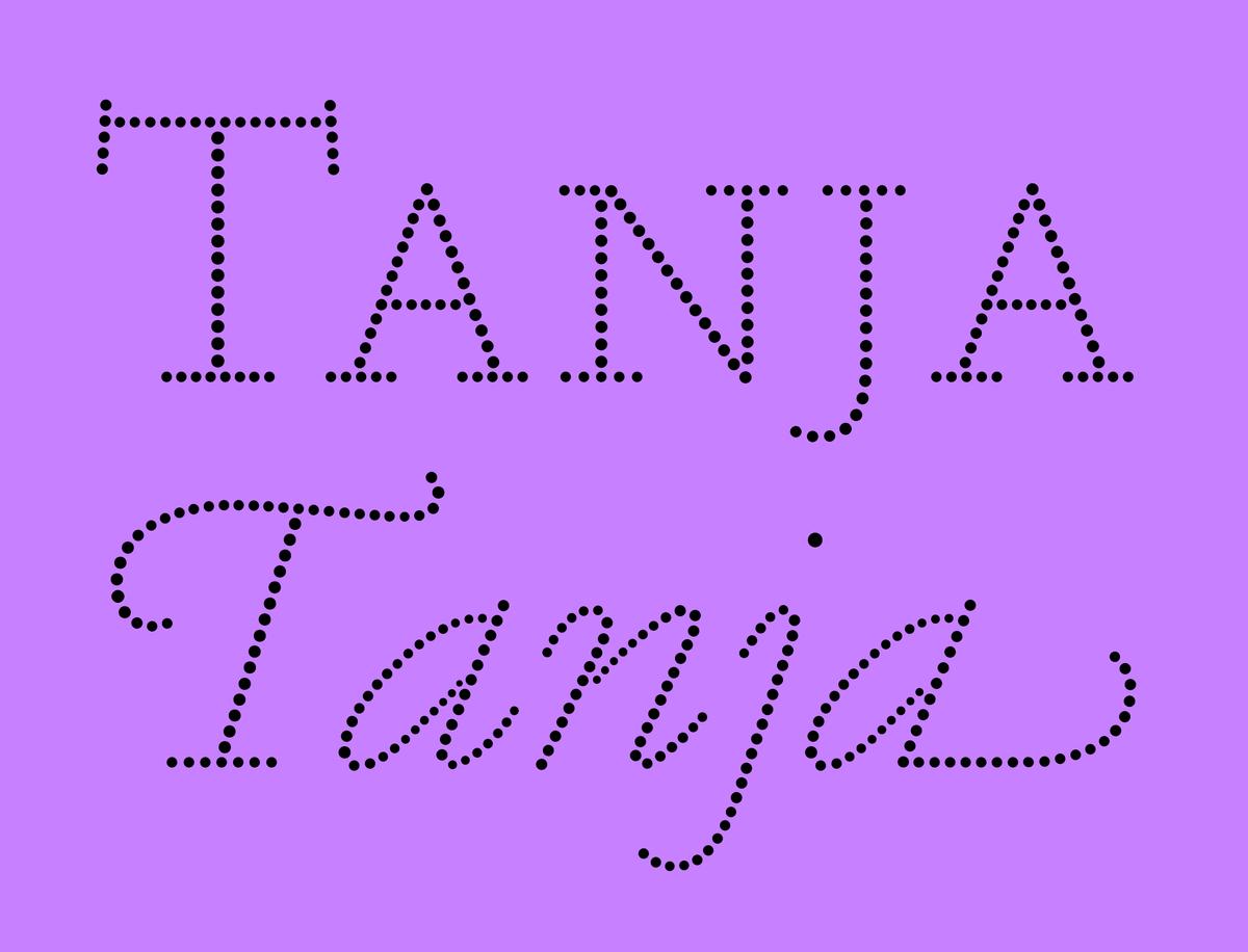
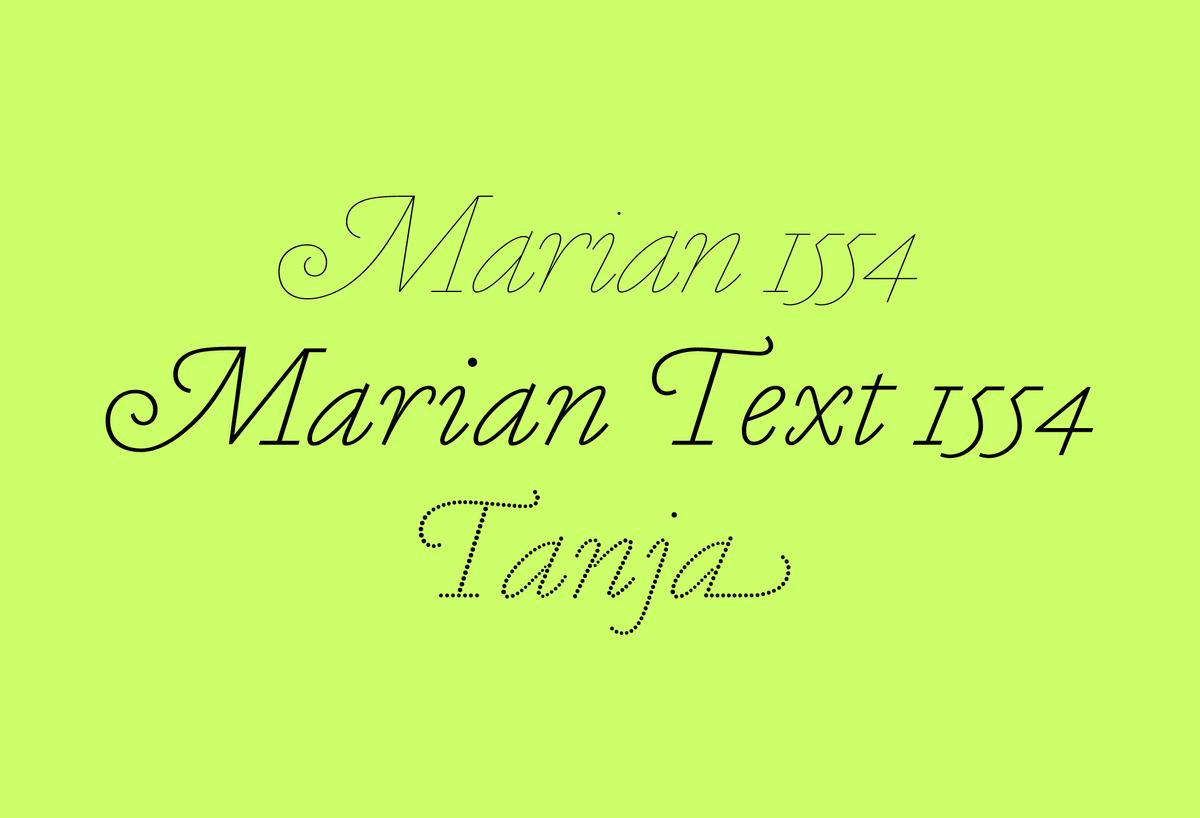
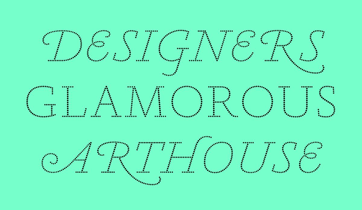
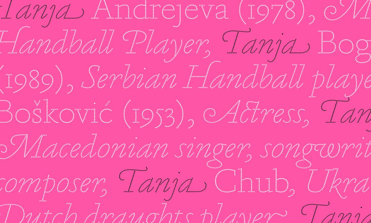
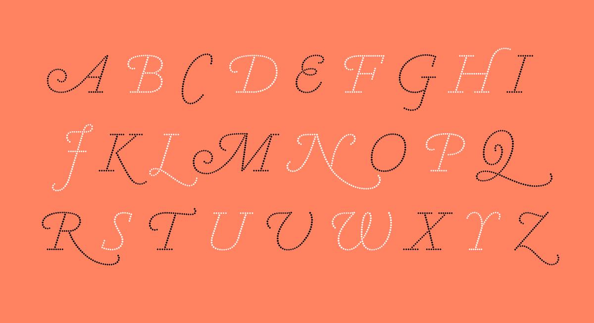
The latest collaboration between Paul Barnes and Christian Schwartz, Tanja is a dot version of our hairline typeface Marian 1554, which is in turn derived from the typefaces of Robert Granjon and Claude Garamond. Typefaces made from circles are an intriguing proposition for graphic designers. Many are created for technical reasons, such as for dot matrix printers, or for large screens at sports events. Usually these are simple sans serif forms, but Tanja is something unique; a Renaissance dot typeface, with no underlying grid and varying size of circles.
Based on the monolinear Marian 1554, Tanja began life as the proposed logo for a German publisher. Though the idea is simple, a seriffed dot typeface, in its details it reveals a complexity as the dots vary gradually in size. Like Marian, it closely follows the historical models of Garamond and Granjon, but has a contemporary aesthethic, a remix of a remix of a classic.
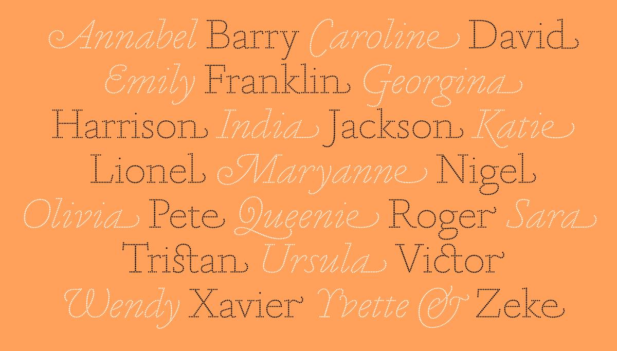
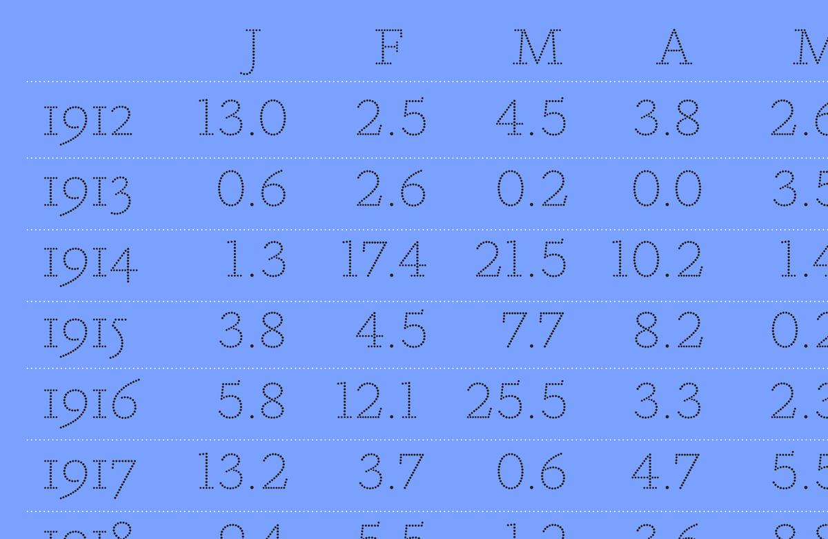
Designed as a display typeface for sizes above 30 point, it comes with a full complement of numeral styles, small capitals, swash letters and ligatures. The production of this typeface was made possible by a special tool developed by Frederik Berlaen, though it still took a great deal of manual labor to tweak and adjust the dots for smooth transitions and optically even inter-dot spacing. Though we think it’s silly to judge a typeface by its number of characters or kerning pairs, we were curious to know the total number of dots in Tanja Roman and Italic. It turns out the family contains precisely 63,364 dots.
