Action Condensed by Erik van Blokland
Action Condensed was designed for the screen by Dutch design legend Erik van Blokland, who was looking for typefaces for interface design without an overtly neutral personality. Each of the family’s four weights has three grades on the same width, allowing text to change weight on rollover without disrupting the layout. You can see it in action on Erik's own site, letterror.com
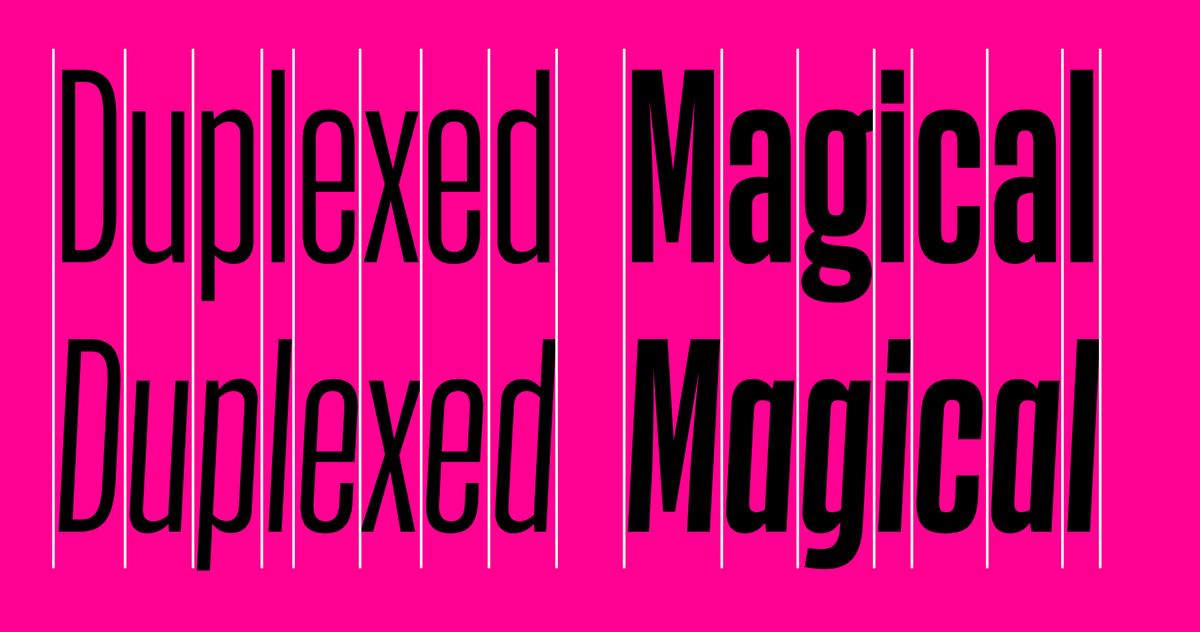
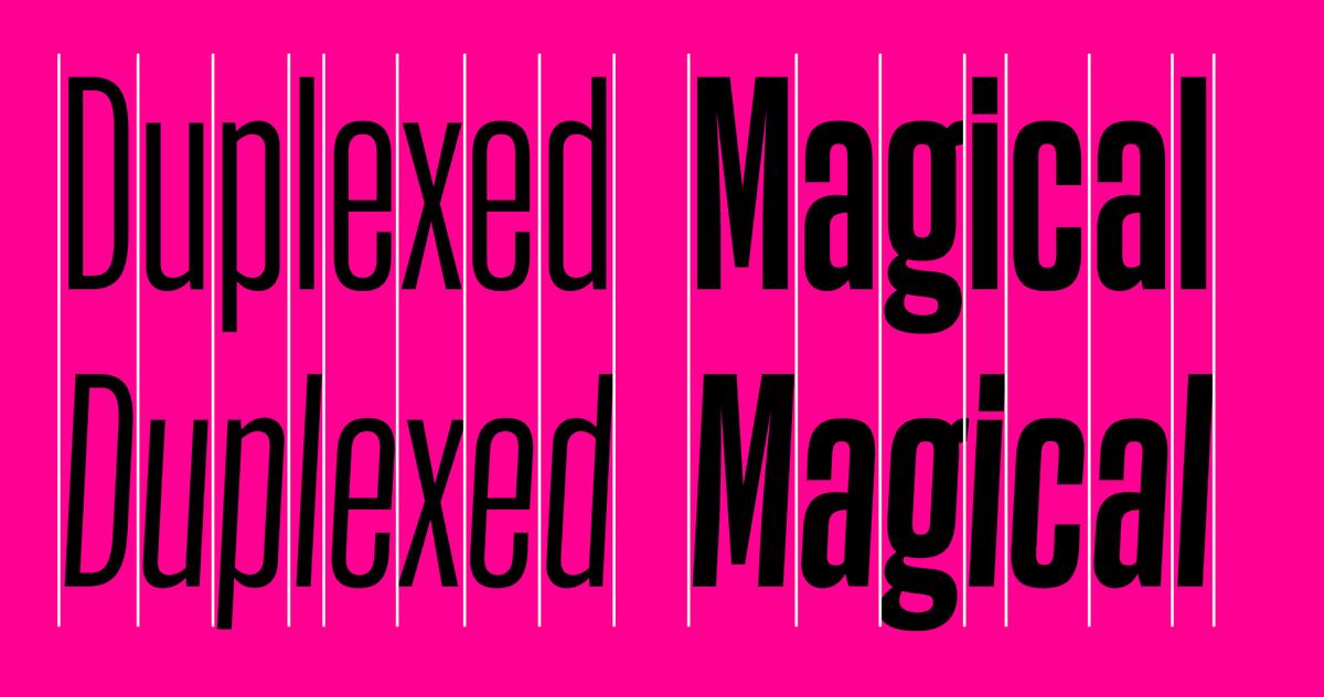

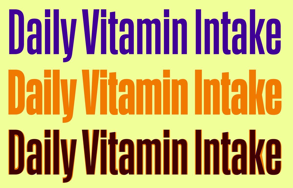
Fully Duplexed
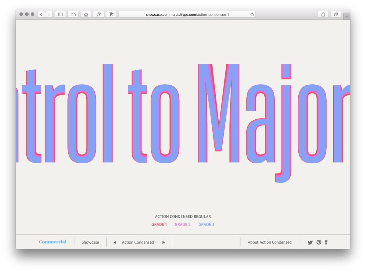
Within each weight of the Action Condensed family are three different grades, all of which, including the italic styles, have been drawn on precisely the same set of character widths. This allows for text to be switched between different grades without any reflowing of text.
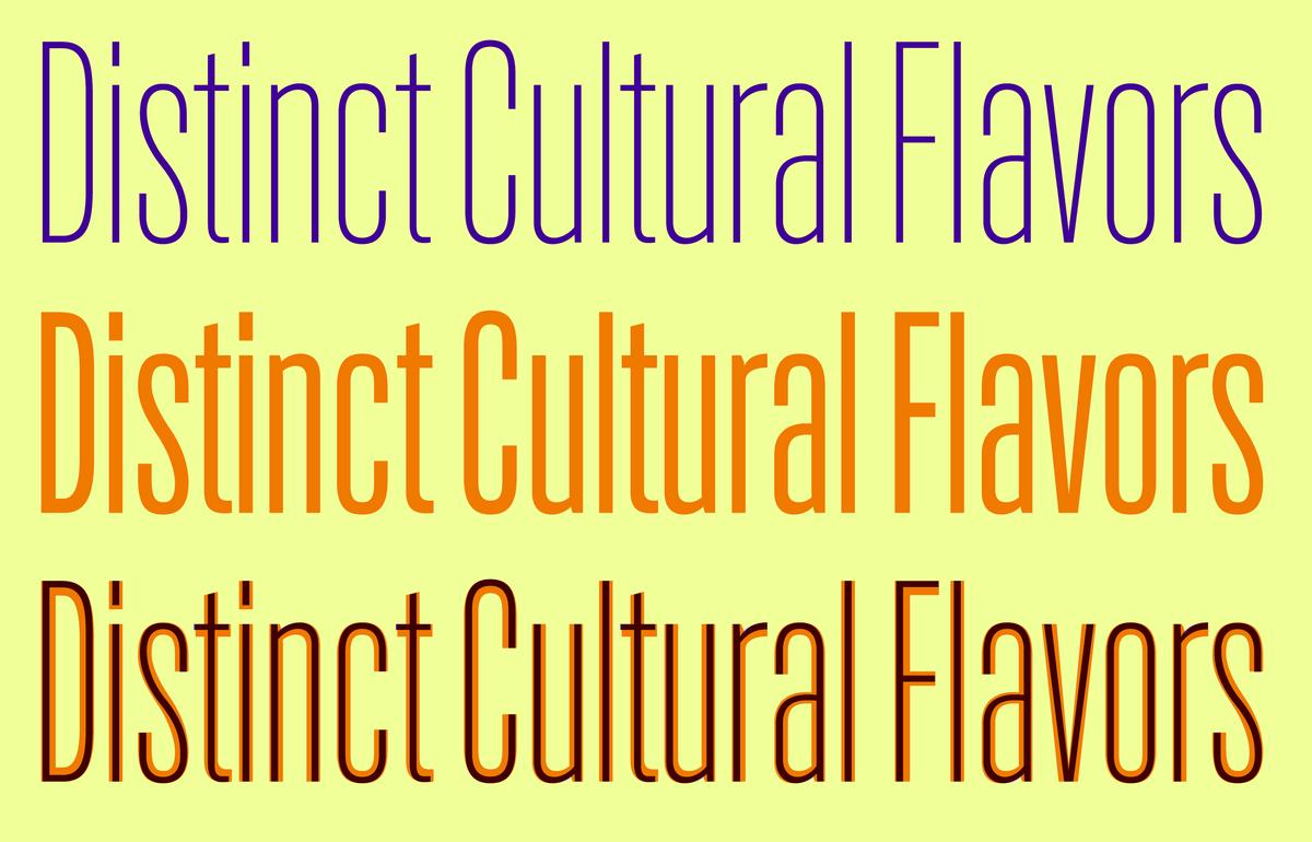
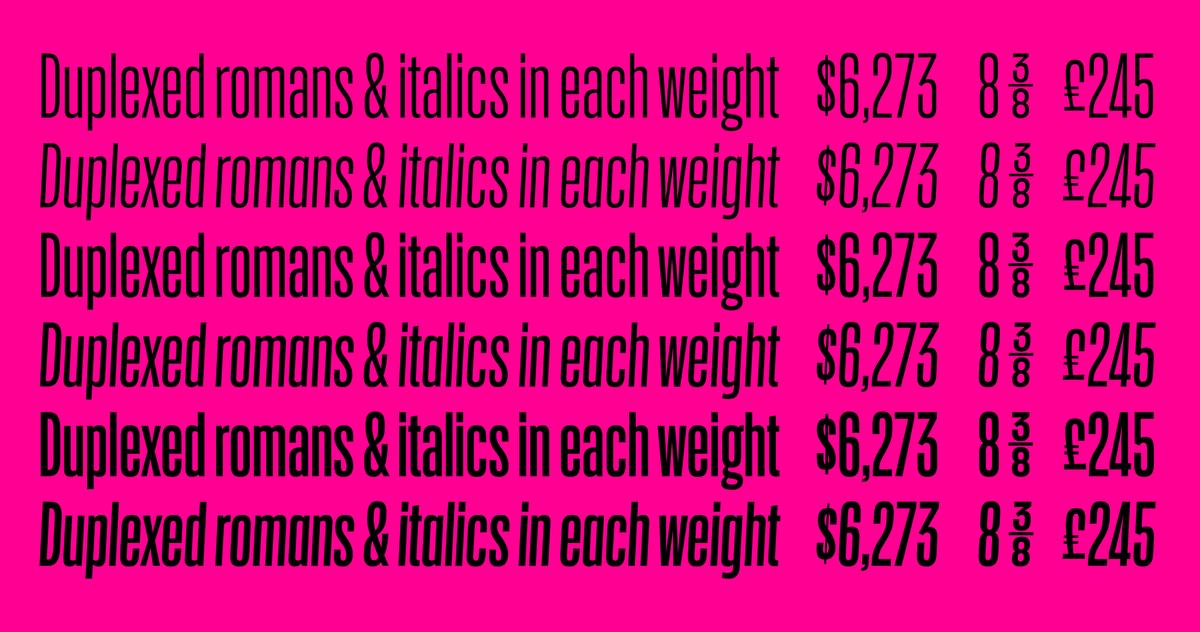
Graded Weights
The grades within each weight of Action Condensed allows for type to be switched between different grades or styles without changing the width of the text setting. This can be used for rollovers while maintaining typographic hierarchy.
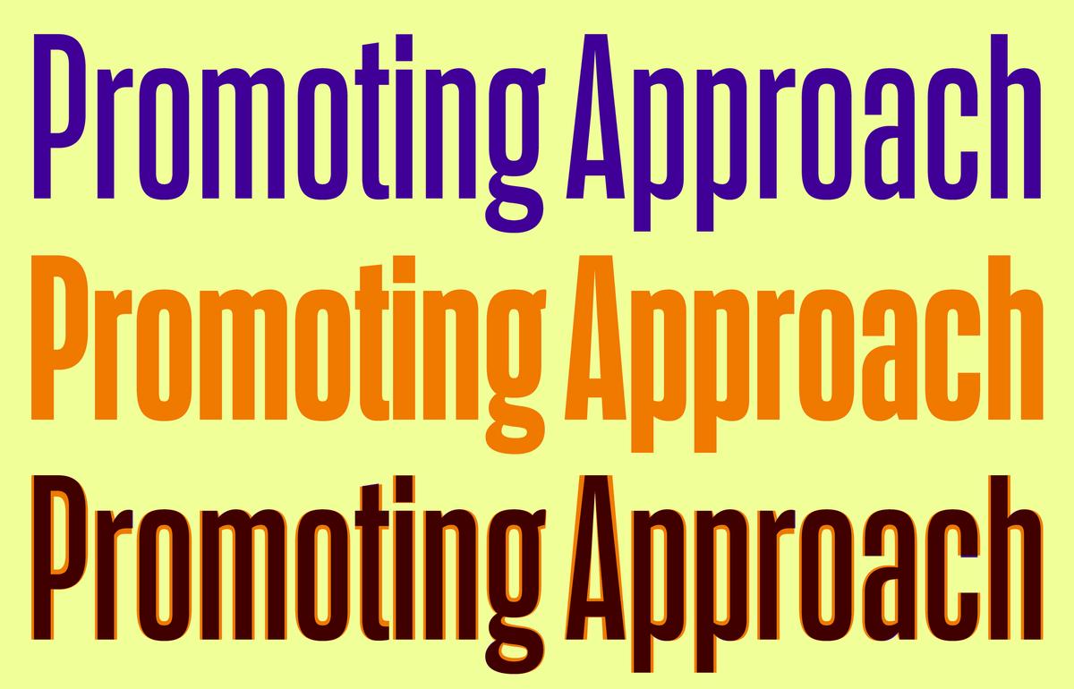
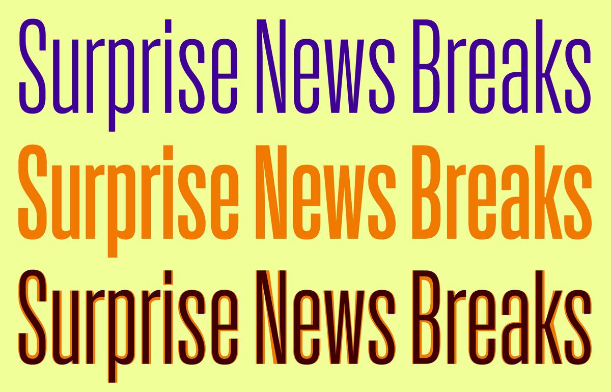
Mapped Styles
Normally when multiple weights of a family are set within the same block of text, any changes require designers to dig in and switch each style individually. But because of the way that grades in Action Condensed are mapped, designers can set separate styles in the same block of text—like Light & Medium as shown here—and quickly toggle different grades via the type palette.
Not Just for Interfaces
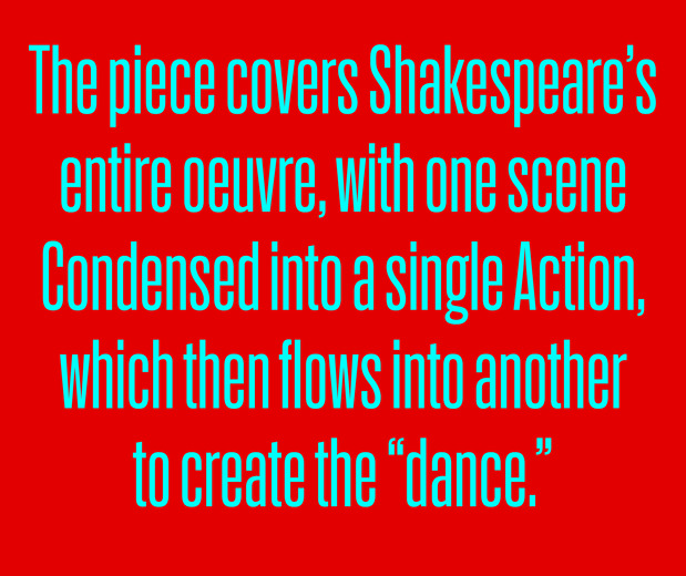
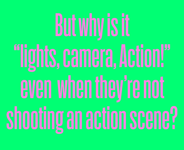
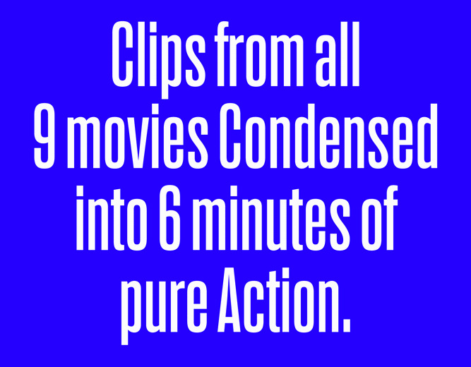
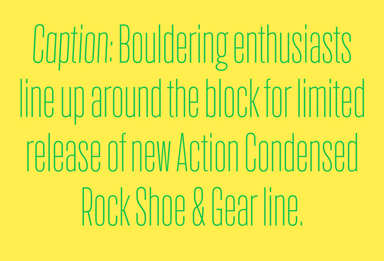
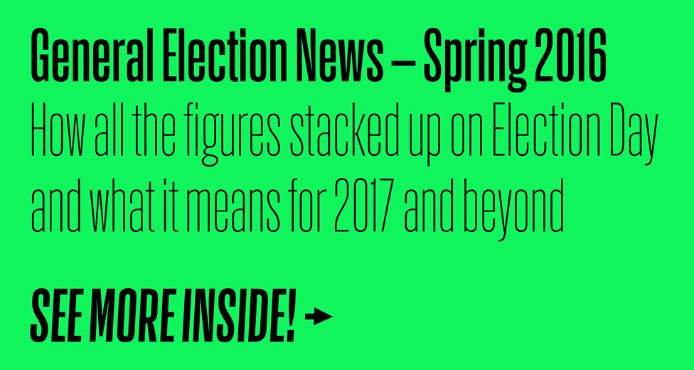
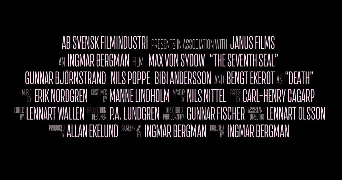
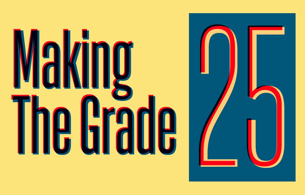
Although Action Condensed was designed with the screen in mind, it works as well on a poster, a film title, or in an editorial layout as it does in a web browser or on a mobile phone. Its casual personality and quirky shapes give a friendliness that is unusual in a straight-sided condensed sans, and the grades can be used for interesting layered effects.

Wael Morcos has designed two new microsites for our Webfonts Showcase, to show Action Condensed in action. One highlights the relationship between the grades in each weight, while the other demonstrates how smoothly the grades work for rollovers while showing unexpected connections between networks of synonyms and antonyms.
Related fonts

