Canela by Miguel Reyes
Many people who spend time discussing and writing about type devote significant energy to categorization. Organizing typefaces into neat groupings of text and display, serif and sans, humanist and geometric; or oldstyle, transitional, and modern, for example, can help untangle the confusing web of typeface history, making the provenance and intended uses of different typefaces easier to grasp. Type designers find categorization helpful as well, to telegraph the traditions that their newest creations are meant to insert themselves into, even when those connections are somewhat tenuous in the interpretation.
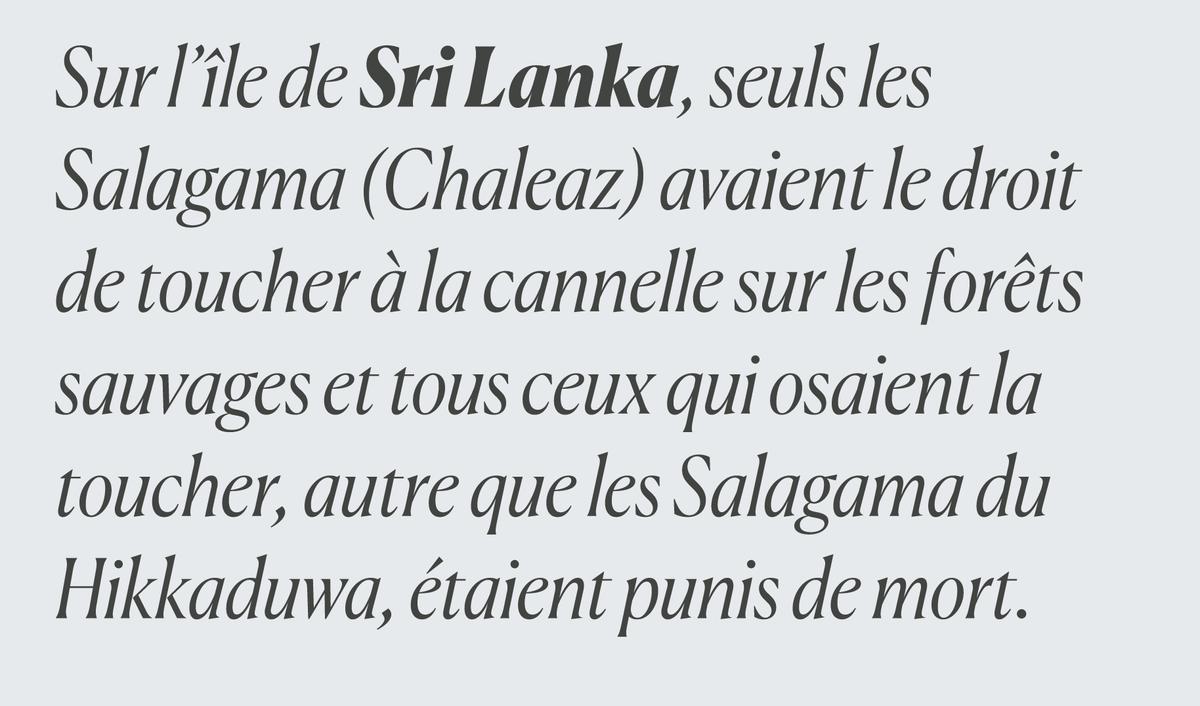
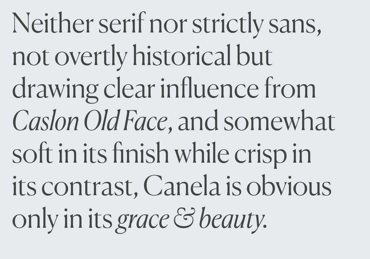
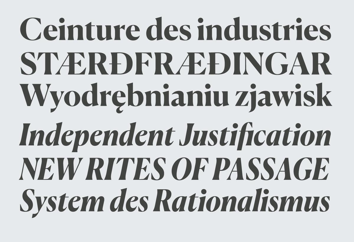
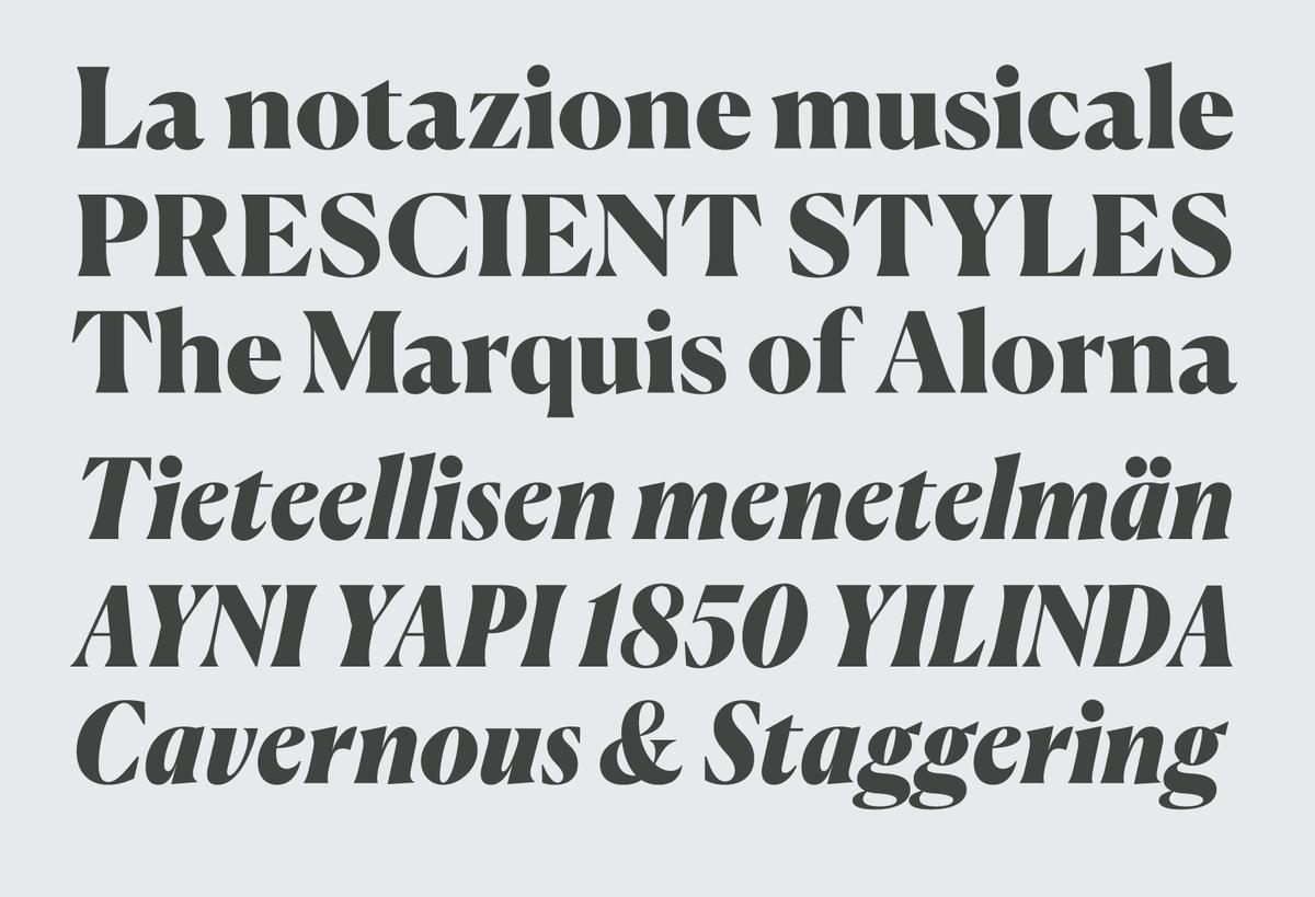
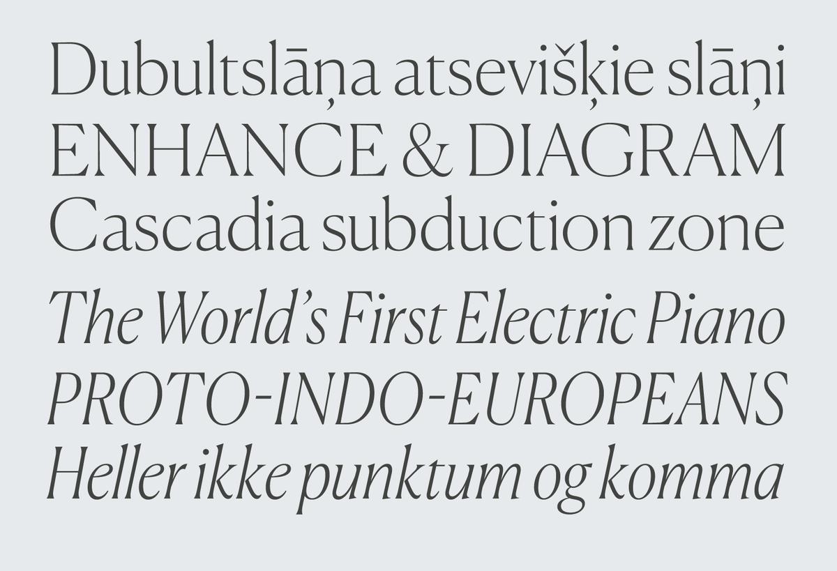
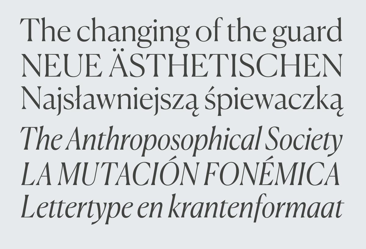
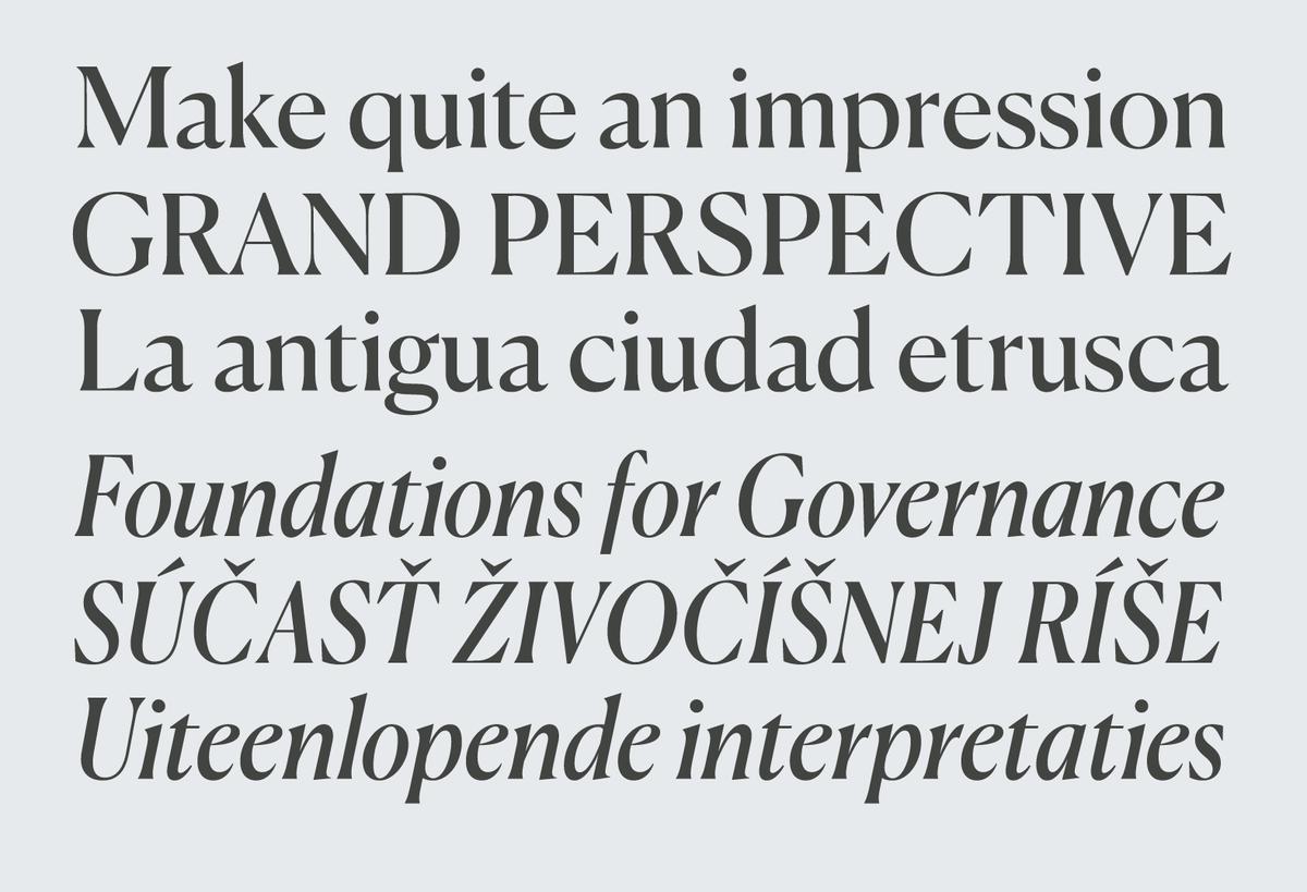
However, some typefaces defy easy classification, synthesizing influences from different genres and historical periods, occupying ambiguous spaces between cleanly defined categories. Canela, designed by Miguel Reyes, is such a typeface. Neither serif nor strictly sans, not overtly historical but drawing clear influence from Caslon Old Face, and somewhat soft in its finish while crisp in its contrast, Canela is obvious only in its grace and beauty. This is a unique typeface that shows the complex personal history of its designer: originally from Puebla, Mexico, Reyes worked as a designer in both Mexico and Spain before studying type design at the famed Type & Media program at the Royal Academy of Art in the Netherlands, and now as a type designer on the staff at Commercial Type in New York.
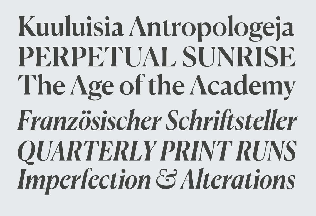
Canela was originally conceived as Reyes’s personal interpretation of William Caslon I’s display types, but as it evolved the historical influence receded, leaving only vestigial traces in the proportions and the structure of certain letterforms. Reyes’s training in stone carving informed the treatment of the capitals, lending them an inscriptional quality. The italics were an exercise in reduction, eschewing the exuberance of Caslon’s italics for a more sober rhythm. Narrow and sharp, the italics have a markedly different tone from the romans. A limited set of alternates helps tip the tonal balance of the italics from austere to pretty, with more traditional cursive forms.
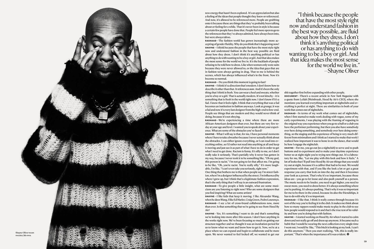
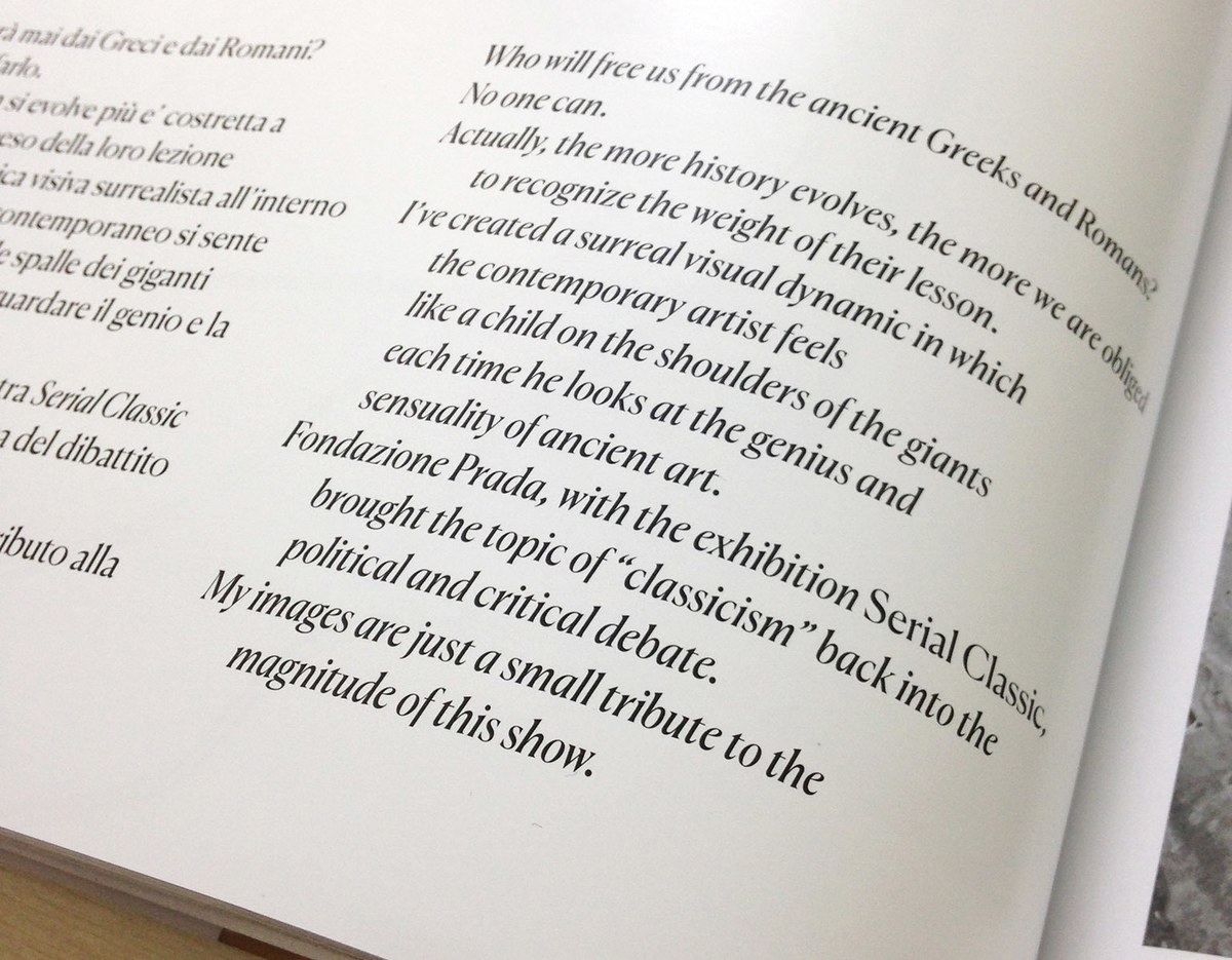
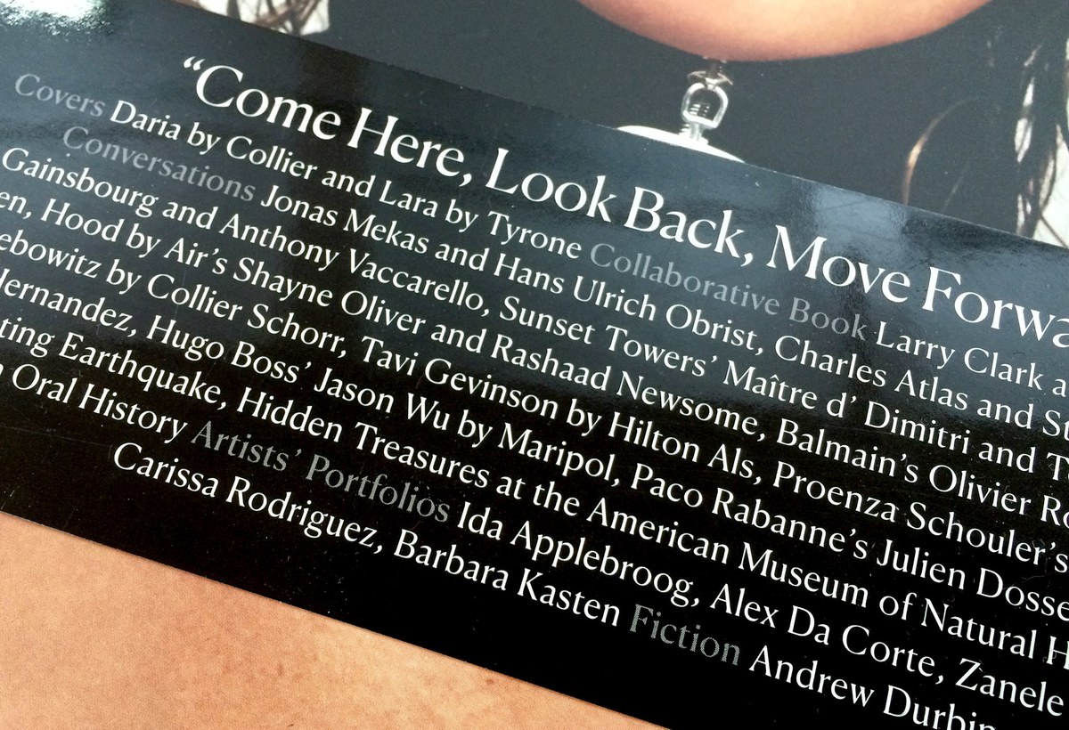
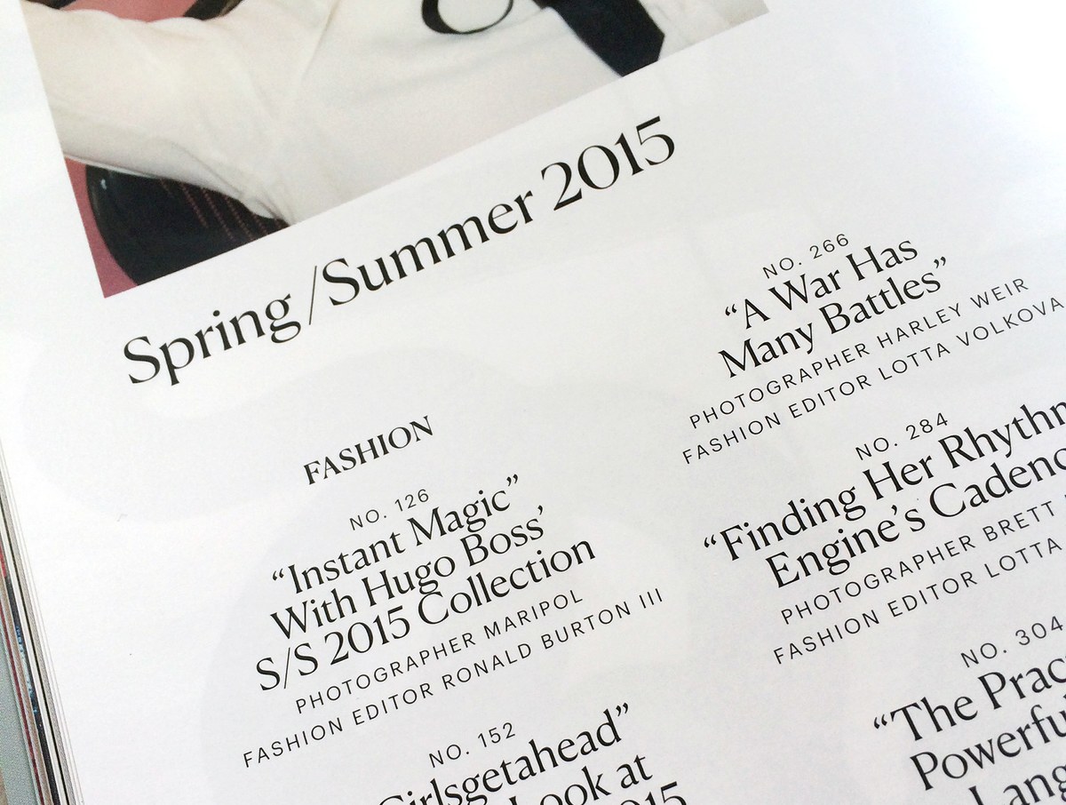
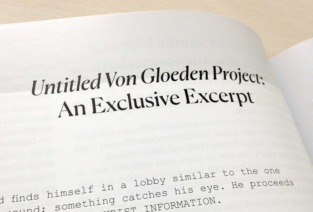
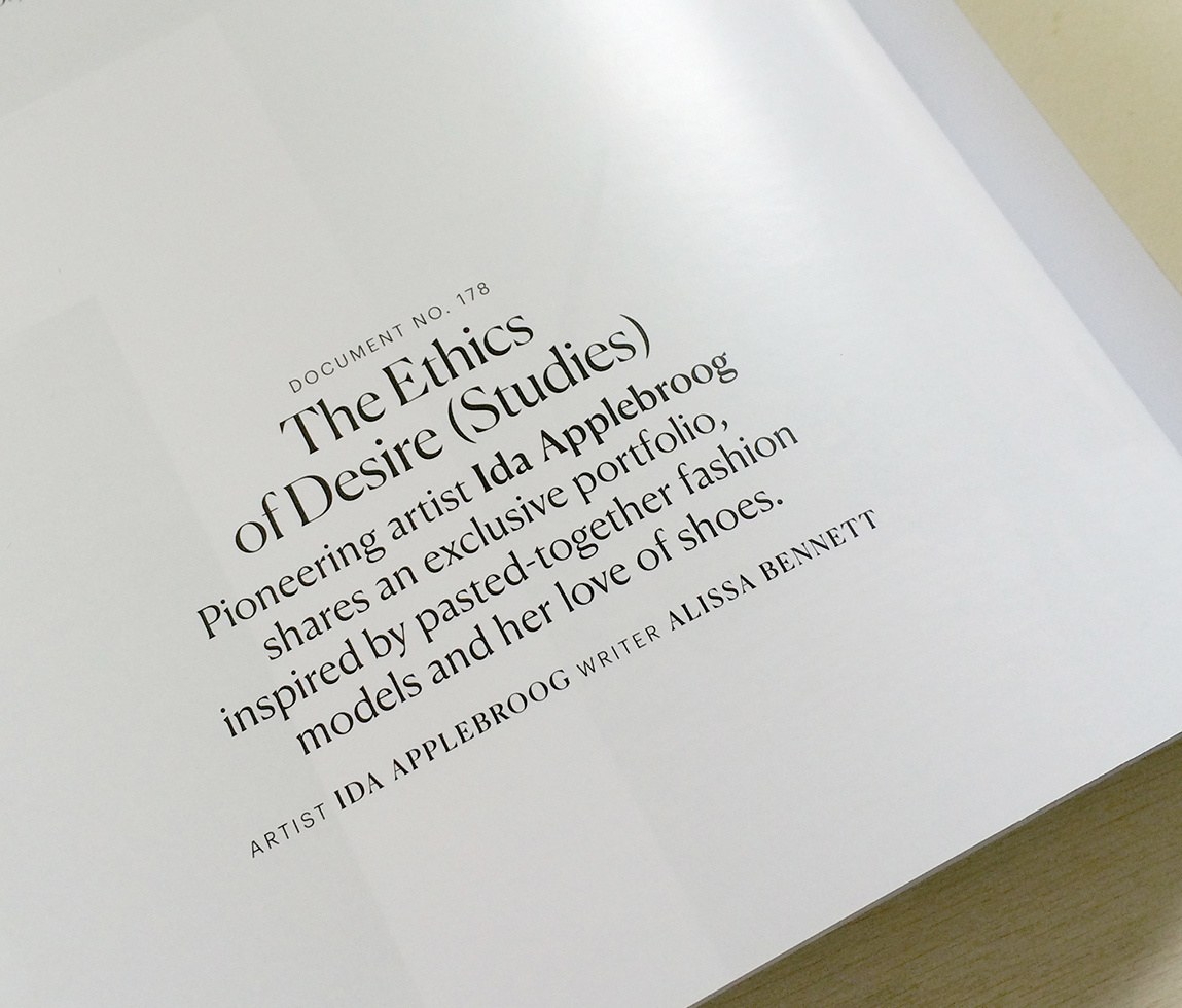
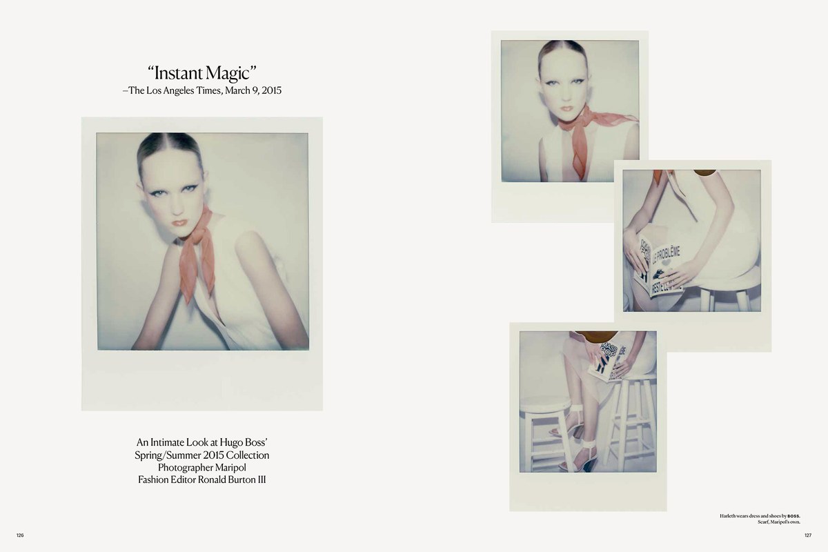
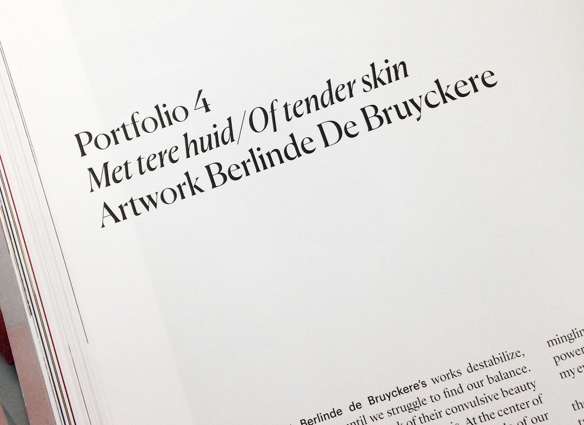
Canela Display appeared first in issues 6, 7, and 8 of Document Journal, a New York-based fashion and art magazine that has debuted several families before release, including Portrait and Chiswick Sans, when previously sharing studio space with Commercial Type. Its elegance and grace proved to be the perfect accompaniment to a quiet and somewhat melancholy moment in fashion.
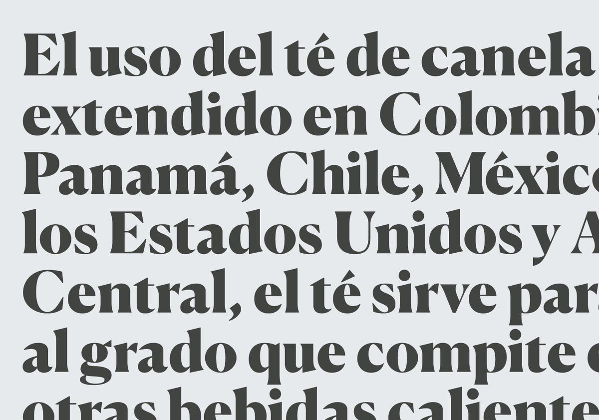
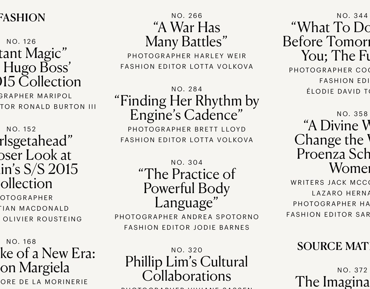
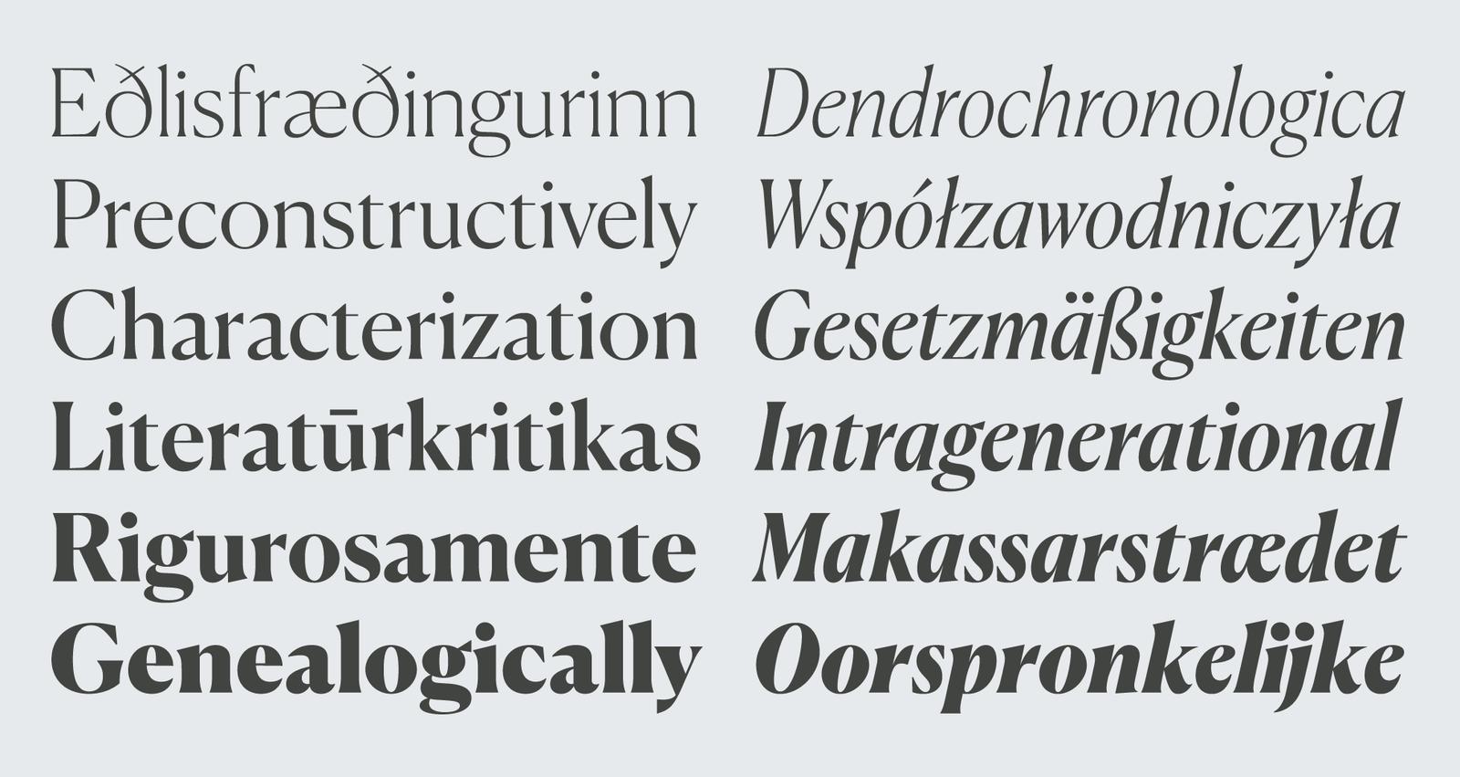
Canela Display is available in six weights, with italics. While ideal for fashion and editorial applications, it is suitable for branding as well, as its distinctive forms lend themselves to the creation of memorable logotypes.
