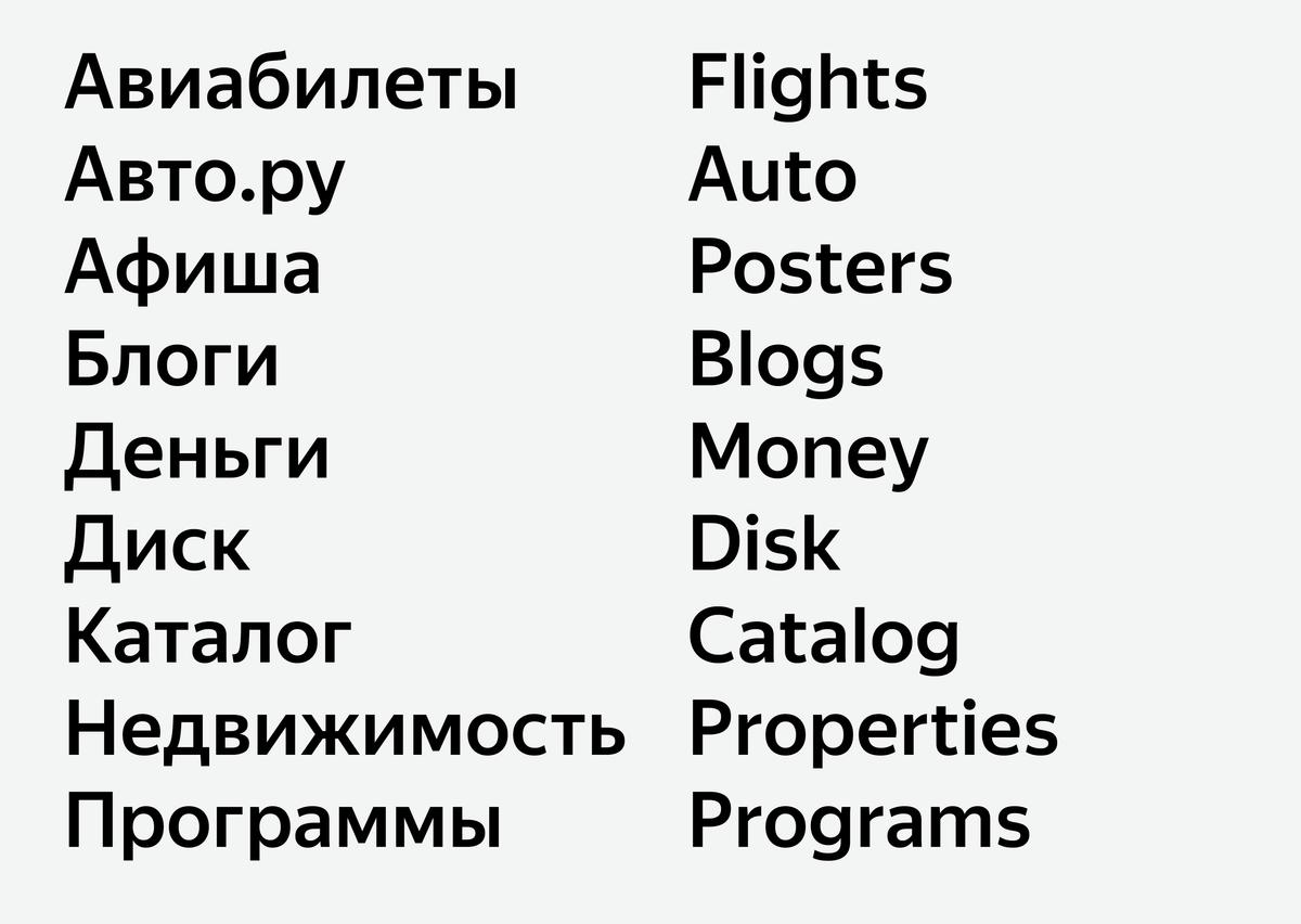
Yandex Sans by Miguel Reyes and Ilya Ruderman
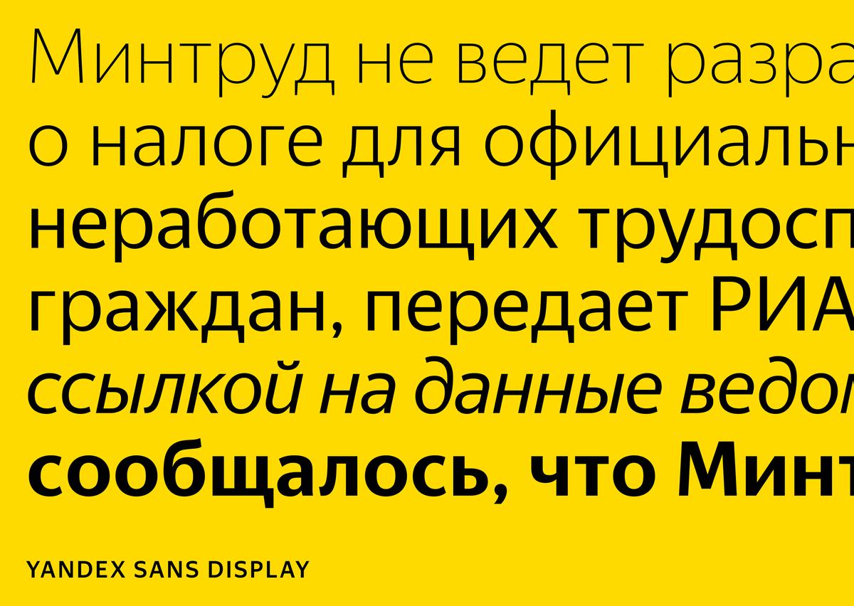
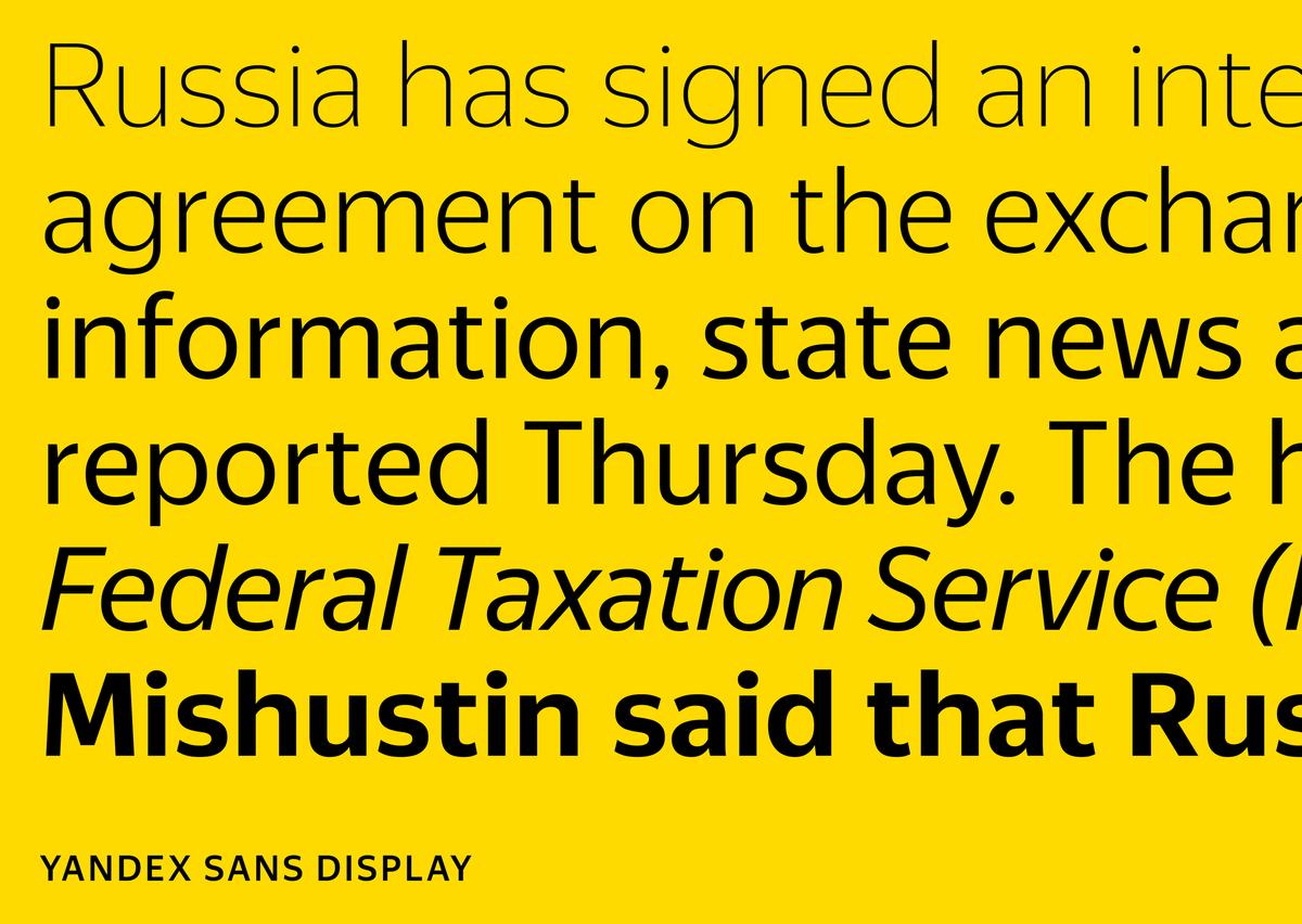
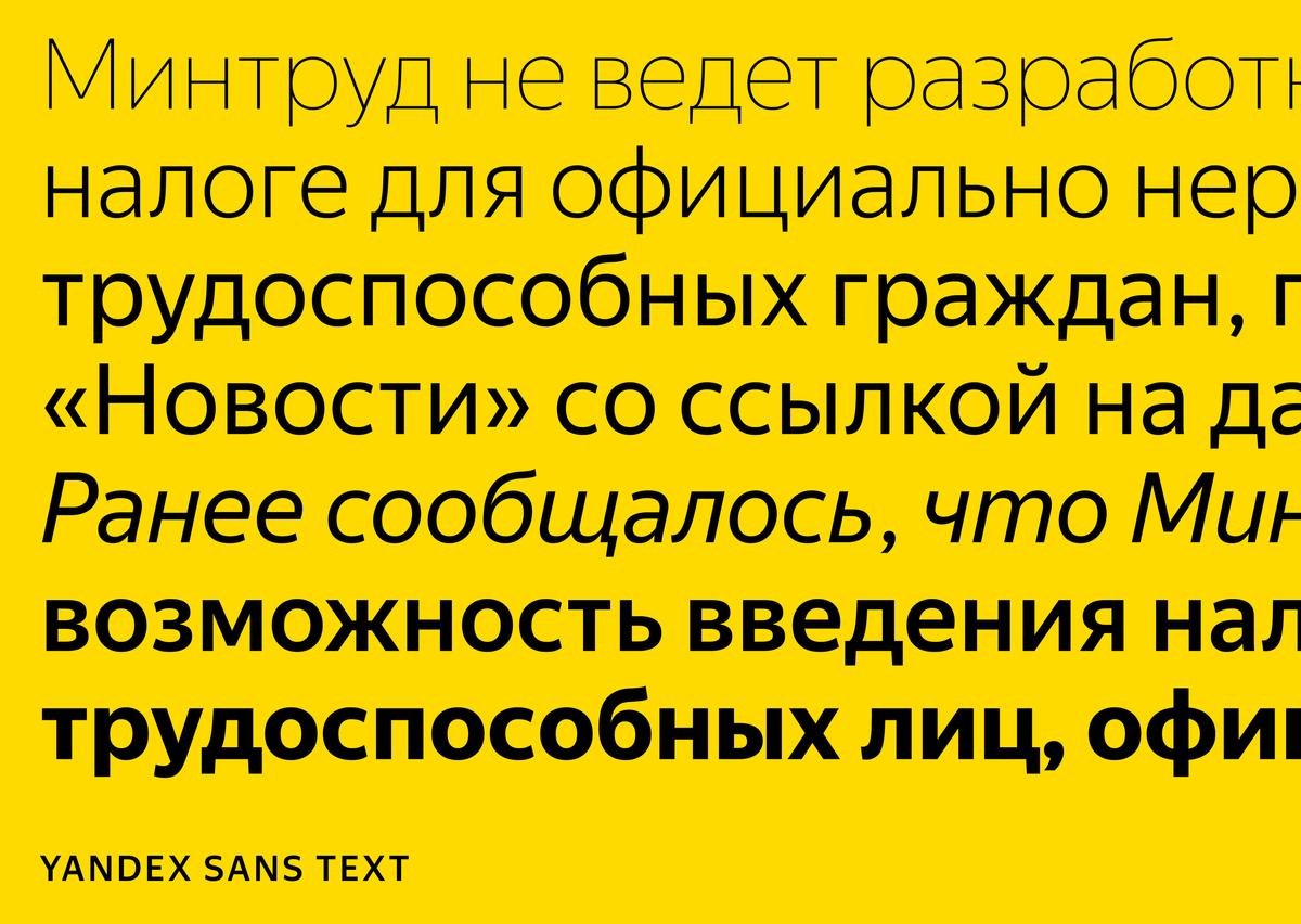
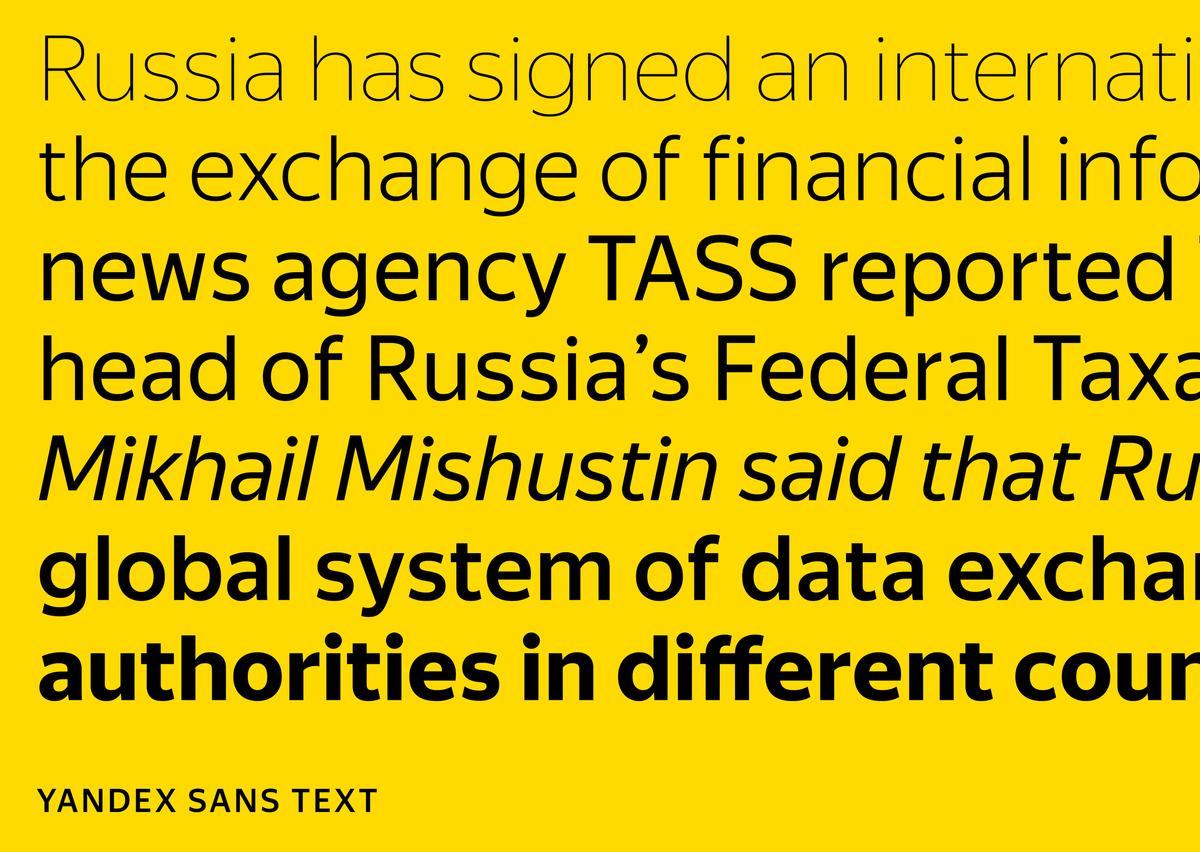
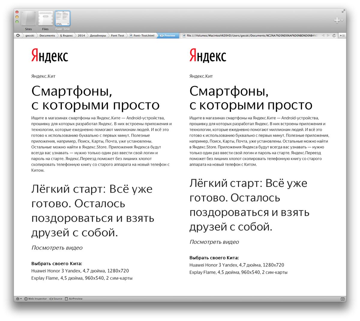
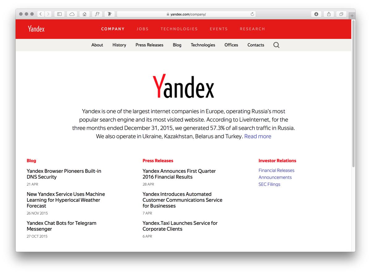
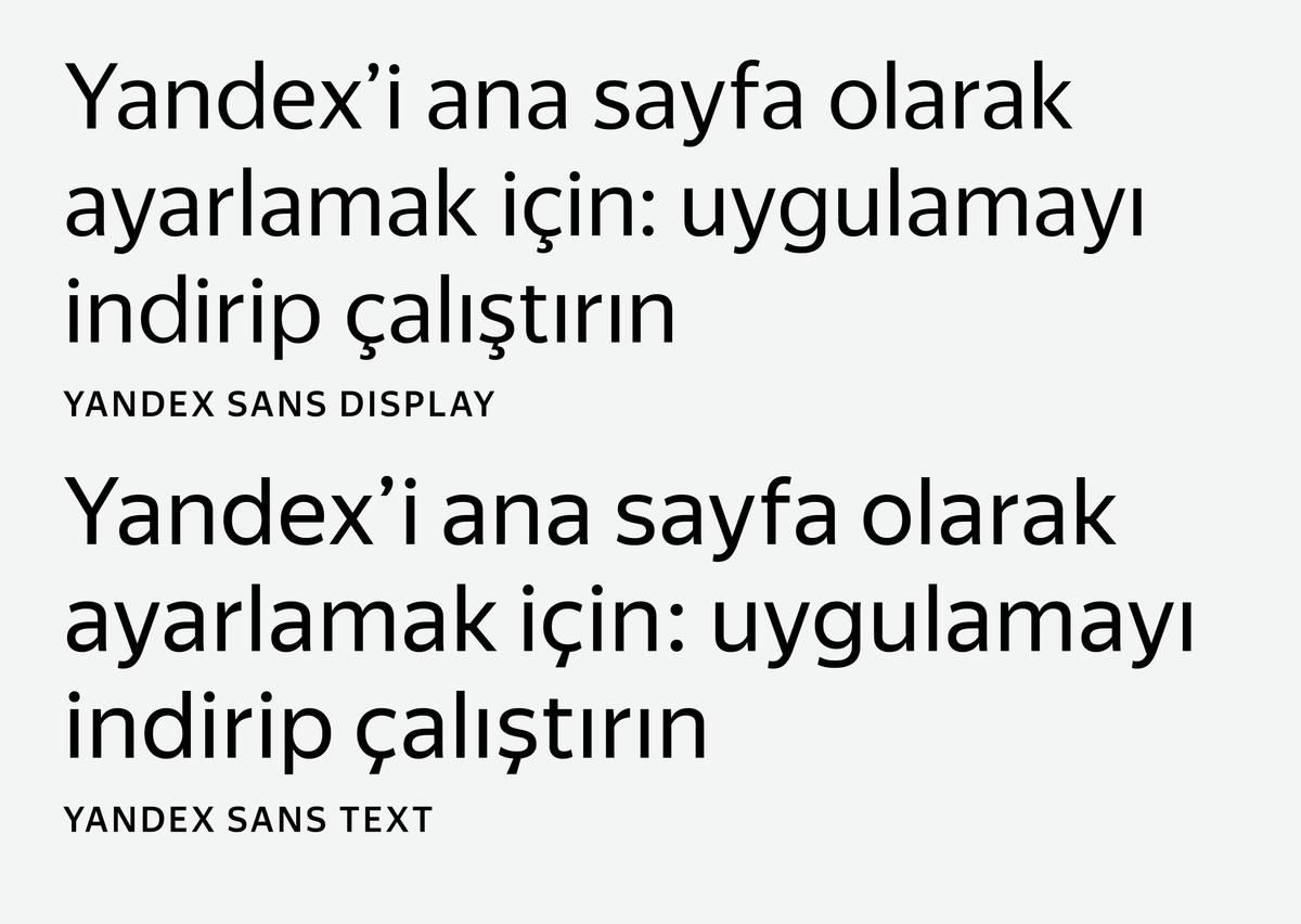
Yandex Sans, designed by Commercial Type designer Miguel Reyes and Moscow-based type designer Ilya Ruderman (of CSTM Fonts and type.today) and art directed by Christian Schwartz, is a new corporate typeface for Yandex, the largest search engine in Russia. Designed for both interfaces and marketing, Yandex Sans has two closely related families: Yandex Sans Text, in 5 weights, and Yandex Sans Display, in 4 weights. A comfortably proportioned humanist sans with open terminals and low contrast, the typeface is designed to look warm and inviting without being overly friendly, and to be both crisp and readable.
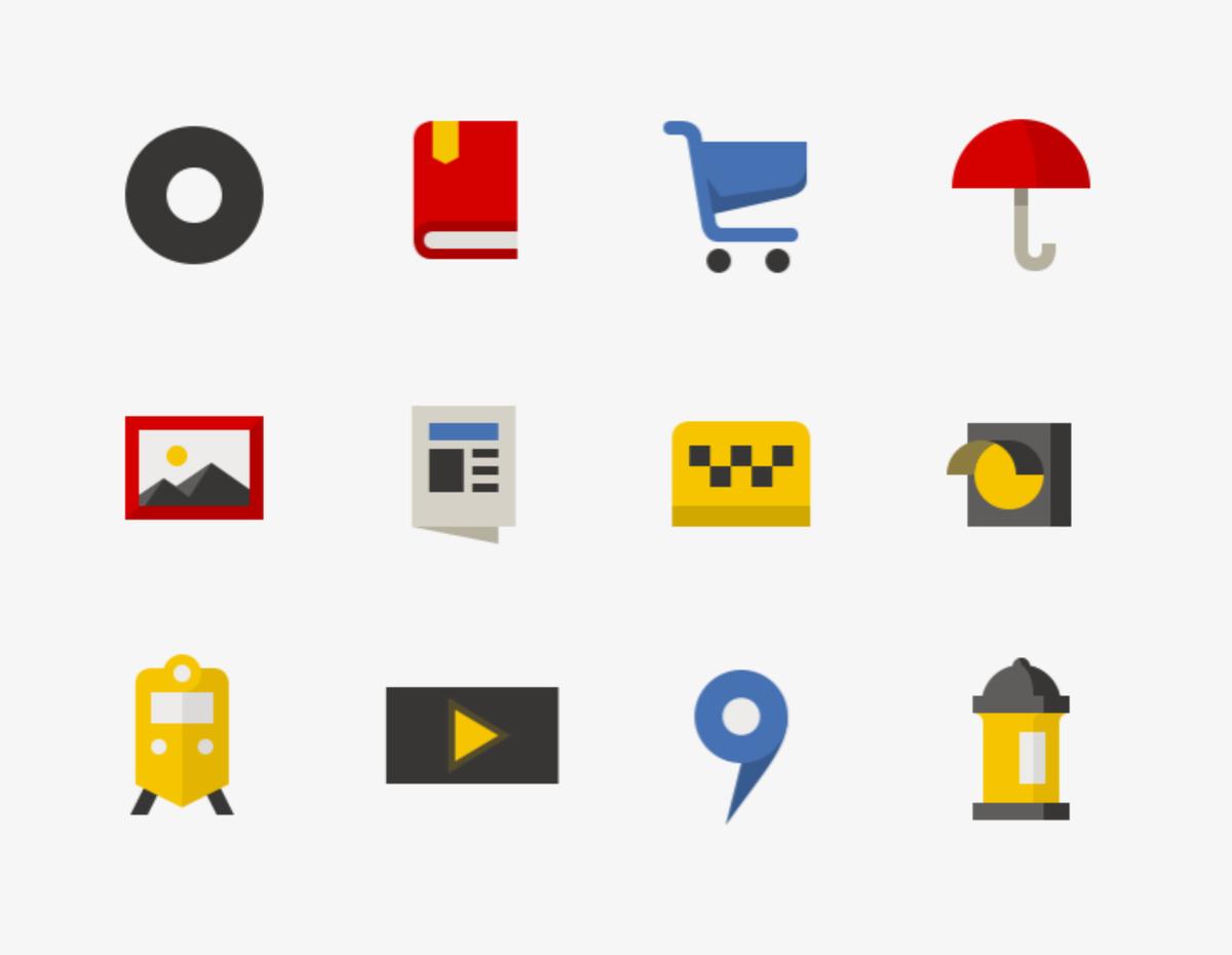
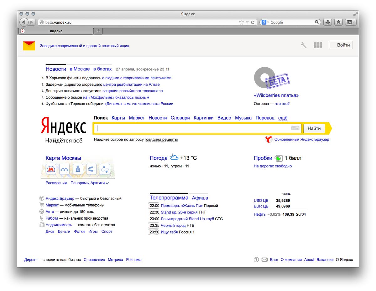
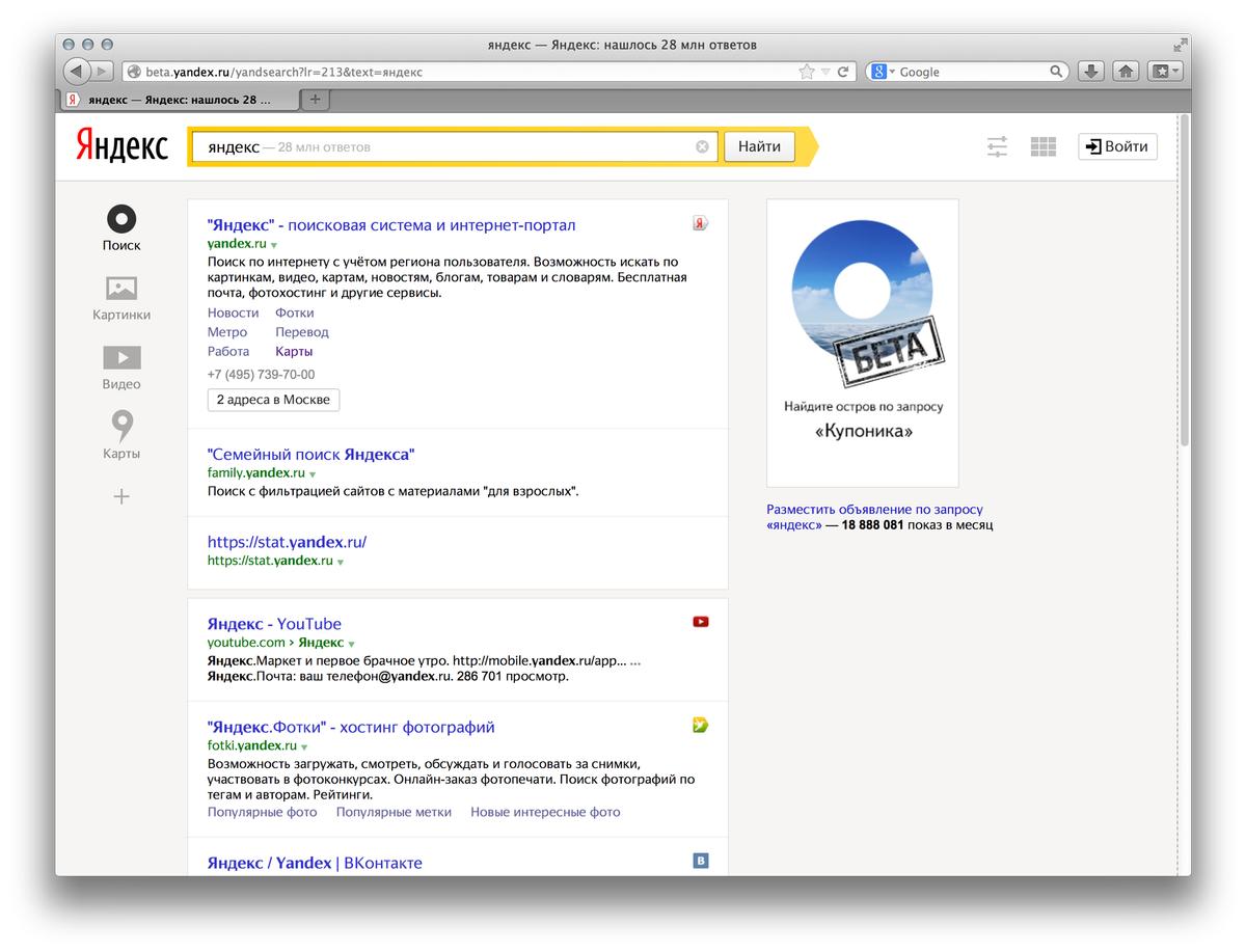
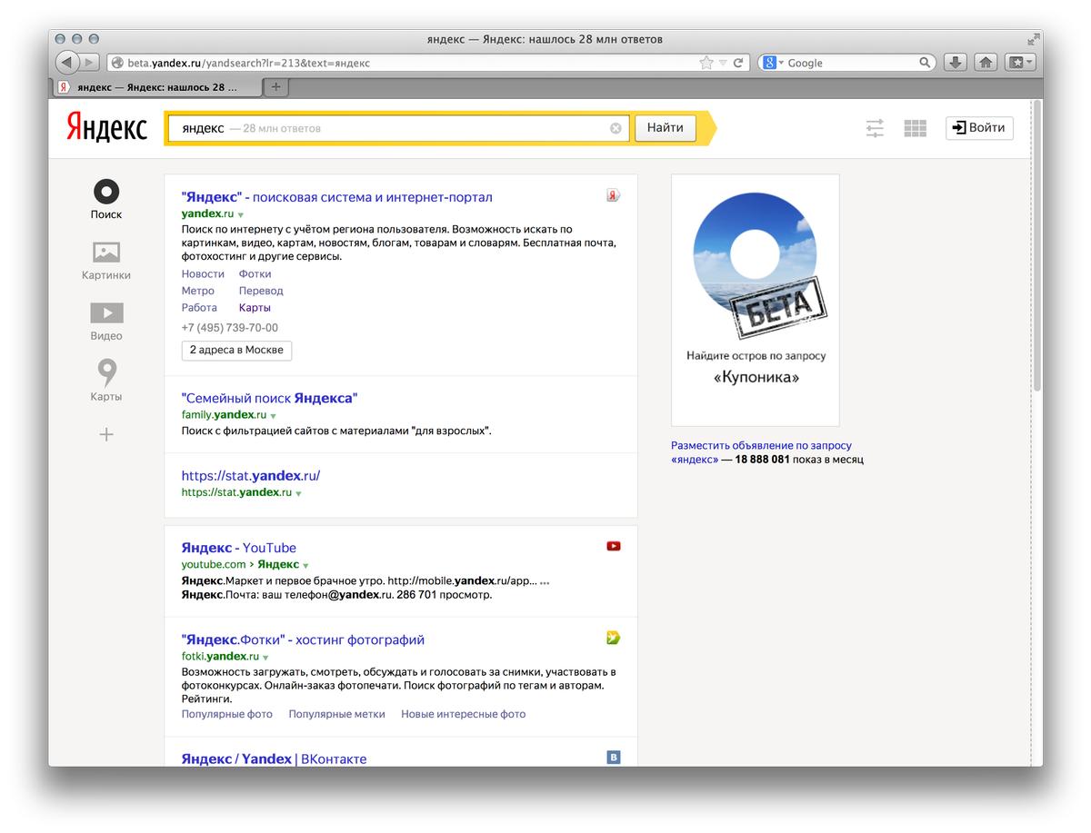
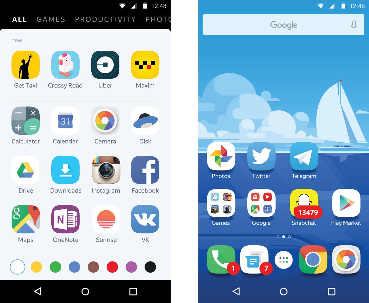
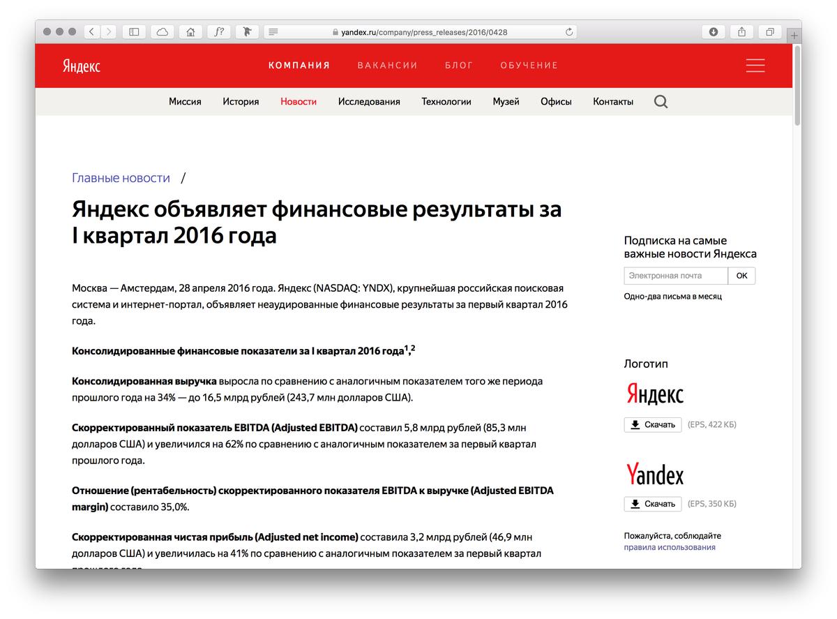
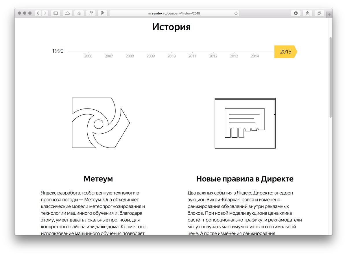
In 2014, we were approached by then Creative Director Irina Voloshina to build a typeface family that could help all of Yandex’s products speak in one consistent voice and strengthen the brand. In addition to their search engine, Yandex has many products and services, including a news aggregator, maps, a marketplace, and even a very popular taxi service. These products exist across the web, mobile web, and mobile apps, and had not really been designed with one consistent visual language in mind. Irina and her team were simplifying and refocusing the design, starting with a set of icons that gave us something visual to respond to. The main idea for evolving the brand was “technology with a human face”. For text and interfaces, the new typeface would need to replace Arial while keeping the same or better copyfit. For display and marketing, the typeface would need to replace Textbook (Bukvarnaya).
The new typeface was designed with three main goals in mind: first and foremost, it had to be functional. If it didn’t have absolute clarity, and wasn’t a pleasure to read on screen, none of the other goals mattered. Since Yandex is a Russian company, the typeface needed to look native in the Cyrillic script. Second, it needed to differentiate Yandex from its competitors and visually separate from the operating systems they appear on. Finally, it needed to strike the right tone of voice for Yandex’s brand, while helping to make the company’s wide range of products feel like a closely related family.
After initial sketches for many different directions, two sans options were the frontrunners: a stiffer sans with more contrast that felt more technical, and a rounder version that felt more human. As it was founded by engineers, Yandex is a data-driven company, so they worked to quantify which option was better, in part by testing the fonts in many different layouts so they could be compared as equally as possible. Miguel and Ilya’s rounder and more human version was the clear winner, especially after being softened further for a warmer tone.
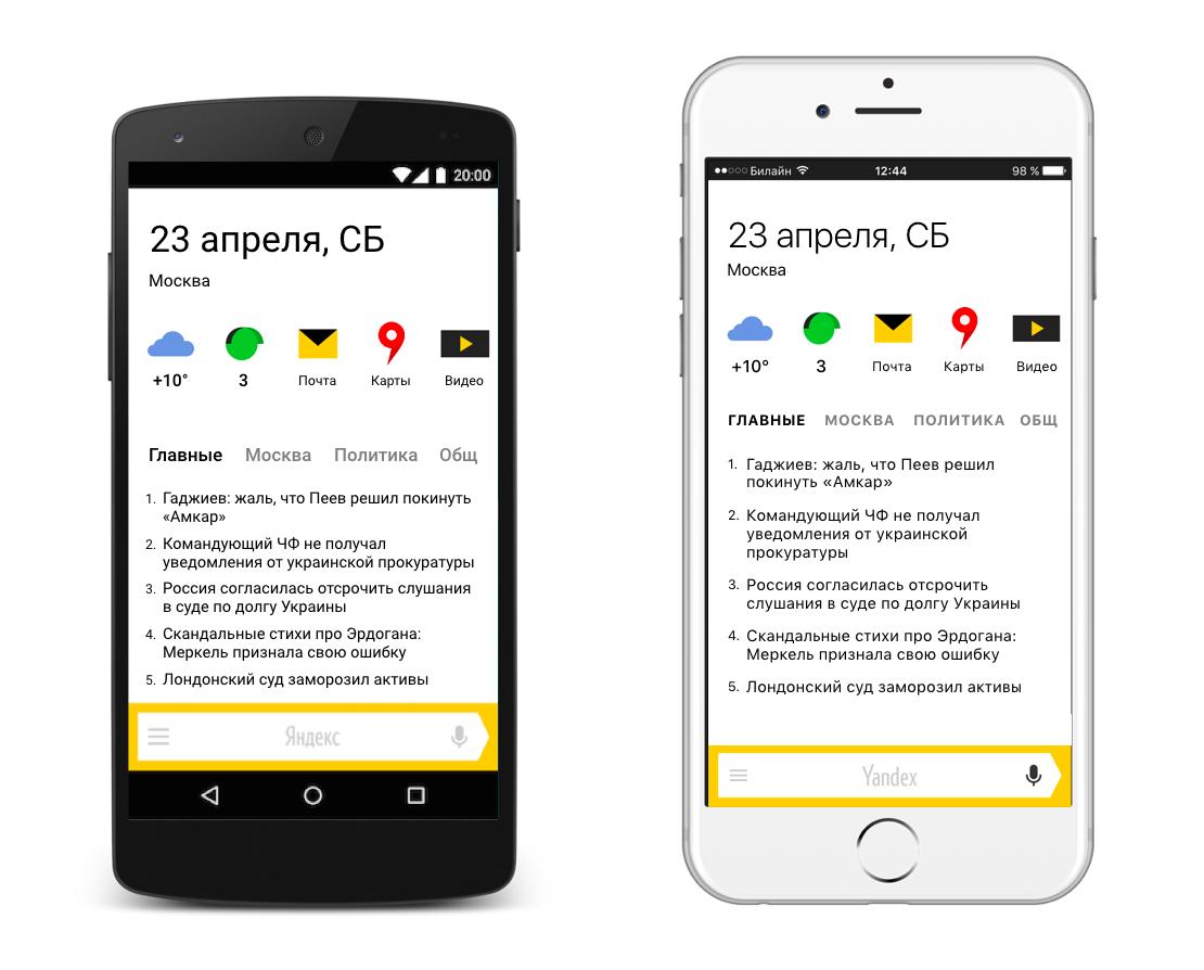
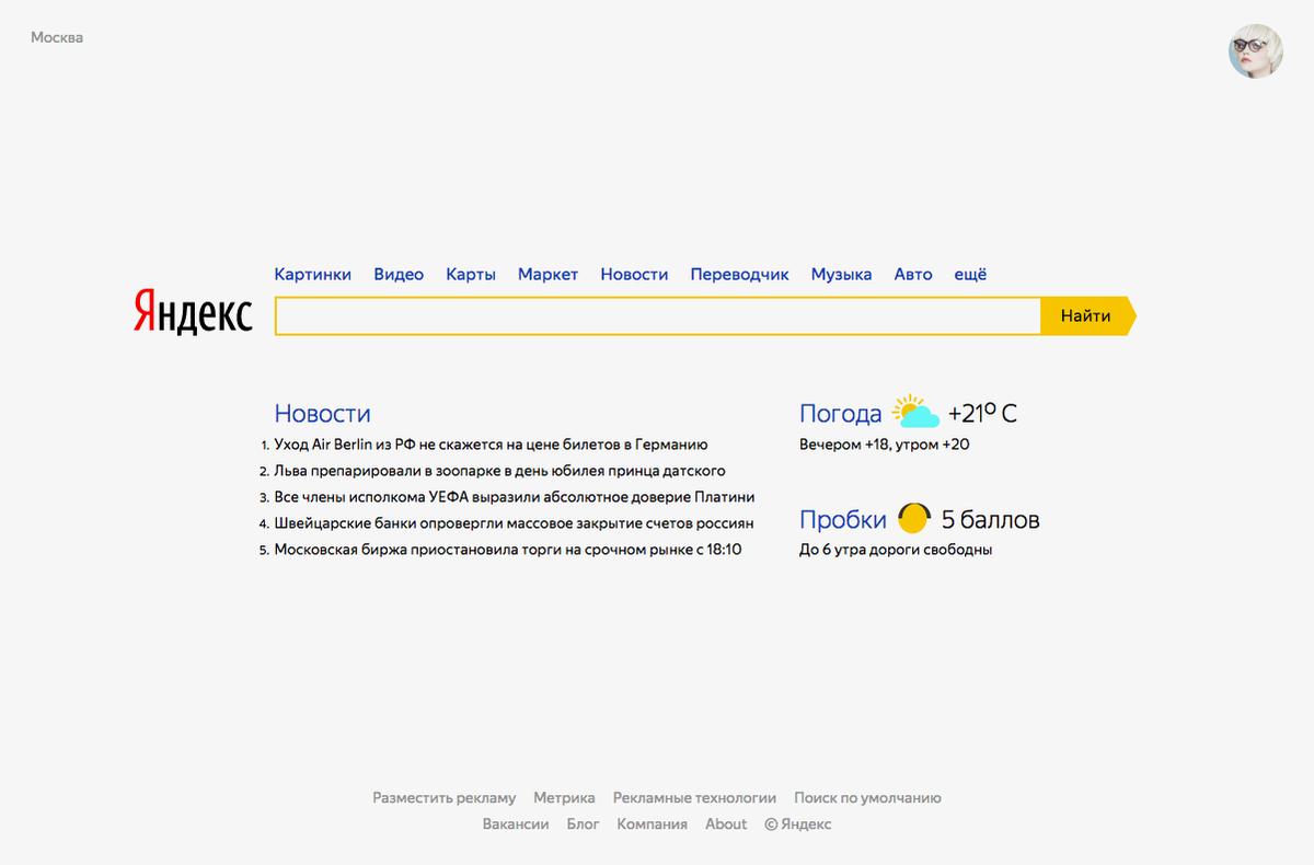
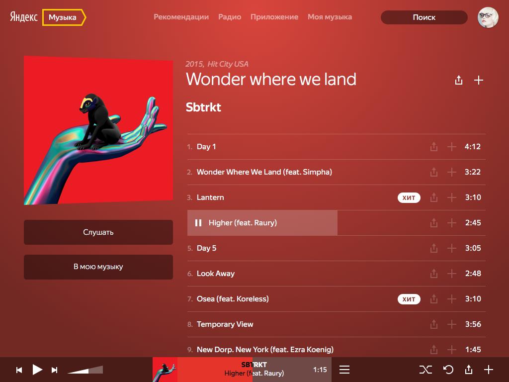
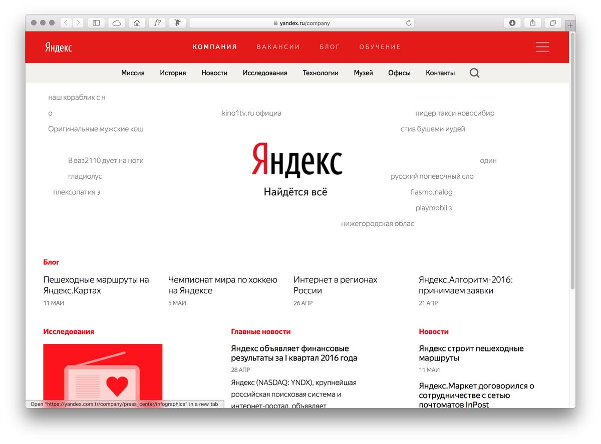
After a two-year process of design, revisions, and testing, Yandex Sans was unveiled to the public at Yandex’s first ever design conference on 23 April 2016 in Moscow, where Yandex design director Konstantin Gorskiy presented the typeface together with Christian Schwartz. It is already being used in a number of Yandex products and websites, and will be rolled out in many more in the months to come.
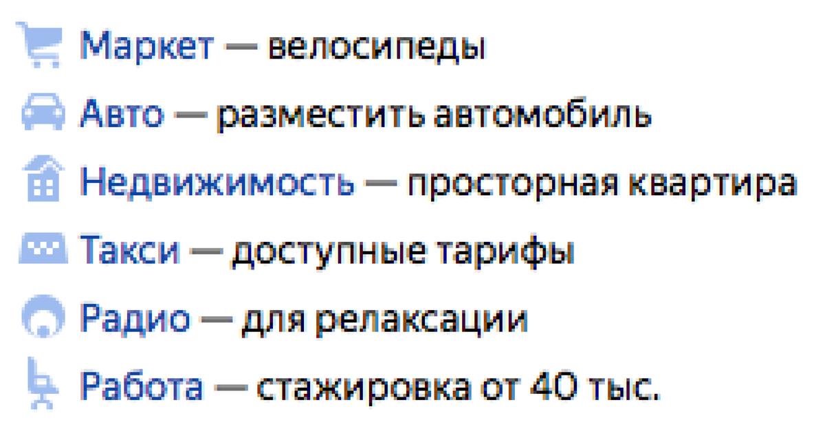
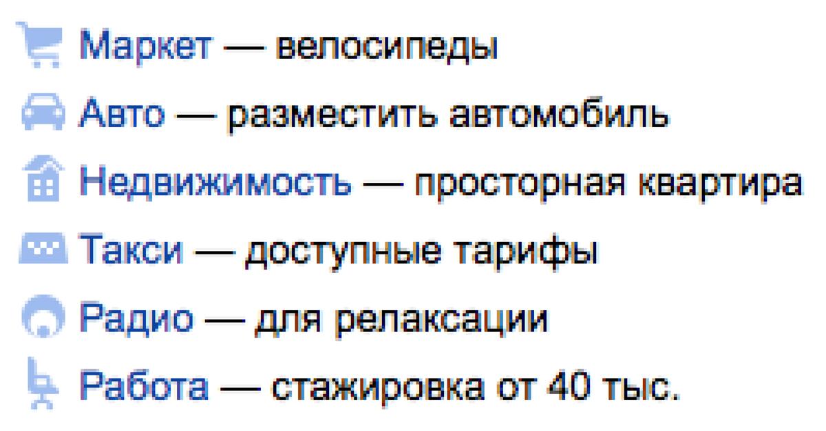
Yandex Sans roughly matches the vertical proportions of Arial, making it easier for the designers at Yandex to change to the new typeface in their interfaces without too many unintended consequences. However, the open terminals make Yandex Sans much easier to read at smaller sizes, particularly on standard resolution screens.
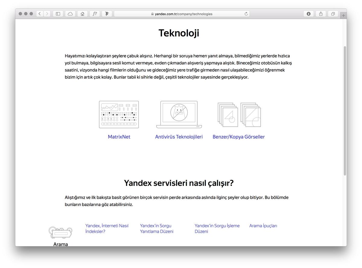
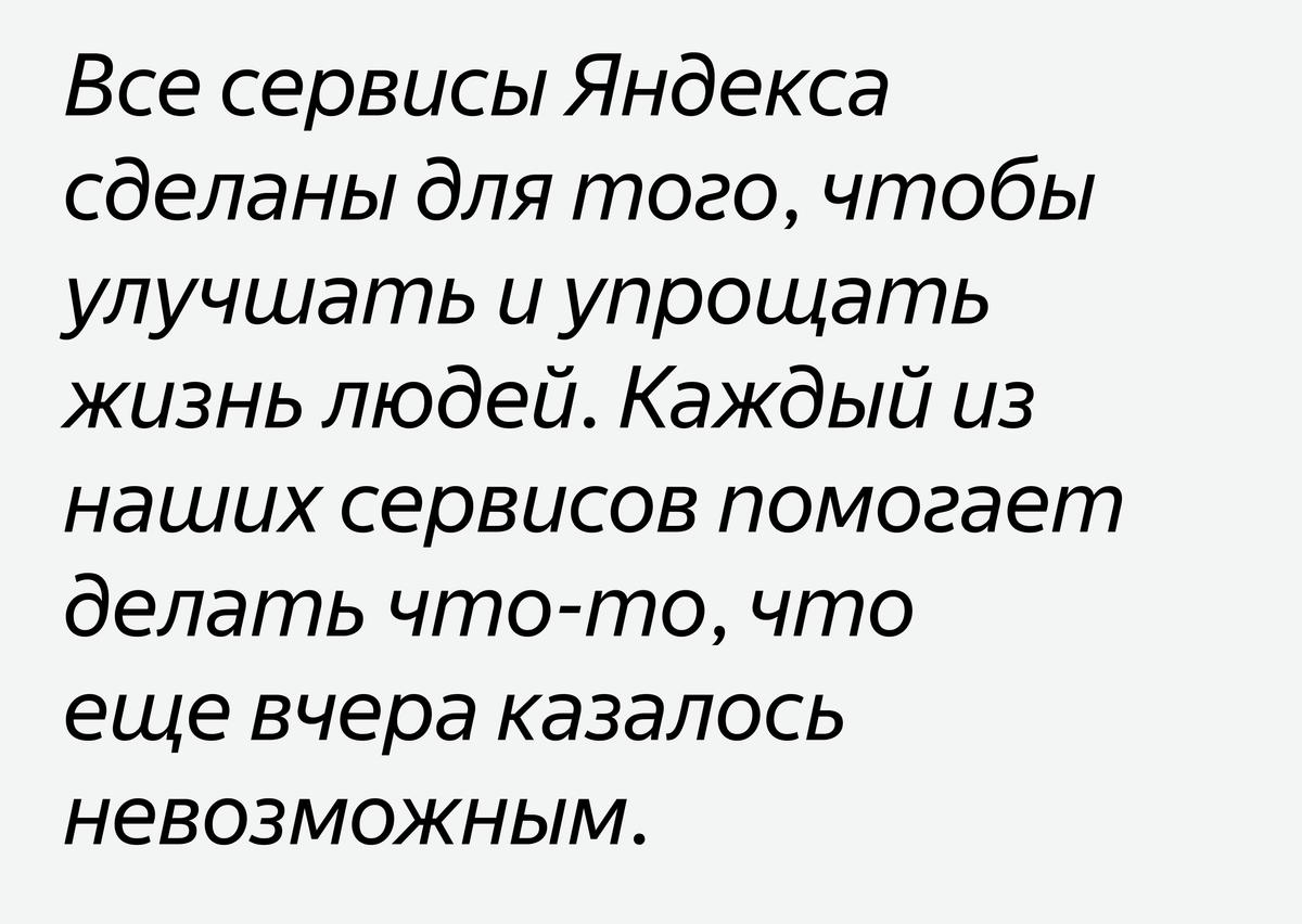
While many Cyrillic components of multilingual typefaces are compromised by design choices made in the Latin, because the Cyrillic is often designed after the fact, the opposite was true in Yandex Sans, where compromises were made in the Latin instead. The K and k, for example, use forms typical of the Russian К and к. Special attention was also paid to Turkish characters such as Ğ ğ Ş ş, as Yandex also has significant market share in Turkey. The italic has more cursive characters than would be expected for an interface typeface, to ensure that the italic is identifiable as italic even at small sizes on screen.
You can read more about this project in an article by Yandex design director Konstantin Gorskiy here, in Russian.
