Algebra by Susana Carvalho and Kai Bernau


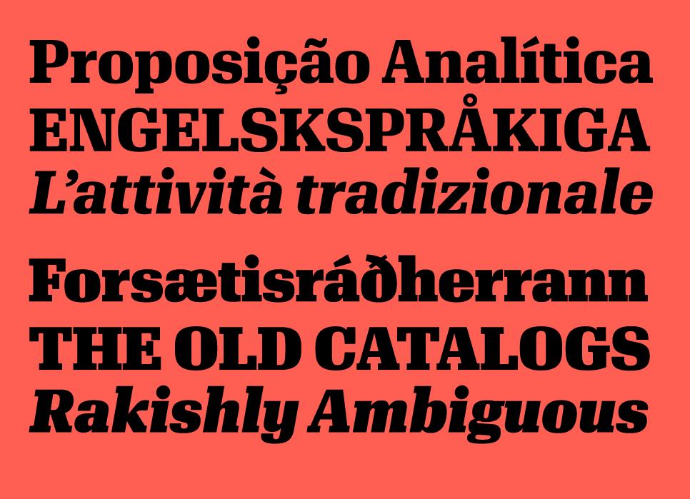
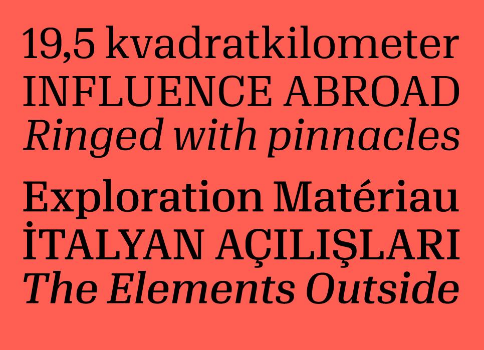
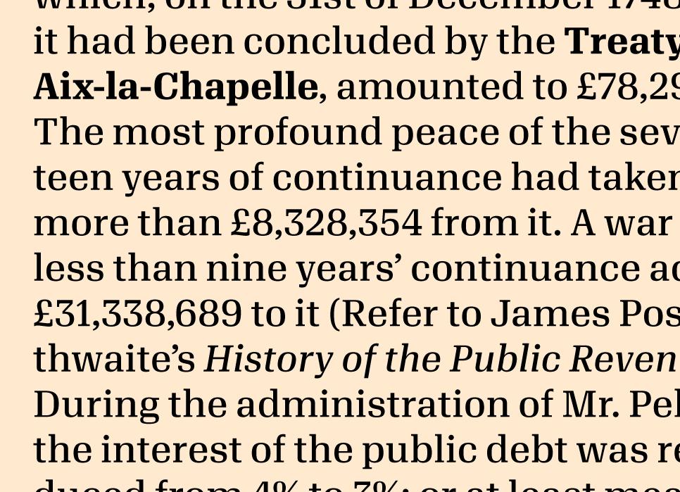
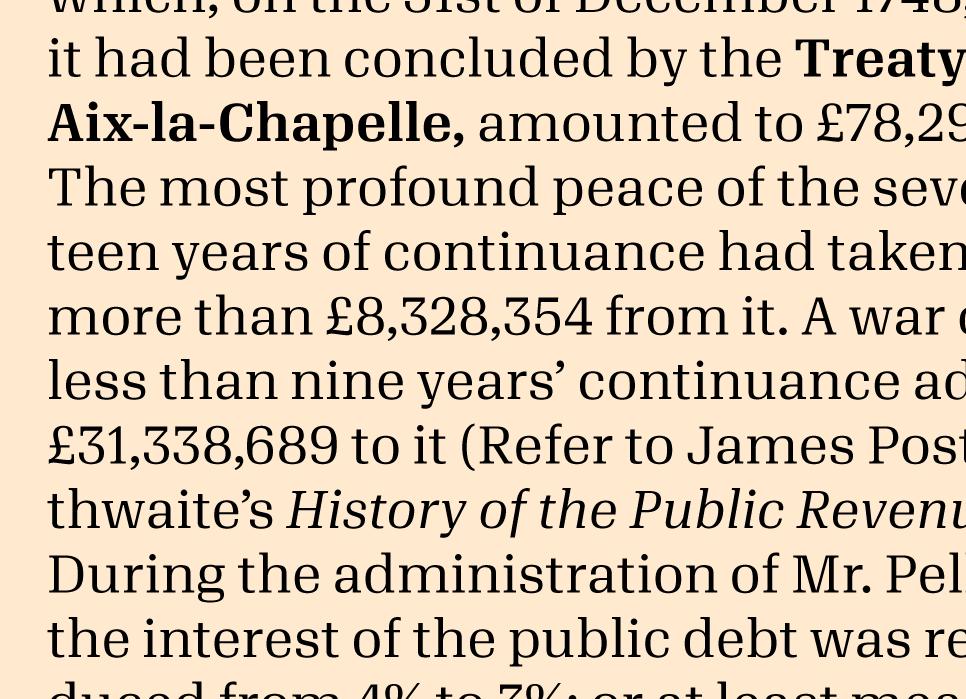
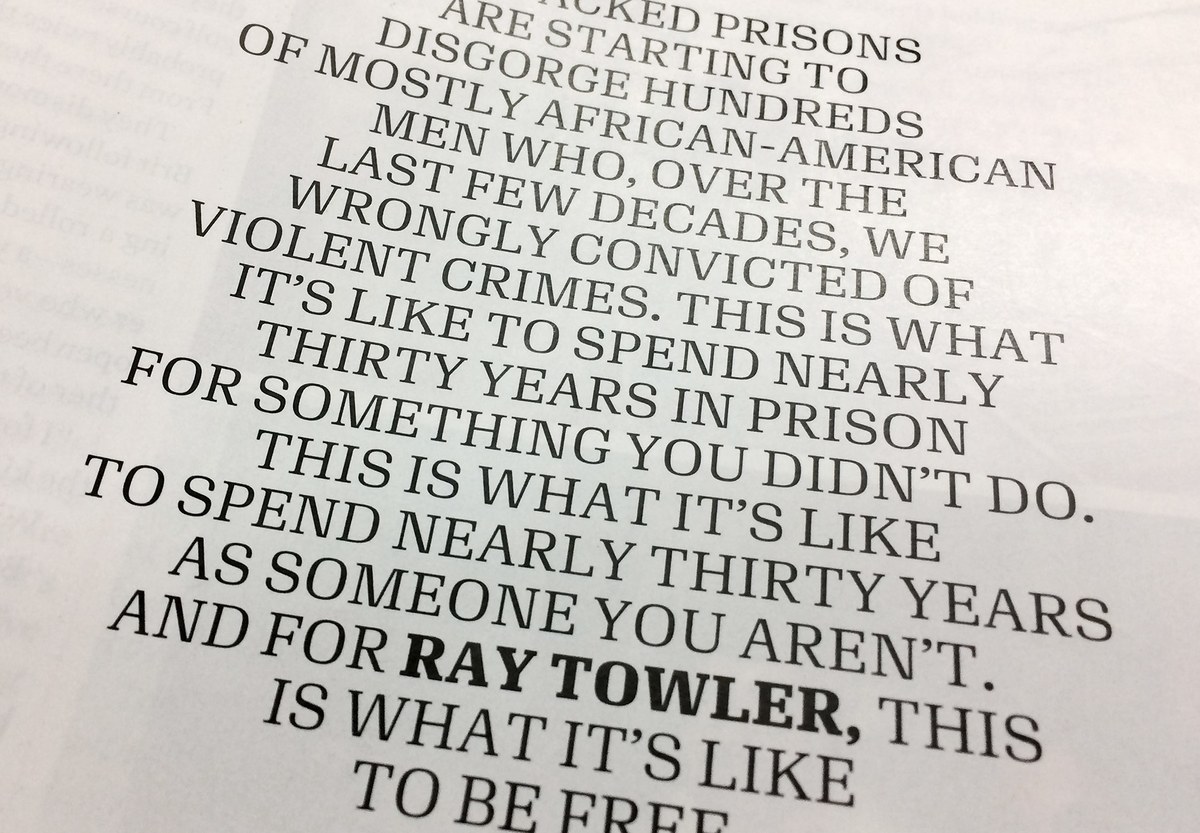
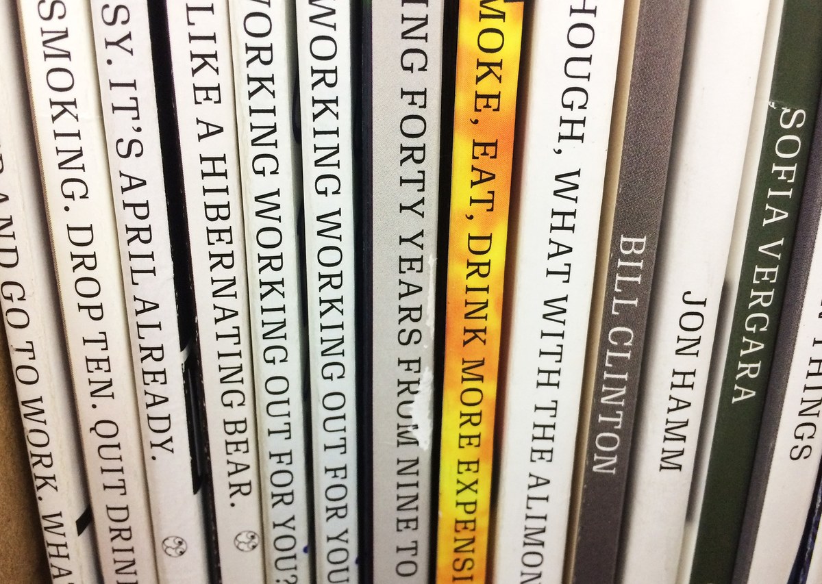
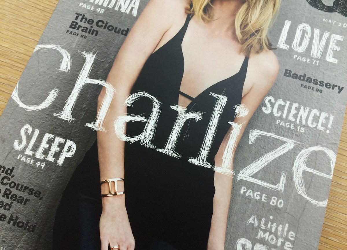
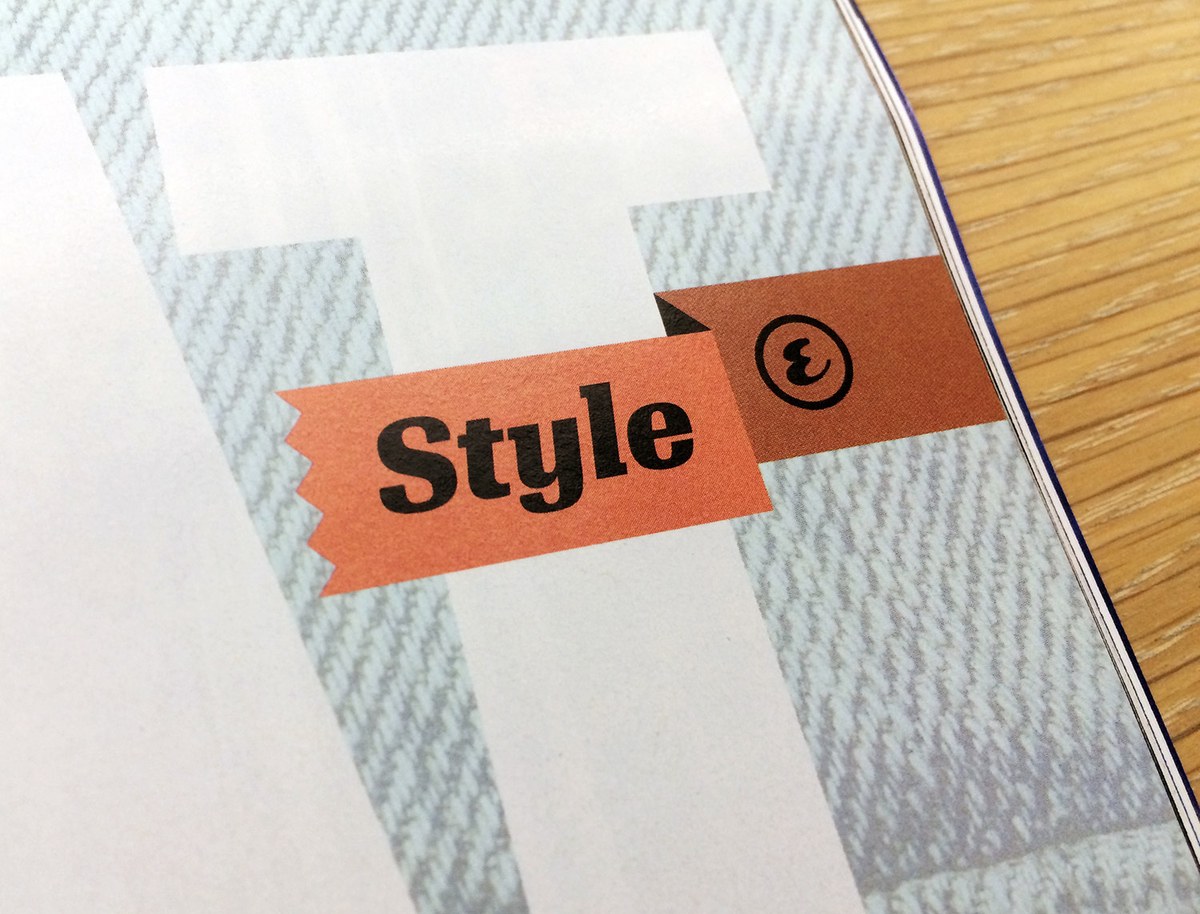
Algebra is a broad-shouldered slab serif typeface built on superelliptical forms, designed by Susana Carvalho and Kai Bernau. Its loose spacing gives a remarkably comfortable texture in text, and its crisp detailing gives a distinctive and serious feeling at display sizes, particularly with some negative tracking.
Algebra references such squarish 20th century serif families as Adrian Frutiger’s Egyptienne, Georg Trump’s Schadow, and Hermann Zapf’s Melior, but its clean lines make it appropriate for use in contemporary magazine design. The flat vertices where diagonals intersect (as in the A or M) are crisp and open, giving these letters a brutal feeling and playing nicely off of the bulky round shapes. Functionally, the flat vertices keep the letters from clogging even at small sizes on screen or under the worst printing conditions.
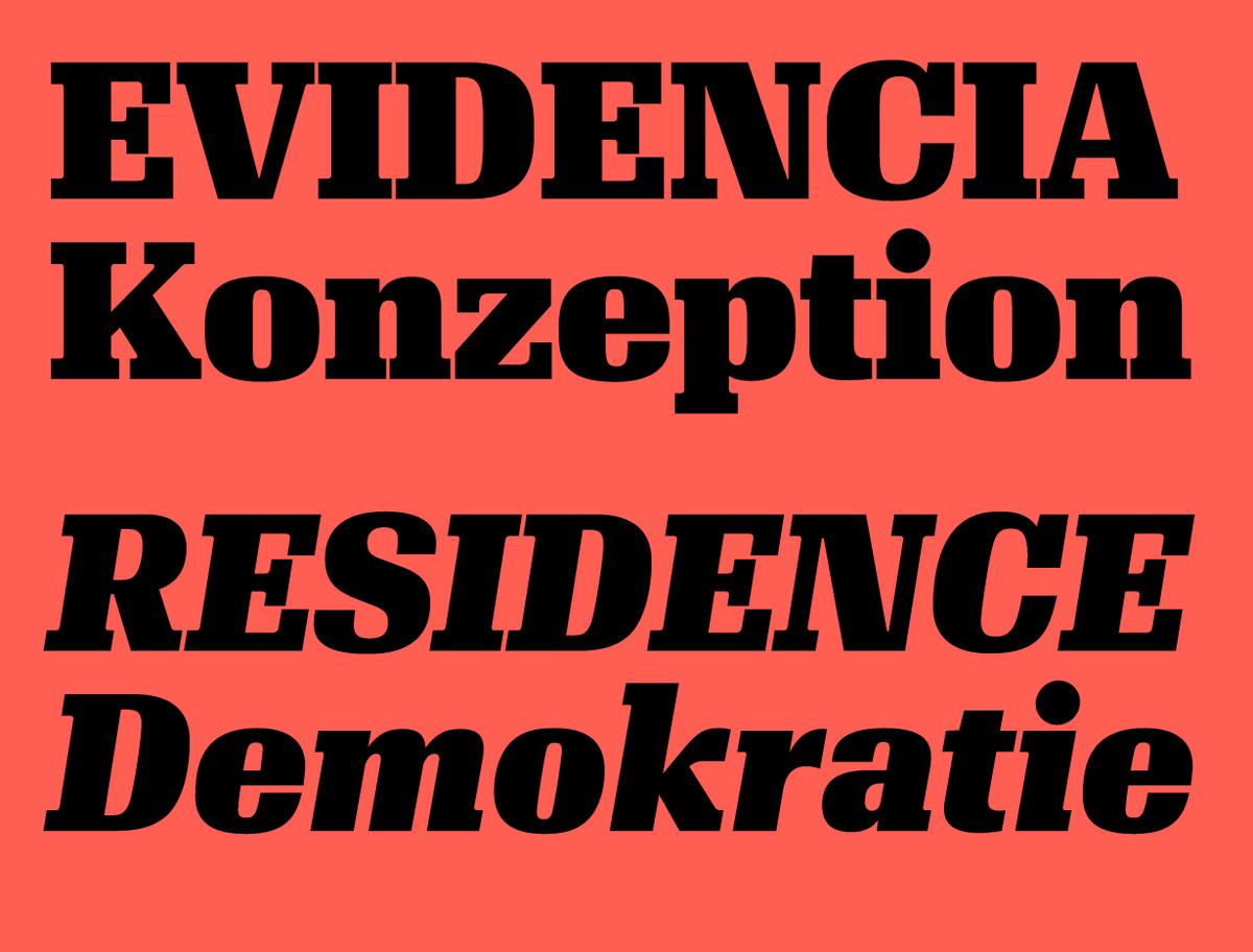
Five of the six weights can be used at any scale, for text or display, though we recommend negative tracking at larger sizes. The forceful Black weight is designed for display use only; its tight spacing and tiny counterforms do not work at text sizes.
Simple italics match the directness of the romans, and a handful of alternates allow the italics to take on a softer, more traditionally cursive feeling.
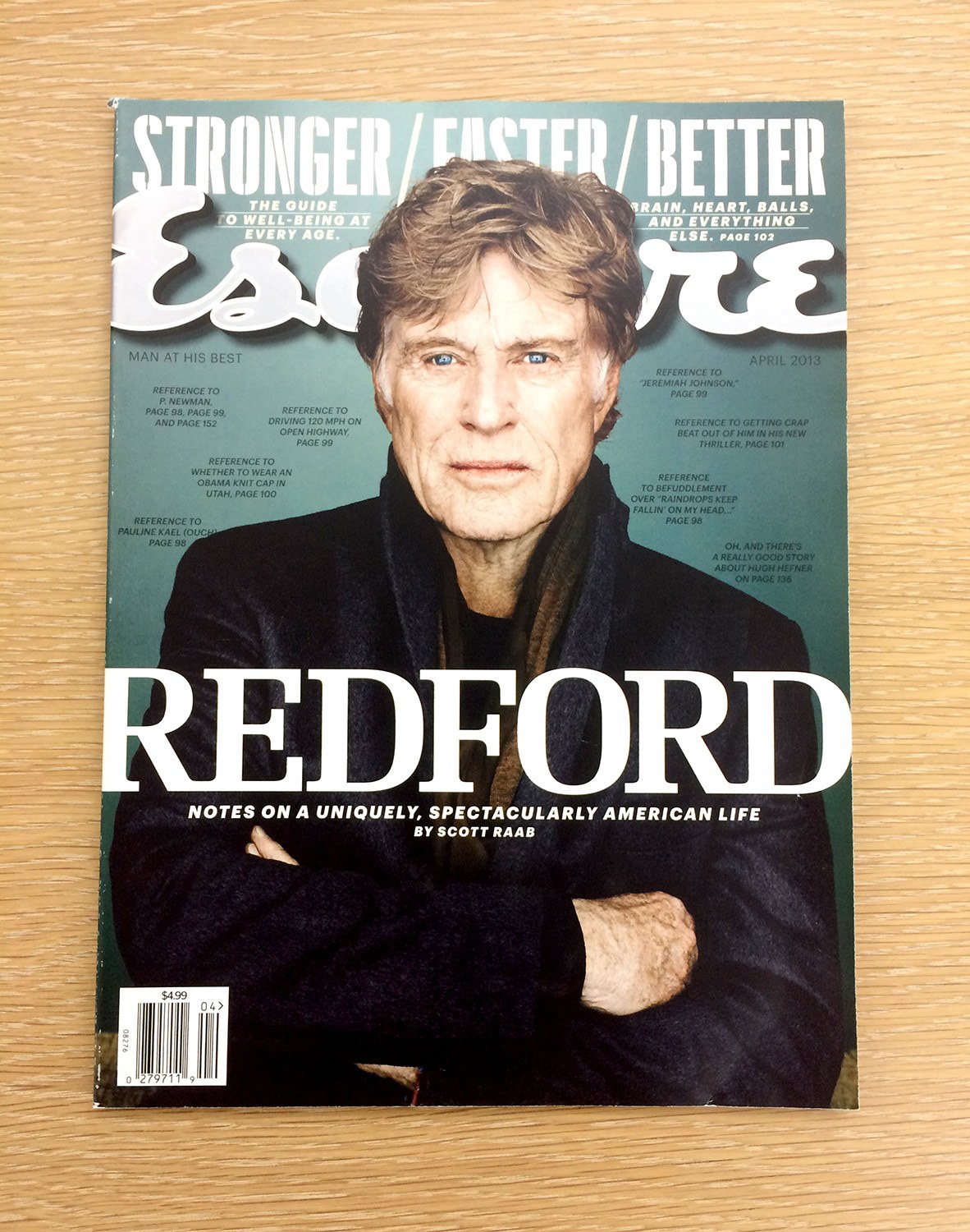
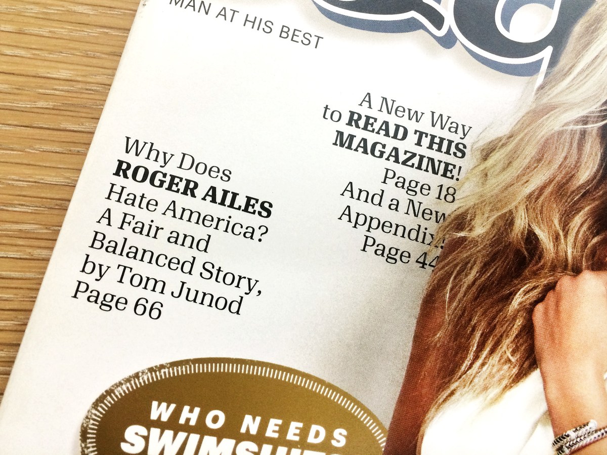
Algebra evolved from Granger, a headline typeface drawn by Carvalho and Bernau for the US edition of Esquire, commissioned by creative director David Curcurito and then art director Darhil Crooks. (Like so many good names, “Granger” turned out to already have been taken when we started to prepare the family for release). The typeface made its debut in the “Fresh Start” issue, which had the fitting theme of “creative destruction”. Granger had slightly softened terminals, which have been sharpened and simplified in Algebra for a clean and direct character.
