Styrene by Berton Hasebe
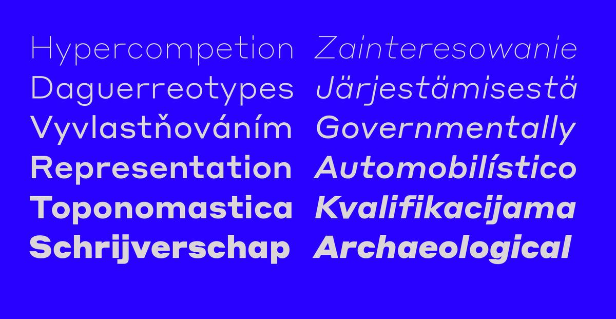
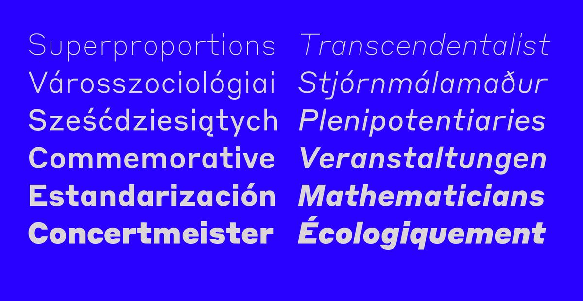
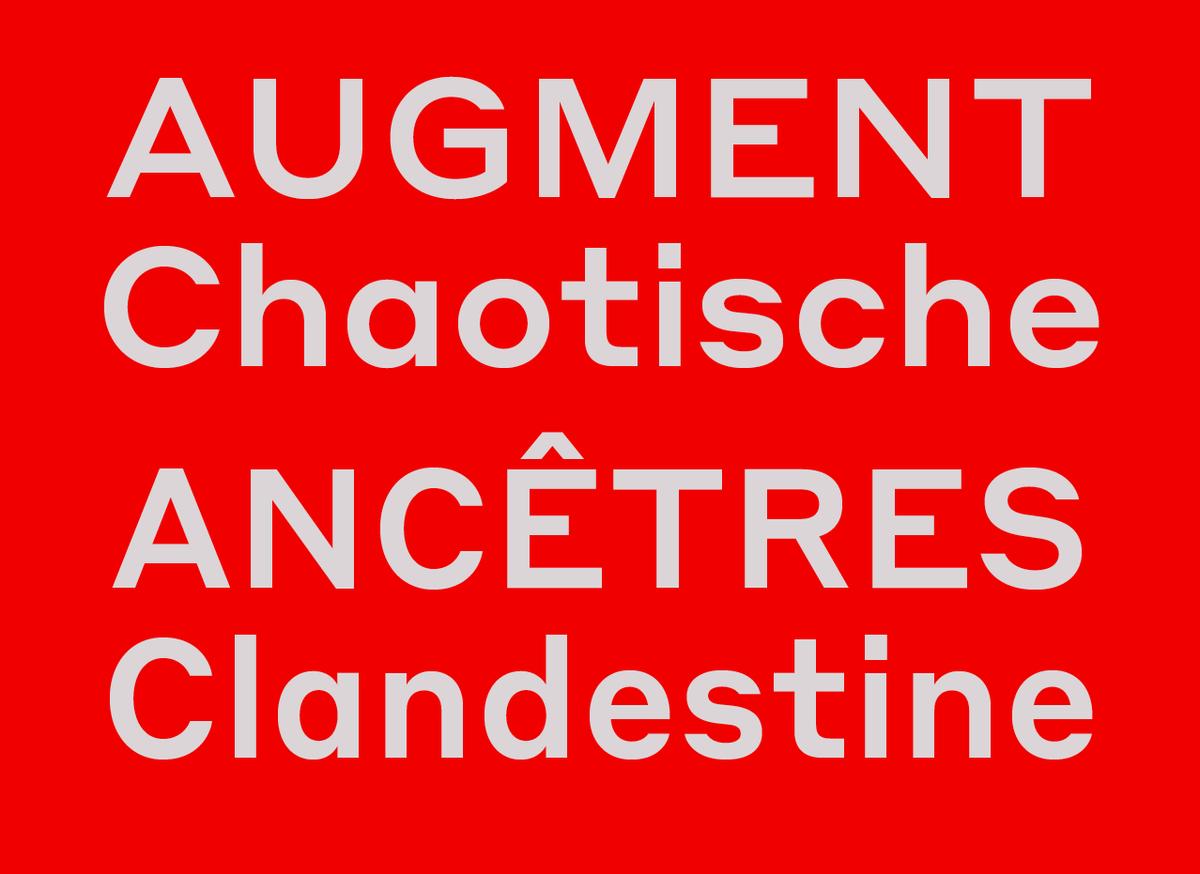
Styrene, designed by Berton Hasebe, is his latest exploration of proportion and simplicity in type design. The initial inspiration for Styrene was a charmingly awkward sans serif called Breede Schreeflooze shown in a 1932 type specimen published by the Enschedé Typefoundry. Though this peculiar old typeface was a jumping off point for the design, the resulting family has a decidedly ahistorical attitude. Its name was inspired by the purposefully synthetic treatment of its curves and geometry. Styrene is characterized by its proportions: typically narrow characters like f, j, r, and t are hyperextended and flattened, adding distinctive gaps to the wordshapes in unexpected places.
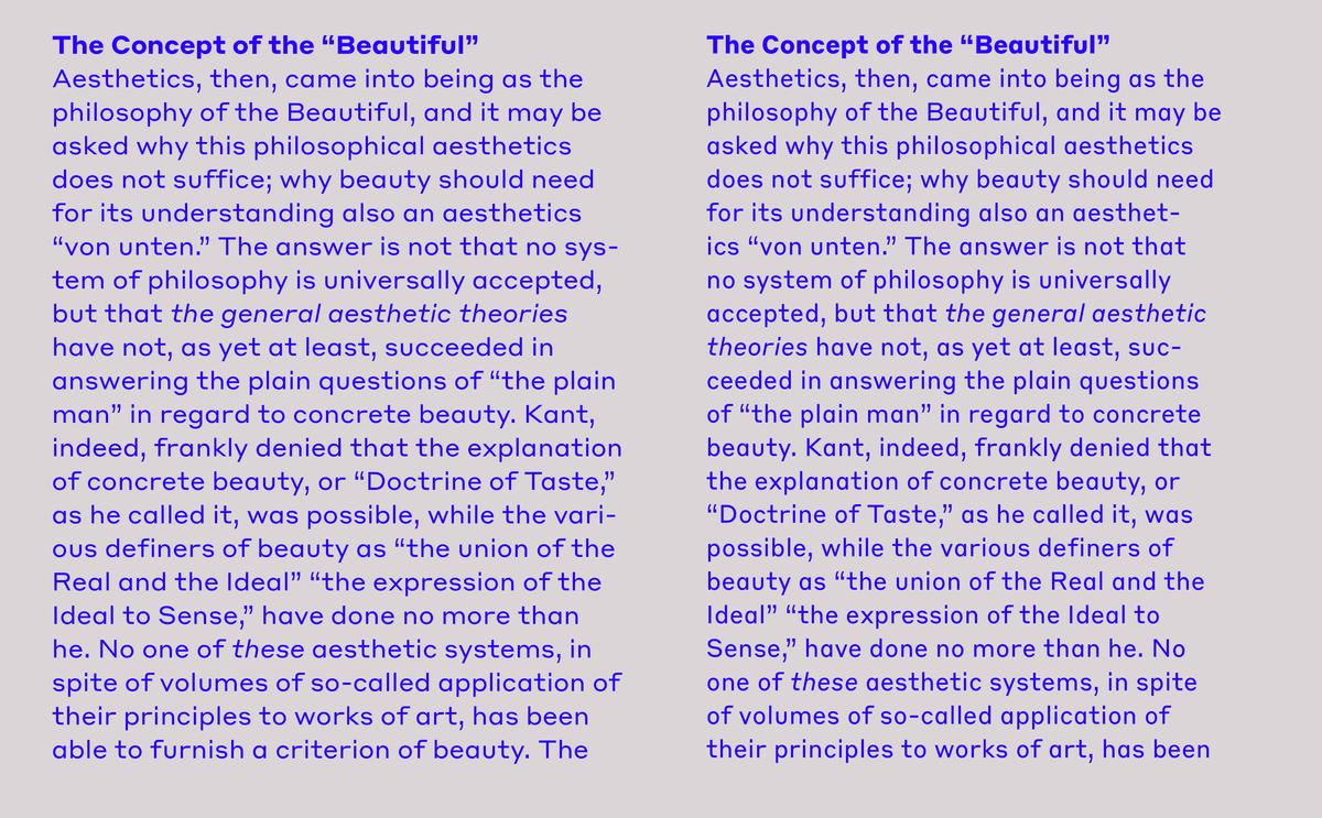
Styrene’s two widths offer different textures in text: version A is dogmatically geometric, with a stronger overall personality, while version B is narrower for more reasonable copyfit, though not truly condensed.
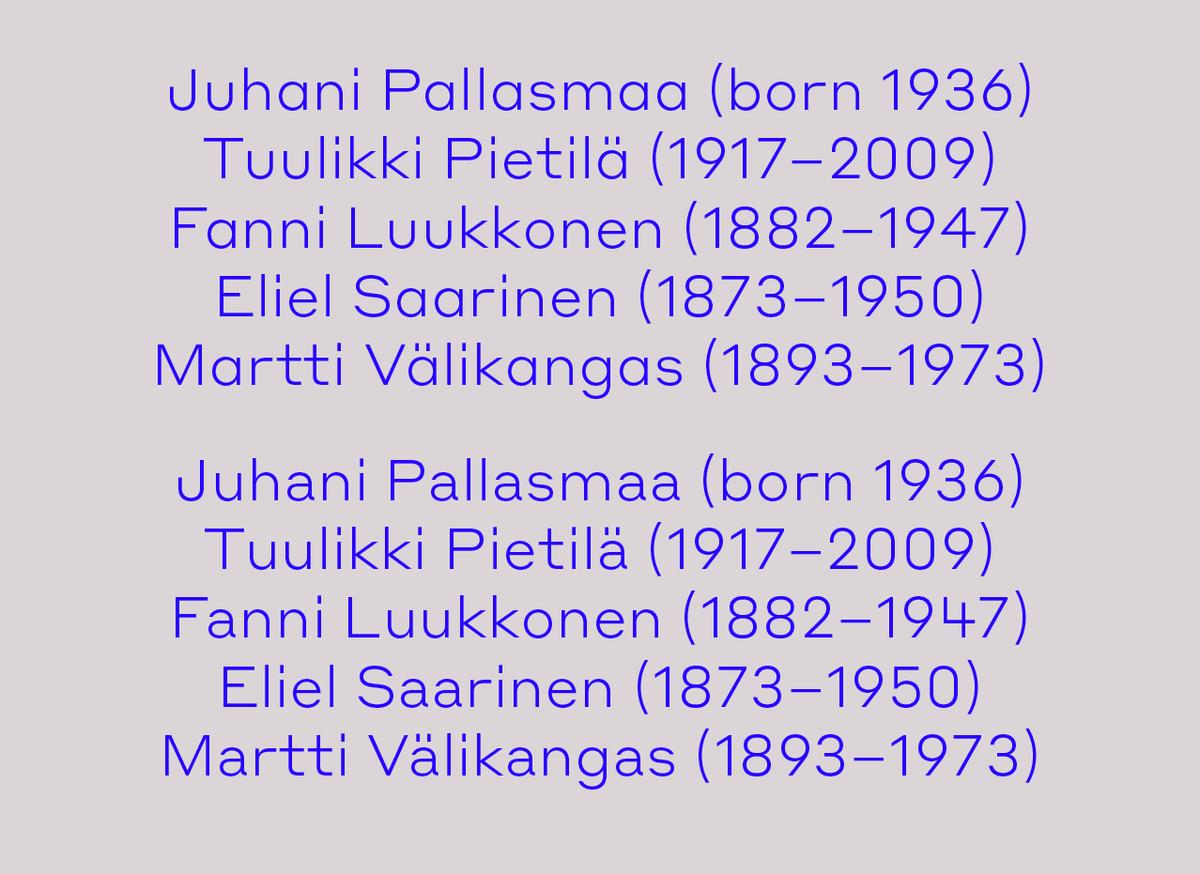
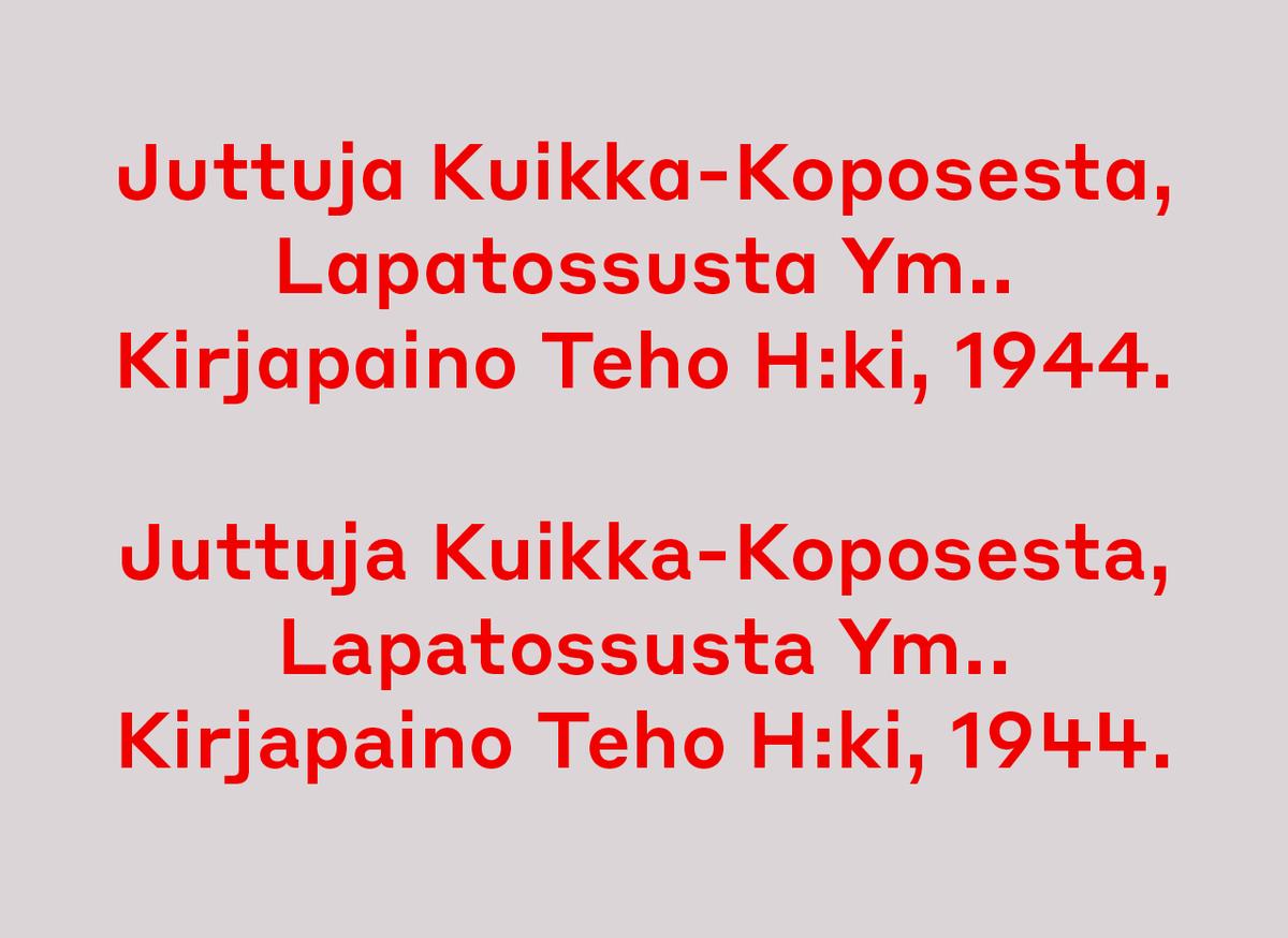
Alternate shapes for a and u shift Styrene's personality from mechanical to more traditional, while an alternate 4 adds eccentricity.
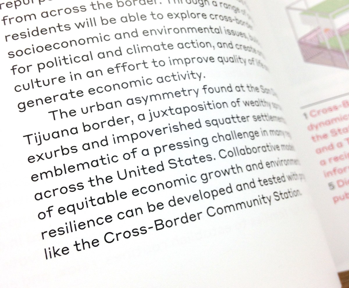
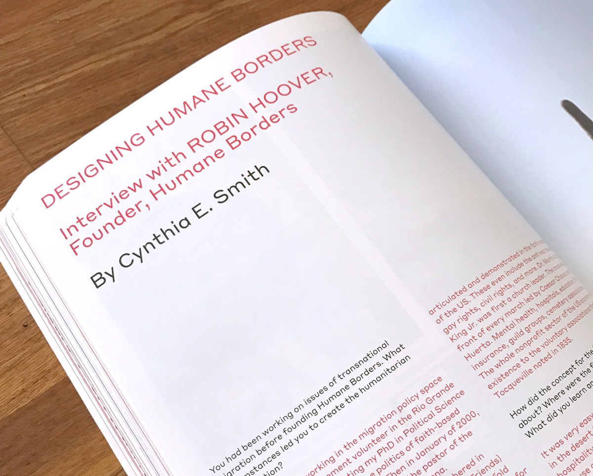
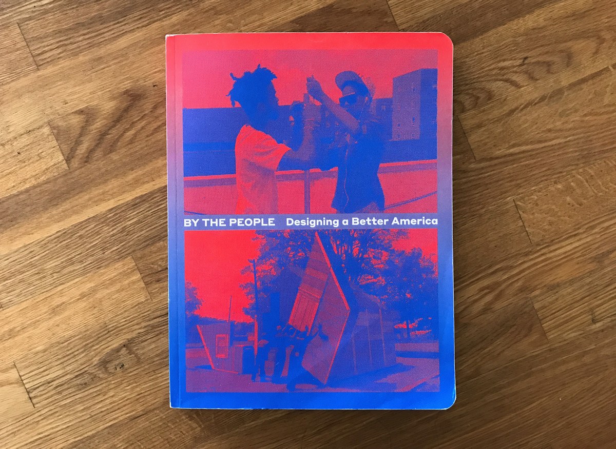
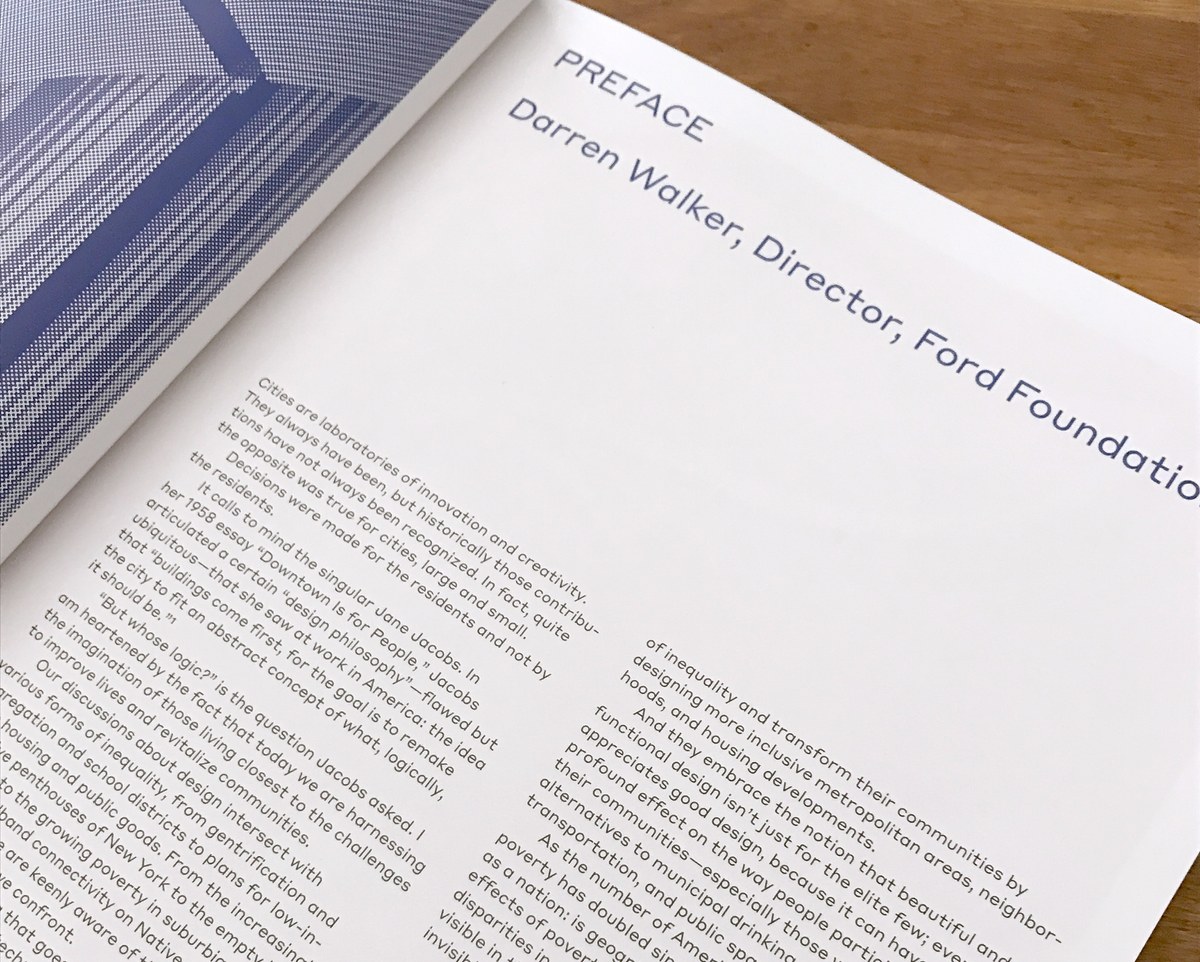
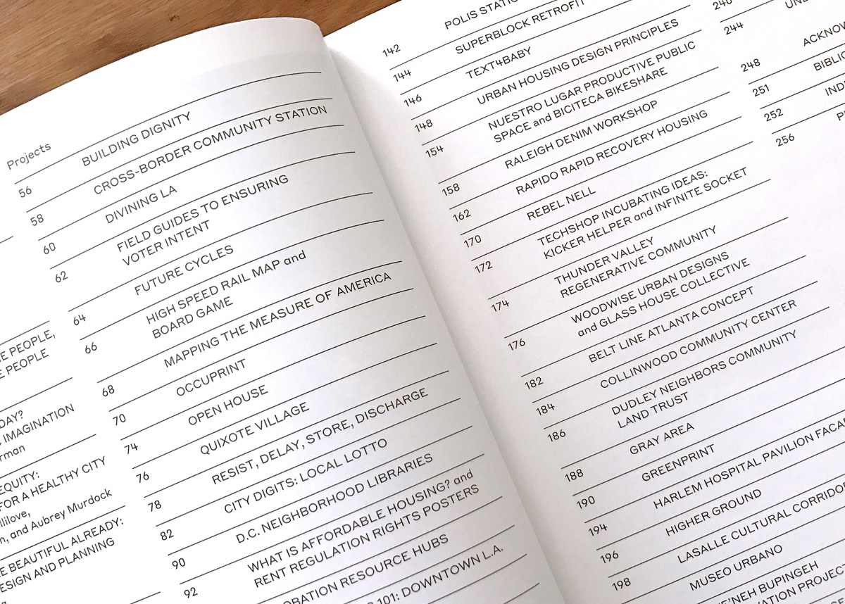
Styrene was the primary typeface in a book called By the People: Designing a Better America, designed by Other Means. This book is the third volume in Cooper Hewitt’s ongoing series on socially responsible design. The museum describes the show as follows: “The first exhibition in the series to focus on conditions in the U.S. and its bordering countries, ‘By the People’ will explore the challenges faced by urban, suburban and rural communities. Organized by Cynthia E. Smith, Cooper Hewitt’s curator of socially responsible design, the exhibition features 60 design projects from every region across the U.S.” The studio was drawn to Styrene's unusual texture and eccentric proportions, saying “It’s extremely legible at all sizes, but its details prevent it from being invisible.” Read more about their process here.
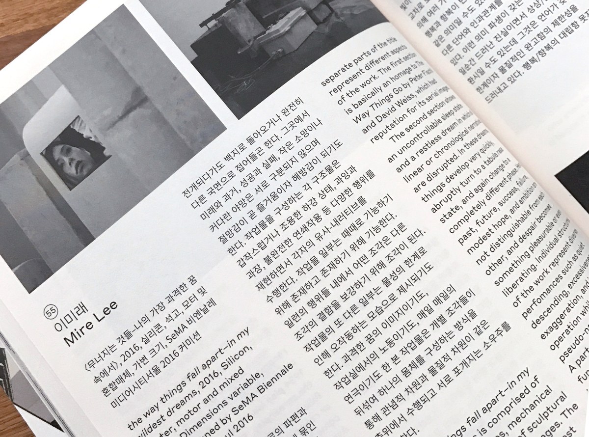
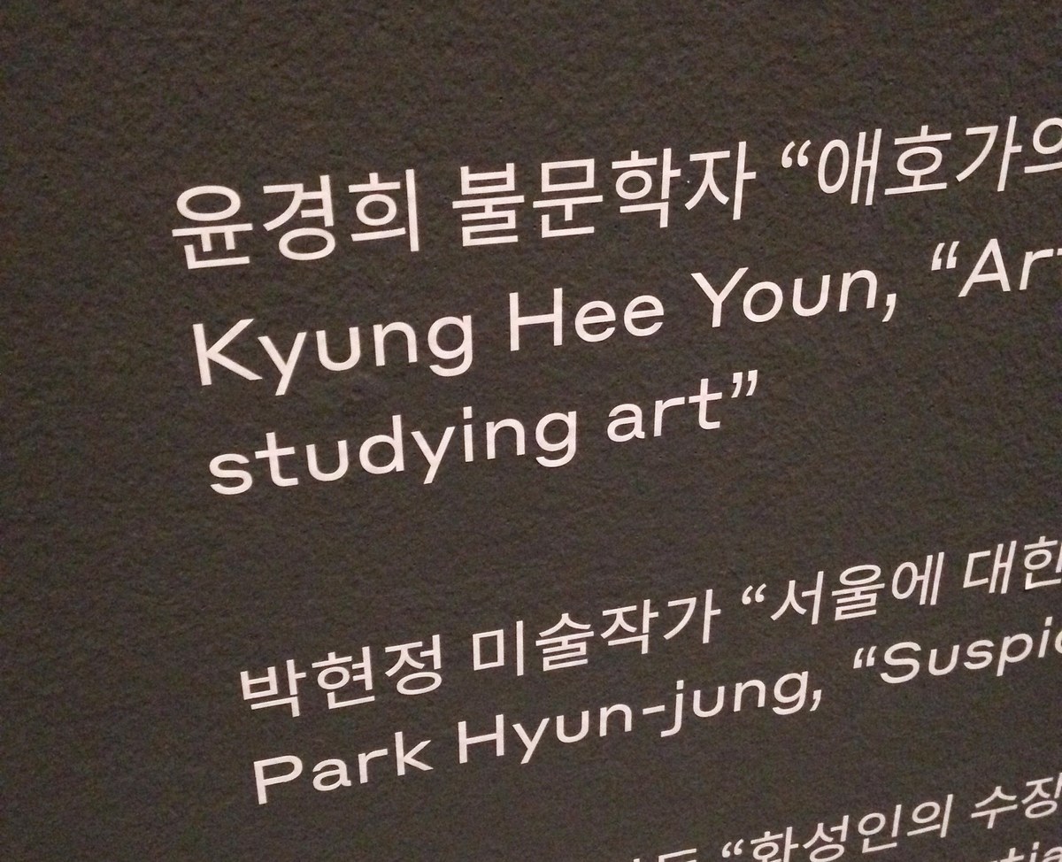
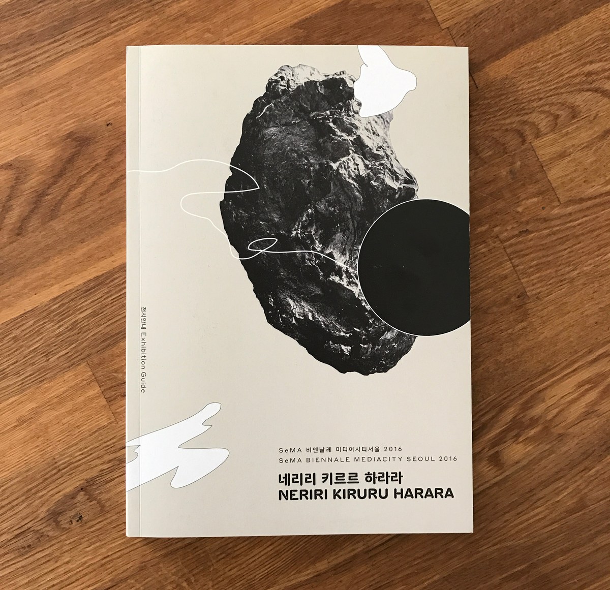
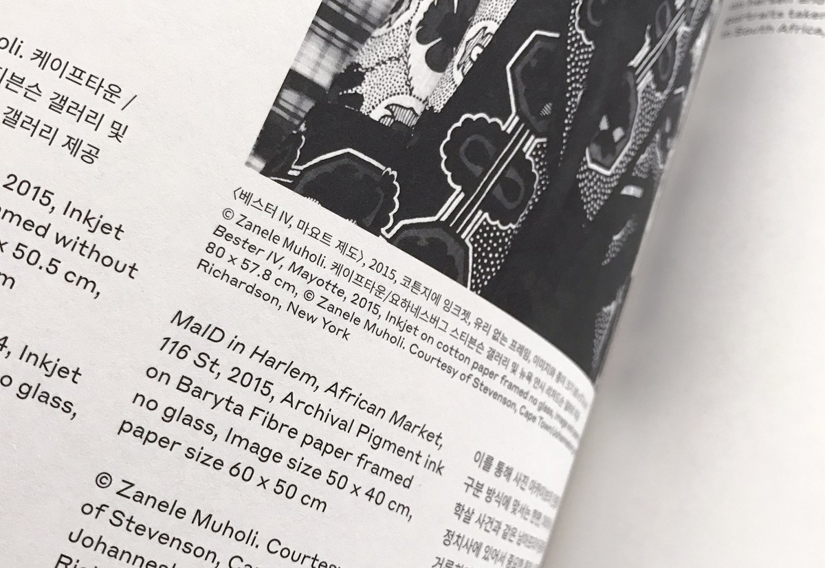
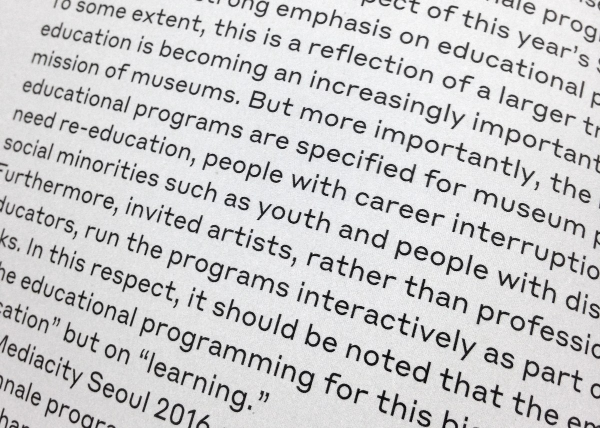
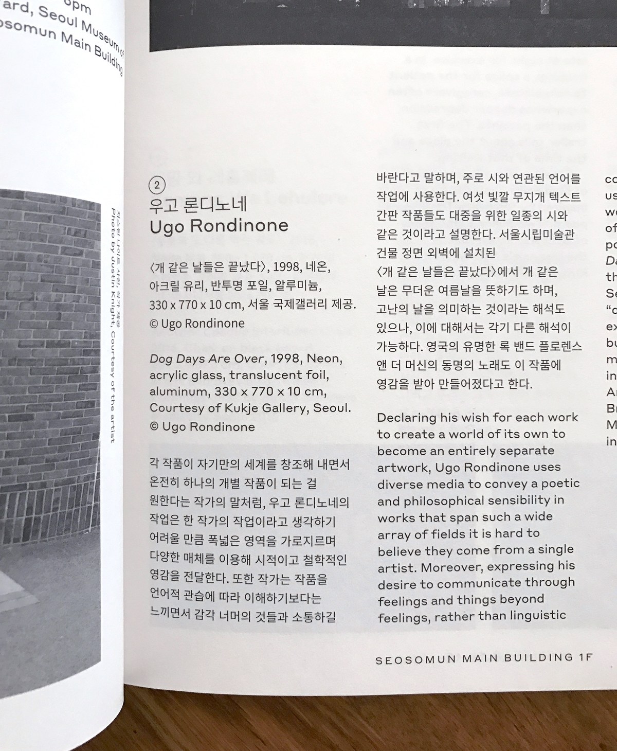
Styrene is also used in the exhibition graphics and publication design for NERIRI KIRURU HARARA, the Seoul Museum of Art's 2016 Biennale. The identity was designed by E Roon Kang of Math Practice, who discovered that the geometry and purposefully uneven density of Styrene was an excellent companion for Korean text, harmonizing perfectly with the geometric shapes and varying density of the Hangul alphabet.
