Robinson by Greg Gazdowicz
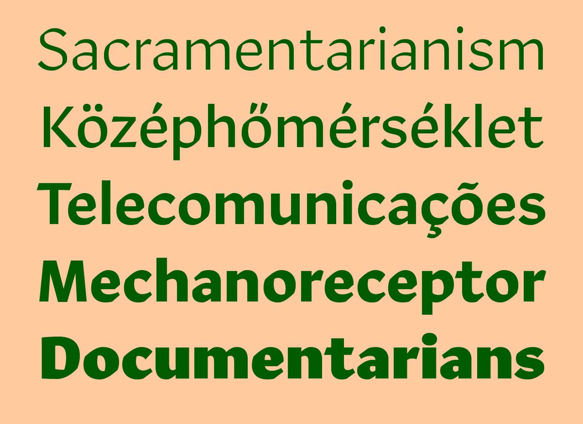
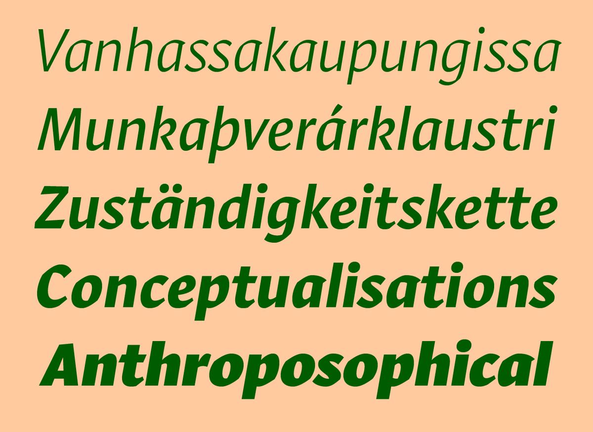
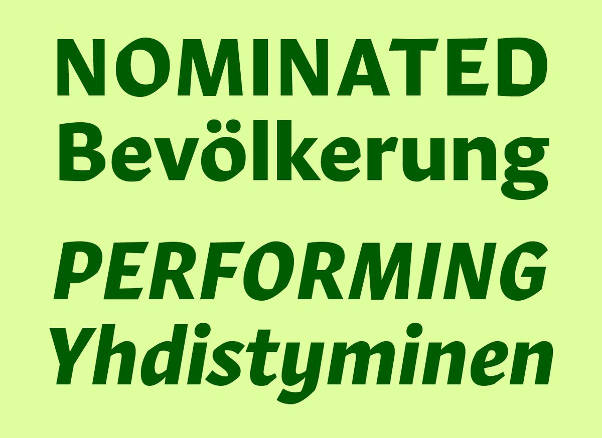
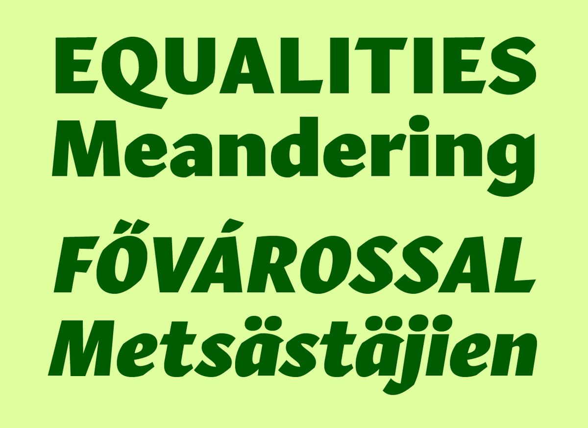
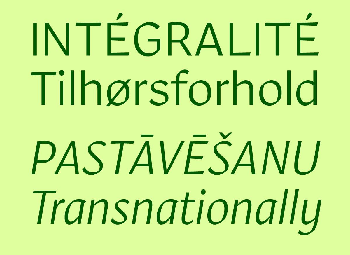
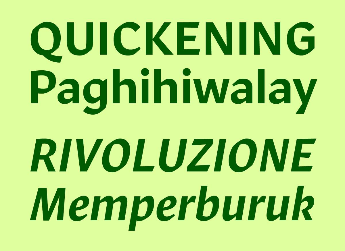
A concise family of 5 weights, Robinson is the first release by Commercial Type designer Greg Gazdowicz. Inspired by calligraphic sans serifs like Warren Chappell’s Lydian, Rudolf Koch’s Stahl, and R. Hunter Middleton’s Samson, Gazdowicz aimed to make a contemporary sans that used the hallmarks of calligraphic construction to add visual interest without being explicitly calligraphic. The result is a crisp, refreshing sans with a lively personality. Robinson is evocative of American book cover lettering from the middle of the 20th century while feeling cleanly contemporary. The romans are plainspoken, with proportions more typical of a grotesque than written forms. The italics show a more explicit connection to calligraphy, but have the same dry and stripped down approach to details seen in the romans. The crispness and contrast lent by the calligraphic finish are exaggerated in the striking Black weight, especially the italic, has a kinetic feeling on the page.
As a graphic designer, Gazdowicz loved using calligraphic typefaces like Lydian in his work, but found them limited in their usable range of sizes, and in tone. He felt that Lydian brought too much of its own baggage for most applications: a feeling of historicism, and a knowing hipness. Gazdowicz examined the traces left on letterforms by the broad-nibbed pen, then set out to construct a sans serif built on the proportions of an American gothic and using these hallmarks of written letters to provide warmth and texture. By grounding the proportions and structures in familiar sans serifs, the typeface feels solid on the page, with the calligraphic finish adding texture and personality without getting in the way of reading.
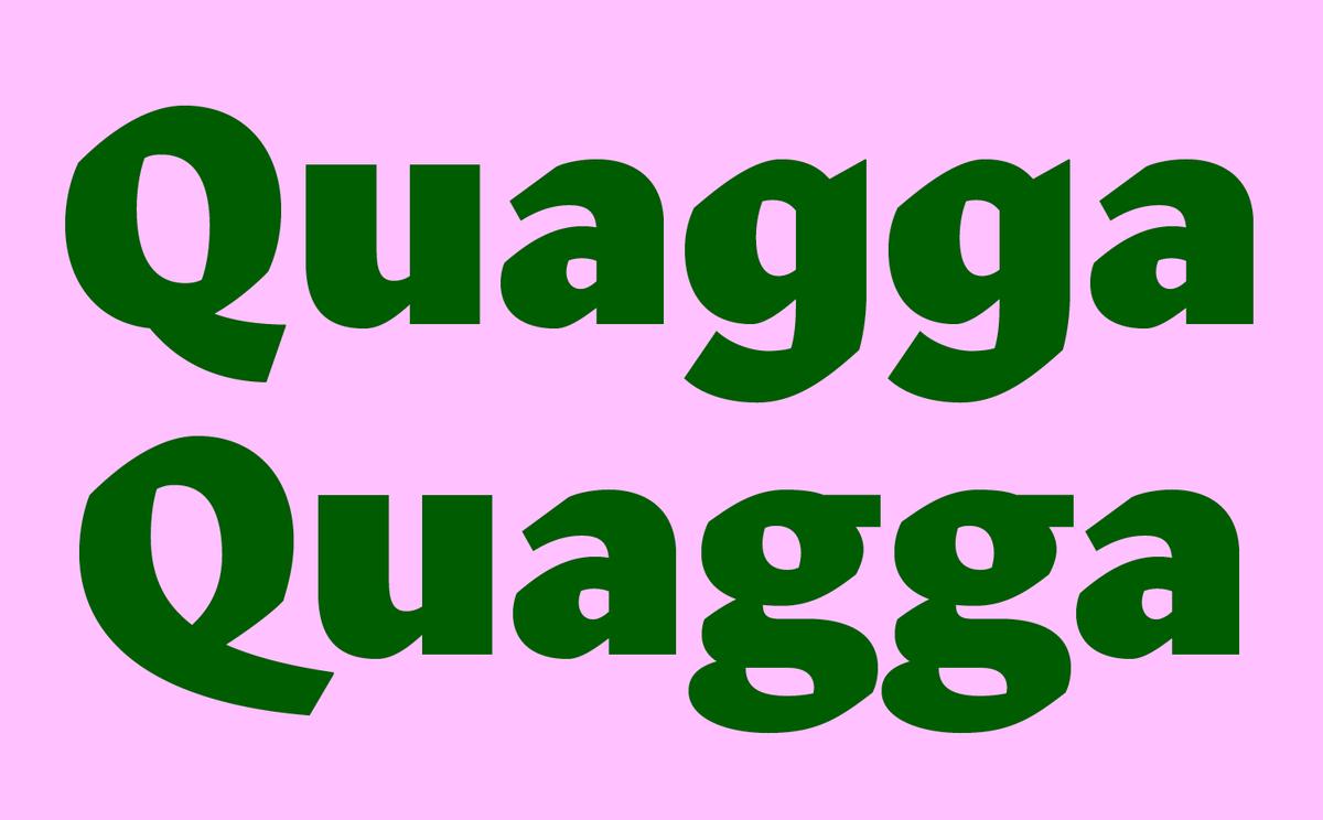

The lowercase g illustrates how Gazdowicz prioritized the simplicity of a sans serif over the expression of the calligraphic tradition. Using the single story form signalled that this family is above all a sans serif, whereas the double story form was firmly planted in the world of calligraphy. The double-story form is included as an alternate, allowing for the family to be pushed towards the calligraphic end of the spectrum when appropriate. The italic also features an alternate k that softens the overall look, and an angular y to replace the default schoolbook form.
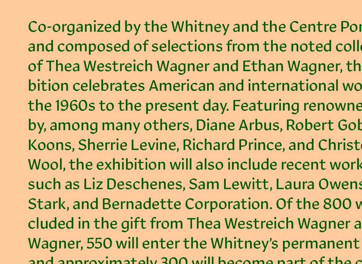
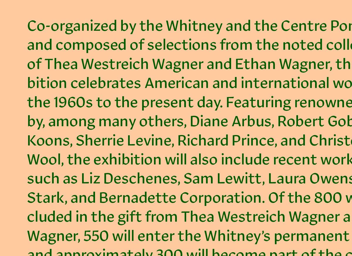
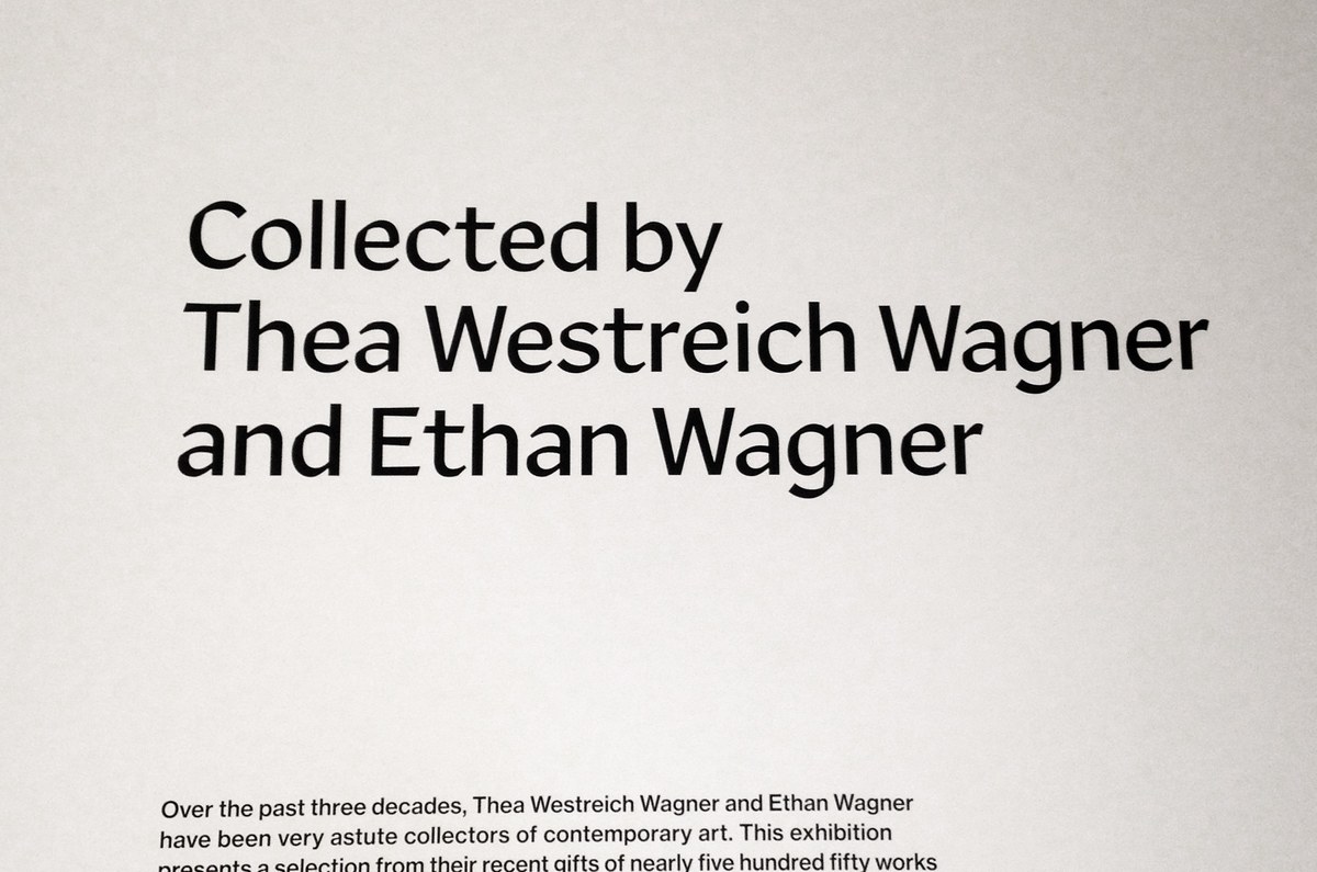
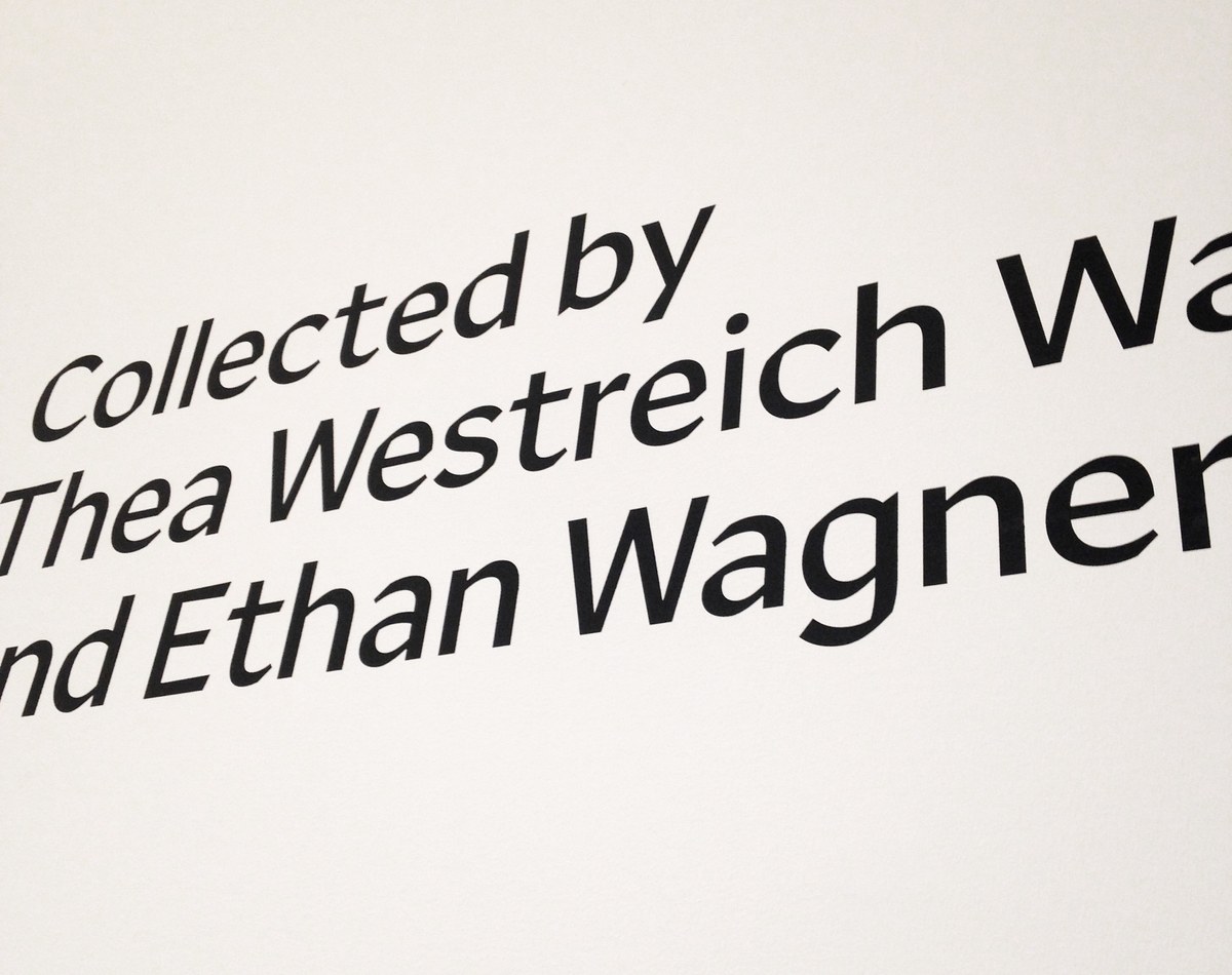
The first public use of Robinson was at the Whitney Museum of American Art, where it helped set a tone of gravitas for an eclectic show of selections from the noted collection of Thea Westreich Wagner and Ethan Wagner. In addition to signage, the family will work well at smaller display sizes and mid-length texts in editorial design, on book covers, and for making logotypes. It is also well suited for the screen, where its open apertures keep it legible and the broken curves create an interesting texture.
