Austin News by Paul Barnes


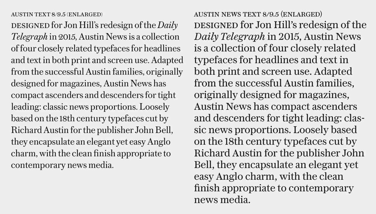

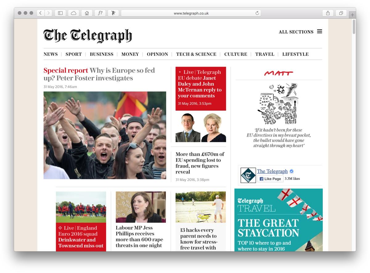
Designed for Jon Hill’s redesign of the Daily Telegraph in 2015, Austin News is a collection of four closely related typefaces for headlines and text in both print and screen use. Adapted from the successful Austin families, originally designed for magazines, Austin News has compact ascenders and descenders for tight leading: classic news proportions. Loosely based on the 18th century typefaces cut by Richard Austin for the publisher John Bell, they encapsulate an elegant yet easy Anglo charm, with the clean finish appropriate to contemporary news media. It is also very well suited to the screen, with Text and Deck holding up well even on small handheld devices.
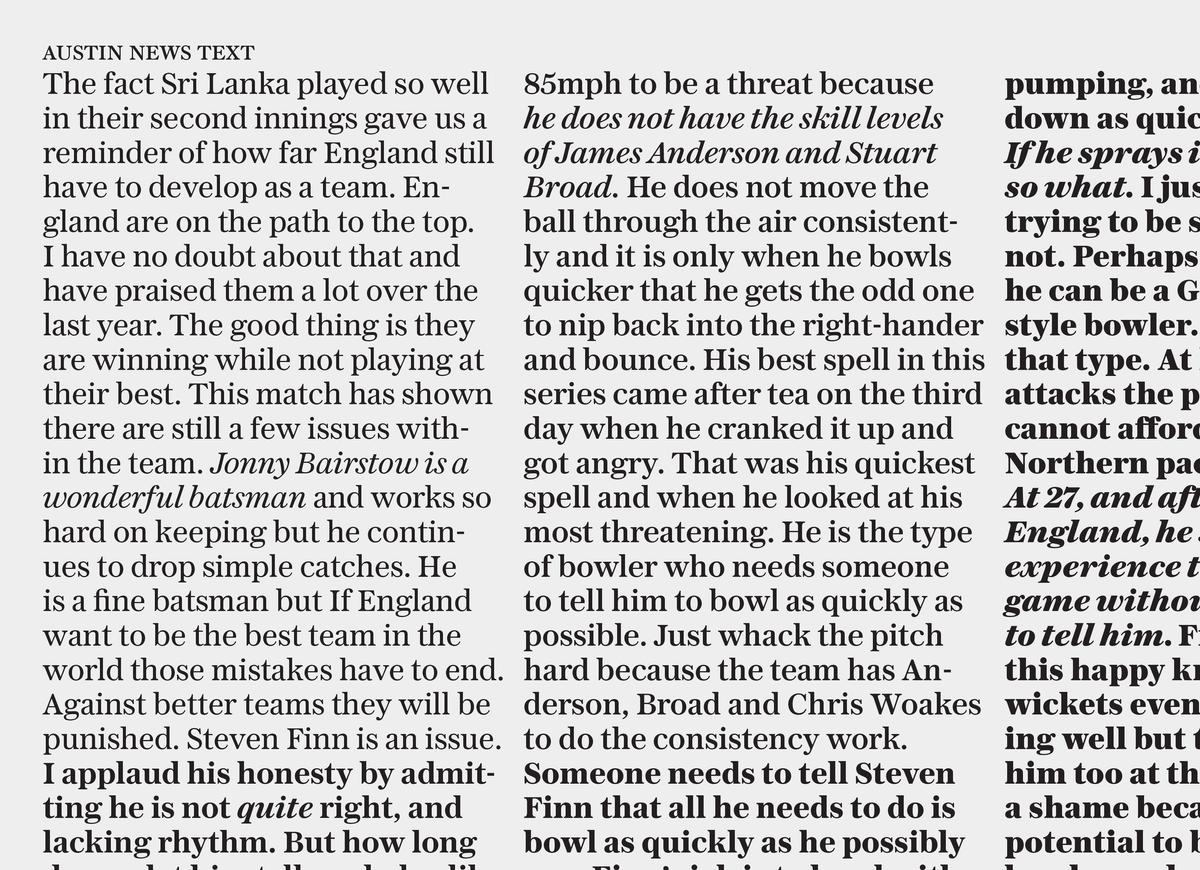
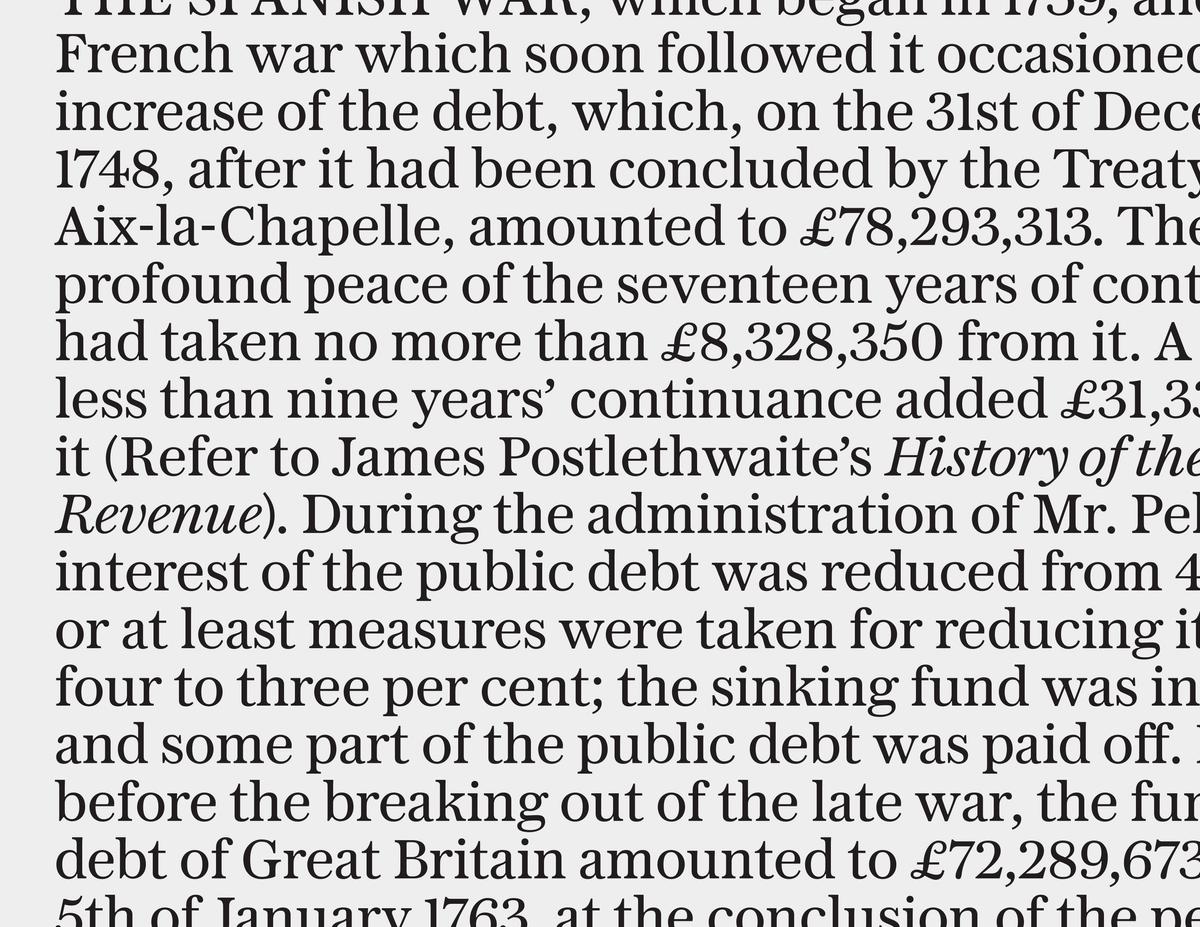
For text sizes, Austin News Text is economical and legible yet pleasing to the reader. With its large x height, heavier serifs, and very short ascenders and descenders, it maintains a comfortable readability down to small sizes on newsprint. Serious in tone, it has a more elegance than a typical news text face, with nuances like the curved leg on the k giving a subtle warmth and personality. Austin News Text features five weights, each with matching italics, from Roman and a slightly heavier Roman No. 2 up to a Fat weight that is well suited for running titles and punching up information graphics.
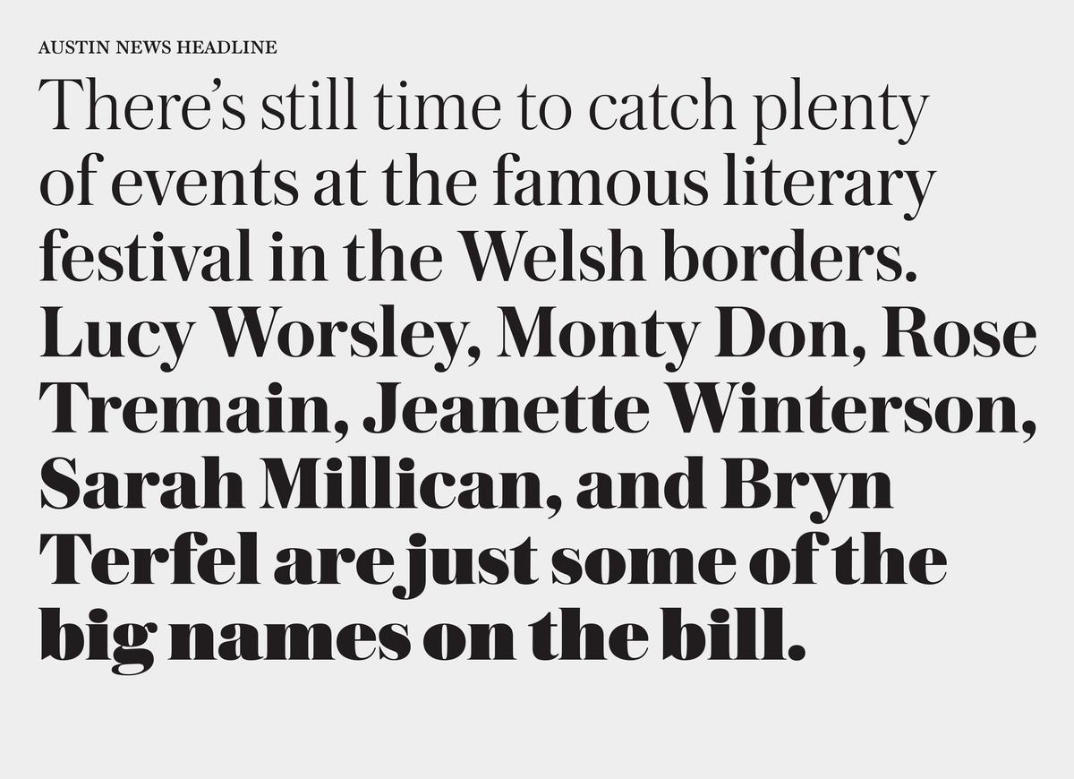
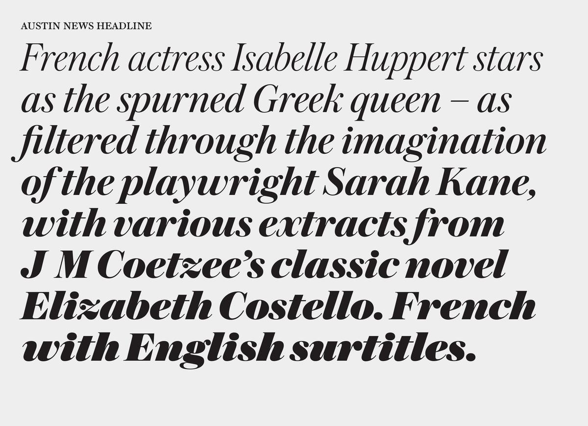
Designed for large sizes, Austin News Headline is a more robust version of Austin with a greater x-height, lower contrast and thickened serifs. Slightly less compact in horizontal proportions and looser in spacing, while more compact in its vertical proportions, it creates a serious impression. The matching italic has enough individuality to be expressive, but not so much as to become distracting. Designed in a range of eight weights from Light through to an ultra heavy Fat weight, they can cover all manner of stories and degrees of seriousness in newspaper design.

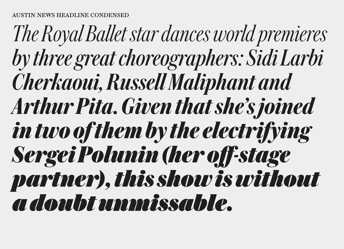
Austin News Headline Condensed is intended for situations where space is at a premium, but stylish type is still a requirement. Its compact proportion looks back to the classic news faces of the early 20th century.

Lastly, Austin News Deck is designed for subheads and other in-between display sizes, where the thin strokes of Headline would be too delicate and the Text too robust.

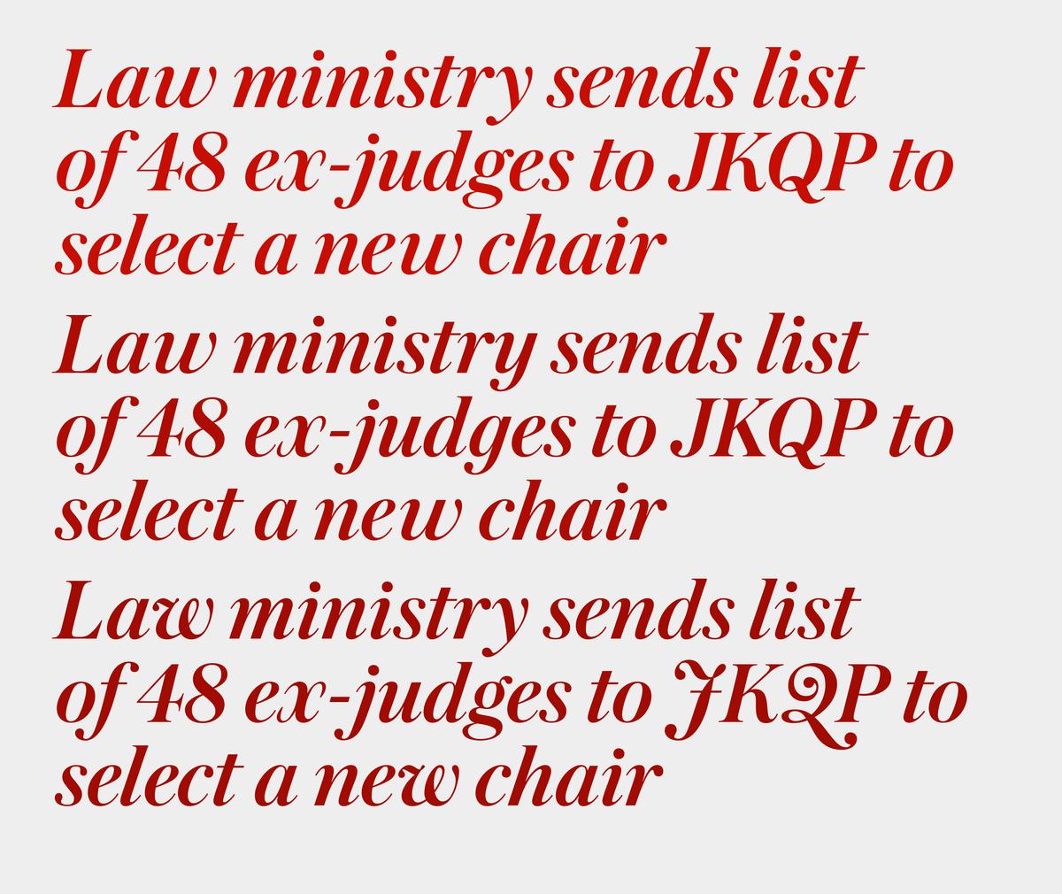
All sizes of Austin News include alternates that allow the user to fine-tune the overall visual tone: more idiosyncratic with the default K and k, or quieter with the straight-legged alternates, with additional nuances possible in the italics.
Related fonts

