Previously known as Zizou, and before that Clouseau, Duplicate is a new family from Commercial Type that began as an experiment by Christian Schwartz to see what he would get if he drew Roger Excoffon’s iconic 20th century sans serif Antique Olive, a typeface Schwartz has long loved and admired, from memory.
Paul will be speaking at this year's Bangkok International Typographic Symposium (BITS), Asia's largest conference on typography. Additionally, both Paul and Christian will be running workshops.
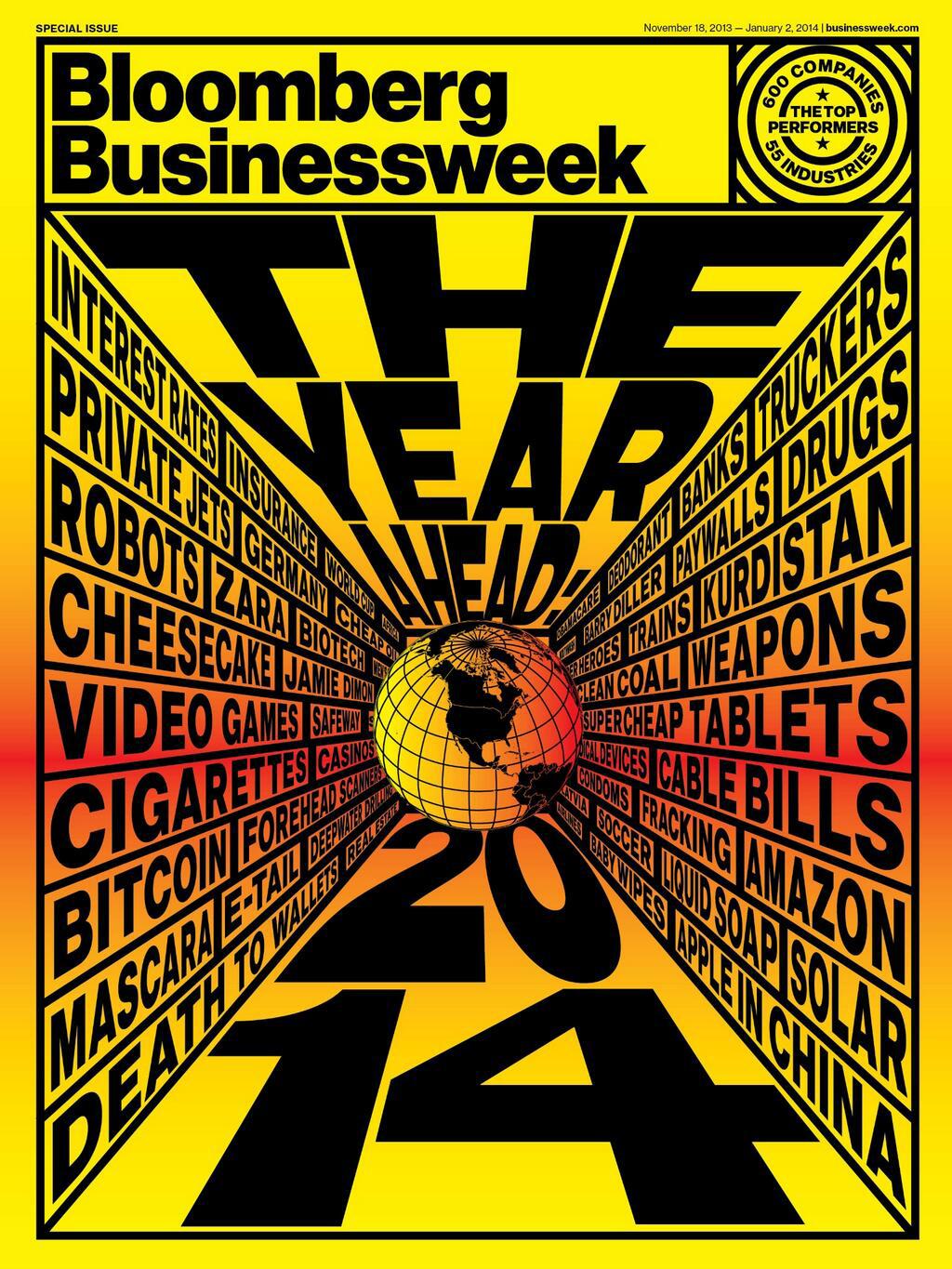
This year, Bloomberg Businessweek’s year-end double issue is focused on the year ahead, but it also includes a number of very dense spreads of hard data from various industries, showing a snapshot of the current state of many companies. In order to pack as much information as possible into the limited space available, creative director Richard Turley commissioned an Agate version of Neue Haas Grotesk in a number of duplexed weights.
Christian Schwartz will present a session called "Making Something out of Something: Typefaces, History, Culture and Meaning" at the third annual RE:DESIGN symposium for creative directors.
Christian Schwartz will reprise his appearance from the Ampersand Conference earlier this summer in Brighton, joining some of the same speakers and some new faces at the first Ampersand to take place in New York City. Christian will close the day with a talk called "Webfonts are just fonts".
Paul will be speaking at "The Modern Magazine", a one-day conference put together by Jeremy Leslie of popular magazine design blog magCulture to celebrate the release of his latest book.
Paul will be speaking on our experiences designing type for the news at the “Wrong” seminar, hosted by the Society of News Design Scandinavia.
Together with Gerry Leonidas and Erik van Blokland, Christian Schwartz will be critiquing typefaces during an informal lunchtime session on the Saturday of the ATypI conference in Amsterdam. More information and signup will be available at the conference. Christian will also help to present the Prix Charles Peignot to this year's recipient during a ceremony on Sunday afternoon.
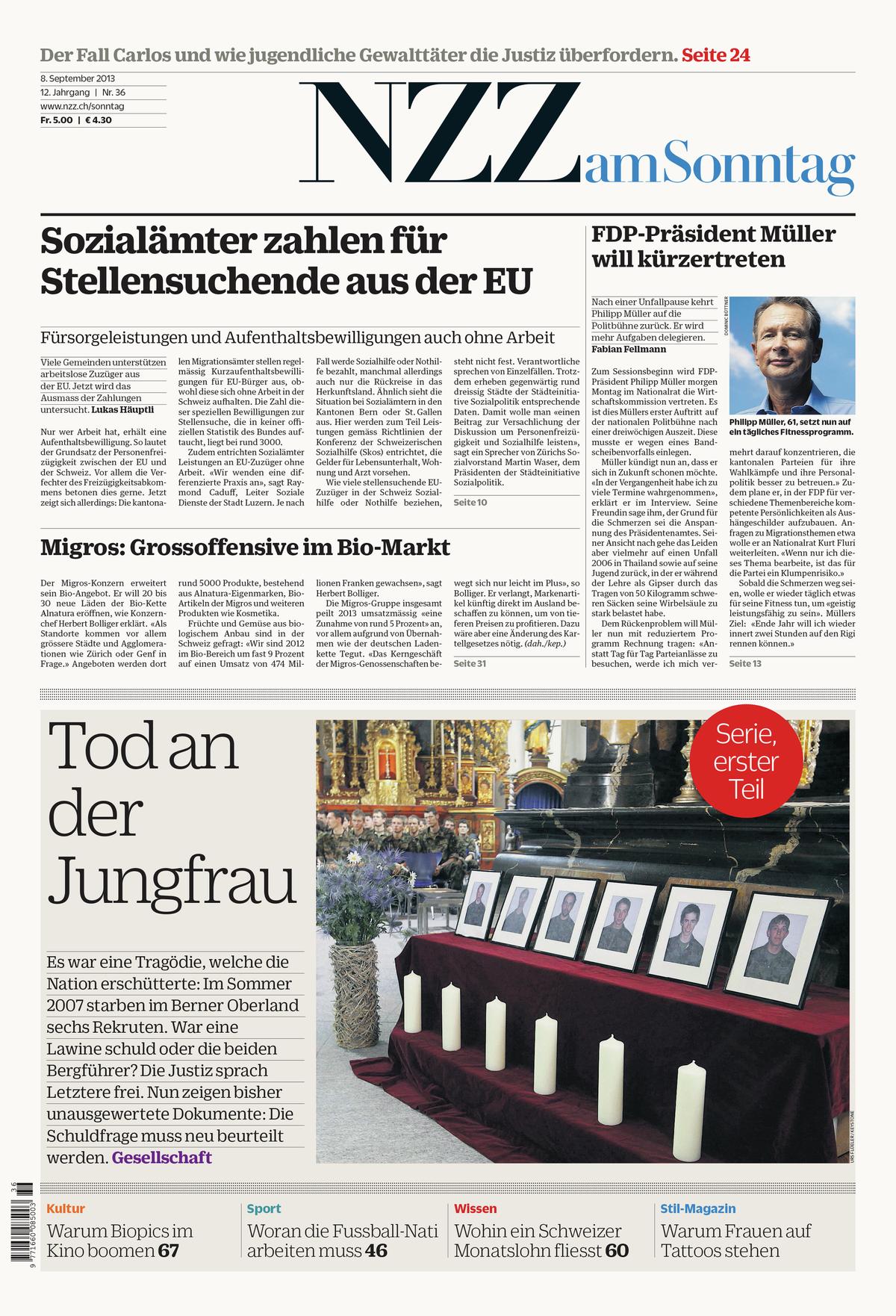
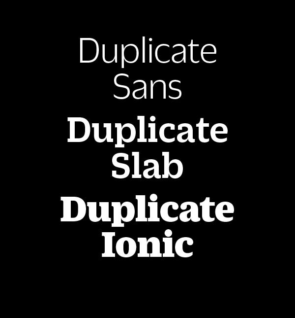
Once known as Zizou, and before that Clouseau, Christian Schwartz's Duplicate has expanded from a small family of sans serifs into a 3-family collection. In addition to the Sans and Slab, the family has been rounded out with the Clarendon-inspired Duplicate Ionic, designed by Miguel Reyes (directed by Schwartz) for a redesign of Zurich's Neue Zürcher Zeitung am Sonntag recently completed by Mark Porter and Simon Esterson.
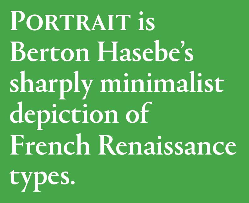
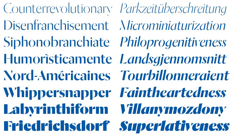
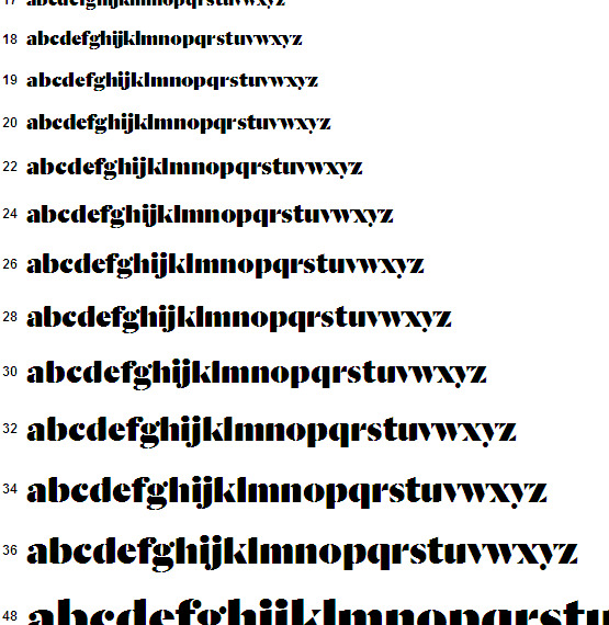
We are very happy to announce the release of Portrait, a major new serif collection in 4 families totaling 29 styles, available today for desktop, web, and mobile app licensing. Portrait is Berton Hasebe’s sharply minimalist depiction of French Renaissance types.
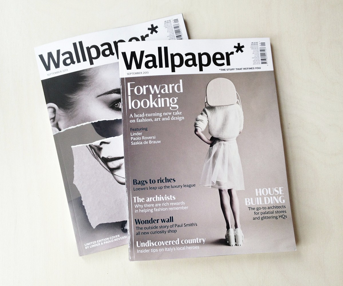
Iconic British style and interiors magazine Wallpaper* has debuted a complete redesign with their September 2013 issue. The redesign was carried out by new creative director Sarah Douglas and art director Lee Belcher. The new type palette features Darby, a brand new typeface by Paul Barnes completed for this redesign, plus Berton Hasebe's Portrait, which is now complete and will be released in September.
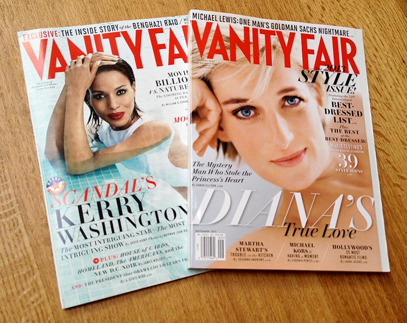
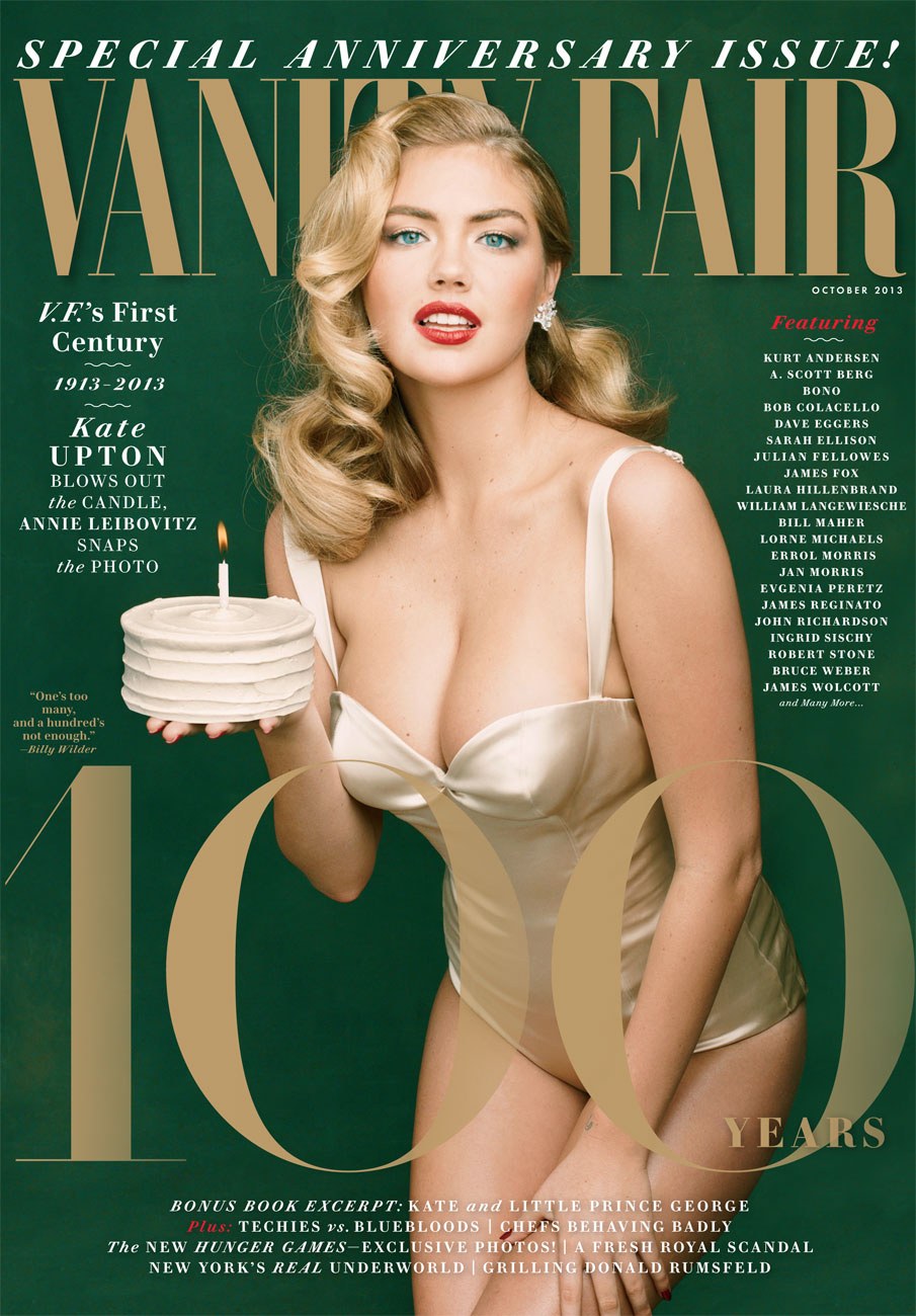
Vanity Fair design director Chris Dixon has been refreshing the look of the magazine since he arrived in late 2011. Part of this upgrade was a new display typeface to replace the Didot the magazine has been using for nearly 20 years. After nearly a year-long design process, VF Didot, designed by Paul Barnes and Christian Schwartz, debuted on the cover of the August 2013 issue.
Christian Schwartz will be joining Erik Spiekermann, The Guardian's Andy Hume, The BBC's Kutlu Çanlıoğlu, & other luminaries on online typography at the 2013 Ampersand Conference in Brighton. Christian will end the day with a talk called "Webfonts are just fonts".
Paul will be speaking at the annual conference of the SND DACH - the Society for News Design Deutschland / Österreich / Schweiz.
Dala Moa is a sans serif stencil typeface for display, sharing the proportions of its cousin Dala Floda. It takes the same inspiration – the erosion of letters on stones – but takes the idea one step further with the removal of serifs, revealing basic underlying structures.
We are happy to announce that the bulk of our library is now available for use on the web. We're now licensing fonts for embedding in mobile apps for iOS, Android, and Windows Mobile directly from our site as well.
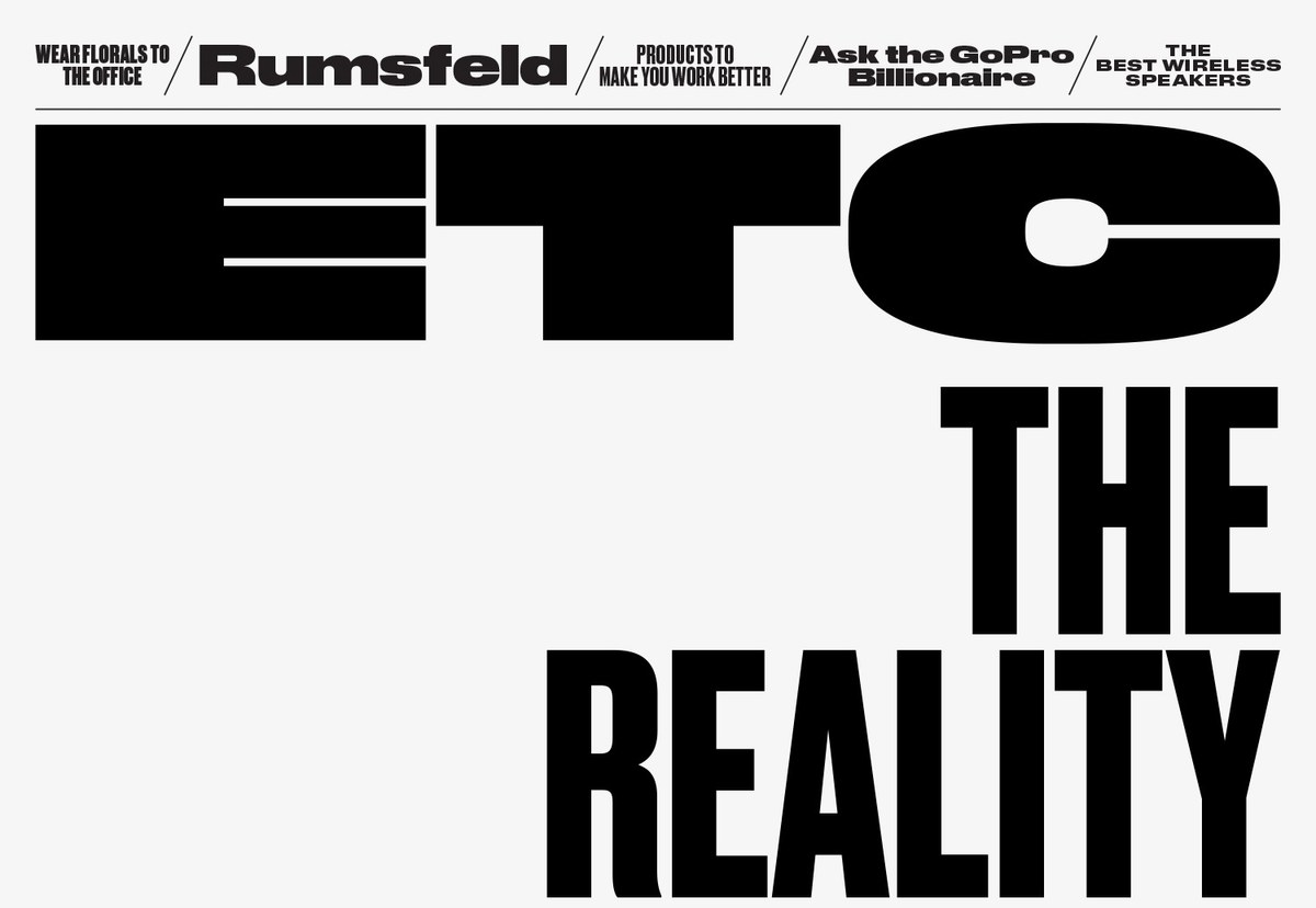
Creative Director Richard Turley and his team, with help from consultant Mark Leeds, have refreshed Bloomberg Businessweek from top to bottom for the first time since their major redesign in 2010. The changes through the front section of the magazine are minor, but Etc. has been completely rethought, with an exuberant approach to display typography centered around the extremely condensed versions of Druk that Berton Hasebe drew for their 2011 year end issue, played against Berton's newly drawn Druk Wide.
Paul will be speaking at this year's TypoBerlin, the beloved international design conference. This year's theme is Touch.
Danish newspaper design specialists Ribergård + Munk commissioned a pair of headline typefaces from us as part of a sweeping overhaul of well over a dozen daily newspapers published throughout Sweden by MittMedia.
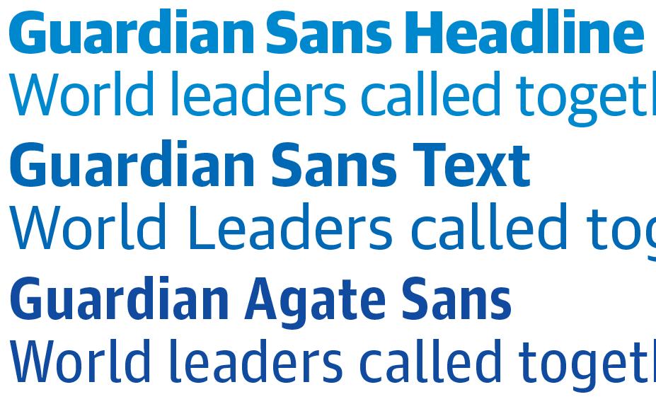
Commercial Type has released Guardian Sans Text, the final missing piece of the Guardian collection originally designed by Paul Barnes and Christian Schwartz for that daily newspaper’s iconic redesign in 2005.
Christian will be speaking at Typocracia 10 in São Paulo, Brazil, and will also be teaching a one-day workshop on magazine logotypes.
Paul Barnes will be speaking to Graphic Design Students at the Faculty of Arts, Plymouth University. He will talking about his graphic design work, type design and the world of Commercial Type.
On 5 March, 2013, Paul will be speaking about his general design work and Commercial Type in Copenhagen at the HK Grafisk Kommunication.
Then on 6 March 2013, Paul will speak at Danish Faces with Trine Rask of Kontrapunkt.
Paul will be lecturing on making typefaces for newspapers and magazines at a conference on editorial design in Munich, fittingly called "Tell me about editorial design!".
Paul will be teaching a workshop at Ecole Nationale Superieure Des Beaux Arts in Lyon, where he will also deliver his lecture “You can’t repeat the past”.
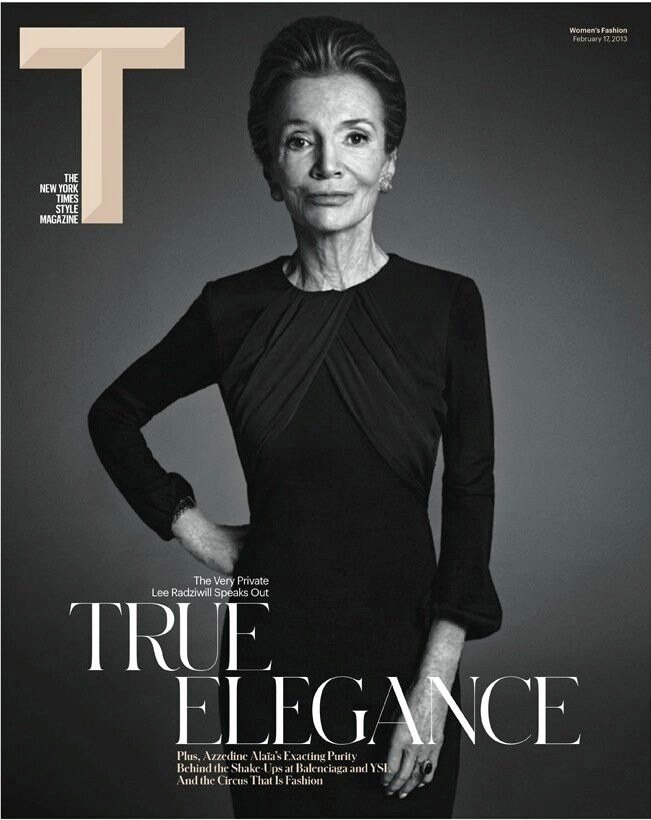
Berton Hasebe and Christian Schwartz have designed Schnyder, a new serif display typeface, for the 2013 top-to-bottom redesign of T, the New York Times Style Magazine under new editor in chief Deborah Needleman and creative director Patrick Li and his team of Shawn Carney, Aurelie Pellissier, and Natalie Do.
Paul will be lecturing to the students in the MA Typeface Design program at the University of Reading.
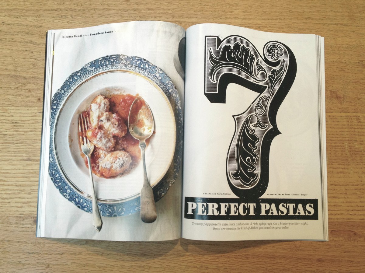
Christian Schwartz drew a Fellini-esque 7 and handful of ornaments for the cover story on 7 great pasta dishes from brilliant New York chef Sara Jenkins (chef and owner of one of the studio's favorite restaurants, Porsena), for the February issue of Bon Appetit. Art director Elizabeth Spiridakis used xlyene transfers to give a warm and organic quality to all of the display type in the story.
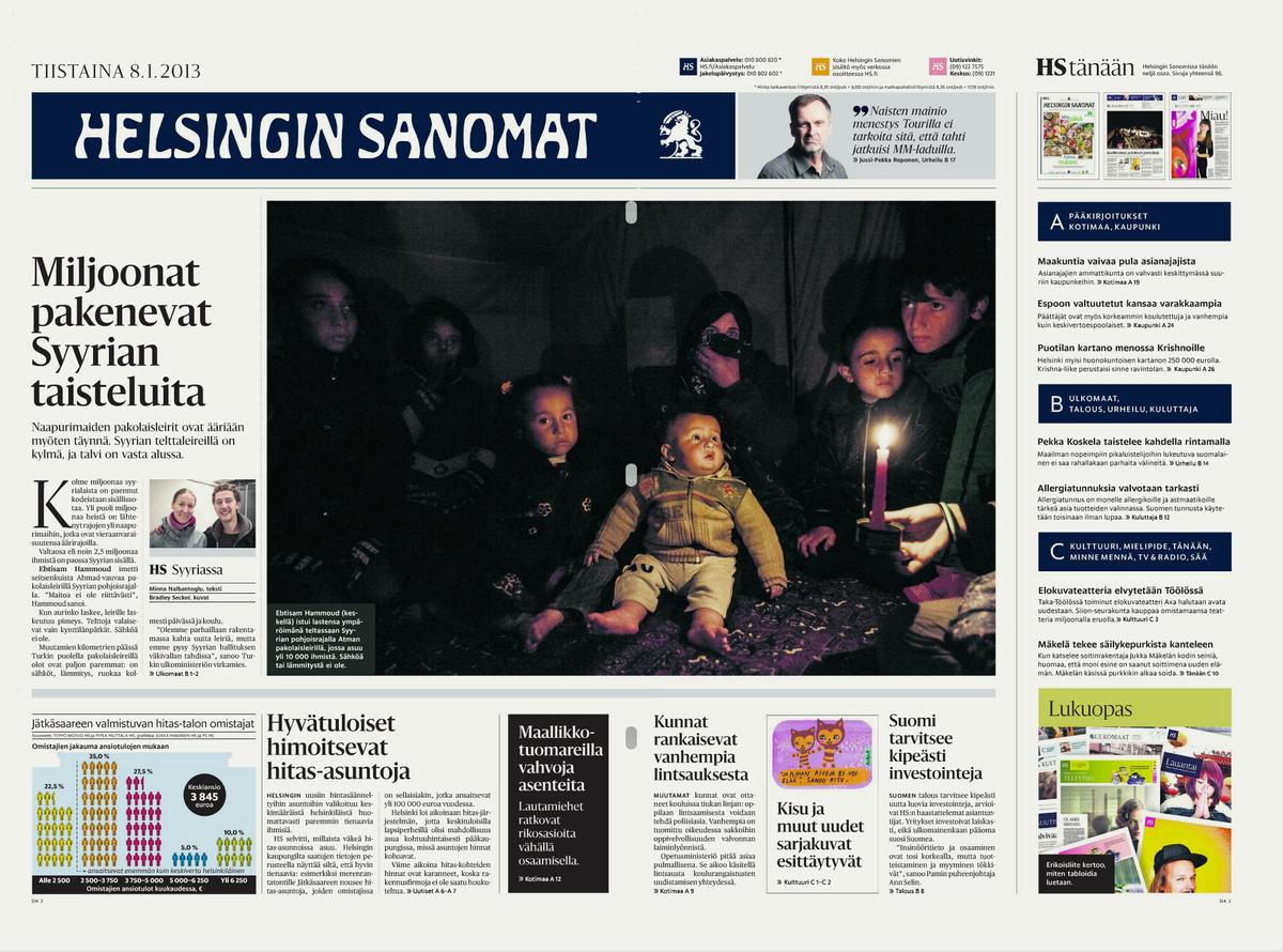
Helsingin Sanomat is Finland's major daily newspaper, with a circulation of around 400,000 on weekdays. A broadsheet since its founding in 1905, the paper made the switch to tabloid format on 8 January 2013. We provided all of the type for the new design: Sanomat, a serif family for headlines in 8 weights; Helsingin, a sans family for display use in 9 weights; Helsingin Text in 6 weights; and a custom grade of Publico Text which has been fine-tuned for the Helsingin Sanomat's presses.
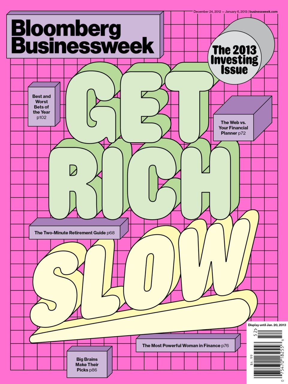
Paul Barnes's revival of a rounded sans serif originally produced by the Caslon foundry around 1839 provides levity in a special issue on investing, the final edition of Bloomberg Businessweek for 2012.