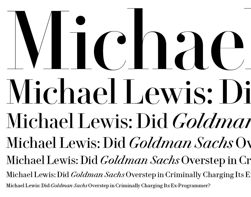
VF Didot for Vanity Fair
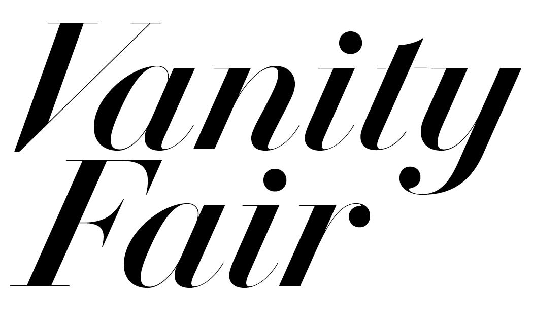
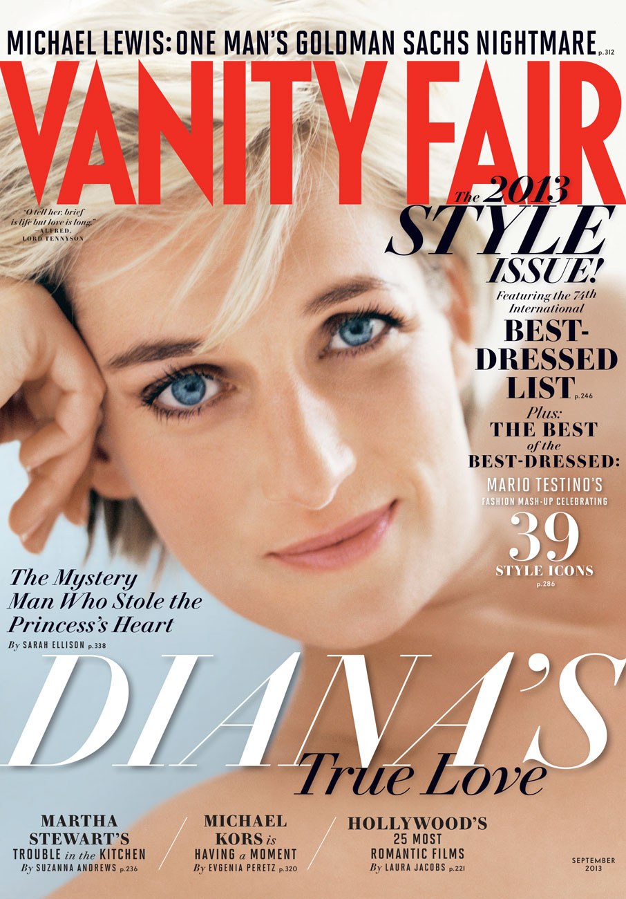
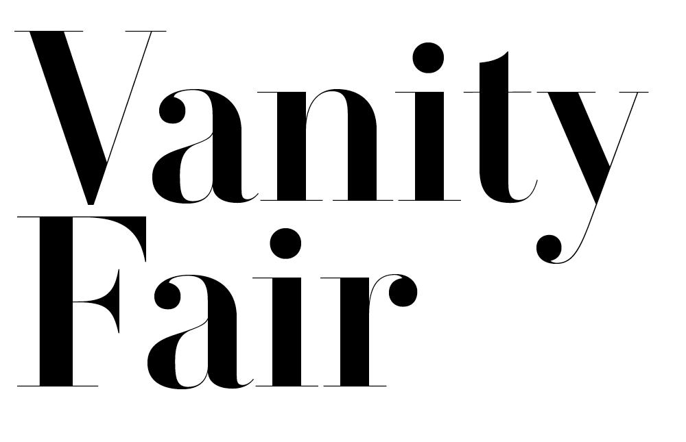
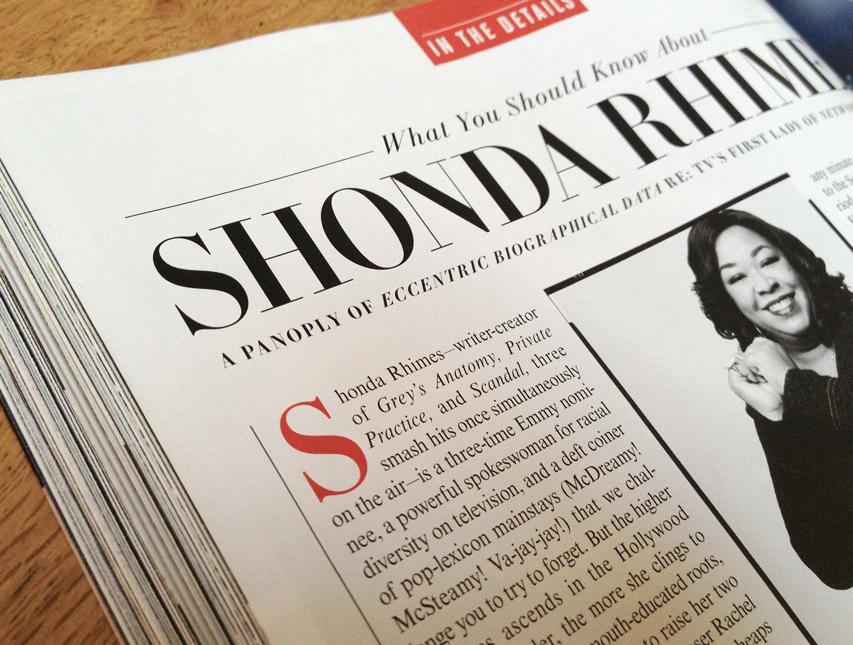
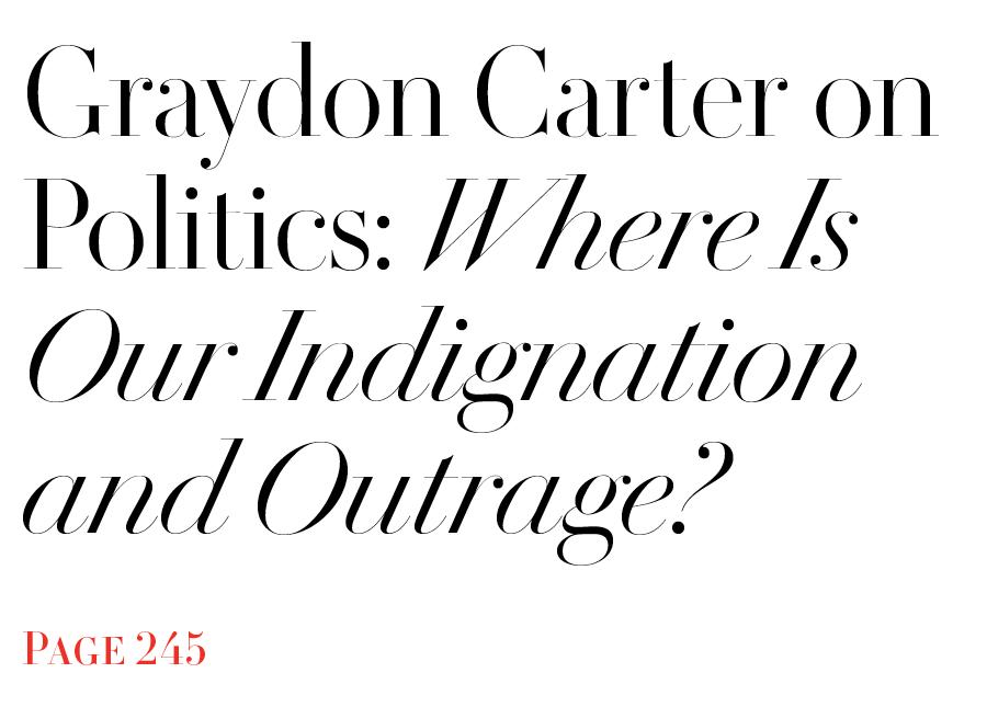
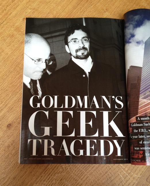
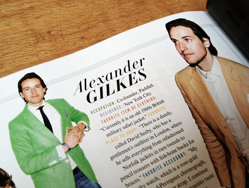
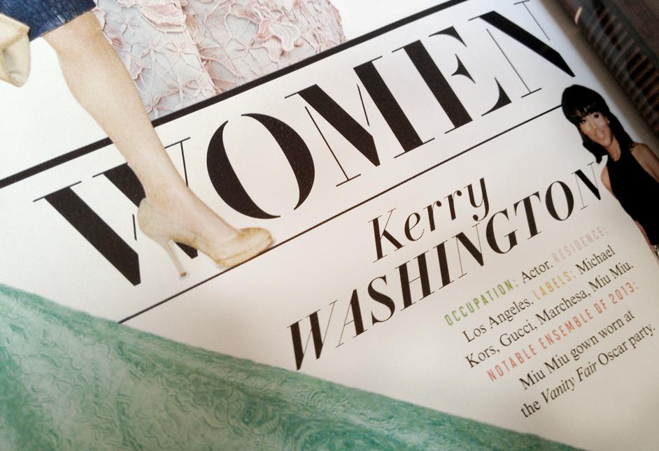
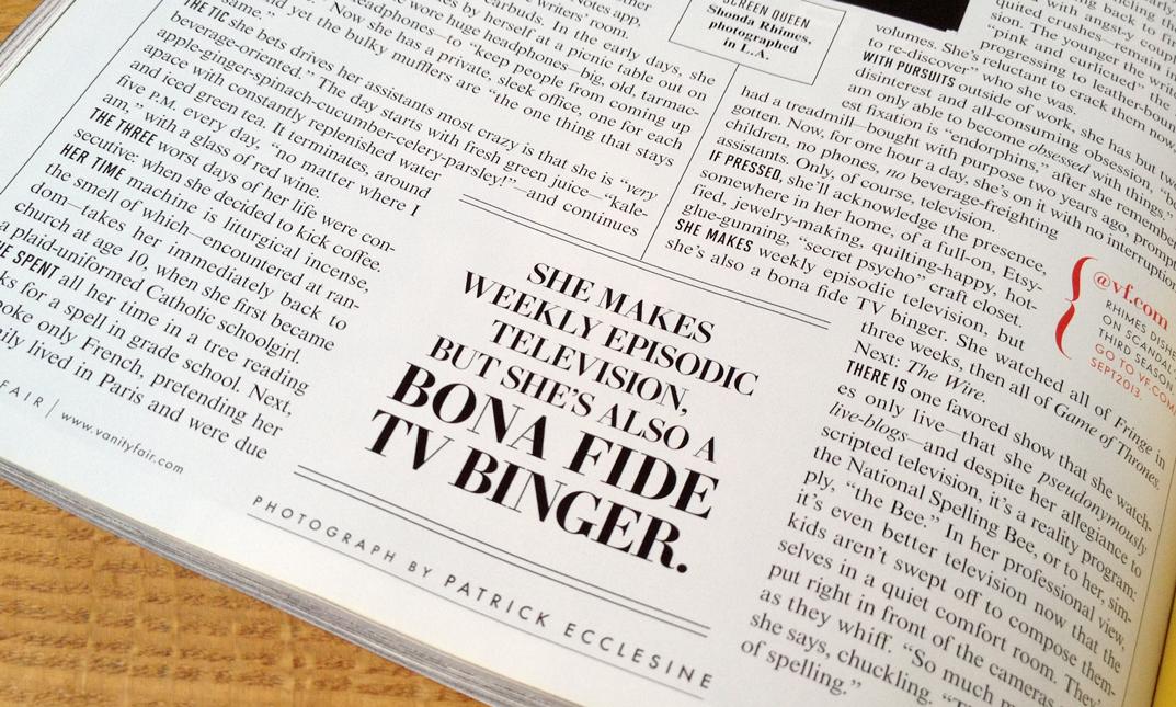
Vanity Fair design director Chris Dixon has been refreshing the look of the magazine since he arrived in late 2011. Rather than a top-to-bottom redesign, this has been a gradual improvement focused on keeping the basic visual DNA of the magazine intact, but improving the sections, navigation, and overall aesthetic. Part of this upgrade was a new display typeface to replace the Didot the magazine has been using for nearly 20 years. After nearly a year-long design process, VF Didot, designed by Paul Barnes and Christian Schwartz, debuted on the cover of the August 2013 issue, and is used in much of the interior of the September 2013 issue.
The brief was not for a fundamental change. The new typeface didn't just need to have high contrast; it needed to be recognizable as a Didot (as opposed to any other kind of Modern), which provided the interesting challenge of making something new in very familiar and well-explored territory. Before starting work on the project, Paul and Christian asked type historian Sébastien Morlighem, an expert on the Modern genre and particularly its history in France, to dig up samples of any interesting, unfamiliar, and surprising French Moderns he could put his hands on. Paul also spent some time with the small but substantial collection of French specimens at the St Bride Printing Library. Sébastien sent samples of many weird and wonderful Moderns, but Chris Dixon, his art director Chris Mueller, and their editor in chief Graydon Carter (who was much more involved in directing the typeface than an editor typically is) were most taken with the work of Molé Le Jeune, a punchcutter employed by the Didot family in the earily 19th century. Molé’s romans hewed closely to the Didot model, but his italics were wildly expressive, with a dramatic angle of slope and sharp forms for v and w.
In addition to enlarging the x-height, which makes the typeface feel fresher and less like a purely historical artifact, Christian and Paul departed fully from the historical model with the ball terminals. These don't have the distinctive teardrop shape of a typical Didot revival, instead having a sharper, rounder form, taking cues from advertising lettering of the mid 20th century.
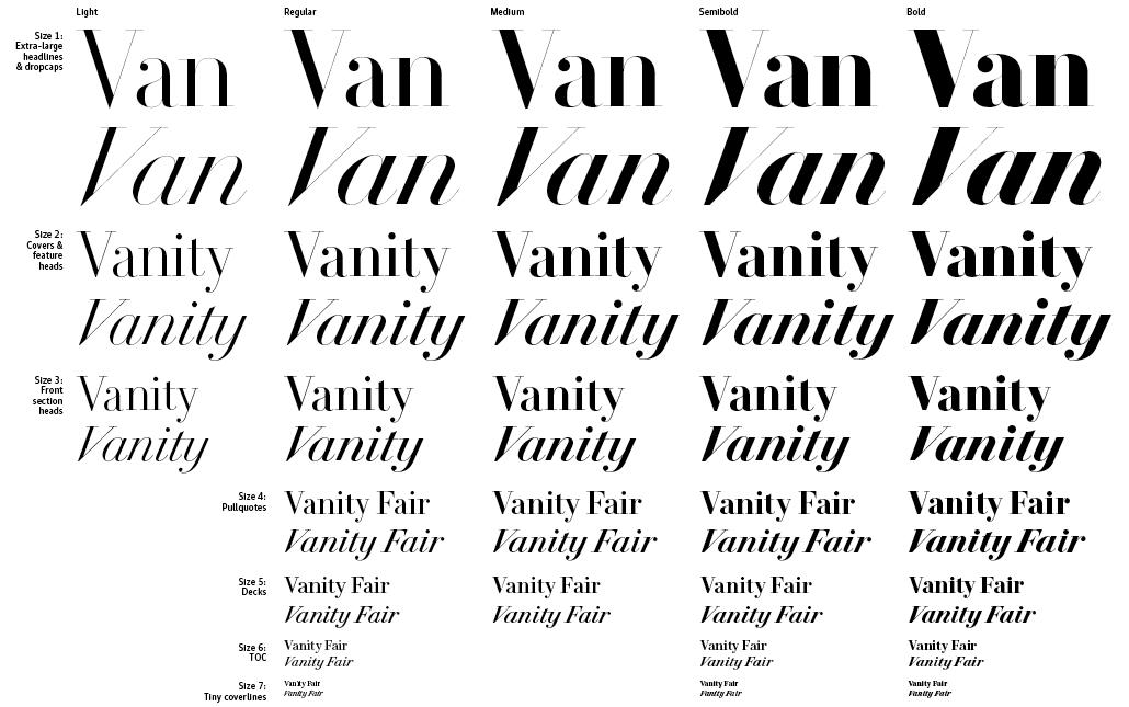
The family has 7 optical sizes and up to 5 weights in each size. The smallest sizes are not intended for blocks of text; instead, they are designed for use as small display type, i.e. for tiny coverlines and the table of contents. As such, the strong personality of the typeface is retained through all sizes, rather than being toned down as it gets smaller. All styles include small caps. Additionally, Vanity Fair has commissioned a stencil version of the Didot in two sizes.
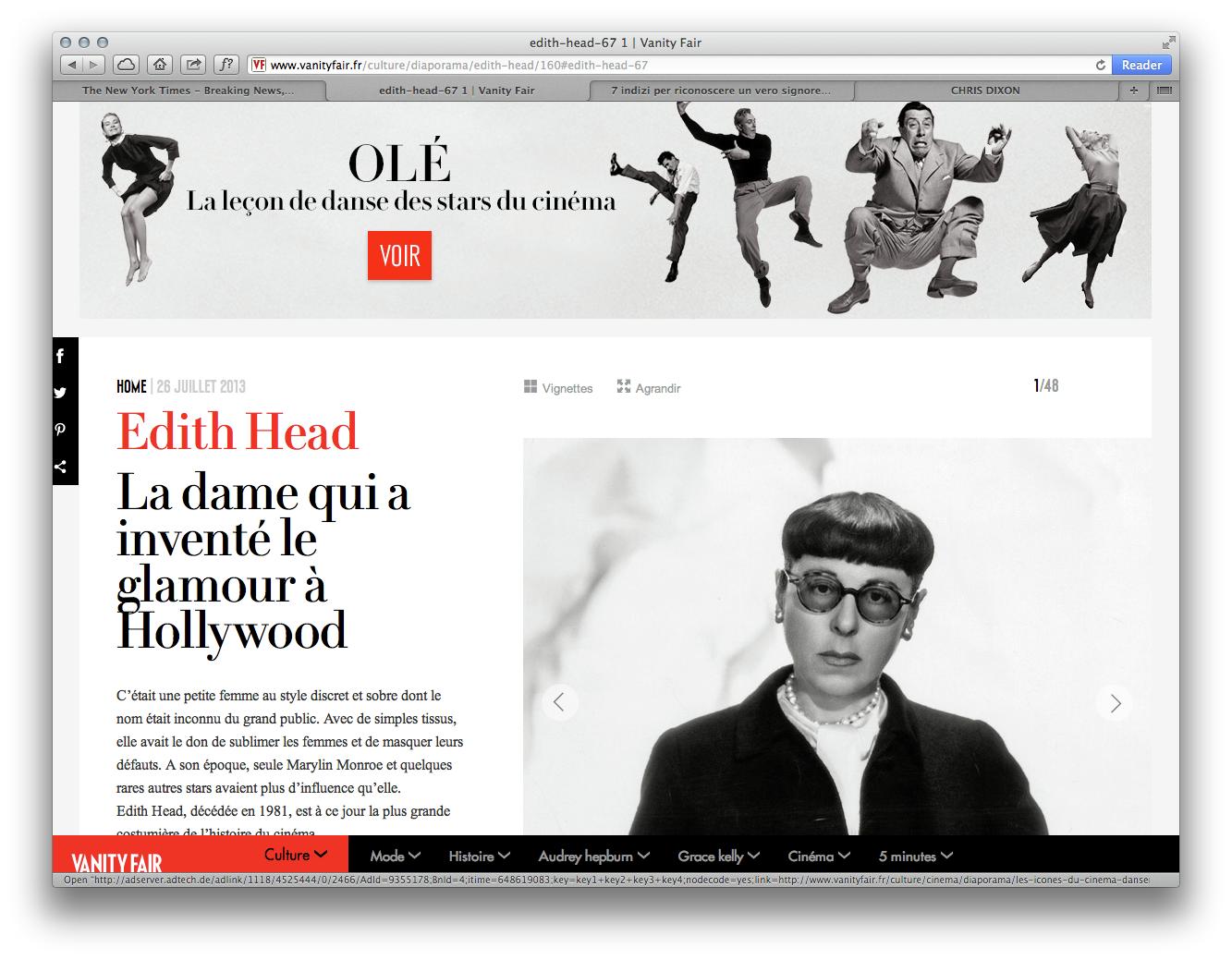
In addition to the US edition of the print magazine, VF Didot is also used in the newly launched French edition (which pairs it with a wonderfully distinctive condensed sans by Jean-Baptiste Levée), on the French edition of the website, and in the US iPhone and iPad apps.
