Portrait by Berton Hasebe
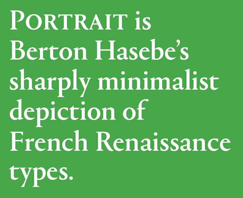
We are very happy to announce the release of Portrait, a major new serif collection in 4 families totaling 29 styles, available today for desktop, web, and mobile app licensing. Portrait is Berton Hasebe’s sharply minimalist depiction of French Renaissance types. The marriage of classical proportions with triangular Latin serifs is an inspired combination, and a fresh way to see these nearly 500-year-old forms. A number of families in the Commercial Type library display a particular fascination with the French Renaissance forms of Granjon, Garamont, and their contemporaries. Of the varied interpretations in the library, the Portrait collection of four families is the most unabashedly new, aggressive in its simplicity but nuanced in its details, and covering a wide range of tones from the sober beauty of the display face, to the warm sparkle of Portrait Text, to the exuberance of the Condensed and Inline.
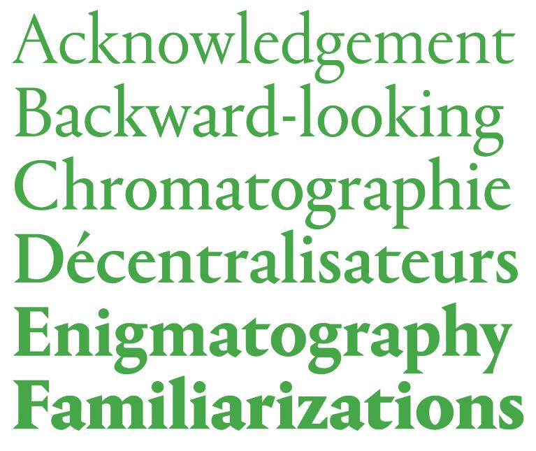
Portrait started out as an experiment in drawing a display typeface that managed to be both beautiful and brutal, and both classical and minimalist. While its lighter weights are quietly elegant, the heavier weights show the influence of chiseled woodcut forms. Portrait draws its primary inspiration from the Two-line Double Pica Roman (equivalent to 32pt in contemporary sizes) cut by French punchcutter Maître Constantin around 1530 for the printer Robert Estienne. Portrait replaces the delicately modeled serif treatments of Constantin’s original with simple, triangular Latin serifs, reimagining the Renaissance forms in a contemporary light.
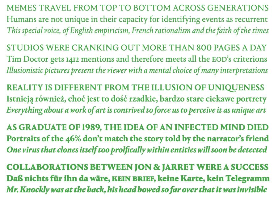
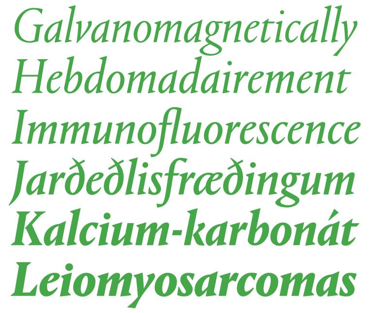
Portrait Text resembles the text types attributed by the printing historian Hendrik Vervliet to Constantin and used by the printer Estienne in the 1530s, which had a lighter and more open texture than the text types that preceded them, and marking the move to more elegant type that culminated in the work of Claude Garamont. The stripped-back simplicity of the Latin serifs gives Portrait a cleaner and sharper tone than a typical Renaissance oldstyle-influenced text face, bringing an active personality to text.
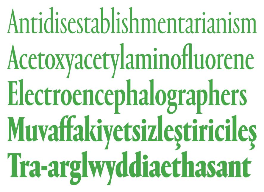
Triangular serifs and extremely condensed proportions go hand in hand, as evidenced by the compressed Latins that were a mainstay of newspaper display typography through the 20th century. This idea inspired the emphatically and exaggeratedly narrow Portrait Condensed. This family’s energetic rhythm also takes cues from French design in the 1950s, particularly Vendôme Condensed, designed by Roger Excoffon and his collaborator François Ganeau, which, like Portrait, had also used Renaissance French typefaces as an starting point.
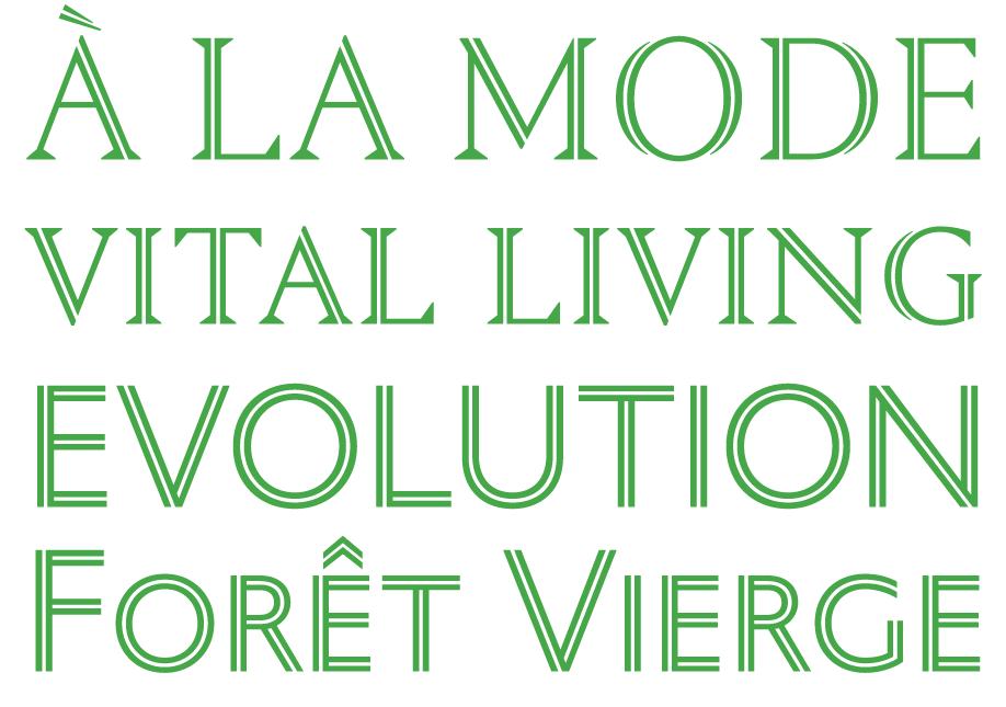
Portrait Inline is a beautiful, decorative addition to the collection, building on the inscriptional proportions of the capitals. In the seriffed Regular, sharply tapering outer strokes play against monoline inner strokes, with all extraneous detailing stripped away. The Inline Sans exposes the geometric underpinnings of the proportions, while adding a dimensional element through its overlapping strokes.
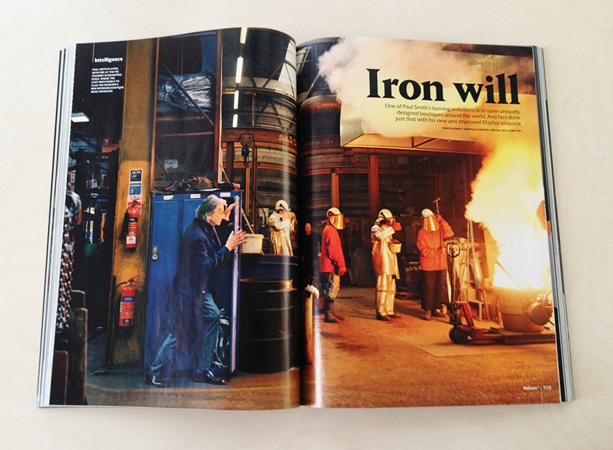
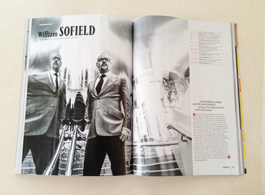
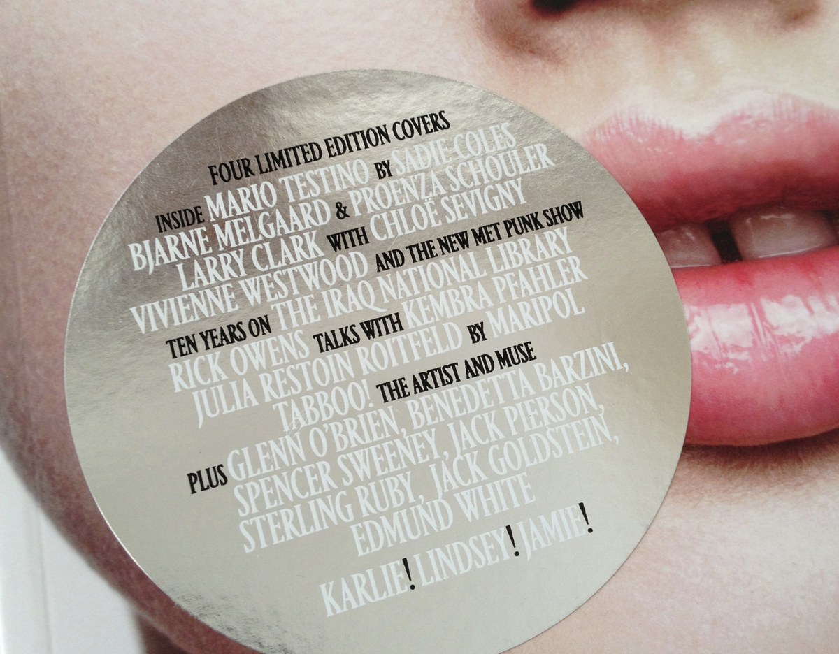
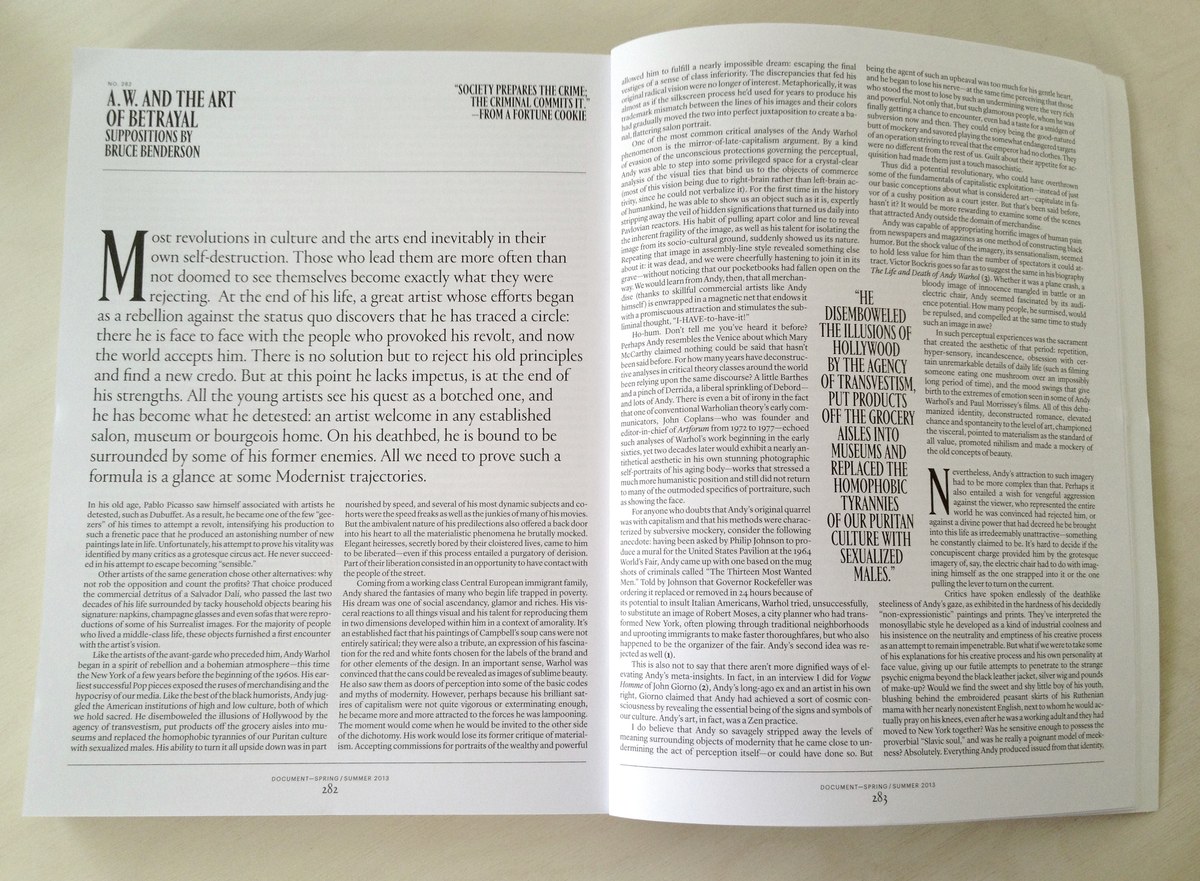
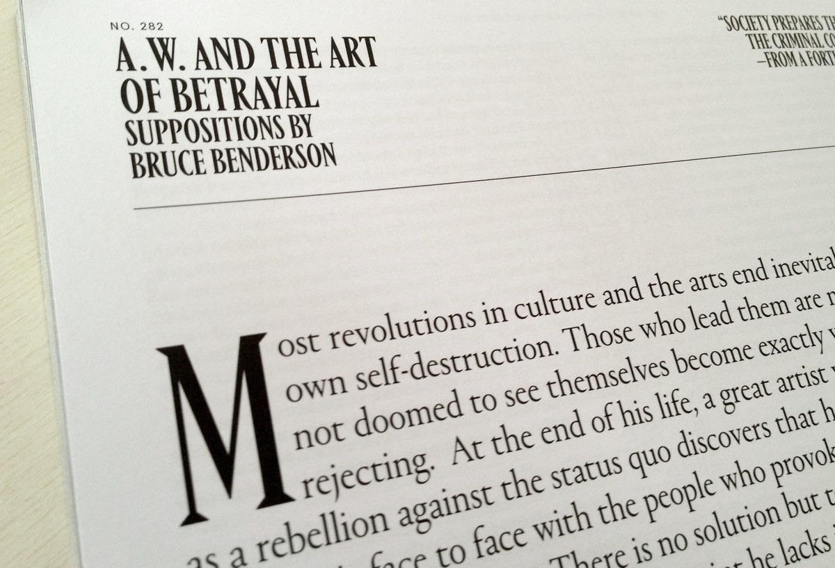
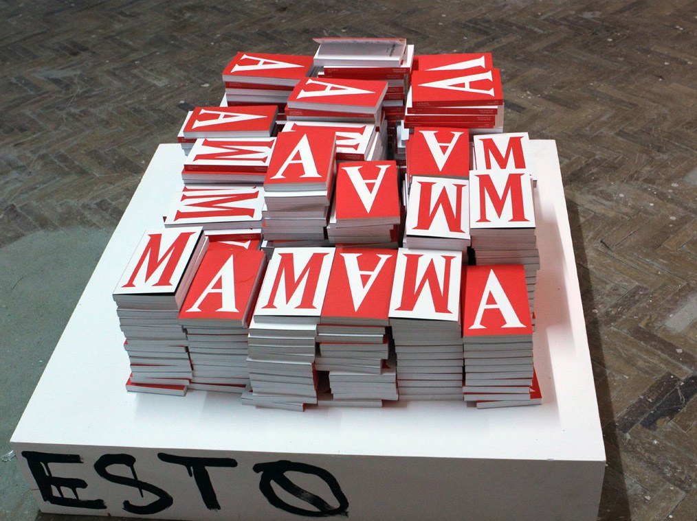
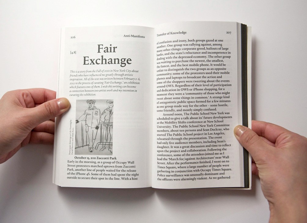
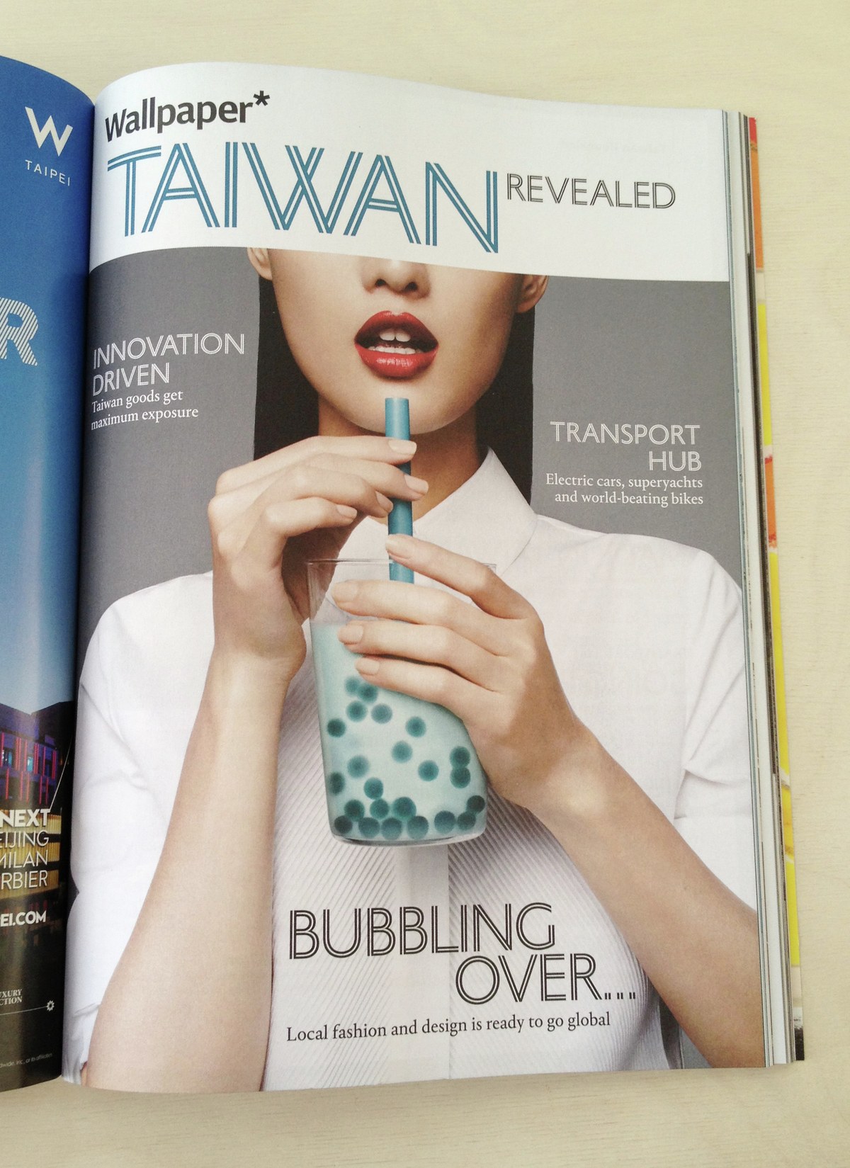
Portrait was used in a handful of publications during its three year design process, including the well-regarded New York-based independent fashion and arts magazine Document Journal; Anti-Manifesto a book designed by Hyo Kwon for the artist Taeyoon Choi; and this year’s redesign of the print and web editions of iconic British interiors and style magazine Wallpaper*.
Related fonts
