Three new families for Helsingin Sanomat
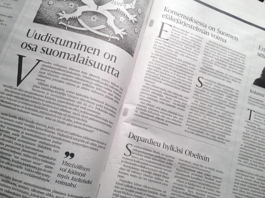
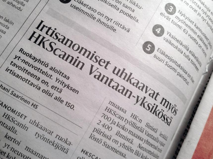
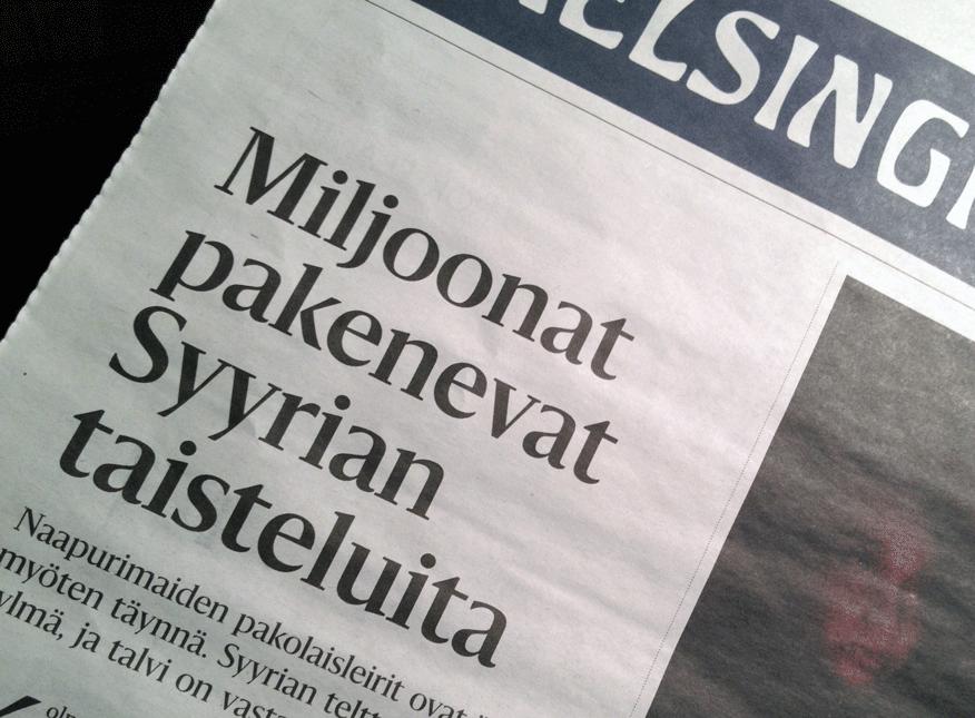
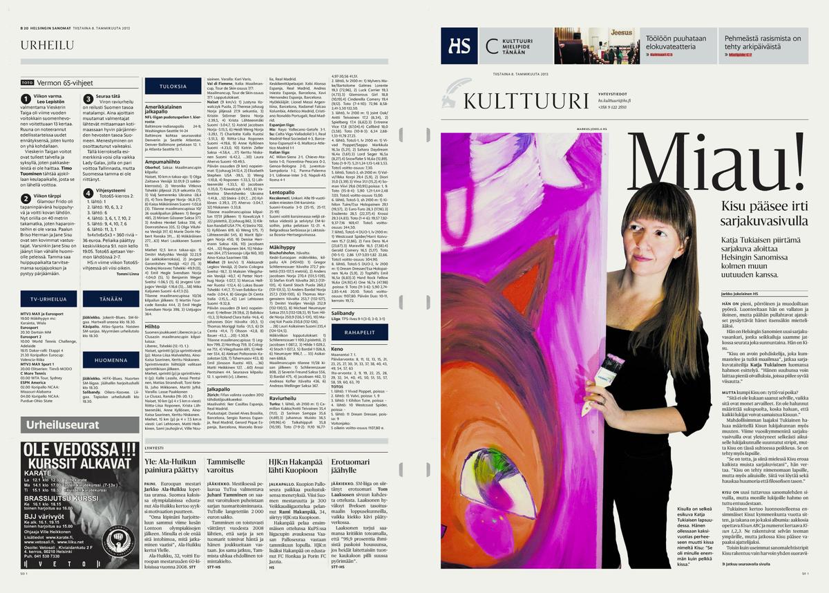
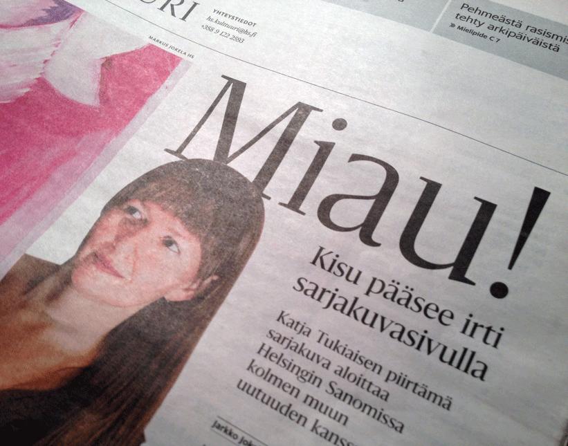
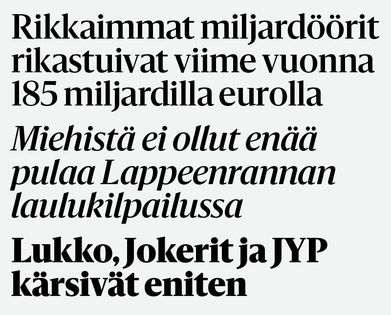
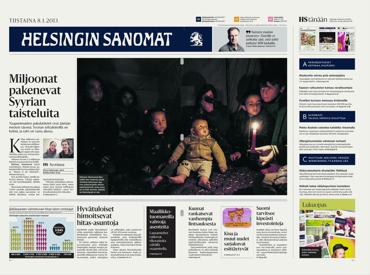
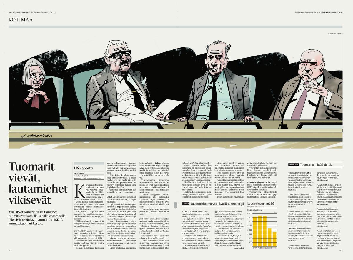
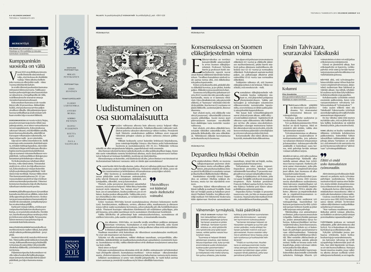
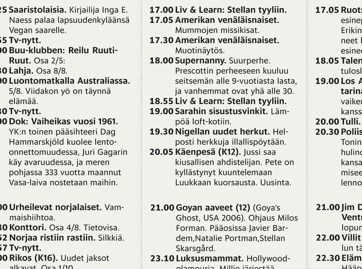
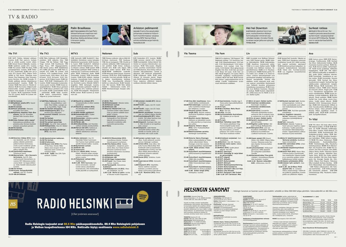
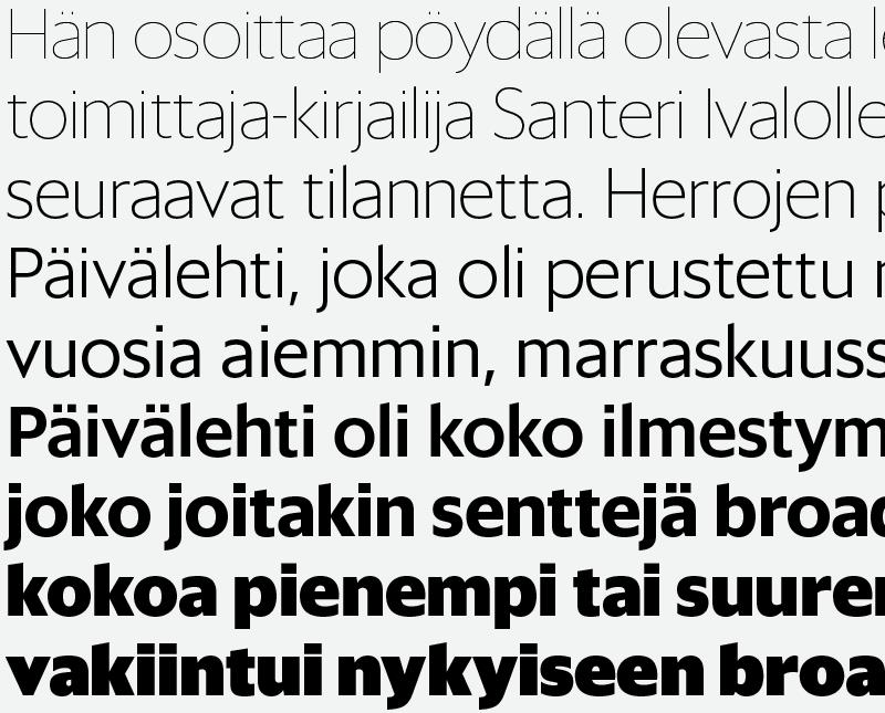
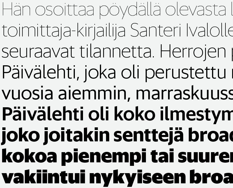
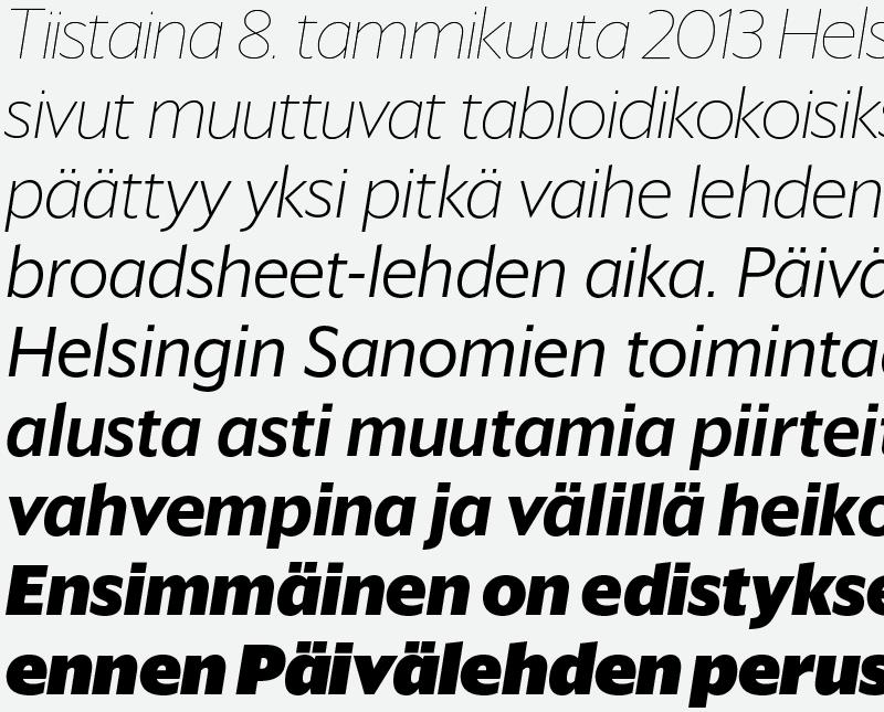
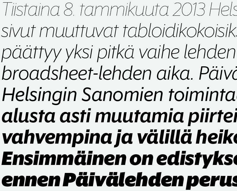
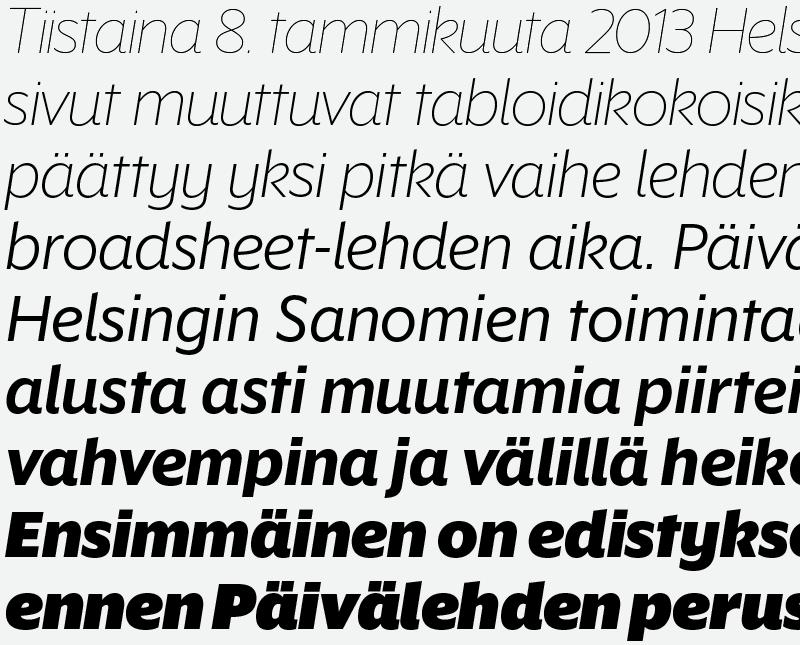
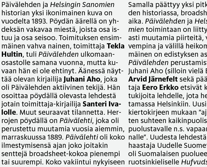
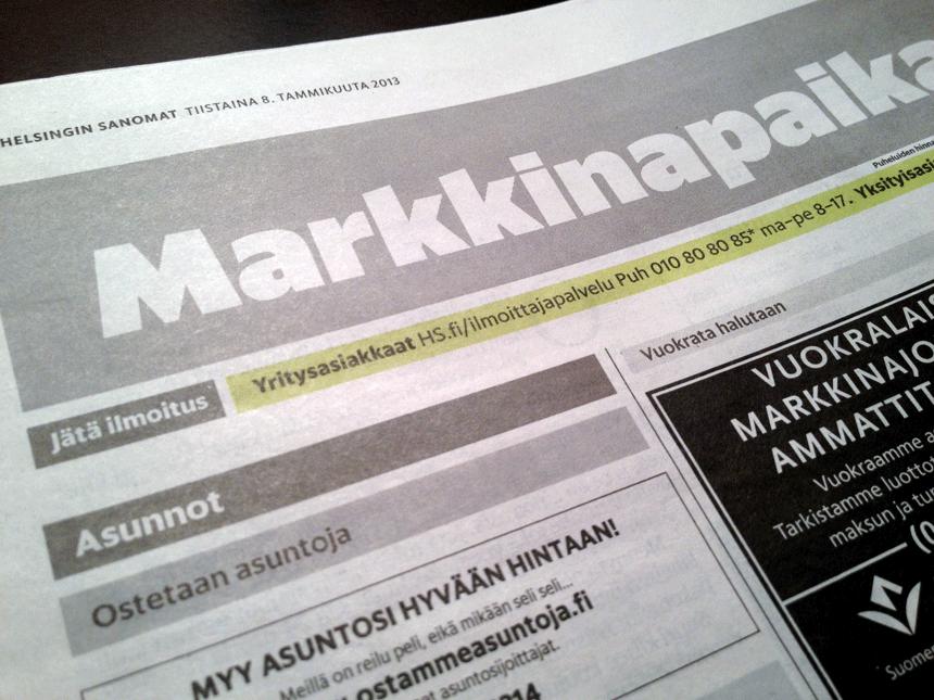
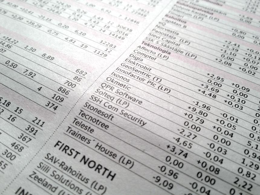
Helsingin Sanomat is Finland's major daily newspaper, with a circulation of around 400,000 on weekdays. A broadsheet since its founding in 1905, the paper made the switch to tabloid format on 8 January 2013. We provided all of the type for the new design: Sanomat, a serif family for headlines in 8 weights, designed by Paul Barnes with Berton Hasebe; Helsingin, a sans family for display use in 9 weights, designed by Christian Schwartz and Vincent Chan; Helsingin Text in 6 weights, for captions, sidebars, info graphics, maps, and listings; and text is in a custom grade of Publico Text which has been fine-tuned for the Helsingin Sanomat's presses. The redesign was conceptualized and executed internally, headed up by group creative director Sami Valtere along with art directors Hannu Pulkkinen and Ari Kinnari.
The new typefaces have debuted in the 8 January edition of Helsingin Sanomat, and will make their way into the magazines, mobile apps, and website soon.
While we did discuss redrawing the nameplate, it was ultimately deemed to be untouchable. There's no other newspaper nameplate like it in the world, and we wouldn't have wanted to ruin it.
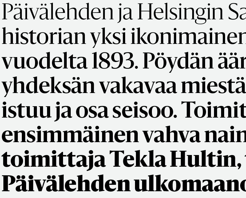
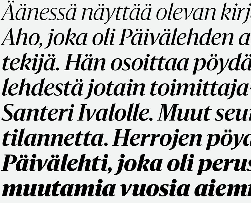
The tabloid layouts are built on a strong grid of square elements. Sanomat is designed to play against this, with organic forms that warm up the coldness and precision of the underlying page structure. Sanomat is an unusual hybrid: a serif face with flared sans terminals, influenced by 'serifless romans' like Optima and Albertus. The sans influence is even more visible in the italics, which lose almost all of their serifs in the lowercase. This almost inscriptional quality helps the typeface look serious and decidedly upscale—very important traits in maintaining the feel of a quality broadsheet in the tabloid format. The serifs are quite short, particularly on the diagonal characters, because of the preponderance of 'vv' and 'yy' pairs in Finnish. The word for 'goodness', hyvyys, is a good example of diagonal-diagonal combinations.
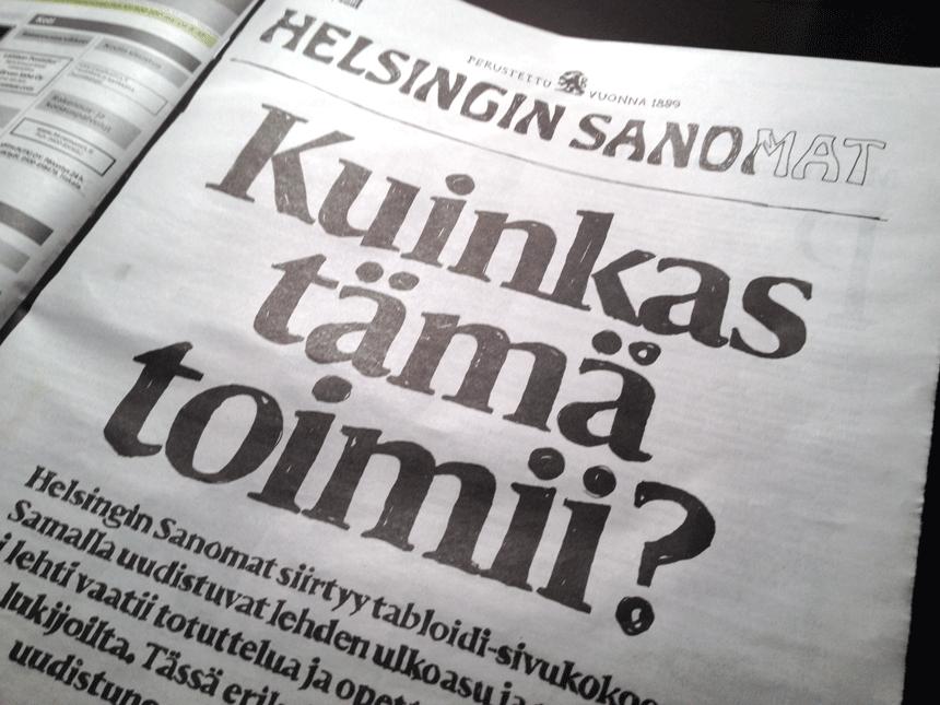
The debut issue of the redesign featured a section explaining the new format, with all of the Sanomat headlines painstaking recreated in felt-tipped marker by the creative director.
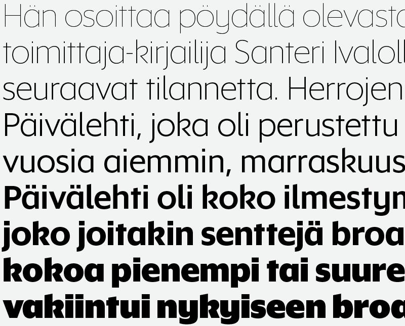
Helsingin is a fairly straighforward geometric sans serif, tempering the quirkiness of Sanomat. The pointy terminals reference the iconic geometric architectural lettering in Helsinki's main square, close to the Helsingin Sanomat's offices. To counter the potentially monotonous texture caused by the many repeating letters in Finnish words, we made the bowls a little bit asymmetrical, more like a humanist sans than a typical geometric. In addition to the newspaper, Helsingin Sanomat has two very popular supplementary publications: a monthly magazine called Kuukausiliite and a weekly entertainment and nightlife magazine called Nyt. The design of these had evolved in very different directions from the daily paper and from one another. One aim of the redesign effort is to coordinate the design of all of the print products more closely, while still allowing each to keep its individual personality. The wide range of weights in the Helsingin family grew directly out of this aim: punchy bold weights for the younger readership of Nyt and elegant thin weights for the more literary flavor of Kuukausiliite. Additionally, a set of alternates allows the family to be even more flexible.
