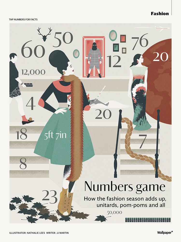
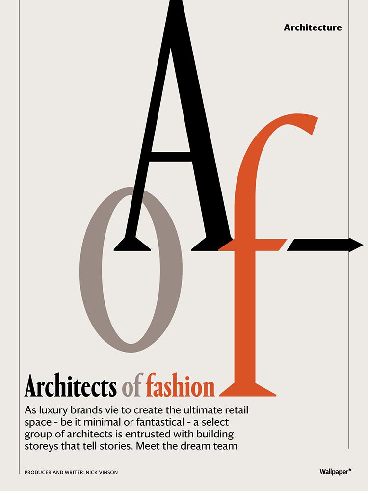
Darby for Wallpaper*
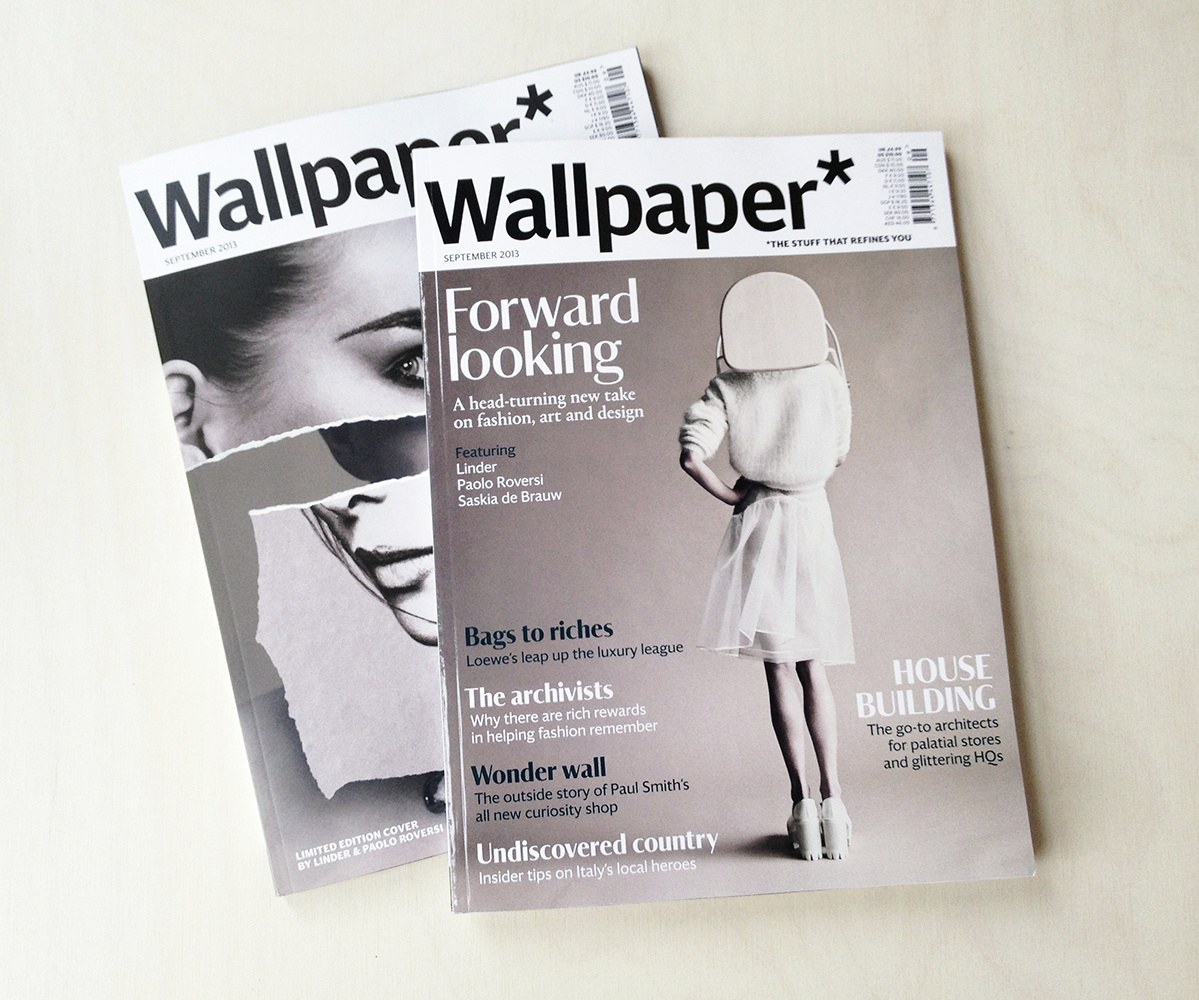
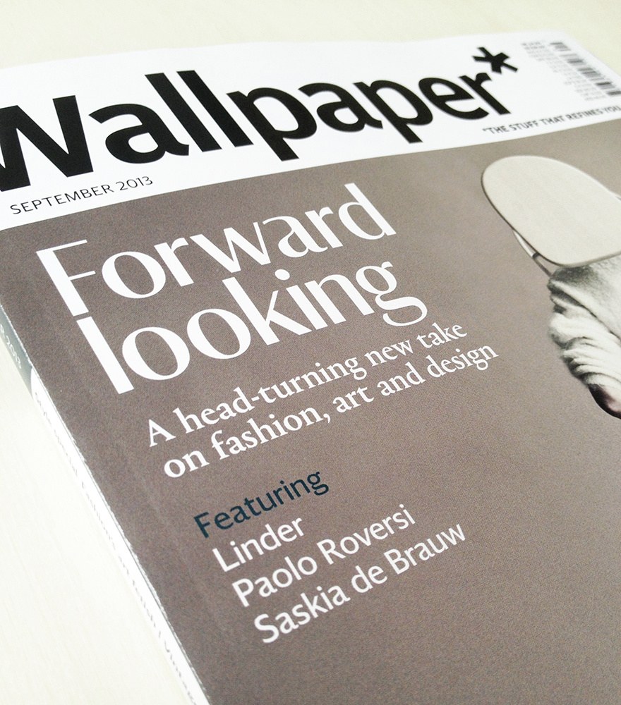
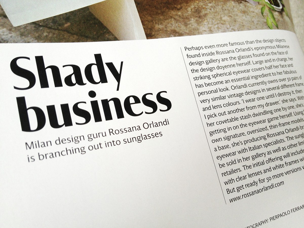
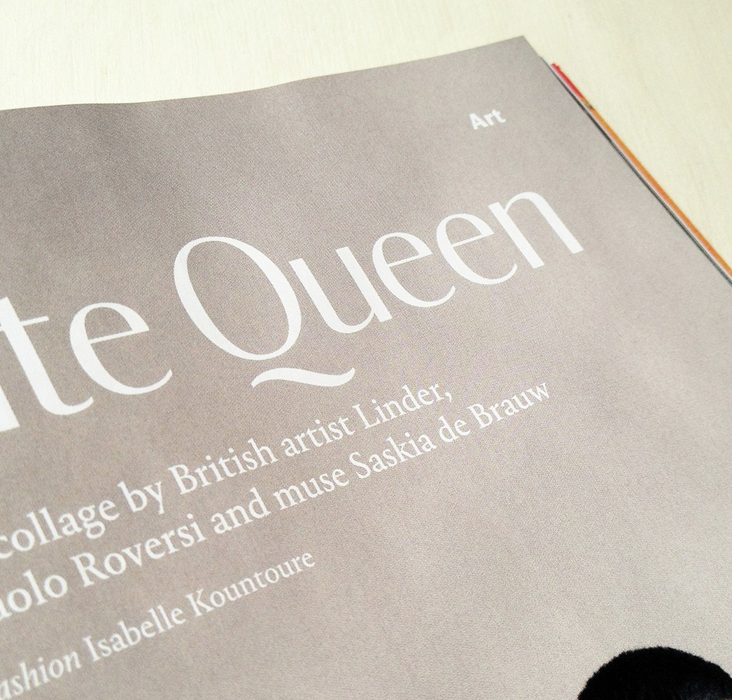
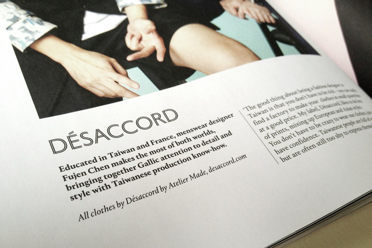
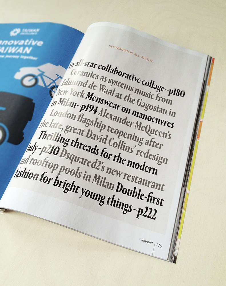
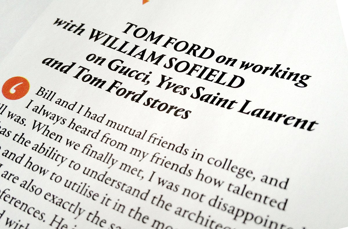
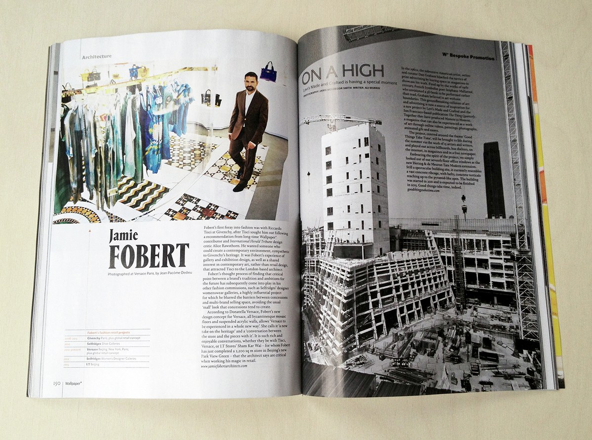
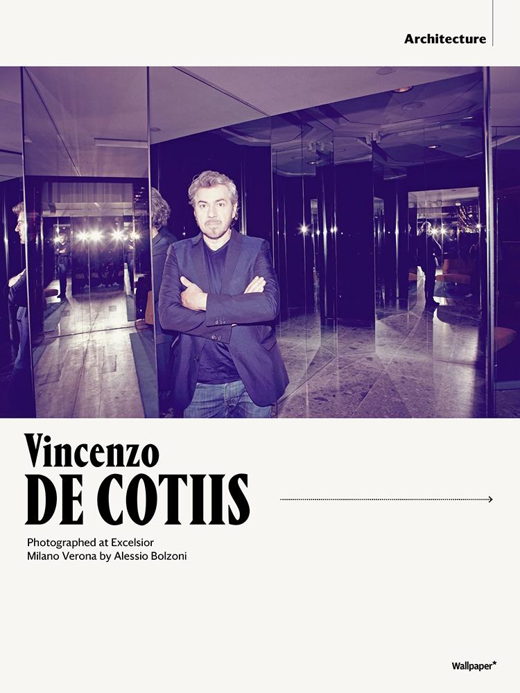
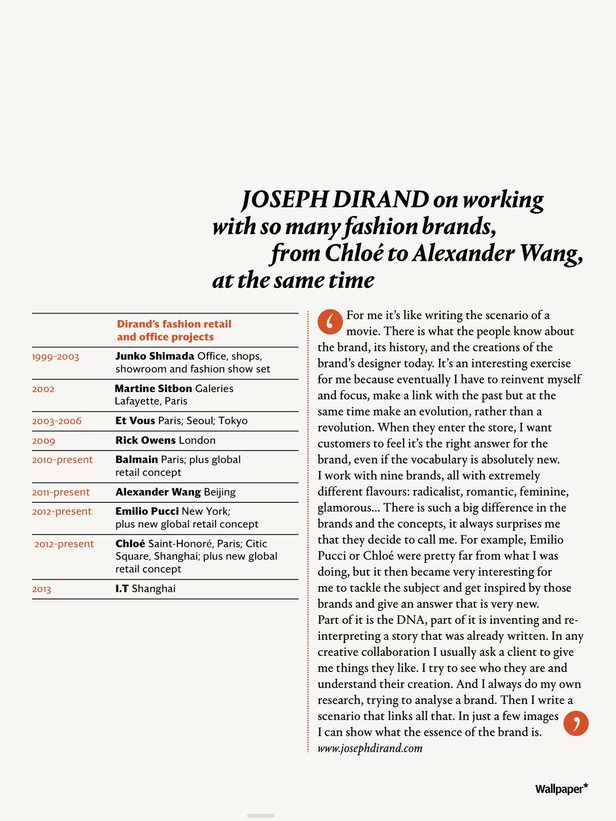
Iconic British style and interiors magazine Wallpaper* has debuted a complete redesign with their September 2013 issue. The redesign was carried out by new creative director Sarah Douglas and art director Lee Belcher. Graphik has been retired after nearly six years as the primary display face, along with Lexicon and Big Caslon. The new type palette features Darby, a brand new typeface by Paul Barnes completed for this redesign, plus Berton Hasebe's Portrait, which is now complete and will be released in September.
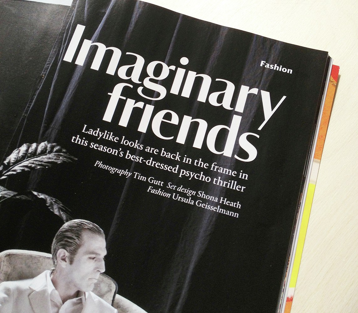
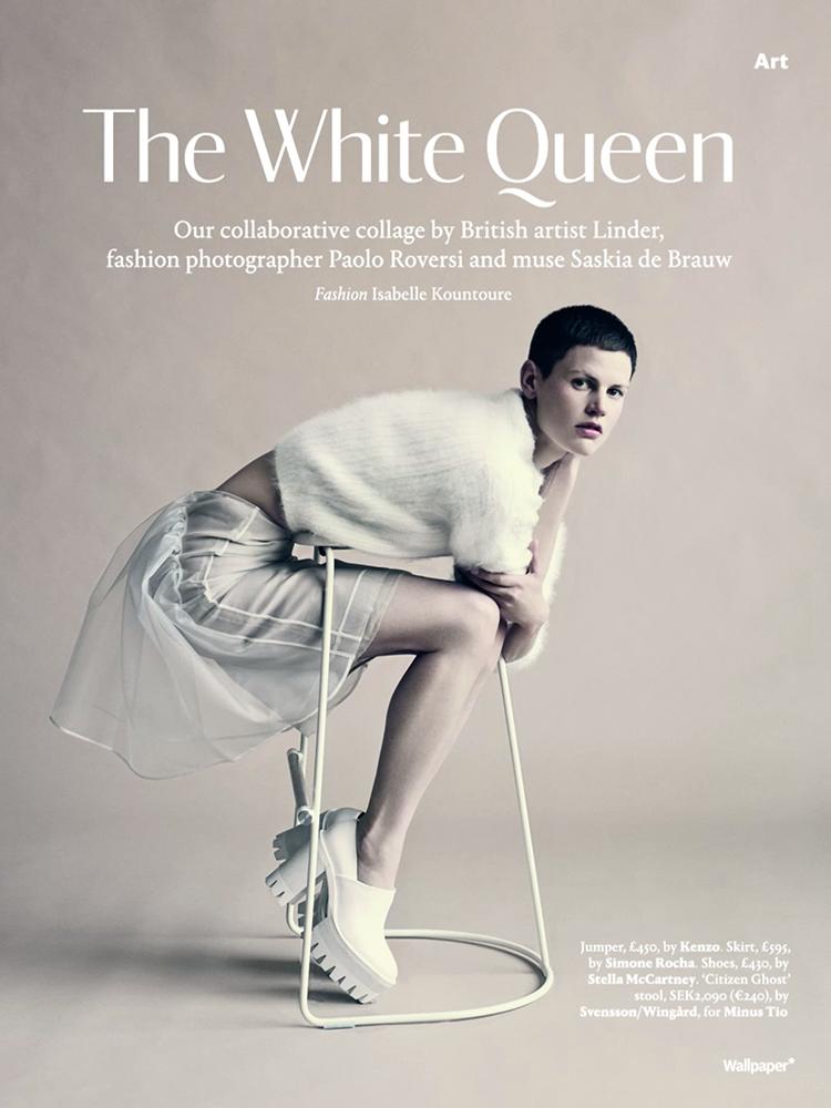
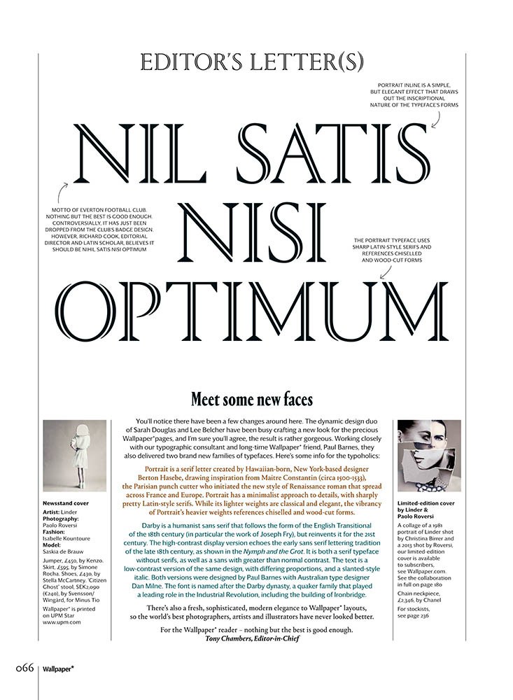
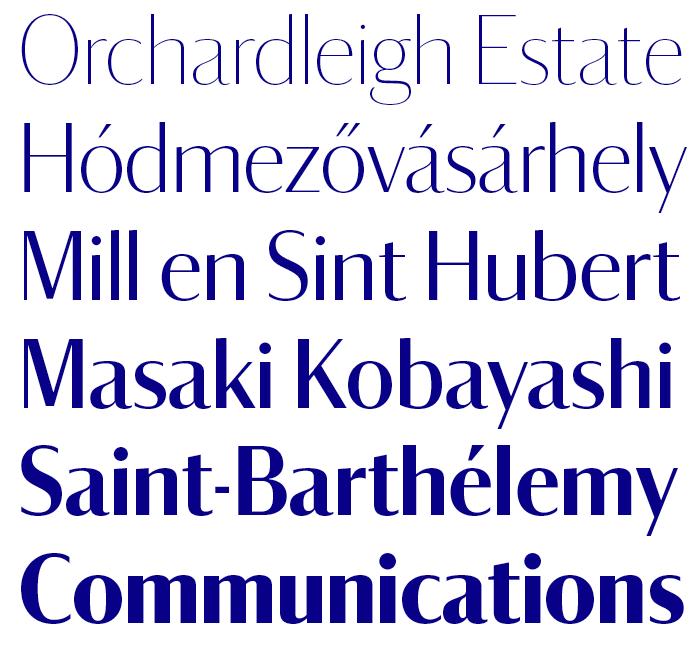
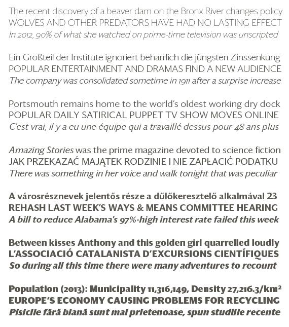
Darby is a humanist sans serif that follows the form of the 18th century English Transitional, particularly the work of Joseph Fry, but reinvents it for the 21st century. The high-contrast display version echoes the early sans serif lettering tradition on the late 18th century, as shown in James Mosely's treatise on the sans serif The Nymph and the Grot. It can equally be described as a serif typeface without serifs, and as a sans with much higher contrast than normal. Darby Sans Text is a low-contrast variation on the same design, with a larger x-height and an aggressively slanted italic. Paul designed both families with the help of Australian type designer Dan Milne. The typeface is named for the the Darby dynasty, a Quaker family who played a leading role in the Industrial Revolution in England, including the building of Ironbridge. This project's initial roots lie in the exploration of historical English lettering that also yielded Chiswick (formerly Wyatt), designed by Paul for O, The Oprah Magazine.
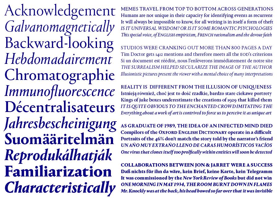
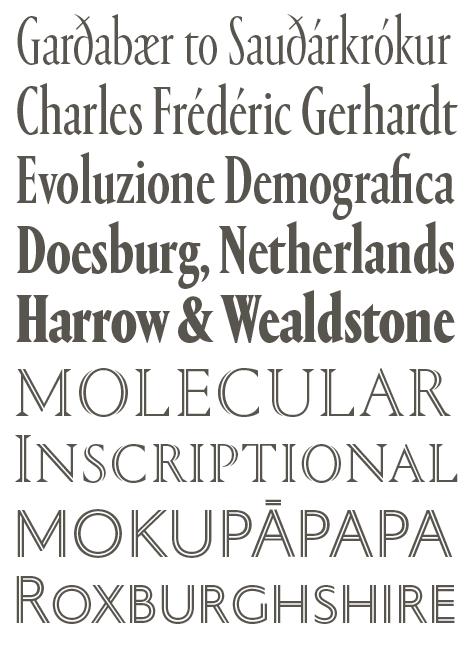
The quiet elegance of Darby plays nicely against the aggressive beauty of Berton Hasebe’s Portrait, which started out as an experiment in drawing a display typeface that managed to be both beautiful and brutal, and both classical and minimalist. The family draws its main inspiration from the Renaissance forms of French punchcutter Constantin. He cut what is believed to be the first true display typeface (at 32pt), with a lowercase to accompany its titling capitals. Its light, delicate forms were a major influence on the large types cut by Augereau and his apprentice Garamond, among other punchcutters of the time. Portrait is a depiction of the French Renaissance oldstyle, rather than a true revival, as it merges Constantin’s classical forms and proportions with a minimalist approach to details and sharply pretty Latin serifs. Portrait's heavier weights show the influence of the chiseled forms of German expressionist woodcuts.
Portrait was previously used in Document Journal, a New York-based fashion and arts magazine, but Wallpaper* marks the first appearance of the Inline, put to great use in the Newspaper section and in a special section on design in Taiwan.
The redesign carries through to the iPad edition and the typefaces will soon appear on the website as well.
