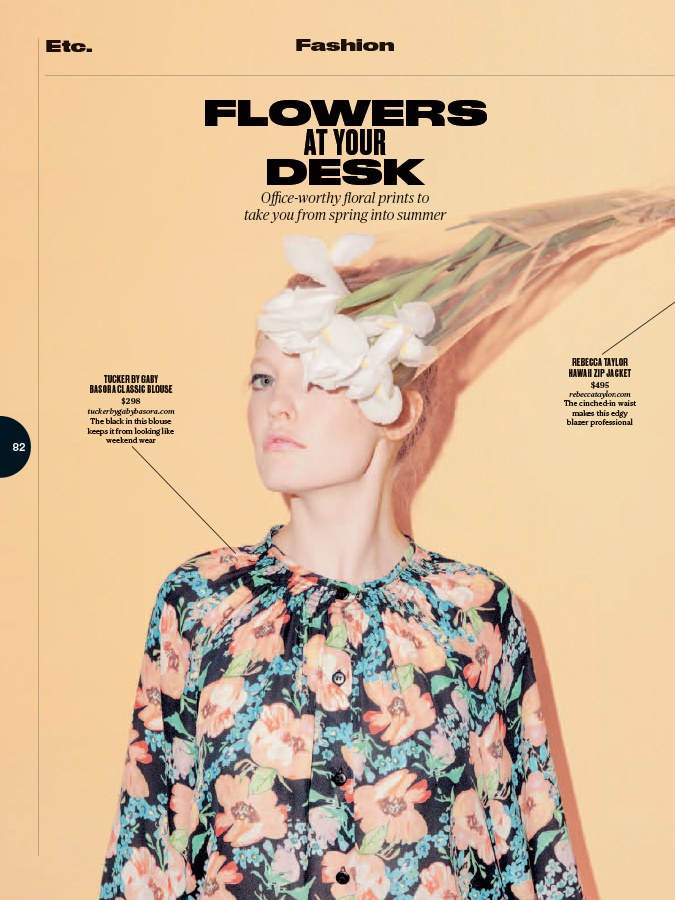
Druk Wide by Berton Hasebe for Bloomberg Businessweek
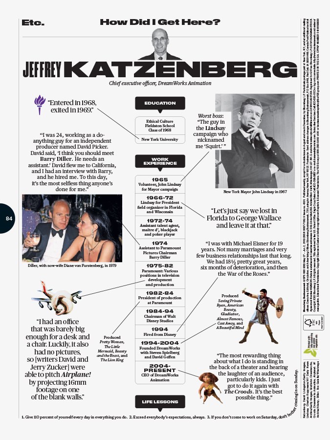
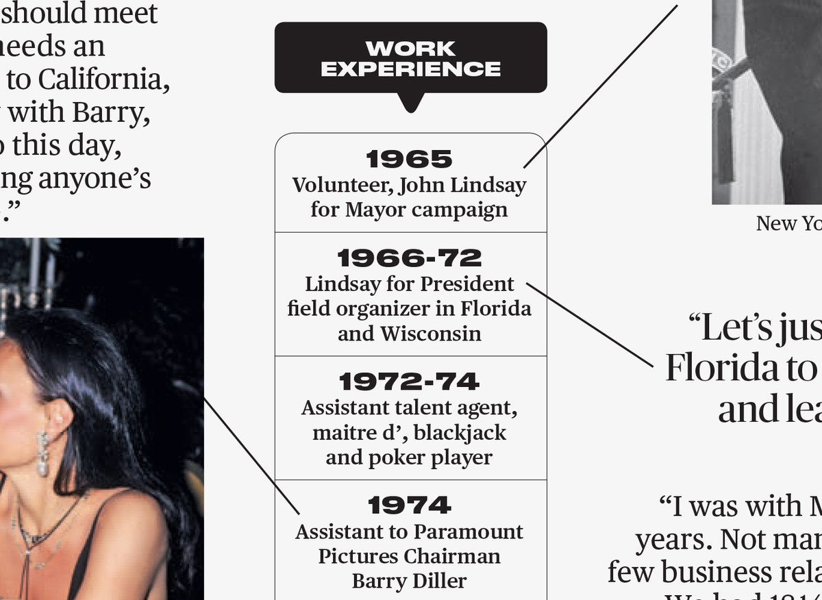
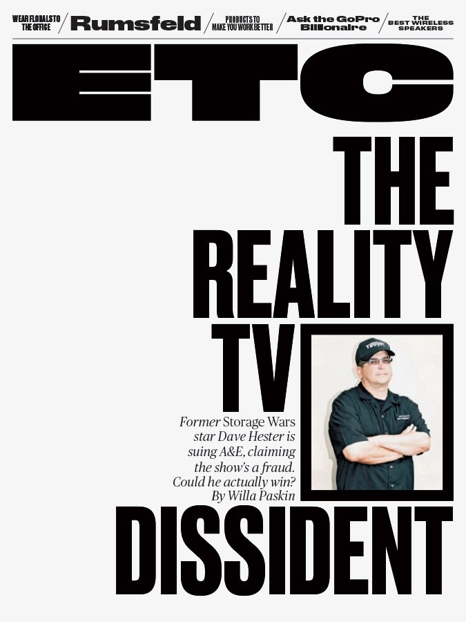
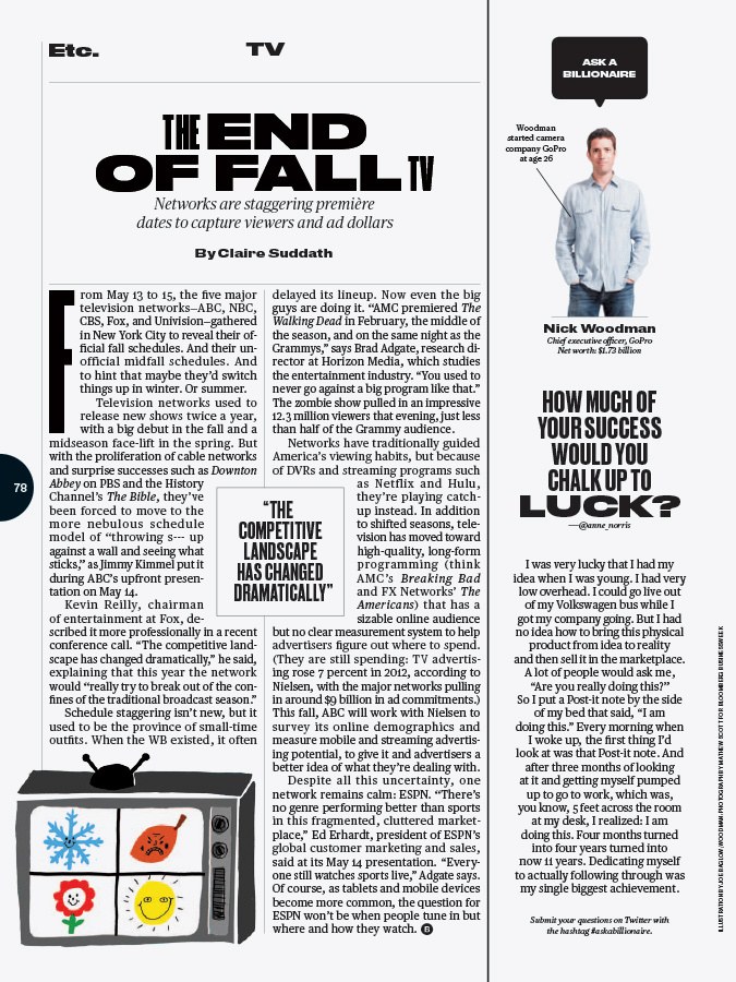
Creative Director Richard Turley and his team, with help from consultant Mark Leeds, have refreshed Bloomberg Businessweek from top to bottom for the first time since their major redesign in 2010. The changes through the front section of the magazine are minor, but Etc. has been completely rethought, with an exuberant approach to display typography centered around the extremely condensed versions of Druk that Berton Hasebe drew for their 2011 year end issue, played against Berton's newly drawn Druk Wide.


Druk Wide is not so much an expanded version of Druk as it is a similar approach to the opposite kind of extreme proportion. Druk's starting point was the many anonymous, slightly crude condensed sans serifs offered by all of the European type foundries in the 20th century, usually with generic names that translate as "Narrow Grotesk". Druk Wide starts from a similar source: the anonymous, extremely heavy, and extremely wide grotesks offered by many European foundries during the same time period. Variations on this design were known as Annonce Grotesk, and sold as the widest variants of Aurora and Venus, among others. Dutch graphic designer Willem Sandberg used a small size of Annonce Grotesk for captions in many of his iconic catalogs for the Stedelijk Museum in the late 1950s and early 1960s. This usage inspired Berton to draw a small-size version of Druk Wide, which the Businessweek team was immediately able to put to use. The new section logotype, drawn by Berton in collaboration with Christian Schwartz, took the wide, chunky forms of Druk Wide and made them even wider, heavier, and chunkier.

A less noticeable addition to the type palette is a slightly heavier grade of Publico Text, used throughout the magazine for a darker, softer, and slightly less noisy tone in text—and occasionally for display as well.
