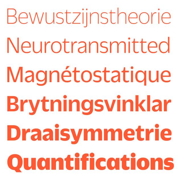
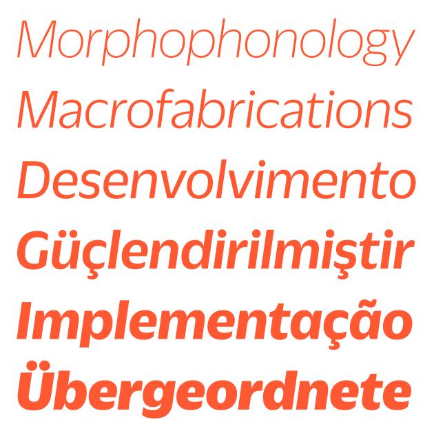
Duplicate by Christian Schwartz and Miguel Reyes
Previously known as Zizou, and before that Clouseau, Duplicate is a new family from Commercial Type that began as an experiment. Drawing on imperfect memories, rather than directly referencing existing work, has long been a method for reinvigorating the creative process in many different fields, from music, to art, to type design. Duplicate began in 2007 as an experiment by Christian Schwartz to see what he would get if he drew Roger Excoffon’s iconic 20th century sans serif Antique Olive, a typeface Schwartz has long loved and admired, from memory. Schwartz was inspired to try this exercise after reading many interviews with musicians who described stumbling upon their signature sound via the same process. The result was a new sans serif with a personality all its own, which has since grown into three related families: Duplicate Sans, Duplicate Slab, and Duplicate Ionic.
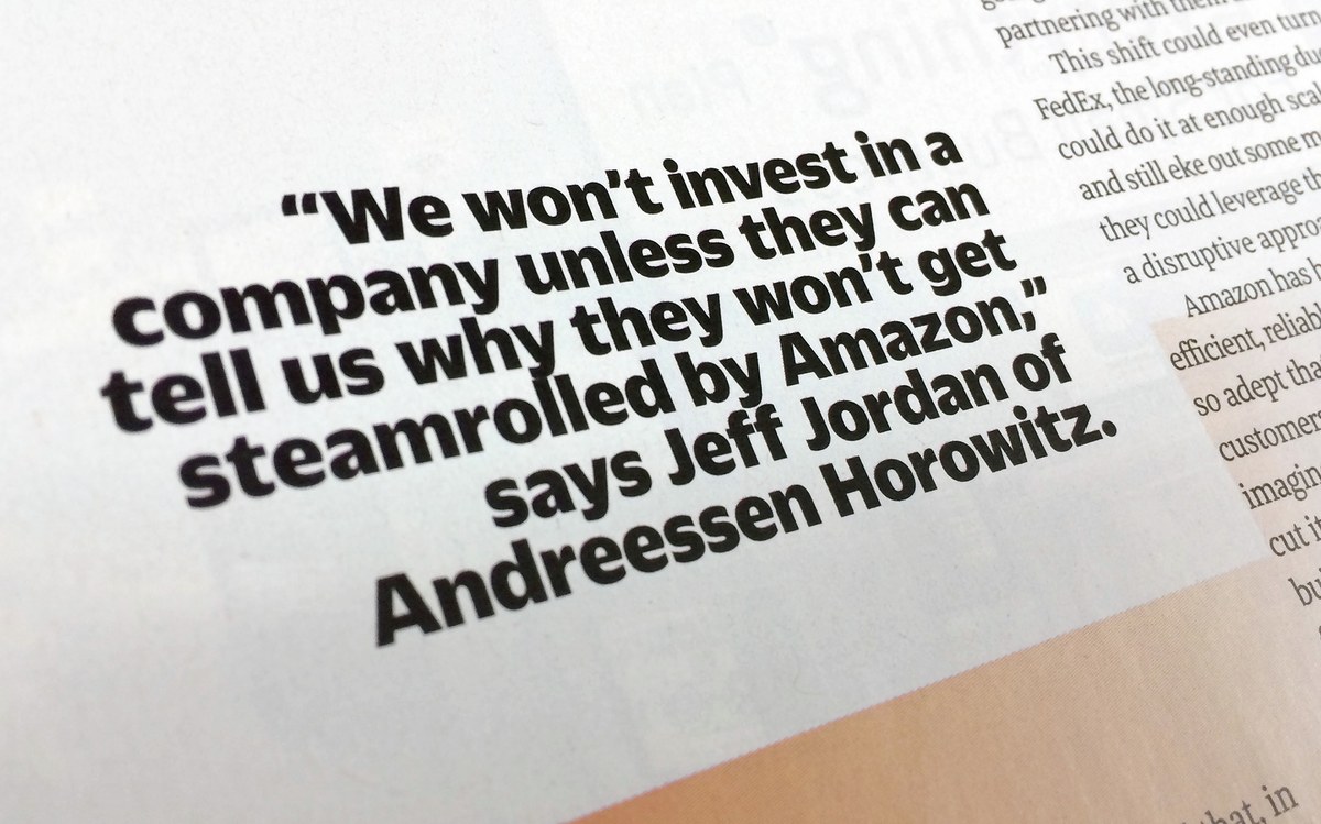
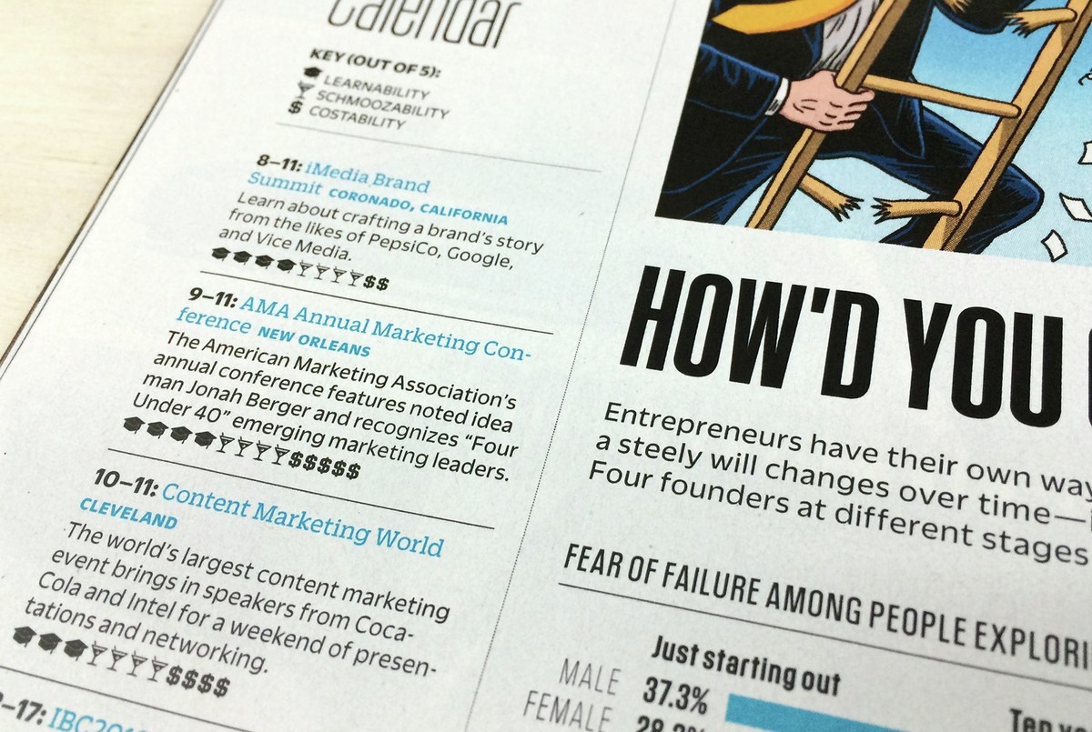
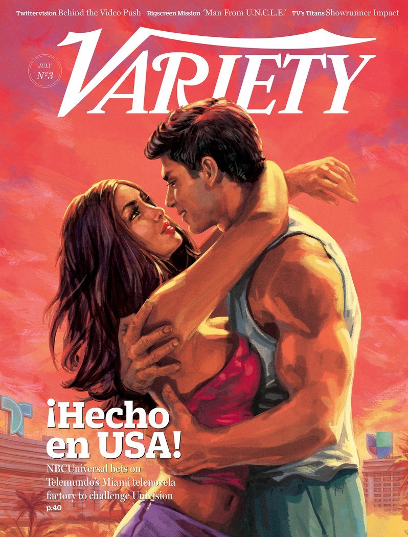
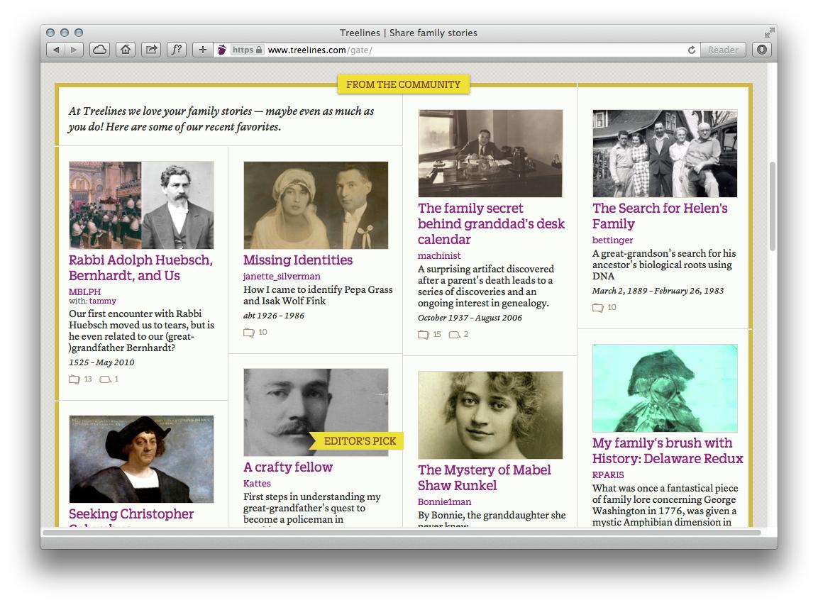
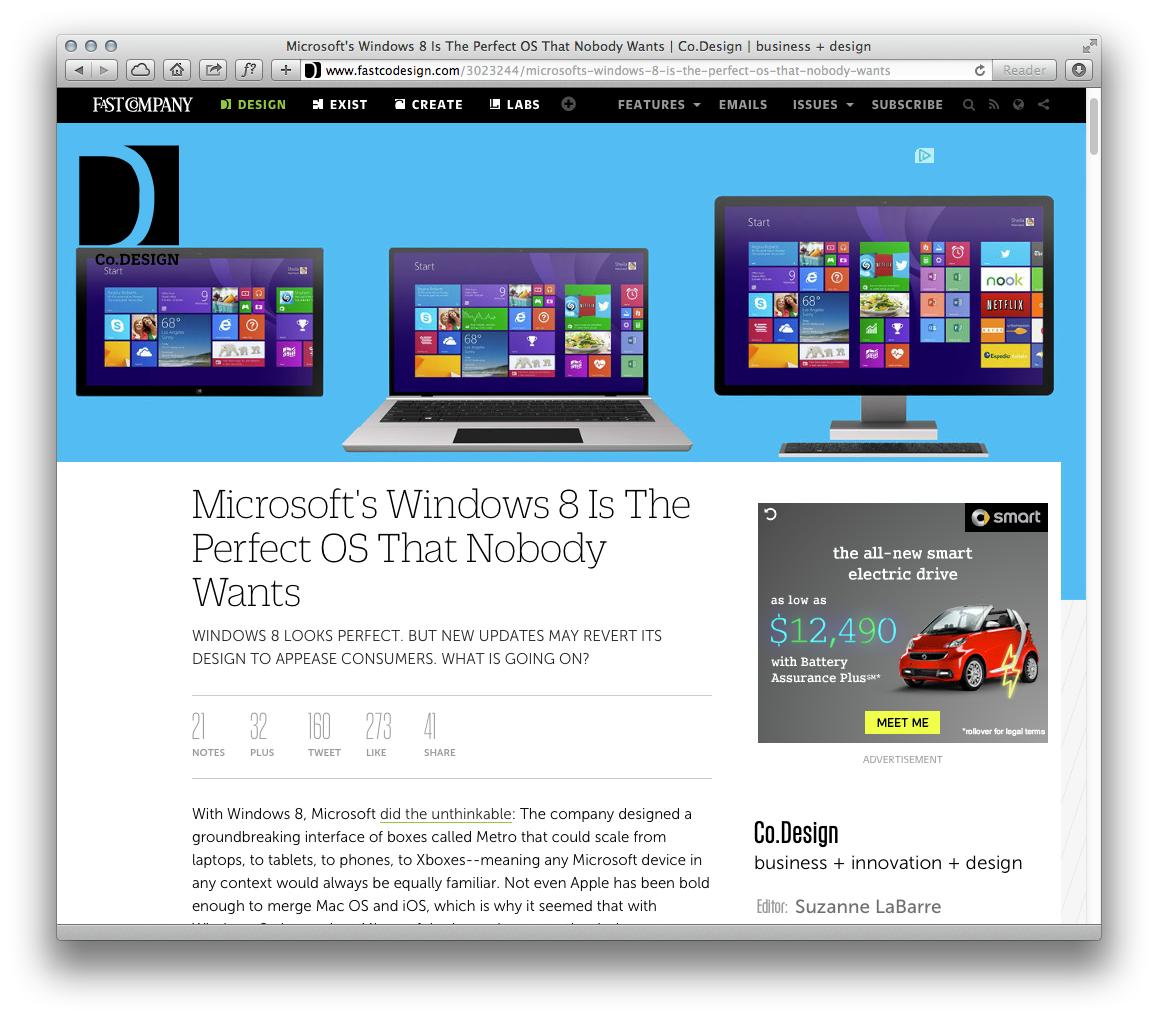
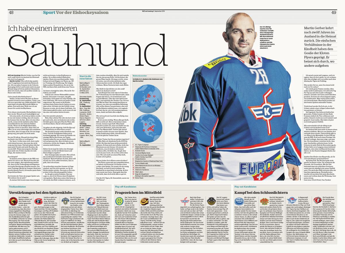
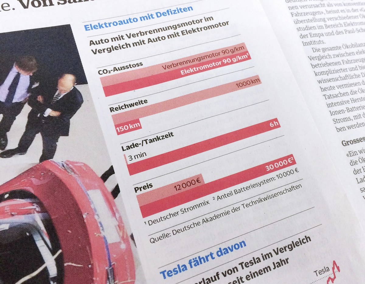
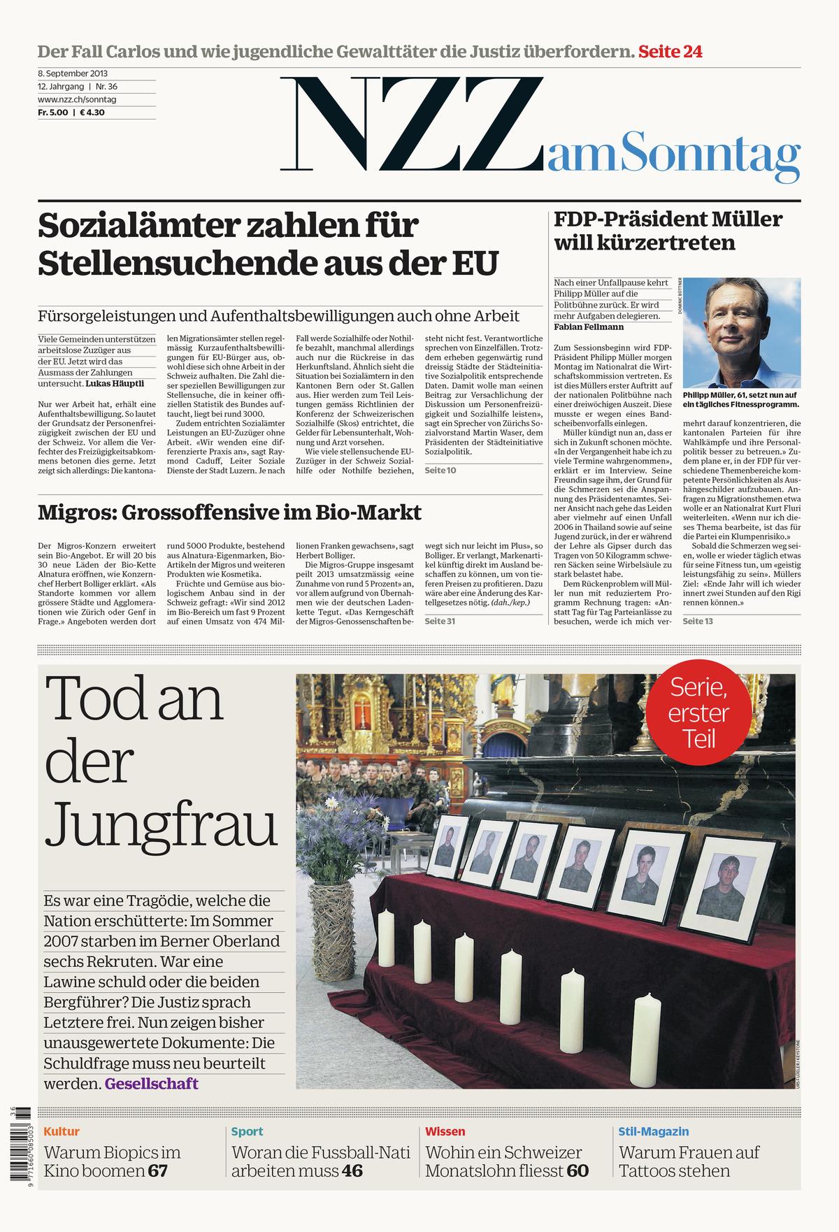
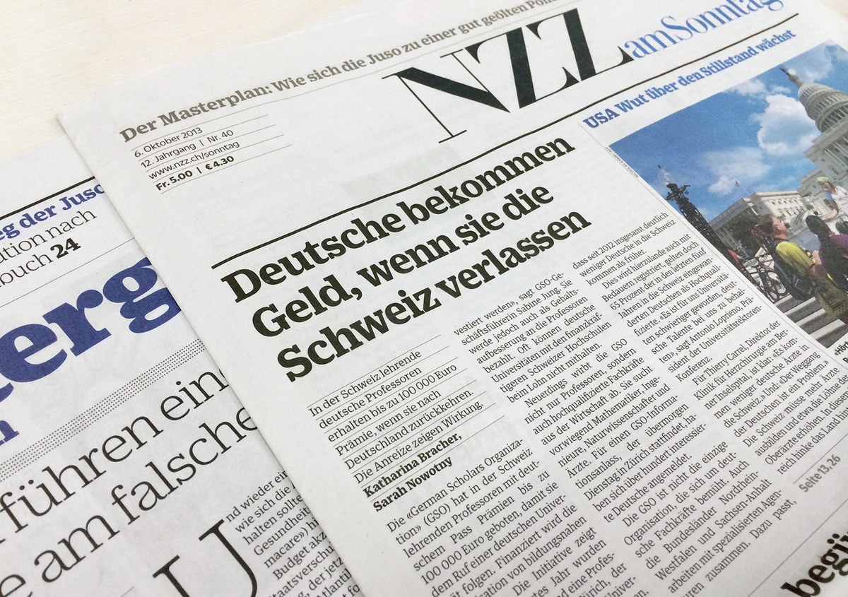
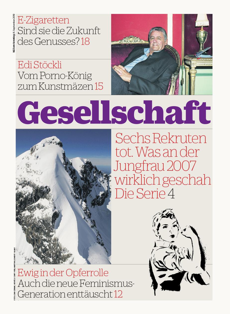
The three families in the Duplicate collection have the same coordinated set of six weights, allowing them to be used together seamlessly. In addition to Fast Company magazine and its family of websites, and the Neue Züricher Zeitung am Sonntag, Duplicate played a major role in Robb Rice's 2013 redesign of Variety, and in Nya Wermlands-Tidningen, a regional newspaper in Sweden redesigned by Per Boström. Duplicate Slab is also paired with Lyon Text for Treelines, a site for presenting the personal narratives embedded in family trees.
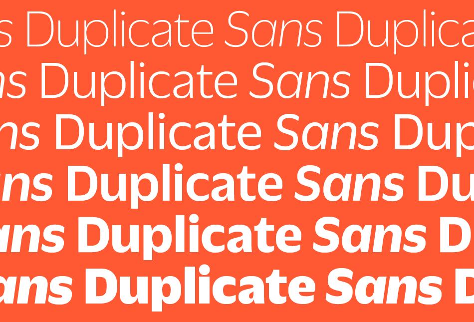
The design process began with the sans. Roger Excoffon’s Antique Olive was a departure from the grotesks popular in Europe in the middle of the 20th century. Its strong personality is tied to a particular time and place, making it difficult to use in a contemporary context without being evocative of France in the 1960s and 70s. Christian Schwartz wanted to see what the result would be if he tried to draw Antique Olive from memory. He was curious whether this could be a route to something that felt contemporary and original, or if the result would be a pale imitation of the original. Most of all, he wanted to see what he would remember correctly and what he would get wrong, and what relationship this would create between the inspiration and the result. Though it shares some structural similarities with Antique Olive – and a handful of details, like the shape of the lowercase a – Duplicate Sans is not a revival, but rather a thoroughly contemporary homage to Excoffon.
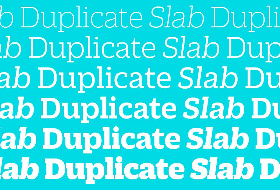
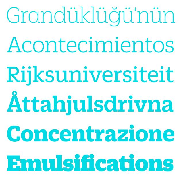
Duplicate Sans was finally finished at the request of Florian Bachleda for his 2011 redesign of Fast Company. Bachleda wanted a slab companion for the sans, so Schwartz decided to take the most direct route: he simply added slabs to the sans in a straightforward manner, doing as little as he could to alter the proportions, contrast, and stylistic details in the process. Duplicate Slab therefore is the perfect match for Duplicate Sans. Because its skeleton is neither geometric nor traditionally humanist, Duplicate Slab has an atypical texture for a slab serif: warm and informal. It manages to be quite pretty in its lightest weights, and both friendly and forceful in its heaviest weight.
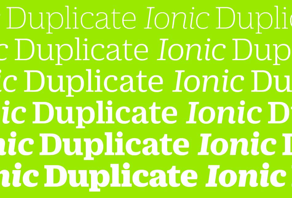
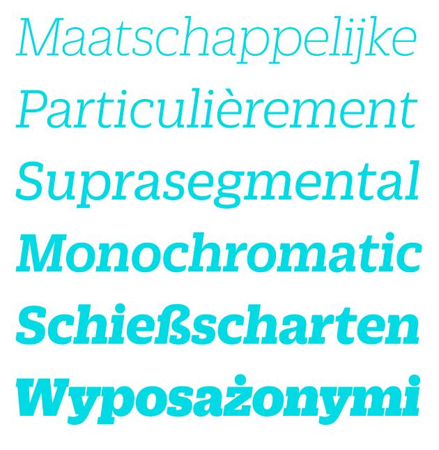
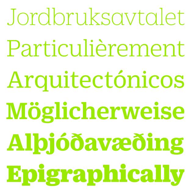
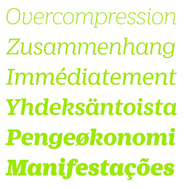
The bracketed serifs and ball terminals that define the Clarendon genre (also known as Ionic) first emerged in Britain in the middle of the 19th century. While combining these structures with a contemporary interpretation of a mid-20th century French sans serif seems counterintutive, the final result feels suprisingly natural. The romans are a collaboration between Christian Schwartz and Miguel Reyes, but the italic is fully Reyes’s creation, departing from the sloped romans seen in Duplicate Sans and Slab with a true cursive. Mark Porter and Simon Esterson were the first to use the family, in their 2013 redesign of the Neue Züricher Zeitung am Sonntag. Because the Ionic genre has long been a common choice for text in newspapers, Duplicate Ionic is a natural choice for long texts.
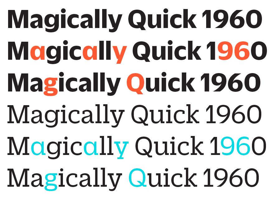
Aside from the Thin and Black, which are designed only for use at larger display sizes, all three families are intended for both text and headline use. Duplicate is suitable for a wide range of applications, from newspapers and magazines through to graphic design and corporate design. A number of alternates, such as a single-story a and double-story g, allow designers to fine tune the personality of the typeface on the page. All 36 styles have been manually hinted for use on the web, and can be licensed for use in mobile apps as well.
