Canela Condensed
The earliest condensed typefaces came into use in the early nineteenth century, first appearing in England and Germany, then in France. These typefaces were mostly sans serifs, but condensed serifs—and particularly condensed fat faces—followed soon after.
From this tradition comes Canela Condensed, designed by Miguel Reyes. While designing Canela, Reyes took many cues from Caslon. Likewise, Canela Condensed draws inspiration from Caslon Extra Condensed, which was ubiquitous on American book covers in the 1960s and ’70s, and the condensed serif typefaces from Photo-Lettering, Inc. that helped to define the same era in magazine design.
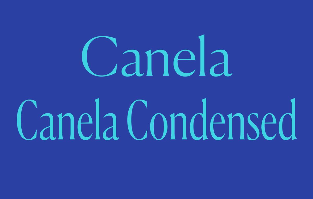
“Canela Condensed is all about the vertical,” said Commercial Type designer Christian Schwartz. “It’s about elegance and beauty and elongating the vertical lines.” The difference in width between Canela Condensed and Canela is not subtle: Reyes has established clear differentiation between the families with the emphatically narrow proportion of the Condensed.

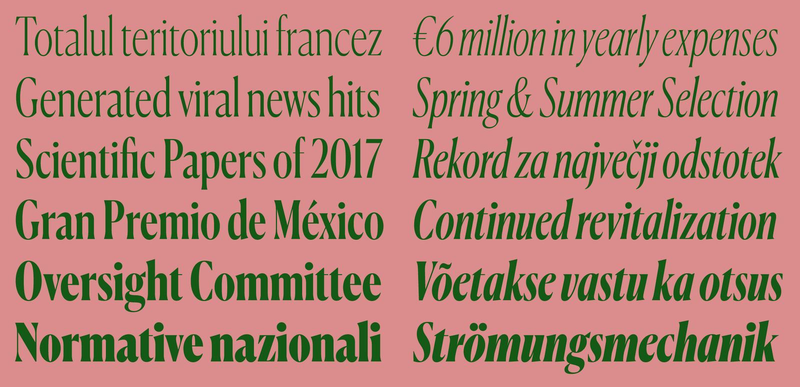
Canela Condensed has six weights, all with italics.
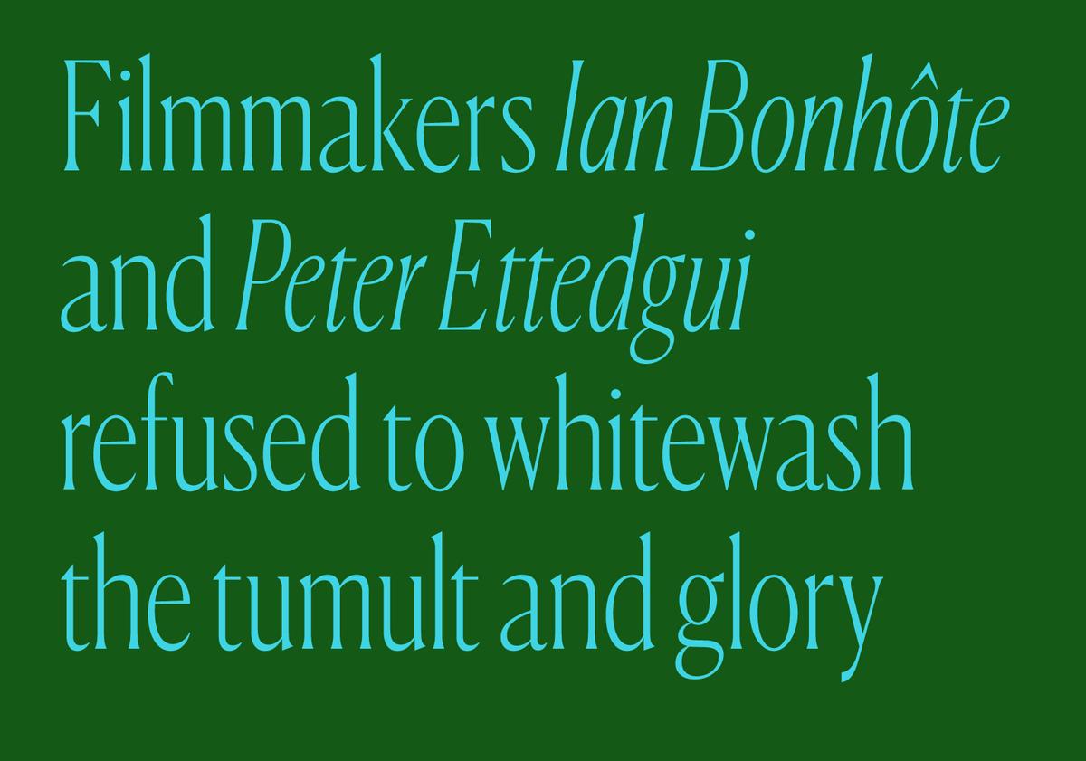
Whereas the process of condensation can sometimes bring out an aggressive edge in a serif typeface, Canela Condensed maintains its quiet elegance, exaggerating the vertical lines of the original width without losing the supple curves of the round forms. The italic features a gentle angle that relies on the cursive shapes in the lower case to distinguish it from the upright.
Like the original Canela, Canela Condensed is only recommended for use at 48pt and above for headline and display typography.


