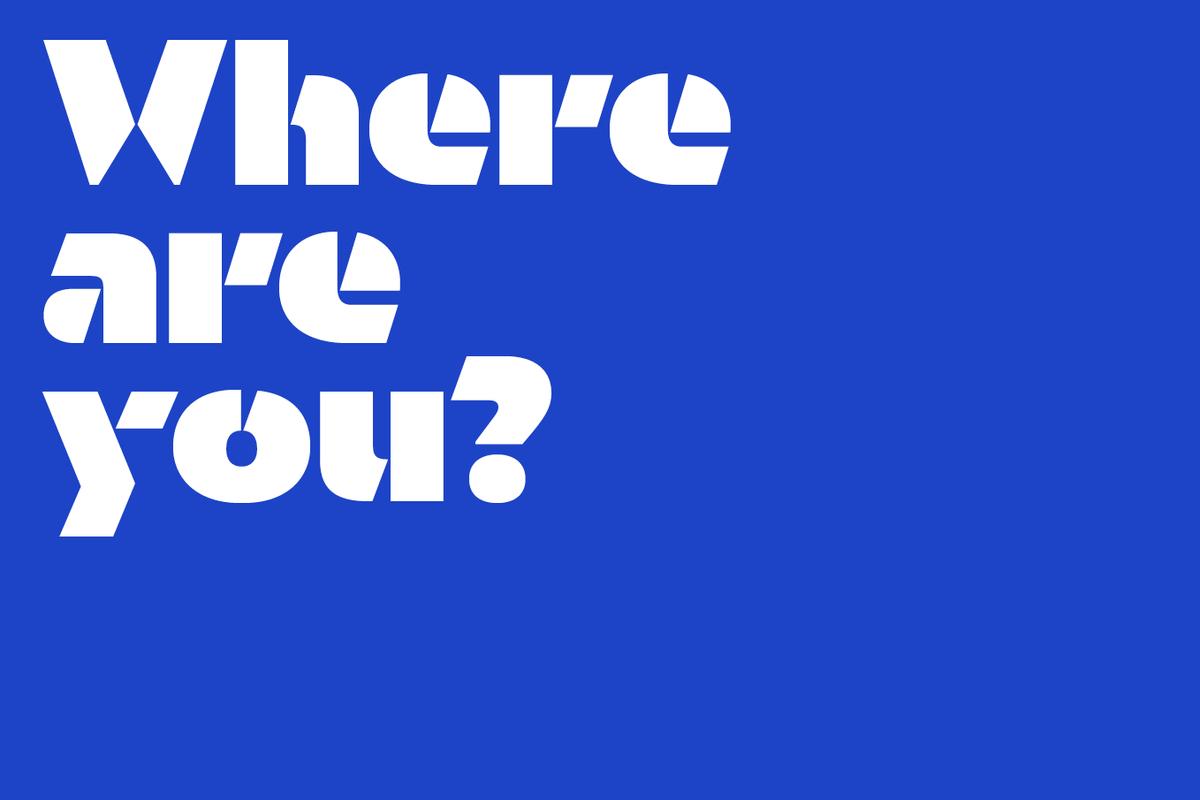
Orientation, a new stencil typeface designed by Sandrine Nugue, makes a striking impression from the first glimpse. Typefaces designed for print are often used for signage, but it is rare for a typeface to go in the other direction, from signage to print and screen. With Orientation, this is exactly how it began.
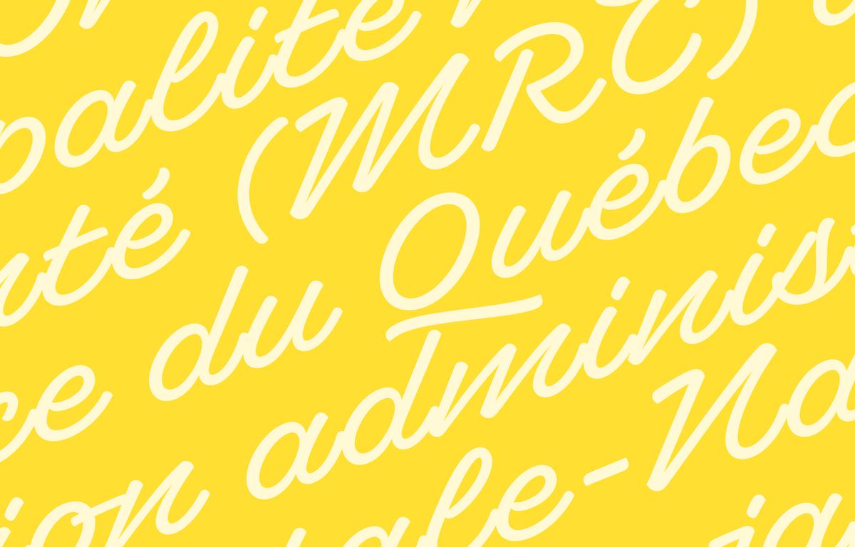
Ross Milne's script typeface Superette was inspired by non-connecting script lettering he observed on a small island in southern Quebec. With its striking angle and purposefully non-joining letterforms, Superette is a gleeful celebration of what is often considered “bad taste” and an exploration of letterforms typically seen outside the context of graphic design.
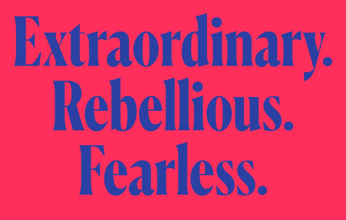
Miguel Reyes has further expanded his popular Canela collection with a condensed display family.
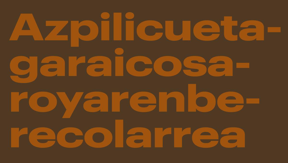
Graphik is an exceptionally complete system of sans serifs designed to be a blank slate, perfectly suited for any style of expression. With the release of Graphik Wide, the rational grid of eight widths from XXXX Condensed to Wide, and nine weights with italics, is now complete.
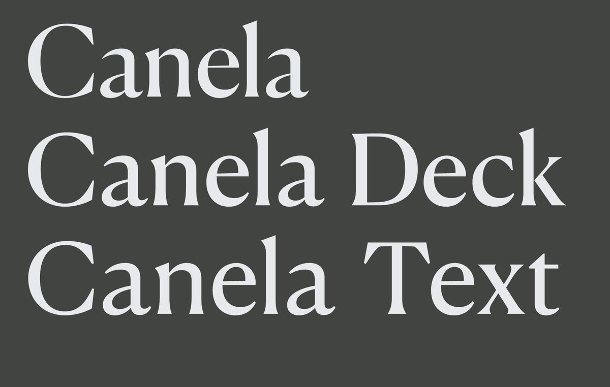
To expand Canela’s range of usable sizes, Miguel Reyes has drawn two additional optical sizes: Canela Deck and Canela Text. Both families are designed to keep the elegance and beauty of the original display face while giving it the robustness it needs to work at smaller sizes.
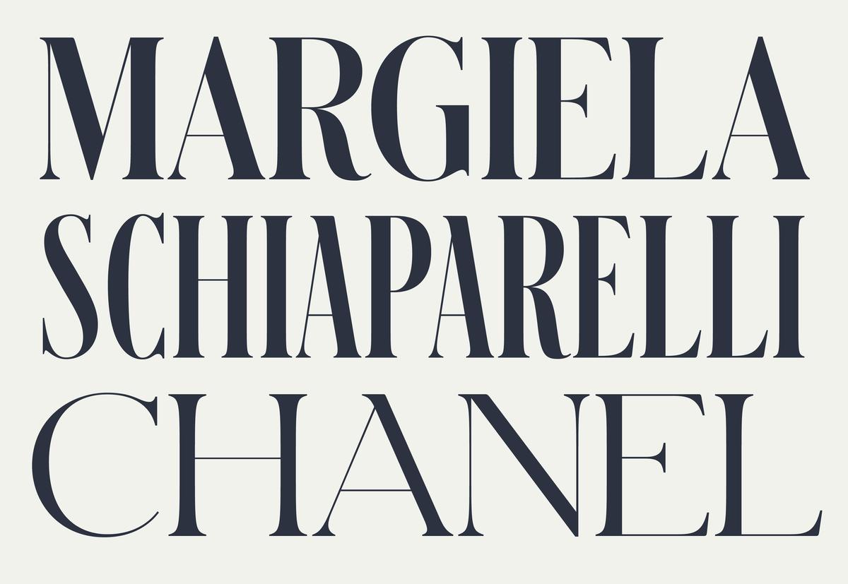
Schnyder was designed by Berton Hasebe and Christian Schwartz for the 2013 top-to-bottom redesign of T, the New York Times Style Magazine by creative director Patrick Li and his team. With three weights, four widths, and four optical sizes, Schnyder is a complete system for making beautiful, offbeat, and distinctive headline treatments.
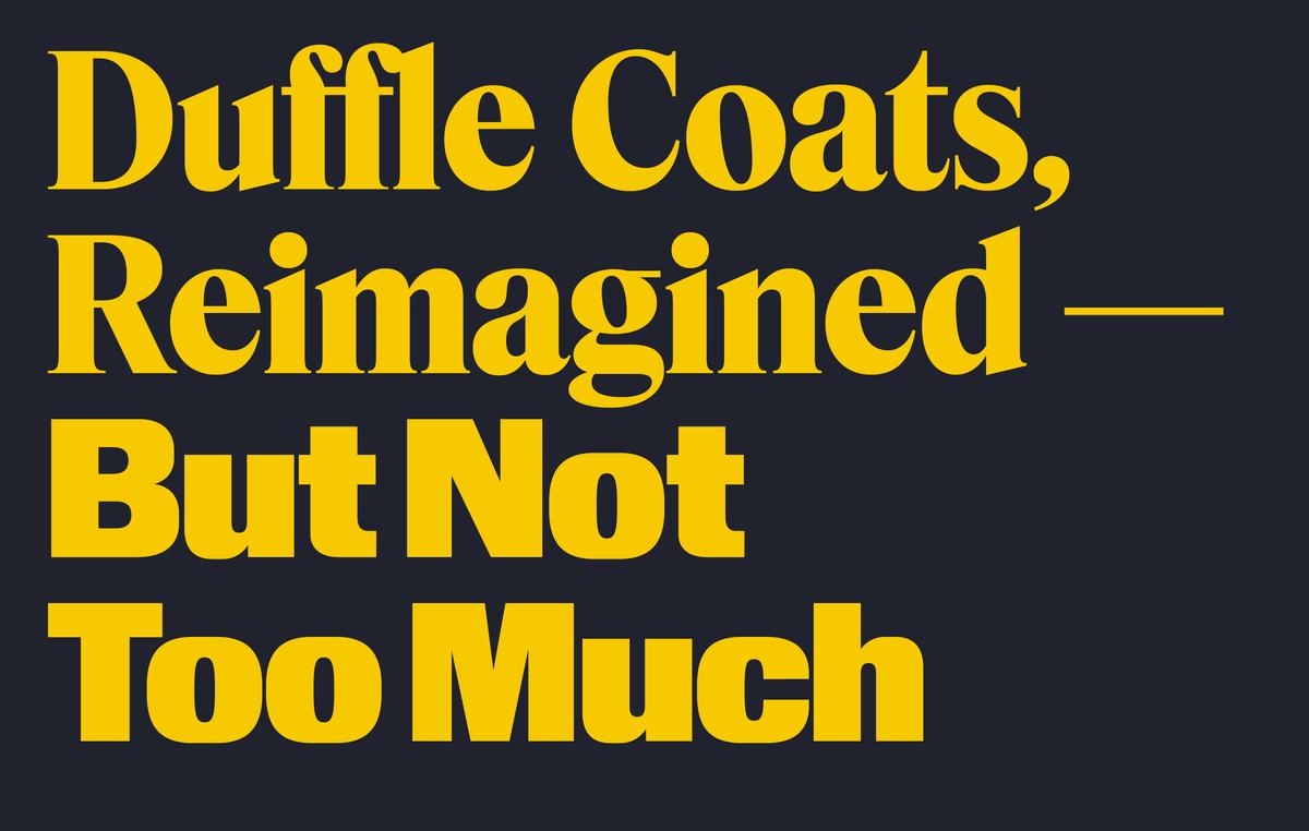
Hanya Yanagihara is now editor in chief of T, the New York Times Style Magazine, leading creative director Patrick Li and his staff to reimagine the look of the magazine from front to back, once again enlisting Berton Hasebe and Christian Schwartz to create custom typefaces for the redesign: Kippenberger, an all-purpose sans; and Fact, a compact and utilitarian serif.
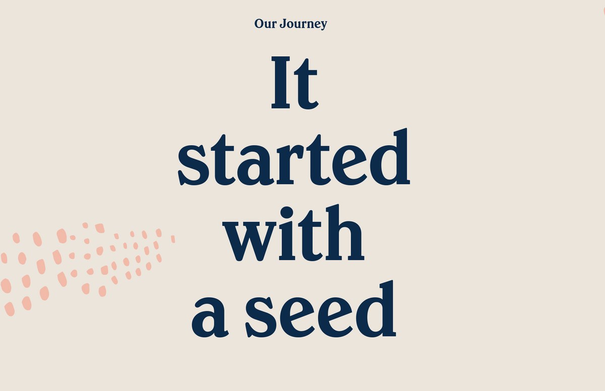
Founded in 2005 and first appearing on shelves in 2007, Greek yogurt maker Chobani rebranded and introduced all new packaging at the end of 2017. The rebrand was carried out by the company's internal design team; two key elements of the new identity are the new logotype, drawn by Berton Hasebe, and a new typeface drawn by Berton in collaboration with Christian Schwartz.