Kippenberger and Fact for T: the New York Times Style Magazine
Hanya Yanagihara is now editor in chief of T, the New York Times Style Magazine, leading creative director Patrick Li and his staff to reimagine the look of the magazine from front to back, once again enlisting Berton Hasebe and Christian Schwartz to create custom typefaces for the redesign. Their last collaboration focused on eccentric letterforms and resulted in Schnyder, an atmospheric display typeface that lives comfortably in the uncanny valley between lettering and type. The goal this time was to create a complete system of typefaces that would capture a certain feeling in graphic design, with references encompassing artist-published underground magazines from the late 20th century, the precisely gridded publication design of Karl Gerstner, and Herb Lubalin’s provocative typographic covers for fact magazine. The redesigned T is denser and more text-oriented than the image-forward approach of the previous editor, and the new typefaces are built for a text-heavy environment.
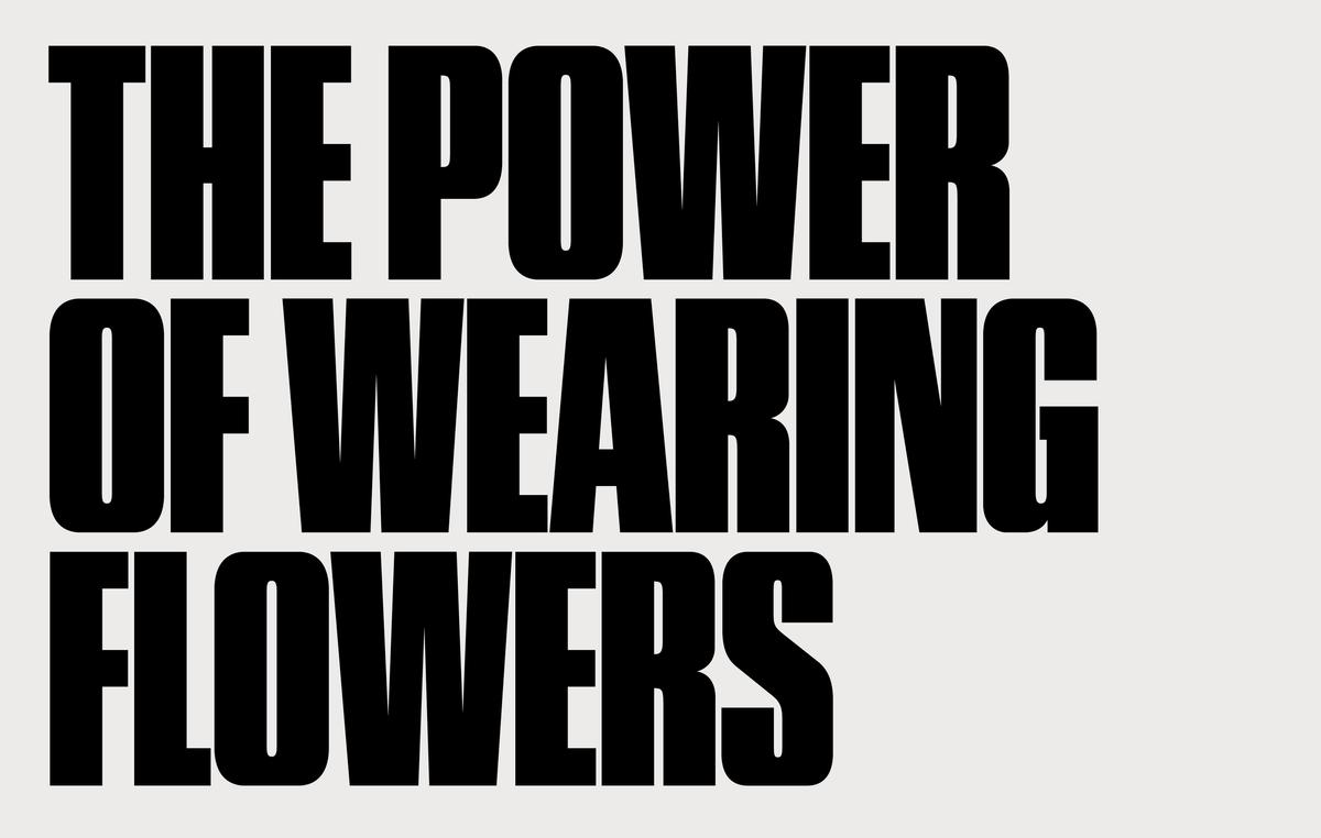
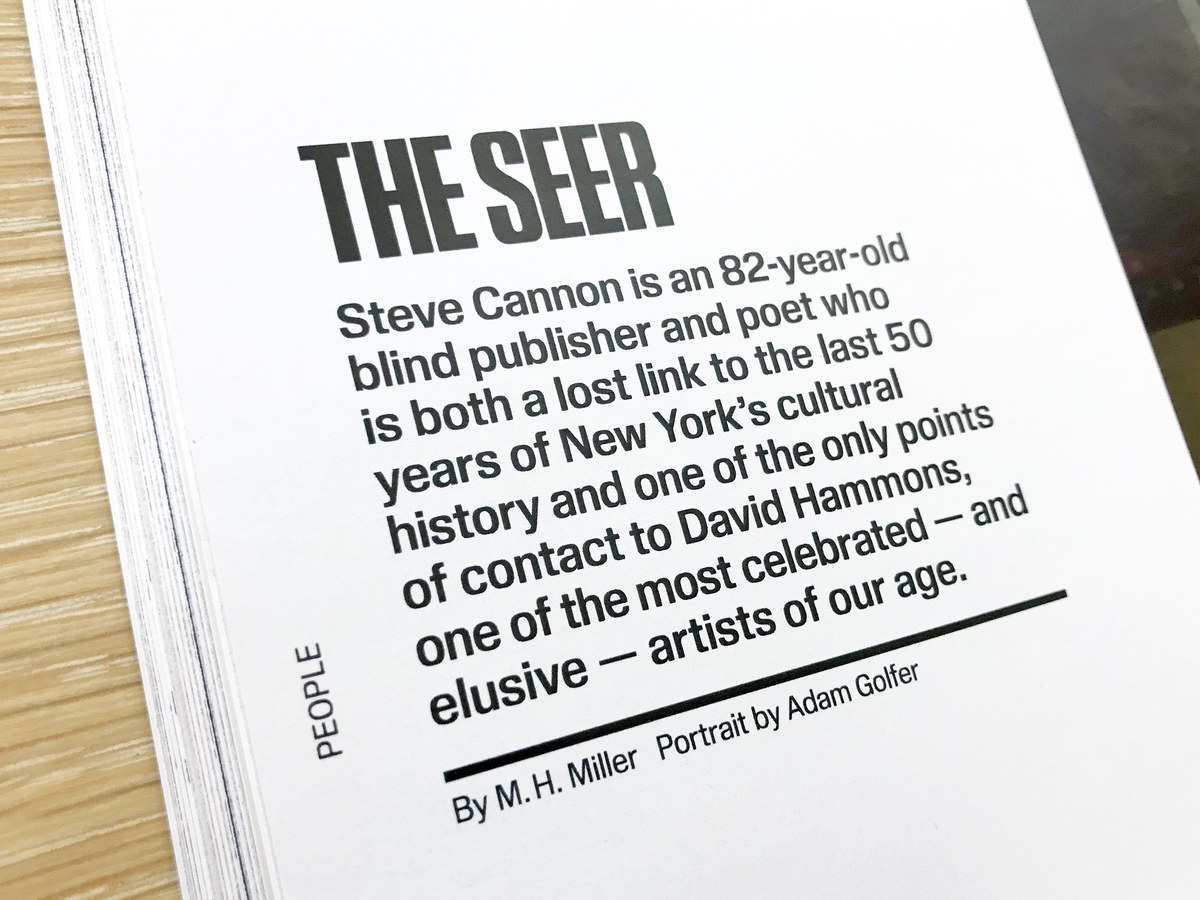
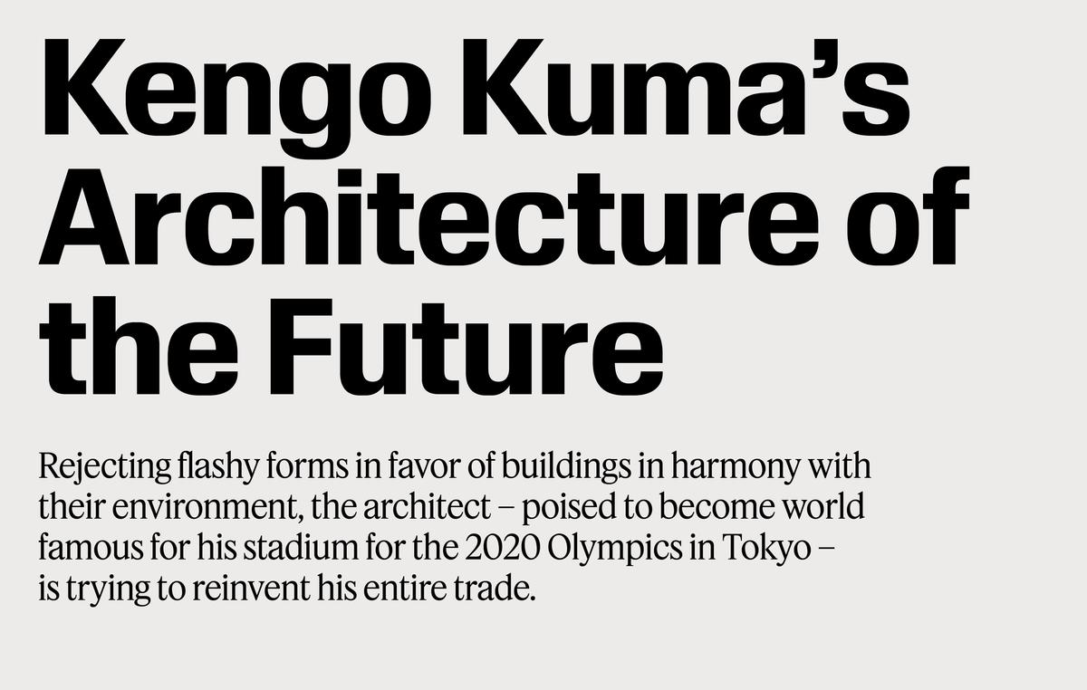
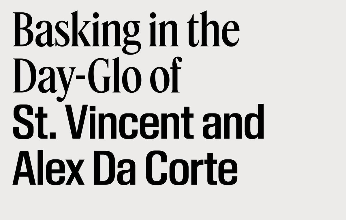
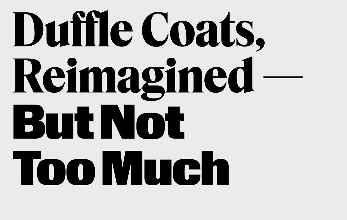
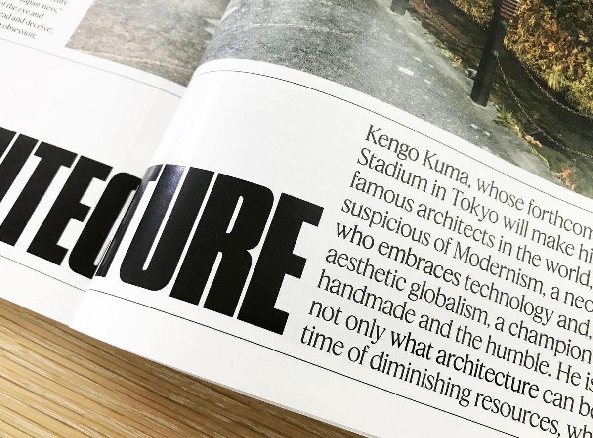
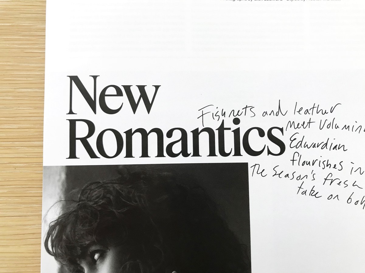
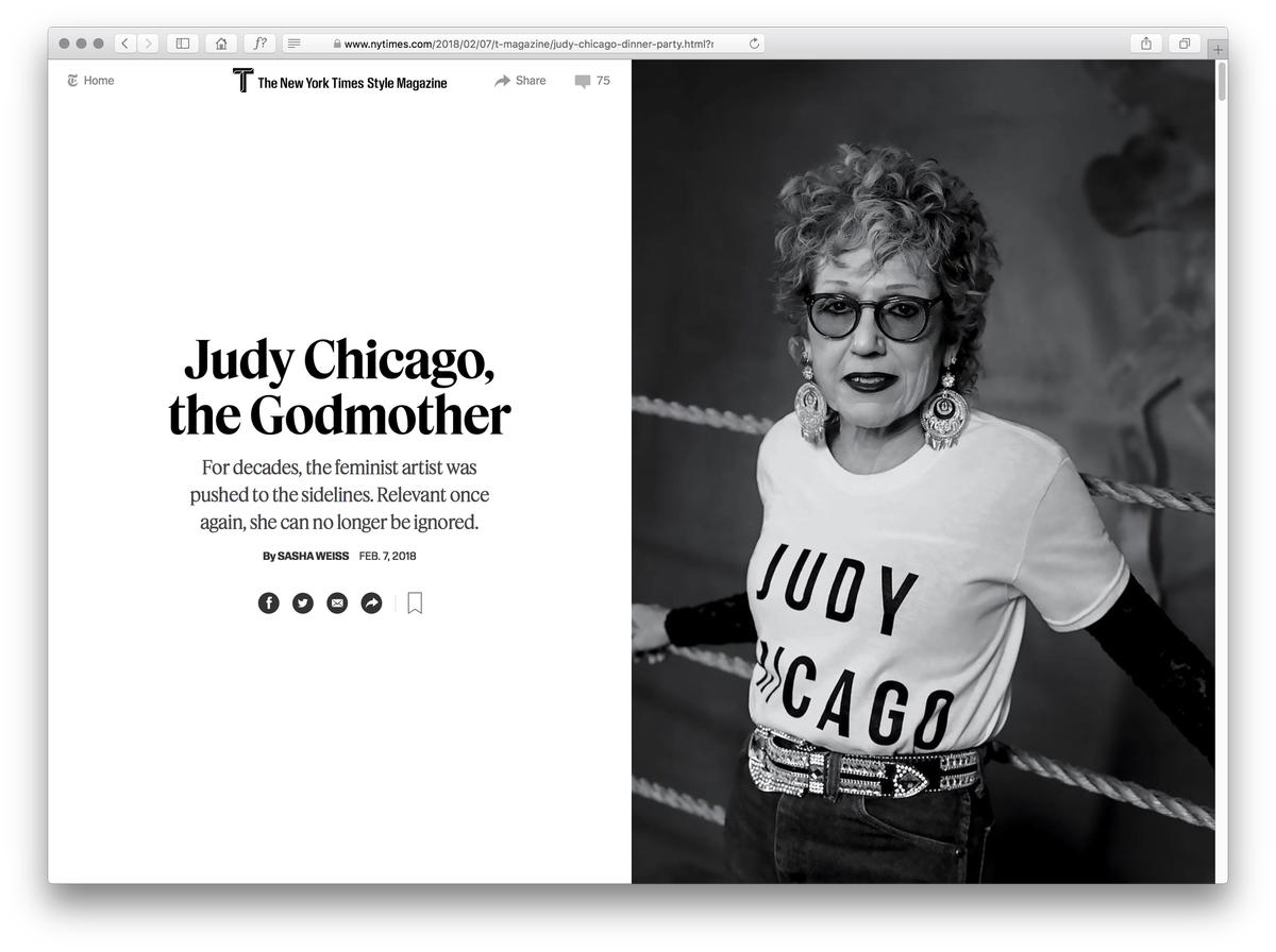
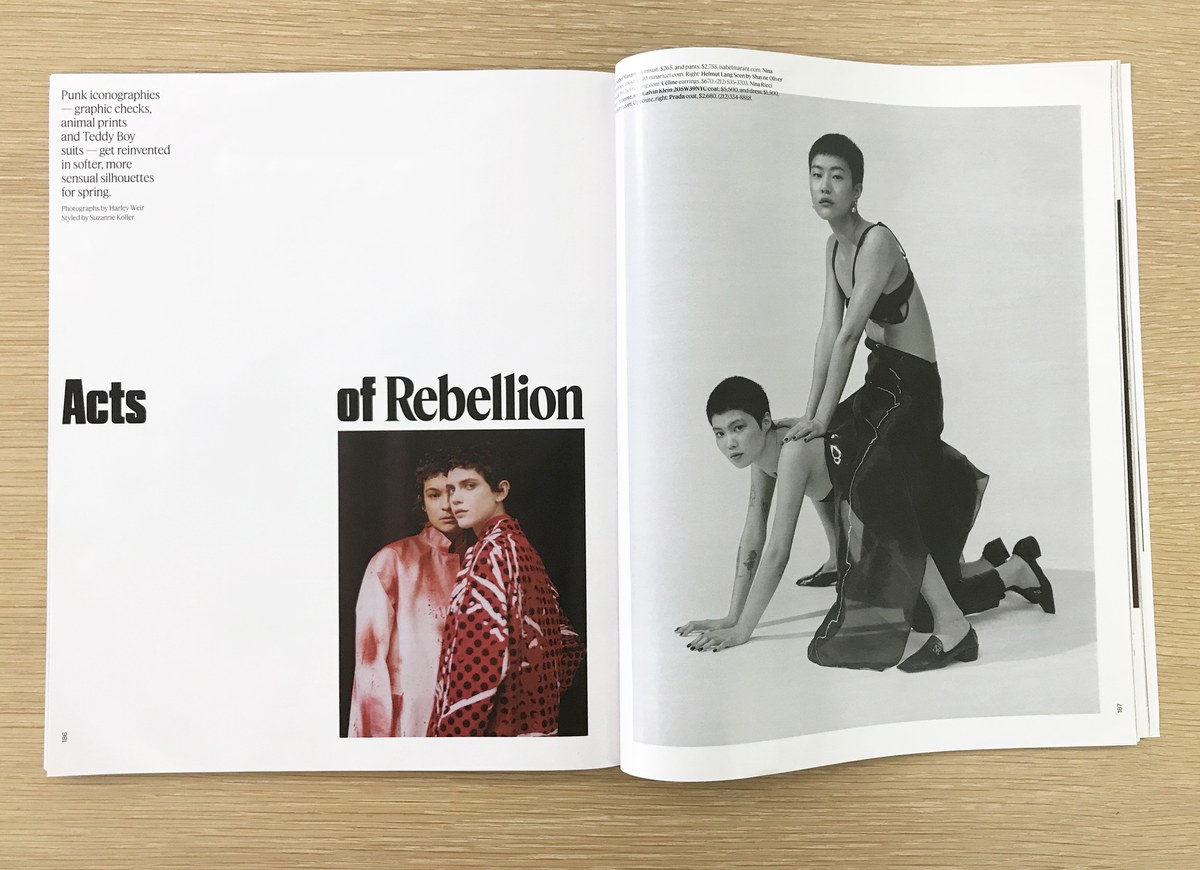
Kippenberger, designed by Berton Hasebe, is a sans serif family in three widths. Round bowls are blunted off in order to facilitate tightly stacked tracking and leading, and its squarish, inflated curves give the feeling of 1960s and 70s phototype and DIY dry transfer headlines without referencing any one typeface in particular. The normal and condensed widths are drawn for use at both small and large sizes, while the Poster width was drawn exclusively for bold, powerful feature openers and coverlines.
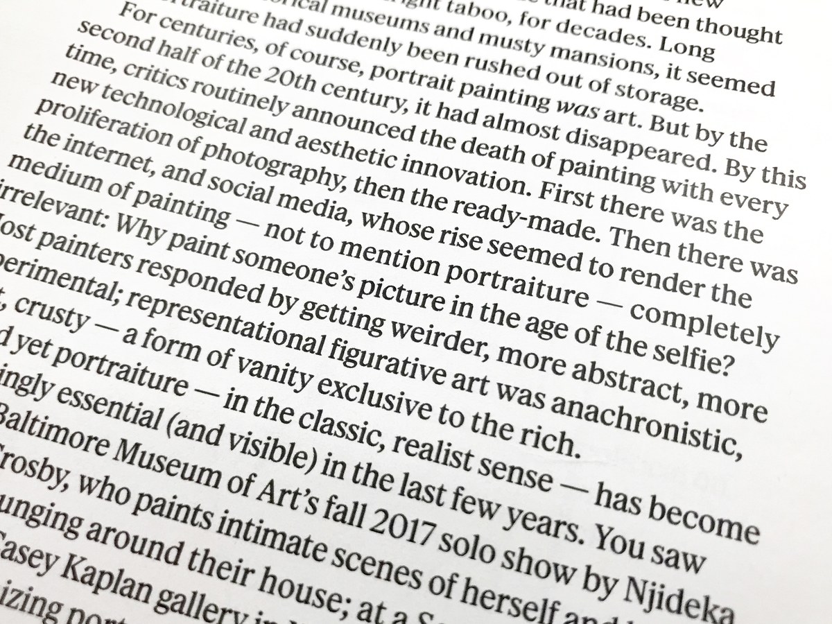

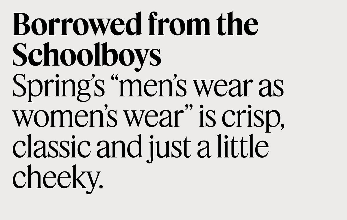
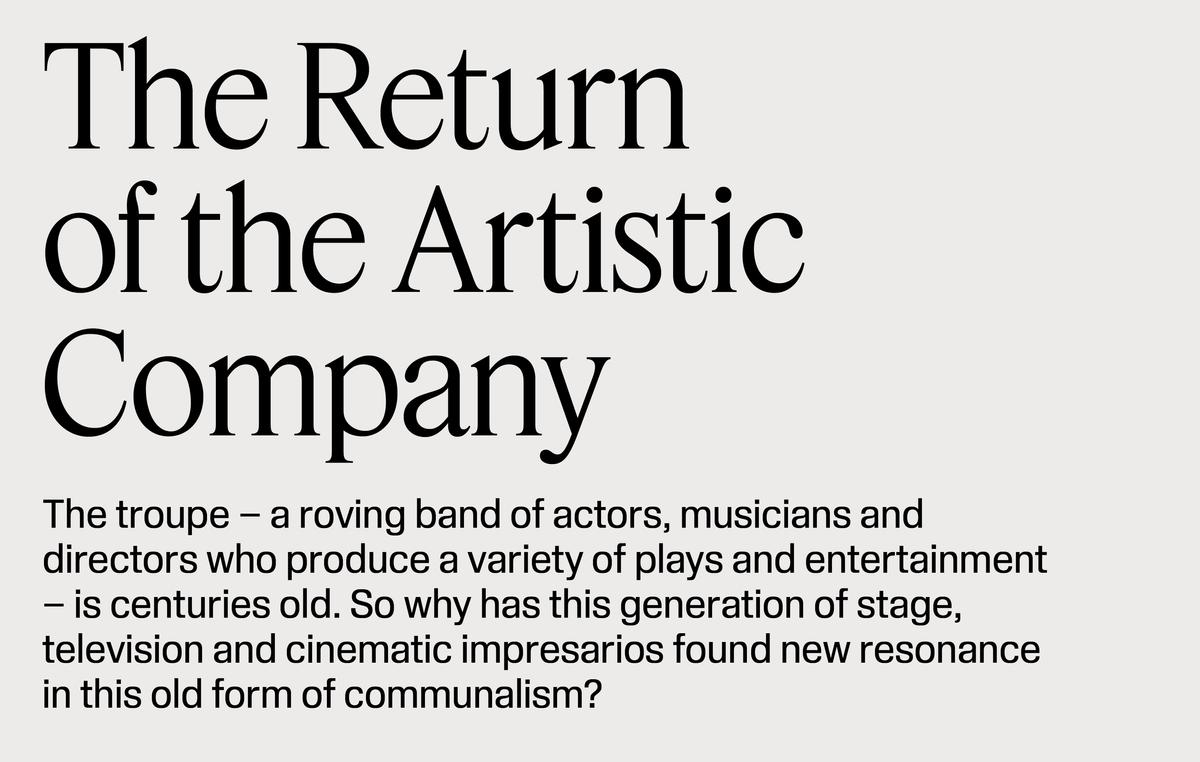
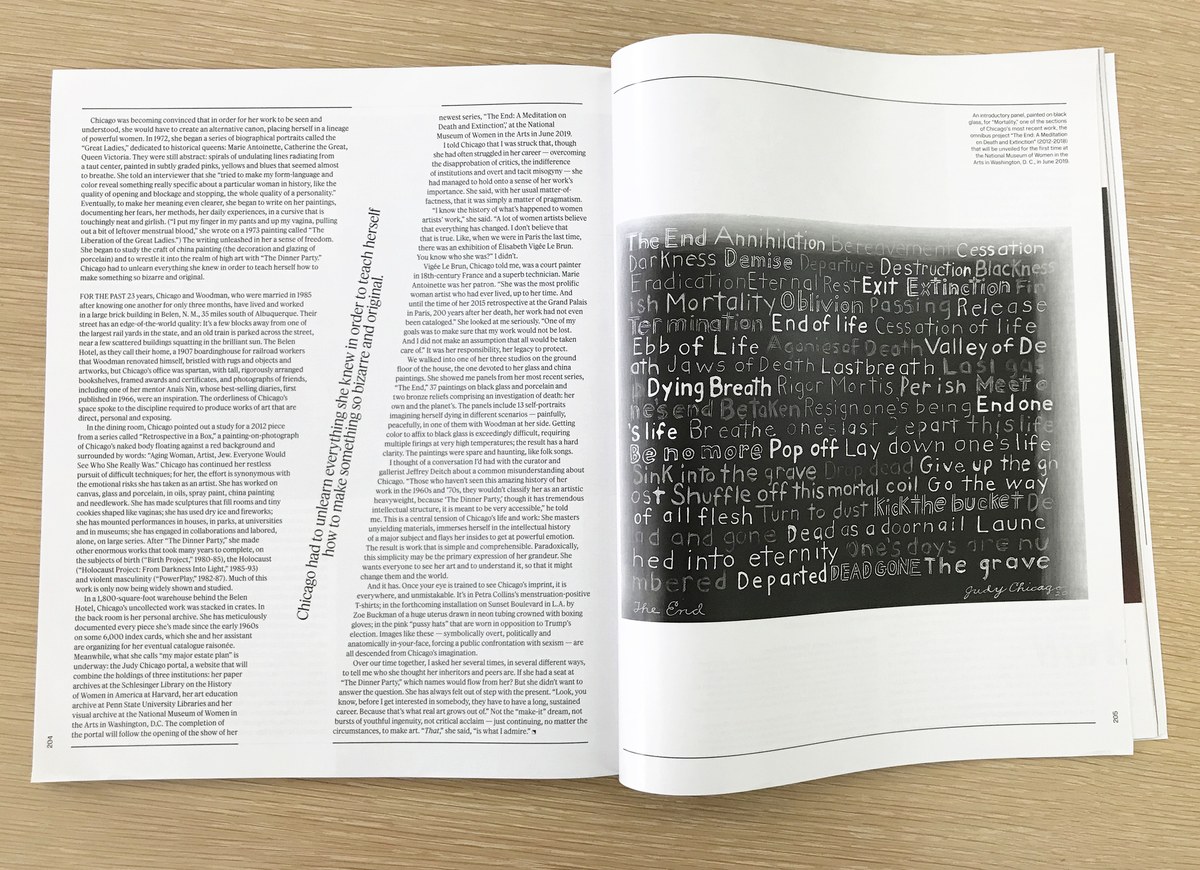
Fact, by Christian Schwartz and Berton Hasebe, is a serif family in three optical sizes and two widths. Its clearest inspiration is Times New Roman and its many imitators, such as Simoncini’s Life, but its large x-height (to match Kippenberger), consistently angled contrast, and soft, drooping ball terminals give it a looser and more organic tone. The core weights have relatively low contrast but sharp, thin serifs to keep a convincing feel for a fashion magazine. The text size is quite narrow, to maximize copyfit.

The two families are designed with matching vertical metrics and similar weight ranges, so they can be mixed freely. T’s digital editions were redesigned at the same time as the print magazine, and Kippenberger and Fact help to keep the personality consistent across all media.
Related fonts

