Superette by Ross Milne
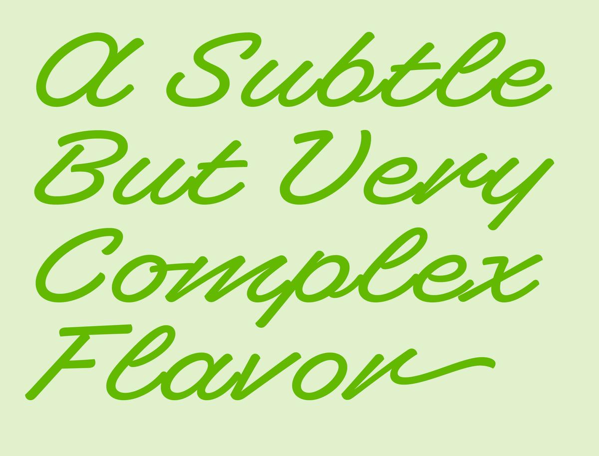
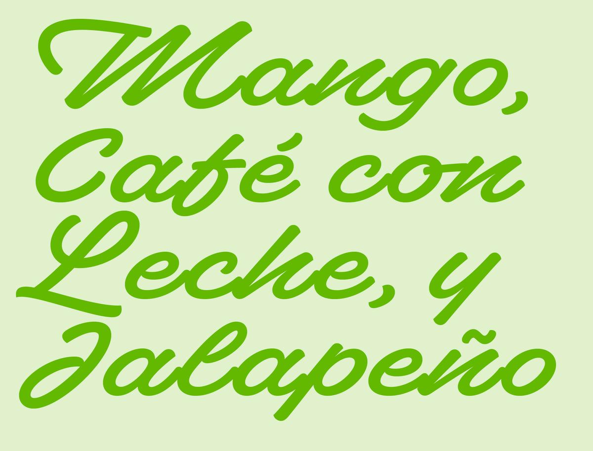
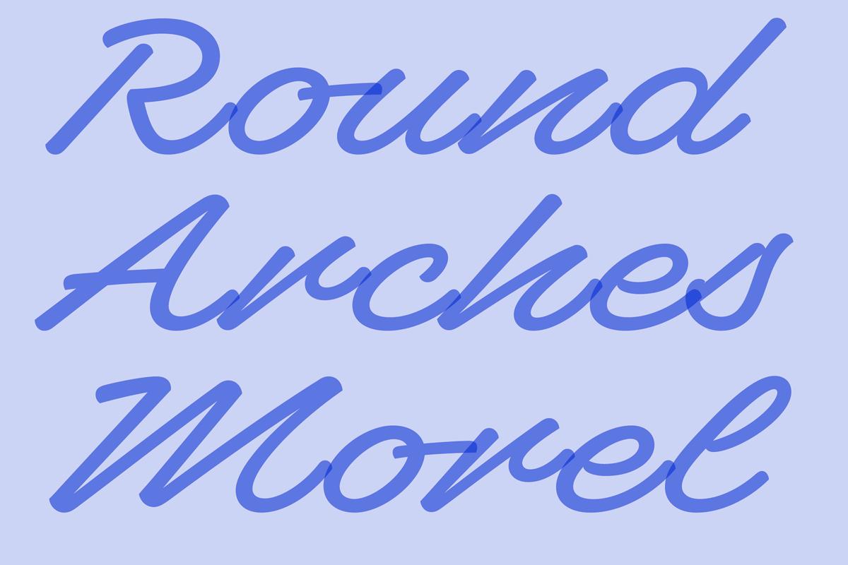
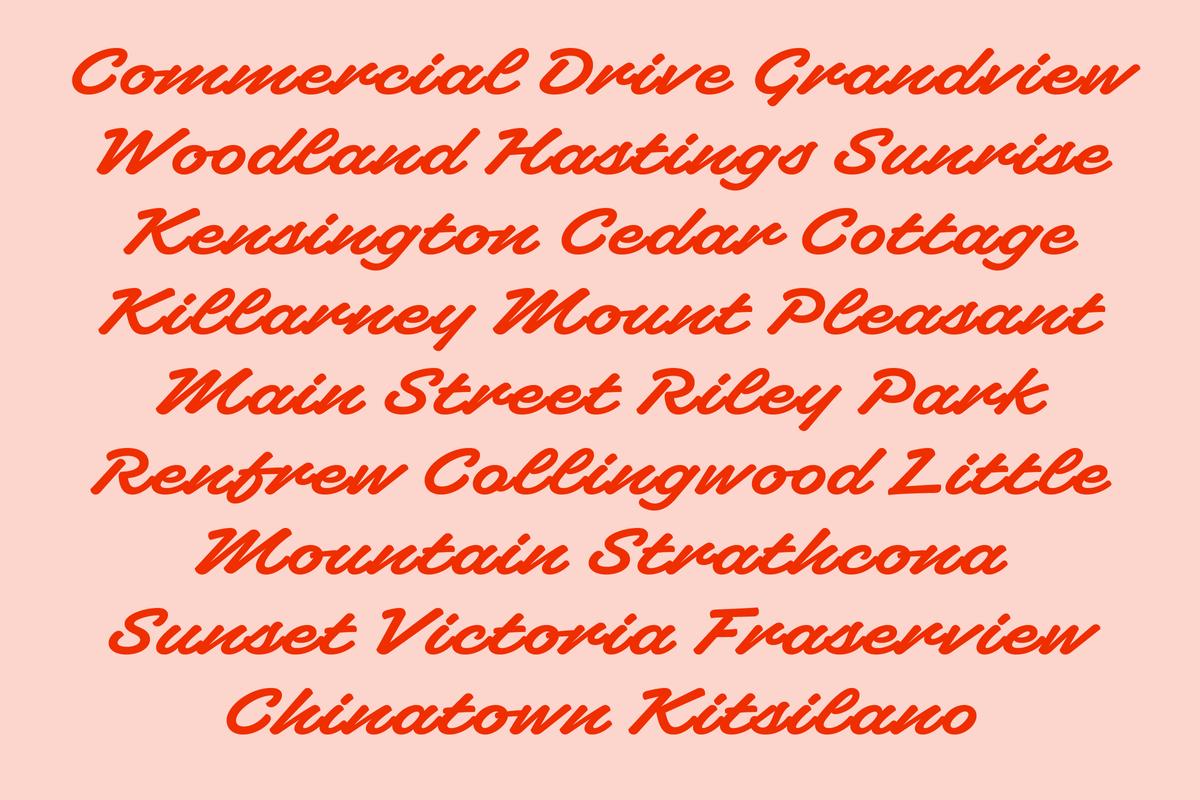
The origin of Superette begins with a trip that Canadian designer Ross Milne took to the small island of Île d'Orléans in southern Quebec, Canada. While exploring the original French settlements, Milne noticed a specific style of lettering on the regional fruit and farm signage. The lettering was in a fast, slanted, mono-linear script style which did not connect smoothly from one letter to the next.
Milne was fascinated by the intense 45° angle of the slant as well as the broken connections between letters. “The script lettering had a rebellious nature that disregarded smooth connections. It felt like the spacing was intentionally butchered, but it worked,” he says.
Celebrating “Bad Taste”
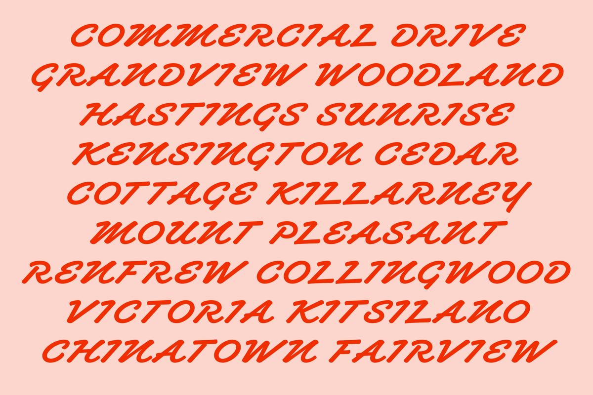
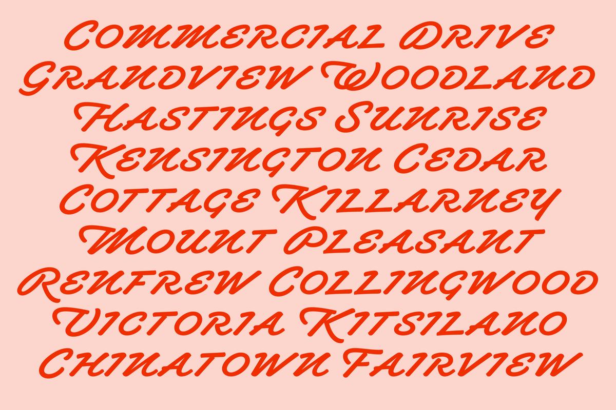
Most script typefaces focus on replicating a specific material or technique such as neon, wood, or brush calligraphy but Milne wanted Superette to be different. “As a graphic designer, I’ve always found that scripts tend to reflect the material they were traditionally created with and this controls how the type works. I didn’t want Superette to be reliant on a tool or material—the light style is inspired by neon vernacular signage, but it isn’t controlled by that. The goal is about speed and the anti-script lack of joining.”
Ross continues, “The non-joining effect is usually considered ‘bad taste’ but I would disagree. Designers are taught from early on in their education never to track out a script until it stops joining but Superette celebrates this effect and results in a script that avoids the smooth connections. It’s perfectly imperfect.”
“Ross’s idea came to us fully-formed,” says Christian Schwartz. “From the beginning we could see the full idea and felt it fit in our library, even though we hadn’t published anything like it before. This type of lettering is a part of visual culture that everyone is familiar with, though people think of it as ‘low brow.’ But when you take it seriously and craft it well, it exposes things about the genre and source material that you might not have appreciated.”

Type, not Lettering
Superette harkens back to the era of metal script typefaces such as Mandate, Brush Script, and Kaufmann that embraced being type instead of attempting to mimic lettering. Schwartz continues, “I wanted to add Superette to our library because it has a point of view. It takes a very particular kind of lettering that doesn’t get a lot of respect and celebrates the formal invention of the letter forms.”
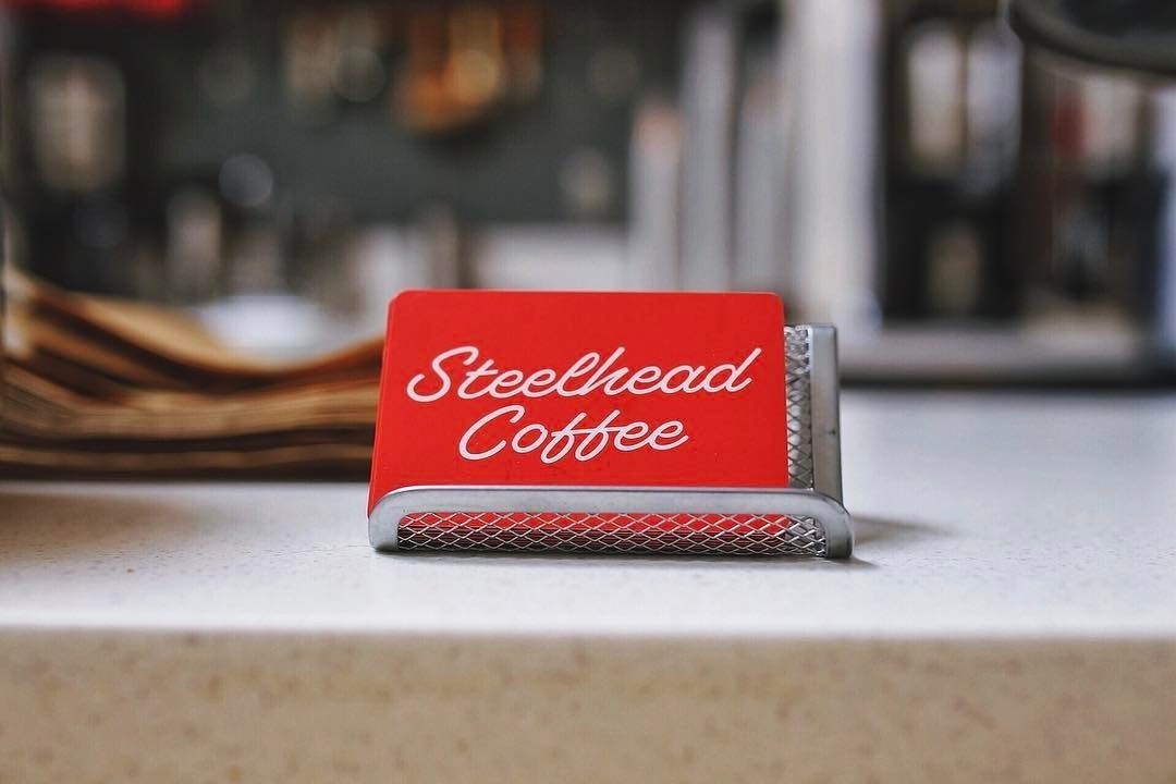
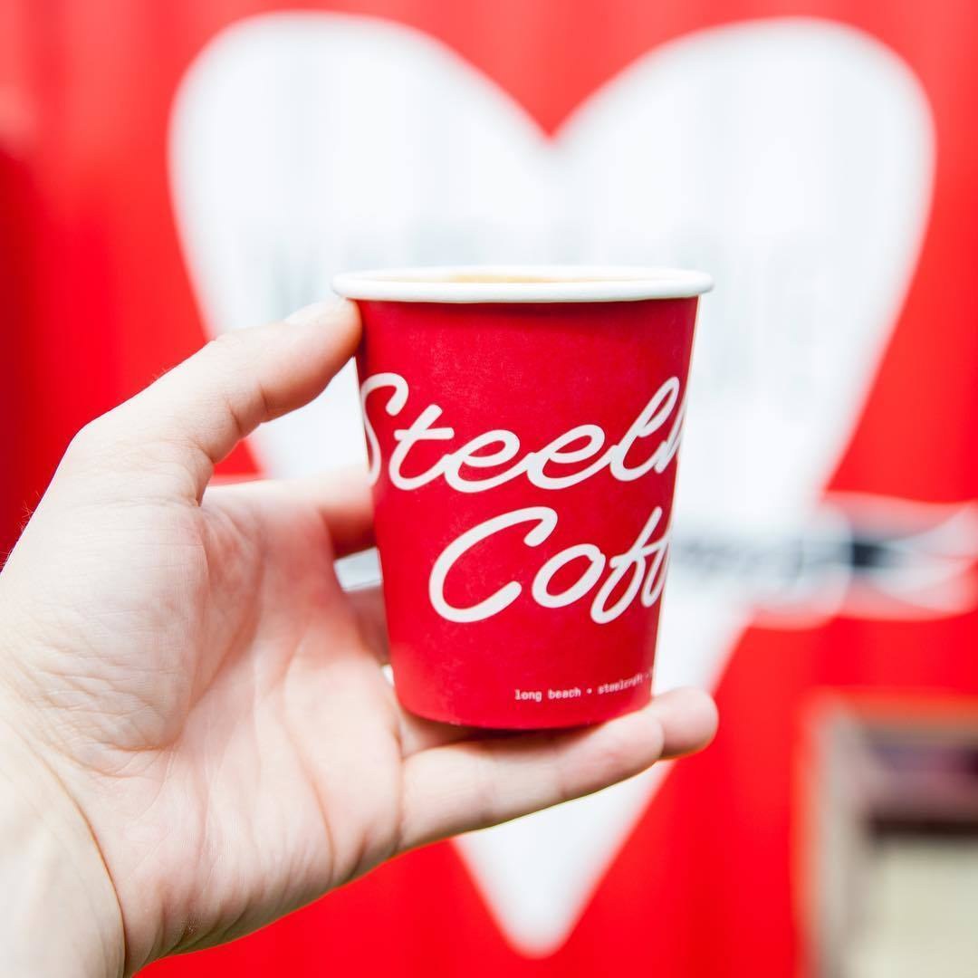
“Superette fully embraces what it is: An exploration of letterforms that you see outside of the typical graphic design context,” says Schwartz. “We thought it was interesting to see what potential it would have for graphic design.” For designers that are looking for a display typeface that will bring distinctive style and stand out from the pack of bland sans serifs, Superette is a kinetic and dynamic choice.
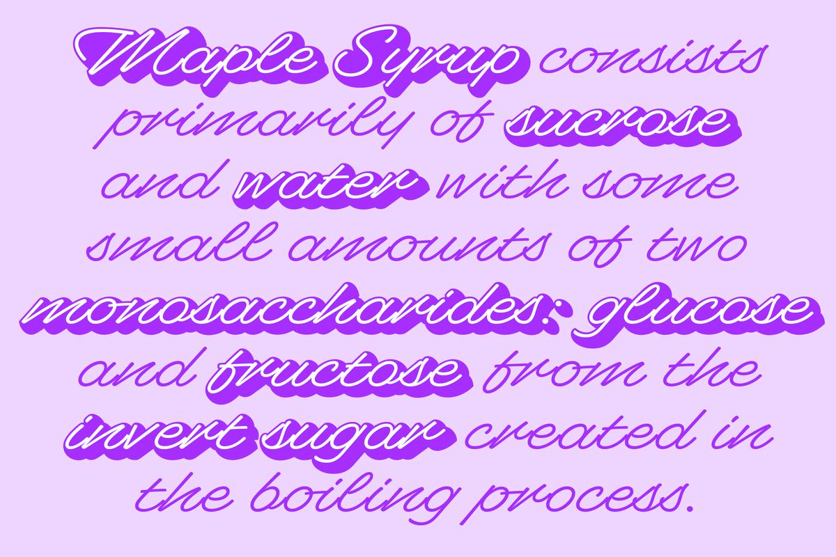
A Script with Depth
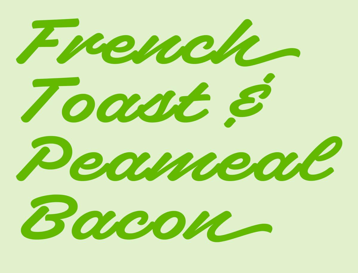
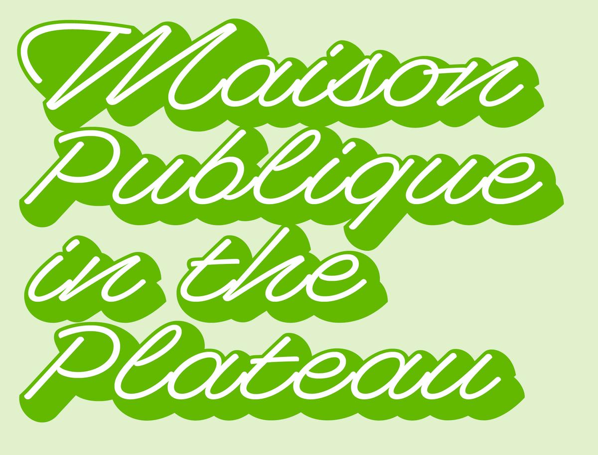
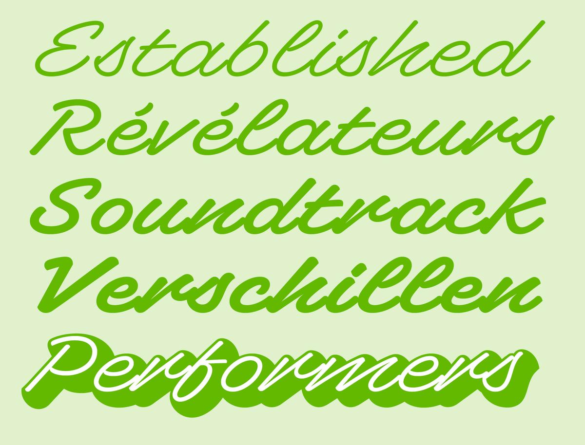
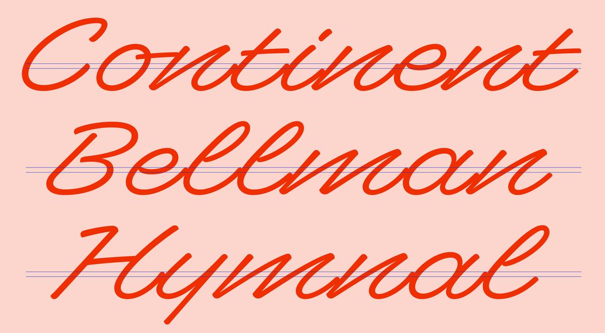
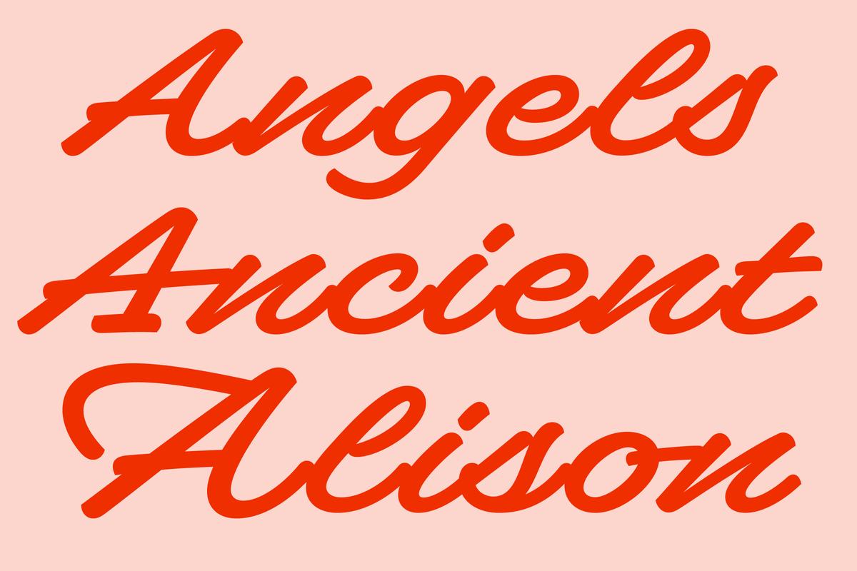
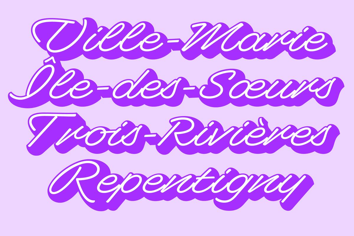
Superette is available in four weights plus a shaded variant based on the light weight.
The idea for the shaded style came from the original signs that Milne photographed in Île d'Orléans. In designing the shaded style, Milne explains: “I wanted something that would be almost over-the-top dramatic to give designers the option to make an impression. The shaded style gives a one-two punch of contrast of weight and impact, which I thought would be fun and useful.”
An extensive amount of work was put into alternate characters that automatically substitute to avoid tiny white “holes” in the shadow that would distract from the reading experience. This makes the shaded style look consistent and effortless which helps amplify the playful tone of entire family.
Additionally, the Shaded and Light styles are designed to work together so a designer can easily emphasize one word or a phrase in a line of text (like with bold or italic) without dramatically affecting copy flow or changing a layout.
Related fonts
