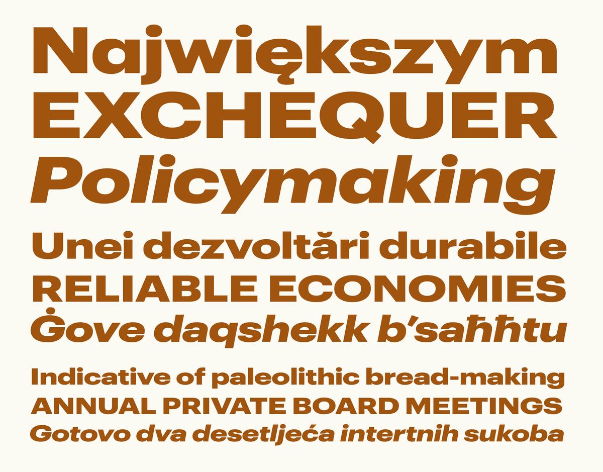
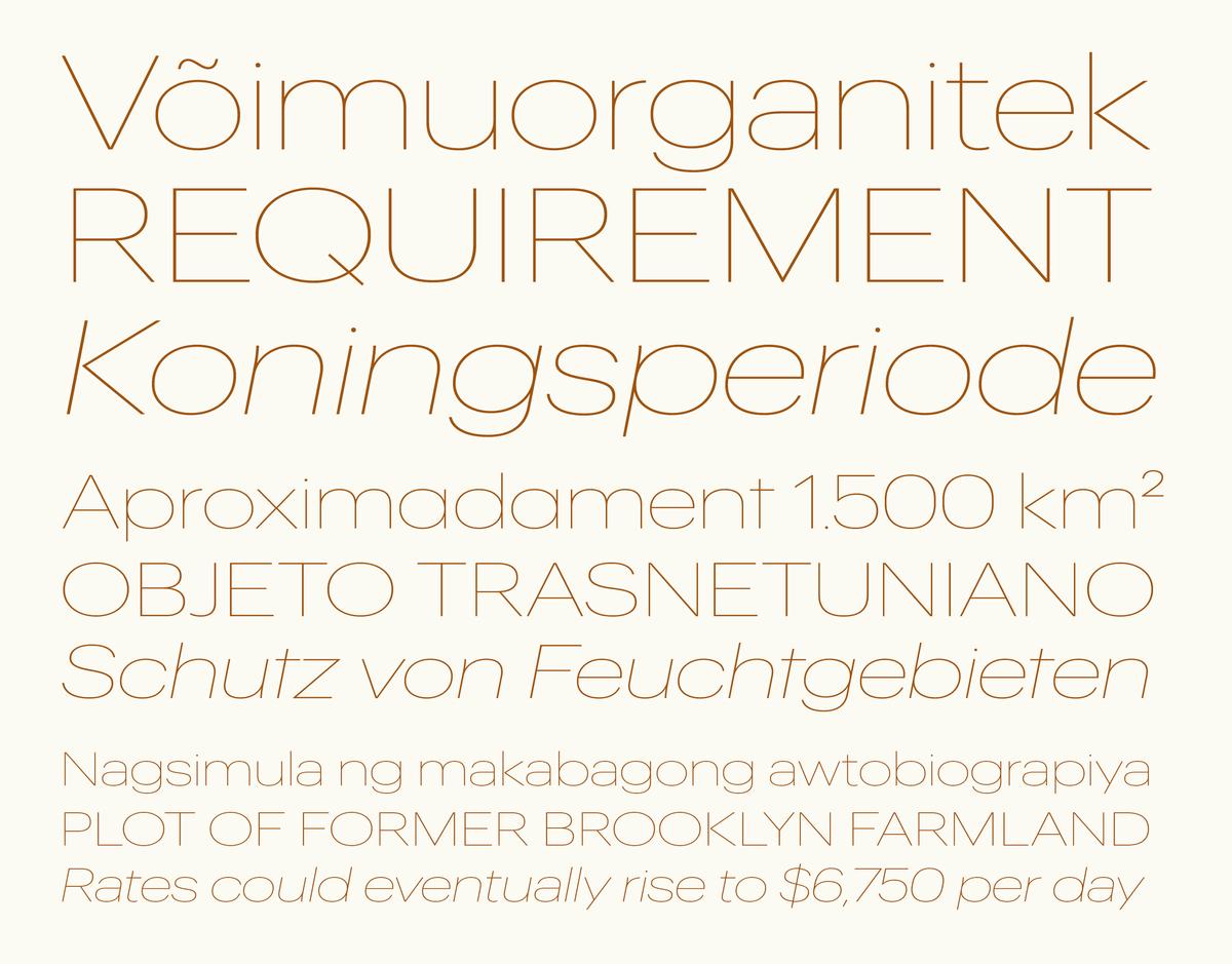
New Release: Graphik Wide
RELEASES | 21 AUGUST 2018
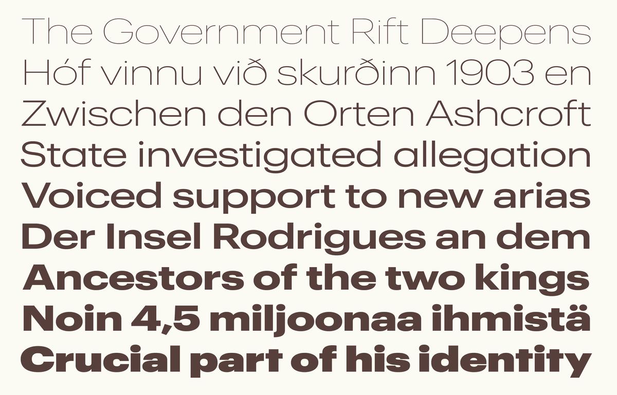
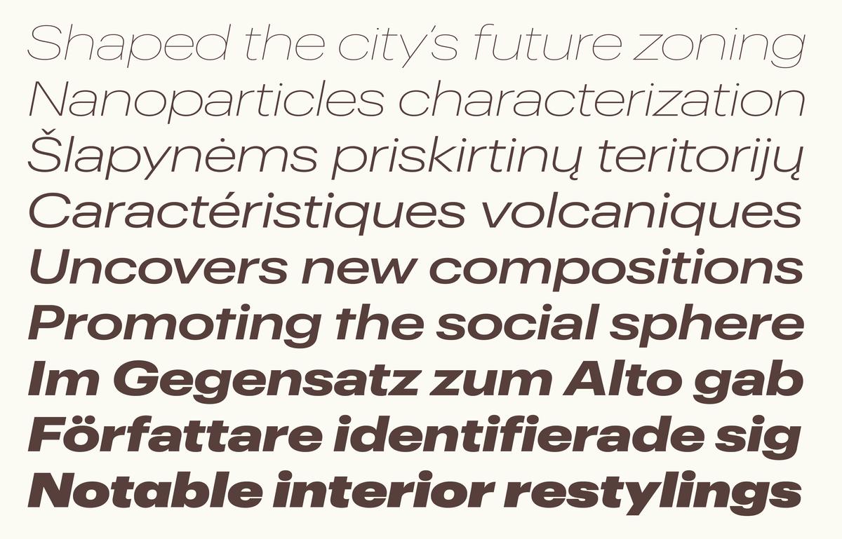
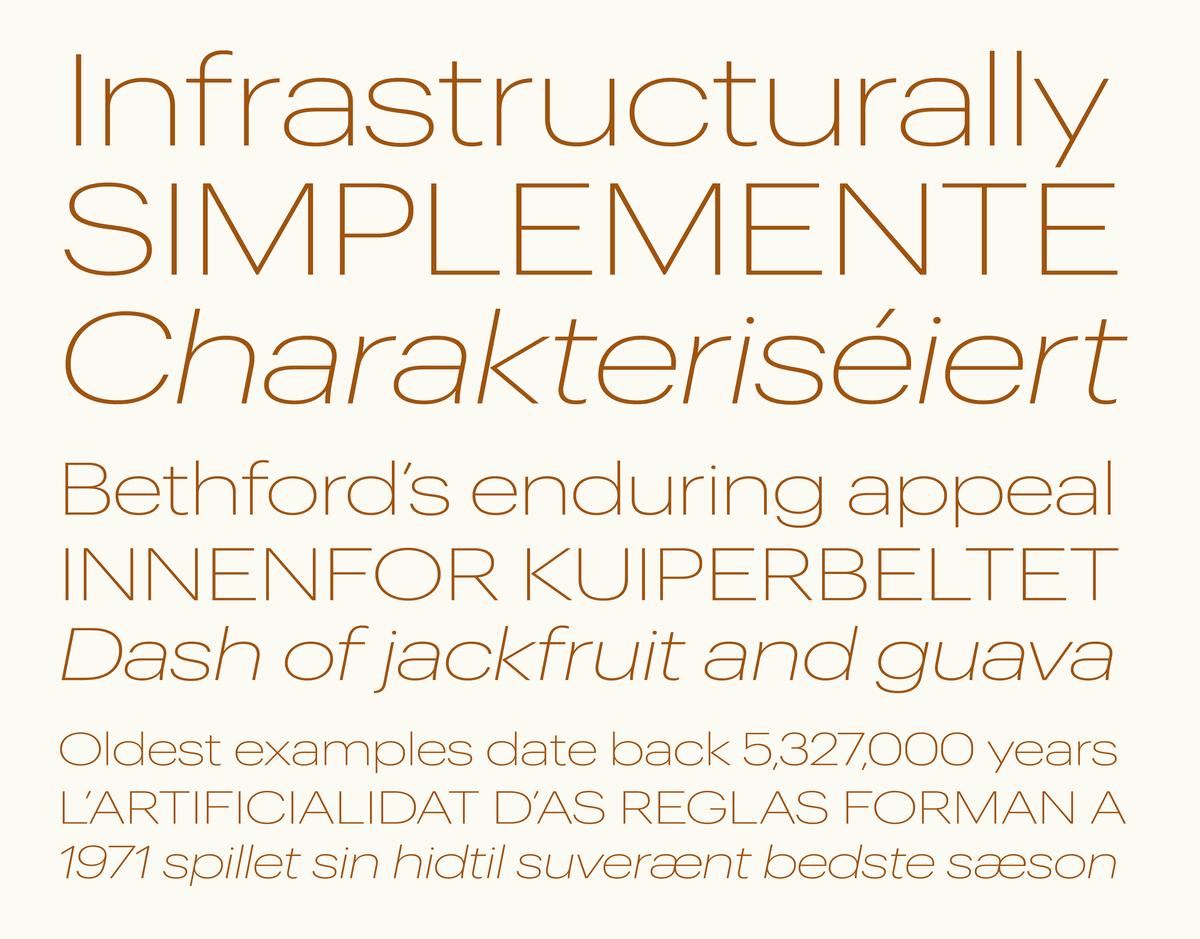
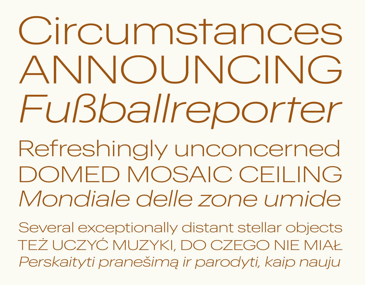
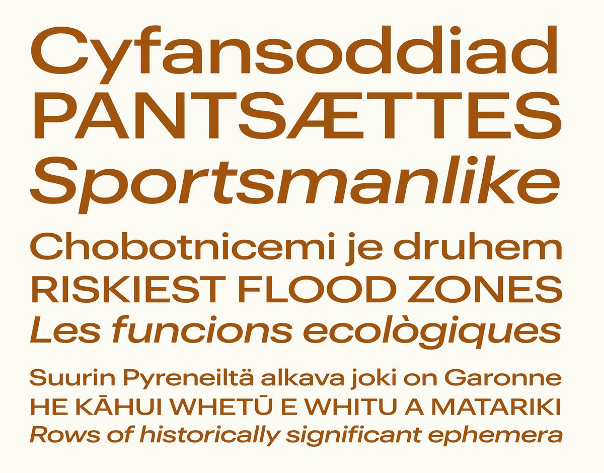
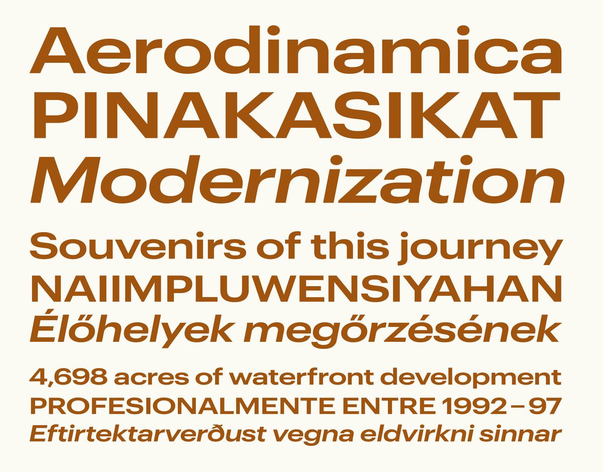
Graphik is an exceptionally complete system of sans serifs designed to be a blank slate, perfectly suited for any style of expression. With the release of Graphik Wide, the rational grid of eight widths from XXXX Condensed to Wide, and nine weights with italics, is now complete.
Graphik Wide was first conceptualized during the earliest days of Commercial Type, during a late night work session when Christian Schwartz was roughing out the narrower widths of Graphik and designer Abi Huynh was creating the format for the PDF specimens. “I was pushing Graphik narrower and narrower Abi said, ‘Wouldn’t it be funny to do a wide as well?’ so I sketched it out in an evening, and we knew it would work.”

Graphik Wide Thin and Thin Italic

Graphik Wide Extralight and Extralight Italic

Graphik Wide Light and Light Italic

Graphik Wide Regular and Regular Italic

Graphik Wide Medium and Medium Italic

Graphik Wide Semibold and Sembold Italic

Graphik Wide Bold and Bold Italic

Graphik Wide Black and Black Italic

Graphik Wide Super and Super Italic
Widening Graphik wasn’t without its challenges. As a typeface gets wider, the tops and bottoms of characters will often flatten out and curves will generally become more rectangular, but this approach did not suit Graphik. “I kept trying to make it feel as round as possible. It was really about adapting the proportional relationships between the letterforms and keeping the consistent feeling of Graphik. It’s like tire pressure—how inflated the bowls and counters are effects everything else.”

Graphik Wide Regular, Regular Italic, and Semibold

Graphik Wide Medium, Medium Italic, and Bold
Graphik Wide further broadens the utility of the Graphik collection with new options for posters, book covers, editorial opening spreads, and even small text. In the thinnest weights, Graphik Wide expresses itself in an elegant and forthright manner while the heaviest weights assertively demand the reader’s attention.
RELEASES | 19 SEPTEMBER 2017
Graphik was designed to be a blank slate; a “vanilla-flavored” typeface that is perfectly suited for whatever style of expression needed. From the beginning, Schwartz had a master plan to build Graphik into a large, multi-width typeface system with a rational approach to the grid of widths and weights. Ten years later, his plan is finally a reality.
READ MORE
ARABIC, RELEASES | 18 SEPTEMBER 2017
Graphik has been expanded by Lebanese type designers Waël Morcos and Khajag Apelian to support the Arabic script. Rather than simply adapting the Latin forms, Graphik Arabic has adapted the idea of Graphik—a plain, all-purpose sans serif suited both to expressive display use and to extended reading.
READ MORE
GREEK, CYRILLIC, RELEASES | 23 NOVEMBER 2015
Graphik now supports Greek and a number of languages that use the Cyrilic alphabet, including Russian, Ukrainian, Belorussian, Bulgarian, and Serbian. The Cyrillic was drawn by Ilya Ruderman, and the Greek was drawn by Panos Haratzopoulos.
READ MORE
T, PUBLICATIONS, CUSTOM TYPEFACES | 13 APRIL 2014
A small addition to Graphik debuted in today's issue of T, the New York Times Style Magazine: Graphik Titling, based on the as-yet unreleased Condensed, X Condensed, and XX Condensed widths of Graphik.
READ MORE