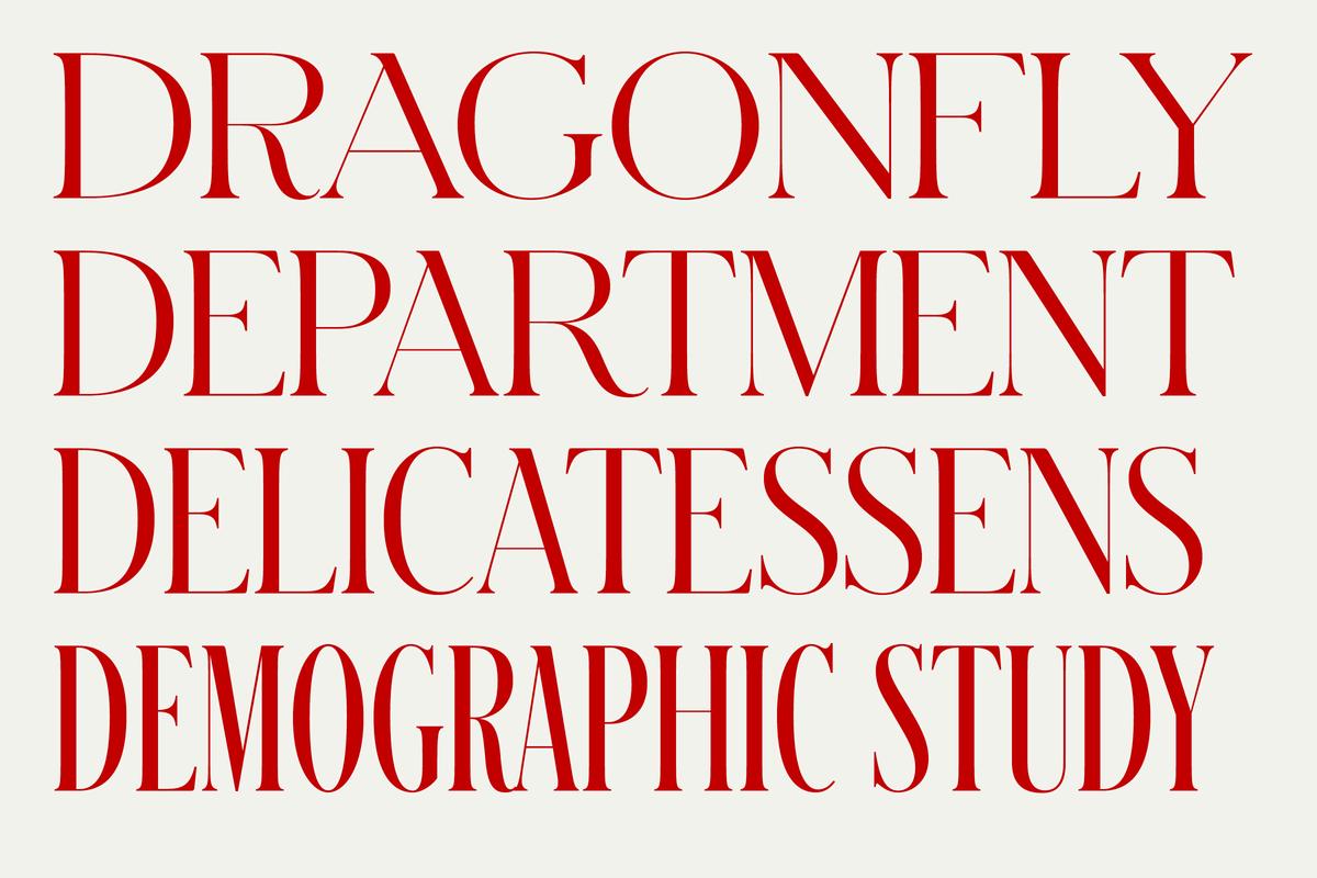
Schnyder, an idiosyncratic fashion typeface

The Pursuit of Something Different
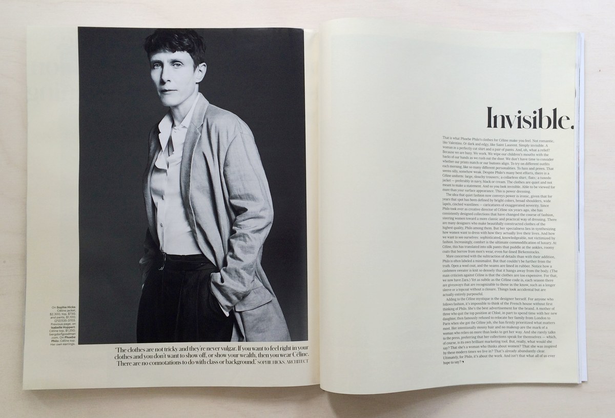
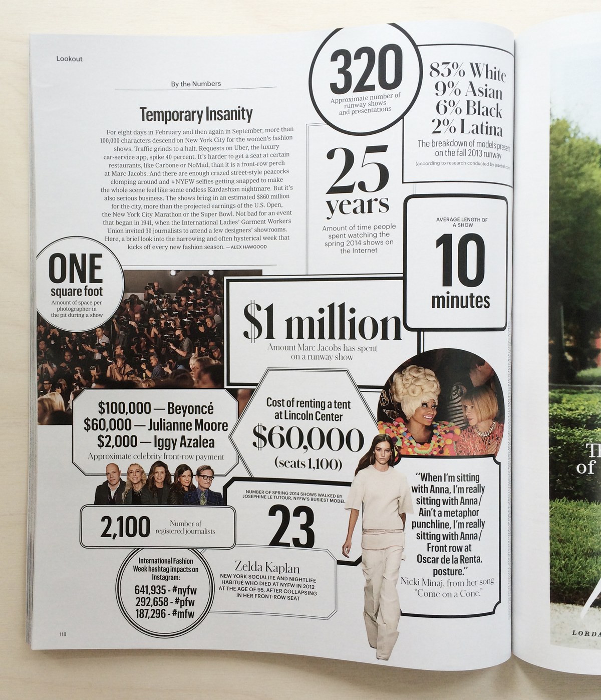
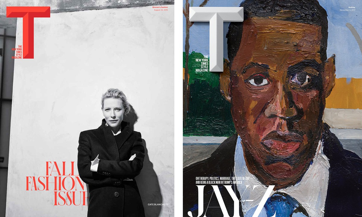
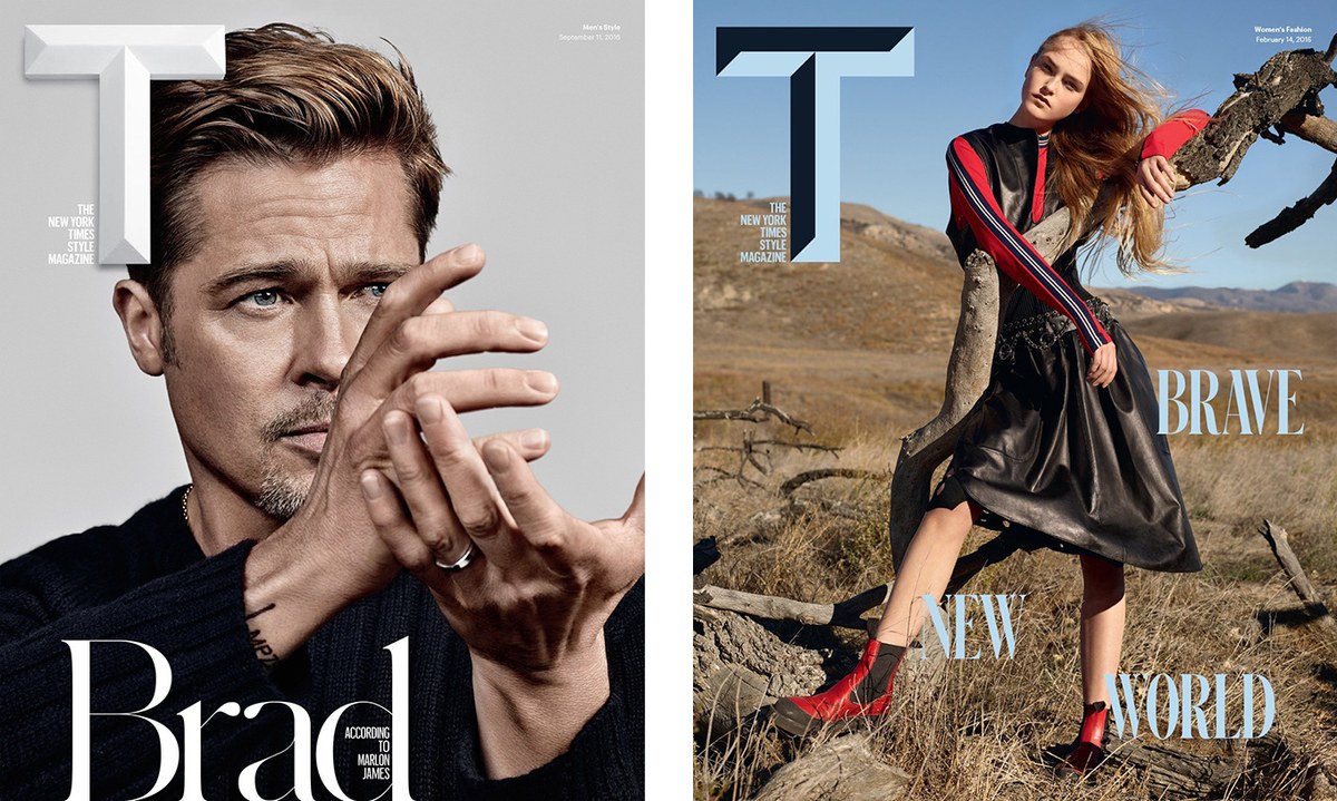
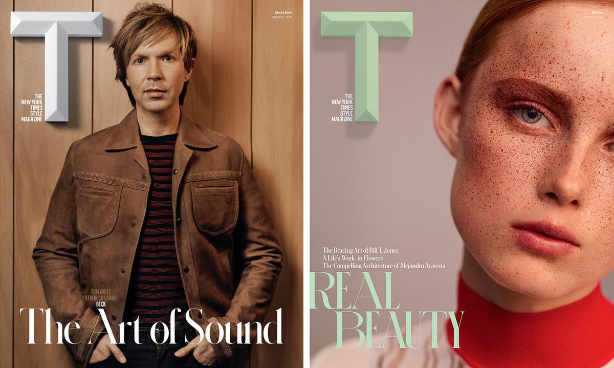
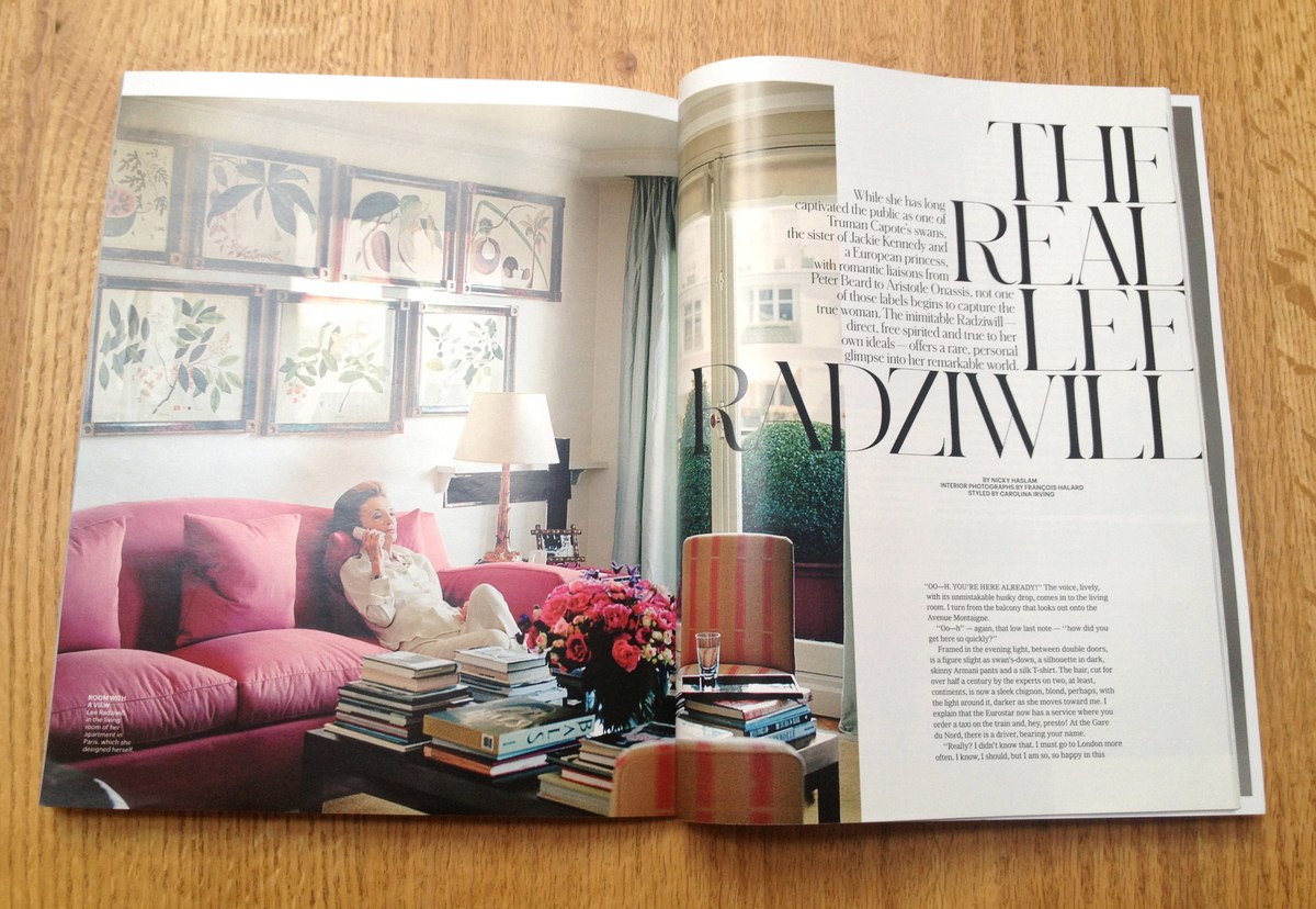
When creative director Patrick Li and his team started work on their redesign of T: The New York Times Style Magazine in 2013, he was looking for a serif display typeface with beauty and an idiosyncratic personality that would feel appropriate in a fashion context.
Li approached designers Berton Hasebe and Christian Schwartz, equipped with a handful of visual references: Romana and similar Beaux Arts serif typefaces from the late 19th century, for their roundness and structure; a Didot in multiple widths, for its contrast and flexibility; and for its quirky letterforms and dramatic personality, an invitation to an exhibition by Swiss painter Jean-Frédéric Schnyder, hand-lettered by the artist himself.
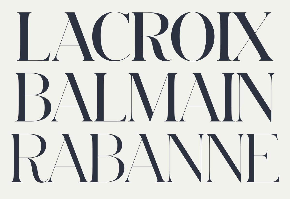
Li describes the lettering as “at once elegant and totally wonky”, qualities he wanted the new typeface to embody. The lettering varied in proportion from line to line, using the width of the letterforms as much as the spacing to justify the stacked lines of copy. What came from these points of inspiration is Schnyder; a typeface of surprising distinction and grace that sits comfortably in the grey area between type and lettering.
Since Schnyder has the high stroke contrast and delicate hairlines typical of a fashion typeface, Hasebe and Schwartz had freedom to experiment with the structure of different letterforms and reference lettering rather than typographic forms. “The contrast is what you expect in a fashion typeface, which gave us an enormous amount of freedom to sneak weird shapes in,” says Schwartz. “Schnyder is definitely not lettering, but it is something more than just static typeface. We like that ambiguity.”
A Specific Typeface with Wider Potential
After the recent release of a very large expansion of Commercial Type’s all-capable sans serif Graphik, Schwartz felt the need to work on something completely different. “Schnyder is a typeface that has a precise specificity. It’s anti-vanilla and that’s what makes it interesting; it has a very strong aesthetic. After getting all of Graphik out, Schnyder feels likes a palette-cleanser.”
“Schnyder is a fashion typeface, but it is first and foremost an editorial typeface,” states Schwartz. “It was drawn for one specific use and it does that very well. Not everything has to be the all-singing, all-dancing typeface that can do everything in all contexts.”
Although Schwartz sees Schnyder being most at home in an editorial context, the peculiar letterforms and distictive personality give it potential for striking use in branding, book design, and even on the web. Hasebe says, ”I hope that Schnyder isn’t just an editorial and fashion typeface. I feel good things happen when something that was designed for one context is used in a completely different context.”
Multiple Widths and Weights
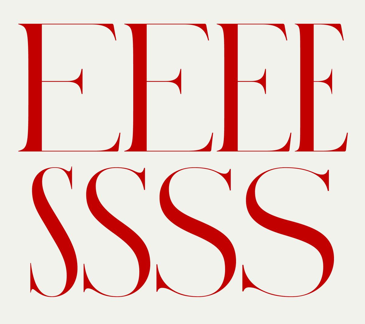
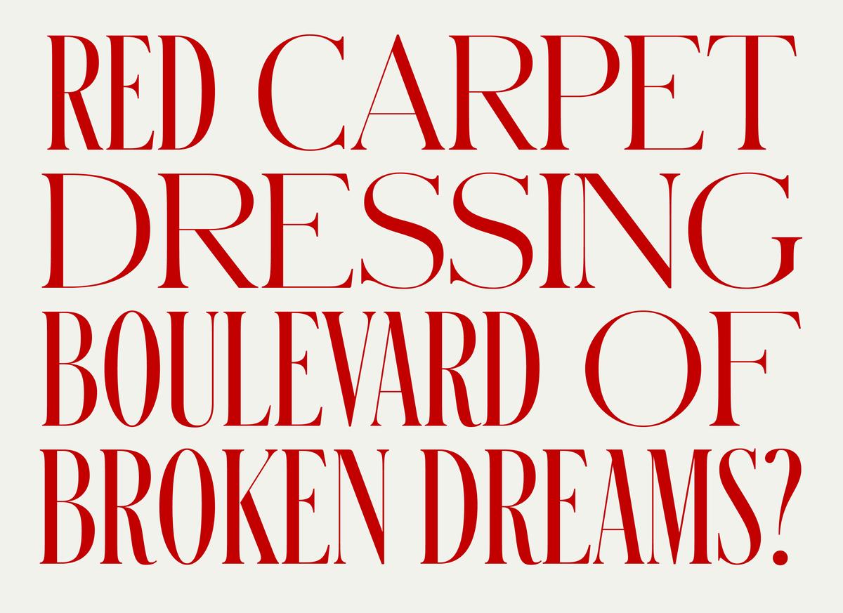
Completed for release with assistance from Hrvoje Živčić, Schnyder comes in four widths, from X Condensed to Wide. The stem thickness in each weight is precisely matched across all widths, enabling the widths to be mixed freely at the same point size for an effect similar to lettering. This ability to mix widths became a signature of how T used the typeface.
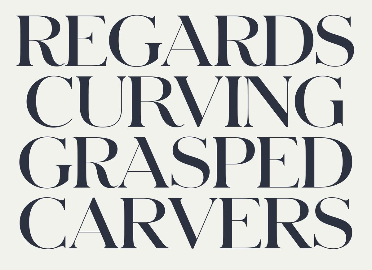
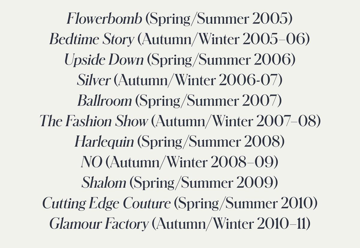
The family features a number of alternate forms. Some, like the R, are contextual, changing to optimize fitting with the following character. Others are stylistic, such as the straight-legged R, and pointy A on the last line, and the eccentric G on the second line. The italic, drawn by Miguel Reyes and available only in the normal width, is a simple slanted roman, as was typical of many Beaux Arts-era serif typefaces.
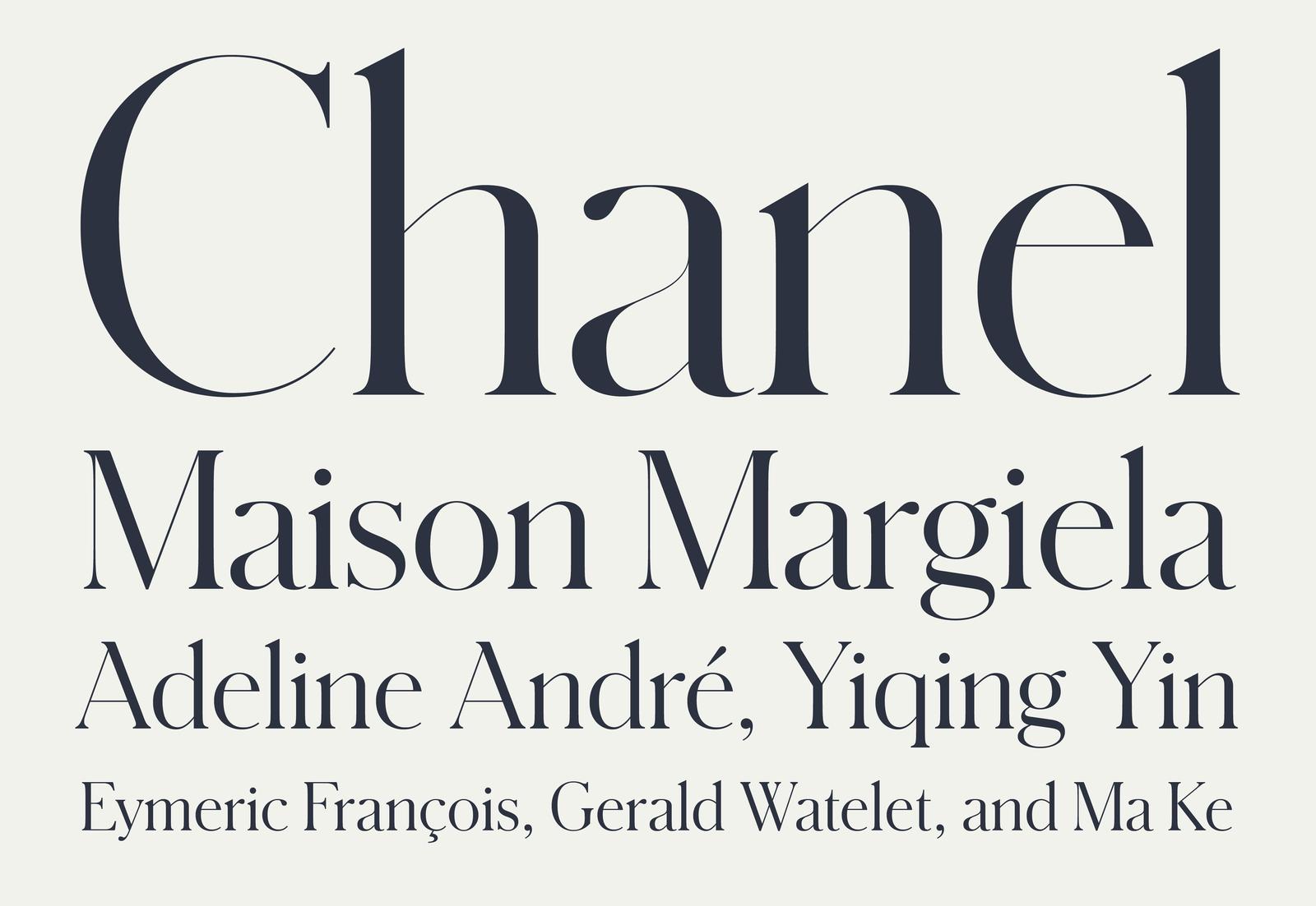
With the exception of the X Condensed, Schnyder is available in four optical sizes, optimized for specific use-cases. The Small size is the most flexible, optimized for use at 18–40 points for subheads, pull-quotes, and small display use, as well as on screen. Medium works best at 28–60 points, for sub-heads and smaller titles, and for large web headlines. Large is designed for 50–90 point headlines, and the extreme thins of X Large are intended for extra large magazine spreads, title pages, and graceful headlines.
