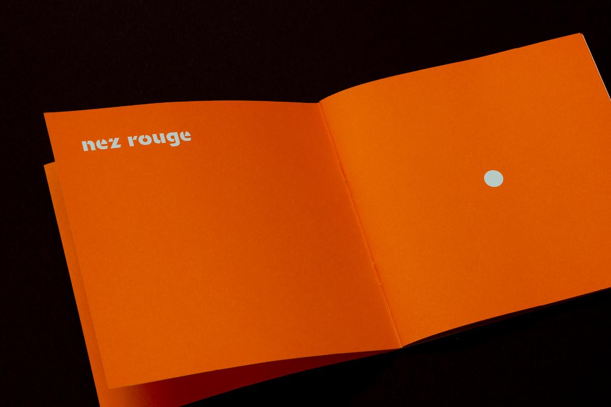
Orientation by Sandrine Nugue
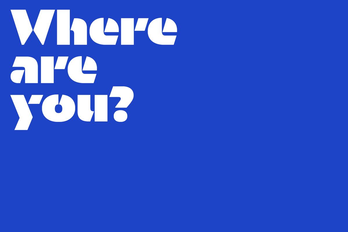
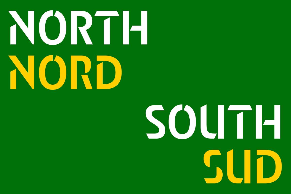
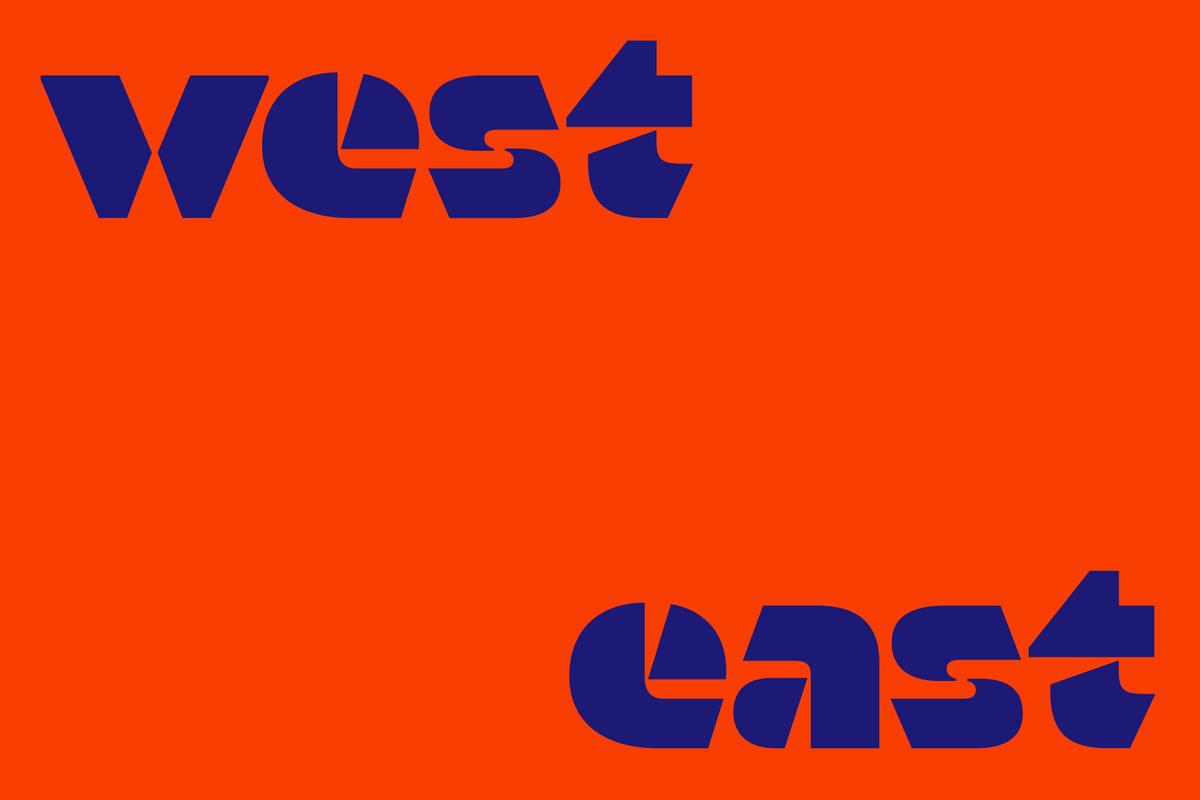
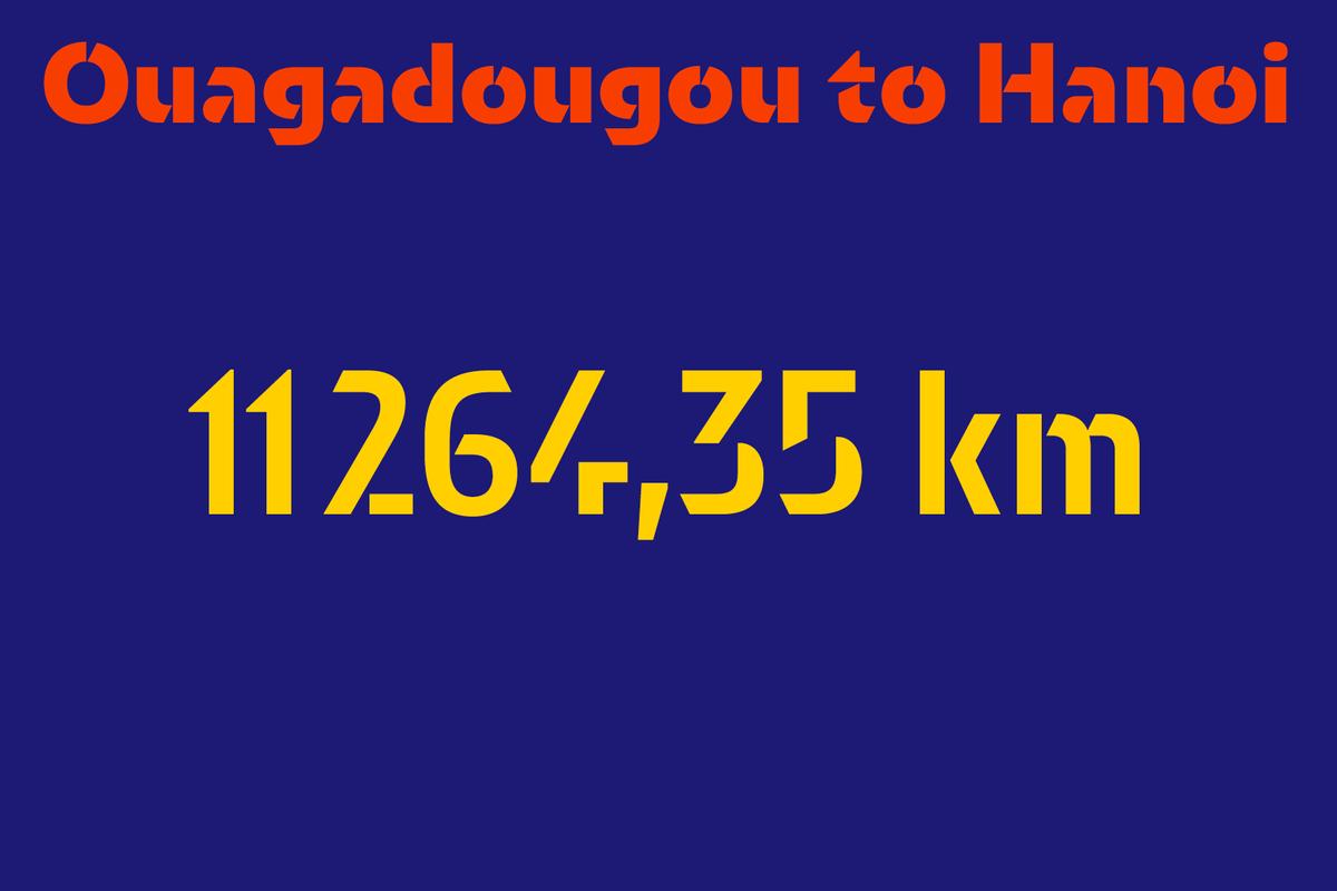
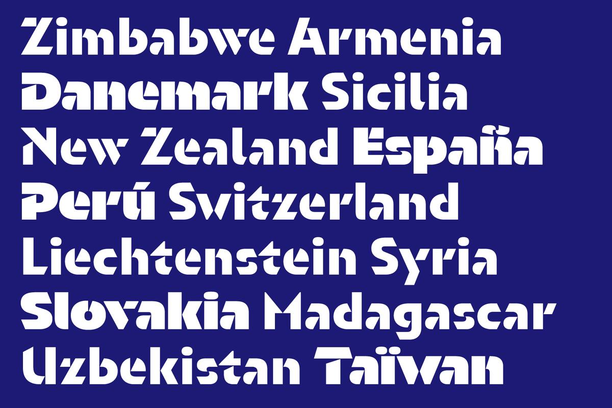
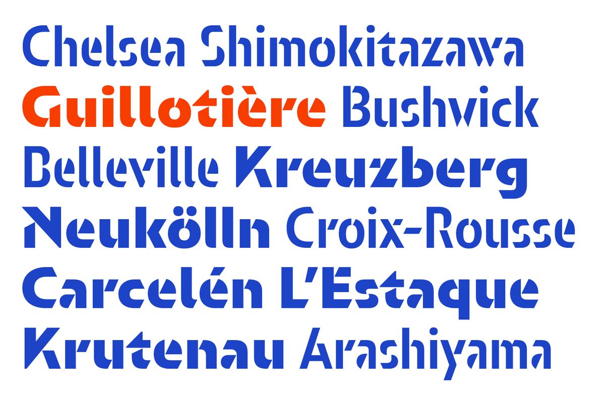
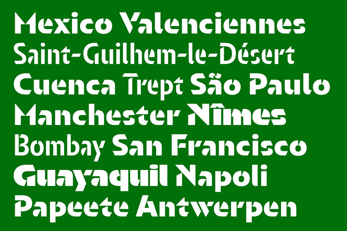
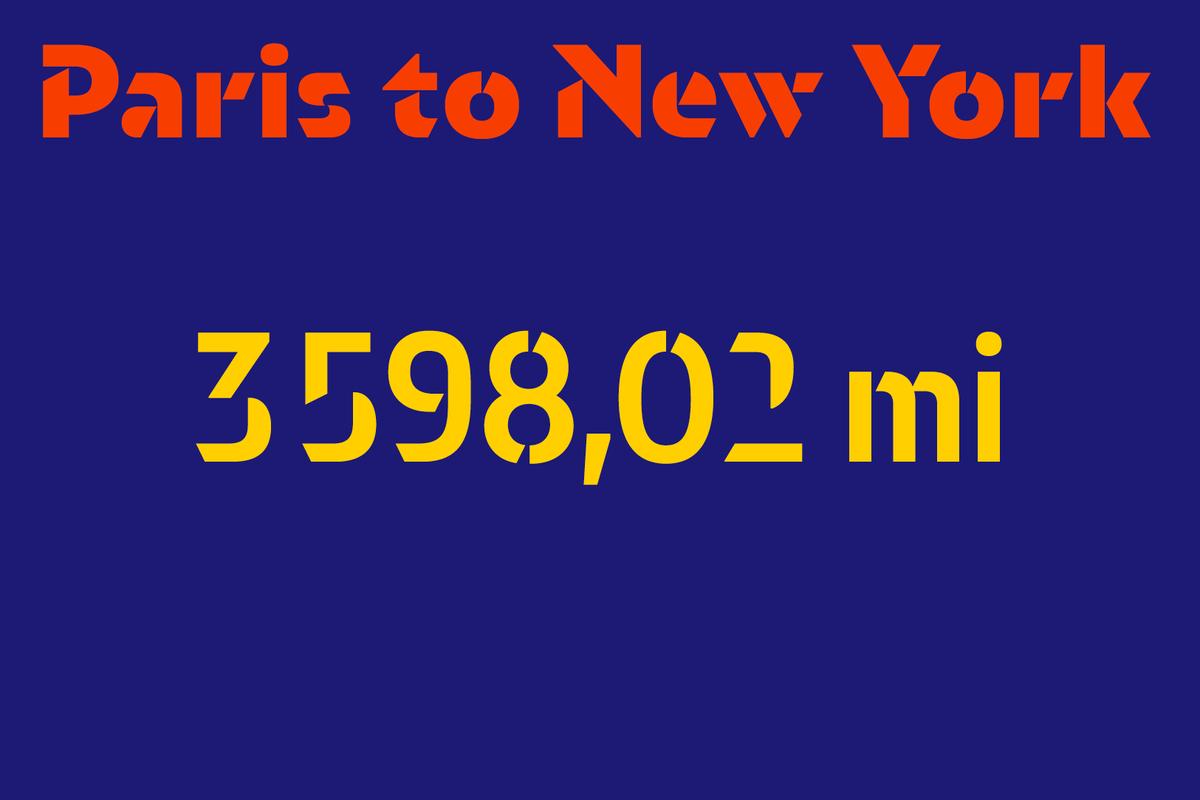
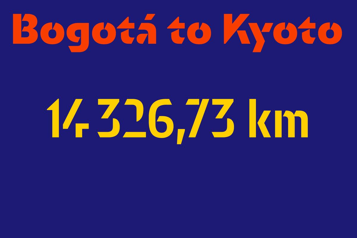
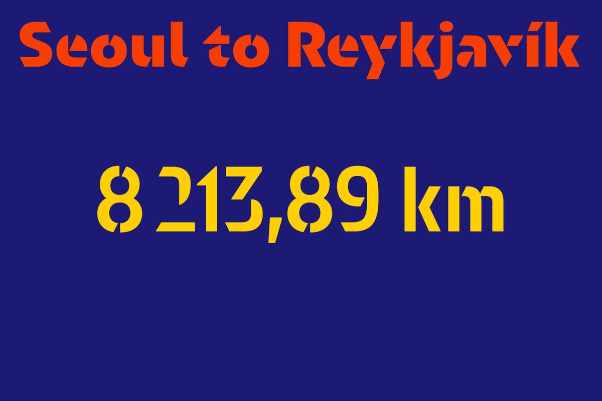
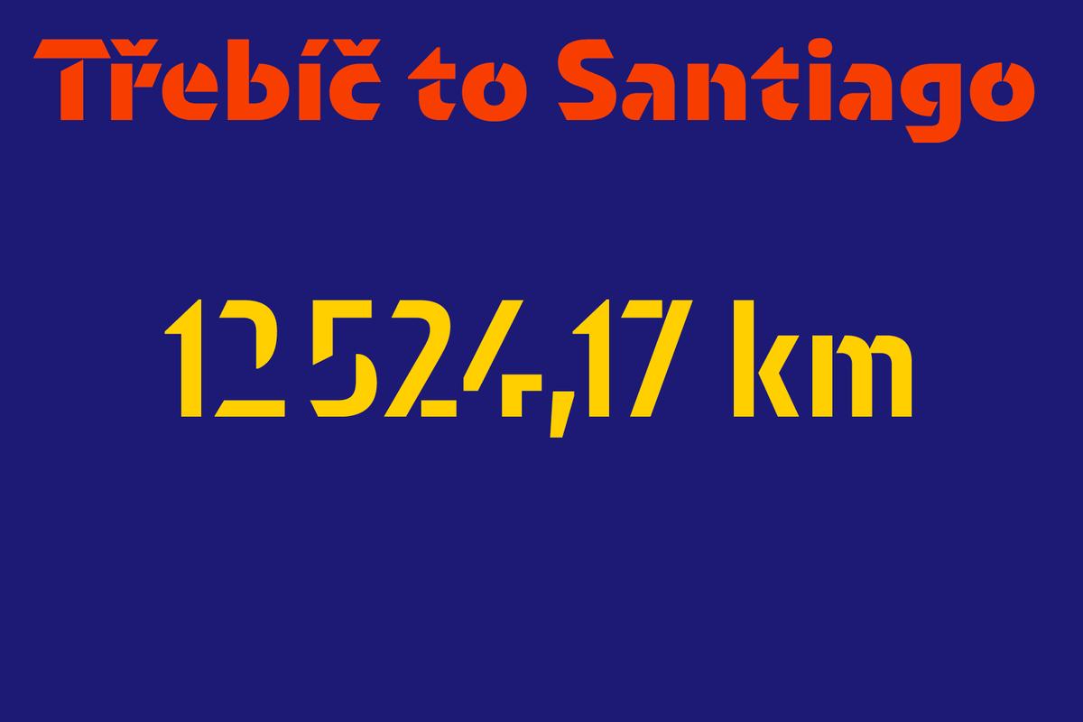
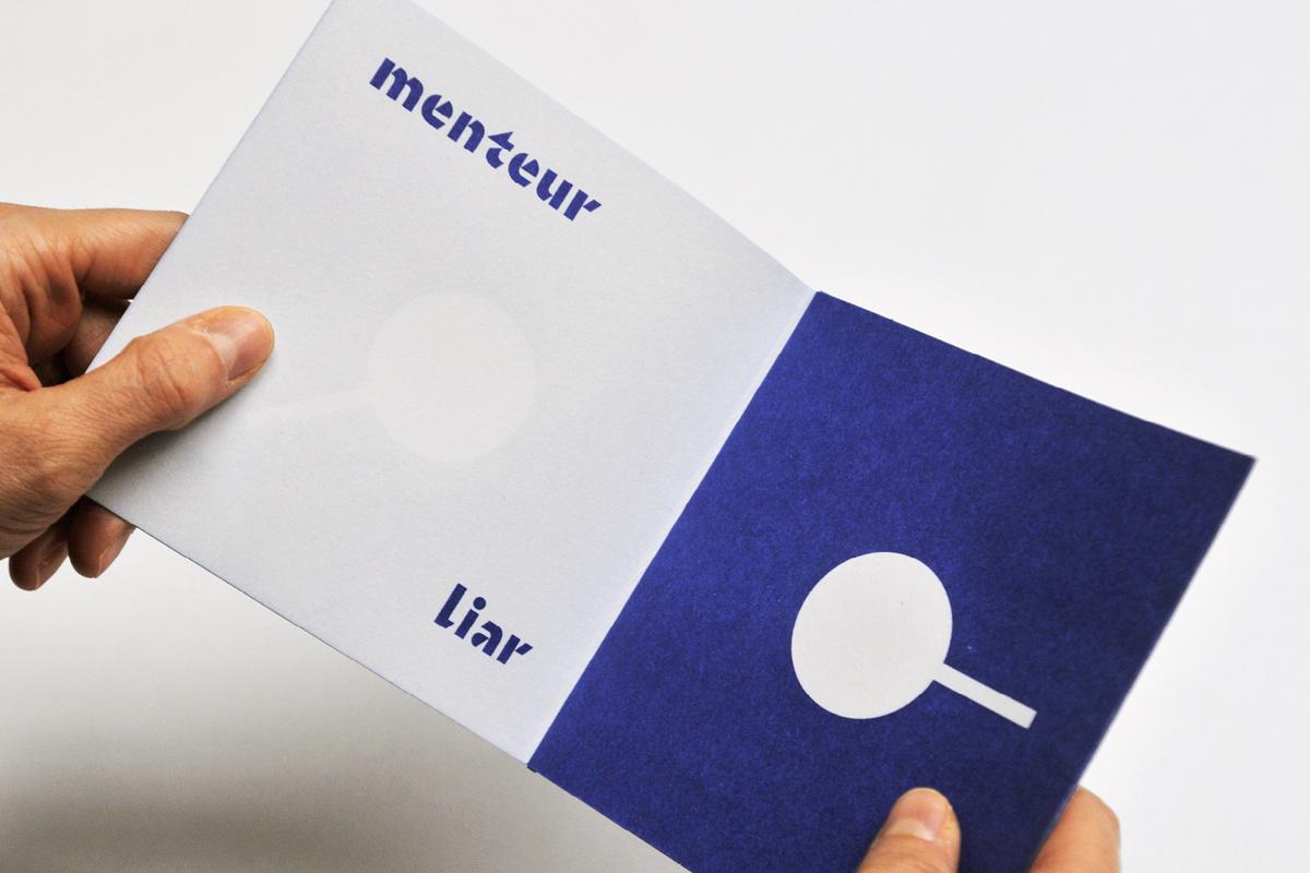
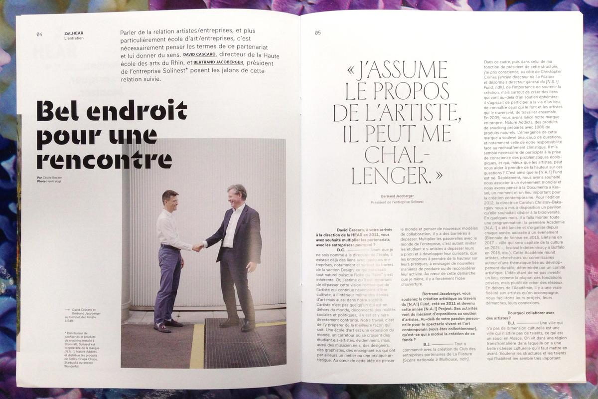
Orientation, a new stencil typeface designed by Sandrine Nugue, makes a striking impression from the first glimpse. Typefaces designed for print are often used for signage, but it is rare for a typeface to go in the other direction, from signage to print and screen. With Orientation, this is exactly how it began.
Creating a Physical Identity
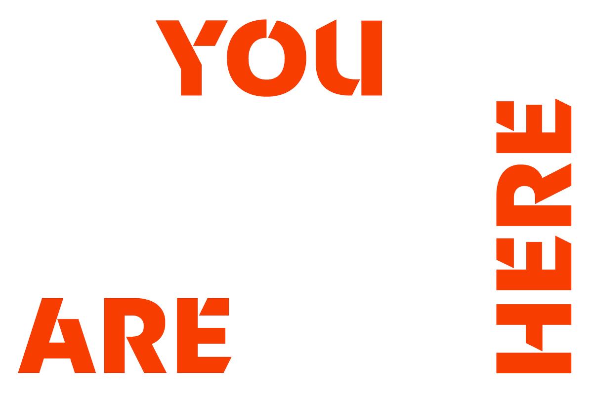
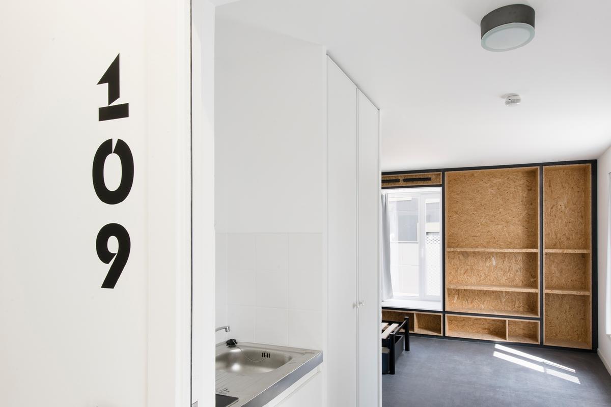
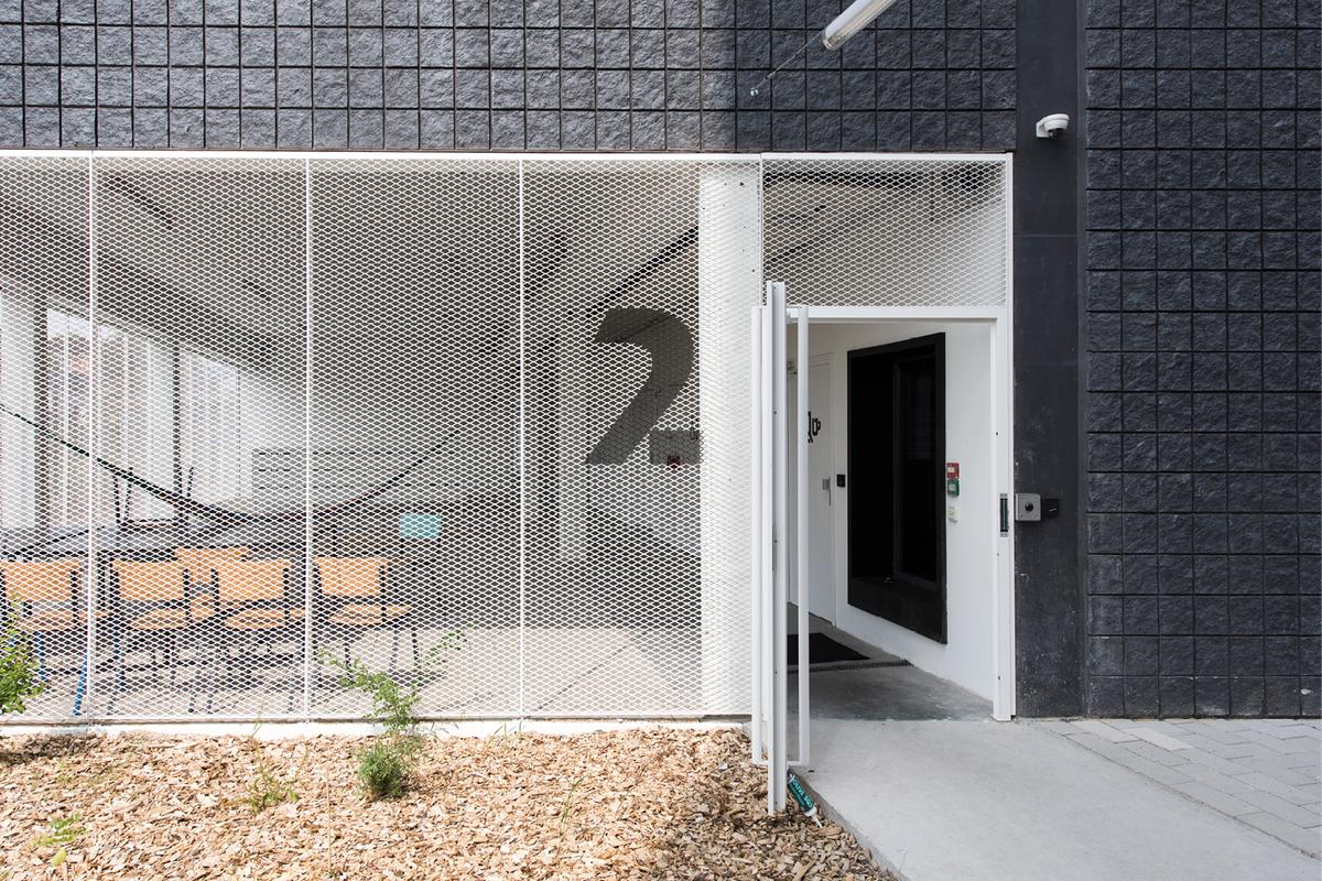
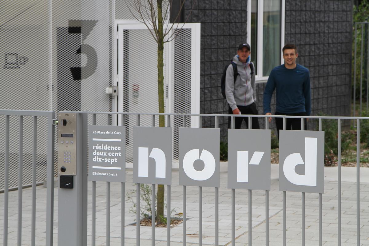
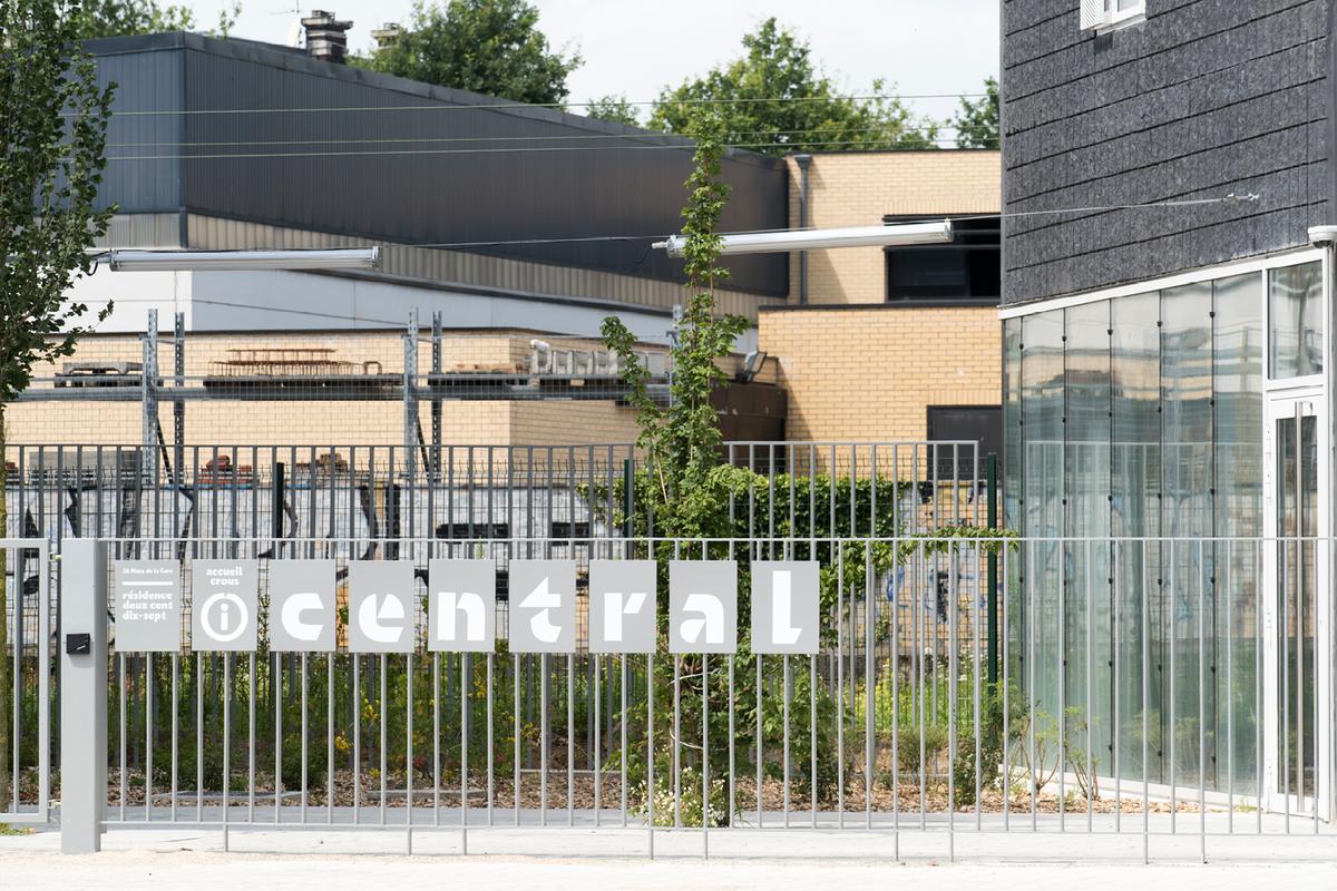
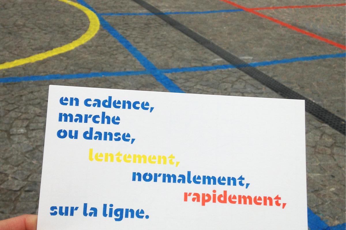
In 2015, Nugue was asked by Paris-based graphic designer Thanh Phong Lê to create a wayfinding typeface for a new dormitory being built for students in Roubaix, France. Because the type would be painted on the building, the brief was clear: Lê needed a typeface that was geometric in form and could be fabricated as a stencil. Beyond these requirements, everything else was left up to Nugue to envision.
Nugue’s process of type design is purposefully direct. “I prefer direct drawing without too many details. My previous typeface Infini is very straight and contains no extraneous curves. Orientation is the same. It is as simple as possible, which made it far more difficult to design. I started out playing with the shapes of the counters and the angle of the ‘cut,’ or joins, of strokes. Because it is a display typeface, I had the freedom to play.”
Spirited Experimentation
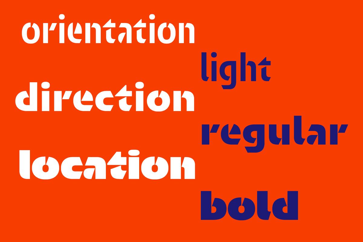
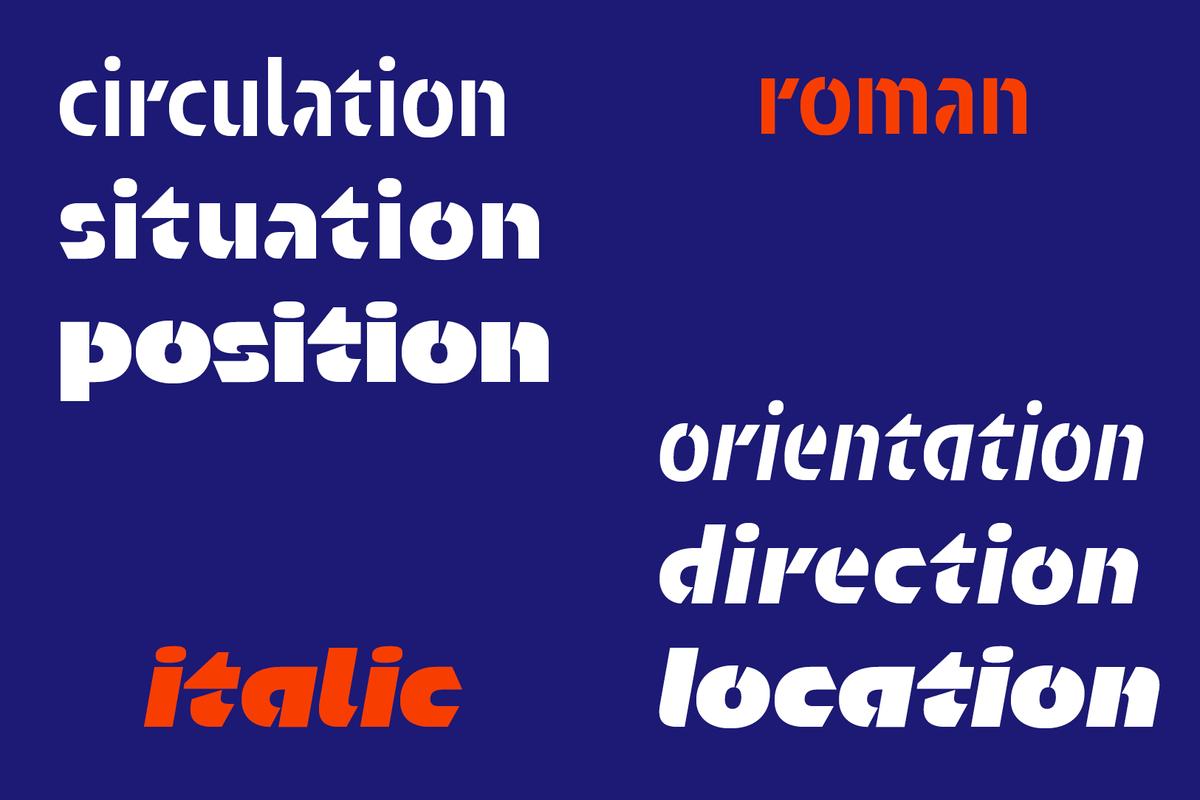
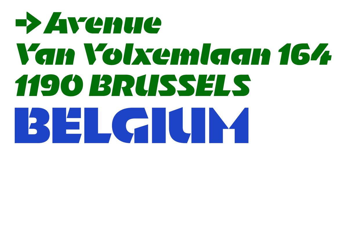
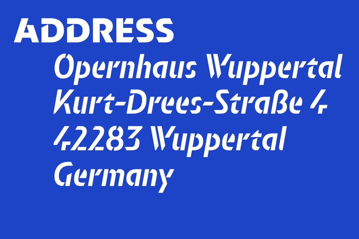
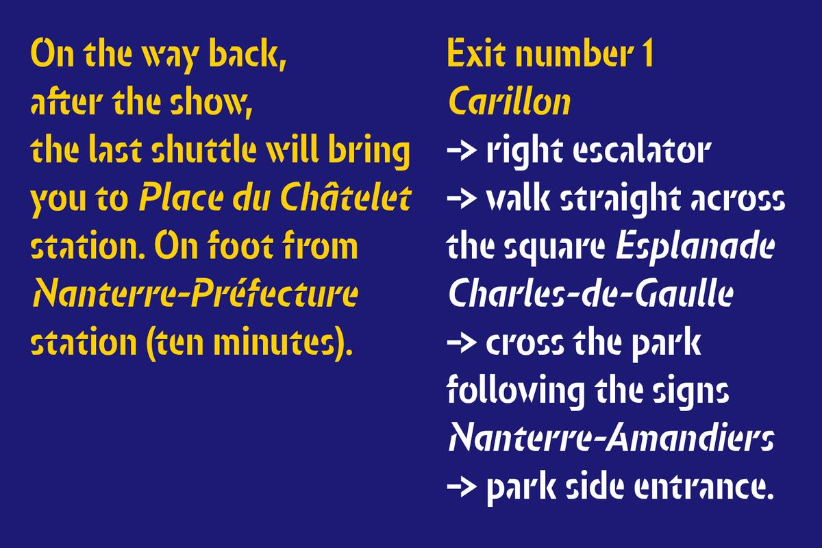
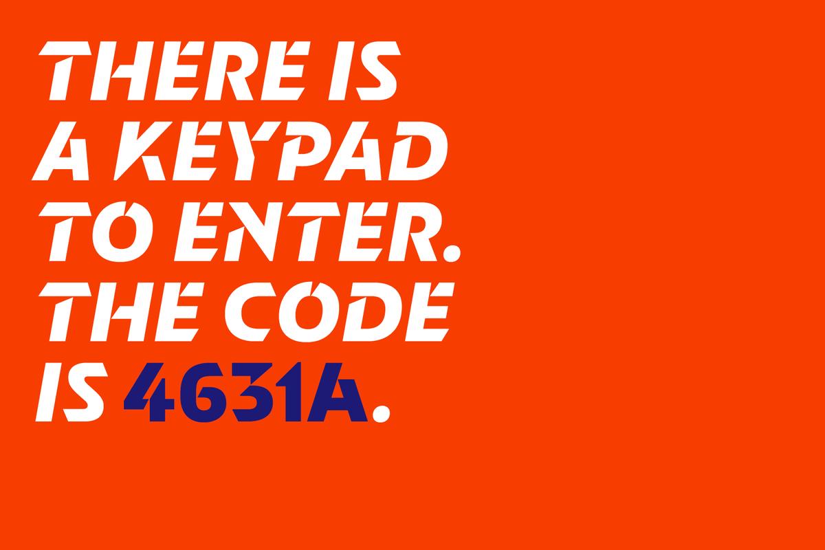
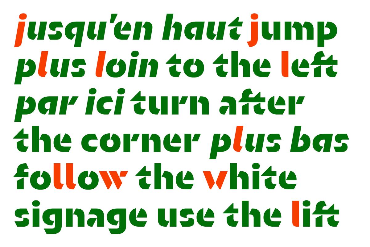
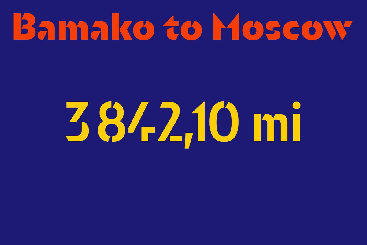
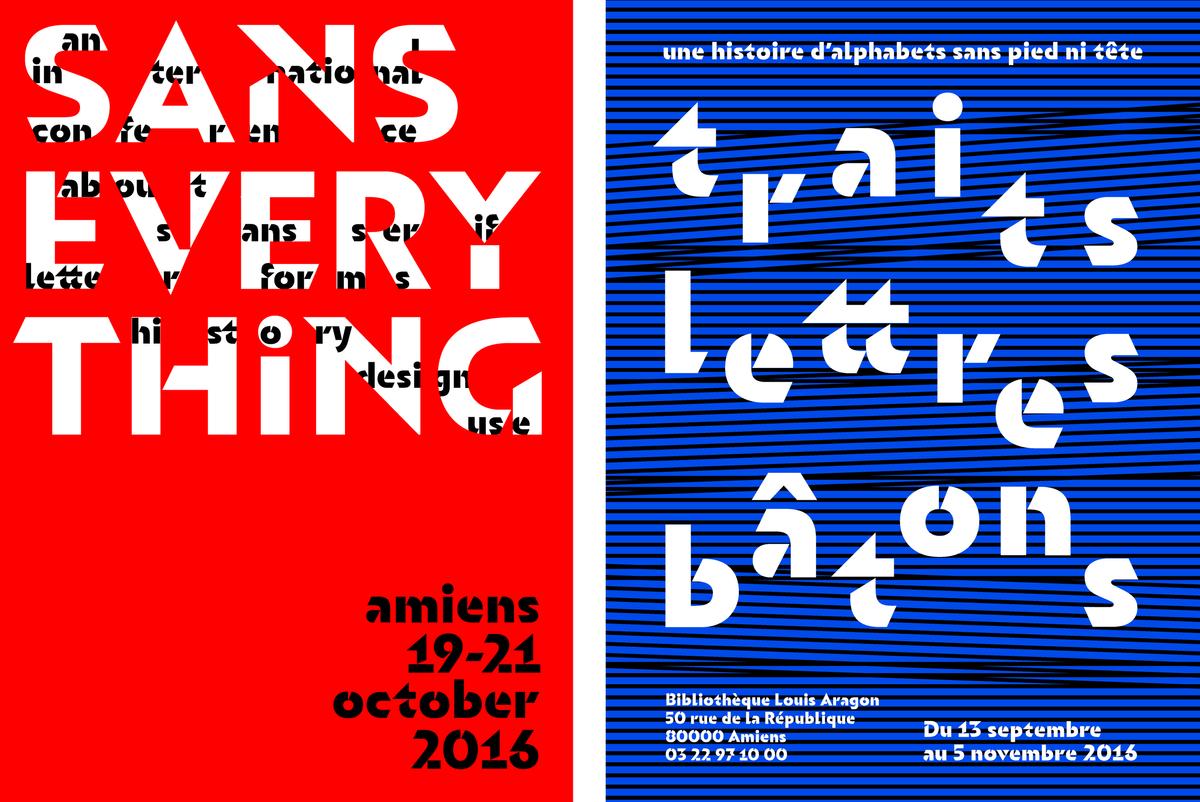
Orientation is dramatic, direct, and playful. It balances bold strokes and purposefully simplified letterforms to create a truly original impression. As the typeface goes from light to bold, the characters become increasingly simplified and abstract. Additionally, Nugue created many alternate characters that push the legibility of individual letters. In the context of words, though, they are surprisingly legible.
Commercial Type’s Paul Barnes first met Nugue in 2012 while she was a student at ÉSAD in Amiens, France, and the two kept in touch. After the commission, Nugue shared Orientation with Barnes. “One of the things we found most interesting about Orientation was the variety of unexpected ways Sandrine found to approach reduction of form and detail,” says Barnes. “It’s an unusually playful and creative kind of minimalism, full of surprises.”
After seeing her typeface used so specifically for physical signage, Nugue says: “I am excited to see how other people will use Orientation outside of wayfinding. I can’t wait to see its strong personality used by other graphic designers for book covers, magazines, logos and identities, posters, and more.”
Orientation is now available in three weights with matching italics. See more and license the typeface here.
