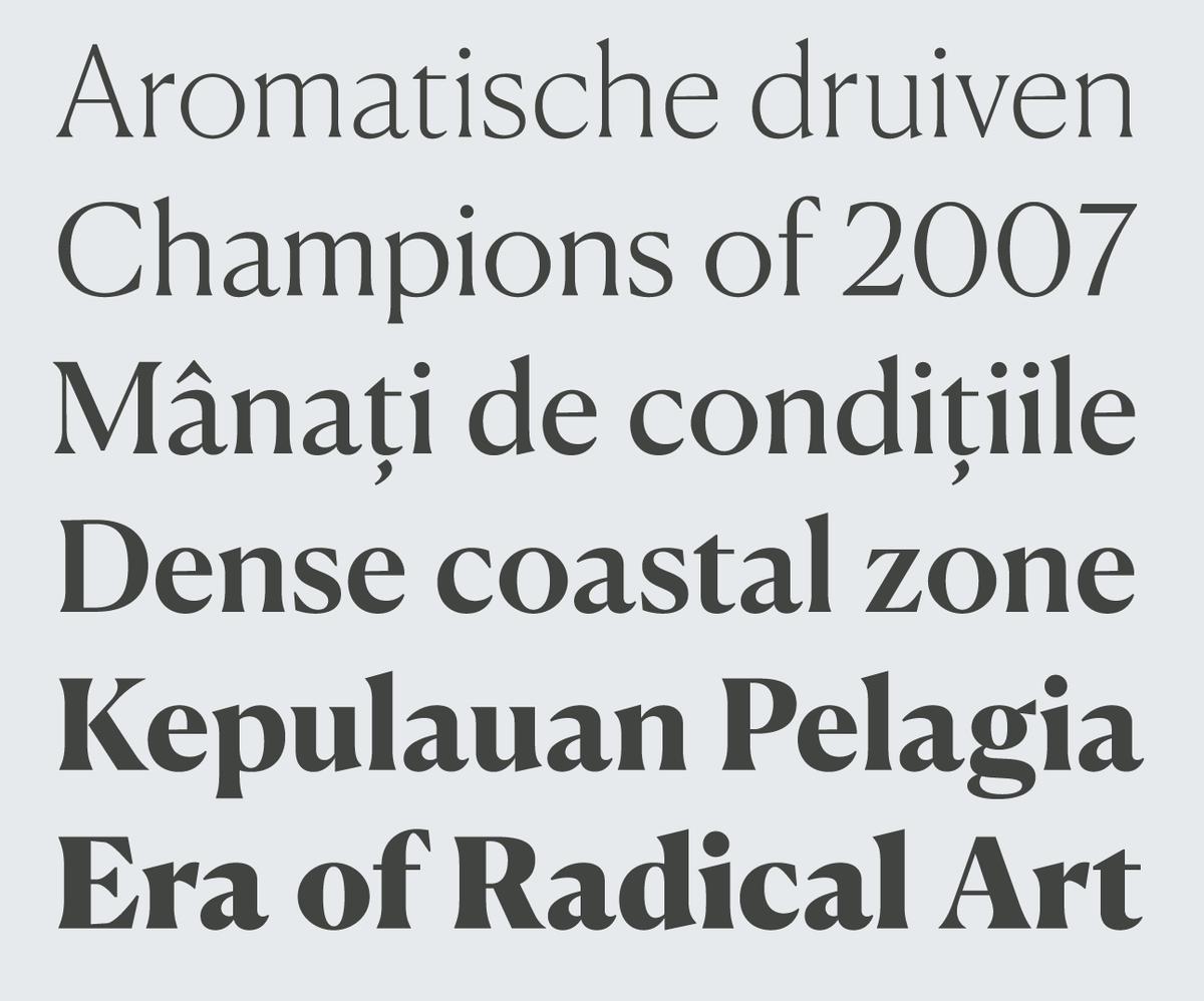
Canela Text and Deck
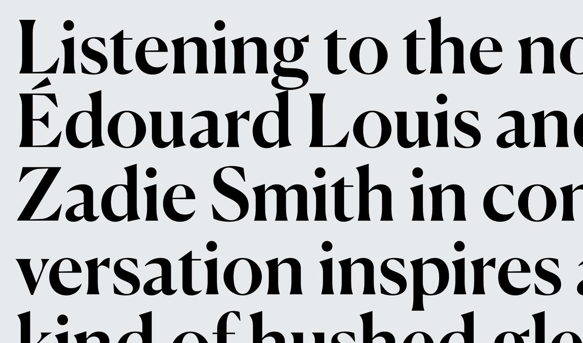
Once a typeface is released into the world, it takes on a life of its own. Even if the typeface was crafted with a highly specific purpose in mind, designers will inevitably push it into unforeseen territory. Often these unexpected uses are happy surprises, but sometimes a type designer has to scramble to catch up with where a typeface has found a niche. Such is the case with Canela, a graceful display typeface designed by Miguel Reyes and released by Commercial Type in 2016.

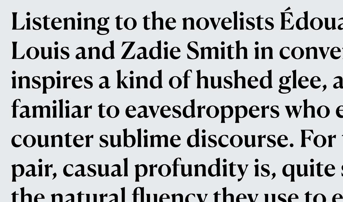
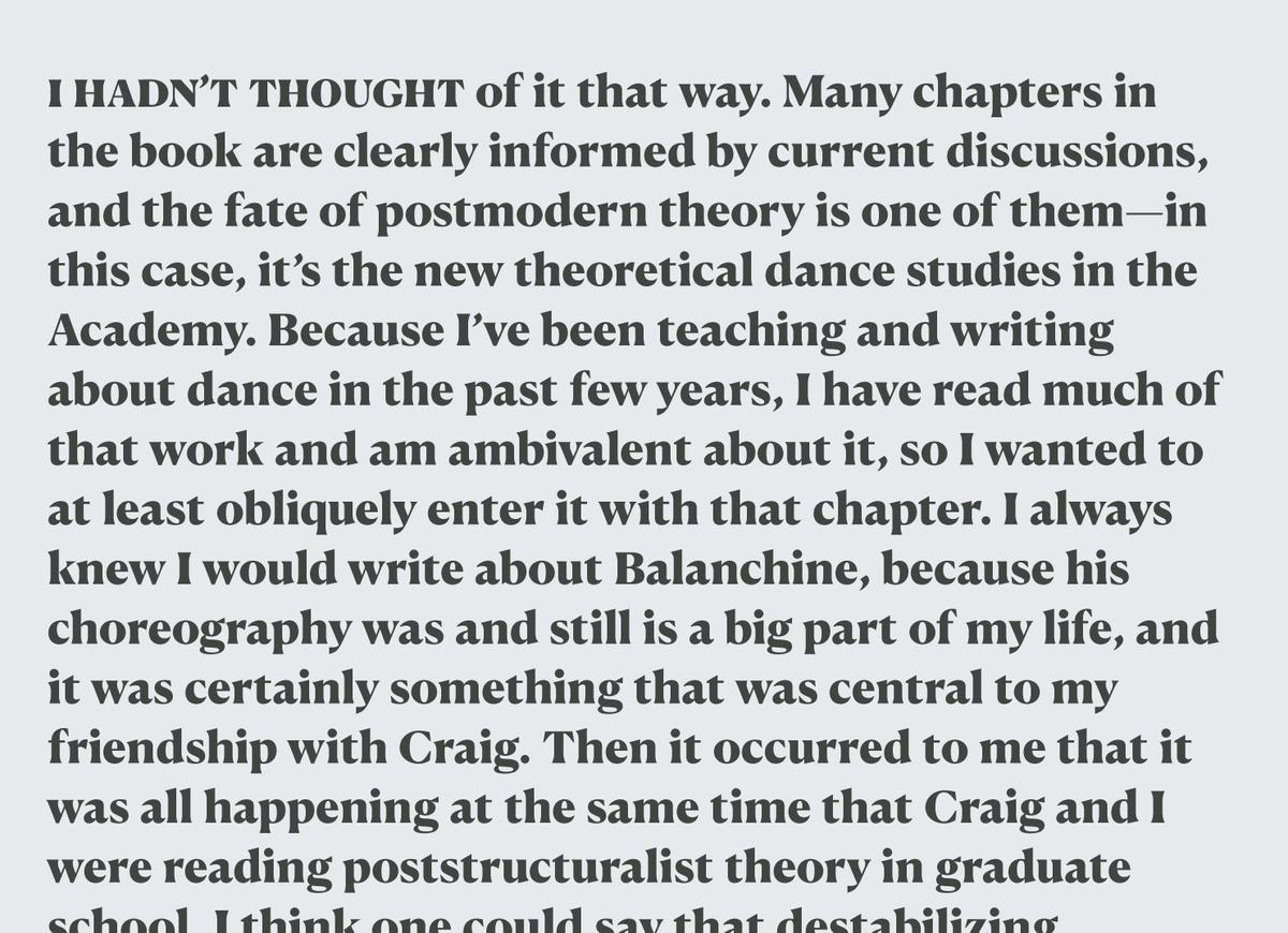
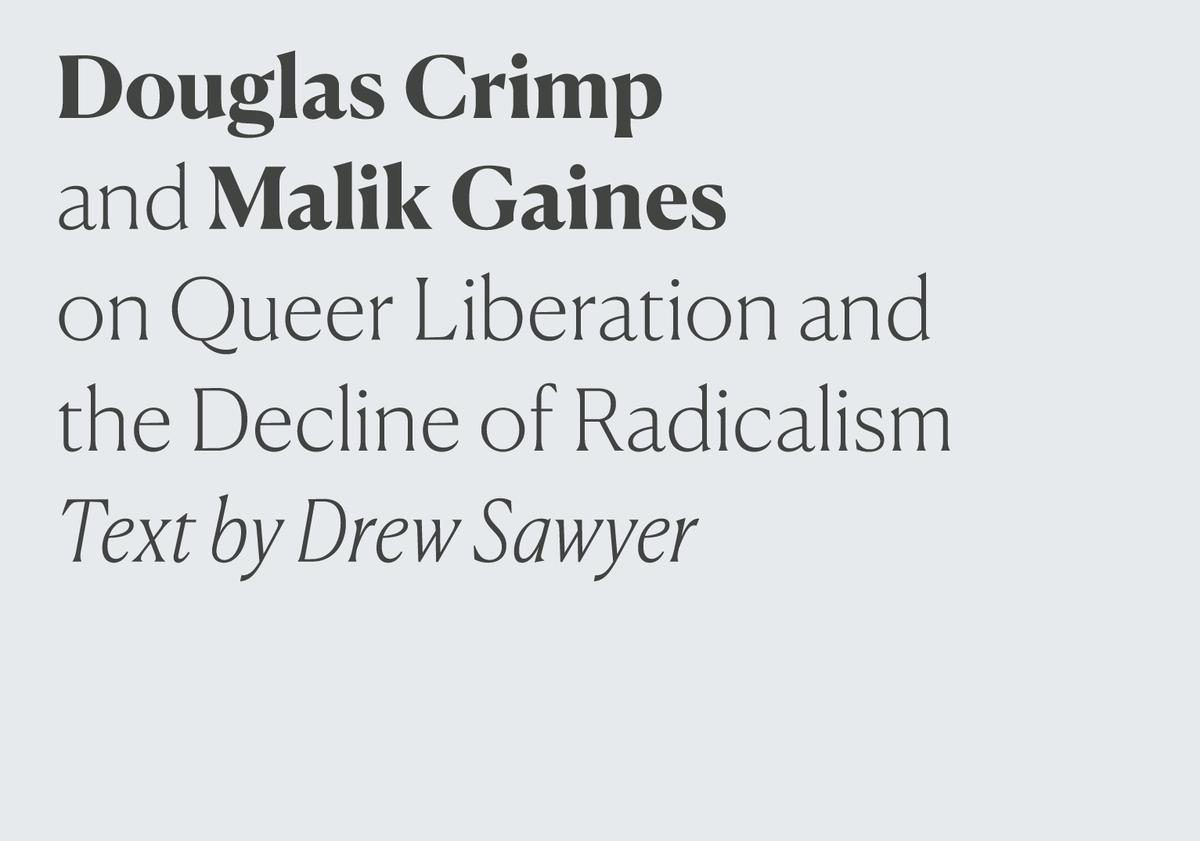
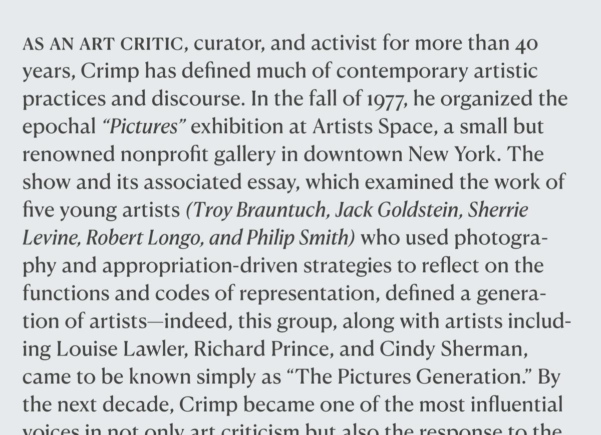
Canela Regular with Canela Deck Regular and Regular Italic.
Observation and reaction
After Canela was released, Reyes was pleasantly surprised to see it used across various categories of design including logos, editorial work, web design, and branding. But he also noticed a problem: though Canela was designed for use at display sizes, designers were using it much smaller than intended, in hopes of bringing its beauty and unique personality to captions and text.
“I started seeing people use Canela at really small sizes and it was breaking apart,” Reyes observed. “Canela works very well and is super pretty when it is big, but it wasn’t working at smaller sizes.” Since Canela has high stroke contrast and thin, delicate details, many of the elements that define it were getting lost.
Designer Christian Schwartz noticed the same thing. “We started seeing Canela being used for small headlines on the web, and knocked out of black, and it was falling apart. It wasn’t maintaining its elegance. People clearly wanted to use Canela at small sizes, so we decided to facilitate what was already being done, rather than telling people what not to do.”
Keeping sophistication at smaller sizes
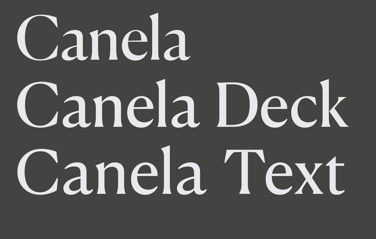
To expand Canela’s range of usable sizes, Reyes has drawn two additional optical sizes: Canela Deck and Canela Text. Both families are designed to keep the elegance and beauty of the original display face while giving it the robustness it needs to work at smaller sizes.
Canela Deck is optimized for the “middle sizes”: subheads and pull quotes in editorial layouts, and all but the largest display sizes on the web. It works well at 20–48pt, where text needs reduced contrast to avoid losing the hairlines and fine details that give Canela its air of sophistication.
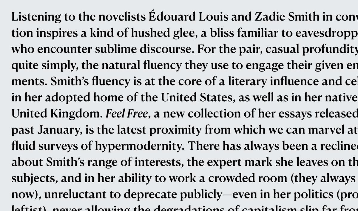
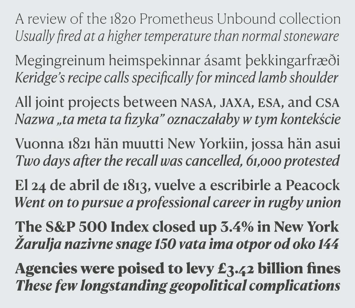
Optimized for use below 20pt, Canela Text brings the grace and distinction of Canela to longer text and small navigational elements. Unlike the more limited weight range found in many text faces, the Canela Text family includes the full range of weights available in the original, from Thin to Black, allowing the extremes to be used at small sizes. Canela Text includes the standard typographic toolkit for setting fine microtypography, such as small caps, tabular figures, and fractions.
Elegance and ambiguity
Canela defies traditional typographic classification. Although its connection to William Caslon I’s eponymous oldstyle is visible in its underlying structure, the family is difficult to categorize and define. Canela’s forms explore the ambiguous space between sans and serif, soft and sharp, modern and classical. “Canela is about an atmosphere; it has a particular feeling,” said Schwartz. “I think its ambiguity is what makes it so appealing.”
With the addition of Canela Deck and Canela Text, designers can now confidently use Canela in a wide range of sizes without compromising its beauty or readability.
Read more about the full Canela family and purchase the typefaces.
