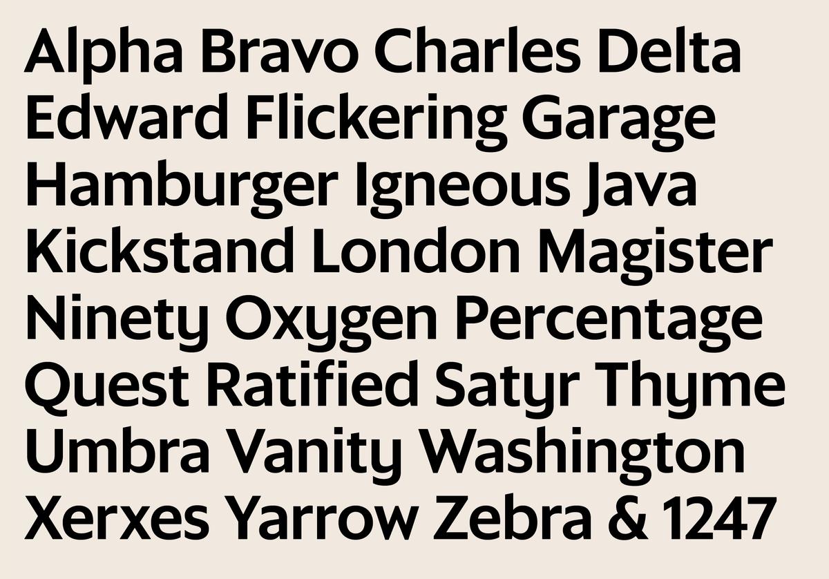
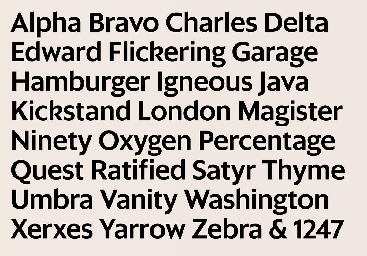
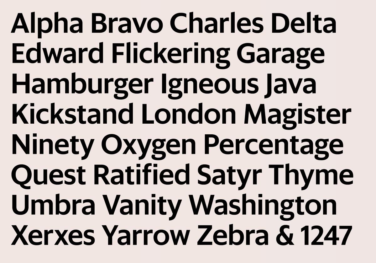
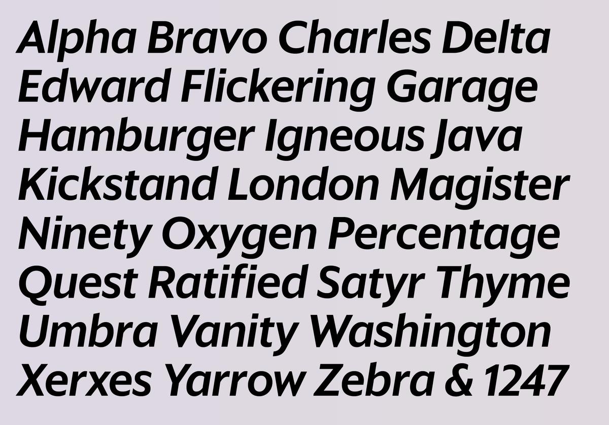
Sanomat Sans
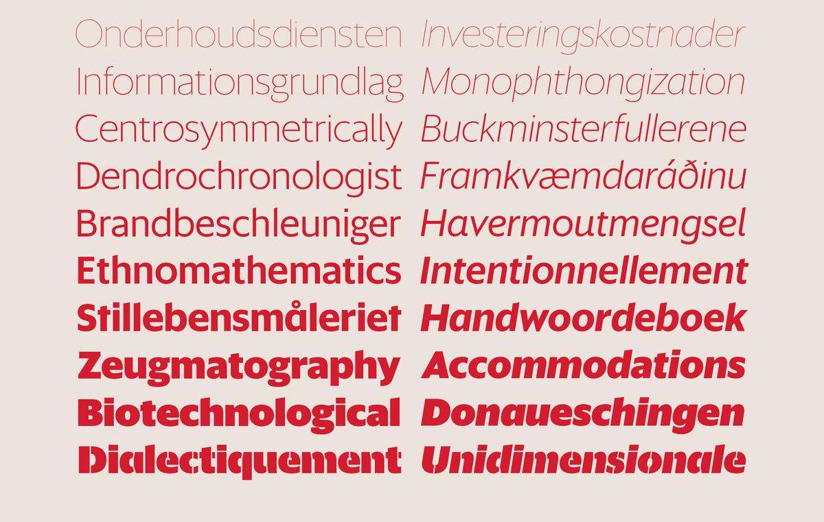
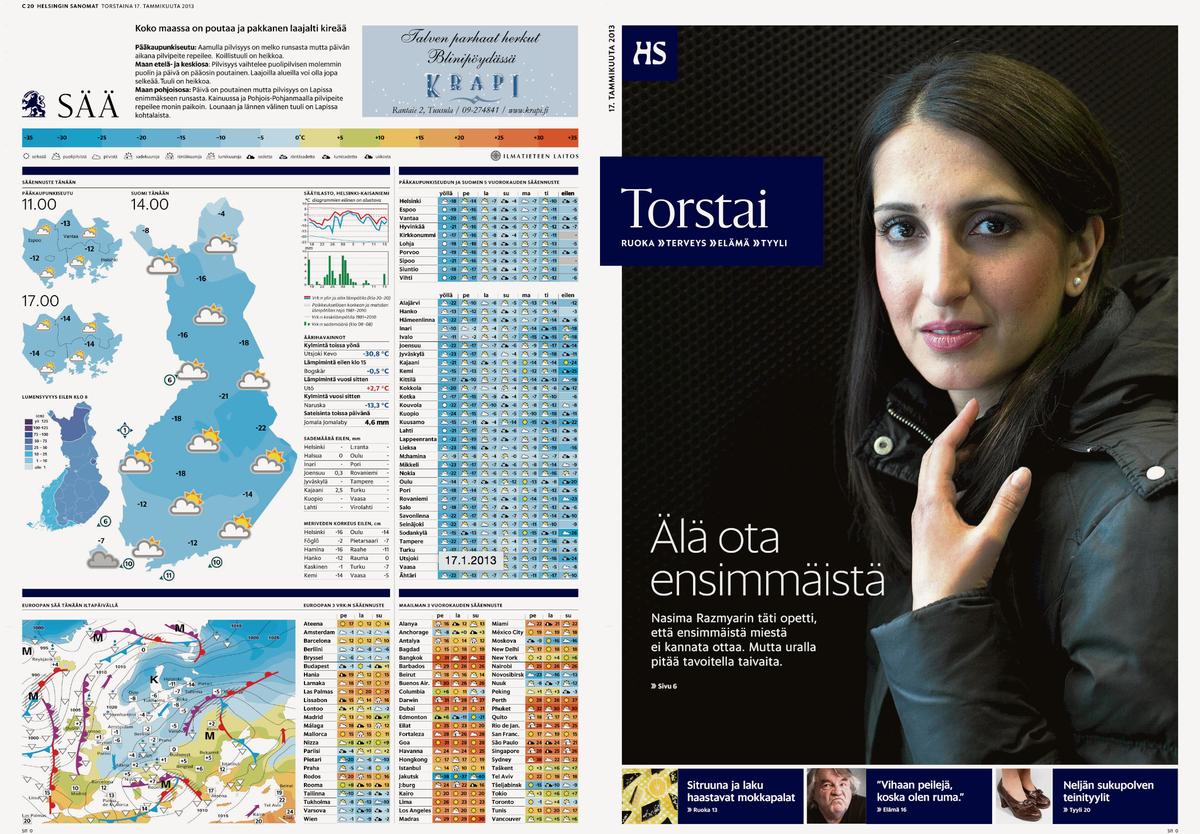
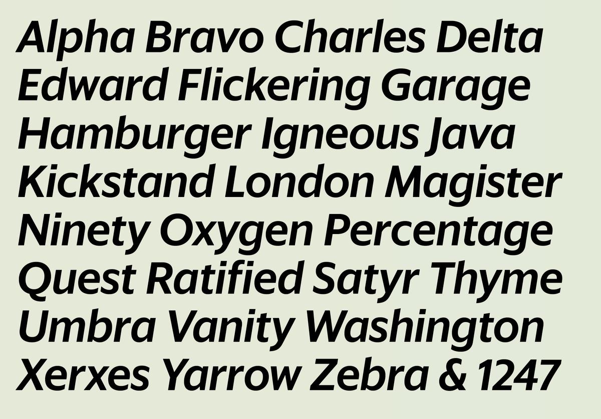
Sanomat Sans is a geometric sans serif with both display and text variants, originally designed by Vincent Chan and Christian Schwartz for Sami Valtere’s 2013 redesign of Helsingin Sanomat, Finland’s most respected national newspaper. A large-format broadsheet since its founding under the name Päivälehti in 1889, the newspaper relaunched in the smaller tabloid format in January 2013. The sharp elegance of Sanomat Sans helped retain the feeling of a quality newspaper in the smaller format, while Sanomat Sans Text is a workhorse, bringing clarity and legibility to smaller sizes. To temper the monotonous texture caused by the many repeating letters in Finnish words, the bowls have a general asymmetry, giving the face a warm tone more typical of a humanist sans. Though Metro by W.A. Dwiggins wasn't a reference for us, it is a clear predecessor in the small genre of organic geometric sans serifs.
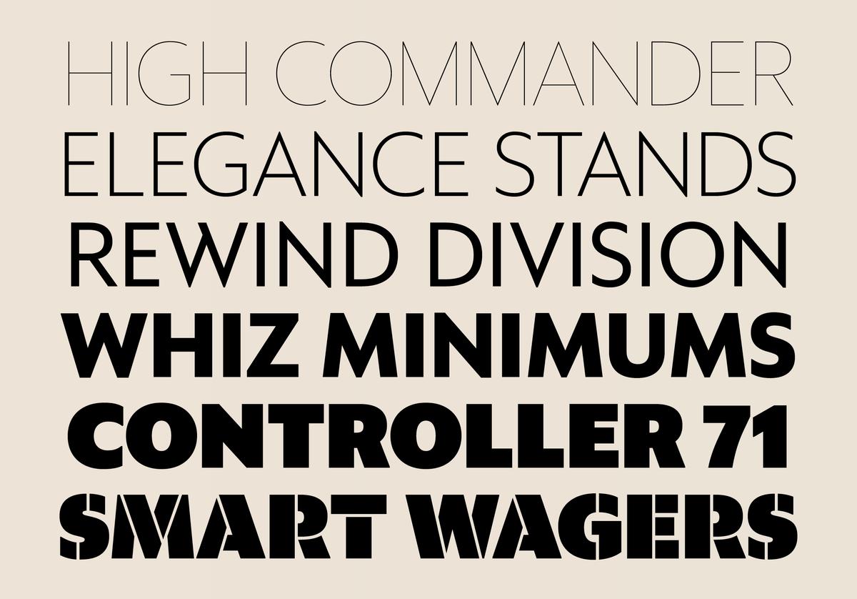
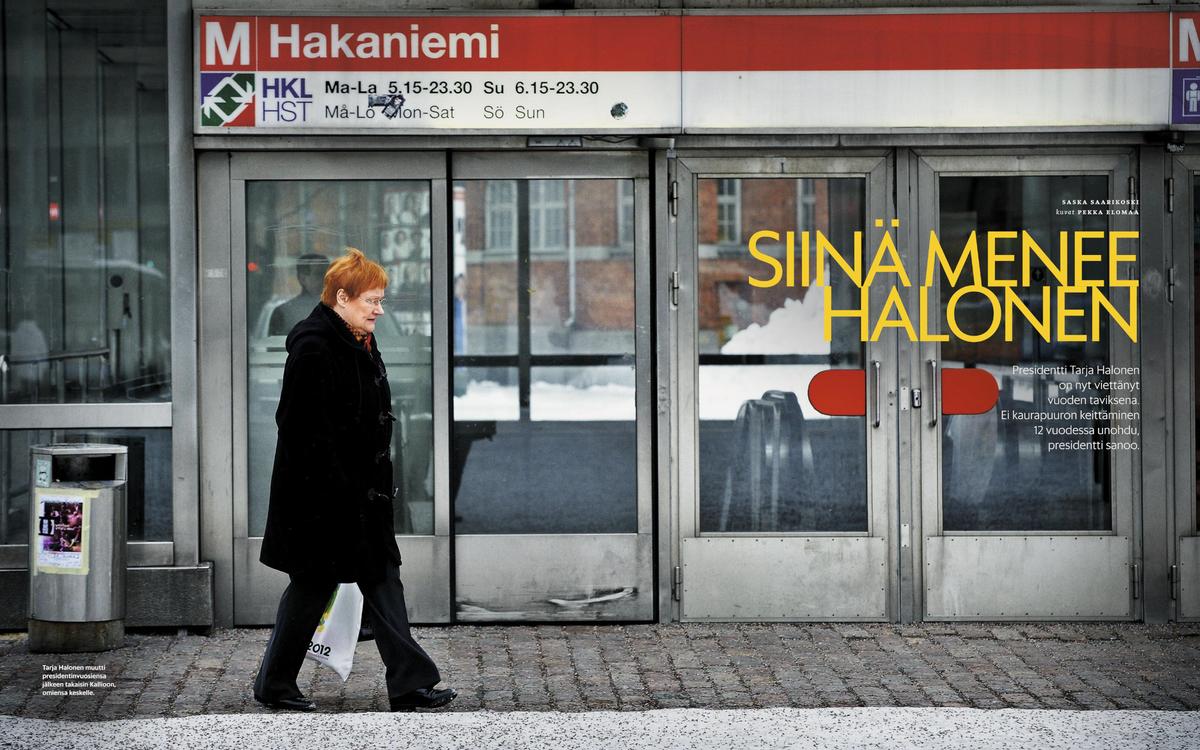
The sharp points on the diagonal characters in the display variant reference the iconic architectural lettering in Helsinki’s main square, close to the newspaper’s offices.
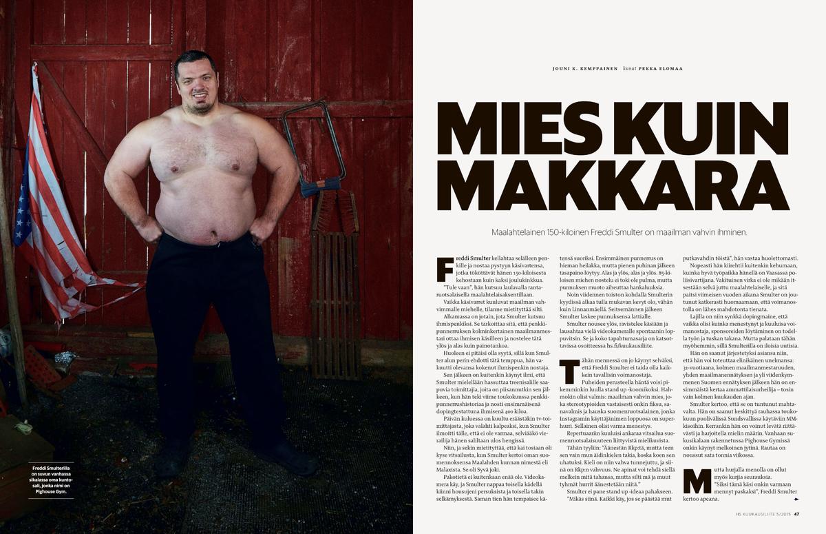
The ten weights of the Sanomat Sans family grew out of the need to express many different personalities in the newspaper’s various offerings: from punchy bold weights, including a Stencil Black drawn by Miguel Reyes, for the younger readership of the weekly magazine Nyt to sophisticated thin weights for the more literary flavor of the culture section on Thursdays and the monthly magazine Kuukausiliite.
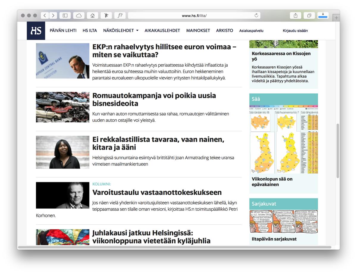
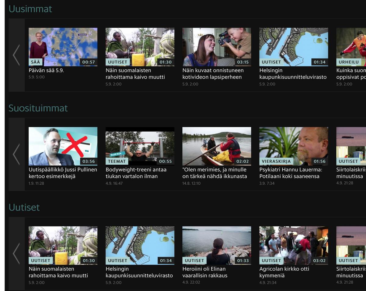
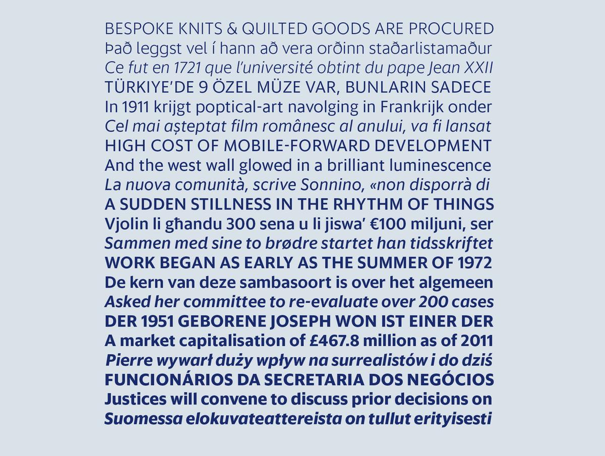
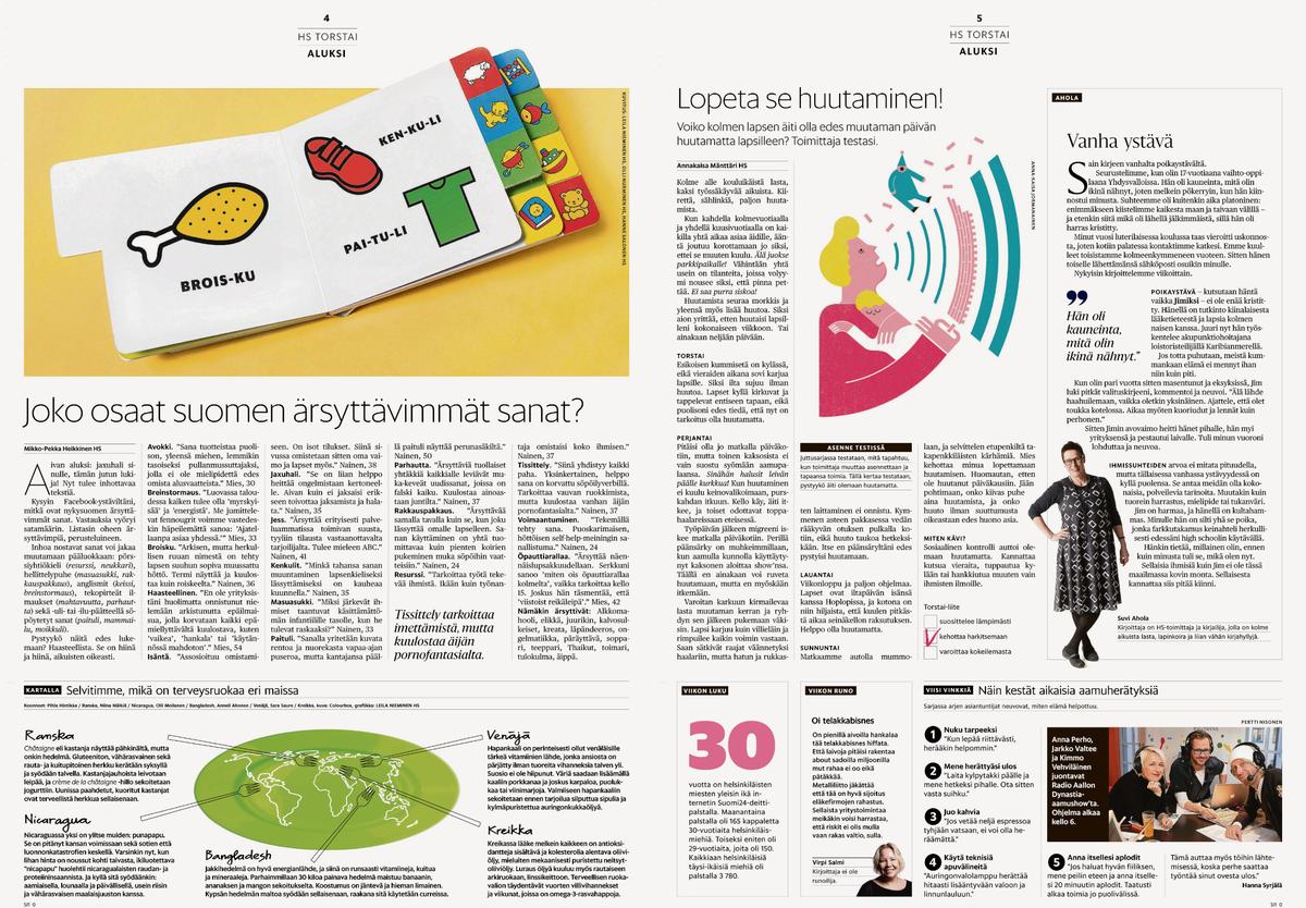
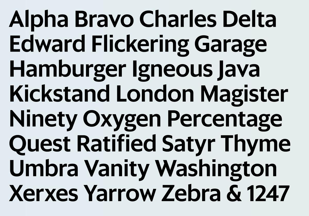
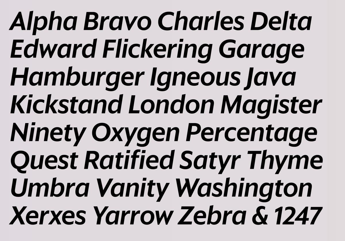
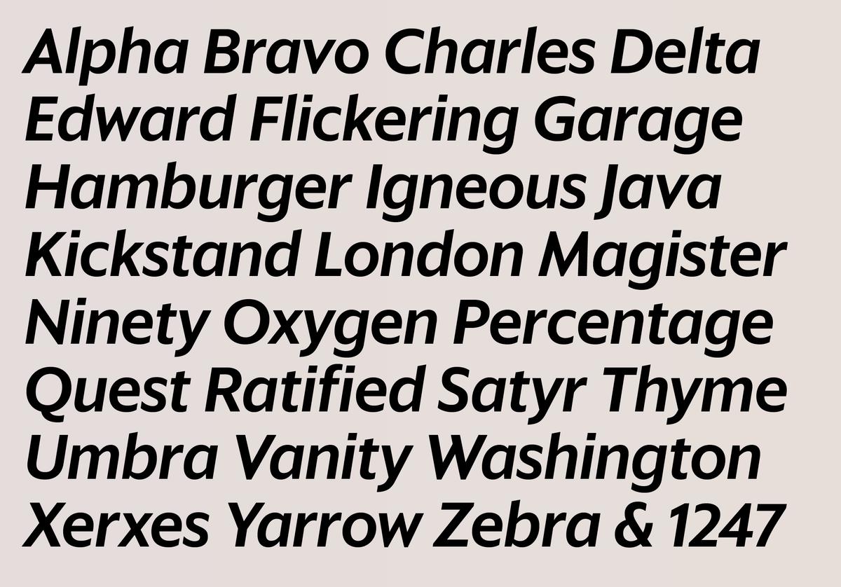
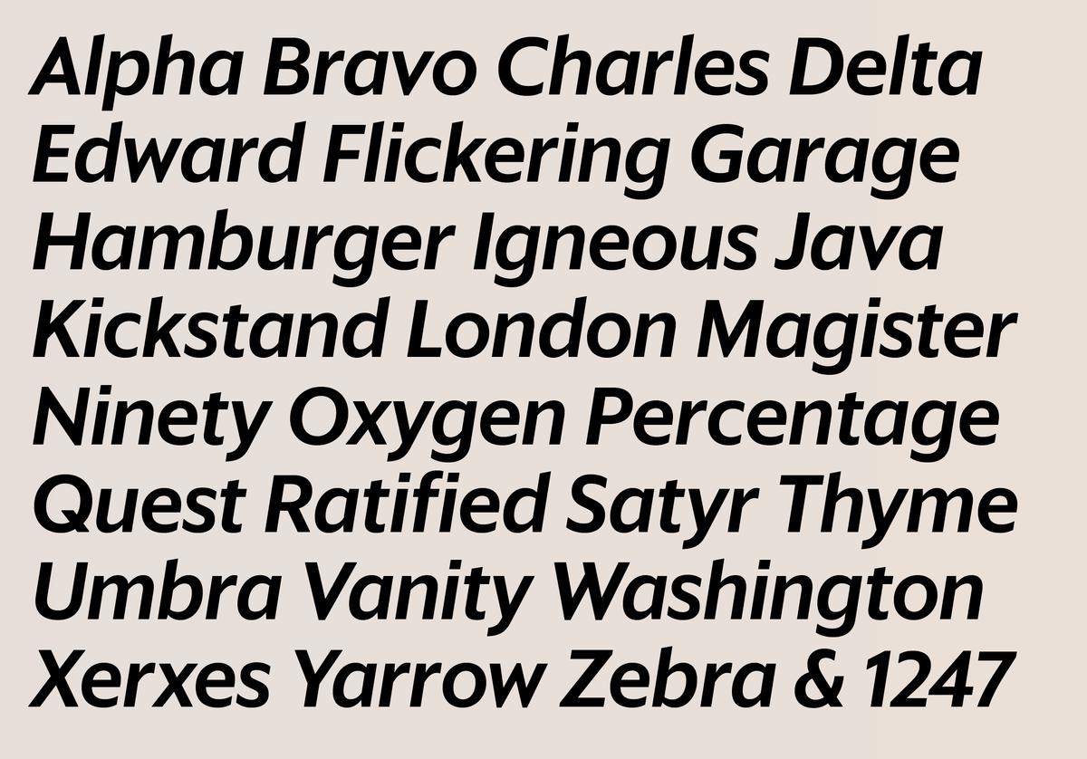
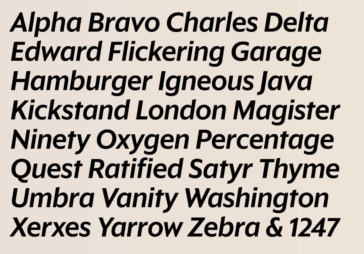
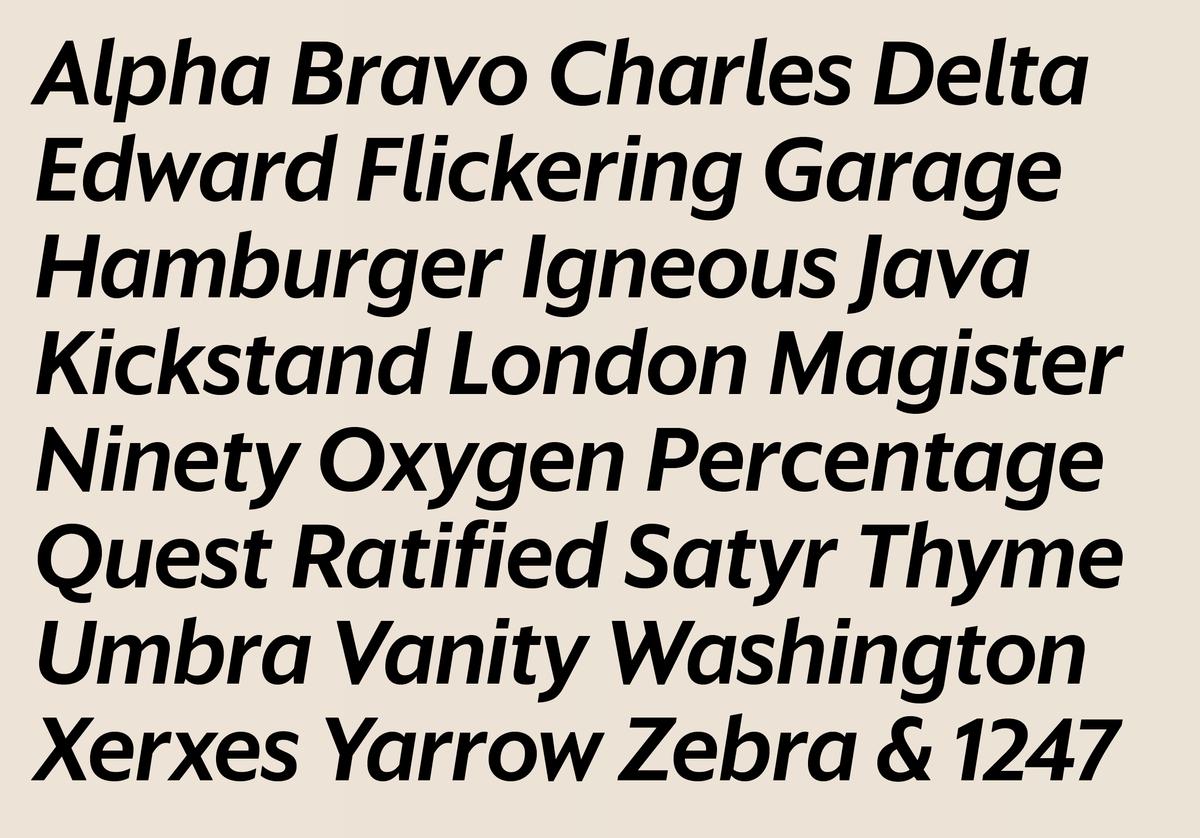
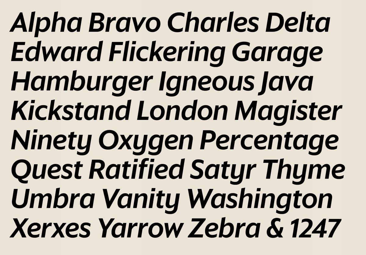
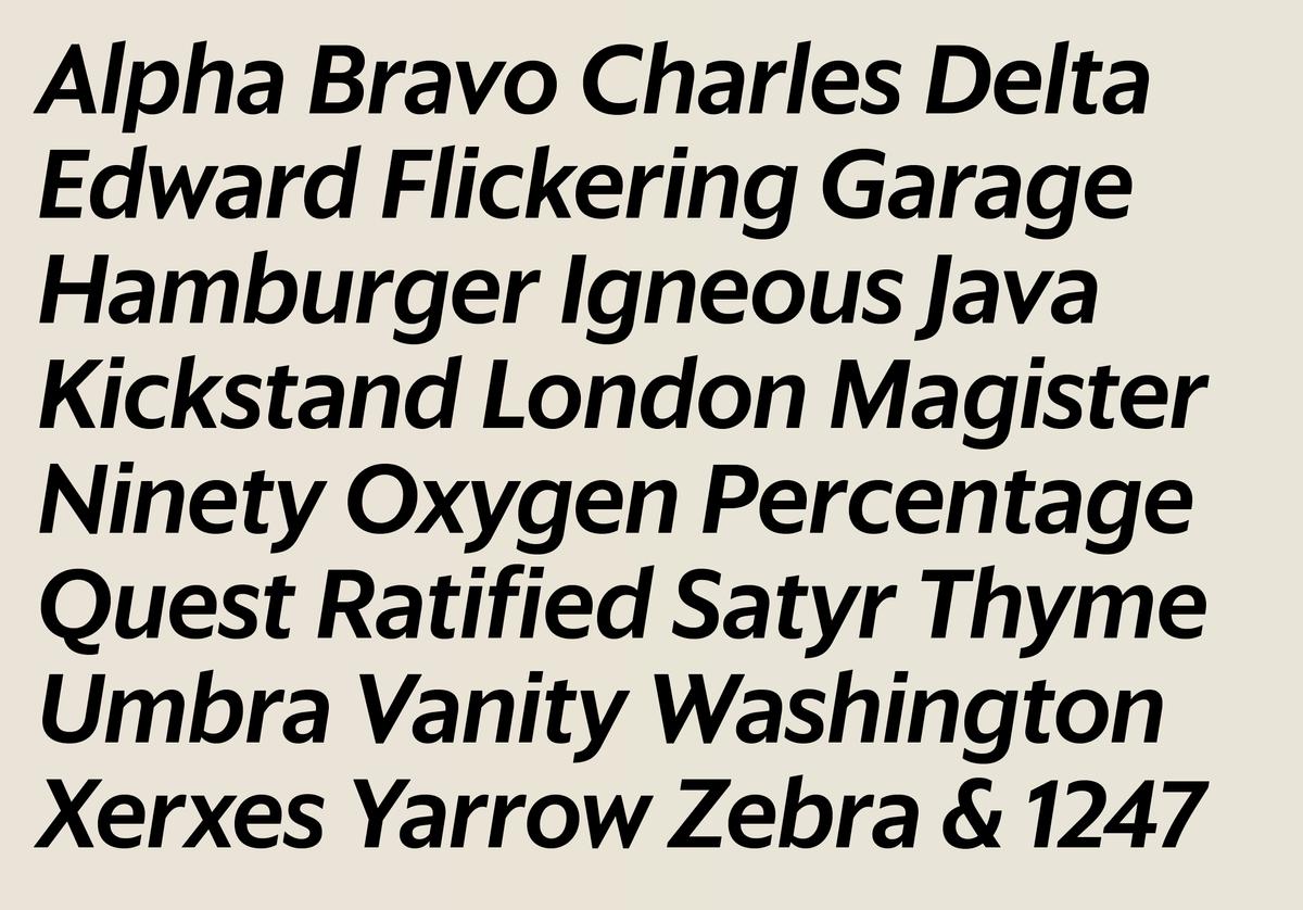
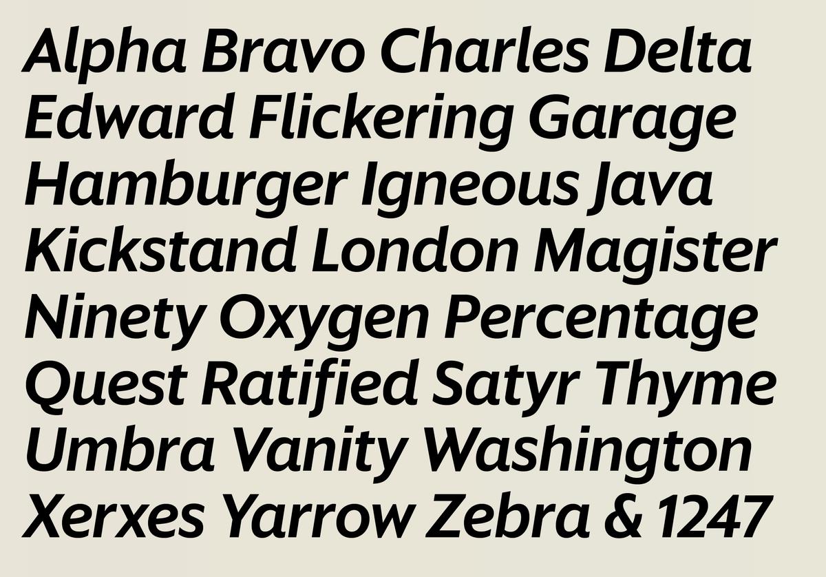
Based on the elegant forms of Sanomat Sans, Sanomat Sans Text is a true workhorse, designed for captions, sidebars, info graphics, maps, television schedules, as well as the newspaper’s apps and website. Comfortable for extended reading on paper and on screen, this family is also an excellent choice for interface design. This family features seven weights, from Light to Extrabold, all fine-tuned to work well at small sizes both on paper and on screen. The open terminals and simplified forms preserve legibility at all sizes, while idiosyncratic forms like the lowercase g give personality and prevent monotony in reading. Tabular figures allow for use in typesetting intensive data.


Sanomat Sans has an extensive set of alternates, giving it a chameleon-like ability to change its tone. Helsingin Sanomat needed a lot out of this typeface. Between all of the sections of the newspaper, its magazines, digital editions, and its forays into television and radio, they needed a wide variety of looks, held together by a consistent underlying structure. Rather than adding a slab, a rounded sans, etc., they requested that we find a way to build these different feelings into the sans itself. The alternate sets can also be combined: we calculated over 300,000 possible combinations, but our math must be wrong…
Pointed diagonals like those on the A V and 7 have blunted alternates, allowing for a quieter, less overtly elegant tone; simplified forms for K W M and y, on the other hand, serve to turn up the elegance; non-descending Q and J forms allow tight leading in all caps; and a handful of lowercase alternates make the italic feel much more cursive.
A similarly large set of alternates allow Sanomat Sans Text to be nearly as much of a chameleon as its headline counterpart.
Related fonts
