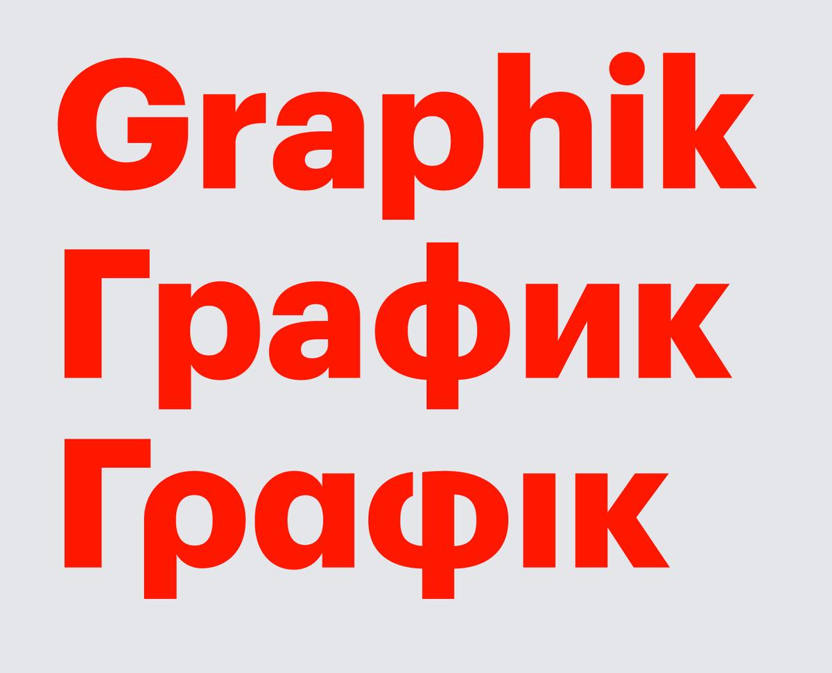
Graphik now supports Greek and a number of languages that use the Cyrilic alphabet, including Russian, Ukrainian, Belorussian, Bulgarian, and Serbian. The Cyrillic was drawn by Ilya Ruderman, and the Greek was drawn by Panos Haratzopoulos.
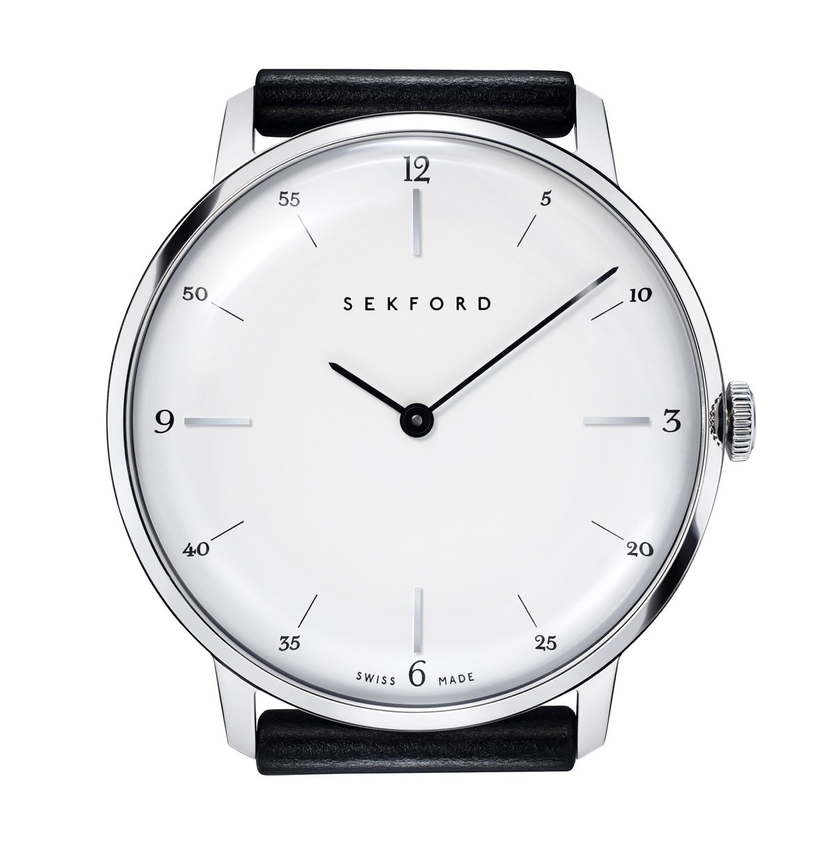
Commercial Type has provided the numbers and other lettering for a new watch that celebrates English heritage.
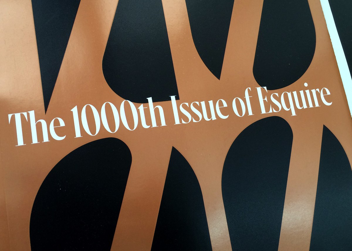
Christian Schwartz drew a new display serif face called Gingrich for the 1000th issue of Esquire. The typeface is named for the founding editor of the magazine.
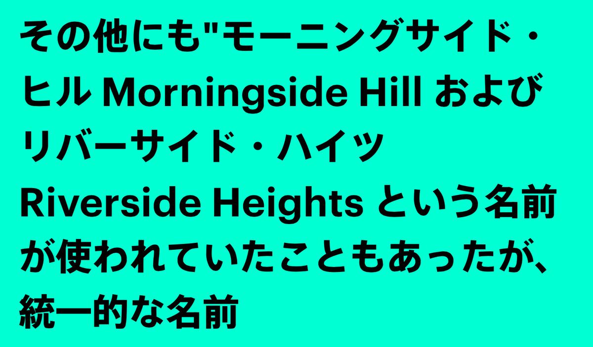
We have licensed a number of our typefaces to serve as the Latin portion of Japanese typefaces available through the unique FitFont service by Type Project.
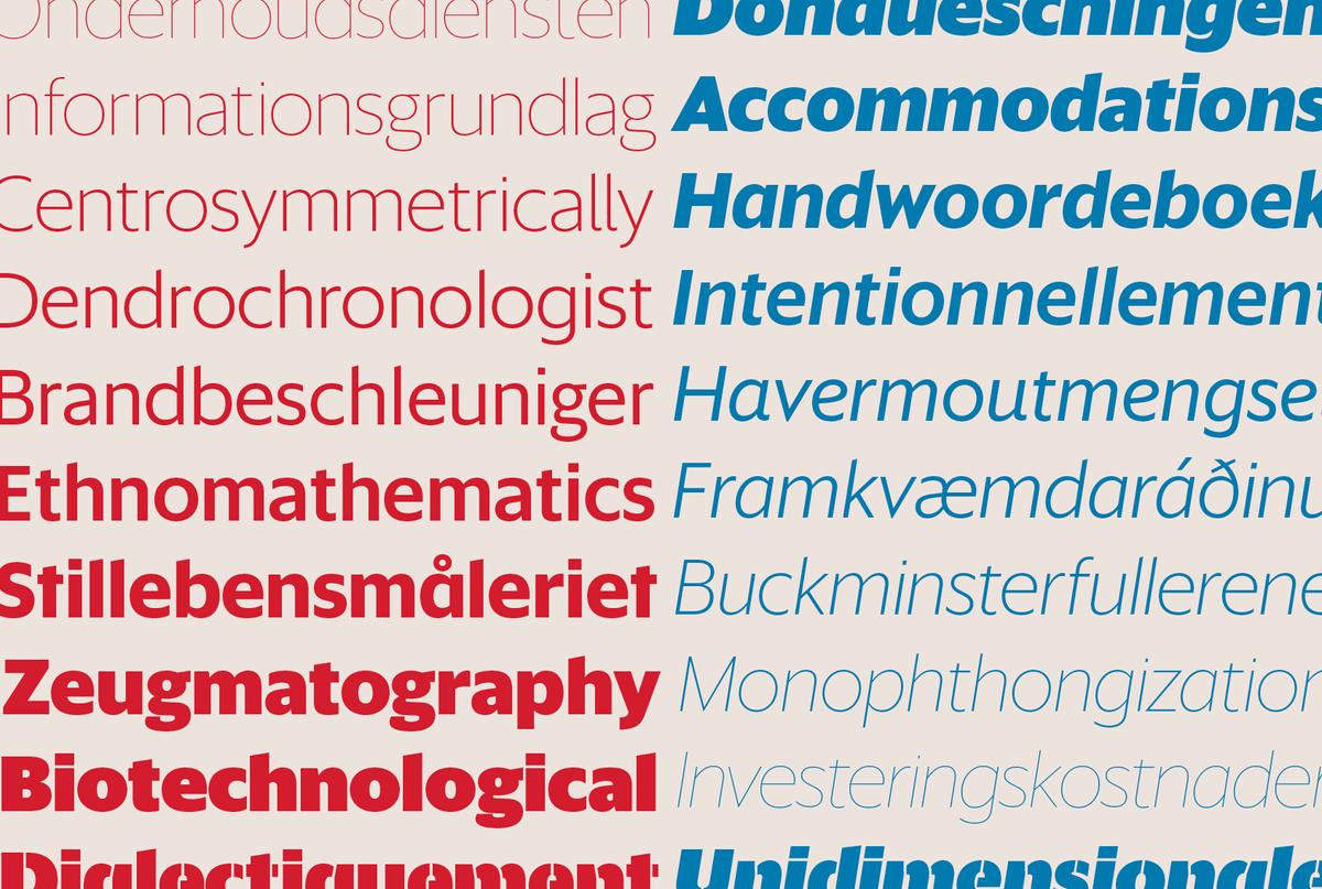
Commercial Type is pleased to announce the release of Sanomat Sans, a geometric sans with a wide range of weights in both display and text variants, originally drawn for the 2013 redesign of Finnish newspaper Helsingin Sanomat, including its digital and broadcast divisions.
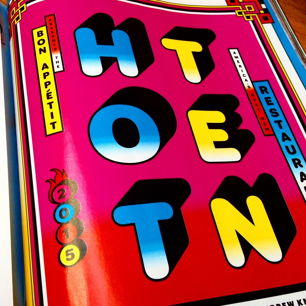
Christian Schwartz drew Graphik Round Black for Bon Appétit's 2015 Hot Ten, their annual roundup of the ten best new restaurants in the US.
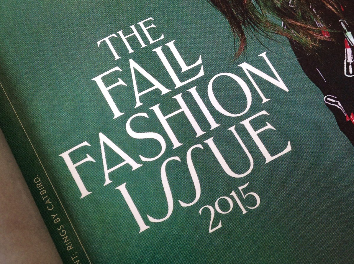
Greg Gazdowicz drew an all-caps titling typeface for New York magazine’s 2015 fall fashion issue.
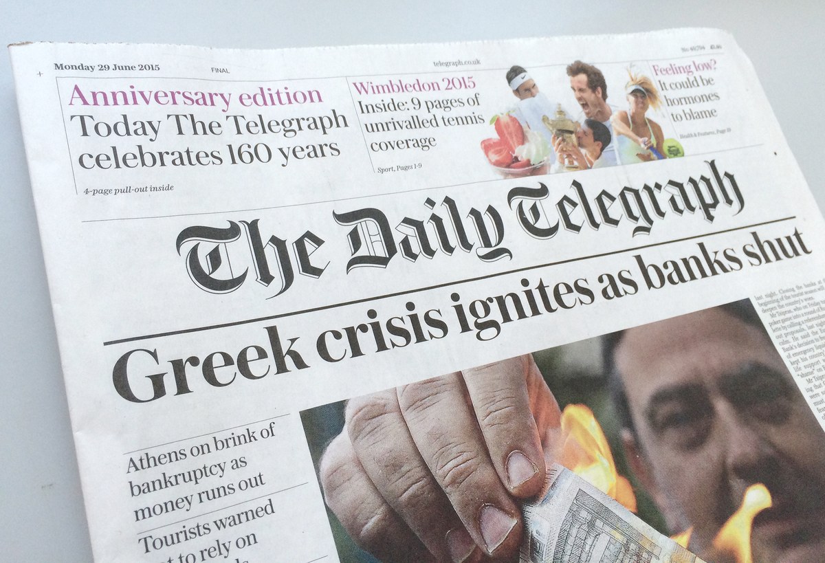
The Daily Telegraph has undergone a design transformation to mark its 160th anniversary. Under the guidance of design director, Jon Hill, one of the last remaining quality daily broadsheets in the UK has a completely new typographic dress from Commercial Type. Working closely with Hill was Commercial Type partner, Paul Barnes, who has developed two new type families as well as designing the new title piece.
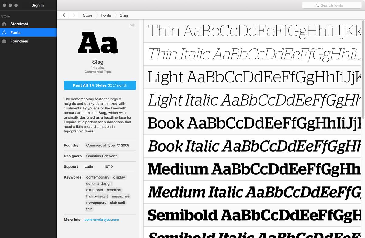
Fontstand, a new service for testing fonts and renting font licenses, has launched today with over 20 independent type foundries participating, including Commercial Type.
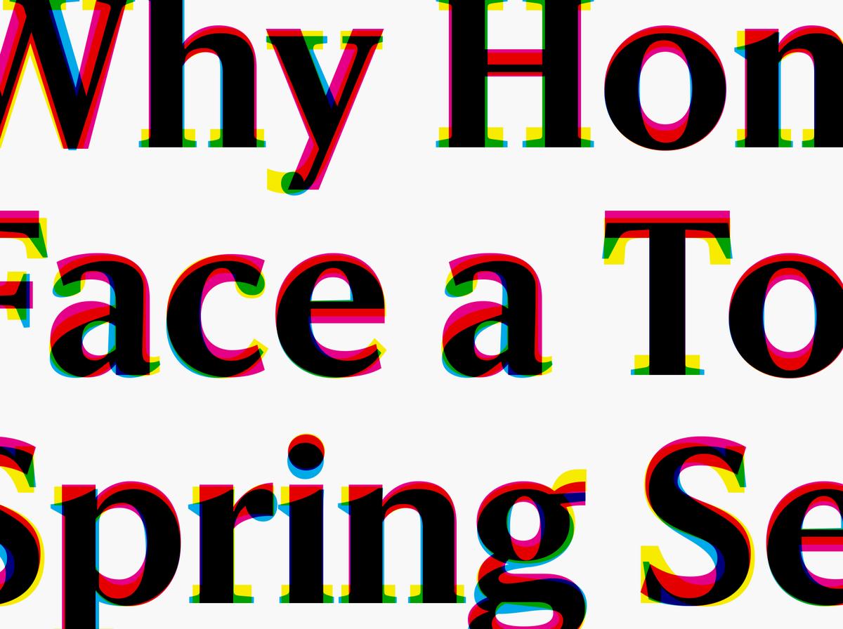
The McClatchy Company publishes 29 daily newspapers across the US. Working with Garcia Media, they have spent the last year developing a unified design language that will bring together the print papers, mobile apps, and web editions with a more consistent overall look. We designed a set of typefaces that will help to bridge the gap between design consistency and individual character.

Berton Hasebe has added two new families to the Druk collection: Druk Text and Druk Text Wide. These families are designed to be useful for the small elements of display typography that give structure and texture to a page without requiring dramatic changes in scale. Each is comprised of 4 weights with italics.