Druk Text by Berton Hasebe
Berton Hasebe has added two new families to the Druk collection: Druk Text and Druk Text Wide. These families are designed to be useful for the small elements of display typography that give structure and texture to a page without requiring dramatic changes in scale. Each is comprised of 4 weights with italics.
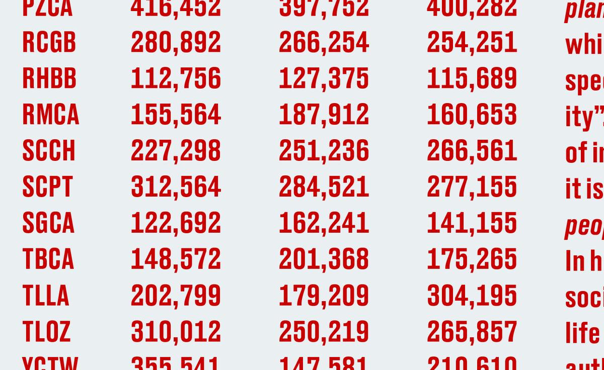
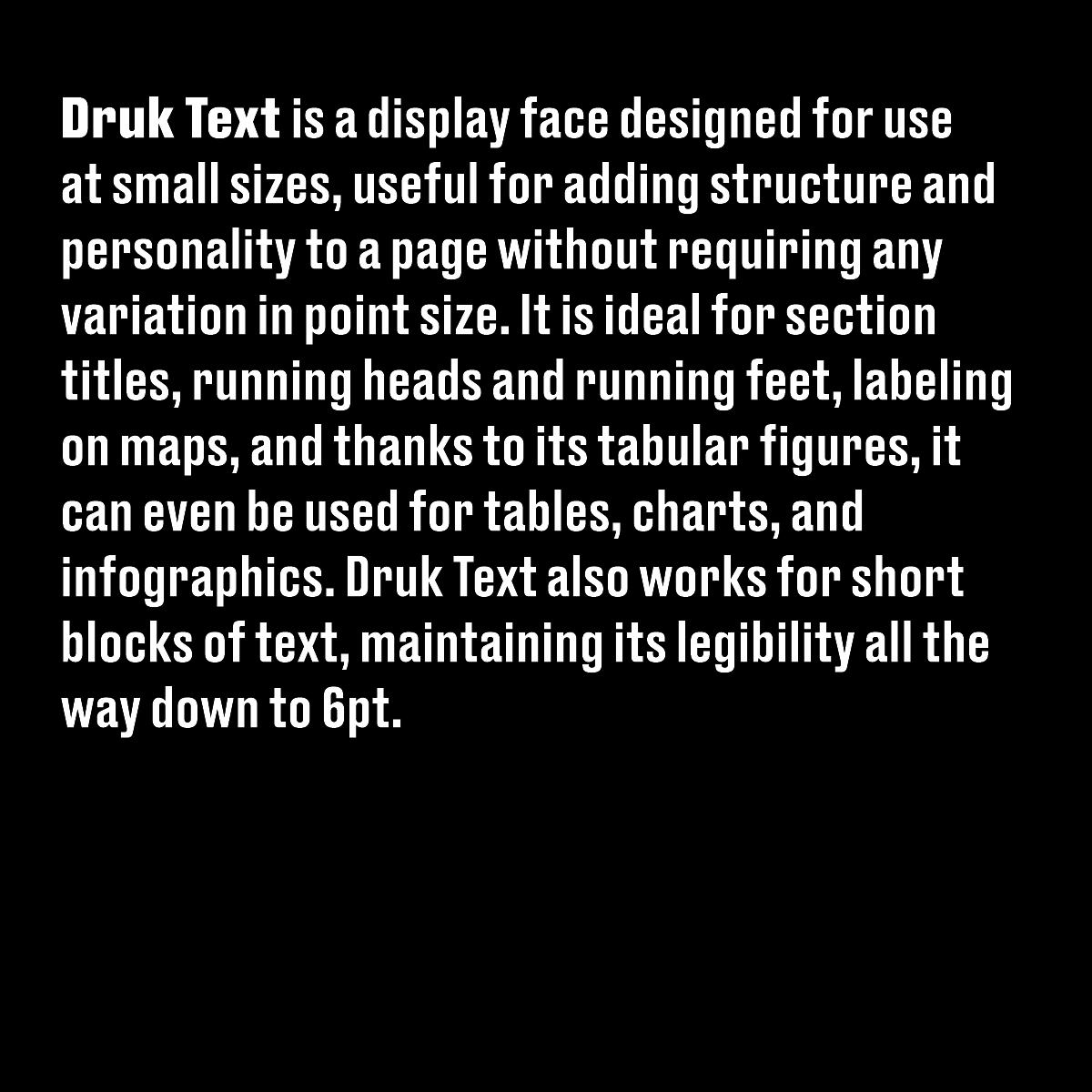
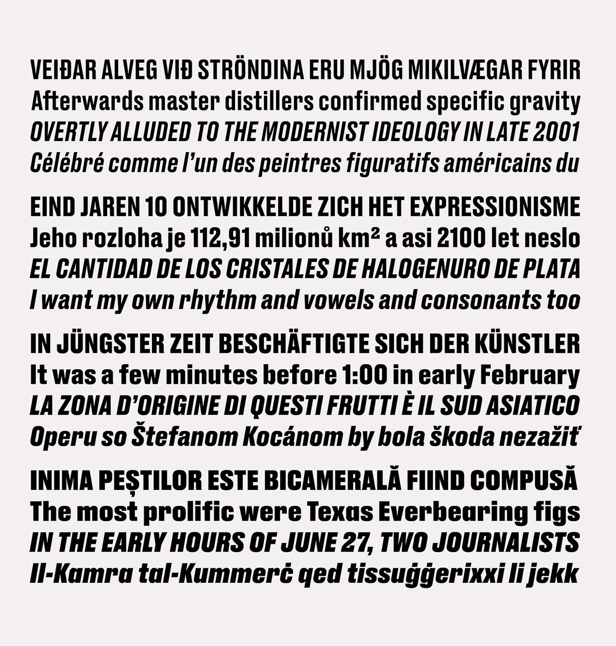
Druk Text is a display face designed for use at small sizes, useful for adding structureand personality to a page without requiring any variation in point size. The family is ideal for section titles, running heads and running feet, labeling on maps, and thanks to its tabular figures, it can even be used for tables, charts, and infographics. It also works for short blocks of text, maintaining excellent legibility all the way down to 6pt.

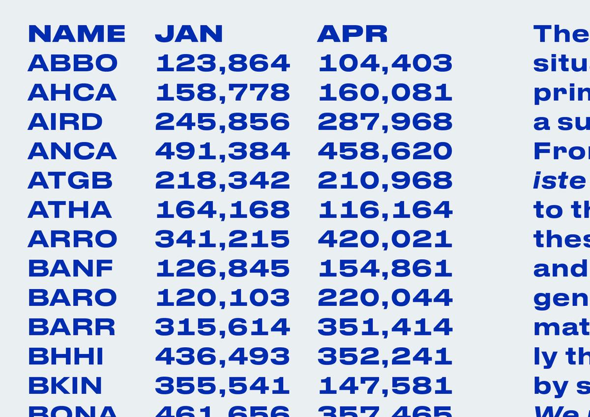
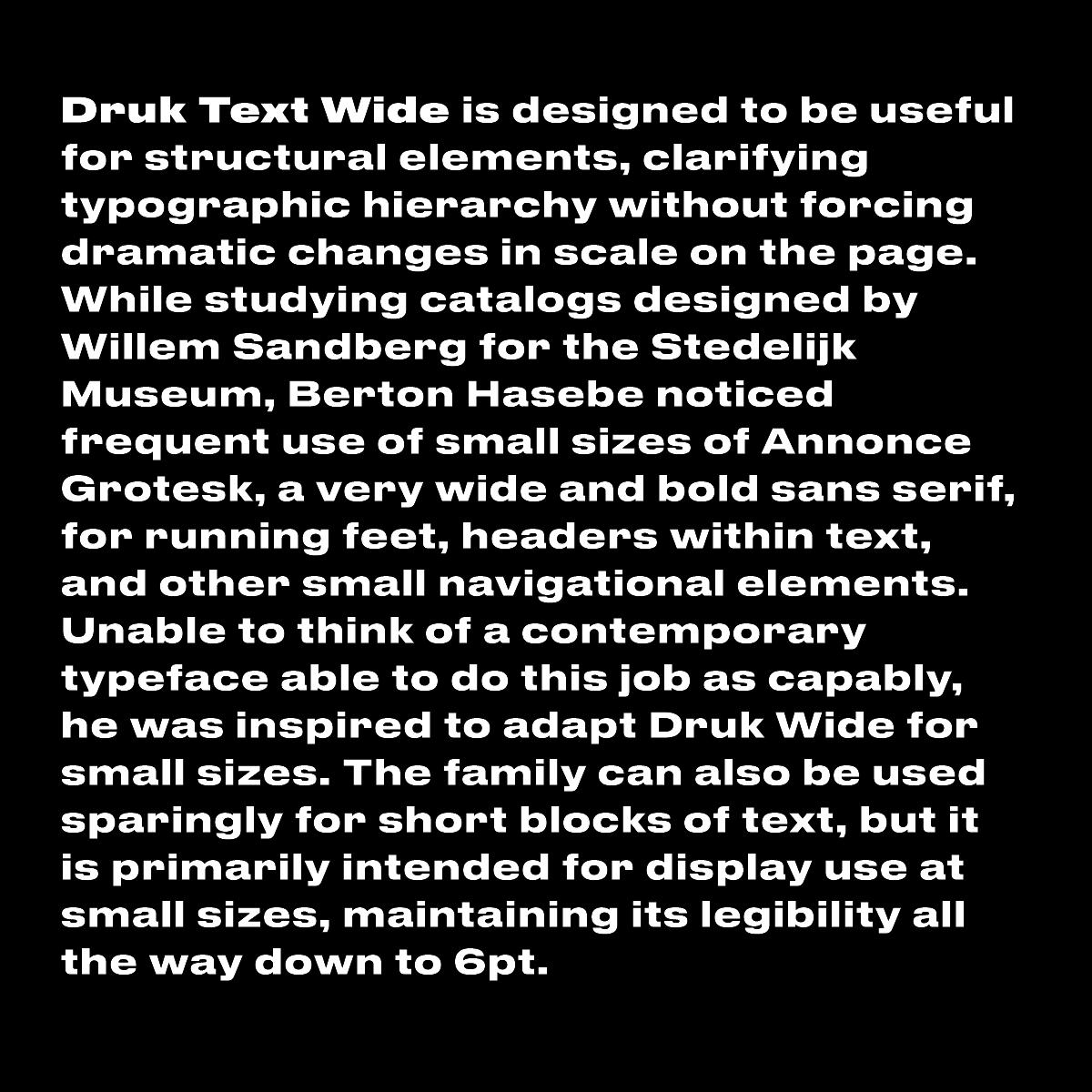
While Druk Text was designed to fulfill a general functional need, Druk Text Wide has its roots in a specific era of graphic design. While studying catalogs designed by Willem Sandberg for the Stedelijk Museum, Berton Hasebe noticed frequent use of small sizes of Annonce Grotesk, a very wide and bold sans serif, for running feet, headers within text, and other small navigational elements. Unable to think of a contemporary typeface able to handle this job with the same ease and panache, he was inspired to adapt Druk Wide for small sizes. Druk Text Wide can also be used sparingly for short blocks of text, but it is primarily intended for display use at small sizes. Like Druk Text, it maintains its legibility all the way down to 6pt and below.
Though Druk Text has a decidedly condensed proportion, and feels extremely narrow at small sizes, the family is much wider and sets much looser than Druk. In addition to the change in proportion and tracking, terminals on characters like a, e, and s have been opened up to maintain legibility at small sizes, and small details and punctuation have been exaggerated for clarity. Druk Text Wide, on the other hand, appears quite wide and heavy in comparison to a typical text typeface, but the family is considerably narrower and lighter than Druk Wide, and also has shorter terminals for more open apertures. The Super weight of Druk Text Wide first appeared in the Etc section of Bloomberg Businessweek, bringing complexity and the same distinctive personality to small type that Druk Wide brings to the large headlines.
Druk Text and Druk Text Wide are available for use on the desktop, for self-hosted web use, and for embedding in mobile apps.
