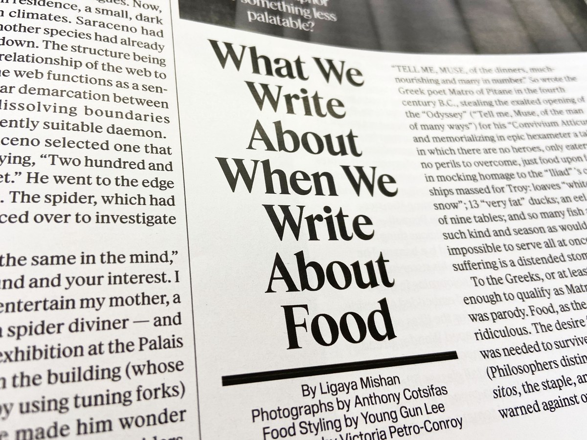
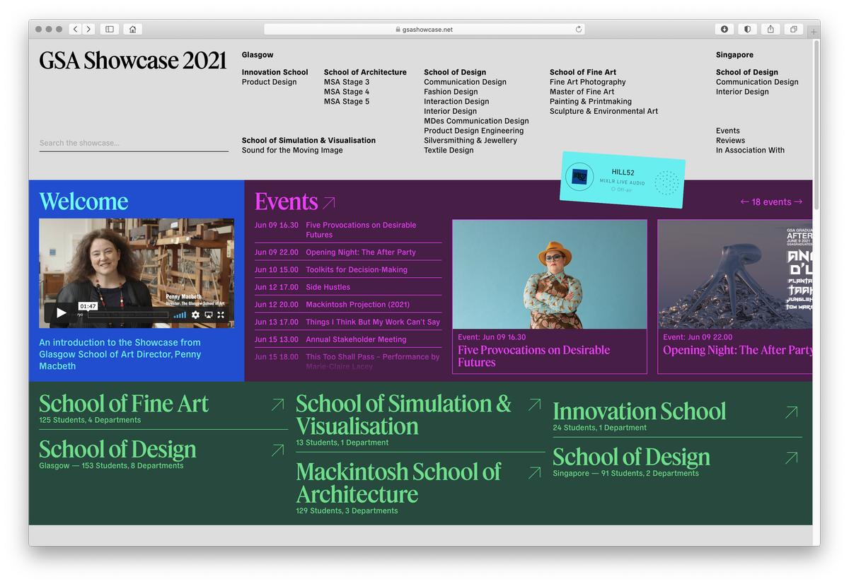
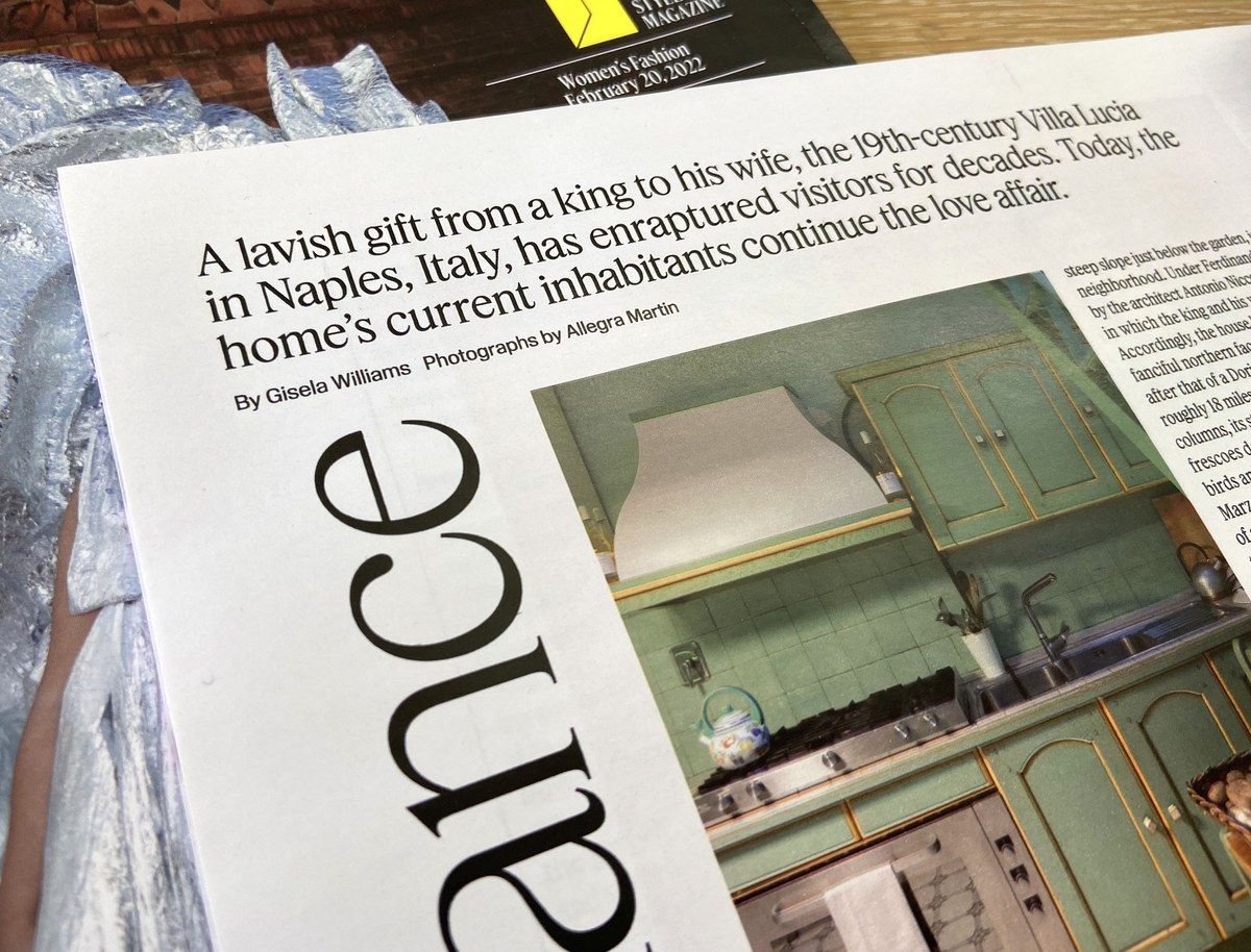
Feature by Berton Hasebe and Christian Schwartz
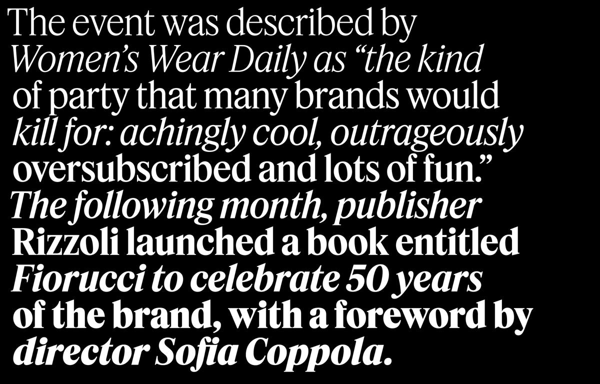
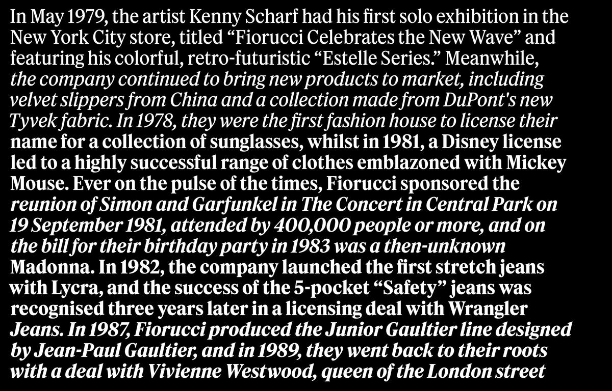
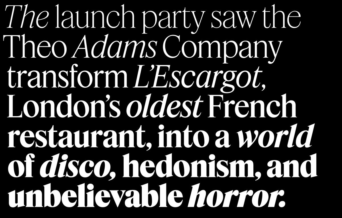
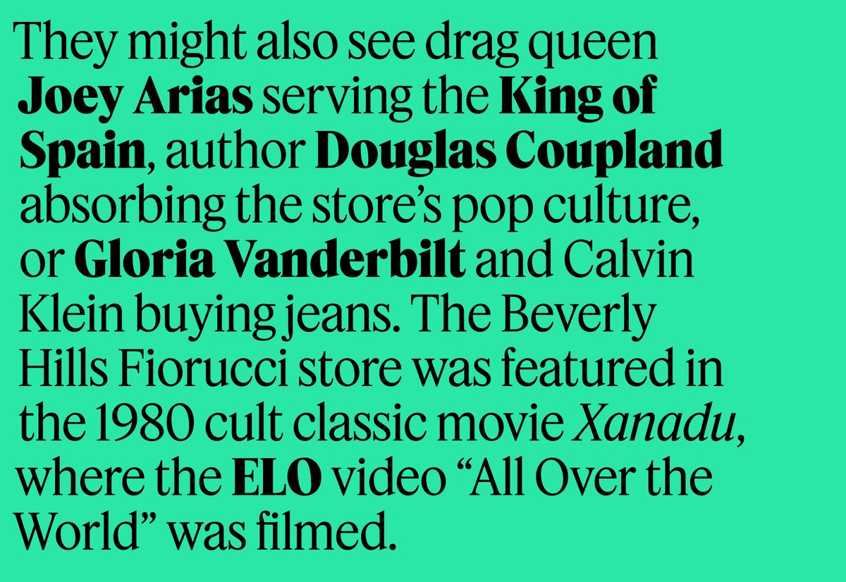
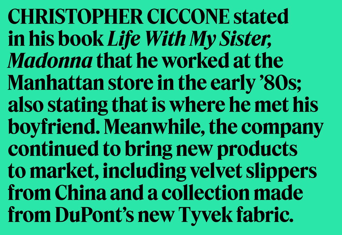
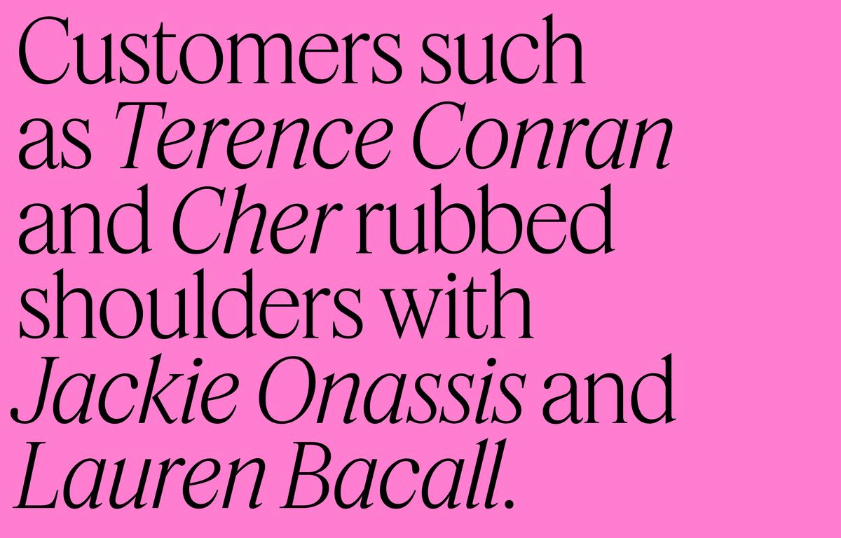
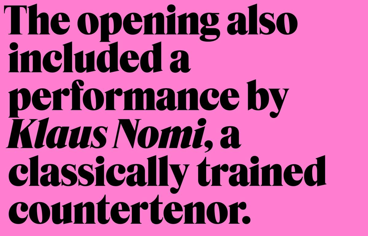
Christian Schwartz and Berton Hasebe originally designed the sober, dense, genre-bending Feature for T: The New York Times Style Magazine. Times-ish at a glance, Feature introduces subtle, lighthearted twists and turns that make it anything but default, and recommend it for applications well beyond editorial work. It knows how to deliver seriousness, but also serious fun, and is pretty almost in spite of itself—a gritty flower pushing through a crack in concrete.
When novelist Hanya Yanagihara took over as editor in chief of T in 2017, she pushed for a radical rethinking of the book from front to back. Under the creative direction of Patrick Li, T went from being airy and image-driven to being visually dense and packed with words. Li asked Christian Schwartz and Berton Hasebe, who had worked with him on the magazine’s previous incarnation, to create a flexible typographic system consisting of a serif and a sans that could comfortably toggle between starring and supporting roles, depending on the content. In response, Hasebe drew the blunt, iconoclastic Review (formerly known as Kippenberger); and together Hasebe and Schwartz designed the dark, narrow serif Feature (née Fact), which has been expanded by Hrvoje Živčić for this release.
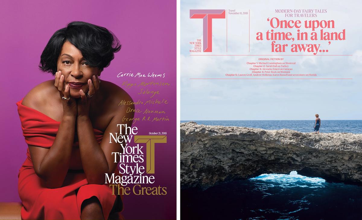
Covers from 2018.
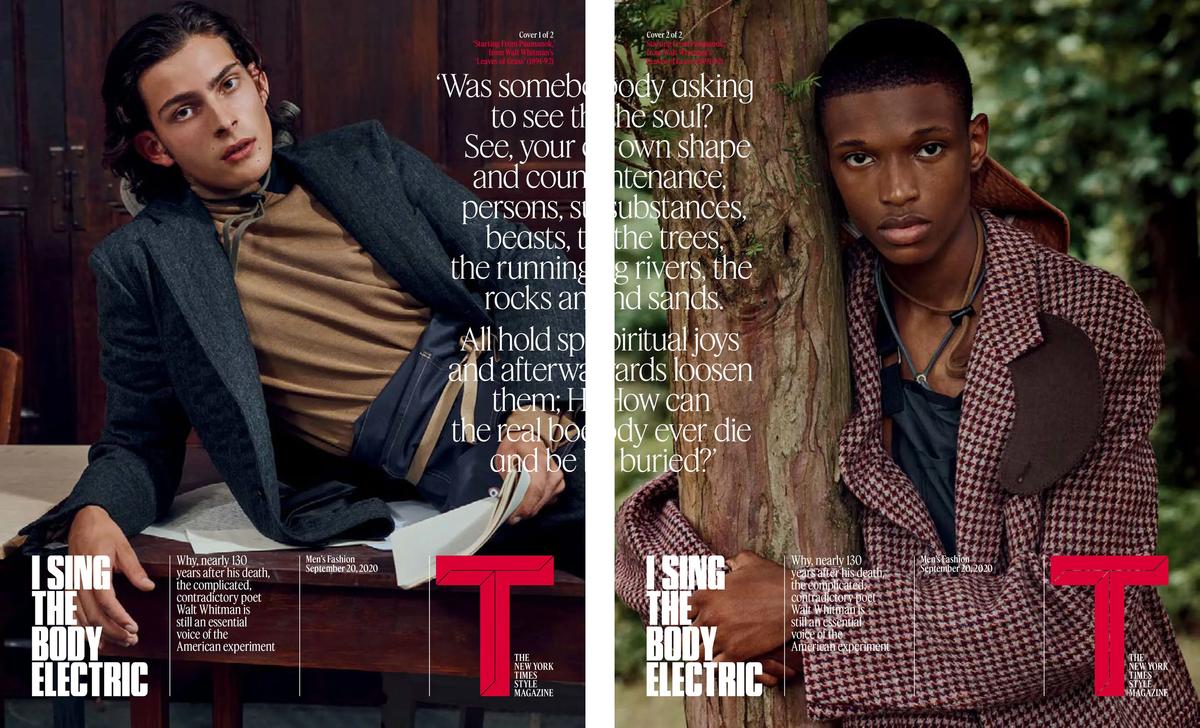
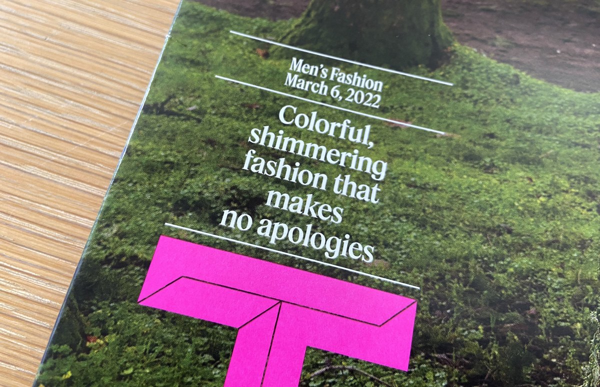
Covers from the Fall 2020 Men’s Fashion Issue.
Review and Feature share the same vertical proportions and can effectively appear on the same line, even theoretically within the same word, but their personalities operate in counterpoint. Review has no problem hogging space (and the limelight), but Feature needed to economize, to cram as much information as possible into its forms, to go to the brink of being a condensed typeface without actually looking condensed. The references Li and his team sent to Schwartz and Hasebe focused on a fruitful period in the sixties and seventies that produced Herb Lubalin’s covers for fact, Karl Gerstner’s grid systems, DIY zines hurriedly thrown together with dry-transfer lettering and strips of phototype, and various iterations on Times New Roman from Photo-Lettering, Inc. in New York and its peers in Europe.
The source material kept circling around Times New Roman and the idea of a certain defaultness. It also gave rise to an ontological question: Is Times New Roman a typeface or a genre? Perhaps it is both—a design so successful that it becomes a de facto default, spawning countless spin-offs.
Initially, Schwartz and Hasebe contemplated drawing a variation on Matthew Carter’s NYT Imperial (based on Edwin Shaar’s Imperial from the 1950s). It would be gutsy and unexpected, they thought, to port the New York Times’s primary typeface into a fashion and style context. Such a move would provide continuity between T and the rest of the paper, and would align with Yanagihara’s conviction that politics, culture, and fashion are not only inextricably bound up with one another, but also currently in crisis. Culture, according to Yanagihara’s vision, called for a newsy typeface.
But Schwartz and Hasebe ultimately abandoned the idea of an Imperial remix. After all, T, though part of the New York Times, is also very much an autonomous publication. As such, it demanded its own voice. So Schwartz and Hasebe went back to Times New Roman, also studying Time-ish designs like Francesco Simoncini and Wilhelm Bilz’s 1965 Life typeface and Brendel Type Studio / Typeshop Collection’s seventies typeface Riccione. Times New Roman may have acquired the status of a default in our culture at large, Schwartz and Hasebe reasoned, but it doesn’t really enjoy that status within the culture of the New York Times. Modeling T’s new text face on this default newsy serif might give T just the amount of separateness from the rest of the paper it needed, while still conveying the sort of immediacy imparted by a typeface like Imperial.
The initial drawings seemed a bit too static, too referential—a composite of all of the Times New Romans that had ever been done. Schwartz and Hasebe started experimenting. They exaggerated the stress angle, giving Feature a consistently angled contrast that pushed out extra white space and made the face feel darker and denser. They also made the contrast lower and lower in the main strokes, but heightened it in the serifs. This sort of mismatched contrast between strokes and serifs is somewhat unusual, and gives a distinctive rhythm and tension to blocks of text. Angling the head serifs was another adjustment that corresponded to the overall diagonal contrast and made Feature feel more dynamic. And adding floppy, organic terminals to characters like a, c, and r gave Feature the final push it needed to assume its own voice. The trick was not to fall headlong into easy tropes of what a fashion typeface “should” look like (high contrast, hairline serifs, round ball terminals), but rather to allude to just enough of those tropes to give a Times-ish design plausibility as a fashion typeface.
Whereas most of the collection can be read as a sort of survey of Timeses, the italics, newly drawn by Hrvoje Živčić, set Feature apart. Hewing more closely to the italics of Simoncini and Bilz’s Life, Feature’s italics are weirdly stiff, playfully mixing cursive and sloped roman forms.
Feature consists of three optical sizes—Text, Deck, and Display—for a total of thirty styles (fifteen weights with matching italics). The Display and Deck each have a condensed companion in four weights as well, currently available in the Commercial Type Vault while the families are being prepared for official release. The Text cut includes small caps, and all three families come with lots of alternates, such as a Q with a tucked-up tail that sits on the baseline for setting tight lines of caps, a fancy quadruserif W, a Saturday Night Fever R, a wide-stance M, and other forms that can be switched on to make the face harmonize better with Review, Feature’s strategic complement.
