Visa Dialect, a new sans for Visa
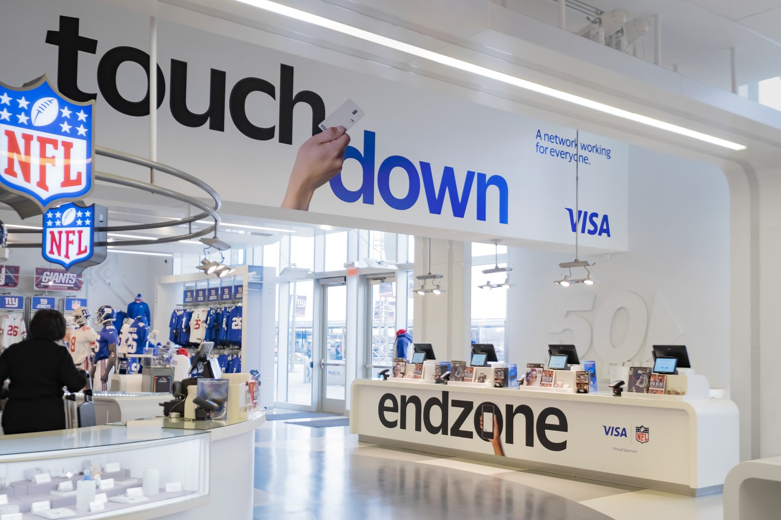
Visa, a multinational financial services company based in San Francisco, is known for its branded credit and debit cards with their distinct blue and yellow stripes. In late 2020, they appointed international design group Mucho to lead a rebranding of the organization. For this project, led by the San Francisco offices creative director Rob Duncan and creative consultant Brett Wickens, Commercial Type was commissioned to create a set of typefaces that would form a central part of Visa’s refreshed identity. The new typeface would have to meet the challenges of an organization that conversed equally in print and on screen. It would also need to work well for both information and corporate communication, and to play a prominent role in advertising, particularly in sponsored events such as the FIFA World Cup, the Olympics, and the Super Bowl.
The typeface that Commercial Type partner Paul Barnes and designer Thomas Bouillet have created is a modern humanist-style sans serif, Visa Dialect. It replaces Visa’s previous corporate typefaces, Open Sans and Roboto, which were viewed as having little distinction to the public. Working closely with Duncan and Wickens, Barnes and Bouillet designed a typeface that balances the need to have a legible and trustworthy style with the desire for a certain amount of distinctiveness. Visa Dialect is an open and rounded sans serif that has gently angled and flared terminals, with the added warmth of rounded dots.
The public first got a glimpse of the typeface during the 2022 Winter Olympics in Beijing, and it will continue to be rolled out worldwide.


