Commercial Type
Please turn your device to landscape orientation to view the pin tester

Select Fonts

Selected Good

End User License Agreement

1.

This End User License Agreement (the “Agreement” “EULA,” “License,” “Agreement” or “License Agreement”) is a legal agreement between the Licensee (you) and Schwartzco, Inc., d/b/a Commercial Type (collectively, “Commercial Type”) and becomes a binding contract between you and Commercial Type when you access, install and/or use the Commercial Type Font Software (“Font Software” or “Fonts”). This Agreement governs the terms of use the Font Software and the design of the Fonts embodied therein (collectively, “Font Software”), for, among other uses, use in multi-use methods, large scale multi-user commercial uses, as well as simple uses such as individual desktop only uses. This License also controls the use and distribution of any media, electronic documentation, updates, add-ons, artwork, web services and/or the form of proprietary technology used to implement use of the Fonts as exists now or in the future. This Agreement becomes effective (a) when you “accept license agreement,” or when you open the electronic file in which the Font Software is contained. If you do not wish to enter into this Agreement, do not purchase, access, download and/or install or otherwise use the Font Software.

What this section means

Please read this document carefully, because you agree to its terms by installing the font software.

2.

(a) Upon payment in full, Commercial Type will grant you a non-exclusive, terminable License to the Font Software that accompanies this EULA. Use of the Font Software is limited to the specific uses permitted in your purchase receipt. All Commercial Type licenses are for use by the identified Licensee (You) only. Transfer or export or use of the Font Software by third parties is not permitted. For the purposes of this Agreement, “Font Software” shall be defined as the design of the Fonts together with the Font Software which, when used generates the typeface, typographic designs and, if included in the Font Software, ornaments or other designs. 

(b) The types of licenses offered by Commercial Type include, but are not limited to:

i. Use for Creation – Desktop. Under this license you are permitted to (1) Use fonts installed to a desktop computer for creating printed material or images; (2) embed the Fonts in non-editable documents. 
Such uses include internal documents, company letterhead, production of a newspaper, magazine, book or other paper publication, print advertising, broadcast advertising, film titles, social media posts, signage, packaging, and point of sale displays.

ii. Uses for Creation with Distribution Rights. Under this license, the Font Software is bundled with and distributed as part of the licensed uses and includes: (1) App License; (2) Web License; (3) ePub License; (4) Software Embedding License; (5) Device Embedding License; (6) Automated Document Production Server License; (7) Embedded Content License.

iii. Add-on or License Extensions. If the proper license extension is purchased, you are permitted to: (1) use the Font Software to produce merchandise for sale, including alphabet-themed products; (2) embed the Fonts in editable documents; (3) use the fonts in external third party platforms; (4) share the fonts with third parties doing work on behalf of Licensee.

iv. Use of the Font Software with Generative or other Artificial Intelligence (“AI”) services or in other AI programming is expressly prohibited.

PLEASE READ: To understand the terms and conditions associated with a particular type of license, review the Attachment to this agreement. The relevant terms and conditions in the attachment form a part of this agreement.

What this section means

This paragraph outlines what kind of usage is permitted with each kind of licensing that may be purchased. The receipt and license document delivered with the fonts will list what usage you are licensed for, and at what license levels (i.e. the number of users permitted by a desktop license, the number of domains and unique visitors per month permitted by a web license, etc.). Your user account on this website will also give a record of the licenses you have purchased and the usage permitted under each of them.

If you are uncertain whether a particular use is permitted under the license you have purchased, please contact us at info[at]commercialtype.com for assistance.

3.

FONT SOFTWARE DELIVERY. The Font Software will be transmitted, as necessary, to Licensee via Internet download for use on the computers and, if applicable, on the websites of Licensee in the (i) WOFF and WOFF2 Web Font formats; (ii) in the Open Type Format for Desktop use and; (iii) in TrueType Format for Application (“App”) uses as specified by the license purchased. Commercial hereby agrees to provide amended or updated Webfonts and/or Font Software, upon the request of Licensee, in the event generally accepted and commercially used software and/or Internet browser formats change in response to technology innovation.

What this section means

The fonts will be delivered in different formats depending on the license you have purchased.

4.

If you are a design consultancy, advertising agency or purchasing this license for use by or on behalf of such an entity, the ultimate end user should also purchase a license appropriate for their intended use of the Font Software. The license granted herein for personal use extends to temporary employees or independent contractors using the Font Software only so long as they are providing professional services expressly for the benefit of Licensee. 

What this section means

A license may not be shared by multiple companies (i.e. both a designer and his or her client). We make an exception for a freelancer working on behalf of a licensed client as an individual may use the fonts during the course of a project must purchase a separate license if they wish to use the fonts for other projects after the completion of the gig.

5.

Commercial Type, its successors, and assigns expressly retain all right and title in and to the Font Software together with the design of the Font embodied therein, together with any trademarks used in connection therewith. Except as may be otherwise expressly permitted herein, you agree not to copy the Font Software or create derivative works based upon the design of the Font or the Font Software. You hereby agree that the design of the Font and the Font Software are the exclusive property of Commercial Type and that the unauthorized use of the design of the Font or the Font Software is an infringement of Commercial Type’s exclusive rights and causing significant monetary harm. All rights not expressly granted herein are reserved to Commercial Type. Commercial Type’s rights and remedies in the event of an infringement shall be cumulative in nature.

What this section means

This license grants you the right to use our fonts and to make a copy of the files for backup purposes, but the fonts (both the software describing the design and the design itself) belong to us. You are not allowed to give copies to your friends, family or clients, and you may not modify the fonts without written permission from us.

6.

Except as may be otherwise expressly permitted herein, you may not alter or copy the Font Software, or the designs embodied therein in any manner whatsoever. Reformatting the Font Software into other formats for use in other operating systems is expressly prohibited. Upon payment of an additional fee and a separate written agreement Commercial Type may provide the Font Software in alternate and/or additional font formats, contact Commercial Type for a quotation. Altering or amending the embedding bits characteristics of the Font Software is expressly prohibited. The Font Software may not be used to create or distribute any electronic document in which the Font Software or any part thereof, is embedded in a manner or format that permits editing, alterations, enhancements, or modifications by the recipient of such document, unless a license that permits such use has been purchased. You may not knowingly transmit any electronic document or the Font Software to any party that intends or is likely to “hack,” edit, alter, enhance, or otherwise modify the Font Software or remove the Font Software from any document.

What this section means

You will need written permission from us before making any kind of modifications to a font which you have licensed from us, including renaming the font or converting it into a different format, in part because we aren’t able to support fonts we haven’t built and tested ourselves. Please contact us at info[at]commercialtype.com for more information.

7.

You may make one (1) back-up copy of Font Software for archival purposes only, and you agree to retain exclusive custody and control over any such copy. Upon termination of the Agreement, you must destroy the original and all copies of the Font Software. The unauthorized sharing, lending, renting, sale, or other unauthorized use or misuse of the back-up copy is a material breach of this Agreement and will result in the immediate termination of this License.

What this section means

You may make a copy of the font files for backup purposes, but you may not give, lend, or sell copies to your friends, family, clients or especially to strangers.

8.

If no other option exists, you may take a digitized copy of the Font Software used for a particular document, or Font Software embedded in an electronic document that is sent to a commercial printer or service bureau for use by the printer or service bureau for preparing the document, provided that the printer or service bureau represents that it shall destroy any and all copies of the Font Software upon completion of its work. Notwithstanding, you agree that the transmission of a “print/preview” pdf document is the first and preferred method of transmitting such documents to a service bureau or printer.

What this section means

If making a PDF is not an option, you may deliver a copy of the fonts to a service bureau or printer for final output. The service bureau must destroy the fonts when they are finished with the job.

9.

The designs embodied into the Font Software, the Font Software itself, and any trademarks associated therewith are the exclusive property of Commercial Type and their designers, where applicable, and are protected by the copyright and other intellectual property laws of the United States, by the copyright and design laws of other nations, and by other international treaties. Any copies that you are expressly permitted to make, pursuant to the Agreement, must contain the same copyright, trademark, and other proprietary notices that appear on or in the Font Software.

What this section means

This license grands you the right to use our fonts, but we retain ownership of both the font design and the font software.

10.

With the exception of subsetting webfonts, you agree not to create, assist in and/or cause the creation of modifications or additions to the Fonts or Font Software, including but not limited to: creating additional weights; creating additional or deleting existing characters; modifying existing characters; modifying font spacing and kerning; converting fonts to an alternate digital format, modify, adapt, translate, reverse engineer, decompile, disassemble, alter, or otherwise attempt to discover the source code of the Font Software without first obtaining written permission from Commercial Type. In the event that permission is given to you, the modifications must be used according to the terms and conditions of the License you purchased and all modifications and additions shall become and shall remain the sole and exclusive property of Commercial Type. You may not sell, lend, or otherwise transmit any modifications or additions to the Font Software to any third party. You agree that any webfonts not directly provided by Commercial Type, such as webfonts that have been subset by Licensee will be supported at Commercial Type’s sole discretion.

Other jurisdictions may provide for additional rights, and if applicable, you may reverse engineer or decompile the Font Software only to the extent that sufficient information is not available for the purpose of creating an interoperable software program (but only for such purpose and only to the extent that sufficient information is not provided by Commercial Type upon written request). All trademarks shall be used in accordance with accepted trademark practice, including identification of the trademark owner’s name. Use of the trademarks associated with the Font Software inures solely to the benefit of Commercial Type.

If you are unsure whether your use of the Font Software is specifically permitted under this Agreement, contact Commercial Type. All uses of Commercial Type Fonts require a license.

What this section means

You can subset webfonts licensed from us, but you will need written permission from us before making any other kind of modifications or additions to a font which you have licensed from us, or hiring anyone else to do so. We can only support the font files we provided, meaning that if you subset your own webfonts, we can’t support them. If you require modifications to a font, we can do the work for you quickly and at a reasonable cost. Please contact us at info[at]commercialtype.com for more information.

11.

Commercial Type Font Software is licensed for use by a specified number of users and for specified uses.

What this section means

This license is not limited to one geographical location; a company with multiple locations may share one font license for all employees so long as they are within the number of licensed users.

12.

Except as may be otherwise expressly provided for herein, you expressly agree not to rent, lease, sublicense, give, lend, or further distribute the Font Software. 

What this section means

You may not give or lend copies of the font files to anyone else, unless you transfer the license to the third party (along with a copy of this EULA and all other documentation that may have been included with the fonts) and destroy all copies of the font files in your possession, including backups.

13.

Commercial Type warrants that the Font Software will perform substantially in accordance with its documentation for ninety (90) days following delivery of the Font Software. To make a warranty claim, you must either return the Font Software to the location from which you obtained it together with a copy of your sales receipt or, if acquired on-line, contact the on-line provider with sufficient information regarding your acquisition of the Font Software to permit the confirmation of the effective date of this License. Schwartzco, Inc. and Commercial Type hereby EXPRESSLY DISCLAIMS ALL WARRANTIES, EXPRESS AND IMPLIED, INCLUDING, BUT NOT LIMITED TO, THE IMPLIED WARRANTIES OF MERCHANTABILITY AND FITNESS FOR A PARTICULAR PURPOSE. COMMERCIAL TYPE DOES NOT WARRANT THAT THE OPERATION OF THE FONT SOFTWARE WILL BE UNINTERRUPTED OR ERROR-FREE, OR THAT THE FONT SOFTWARE IS WITHOUT DEFECTS. UNDER NO CIRCUMSTANCES SHALL COMMERCIAL TYPE BE LIABLE TO YOU OR ANY OTHER PARTY, WHETHER IN CONTRACT OR TORT (INCLUDING NEGLIGENCE) OR OTHERWISE, FOR ANY SPECIAL, CONSEQUENTIAL, OR INCIDENTAL DAMAGES, INCLUDING LOST PROFITS, SAVINGS OR BUSINESS INTERRUPTION AS A RESULT OF THE USE OF THE FONT SOFTWARE EVEN IF NOTIFIED IN ADVANCE OF SUCH POSSIBILITY. You hereby agree that your entire, exclusive, and cumulative liability and remedy shall be limited to the purchase price of this Font Software License. Under no circumstances shall Schwartzco, Inc.’s or Commercial Type’s liability to you exceed either the refunding of the cost of the Font Software License or replacement of the Font Software either of which shall be at Commercial Type’s sole discretion.

What this section means

The fonts will perform as promised in the documentation, and we will provide technical support within a reasonable timeframe, to the best of our ability. In the event of a refund, we cannot refund more than the purchase price for the license, and all copies of the fonts in your possession must be destroyed.

14.

OTHER LAW – CONSUMERS ONLY. Some jurisdictions do not allow the exclusion or limitation of incidental, consequential or special damages, implied warranties, or implied warranties as they relate to sales to consumers. ANY IMPLIED WARRANTY OR OTHER RIGHT CREATED BY LAW IS ONLY EFFECTIVE FOR THE NINETY (90) DAY WARRANTY PERIOD. THERE ARE NO WARRANTIES OR CONDITIONS OF ANY KIND AFTER THE NINETY (90) DAY WARRANTY PERIOD. To the extent permissible by law, you agree that all implied warranties are not to be effective for more than thirty (30) days.

What this section means

This paragraph is required by law and simply means that any warranty (explicit or implied) is limited.

15.

You expressly agree that this Agreement shall be governed by the laws of the State of New York, USA, as they apply to contracts entered into and wholly performed therein and without respect to its conflict of laws provisions or the conflict of laws provisions of any other jurisdiction. You expressly submit to the personal jurisdiction of the state and federal courts in the State of New York, USA, agree to waive any defenses arising out of the selection of jurisdiction or venue and further agree to service of process by mail. You hereby expressly agree that the application of the United Nations Convention of Contracts for the International Sale of Goods is expressly excluded.

What this section means

Our main office is in New York City, so this agreement is governed by the laws of New York State.

16.

You acknowledge that you have read and understand this Agreement and that by using the software you agree to be bound by its terms and conditions. You further agree that it is the complete and exclusive statement of the agreement between Commercial Type and Licensee which supersedes any proposal or prior agreement, oral or written, and any other communications relating to the subject matter of this Agreement. No variation of the terms of this Agreement or any different terms will be enforceable in the absence of an express written amendment, or consent, including a written express waiver of the affected terms of this Agreement. If any provision of this Agreement is declared by a court of competent jurisdiction to be invalid, void, or unenforceable, the remaining provisions of this Agreement shall continue in full force and effect, and the invalid provision shall be replaced by Commercial Type with a provision that effects the intent of the invalid provision. Commercial Type expressly reserves the right to amend or modify its License Agreements at any time and without prior notification.

What this section means

Again, please read this document carefully, because you agree to its terms by installing the font software.

17.

The Agreement shall automatically terminate in the event You or any authorized user breaches any term or condition set forth herein. Notwithstanding any termination of this License, Commercial Type expressly reserves all other rights and remedies under equity or law. The Agreement may only be modified in a writing signed by an authorized officer of Commercial Type.

What this section means

If any of the terms in this agreement are broken, the license is no longer valid. We will notify you in writing if the EULA changes.

18.

You agree to be responsible for compliance with all laws, foreign and domestic relating to the control of exports or the transfer of technology. If you are purchasing this License for government use, or under a government contract, you agree to familiarize yourself with and follow any applicable rules and regulations relating to the purchase of a license to use software and the actual use thereof.

All inquiries and arrangements for returns, if any, may be sent via e-mail to info[at]commercialtype.com. The Commercial Type website is located at commercialtype.com.

©2023 Schwartzco, Inc. d/b/a Commercial Type. All Rights Reserved.

What this section means

You agree to follow the law and other applicable rules in your use of this font license.

19.

ATTACHMENT TO END USER LICENSE AGREEMENT

Your license may include these Types of Uses, if purchased. See the receipt and license document delivered with the font files for details. Some of these license types may not be purchased via this website.

Please contact info[at]commercialtype.com for details and pricing.

Creation with Distribution Licenses

  1. App License

    1. Allows for embedding in Applications or Apps using the iOS, Windows Mobile, and Android mobile operating system formats.

    2. License is per individual title, without restriction as to the type of OS.

  2. Web License

    1. Use the Font Software to style HTML and SVG documents using the CSS @font-face mechanism.

    2. Use in email permitted, with fonts served from licensee’s server.

    3. License covers a discrete number of domains, with unlimited subdomains permitted for each.

    4. License covers an aggregated total number of unique monthly visitors across all licensed domains.

    5. If the maximum number of allowed unique visitors is exceeded for three (3) consecutive months, the purchase of an additional license is required. Commercial reserves the right to inspect or monitor your usage.

    6. You shall make a reasonable attempt to prevent the use of any process that allows hot-linking, re-serving or re-directing access to and/or use of the Font Software by unlicensed parties. You agree to exercise commercially reasonable efforts to ensure that the Font Software is retained with the other assets associated with the licensed domains.

    7. For the purposes of clarity, the use of third party font hosting services is strictly prohibited and the Font Software should be stored and served from the same devices and location as the other software and assets associated with the licensed domains.

  3. ePub License

    1. For use of the font software to style text in ePubs, for use in any operating system or device in which embedded fonts are supported.

  4. Software/Video Game Embedding License

    1. For embedding the fonts in non-mobile desktop software for use in MacOS, Windows, Linux, etc.

    2. License is per individual title, without restriction as to the type of OS or Platform.

  5. Device Embedding License

    1. For embedding fonts in any type of electronic device.

    2. This License is granted only on a per device basis.

  6. Automated Document Production Server License

    1. This License permits installing the Fonts Software on a server that generates documents automatically, such as bank statements, credit card bills, investment fund prospectuses, among others. 

    2. For creating user-generated content using the fonts, such as logos or templated documents.

  7. Embedded Content License

    1. For content using the font, distributed through content aggregators or ad networks:

      1. HTML5-based advertising.

      2. Embedded content in services such as Facebook Instant, Google AMP, Apple News, etc.

    2. License is for a discrete number of impressions.

    3. For use where the Fonts are hosted on the creator’s server, or CDN.

  8.  Merchandise License

    1. For use in creating merchandise for sale, among others, on goods such as apparel, mugs, housewares in which a logotype or other text set in the typeface is the primary design element;

    2. Promotional items given away for free are covered by the standard desktop license and do not require a merchandise license;

    3. Packaging and point of purchase promotion is covered by desktop license;

    4. Electronic devices, third party software, etc. would require an Embedding license, not a merchandise license

  9. Document-Based Editable Embedding License

    1. PDF embedding is permitted in the standard Desktop License.

    2. This License permits changing the embedding setting from Print & Preview (default) to Editable Embedding, which allows a Font to be embedded in a document which can then be viewed, printed, and edited.

  10. External Platform License (for platform user)

    1. For use of the font on third party platforms and services.

    2. Examples:

      1. Font is loaded onto slides.com for licensee to make templated presentations.

      2. Font is used on website that automates production of business cards for licensee.

    3. Fonts are hosted on the third party server, or shared CDN. No further distribution is allowed.

    4. Content may only be produced/edited by the license holder (fonts cannot be used by the third-party platform or other users of the third-party-platform not authorized by licensee).

    5. Font must be removed from third-party platform upon discontinuation of the third-party services.

  11. Distribution License

    1. Allows for distribution of desktop fonts to a third party who needs to work with the fonts on licensee’s behalf. Subcontractor will receive a desktop license that limits usage to working with the licensing client, along with the standard EULA.

    2. License covers a discrete number of third parties doing work on behalf of licensee simultaneously.

What this section means

This attachment to the EULA details the usage permitted under each license type, some of which can be purchased on this website, and some of which can only be obtained by contacting us and working with our licensing department. Please contact info[at]commercialtype.com for assistance.

Licensee

Shipping

Billing

Select Licenses

Licenses Total

Cart

Your cart is empty
Total

Frame by Paul Barnes

Frame Text Semibold.
Frame Text Bold.
Frame is a face in four weights with italics in text and headline variants. It takes the Caslon model and remakes it with modern proportions and a focus on sharpness.
Frame Head Italic.
Frame Text Roman.
Frame Text Medium.
Frame Text Semibold.
Frame Text Bold.
Frame is a face in four weights with italics in text and headline variants. It takes the Caslon model and remakes it with modern proportions and a focus on sharpness.
Frame Head Italic.

Recycling Caslon

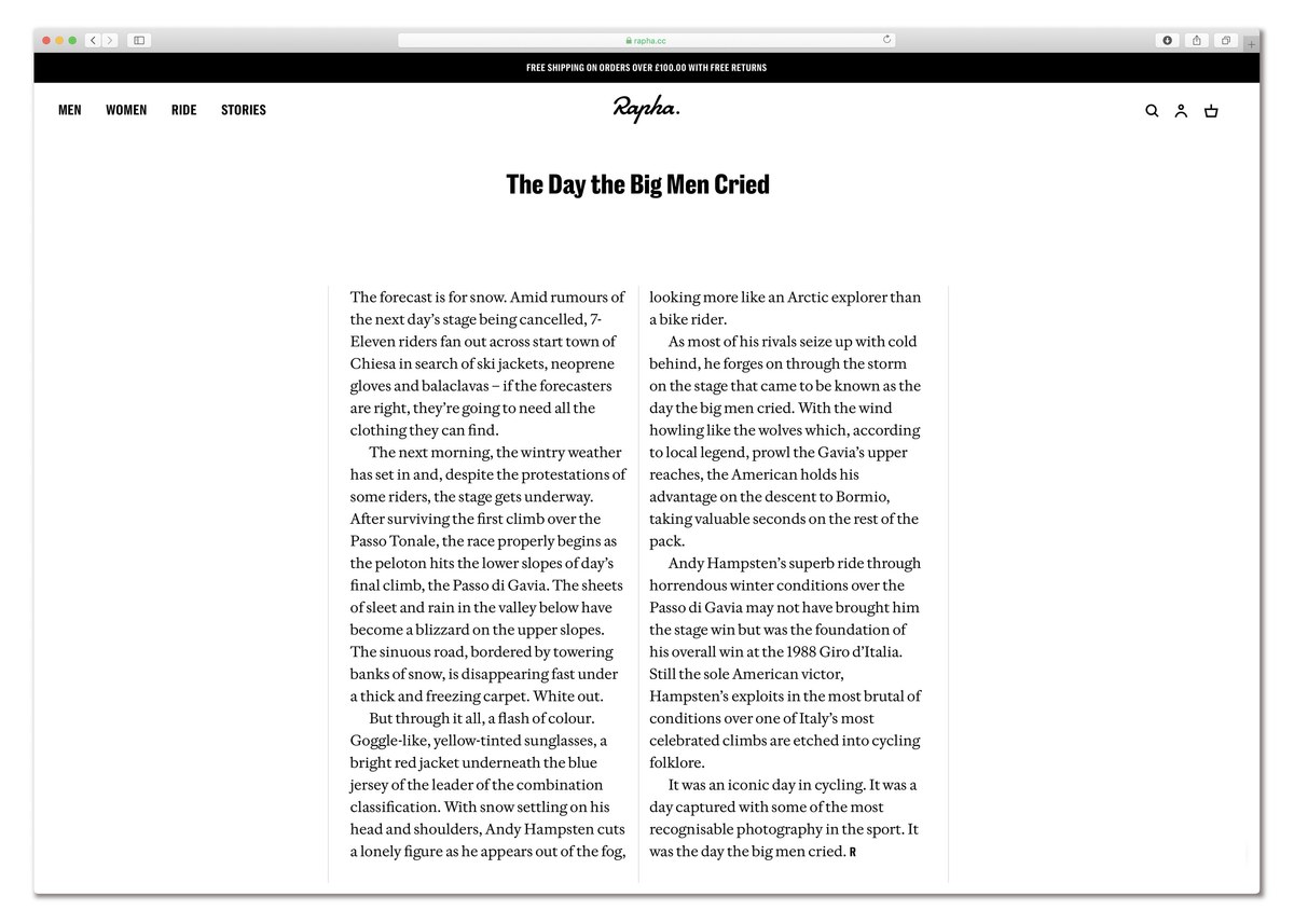
For many years, Rapha had a simple typographic approach: a condensed sans, Trade Gothic, matched with a serif, which in recent years was Adobe Caslon. The company planned to relaunch its website in 2019, with a development of the existing system rather than a wholesale change. Some elements worked, others less so. In the case of Adobe Caslon, though the face had a serious but warm aesthetic, it was uneconomical in headlines due to its relatively small x-height and generous extenders. The brand’s propensity to use italic was not based on an aesthetic choice or its effectiveness as a tool for emphasis, but rather on the italic’s narrowness compared to the roman.

Working with Rapha’s design director, Jack Saunders, Paul Barnes wondered if a new, more economical Caslon that still worked for both text and headlines was possible. What makes a Caslon a Caslon is a well-worn tread many contemporary type designers tackle, and one that Barnes previously avoided for that very reason. But here, new ground and new possibilities were revealed: were the relatively long ascenders and descenders in Adobe Caslon an intrinsic part of Caslon? More importantly, could a new design appear close enough to Caslon to most who would see it, but still differ significantly enough to make the process worthwhile?

In use Frame at home alongside Caslon Doric in Rapha’s editorial web content.
In use Frame at home alongside Caslon Doric Condensed Text in Rapha’s editorial web content.
In use Frame at home alongside Caslon Doric in Rapha’s editorial web content.
In use Frame at home alongside Caslon Doric Condensed Text in Rapha’s editorial web content.
In use Frame at home alongside Caslon Doric in Rapha’s editorial web content.

Cycling and type are natural allies. Both disciplines are highly repetitive activities; whether pedalling across dozens of kilometres or spacing and kerning the same letters, there’s a sense of doing something over and over again. At the professional level, both require dedication and long hours to achieve good results, and often this excellence is regarded as an individual pursuit. Coincidentally, the traditional heartlands of cycling – the Low Countries (the Netherlands and Belgium), France, and Italy – were also centres of printing and typography. Both have a close relationship to their history and legend: just as a type aficionado might know that Claude Garamond created the definitive form of the Renaissance roman, a hardcore cycling fan will recall Eddy Merckx’s seventeenth-stage victory at the 1969 Tour de France. These historical moments are the cornerstones against which we measure other achievements.

As in type, professional cycling has also always had a close relationship with journalism, newspapers, and the wider media. The three major national stage races – the Tour de France (L’Auto, 1903), the Giro d’Italia (La Gazzetta dello Sport, 1909), and the Vuelta España (Informaciones, 1935) – were all initially set up by newspapers to boost circulation, and the press in turn promoted and documented these events. Many races, like the classics Ronde van Vlaanderen (Tour of Flanders) and Omloop Het Nieuwsblad (originally Omloop Het Volk), were also started by newspapers and others, such as Paris-Roubaix, relied on newspapers’ support. From the earliest days of the professional sport, letters and typography were everywhere: on the bikes, riders’ jerseys, the pinned race numbers, and the banners at the start and finish. And just as the clothes, hairstyles, and cars all date the scene, so does the typography.

The evolution of Rapha, 2014: photography has become colour, and Adobe Caslon appears.
The last stage before Frame and Caslon Doric, 2017.
The history of Rapha The earliest incarnation of Rapha, 2004: the script logo and tracked-out all capital sans serif became a key and last signifier of the brand. The black-and-white photos hearken back to the glory days of cycling in the 1950s and 1960s.
The inspiration for Rapha: the original St Raphaël cycling team at the Tour de France in 1962 with its five-time Tour winner centre, Jacques Anquetil. Nationaal Archief, the Netherlands.

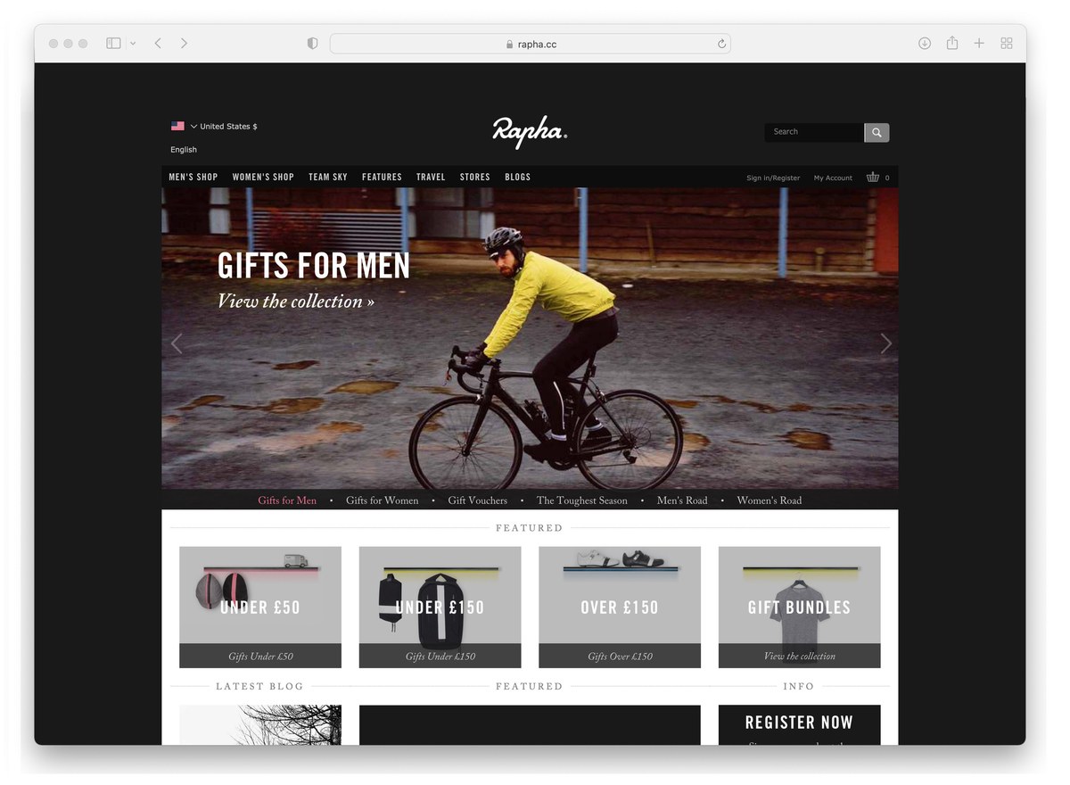
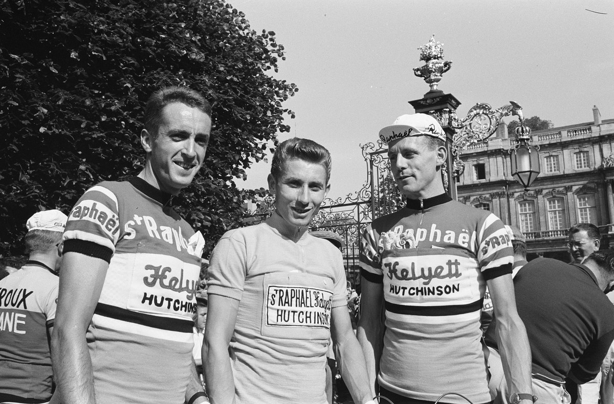
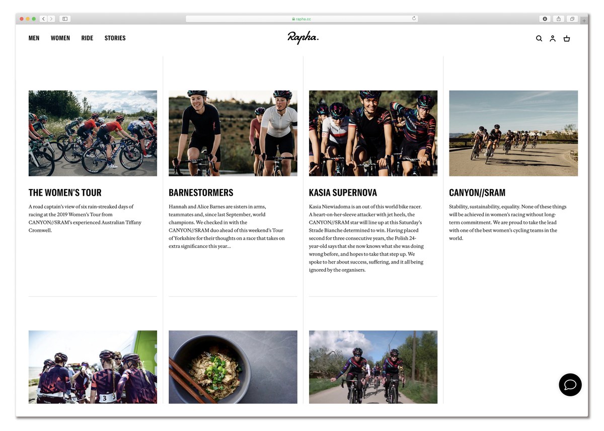
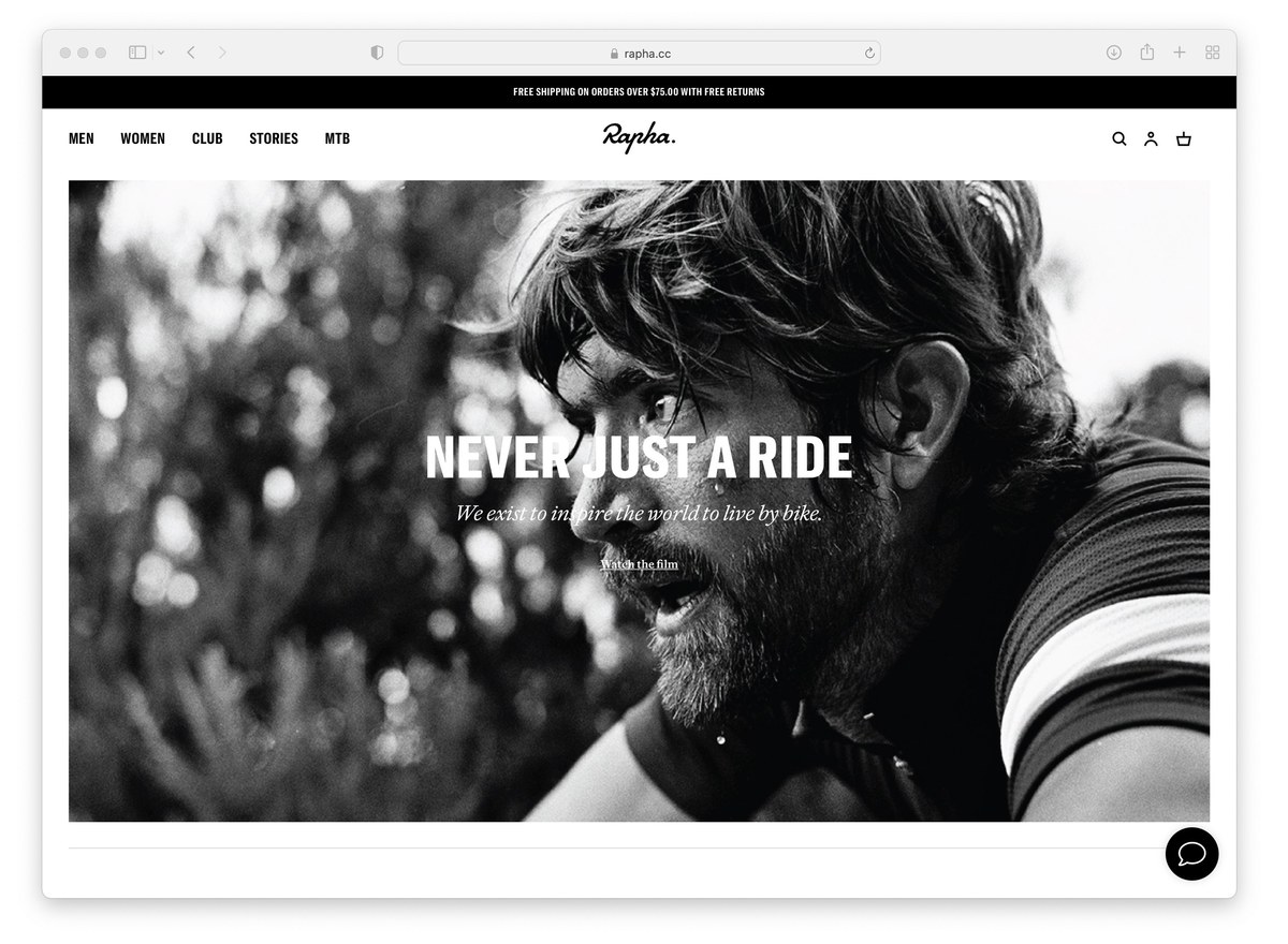
As a design-led company, Rapha has always been conscious of the relationship between cycling and typography. When it launched, the black-and-white photographs combined with a script logo and tracked-out all-sans capital style elicited a golden moment of cycling in the post-Second World War era, a rejection of the current visual landscape of cycling with its garish colours and questionable reputation. (Trade Gothic was matched with several serif fonts: Sabon, Clarendon, and eventually Adobe Caslon. The choice of Adobe Caslon perhaps had to do with its ready availability: Adobe started bundling it with its Creative Suite in 2003.) Even the name Rapha is evocative and specific, recalling the cycling team Saint Raphaël, sponsored by the French apertif from 1954 to 1964, and its directeur sportif Raphaël Géminiani. (‘The Original Rapha’, The Inner Ring, 16 May, 2012. As the article points out, at some point the main team had a sister team, Rapha–Gitane–Dunlop.)

Double Dutch

When Rapha first approached Commercial Type, Barnes had never thought of making any kind of Caslon, having long had an ambivalent relationship with the most British of faces. He felt that many revivals, such as Adobe Caslon and Big Caslon, reflected all that could be said of the first Caslon. Although much of Commercial Classics draws upon the work of later generations of the Caslon foundry, Barnes had little curiosity about looking at William Caslon I’s work – including the master’s first roman from 1725. It was only when Saunders chose Caslon Doric and wanted a serif with similar proportions that Barnes started to examine Caslon afresh, leading him down the path to make Frame. 

Frame’s origins are rooted in the founder’s seriffed faces, which in turn were derived from the Dutch typefounders of the sixteenth and seventeenth centuries. Discerning printers pre-Caslon would have imported type from the Low Countries. These so-called Dutch-style types were characterized by narrower faces with increased x-height and shorter extenders, innovations that, because they allowed more words to a page, were economical both in their use of space and financially. Throughout the ensuing centuries, the tall x-height and abbreviated ascenders and descenders were exaggerated even more, and the phrase ‘Dutch style’ now alludes to the more modern newspaper faces of the nineteenth and twentieth centuries. Updating the Caslon tradition and returning to Caslon’s Dutch heritage, Frame in this sense is a copy of a copy.

The greatest inspiration to Frame was William Caslon I’s Great Primer (c. 1728), perhaps Caslon at his closest to the Dutch model of the previous century. As shown in A Specimen of Printing Types by William Caslon, Letter-Founder to his Majesty, 1785. St Bride Library.
Something old, something new Adobe Caslon mimics the effect of letterpress squash; serifs have rounded ends, junctures are curved. Frame removes these and is sharp.
The four weights of Frame Text.
Something old, something new A side-by-side comparison of the shared proportions in Caslon Doric and Frame.

Designing Frame

Several design decisions allowed Barnes to find the freedom to make Frame, a Caslon for the twenty-first century. The first was where the typeface would appear, primarily as a digital face living online. Secondly, the softness inherent in Adobe Caslon suggests the effect of letterpress squash and would now be unnecessary: Frame could have a new, crisp character. The critical moment came when Caslon Doric was chosen to replace Trade Gothic and the decision was made that the new serif face should match the vertical cap- and x-height proportions of the sans. Enlarging the lowercase would give the new serif a more modern Dutch appearance. This reminded Barnes of Publico, a serif face designed with Christian Schwartz to match the proportions of the original Helvetica.

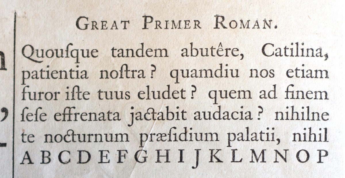
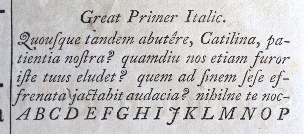
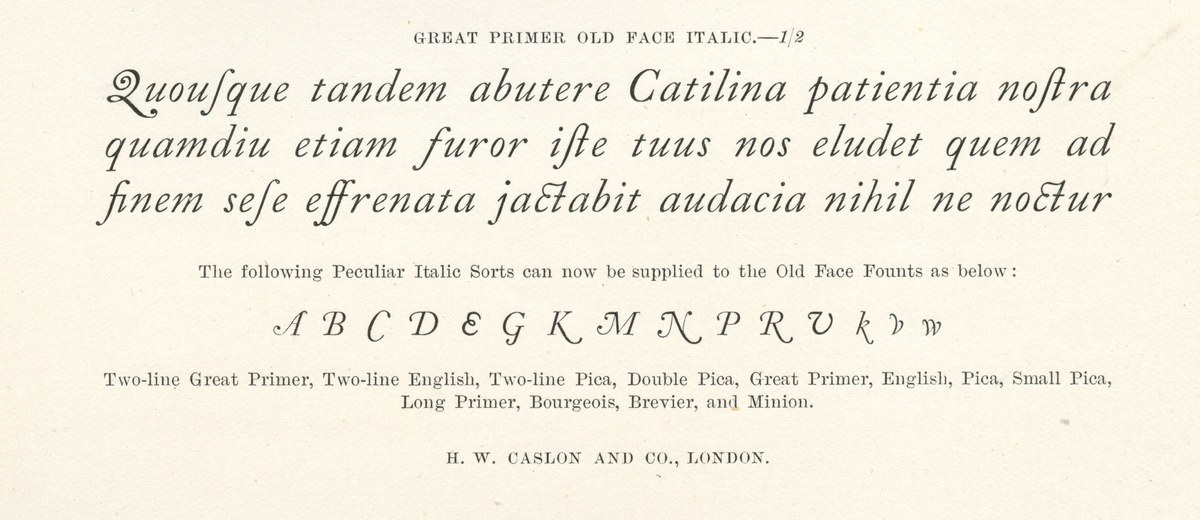
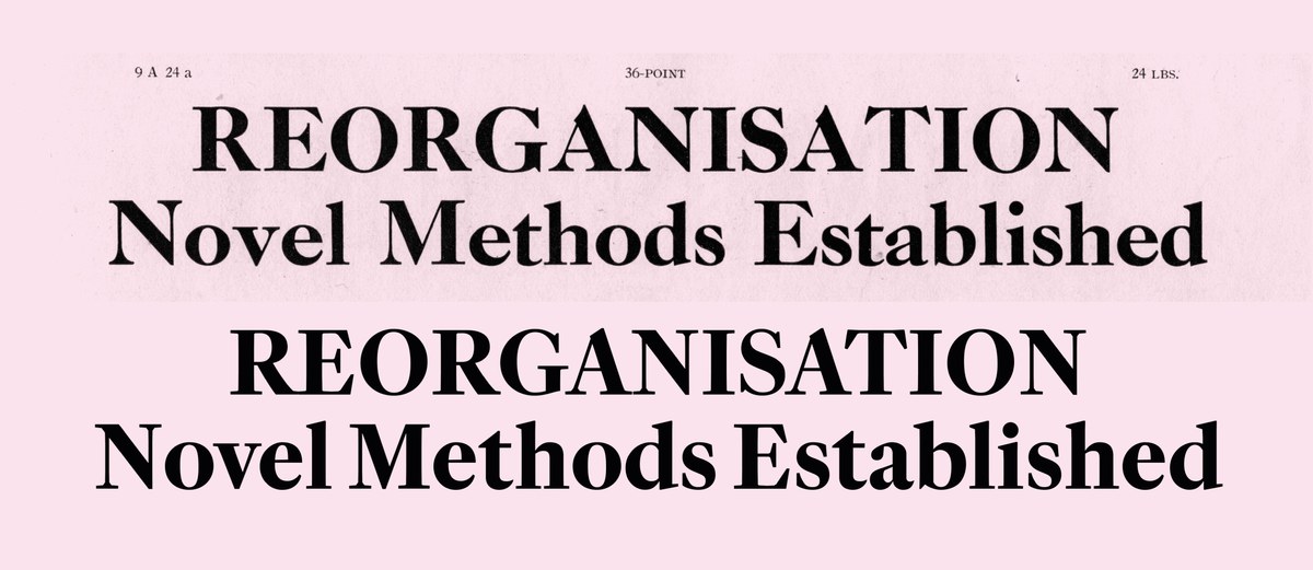
As one of the earliest William Caslon I faces cut in 1734, Great Primer is probably the Caslon text face that comes closest to the Dutch style. Great Primer was particularly appealing as a source because it retains the sharpness and grittiness of the masters of the Low Countries in the seventeenth century. Grittiness was important to Barnes, as it’s a quality that is highly regarded in professional cycling – the tradition of the strong, able to ride at the front into the headwind, whatever the conditions. These attributes are especially valued in the Low Countries and in the classic races like Paris-Roubaix and the Ronde van Vlaanderen.

Streamlined forms Gentle angled ends to strokes.
Streamlined forms Frame’s default C, G, and S follow the Dutch model (left), but include alternates that adhere to Caslon’s style (right).
Streamlined forms William Caslon I’s Great Primer (top) and Frame (bottom) clearly show the largeness of the x-height and the reduced ascenders and descenders.
Streamlined forms Sharp, thin structures in the lowercase of Caslon’s large sizes.
Streamlined forms Reduced serifs can also be found in the smallest size William Caslon cut, Pearl Roman, cut before 1734. St Bride Printing Library.
Streamlined forms Sharp joins between thin strokes, terminals, and thick strokes.
Streamlined forms Straight interiors for rounded characters.
Streamlined forms Gentle tapering to stroke ends.
Streamlined forms Frame’s default C, G, and S follow the Dutch model (left), but we included alternates that adhere to Caslon’s style (right). Note the small angled brackets.
Streamlined forms Gentle angled ends to strokes.
Streamlined forms Frame’s default C, G, and S follow the Dutch model (left), but include alternates that adhere to Caslon’s style (right).
Streamlined forms William Caslon I’s Great Primer (top) and Frame (bottom) clearly show the largeness of the x-height and the reduced ascenders and descenders.
Streamlined forms Sharp, thin structures in the lowercase of Caslon’s large sizes.

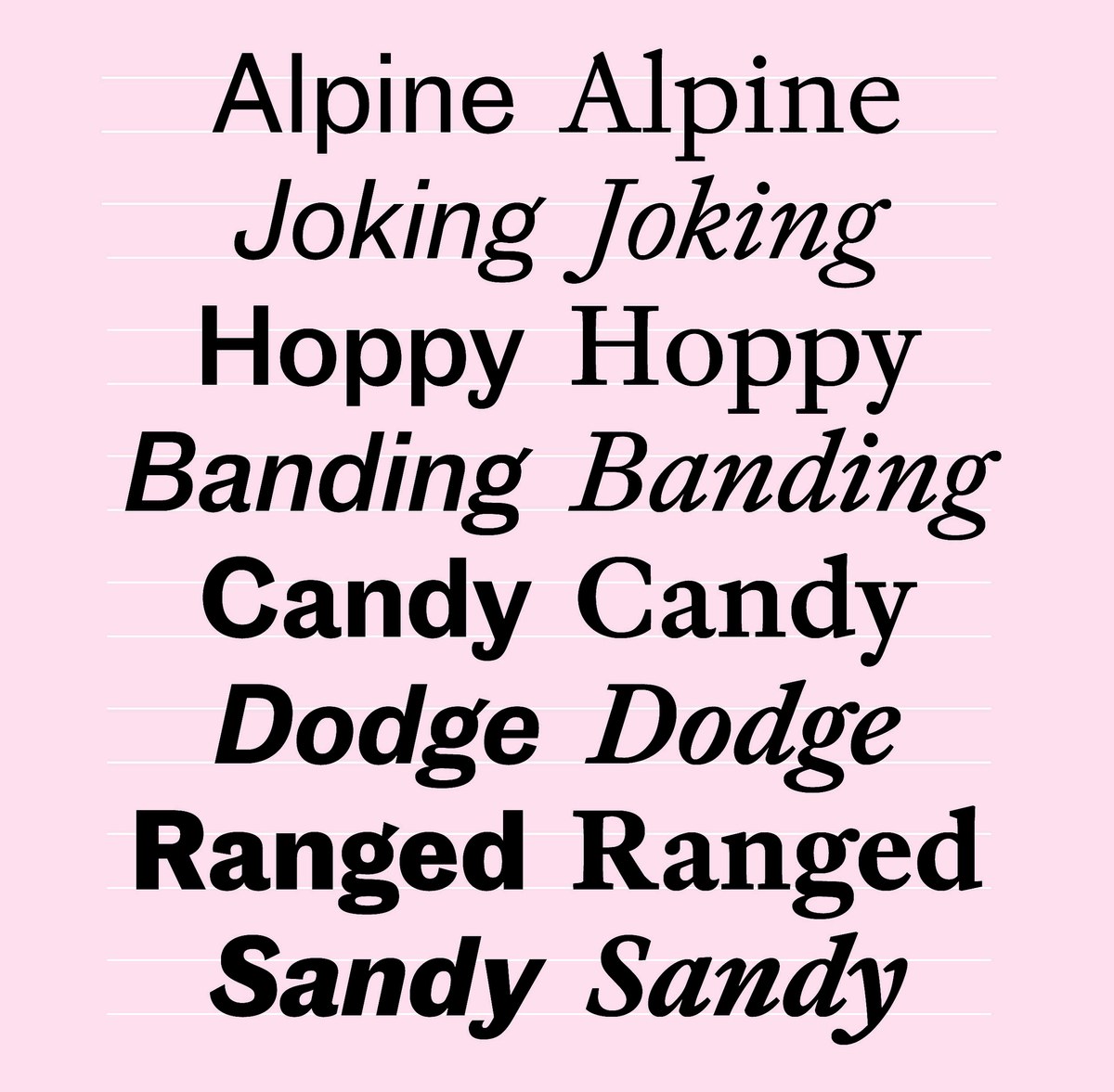
Frame diverges most noticeably from Caslon’s Great Primer and Adobe Caslon in its proportions and in the reduction of details to simpler forms. At text sizes, many details become lost and streamlining the forms also returns a sharpness to the overall personality of the face. In several of Caslon’s faces, the serif structure in the lowercase is almost a flat line, with little or no tapering. Frame’s lowercase serifs have gentle straight flaring of the stroke, and the serif itself is a shallow, nearly flat stroke, ending in an angled terminal. In the capitals, the stroke flares before meeting an angled corner and then tapers. The balls are rounded on the outside but flat on the inside, shifting between roundness and angularity. The contrast is deliberately low in the Text face, almost matching Adobe Caslon. Certain letterforms are drawn from the Dutch style rather than Caslon: for example, the lack of top and bottom serifs on the C, G, and S. By rescaling the proportions, the capitals that are quite prominent in the Caslons leave less of an impact on the overall colour of a page set in Frame.

A steady rhythm The fluctuating angles of Caslon’s original italics: French Canon, 1734; Great Primer, 1730; Pica No. 1, 1725; and Frame, 2022.
A steady rhythm Distilling down letterforms improves legibility by evening out the rhythm and overall colour. From left to right: simplified forms of h, v, and w; more complicated alternatives to v and w; and the forms that Caslon followed.
A steady rhythm Frame Italic in four weights.
A steady rhythm Great Primer Italic (c. 1730) has a steady angle and regularised rhythm. As shown in A Specimen of Printing Types by William Caslon, Letter-Founder to his Majesty, 1785. St Bride Library.
A steady rhythm William Caslon I’s Great Primer Italic, cut before 1730 (top) was the historical foundation for Frame (bottom).
A steady rhythm Sharp junctures.
A steady rhythm The fluctuating angles of Caslon’s original italics: French Canon, 1734; Great Primer, 1730; Pica No. 1, 1725; and Frame, 2022.
A steady rhythm Distilling down letterforms improves legibility by evening out the rhythm and overall colour. From left to right: simplified forms of h, v, and w; more complicated alternatives to v and w; and the forms that Caslon followed.
A steady rhythm Frame Italic in four weights.
A steady rhythm Great Primer Italic (c. 1730) has a steady angle and regularised rhythm. As shown in A Specimen of Printing Types by William Caslon, Letter-Founder to his Majesty, 1785. St Bride Library.

Caslon’s italics show a variety of styles. The largest sizes narrow in width, with a shallow angle and tight spacing. The Text sizes’ angles frequently vary, from steep in Great Primer to something gentler in Pica; the width also varies, from Great Primer at its widest, to Pica at its narrowest (like Adobe Caslon). In contrast to earlier models, such as the French master Granjon of the sixteenth century, Caslon’s italics have fewer changes in angle and width to maintain a steadier rhythm. Where Granjon’s italics often overshadow the roman, Caslon’s assume a much more subservient role and are far less dramatic. Frame has the regularity of Caslon’s faces, with its angle and width falling in the middle of the original smaller sizes and Great Primer.

As with the roman, the details of the italic are reductionist. The capitals follow exactly the same serif structure, while the tails reach the main strokes in a sharp and obvious point in the lowercase and their exteriors have a subtle, barely noticeable juncture. Simplifying some characters maintains rhythm, smoothes out the overall colour, and improves legibility. The h lacks an inward ball terminal to maintain the rhythm of the n and m, and the v and w are gently curved, rather than having rounded bowls with head, stroke, and ball.

Grace notes The swashes for Frame are closer to those cut by Granjon in the sixteenth century.
Grace notes Great Primer as shown in 1895, recut by the Caslon foundry. The spacing was loosened and a series of swash capitals were added. The lower case f has been mispositioned on the body. The J and Q follow the original form from 1730.

The swash letters that appear in Caslon specimens from the latter part of the nineteenth century, as well as in many modern Caslon revivals, were not cut for the original in 1730 (bar the J and Q), but added later. They have a different flavour from the corresponding eighteenth-century letters and lack the confidence and majesty of those made in the sixteenth century. In Frame, the swashes are informed by the drama of Granjon, but tempered by the calmer qualities of the lowercase.

Overall, the italic attempts to capture the spirit and energy of Caslon’s original, but with the measuredness and regularity needed for legibility. Although the roman addressed many of Rapha’s concerns about economy, the italic remains a popular choice for headlines, where its understated elegance draws readers’ attention without overpowering.

A style for every size Even though the roman is more economical, the characterful italic is still a popular choice for headlines. Shown with Caslon Doric.
A style for every size Frame Text used with Caslon Doric.
A style for every size A comparison between Frame Text and Head.
A style for every size Caslon Old Face Heavy cut in the early twentieth century (top) has a different sensibility and proportions from the eighteenth-century original. Frame’s Bold (bottom) follows the proportions and style of the earlier roman much more closely.

Head and Body Copy

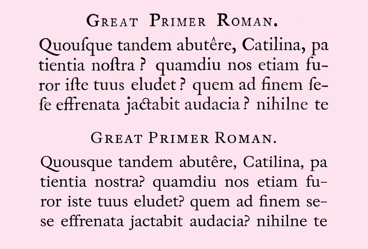
In the age of Caslon, every size of type was cut individually, although the average reader hardly would have noticed how the design changed between sizes. Adobe Caslon and Big Caslon are based on William Caslon’s vision, but a side-by-side comparison shows that they are quite different. They diverge not only in their degree of contrast but also in width, proportion, and spacing. Yet, both are accepted as one and the same: Caslon. Only when type stopped being cut by hand did it gain the greater consistency users expect today. In the case of Frame, the headline variants are closer to the modern approach of adapting the text rather than remaking it, in this case by increasing contrast and tightening spacing for use at sizes above 18pt. Though the headline is sharper and crisper, it is not as extreme as a hairline Modern. 

Gaining weight The small weight range of Frame: Roman, Medium, Semibold, Bold.

Bolder and Bolder

Without a model, a convincing bold had to be created that retained the ethos of the regular weight while dealing with the challenges of becoming heavier. As weight increases, the x-height rises to avoid the letters becoming too wide. Thus the small number of weights (four in total) reflects both the client’s need for only a bold, and not heavier weight; and remains true to the original design without becoming a caricature. When Rapha requires darker weight and greater emphasis, they can turn to Caslon Doric.

Frame is a typeface steeped in the rich tradition of Caslon and, by extension, the Dutch style. Yet while Frame echoes its predecessors, accounting for Rapha’s needs alchemized a truly contemporary style. Like many faces that follow Caslon, it is informed by the exigencies of time and place. In this case, sharing the proportions of Caslon Doric gives a unified identity and efficiency appropriate to the brand. Frame’s utility is proven across all mediums: from print and web to environmental and fashion design.