Harding, a new typeface for Nature
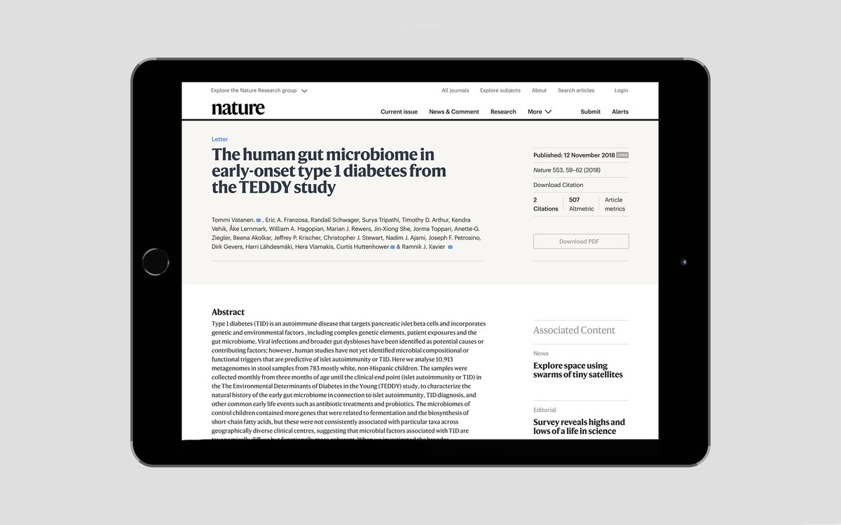
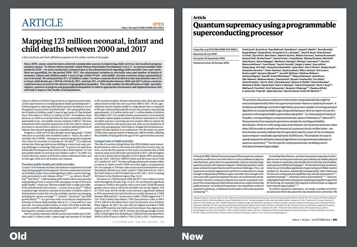
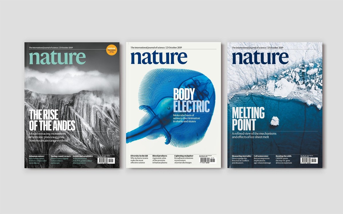
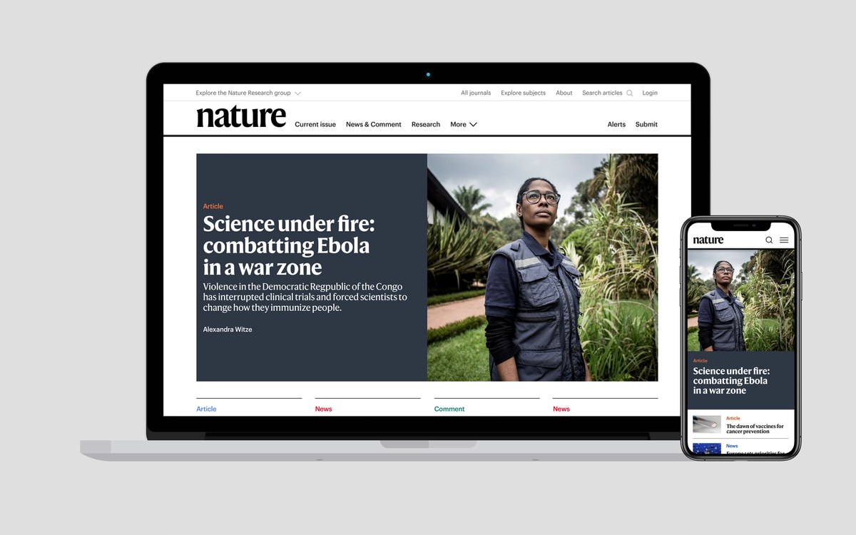
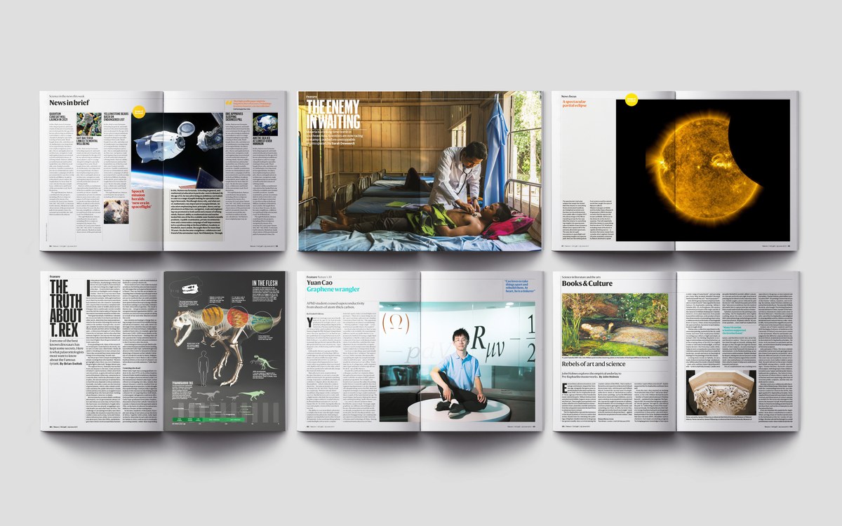
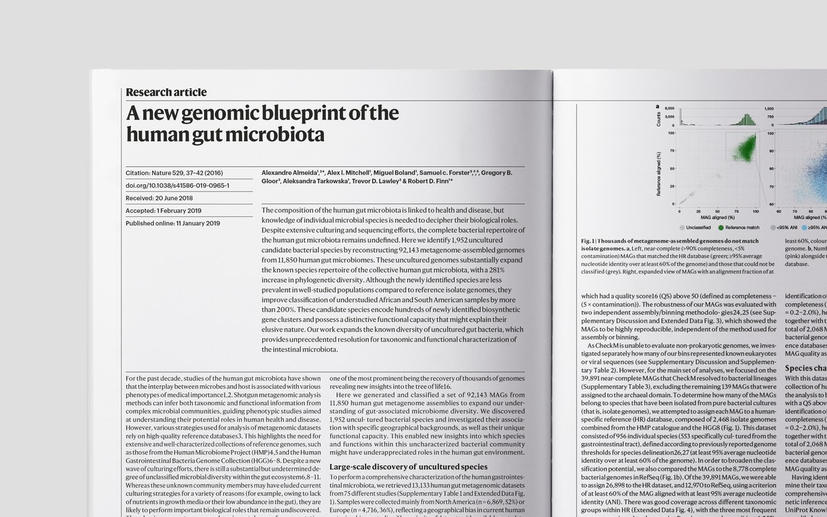
Commercial Type partners Paul Barnes and Christian Schwartz have designed a new series of typefaces for Nature, one of the world’s leading scientific journals. Working closely with creative director Kelly Krause and external design consultant Mark Porter, Barnes and Schwartz have created Harding, a multi weight text and display family, that is being introduced into Nature’s online and print portfolio in the forthcoming months.
The project began at the end of 2018, when Porter approached Commercial Type to design a series of headline faces to give a more modern and friendly, yet authoritative scientific voice to his redesign. Amongst the reference material he supplied were various styles of contrasted flared sans faces, a style that has long fascinated Barnes and Schwartz. The style can be seen in the work of Hermann Zapf’s Optima, Robert Hunter Middleton’s Stellar, and more recently Gerard Unger’s Alverata, but goes further back to the early nineteenth century, and is reflected in Barnes’ Chiswick Sans and Darby Sans.
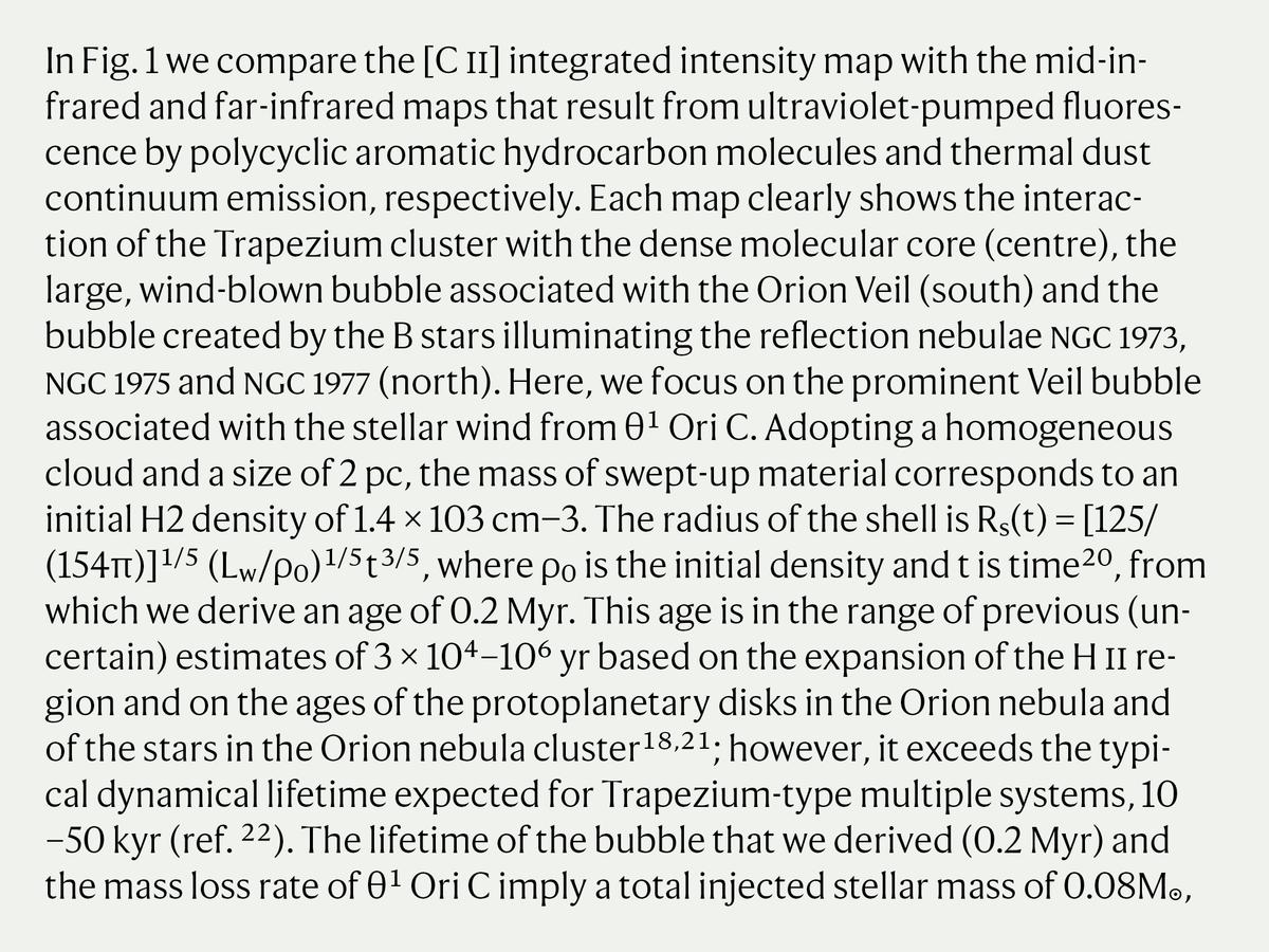
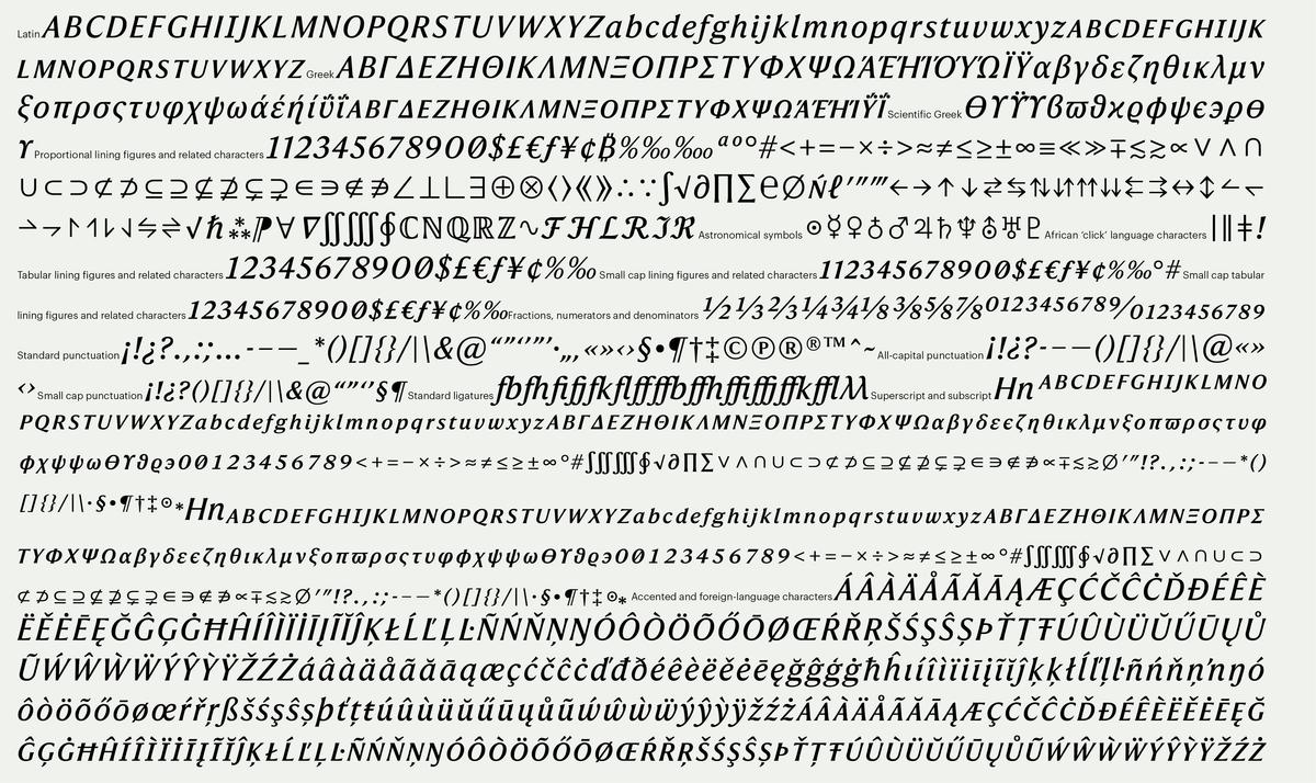
Harding Display comes in five weights from roman to extra bold with proportions and spacing of a face designed for headlines. In style it has the qualities of a serif face of contrast and elegance, but without the serifs which are replaced with an simple but distinctive flaring. Tension is created between the flared terminals of some letters such as the lower case r, and the round ball terminals on the lower case a, f and c that give the face a softness and warmth. This softness can be found in the teardrop bowl to the a. The italic cleverly mixes the forms of the roman with a more typical serif italic: the incoming strokes are simple flairs, while the outgoing strokes end in tails more commonly found in a serif letters. The contrast between balls and flared terminals again is referenced, making an elegant companion to the roman.
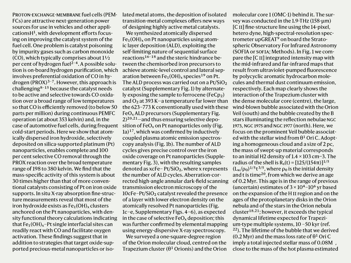
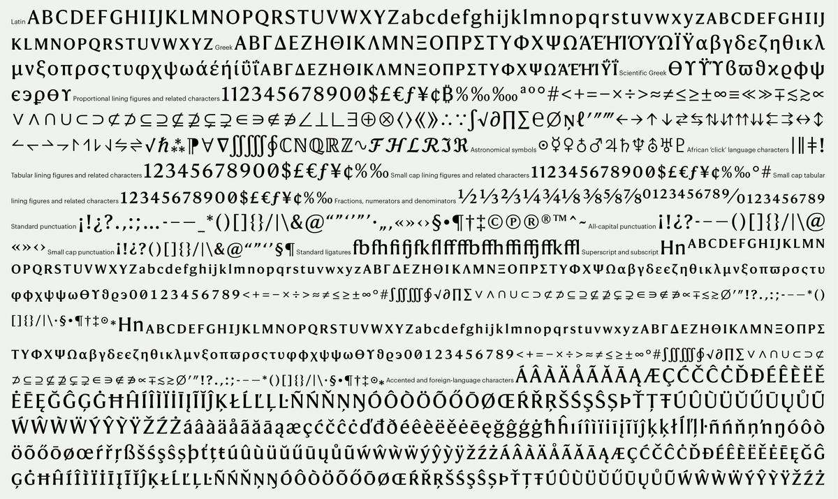
Krause and Porter wanted the headline typeface to function for text as well, which presented some interesting challenges. Typefaces used in scientific journals need enormous character sets to cope with the complex typesetting necessary for academic research papers. This is particularly complex in a publication like Nature, which covers a vast range of topics. Traditionally these publications have cobbled together their typesetting from various differing styles; in the age of metal this would see Times New Roman combined with a nineteenth century modern that contains the mathematical character set, with a different typeface altogether for the Greek characters. In this case, Commercial Type was challenged to include all of these characters in Harding, from planetary symbols needed by astronomers to characters used to denote the click sounds in some African languages needed by linguists.
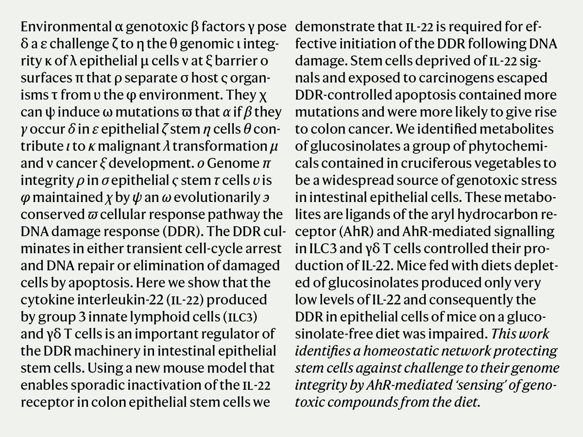
Harding Text is a looser-spaced version of Harding, with special attention paid to differentiating characters like capital I, lowercase l, and number 1, a particularly important issue for typesetting scientific papers. The Greek character set was drawn by long term collaborator Panos Haratzopoulos, who has designed Greek extensions for a number of Commercial Type releases. While our Greek adaptations are typically designed for use by Greek designers working for Greek audiences, leading to a close integration of Greek and Latin forms, the brief for Harding necessitated making the differences more explicit between characters like a and alpha, and including a number of forms that are not common in modern Greek but are still used in mathematical formulae.
Throughout the process of designing this exhaustive character set, Barnes and Schwartz were appreciative of the extensive feedback given by scientists from many different specialties, and leaned heavily on their expertise for characters the designers were seeing for the first time.
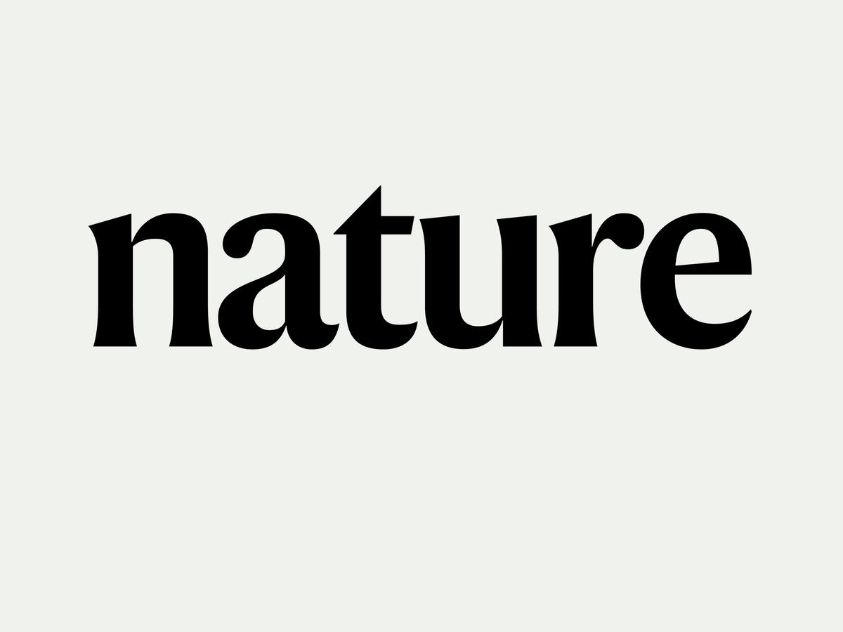
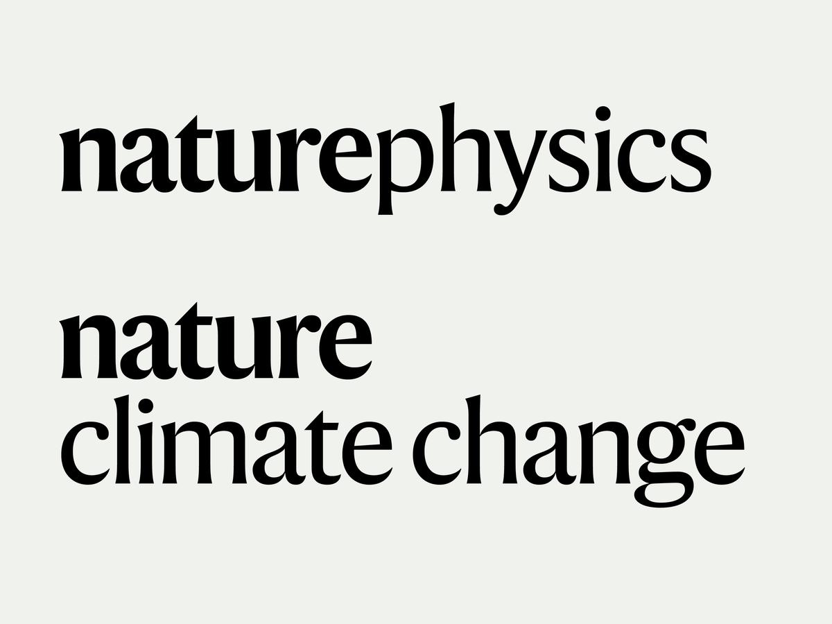
Harding was also the basis of Nature’s new titlepiece, which was developed into a series of titling faces for the various subbrands within the portfolio. Narrower and with less flaring, it is also a bit softer, with terminals rounded in the lowercase to evoke earlier incarnations of the titlepiece in Garamond and Baskerville.
The typeface is named for the late neurologist Anita Harding, whose best-know contribution to her field was the discovery of the “first identification of a mitochondrial DNA mutation in human disease and the concept of tissue heteroplasmy of mutant mitochondrial DNA”, in collaboration with Ian Holt and John Morgan-Hughes, which was published in Nature in 1986.
You can read more about the redesign as a whole in this article by creative director Kelly Krause.
