Darby Serif by Paul Barnes
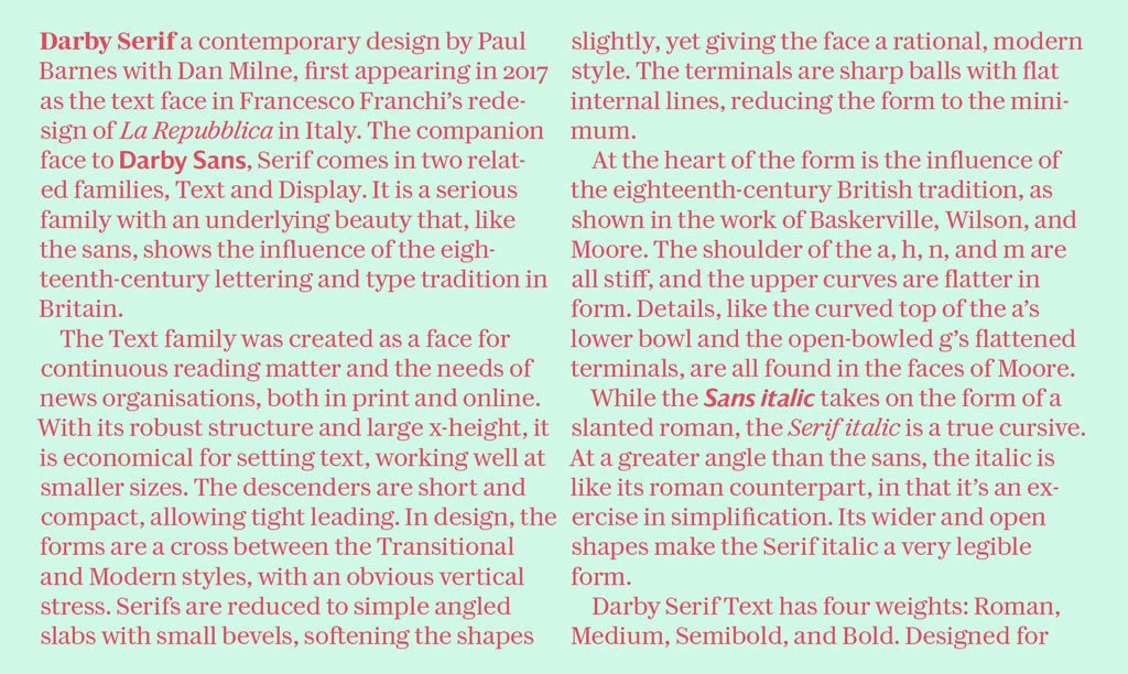
Darby Serif is a contemporary design by Paul Barnes with Dan Milne, first appearing in 2017 as the text face in the redesign of La Repubblica in Rome by Francesco Franchi and Angelo Rinaldi. The companion face to Darby Sans, Darby Serif comes in two related families, Text and Display. It is a serious family with an underlying beauty that, like the sans, shows the influence of the eighteenth-century lettering and type tradition in Britain.
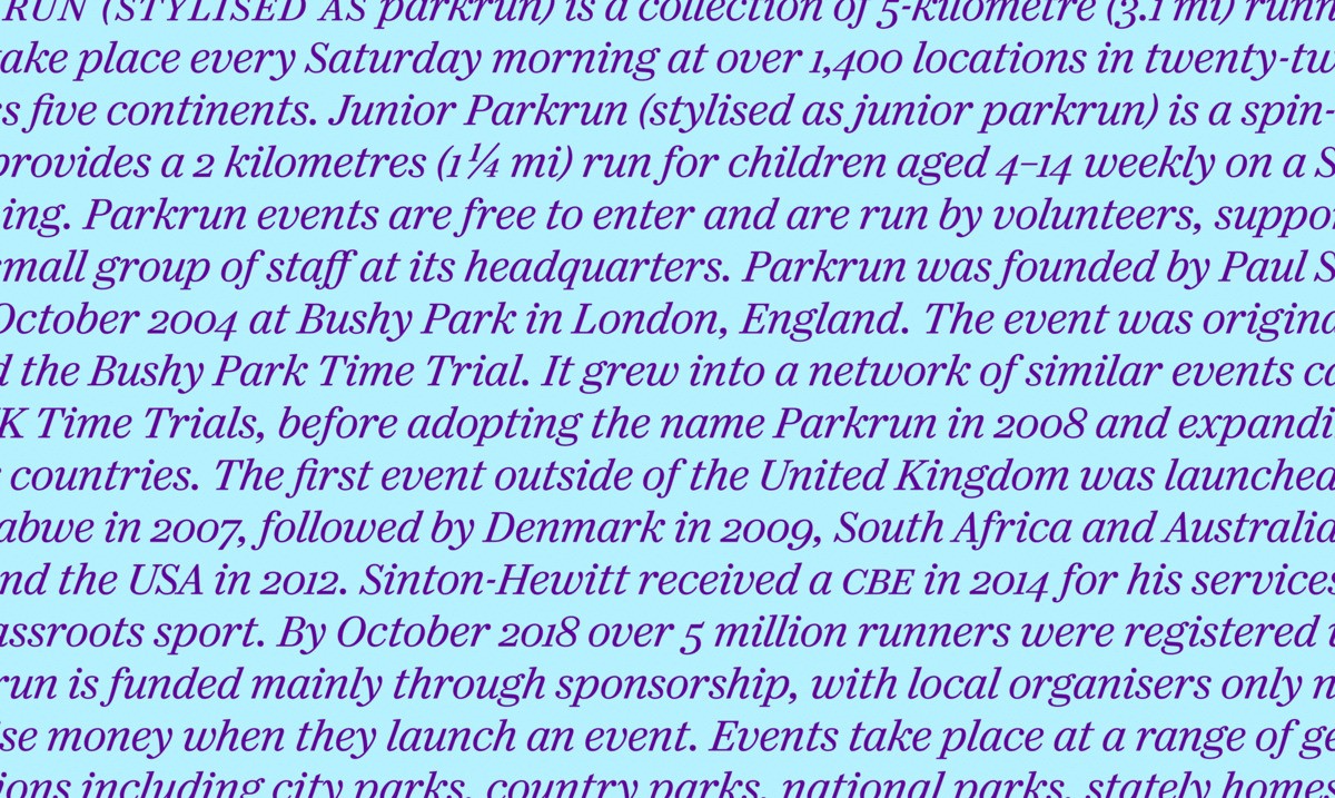
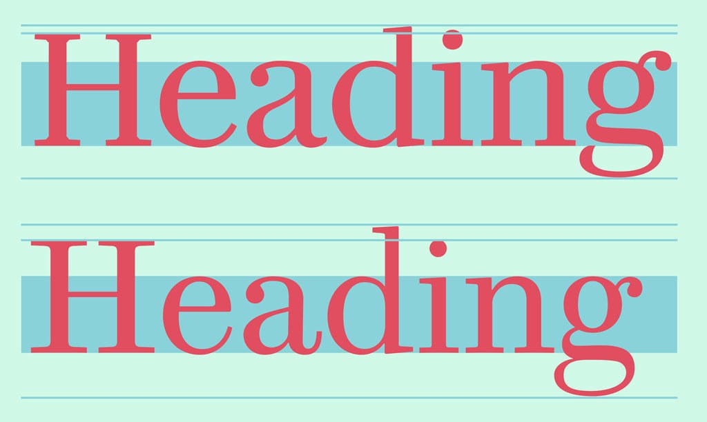
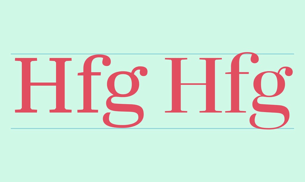
Darby Serif Text was created as a face for continuous reading matter and the needs of news organisations, both in print and online. With its robust structure and large x-height, it is economical for setting text, working well at smaller sizes. The descenders are short and compact, allowing tight leading. In design, the forms are a cross between the Transitional and Modern styles, with an obvious vertical stress. Serifs are reduced to simple angled slabs with small bevels, softening the shapes slightly, yet giving the face a rational, modern style. The terminals are sharp balls with flat internal lines, reducing the form to the minimum.
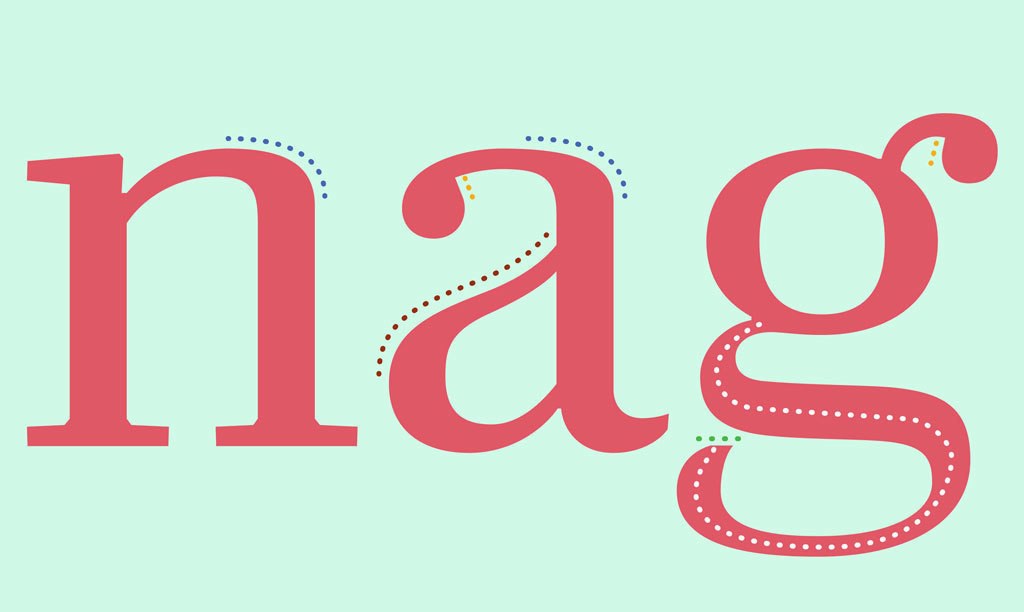
At the heart of the form is the influence of the eighteenth-century British tradition, as shown in the work of Baskerville, Wilson, and Moore. The shoulder of the a, h, n, and m are all stiff, and the upper curves are flatter in form. Details, like the curved top of the a’s lower bowl and the open-bowled g’s flattened terminals, are all found in the faces of Moore.
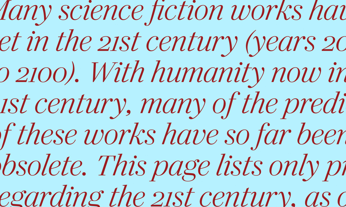
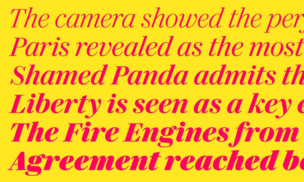
While the Sans italic takes on the form of a slanted roman, the Serif italic (like Darby Sans Poster) is a true cursive. At a greater angle than the sans, the italic is like its roman counterpart, in that it is an exercise in simplification. Its wide and open shapes make the Serif italic a very legible form.
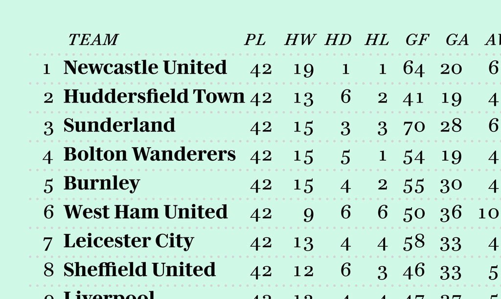
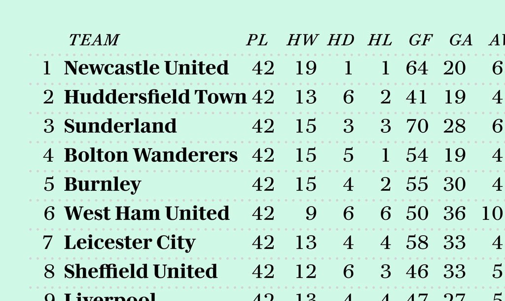
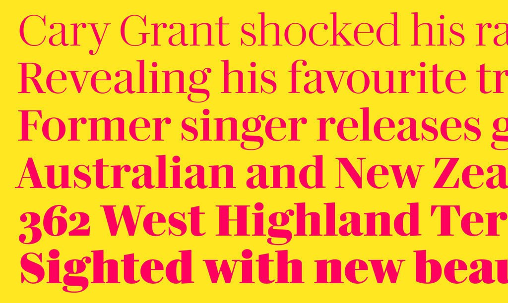
Darby Serif Text has four weights: Roman, Medium, Semibold, and Bold. Designed for complex typographic problems, it includes small capitals and both lining and non-lining figures in proportional and tabular styles. The Text family is perfect not just for news, but also for editorial and book typography, as well as for general graphic design.
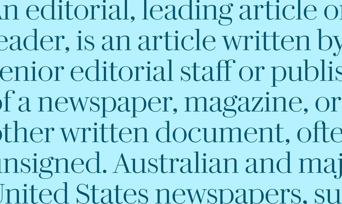
With tighter spacing and higher contrast, Darby Serif Display is typical of headline faces, making it ideal for sizes above 24 point. As vertical economy is not as of paramount importance as in the Text, the ascenders and descenders are longer. Additionally, the serifs are finer and the size of the beveled bracketing is reduced to a barely-perceptible minimum. With six weights, it gives designers a wider palette than Text, a spectrum ranging from a delicate light weight to an emphatic black. This is ideal for where a wide scope of weights is required, from newspaper and magazine headlines, to chapter headings in book design.

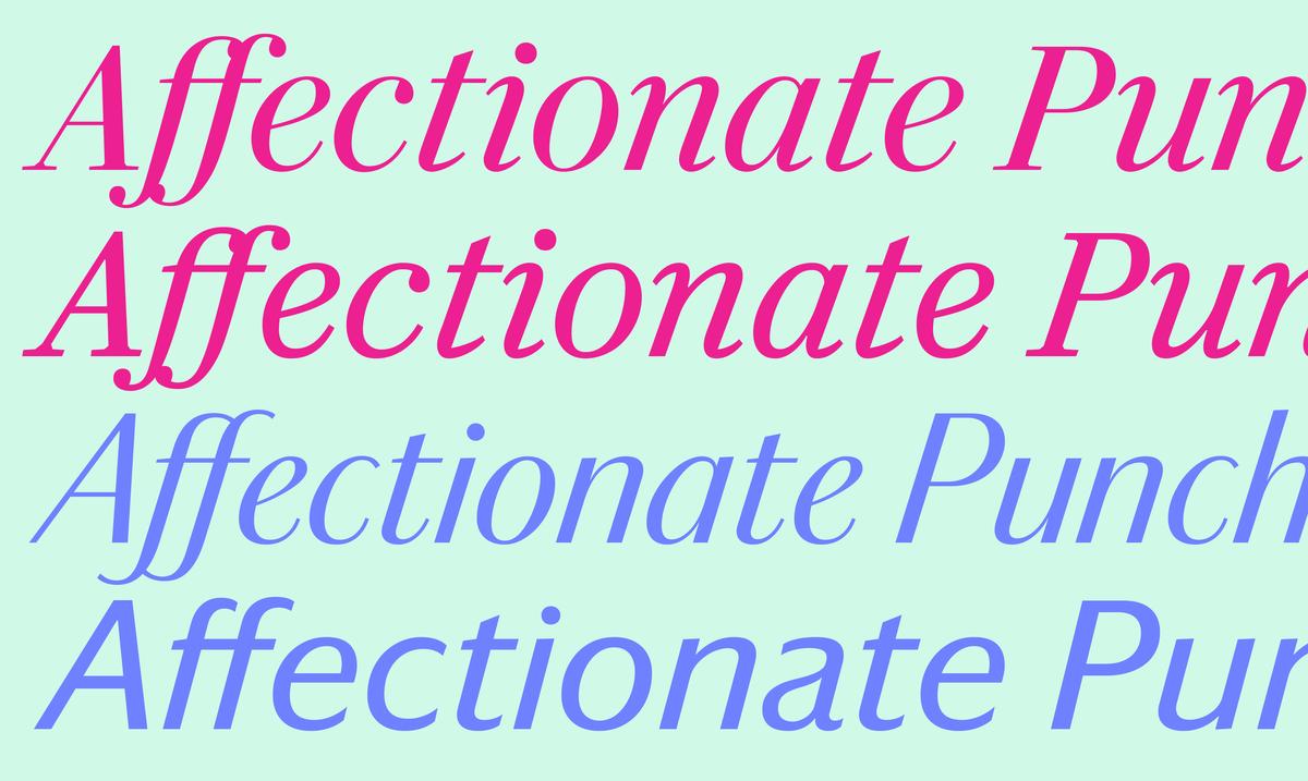
Darby Serif is a welcome addition to the Commercial Type Library; the Text perfect for small sizes and running copy, and the Display variant for headlines and large sizes. Its roots give it a quiet beauty, while its sharpness and simplification lend it modernity. With its Sans companion, it is now a family perfect for multiple uses: from the serious Serif Text, to the stark sharp elegance of the Sans Poster.
